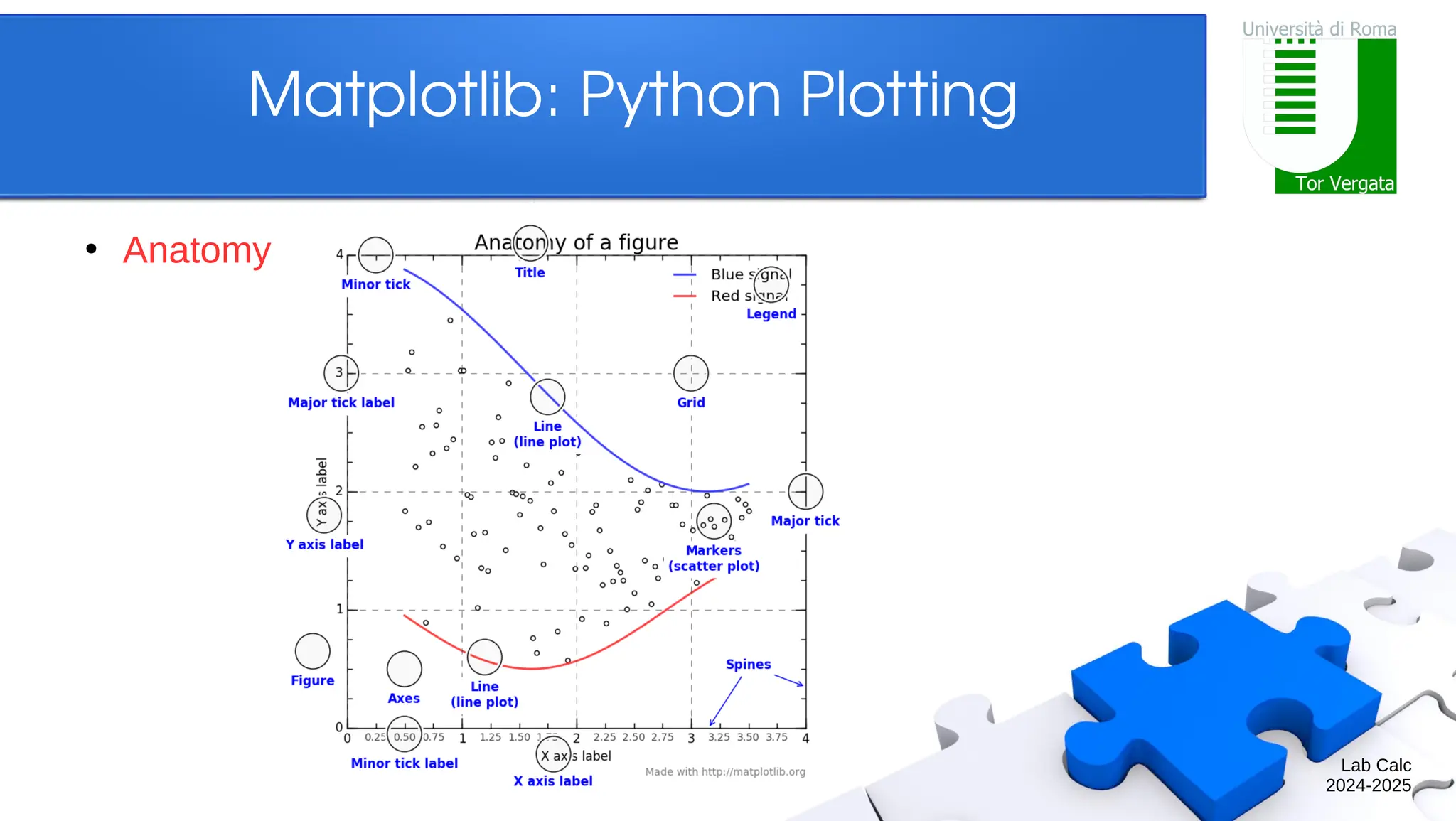
Lab Calc 2024-2025 Matplotlib: PythonPlotting ● Overview – Anatomy of a figure ● Figures and axes – 2D plotting ● Standard line plotting ● Other plotting + text annotation – 3D plotting ● 3D axes + 3D line/surface plotting – Other plotting ● Contours + image visualization
3.
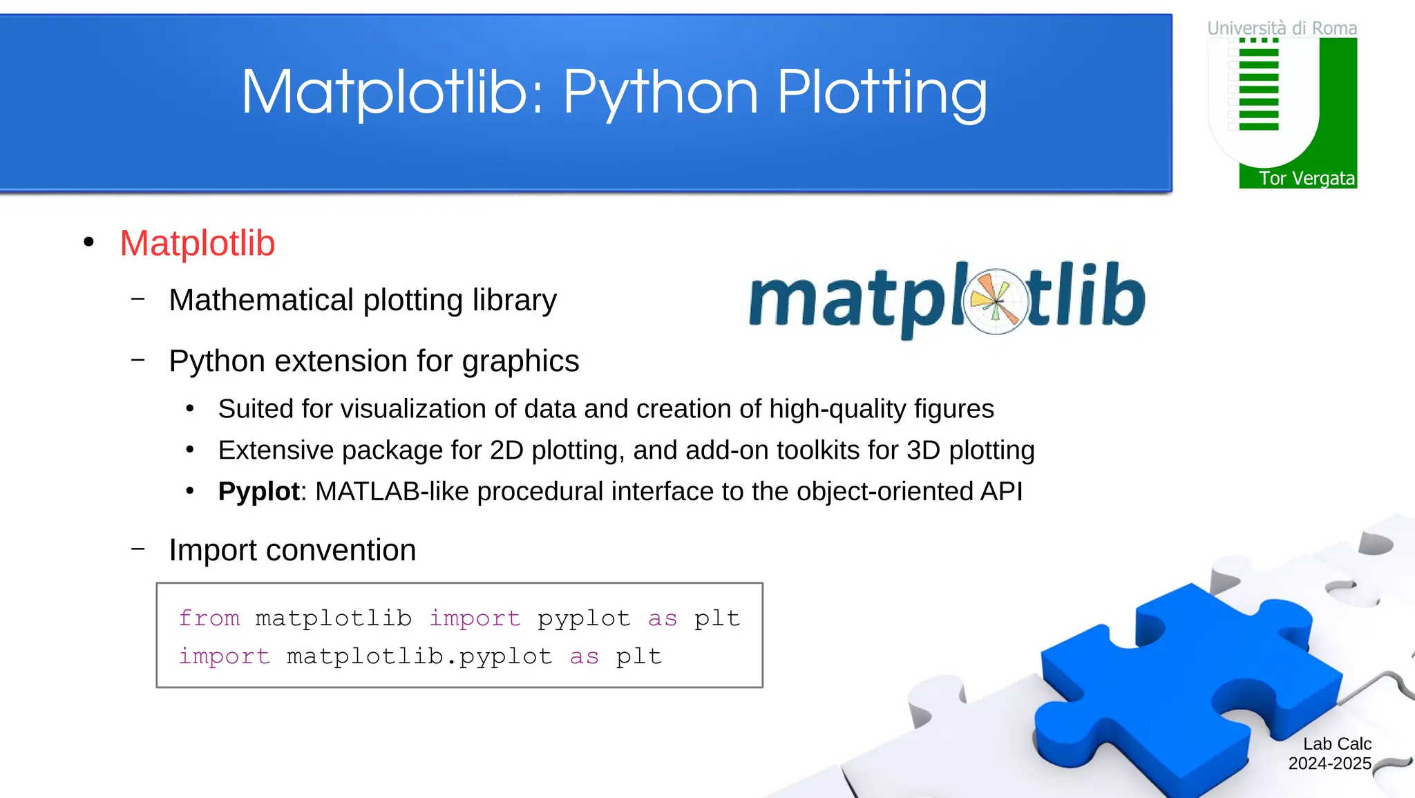
Lab Calc 2024-2025 Matplotlib: PythonPlotting ● Matplotlib – Mathematical plotting library – Python extension for graphics ● Suited for visualization of data and creation of high-quality figures ● Extensive package for 2D plotting, and add-on toolkits for 3D plotting ● Pyplot: MATLAB-like procedural interface to the object-oriented API – Import convention from matplotlib import pyplot as plt import matplotlib.pyplot as plt
Lab Calc 2024-2025 Matplotlib: PythonPlotting ● A simple plot – Syntax is array-based – If not interactive, also write: In [1]: x = np.linspace(0, 2.0*np.pi, 100) In [2]: cx, sx = np.cos(x), np.sin(x) In [3]: plt.plot(x, cx) ...: plt.plot(x, sx) ...: plt.show()
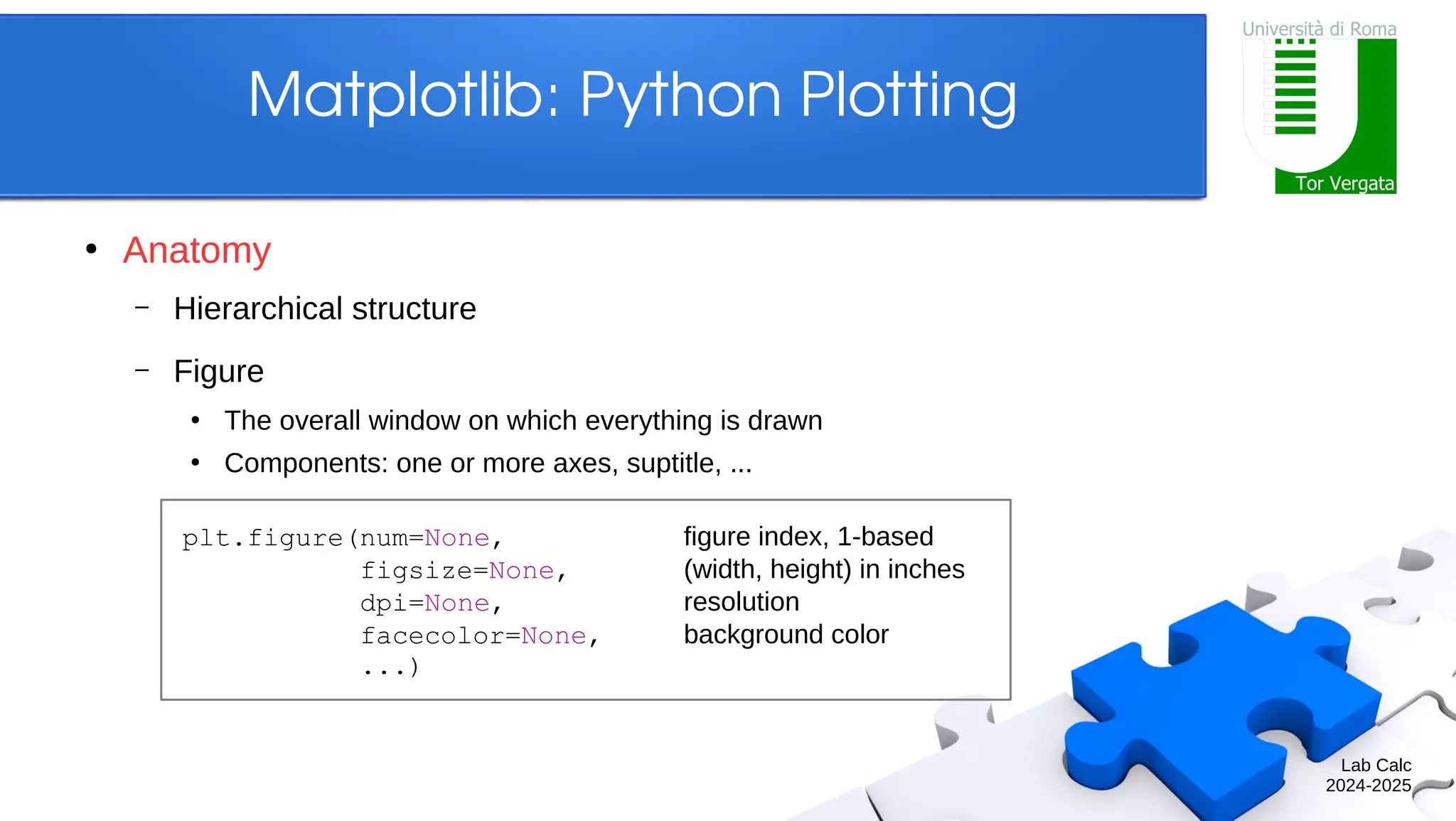
Lab Calc 2024-2025 Matplotlib: PythonPlotting ● Anatomy – Hierarchical structure – Figure ● The overall window on which everything is drawn ● Components: one or more axes, suptitle, ... plt.figure(num=None, figure index, 1-based figsize=None, (width, height) in inches dpi=None, resolution facecolor=None, background color ...)
9.
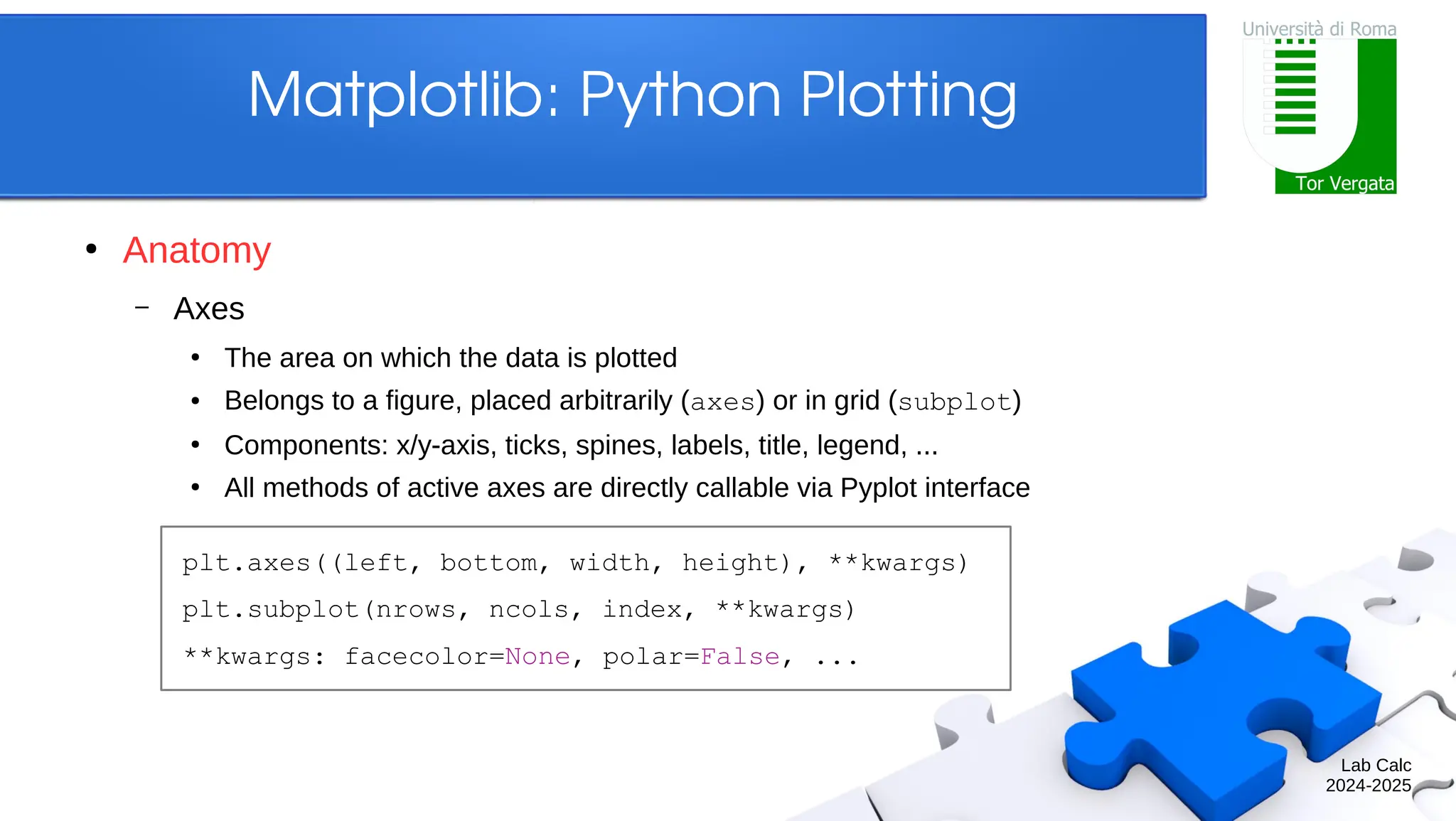
Lab Calc 2024-2025 Matplotlib: PythonPlotting ● Anatomy – Axes ● The area on which the data is plotted ● Belongs to a figure, placed arbitrarily (axes) or in grid (subplot) ● Components: x/y-axis, ticks, spines, labels, title, legend, ... ● All methods of active axes are directly callable via Pyplot interface plt.axes((left, bottom, width, height), **kwargs) plt.subplot(nrows, ncols, index, **kwargs) **kwargs: facecolor=None, polar=False, ...
10.
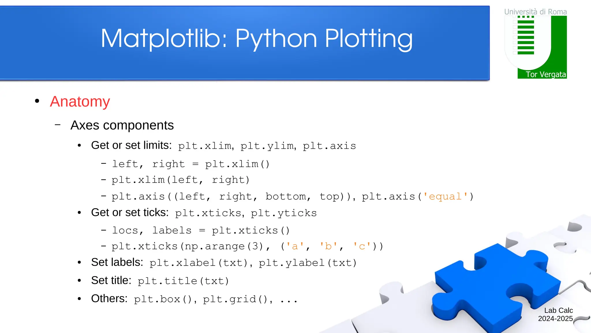
Lab Calc 2024-2025 Matplotlib: PythonPlotting ● Anatomy – Axes components ● Get or set limits: plt.xlim, plt.ylim, plt.axis – left, right = plt.xlim() – plt.xlim(left, right) – plt.axis((left, right, bottom, top)), plt.axis('equal') ● Get or set ticks: plt.xticks, plt.yticks – locs, labels = plt.xticks() – plt.xticks(np.arange(3), ('a', 'b', 'c')) ● Set labels: plt.xlabel(txt), plt.ylabel(txt) ● Set title: plt.title(txt) ● Others: plt.box(), plt.grid(), ...
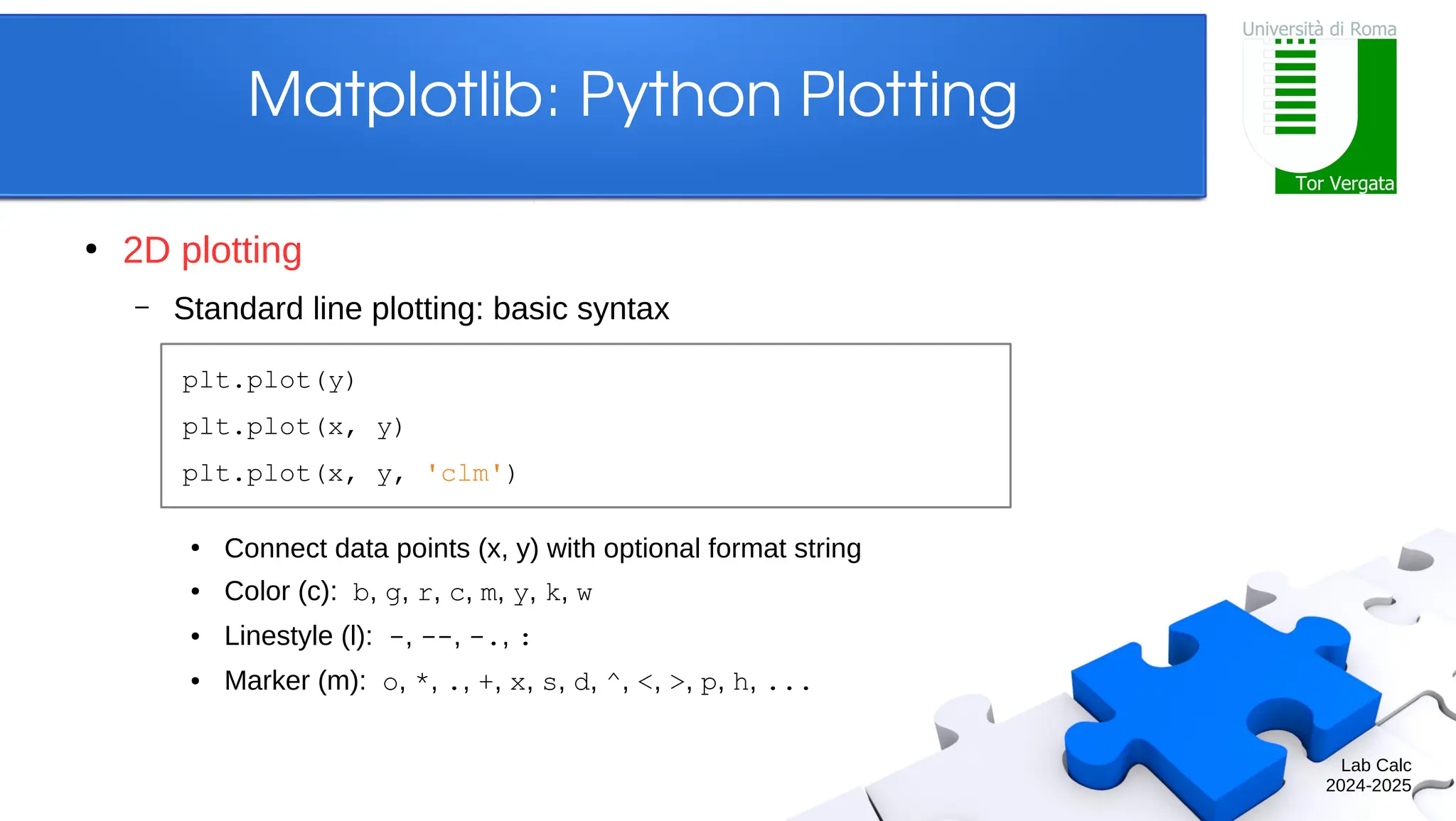
Lab Calc 2024-2025 Matplotlib: PythonPlotting ● 2D plotting – Standard line plotting: basic syntax ● Connect data points (x, y) with optional format string ● Color (c): b, g, r, c, m, y, k, w ● Linestyle (l): -, --, -., : ● Marker (m): o, *, ., +, x, s, d, ^, <, >, p, h, ... plt.plot(y) plt.plot(x, y) plt.plot(x, y, 'clm')
13.
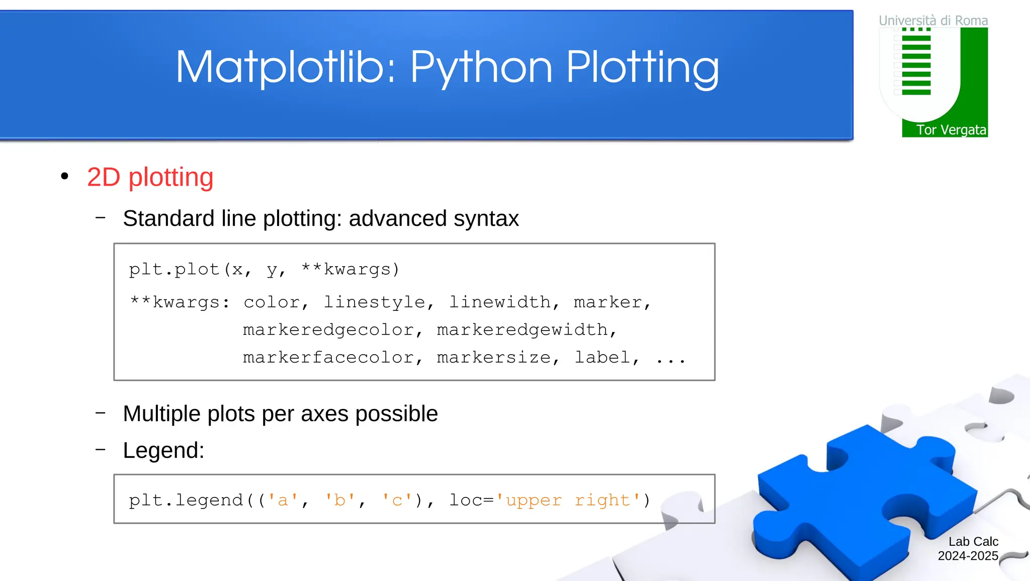
Lab Calc 2024-2025 Matplotlib: PythonPlotting ● 2D plotting – Standard line plotting: advanced syntax – Multiple plots per axes possible – Legend: plt.plot(x, y, **kwargs) **kwargs: color, linestyle, linewidth, marker, markeredgecolor, markeredgewidth, markerfacecolor, markersize, label, ... plt.legend(('a', 'b', 'c'), loc='upper right')
14.
Lab Calc 2024-2025 Matplotlib: PythonPlotting ● 2D plotting – For full plot details, check out plt.plot? – Example In [1]: t = np.arange(0.0, 2.0, 0.01) ...: s = 1.0 + np.sin(2.0*np.pi*t) In [2]: plt.axes(facecolor='silver') ...: plt.plot(t, s, 'r') ...: plt.xlabel('time (s)') ...: plt.ylabel('voltage (mV)') ...: plt.title('About as simple as it gets') ...: plt.grid()
15.
Lab Calc 2024-2025 Matplotlib: PythonPlotting ● 2D plotting – Plotting methods are actually connected to axes ● Pyplot provides an interface to the active axes In [1]: t = np.arange(0.0, 2.0, 0.01) ...: s = 1.0 + np.sin(2.0*np.pi*t) In [2]: ax = plt.axes() ...: ax.plot(t, s, 'r') ...: ax.set(facecolor='silver', ...: xlabel='time (s)', ...: ylabel='voltage (mV)', ...: title='About as simple as it gets') ...: ax.grid()
16.
Lab Calc 2024-2025 Matplotlib: PythonPlotting ● 2D plotting – Example: data statistics ● Data in the file “populations.txt” describes the populations of hares, lynxes and carrots in northern Canada during 20 years ● Load the data and plot it ● Compute the mean populations over time ● Which species has the highest population each year? # year hare lynx carrot 1900 30e3 4e3 48300 1901 47.2e3 6.1e3 48200 1902 70.2e3 9.8e3 41500 ...
17.
Lab Calc 2024-2025 Matplotlib: PythonPlotting ● 2D plotting – Example: data statistics ● Load the data and plot it In [1]: data = np.loadtxt('populations.txt') In [2]: year, hares, lynxes, carrots = data.T In [3]: plt.axes((0.2, 0.1, 0.6, 0.8)) ...: plt.plot(year, hares) ...: plt.plot(year, lynxes) ...: plt.plot(year, carrots) ...: plt.xticks(np.arange(1900, 1921, 5)) ...: plt.yticks(np.arange(1, 9) * 10000) ...: plt.legend(('Hare', 'Lynx', 'Carrot'))
18.
Lab Calc 2024-2025 Matplotlib: PythonPlotting ● 2D plotting – Example: data statistics ● Compute the mean populations over time ● Which species has the highest population each year? In [4]: populations = data[:, 1:] In [5]: populations.mean(axis=0) Out[5]: array([34080.9524, 20166.6667, 42400.]) In [6]: populations.std(axis=0) Out[6]: array([20897.9065, 16254.5915, 3322.5062]) In [7]: populations.argmax(axis=1) Out[7]: array([2, 2, 0, 0, 1, 1, 2, 2, 2, 2, ...])
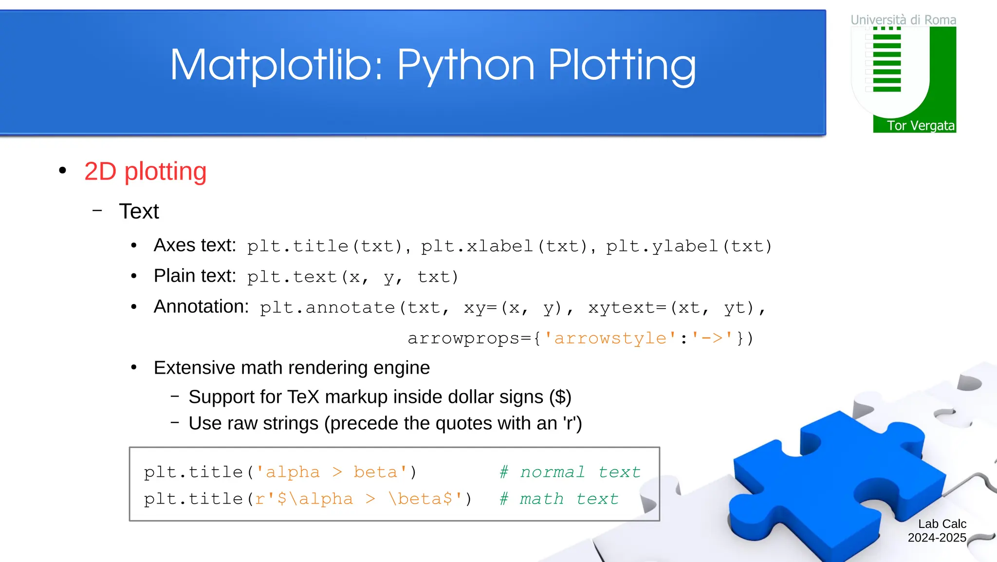
Lab Calc 2024-2025 Matplotlib: PythonPlotting ● 2D plotting – Text ● Axes text: plt.title(txt), plt.xlabel(txt), plt.ylabel(txt) ● Plain text: plt.text(x, y, txt) ● Annotation: plt.annotate(txt, xy=(x, y), xytext=(xt, yt), arrowprops={'arrowstyle':'->'}) ● Extensive math rendering engine – Support for TeX markup inside dollar signs ($) – Use raw strings (precede the quotes with an 'r') plt.title('alpha > beta') # normal text plt.title(r'$alpha > beta$') # math text
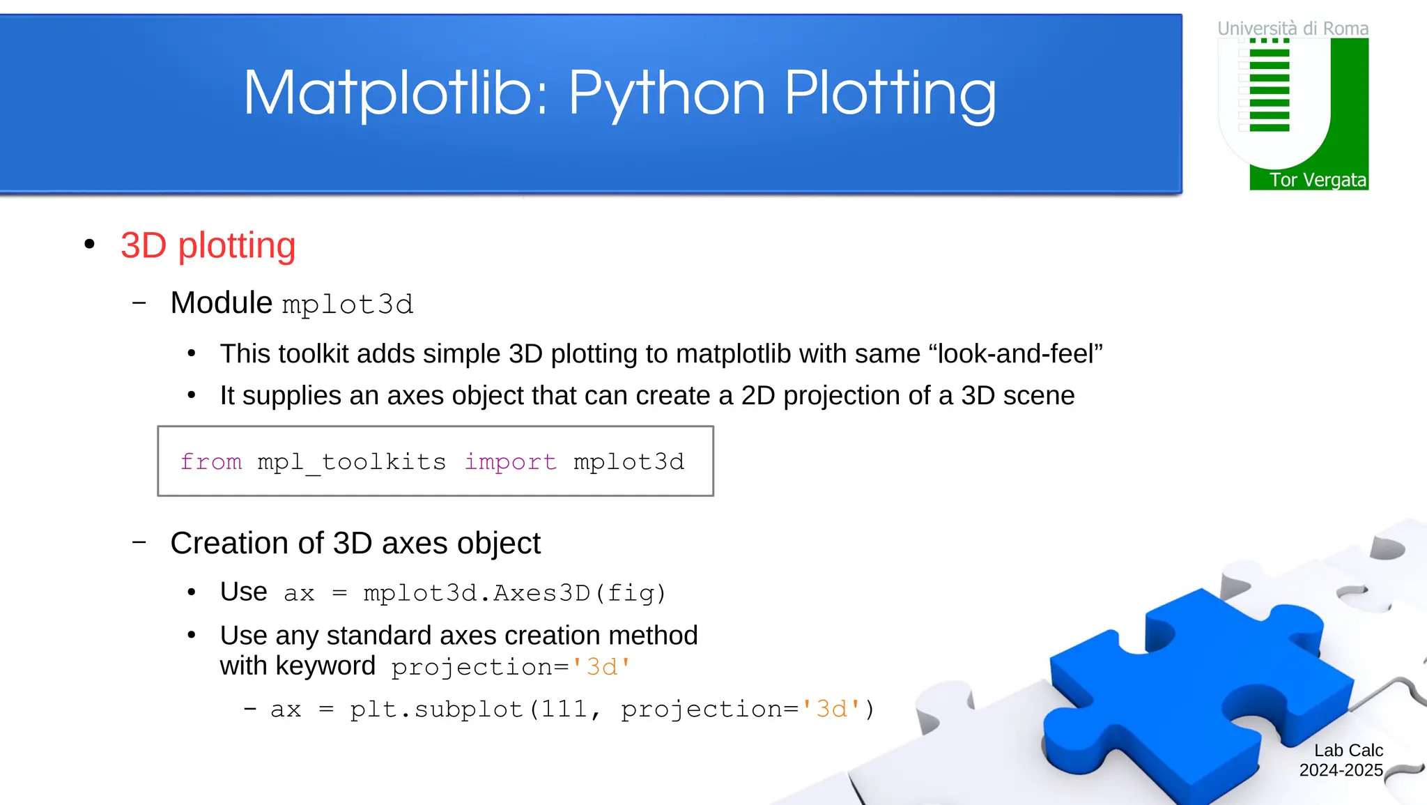
Lab Calc 2024-2025 Matplotlib: PythonPlotting ● 3D plotting – Module mplot3d ● This toolkit adds simple 3D plotting to matplotlib with same “look-and-feel” ● It supplies an axes object that can create a 2D projection of a 3D scene – Creation of 3D axes object ● Use ax = mplot3d.Axes3D(fig) ● Use any standard axes creation method with keyword projection='3d' – ax = plt.subplot(111, projection='3d') from mpl_toolkits import mplot3d
Lab Calc 2024-2025 Matplotlib: PythonPlotting ● 3D plotting – Natural plot extensions ● Line plots: ax.plot(x, y, z), ax.plot3D(x, y, z) ● Scatter plots: ax.scatter(x, y, z), ax.scatter3D(x, y, z) In [1]: theta = np.linspace(-4*np.pi, 4*np.pi, 100) ...: z = np.linspace(-2, 2, 100) ...: r = z**2 + 1 ...: x = r * np.sin(theta) ...: y = r * np.cos(theta) In [2]: ax = plt.axes(projection='3d') ...: ax.plot(x, y, z, 'r') ...: ax.set(title='parametric curve')
26.
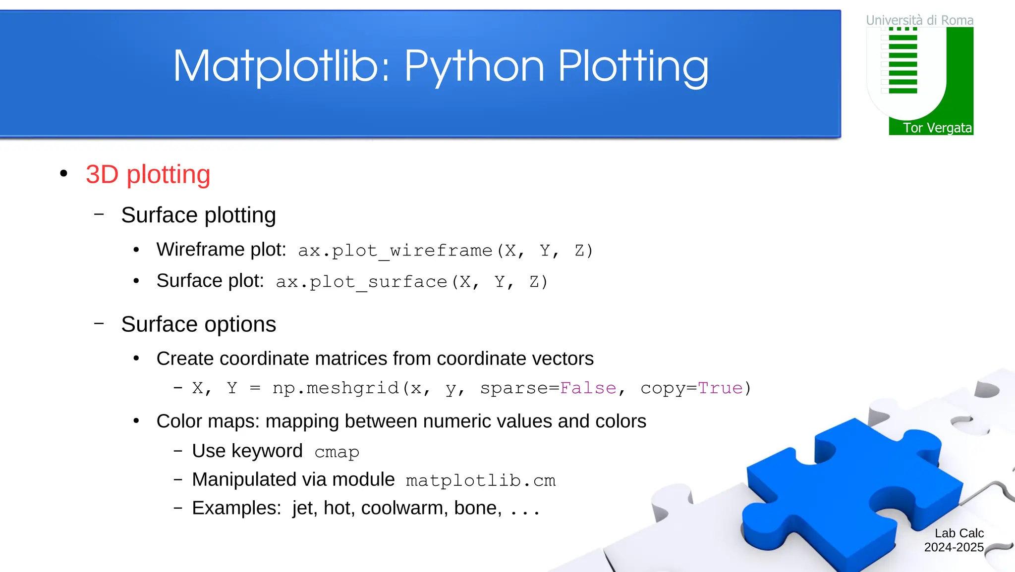
Lab Calc 2024-2025 Matplotlib: PythonPlotting ● 3D plotting – Surface plotting ● Wireframe plot: ax.plot_wireframe(X, Y, Z) ● Surface plot: ax.plot_surface(X, Y, Z) – Surface options ● Create coordinate matrices from coordinate vectors – X, Y = np.meshgrid(x, y, sparse=False, copy=True) ● Color maps: mapping between numeric values and colors – Use keyword cmap – Manipulated via module matplotlib.cm – Examples: jet, hot, coolwarm, bone, ...
27.
Lab Calc 2024-2025 Matplotlib: PythonPlotting ● 3D plotting – Example In [1]: x = np.arange(-5, 5, 0.25) ...: y = np.arange(-5, 5, 0.25) ...: X, Y = np.meshgrid(x, y) ...: R = np.sqrt(X**2 + Y**2) ...: Z = np.sin(R) In [2]: plt.figure(figsize=(10, 4)) ...: plt.suptitle('surface plots') ...: ax1 = plt.subplot(1, 2, 1, projection='3d') ...: ax1.plot_wireframe(X, Y, Z, color='black') ...: ax2 = plt.subplot(1, 2, 2, projection='3d') ...: ax2.plot_surface(X, Y, Z, cmap='coolwarm')
28.
Lab Calc 2024-2025 Matplotlib: PythonPlotting ● Contour plotting – Contour lines: basic syntax – Other contour functions: ● Filled contours: plt.contourf(X, Y, Z, levels) ● Contour identification: plt.clabel(cs), plt.colorbar(cs) ● 3D contour lines (mplot3d): ax.contour(X, Y, Z, levels) plt.contour(Z) plt.contour(X, Y, Z) plt.contour(X, Y, Z, levels)
29.
Lab Calc 2024-2025 Matplotlib: PythonPlotting ● Contour plotting – Example In [1]: t = np.arange(-2, 2, 0.01) ...: X, Y = np.meshgrid(t, t) ...: Z = np.sin(X * np.pi / 2) ...: + np.cos(Y * np.pi / 4) In [2]: plt.figure(figsize=(10, 4)) ...: plt.subplot(1, 2, 1) ...: cs = plt.contour(X, Y, Z) ...: plt.clabel(cs) ...: plt.subplot(1, 2, 2) ...: cs = plt.contourf(X, Y, Z, cmap='coolwarm') ...: plt.colorbar(cs)
30.
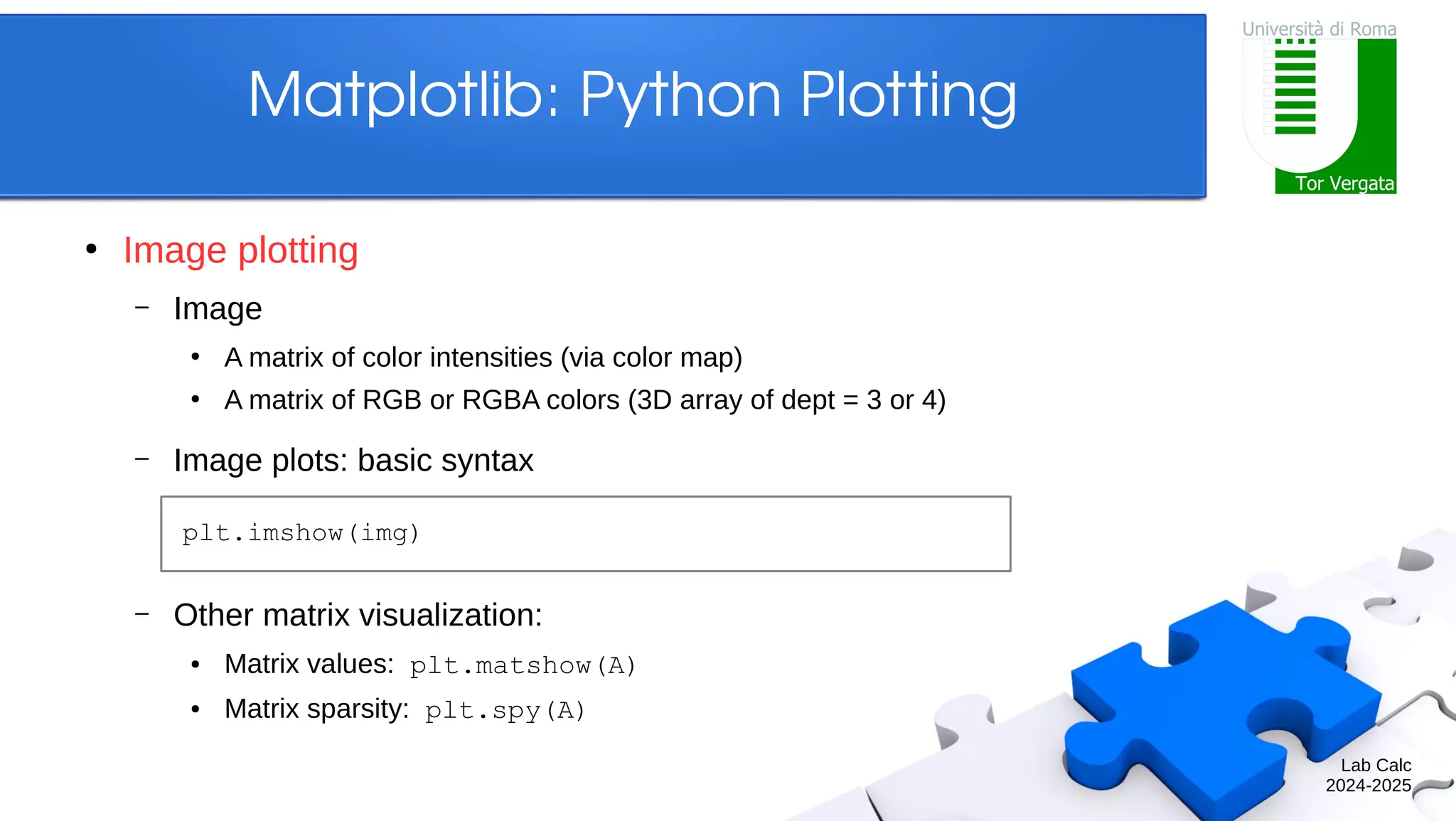
Lab Calc 2024-2025 Matplotlib: PythonPlotting ● Image plotting – Image ● A matrix of color intensities (via color map) ● A matrix of RGB or RGBA colors (3D array of dept = 3 or 4) – Image plots: basic syntax – Other matrix visualization: ● Matrix values: plt.matshow(A) ● Matrix sparsity: plt.spy(A) plt.imshow(img)
31.
Lab Calc 2024-2025 Matplotlib: PythonPlotting ● Image plotting – Example In [1]: A = np.diag(np.arange(10, 21)) In [2]: plt.figure(figsize=(10, 4)) ...: plt.subplot(2, 1, 1) ...: plt.imshow(A, cmap='summer') ...: plt.subplot(2, 1, 2) ...: plt.spy(A, marker='*')
32.
Lab Calc 2024-2025 Matplotlib: PythonPlotting ● Image plotting – Example: Mandelbrot set ● Fractal set of complex numbers ● Definition: any c for which zi+1 = zi 2 + c does not diverge, starting from z0 = 0 ● Property: limi→∞ sup | zi+1 | ≤ 2 for any valid c In [1]: def mandelbrot(nx, ny, max_it=20): ...: # TODO ...: return M In [2]: M = mandelbrot(501, 501, 50) ...: plt.imshow(M.T, cmap='flag') ...: plt.axis('off')
33.
Lab Calc 2024-2025 Matplotlib: PythonPlotting ● Image plotting – Example: Mandelbrot set In [1]: def mandelbrot(nx, ny, max_it=20): ...: x = np.linspace(-2.0, 1.0, nx) ...: y = np.linspace(-1.5, 1.5, ny) ...: C = x[:,np.newaxis] ...: + 1.0j*y[np.newaxis,:] ...: Z = C.copy() ...: M = np.ones((nx, ny), dtype=bool) ...: for i in range(max_it): ...: Z[M] = Z[M]**2 + C[M] ...: M[np.abs(Z) > 2] = False ...: return M
34.
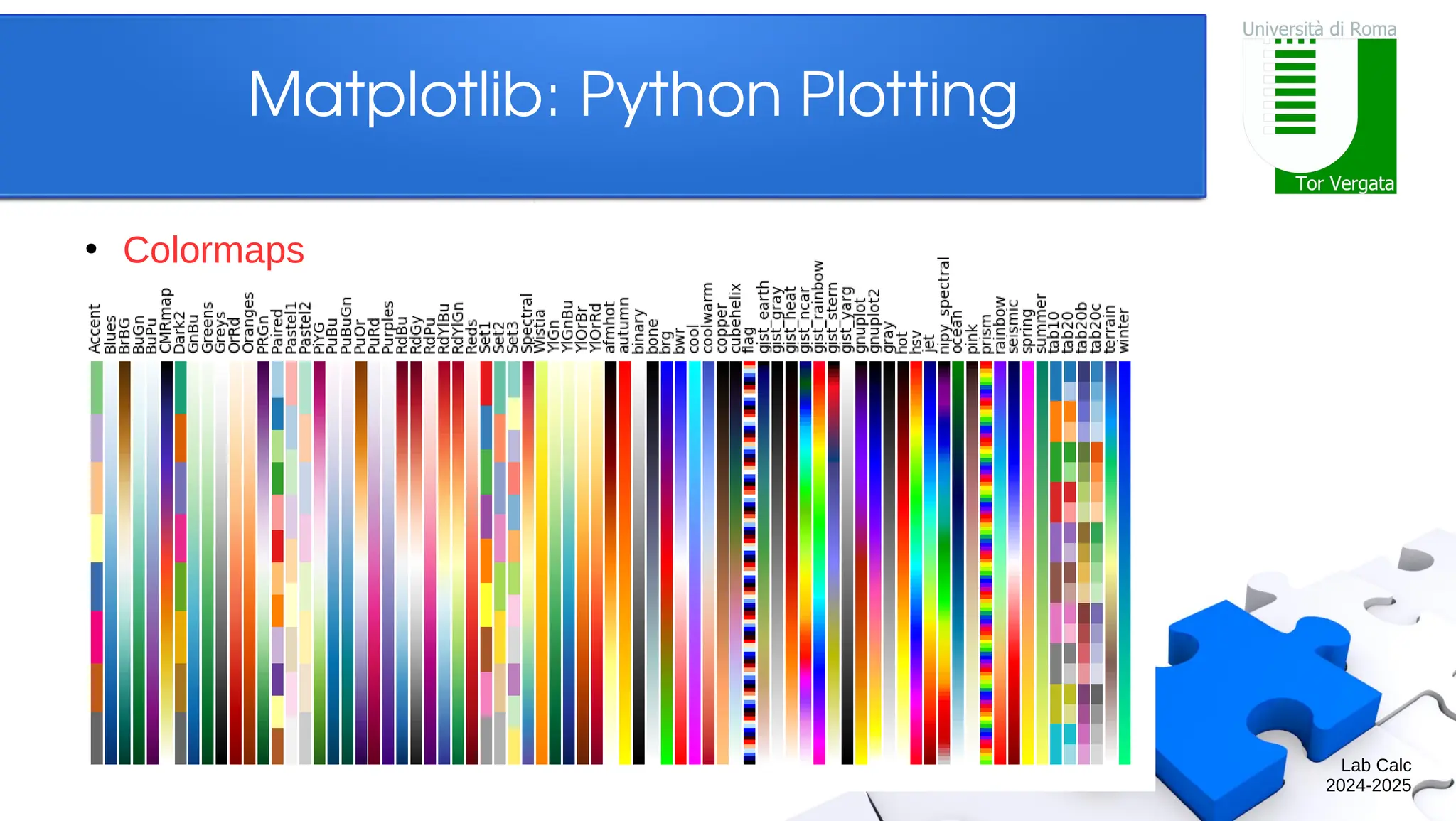
Lab Calc 2024-2025 Matplotlib: PythonPlotting ● Colors – Predefined colors ● abbreviation: b, g, r, c, m, y, k, w ● full name: blue, green, red, cyan, magenta, yellow, black, white, ... – RGB/RGBA code ● tuple of three or four float values in [0, 1] ● a hexadecimal RGB or RGBA string – Black and white ● string representation of a float value in [0, 1] – All string specifications of color are case-insensitive
![Lab Calc 2024-2025 Matplotlib: Python Plotting ● A simple plot – Syntax is array-based – If not interactive, also write: In [1]: x = np.linspace(0, 2.0*np.pi, 100) In [2]: cx, sx = np.cos(x), np.sin(x) In [3]: plt.plot(x, cx) ...: plt.plot(x, sx) ...: plt.show()](https://image.slidesharecdn.com/slidespython3-250302174436-f63e4fef/75/slides_python_-for-basic-operation-of-it-5-2048.jpg)
![Lab Calc 2024-2025 Matplotlib: Python Plotting ● A simple plot – Default settings (see also plt.rcParams) In [3]: plt.figure(figsize=(6.0, 4.0), dpi=72.0) ...: plt.subplot(1, 1, 1) ...: plt.plot(x, cx, color='#1f77b4', ...: linewidth=1.5, linestyle='-') ...: plt.plot(x, sx, color='#ff7f0e', ...: linewidth=1.5, linestyle='-') ...: plt.xlim(-0.1*np.pi, 2.1*np.pi) ...: plt.xticks(np.linspace(0, 6, 7)) ...: plt.ylim(-1.1, 1.1) ...: plt.yticks(np.linspace(-1, 1, 9))](https://image.slidesharecdn.com/slidespython3-250302174436-f63e4fef/75/slides_python_-for-basic-operation-of-it-6-2048.jpg)
![Lab Calc 2024-2025 Matplotlib: Python Plotting ● Anatomy – Example In [1]: plt.figure(facecolor='silver') ...: plt.subplot(1, 2, 1) ...: plt.title('subplot') ...: plt.axes((0.4, 0.3, 0.4, 0.4)) ...: plt.xlim(1, 5) ...: plt.ylim(-5, -1) ...: plt.title('axes')](https://image.slidesharecdn.com/slidespython3-250302174436-f63e4fef/75/slides_python_-for-basic-operation-of-it-11-2048.jpg)
![Lab Calc 2024-2025 Matplotlib: Python Plotting ● 2D plotting – For full plot details, check out plt.plot? – Example In [1]: t = np.arange(0.0, 2.0, 0.01) ...: s = 1.0 + np.sin(2.0*np.pi*t) In [2]: plt.axes(facecolor='silver') ...: plt.plot(t, s, 'r') ...: plt.xlabel('time (s)') ...: plt.ylabel('voltage (mV)') ...: plt.title('About as simple as it gets') ...: plt.grid()](https://image.slidesharecdn.com/slidespython3-250302174436-f63e4fef/75/slides_python_-for-basic-operation-of-it-14-2048.jpg)
![Lab Calc 2024-2025 Matplotlib: Python Plotting ● 2D plotting – Plotting methods are actually connected to axes ● Pyplot provides an interface to the active axes In [1]: t = np.arange(0.0, 2.0, 0.01) ...: s = 1.0 + np.sin(2.0*np.pi*t) In [2]: ax = plt.axes() ...: ax.plot(t, s, 'r') ...: ax.set(facecolor='silver', ...: xlabel='time (s)', ...: ylabel='voltage (mV)', ...: title='About as simple as it gets') ...: ax.grid()](https://image.slidesharecdn.com/slidespython3-250302174436-f63e4fef/75/slides_python_-for-basic-operation-of-it-15-2048.jpg)

![Lab Calc 2024-2025 Matplotlib: Python Plotting ● 2D plotting – Example: data statistics ● Load the data and plot it In [1]: data = np.loadtxt('populations.txt') In [2]: year, hares, lynxes, carrots = data.T In [3]: plt.axes((0.2, 0.1, 0.6, 0.8)) ...: plt.plot(year, hares) ...: plt.plot(year, lynxes) ...: plt.plot(year, carrots) ...: plt.xticks(np.arange(1900, 1921, 5)) ...: plt.yticks(np.arange(1, 9) * 10000) ...: plt.legend(('Hare', 'Lynx', 'Carrot'))](https://image.slidesharecdn.com/slidespython3-250302174436-f63e4fef/75/slides_python_-for-basic-operation-of-it-17-2048.jpg)
![Lab Calc 2024-2025 Matplotlib: Python Plotting ● 2D plotting – Example: data statistics ● Compute the mean populations over time ● Which species has the highest population each year? In [4]: populations = data[:, 1:] In [5]: populations.mean(axis=0) Out[5]: array([34080.9524, 20166.6667, 42400.]) In [6]: populations.std(axis=0) Out[6]: array([20897.9065, 16254.5915, 3322.5062]) In [7]: populations.argmax(axis=1) Out[7]: array([2, 2, 0, 0, 1, 1, 2, 2, 2, 2, ...])](https://image.slidesharecdn.com/slidespython3-250302174436-f63e4fef/75/slides_python_-for-basic-operation-of-it-18-2048.jpg)

![Lab Calc 2024-2025 Matplotlib: Python Plotting ● 2D plotting – Example In [1]: names = ['a', 'b', 'c', 'd'] ...: values = [1, 10, 40, 50] In [2]: plt.figure(figsize=(3, 9)) ...: plt.subplot(3, 1, 1) ...: plt.bar(names, values) ...: plt.subplot(3, 1, 2) ...: plt.scatter(names, values) ...: plt.subplot(3, 1, 3) ...: plt.fill_between(names, values) ...: plt.suptitle( ...: 'categorical plotting', y=0.92)](https://image.slidesharecdn.com/slidespython3-250302174436-f63e4fef/75/slides_python_-for-basic-operation-of-it-20-2048.jpg)
![Lab Calc 2024-2025 Matplotlib: Python Plotting ● 2D plotting – Example In [1]: x = np.linspace(0, 2.0*np.pi, 25) In [2]: plt.scatter(x, np.sin(x)) ...: plt.ylim(-2, 2) ...: plt.text(3, 1, 'sine function', ...: fontsize=18, style='italic') ...: plt.annotate('localnmax', ...: xy=(np.pi/2.0, 1), xytext=(1.3, 0), ...: arrowprops={'arrowstyle':'->'}) ...: plt.annotate('localnmin', ...: xy=(np.pi*3.0/2.0, -1), xytext=(4.5, -0.4), ...: arrowprops={'arrowstyle':'->'})](https://image.slidesharecdn.com/slidespython3-250302174436-f63e4fef/75/slides_python_-for-basic-operation-of-it-22-2048.jpg)
![Lab Calc 2024-2025 Matplotlib: Python Plotting ● 3D plotting – 3D axes properties ● Z-axis: ax.set(..., zlabel='z', zticks=(-1,0,1)) ● Orientation: ax.view_init(elev=30, azim=45) In [1]: ax = plt.axes(projection='3d') ...: ax.view_init(elev=30, azim=45) ...: ax.set(xlabel='x', ylabel='y', zlabel='z')](https://image.slidesharecdn.com/slidespython3-250302174436-f63e4fef/75/slides_python_-for-basic-operation-of-it-24-2048.jpg)
![Lab Calc 2024-2025 Matplotlib: Python Plotting ● 3D plotting – Natural plot extensions ● Line plots: ax.plot(x, y, z), ax.plot3D(x, y, z) ● Scatter plots: ax.scatter(x, y, z), ax.scatter3D(x, y, z) In [1]: theta = np.linspace(-4*np.pi, 4*np.pi, 100) ...: z = np.linspace(-2, 2, 100) ...: r = z**2 + 1 ...: x = r * np.sin(theta) ...: y = r * np.cos(theta) In [2]: ax = plt.axes(projection='3d') ...: ax.plot(x, y, z, 'r') ...: ax.set(title='parametric curve')](https://image.slidesharecdn.com/slidespython3-250302174436-f63e4fef/75/slides_python_-for-basic-operation-of-it-25-2048.jpg)
![Lab Calc 2024-2025 Matplotlib: Python Plotting ● 3D plotting – Example In [1]: x = np.arange(-5, 5, 0.25) ...: y = np.arange(-5, 5, 0.25) ...: X, Y = np.meshgrid(x, y) ...: R = np.sqrt(X**2 + Y**2) ...: Z = np.sin(R) In [2]: plt.figure(figsize=(10, 4)) ...: plt.suptitle('surface plots') ...: ax1 = plt.subplot(1, 2, 1, projection='3d') ...: ax1.plot_wireframe(X, Y, Z, color='black') ...: ax2 = plt.subplot(1, 2, 2, projection='3d') ...: ax2.plot_surface(X, Y, Z, cmap='coolwarm')](https://image.slidesharecdn.com/slidespython3-250302174436-f63e4fef/75/slides_python_-for-basic-operation-of-it-27-2048.jpg)

![Lab Calc 2024-2025 Matplotlib: Python Plotting ● Contour plotting – Example In [1]: t = np.arange(-2, 2, 0.01) ...: X, Y = np.meshgrid(t, t) ...: Z = np.sin(X * np.pi / 2) ...: + np.cos(Y * np.pi / 4) In [2]: plt.figure(figsize=(10, 4)) ...: plt.subplot(1, 2, 1) ...: cs = plt.contour(X, Y, Z) ...: plt.clabel(cs) ...: plt.subplot(1, 2, 2) ...: cs = plt.contourf(X, Y, Z, cmap='coolwarm') ...: plt.colorbar(cs)](https://image.slidesharecdn.com/slidespython3-250302174436-f63e4fef/75/slides_python_-for-basic-operation-of-it-29-2048.jpg)
![Lab Calc 2024-2025 Matplotlib: Python Plotting ● Image plotting – Example In [1]: A = np.diag(np.arange(10, 21)) In [2]: plt.figure(figsize=(10, 4)) ...: plt.subplot(2, 1, 1) ...: plt.imshow(A, cmap='summer') ...: plt.subplot(2, 1, 2) ...: plt.spy(A, marker='*')](https://image.slidesharecdn.com/slidespython3-250302174436-f63e4fef/75/slides_python_-for-basic-operation-of-it-31-2048.jpg)
![Lab Calc 2024-2025 Matplotlib: Python Plotting ● Image plotting – Example: Mandelbrot set ● Fractal set of complex numbers ● Definition: any c for which zi+1 = zi 2 + c does not diverge, starting from z0 = 0 ● Property: limi→∞ sup | zi+1 | ≤ 2 for any valid c In [1]: def mandelbrot(nx, ny, max_it=20): ...: # TODO ...: return M In [2]: M = mandelbrot(501, 501, 50) ...: plt.imshow(M.T, cmap='flag') ...: plt.axis('off')](https://image.slidesharecdn.com/slidespython3-250302174436-f63e4fef/75/slides_python_-for-basic-operation-of-it-32-2048.jpg)
![Lab Calc 2024-2025 Matplotlib: Python Plotting ● Image plotting – Example: Mandelbrot set In [1]: def mandelbrot(nx, ny, max_it=20): ...: x = np.linspace(-2.0, 1.0, nx) ...: y = np.linspace(-1.5, 1.5, ny) ...: C = x[:,np.newaxis] ...: + 1.0j*y[np.newaxis,:] ...: Z = C.copy() ...: M = np.ones((nx, ny), dtype=bool) ...: for i in range(max_it): ...: Z[M] = Z[M]**2 + C[M] ...: M[np.abs(Z) > 2] = False ...: return M](https://image.slidesharecdn.com/slidespython3-250302174436-f63e4fef/75/slides_python_-for-basic-operation-of-it-33-2048.jpg)
![Lab Calc 2024-2025 Matplotlib: Python Plotting ● Colors – Predefined colors ● abbreviation: b, g, r, c, m, y, k, w ● full name: blue, green, red, cyan, magenta, yellow, black, white, ... – RGB/RGBA code ● tuple of three or four float values in [0, 1] ● a hexadecimal RGB or RGBA string – Black and white ● string representation of a float value in [0, 1] – All string specifications of color are case-insensitive](https://image.slidesharecdn.com/slidespython3-250302174436-f63e4fef/75/slides_python_-for-basic-operation-of-it-34-2048.jpg)

![Lab Calc 2024-2025 Matplotlib: Python Plotting ● Input and output – Save figures ● Most backends support png, pdf, eps, svg – Image I/O In [1]: plt.plot([1, 2, 4, 2]) ...: plt.savefig('plot.png', format='png') In [1]: img = plt.imread('elephant.png') In [2]: plt.imshow(img) In [3]: plt.imsave('new_elephant.png', img)](https://image.slidesharecdn.com/slidespython3-250302174436-f63e4fef/75/slides_python_-for-basic-operation-of-it-37-2048.jpg)