Download as PDF, PPTX


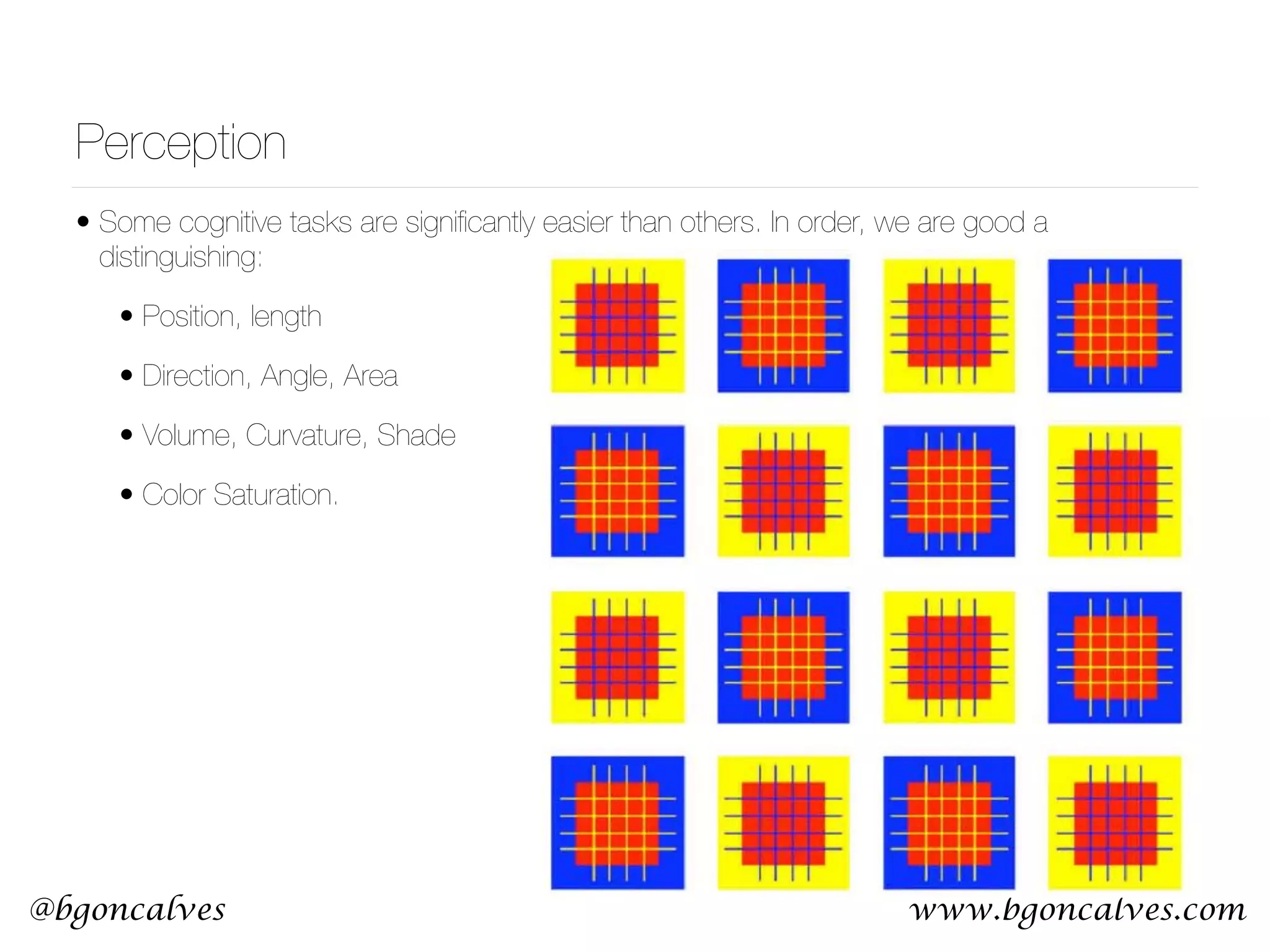
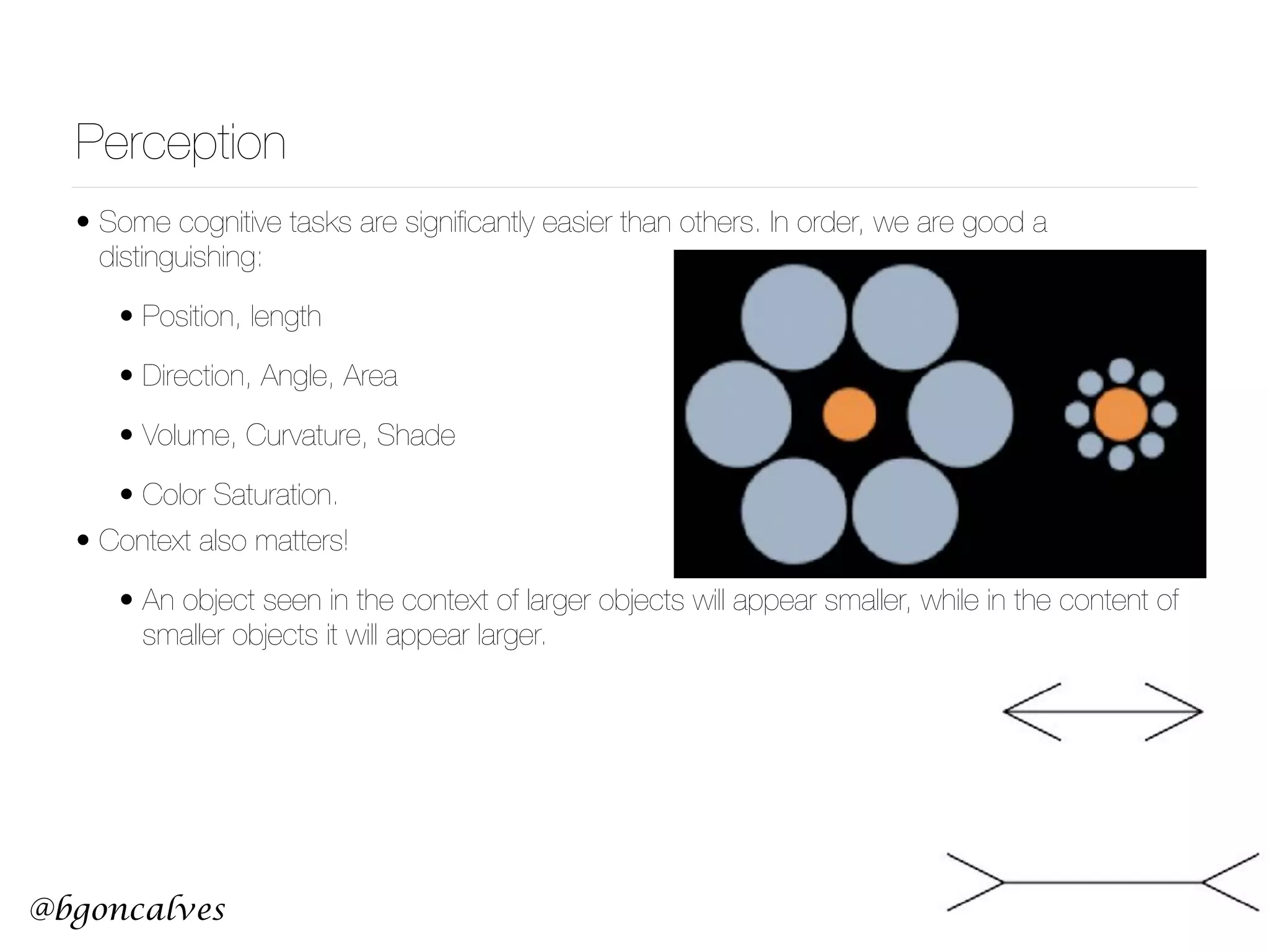
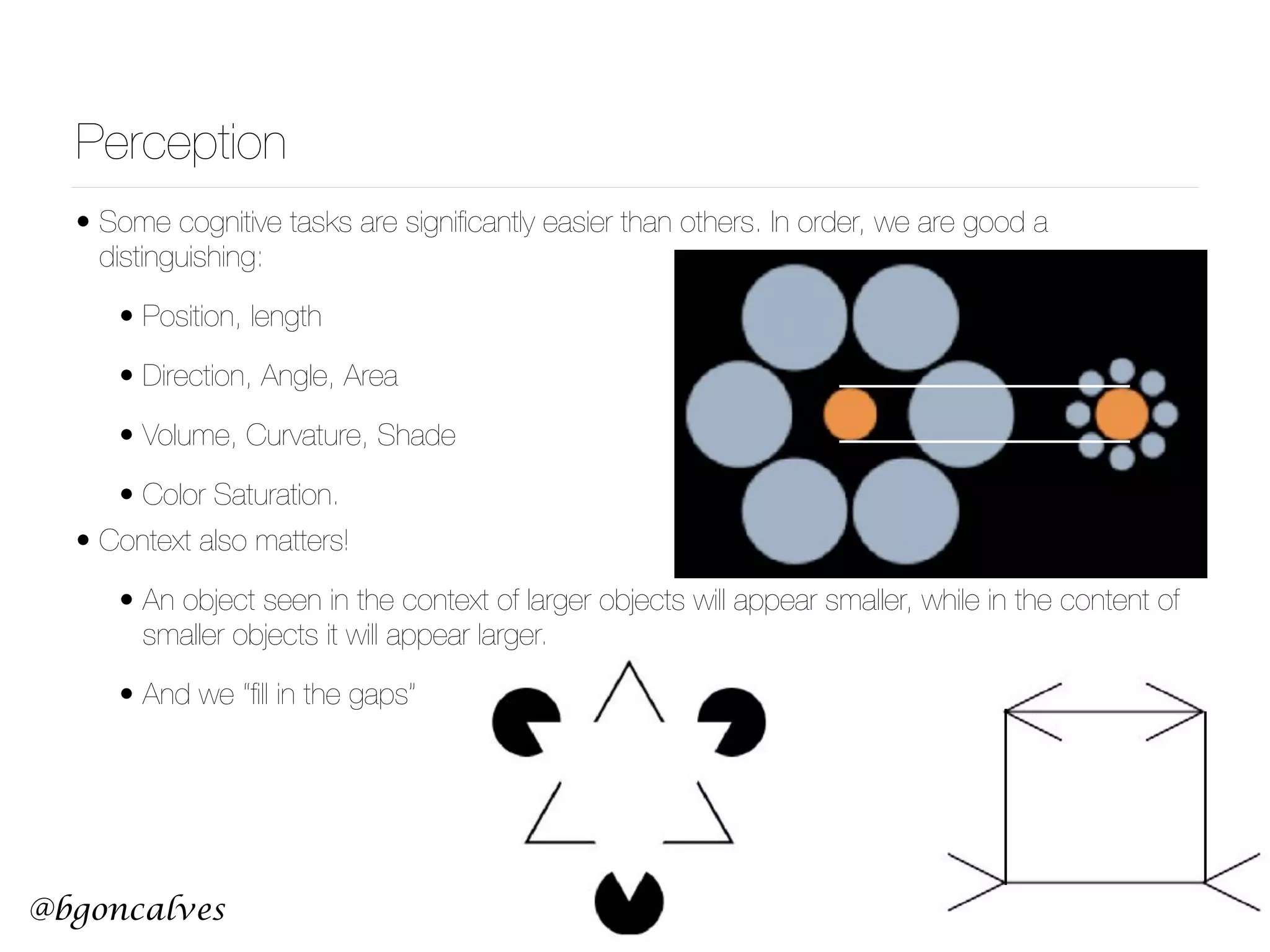
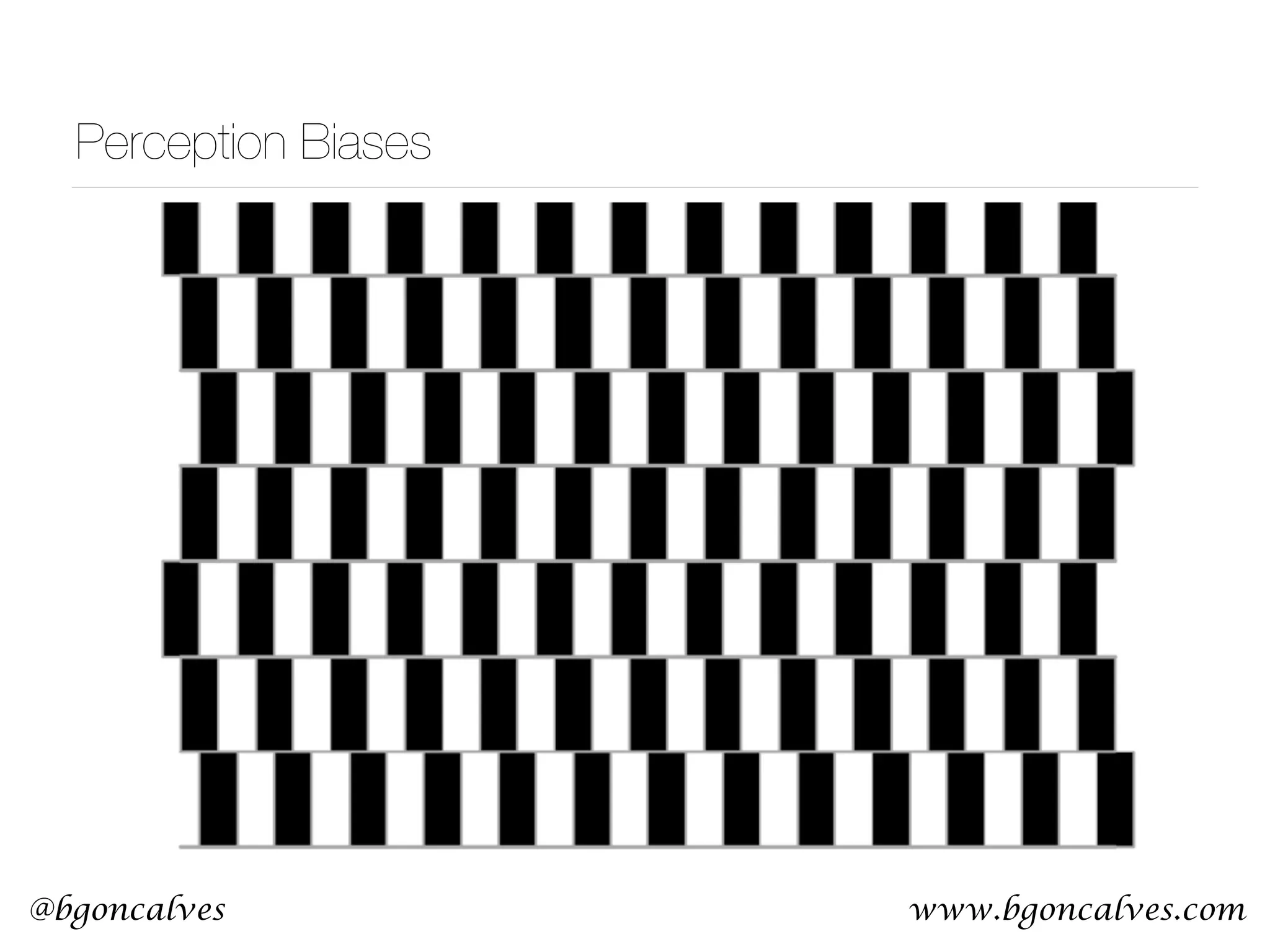

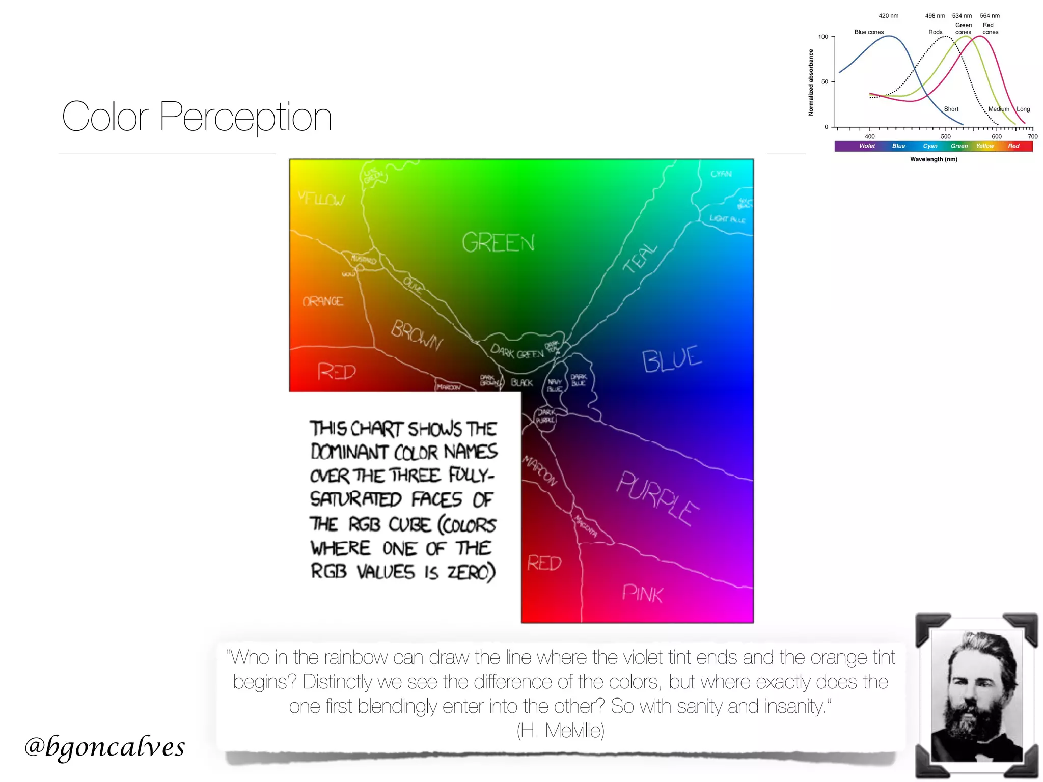
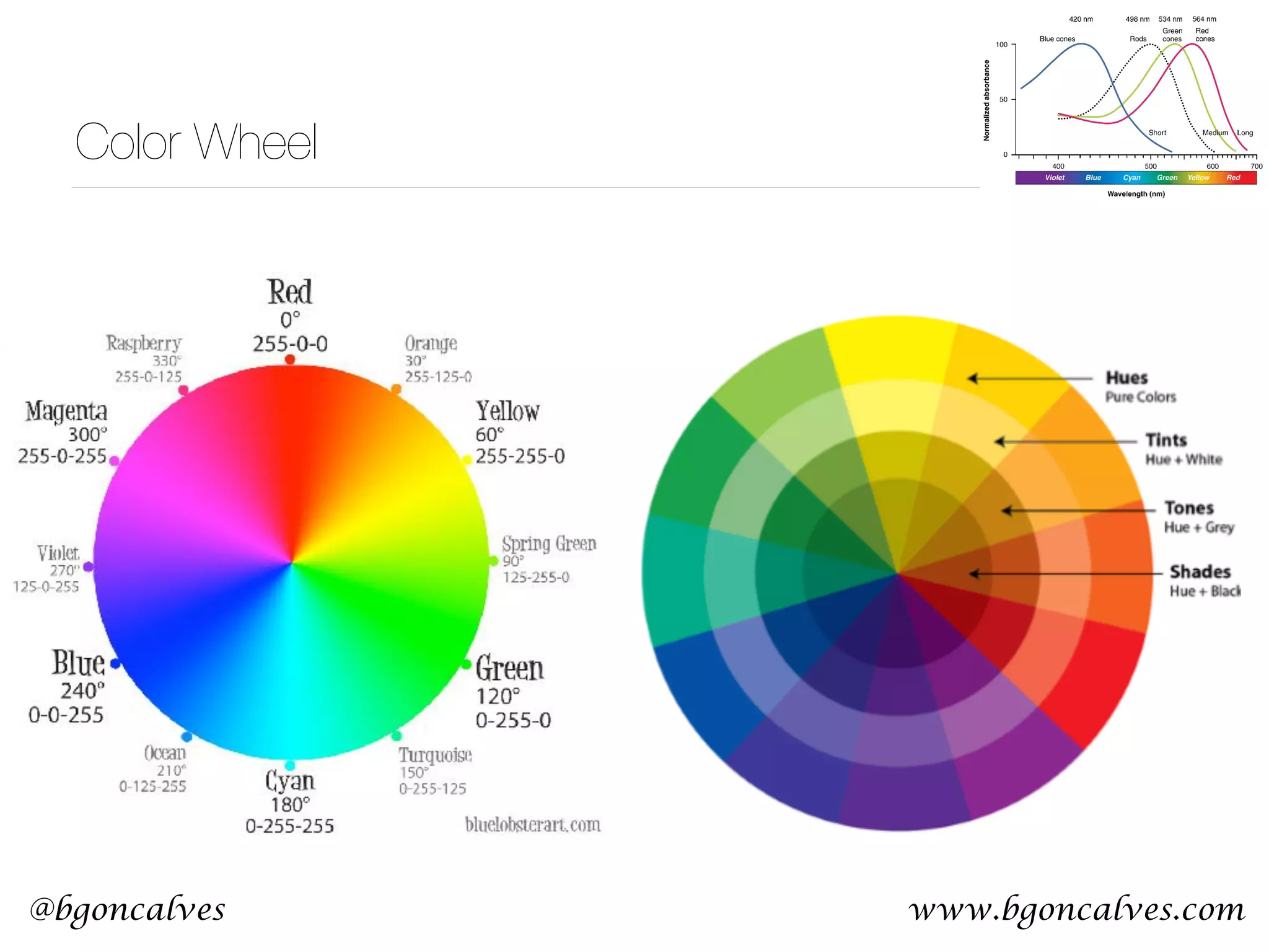
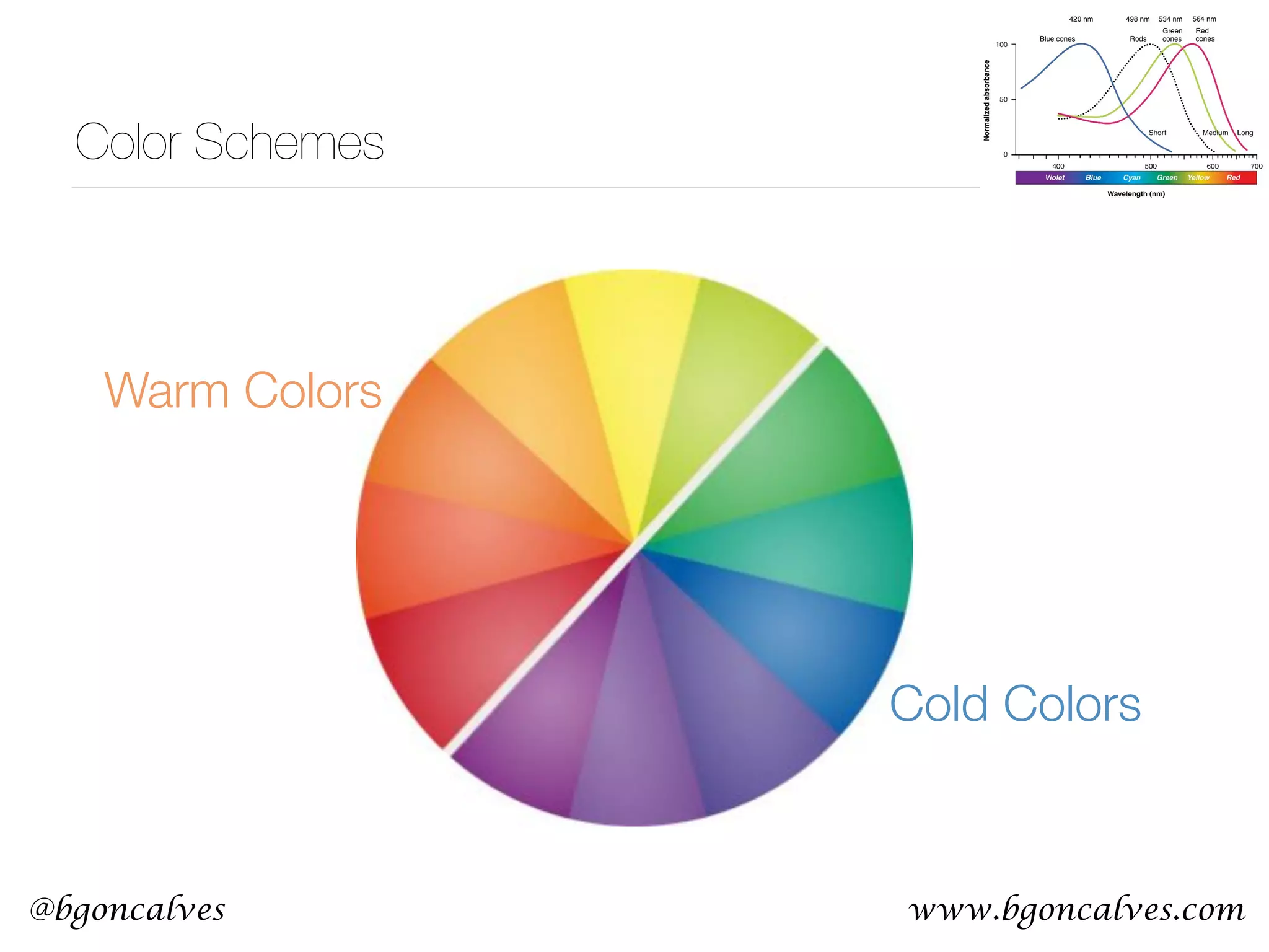
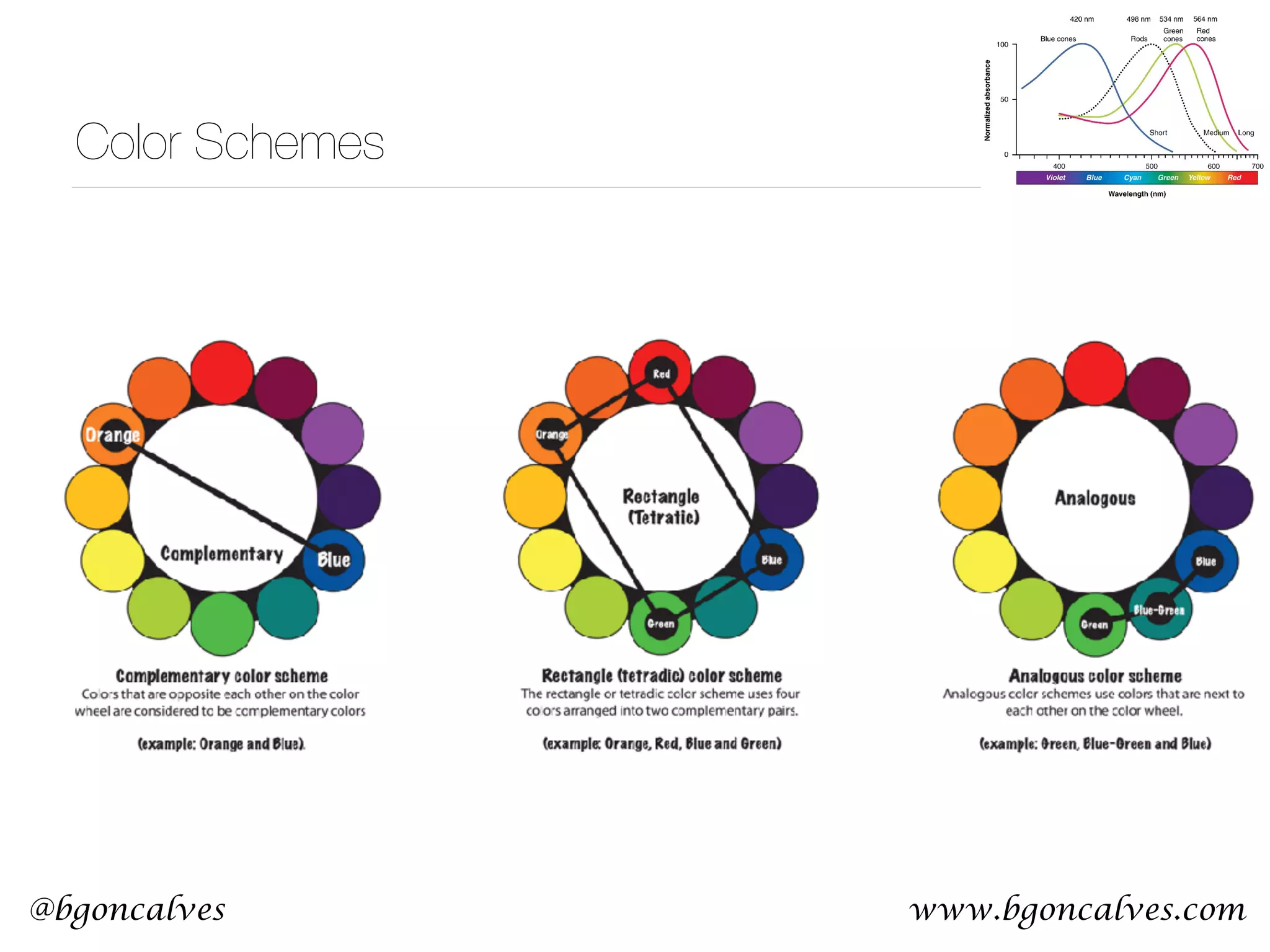


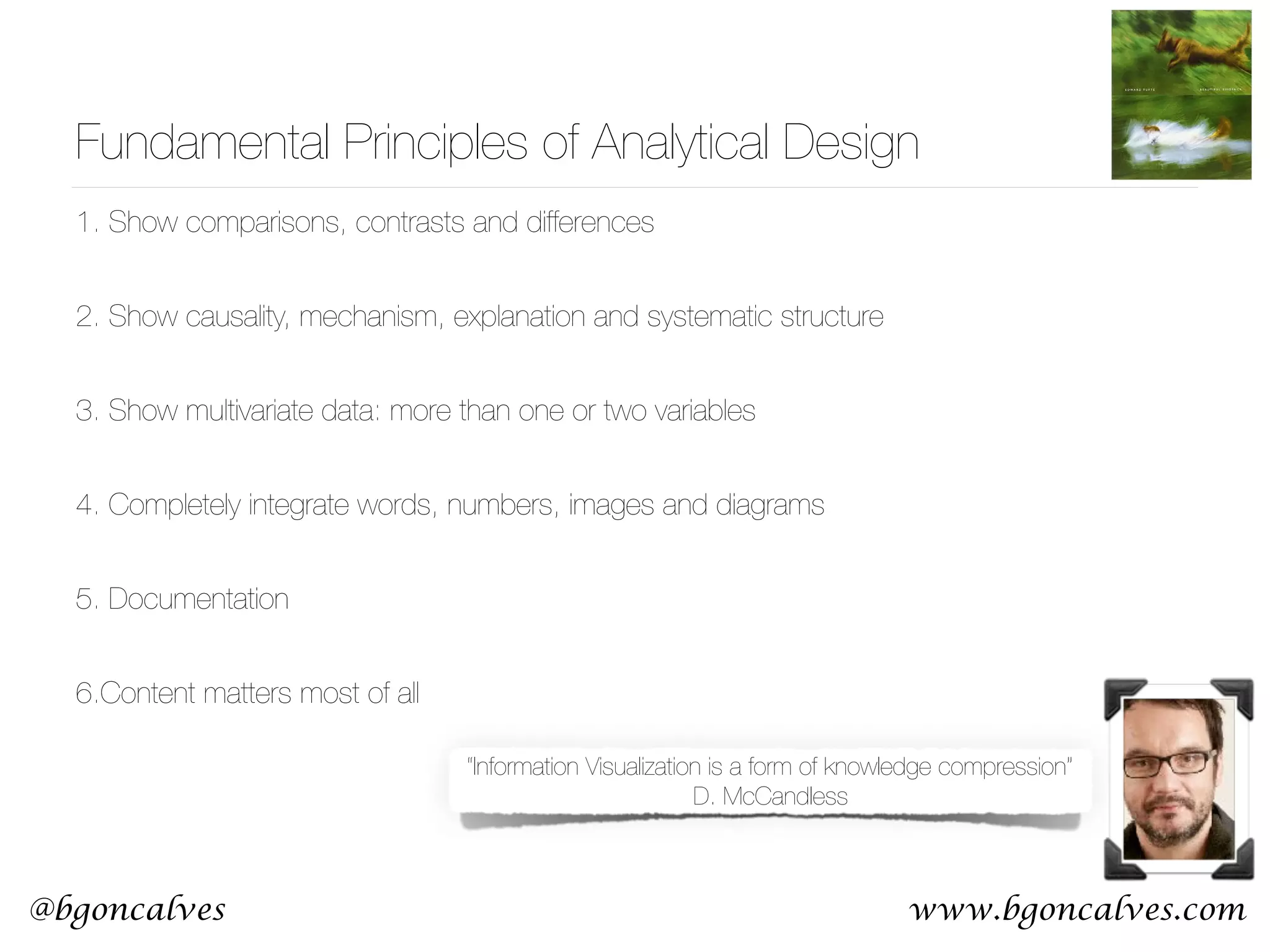
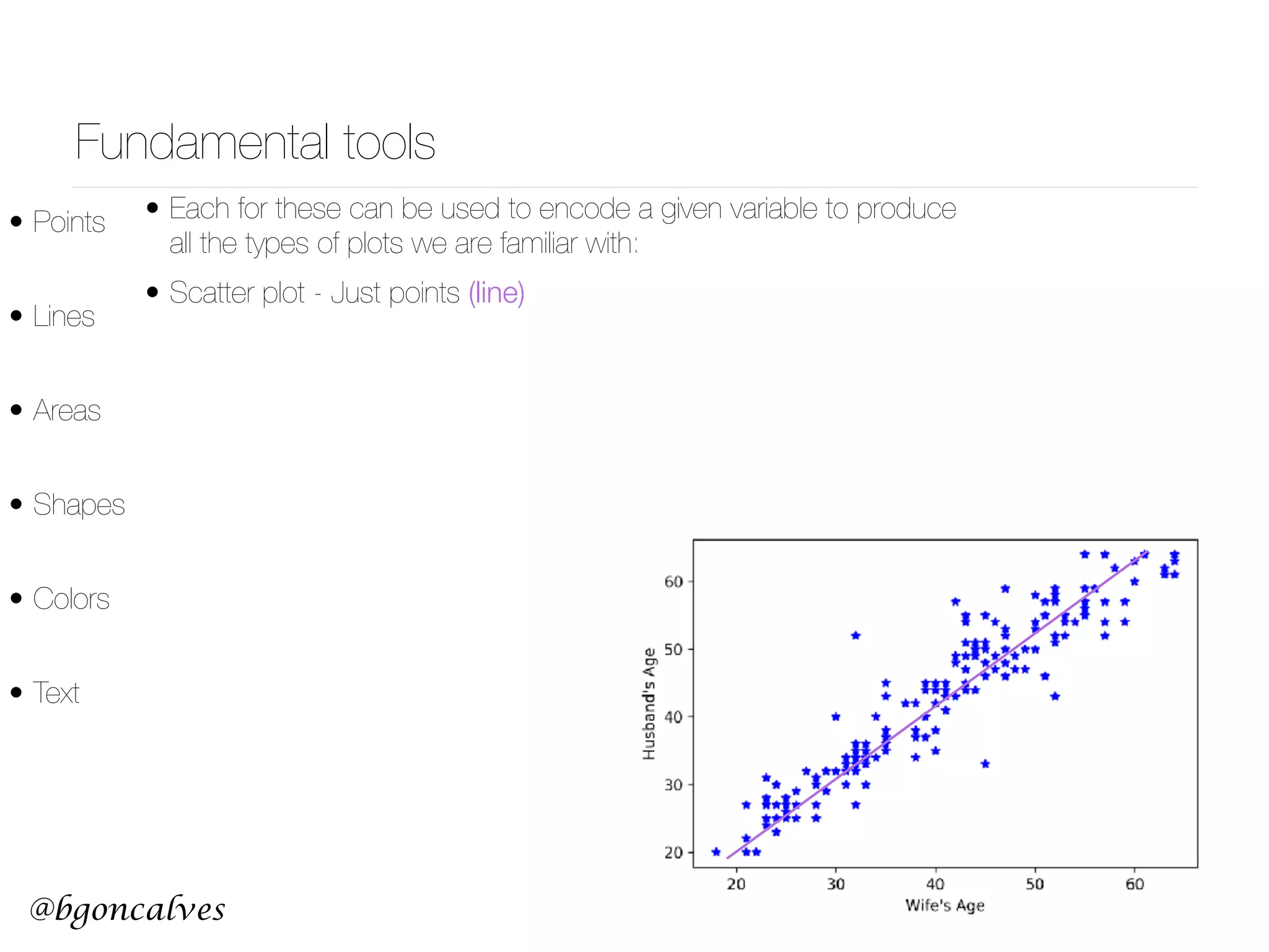
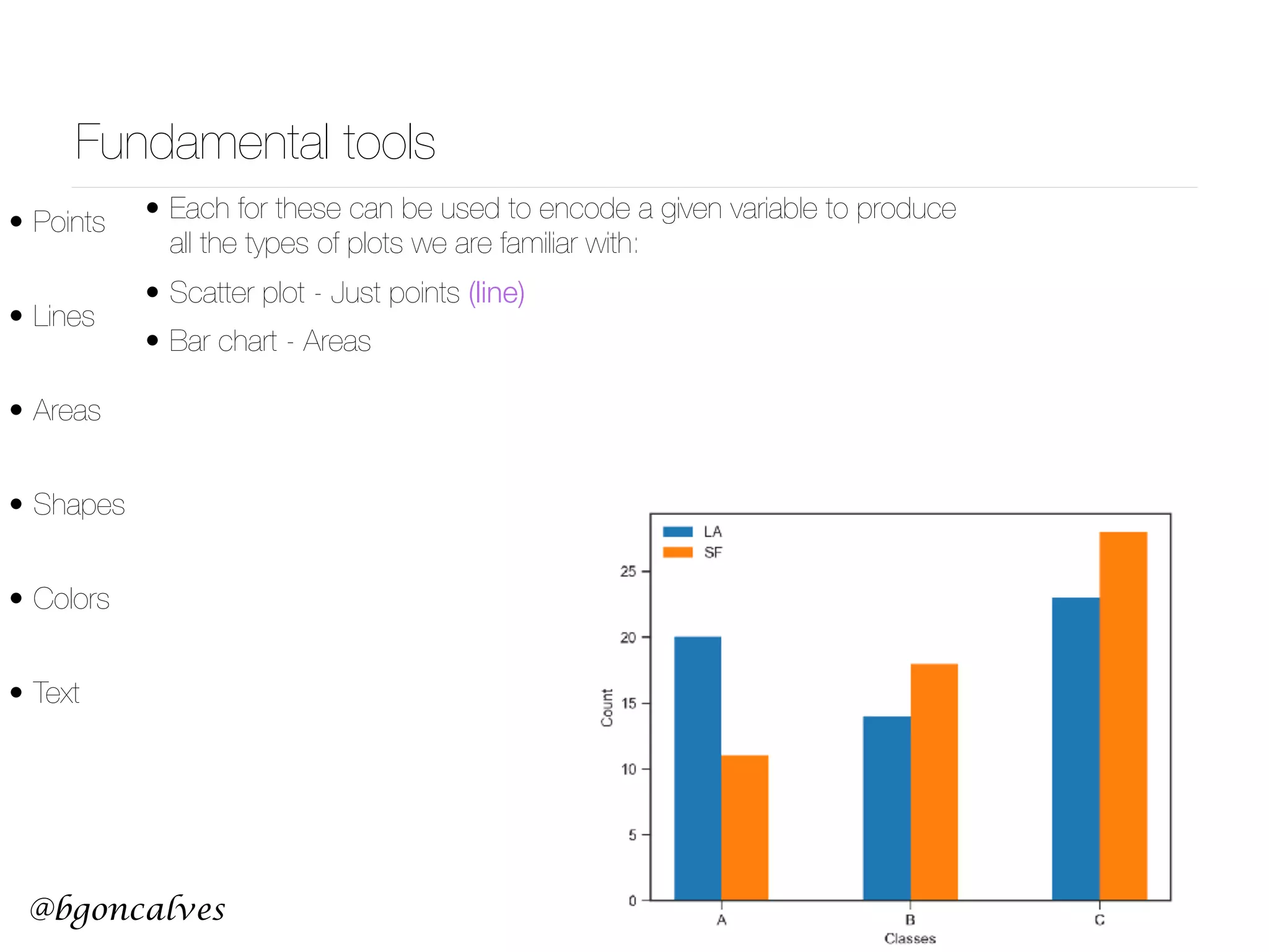
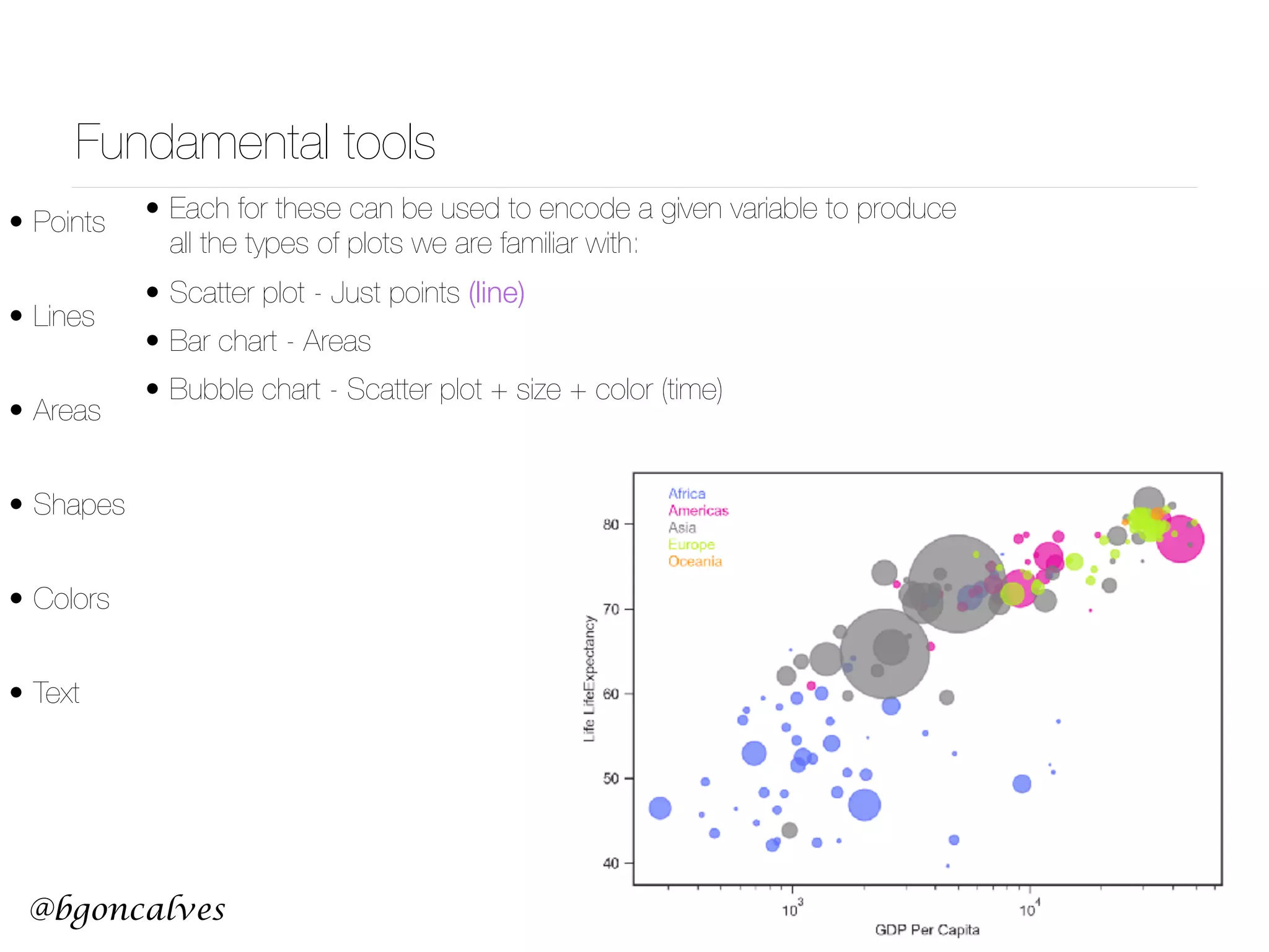
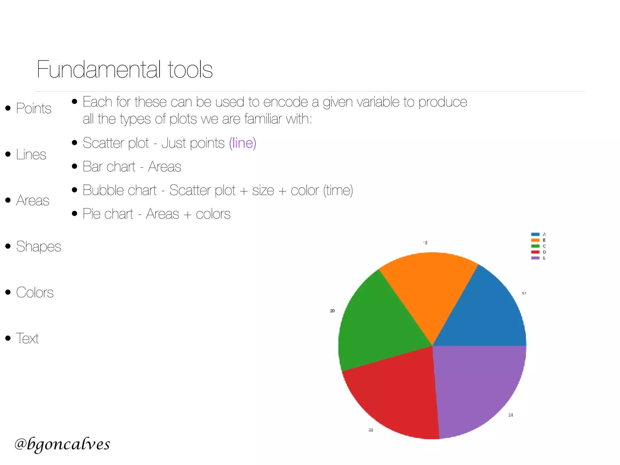
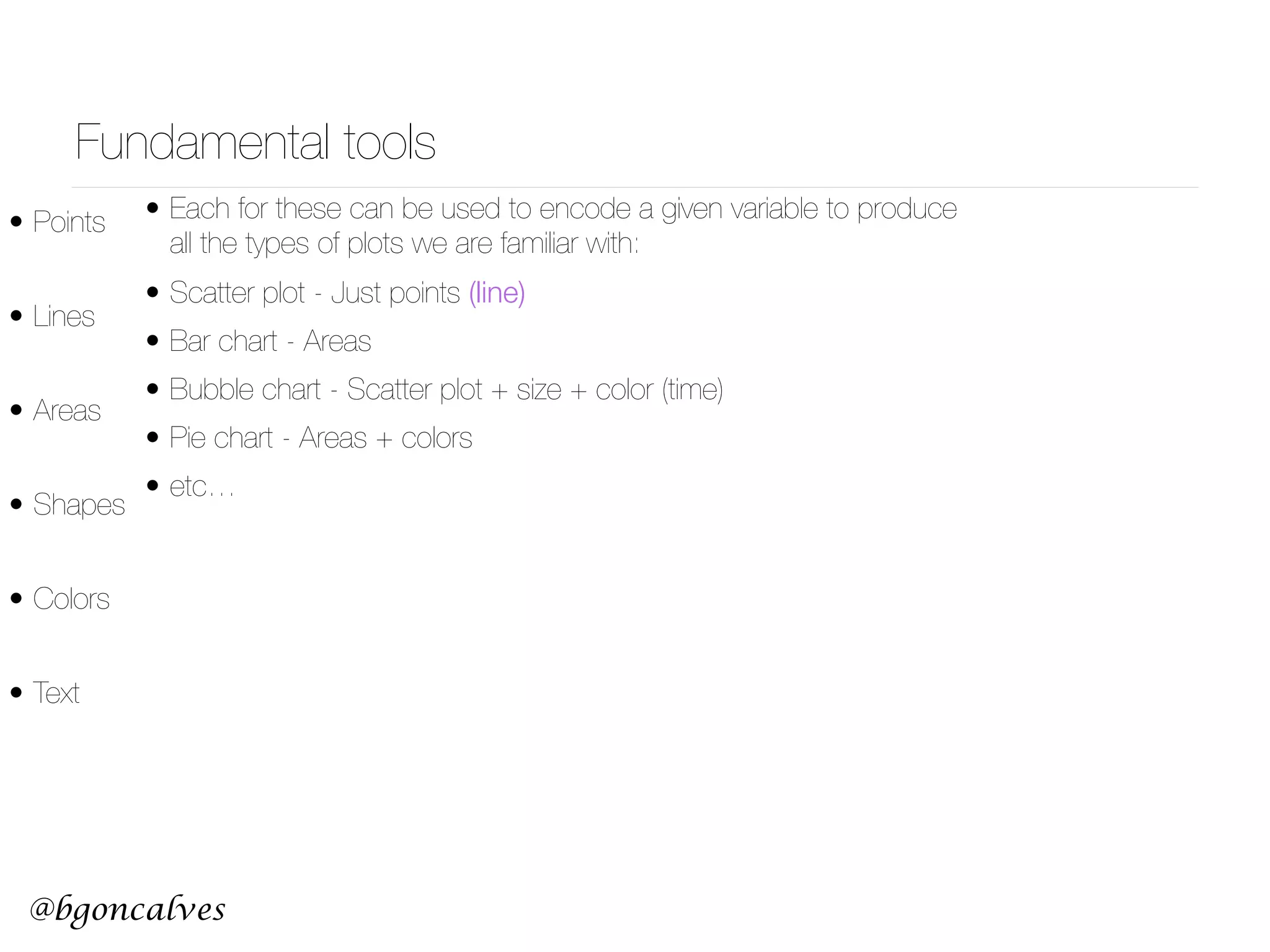

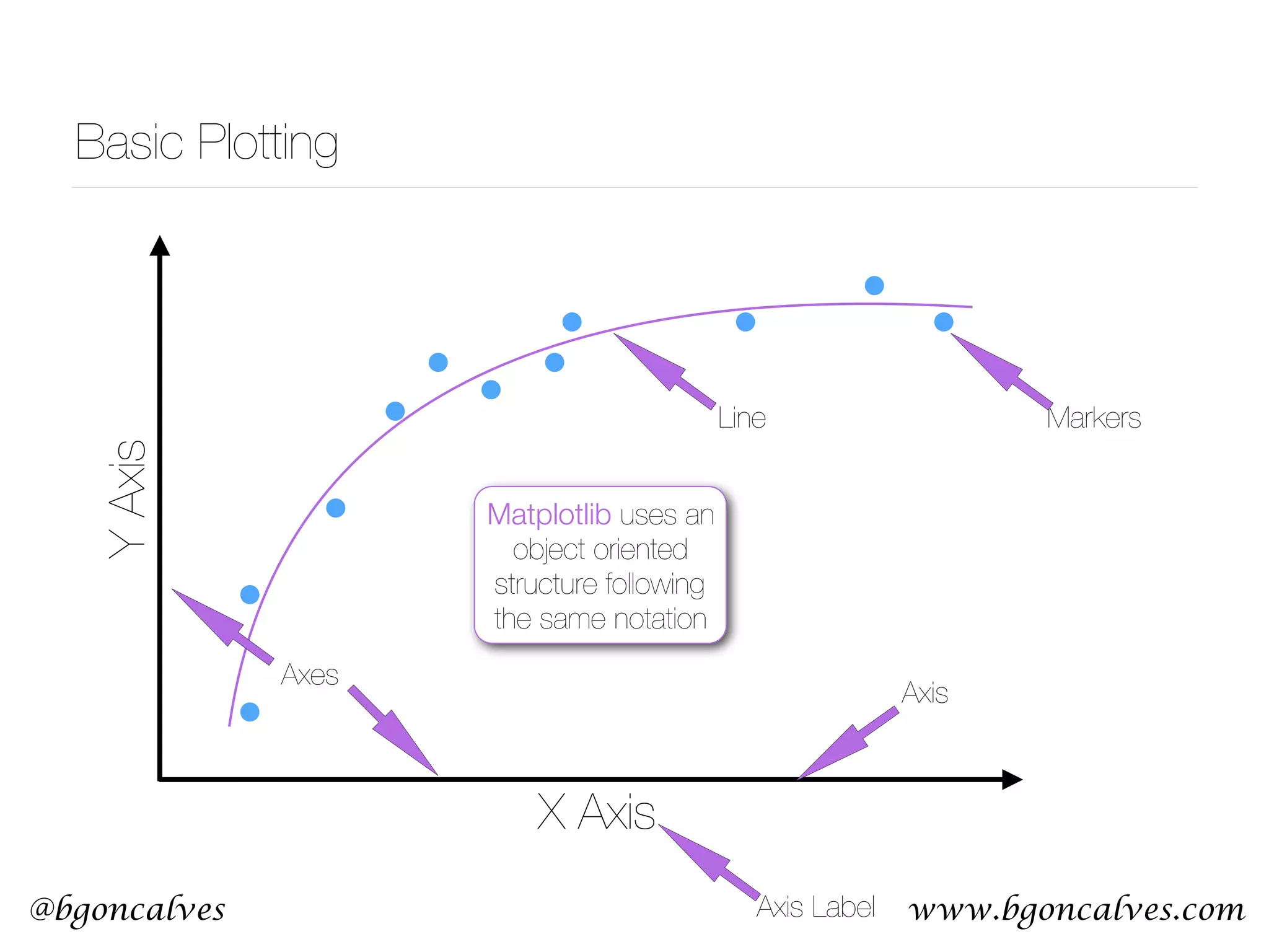
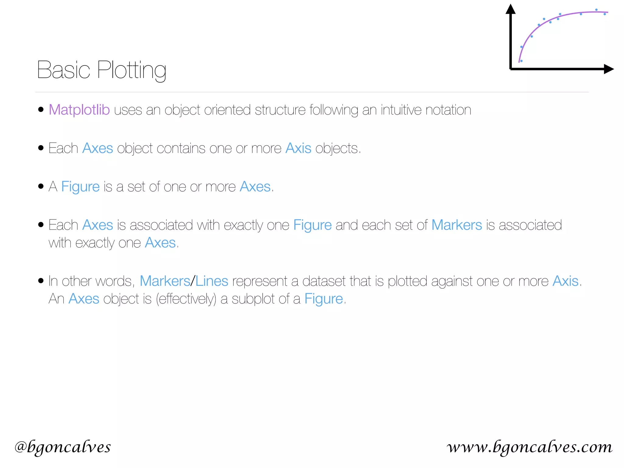
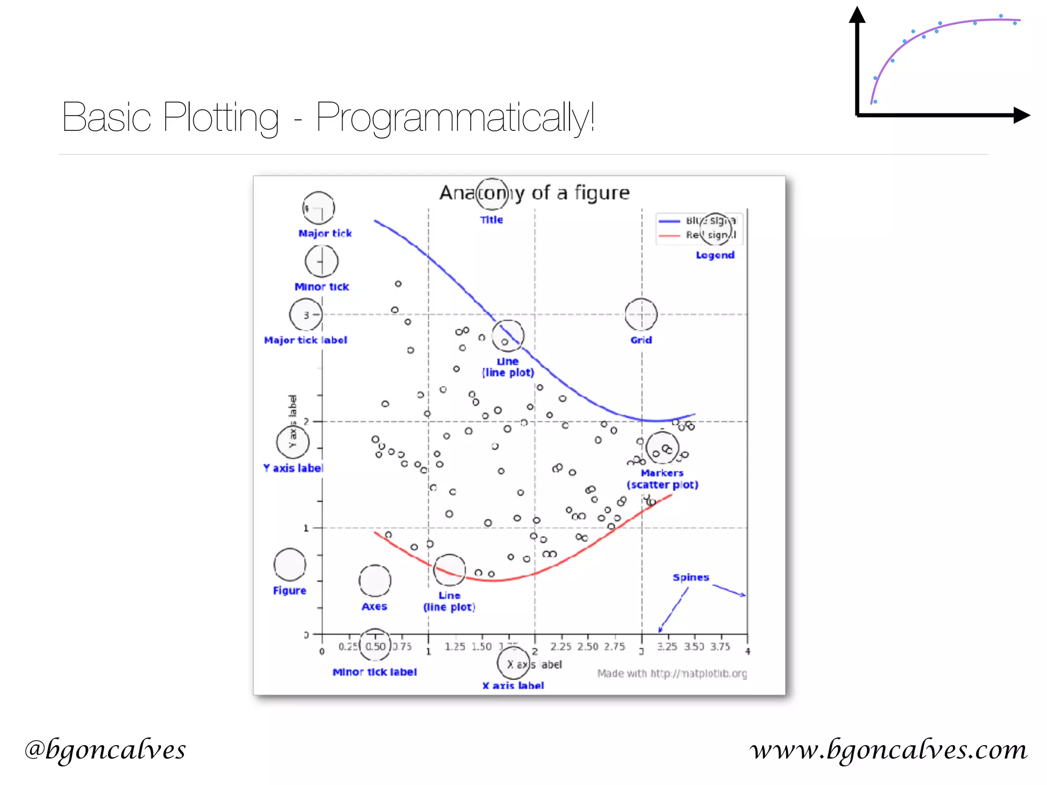


The document discusses data visualization using Matplotlib, emphasizing the cognitive aspects of human perception, color theory, and the fundamental tools for creating various types of plots. It provides essential guidelines for effective visual representation of data, including techniques to depict comparisons, causality, and multivariate data. Additionally, it outlines the object-oriented structure of Matplotlib for programming visualizations and the intuitive functions for creating and customizing plots.