Download as PPS, PPTX

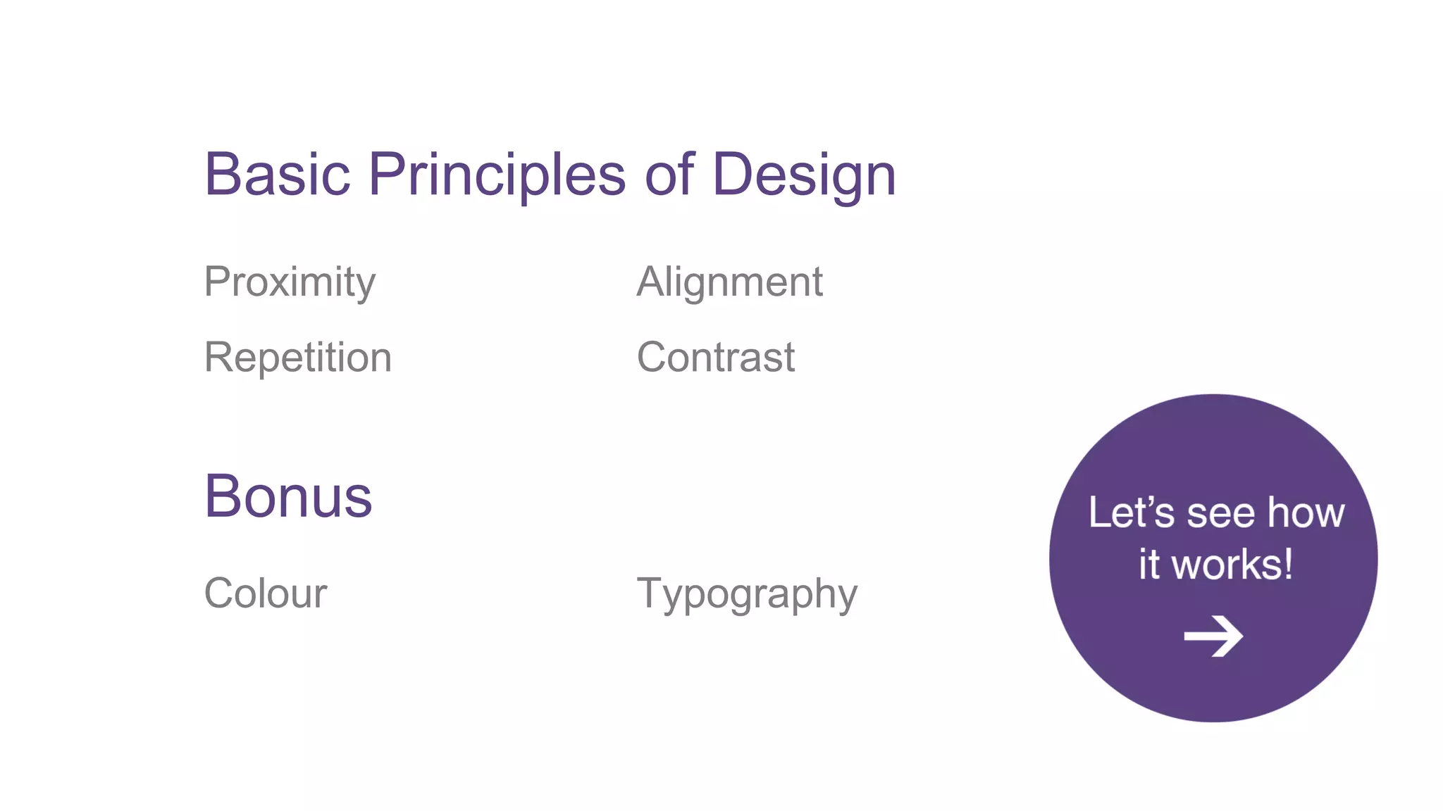
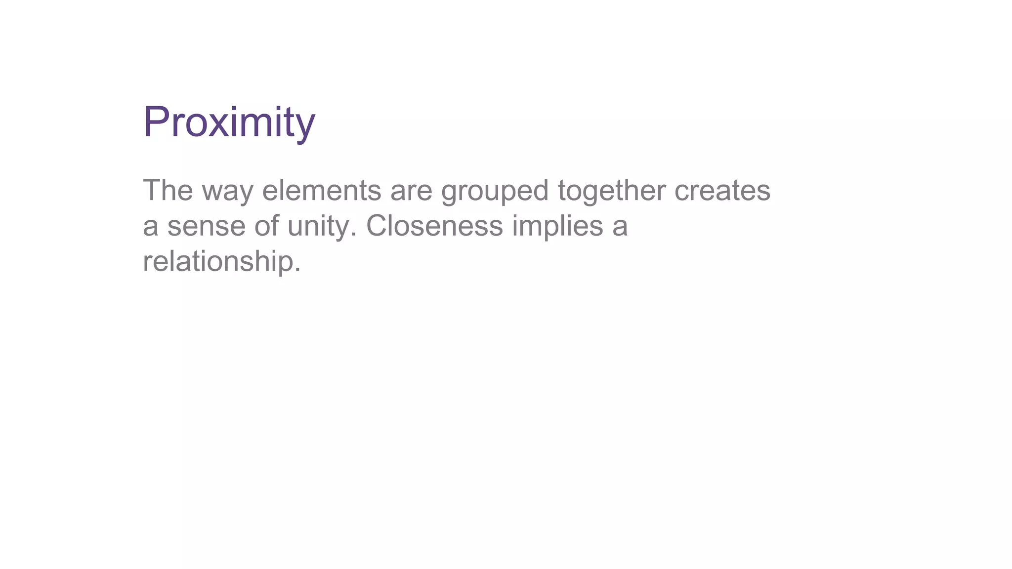
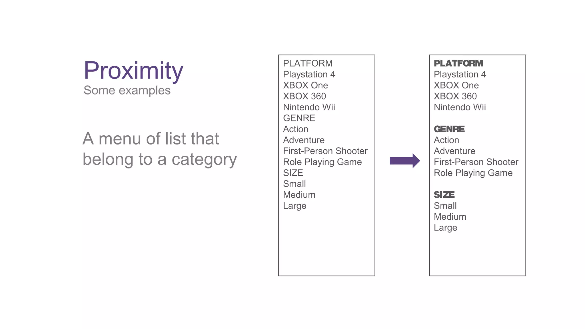


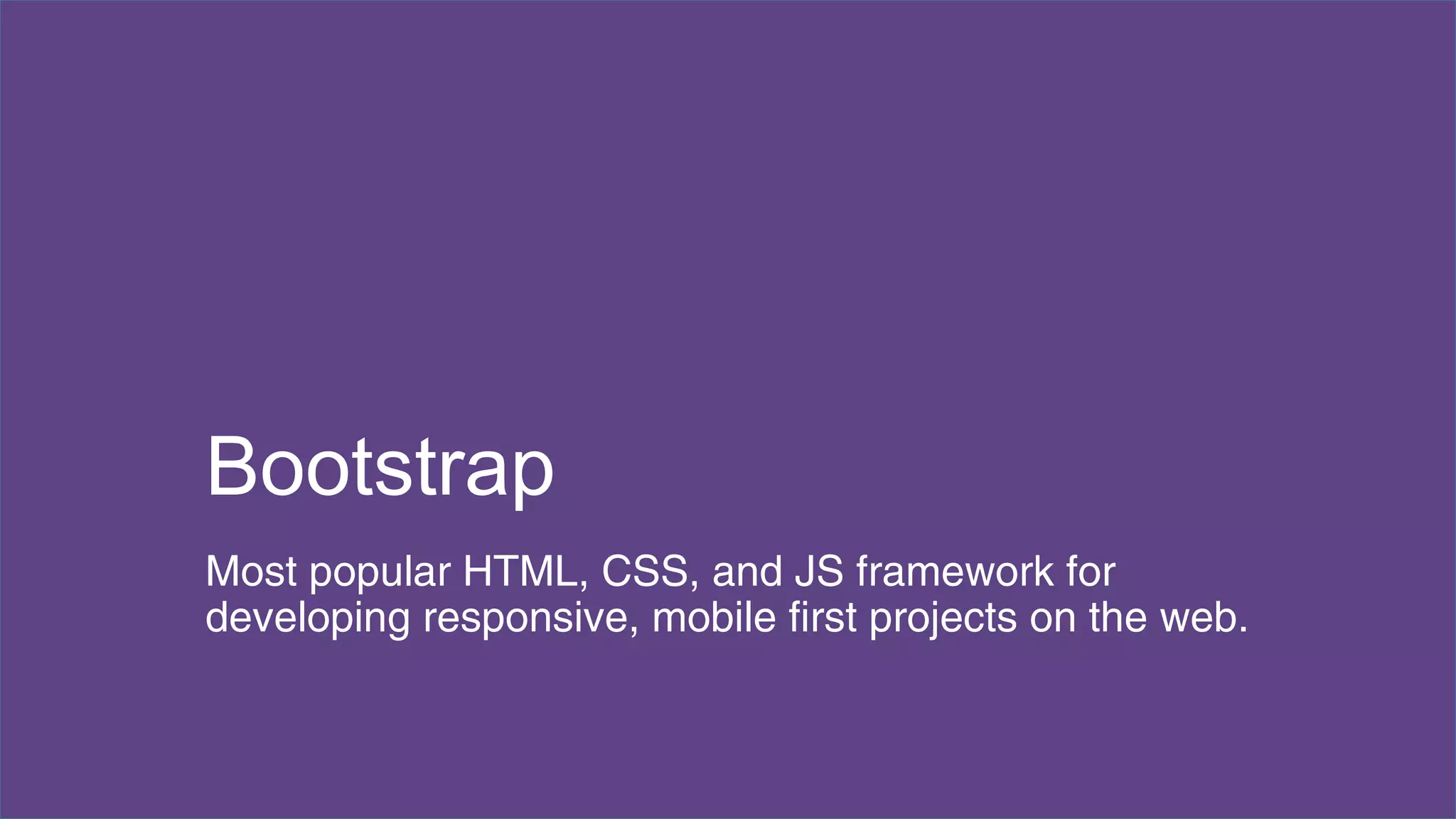
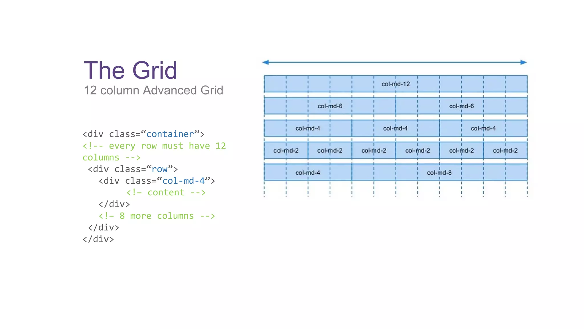
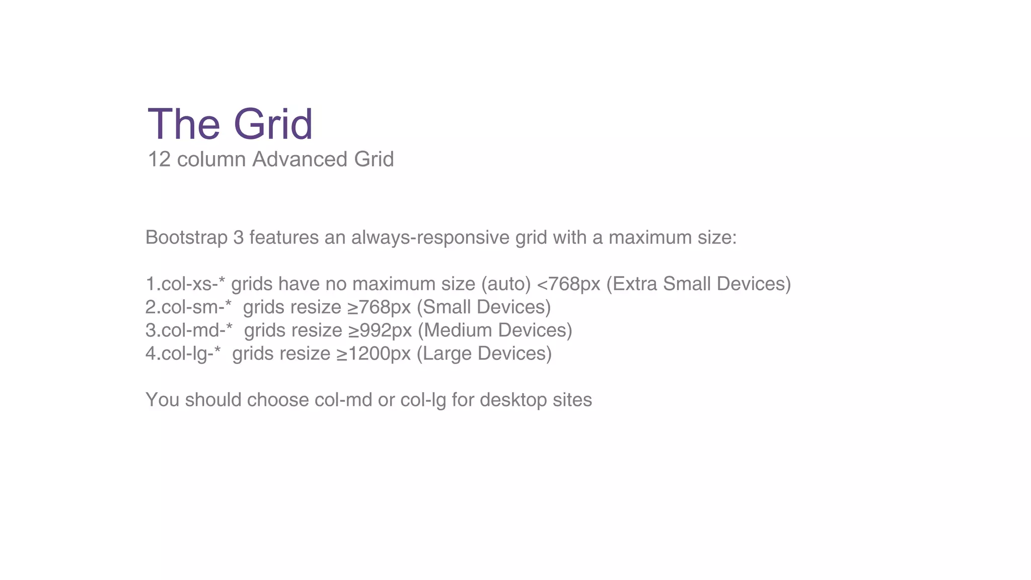
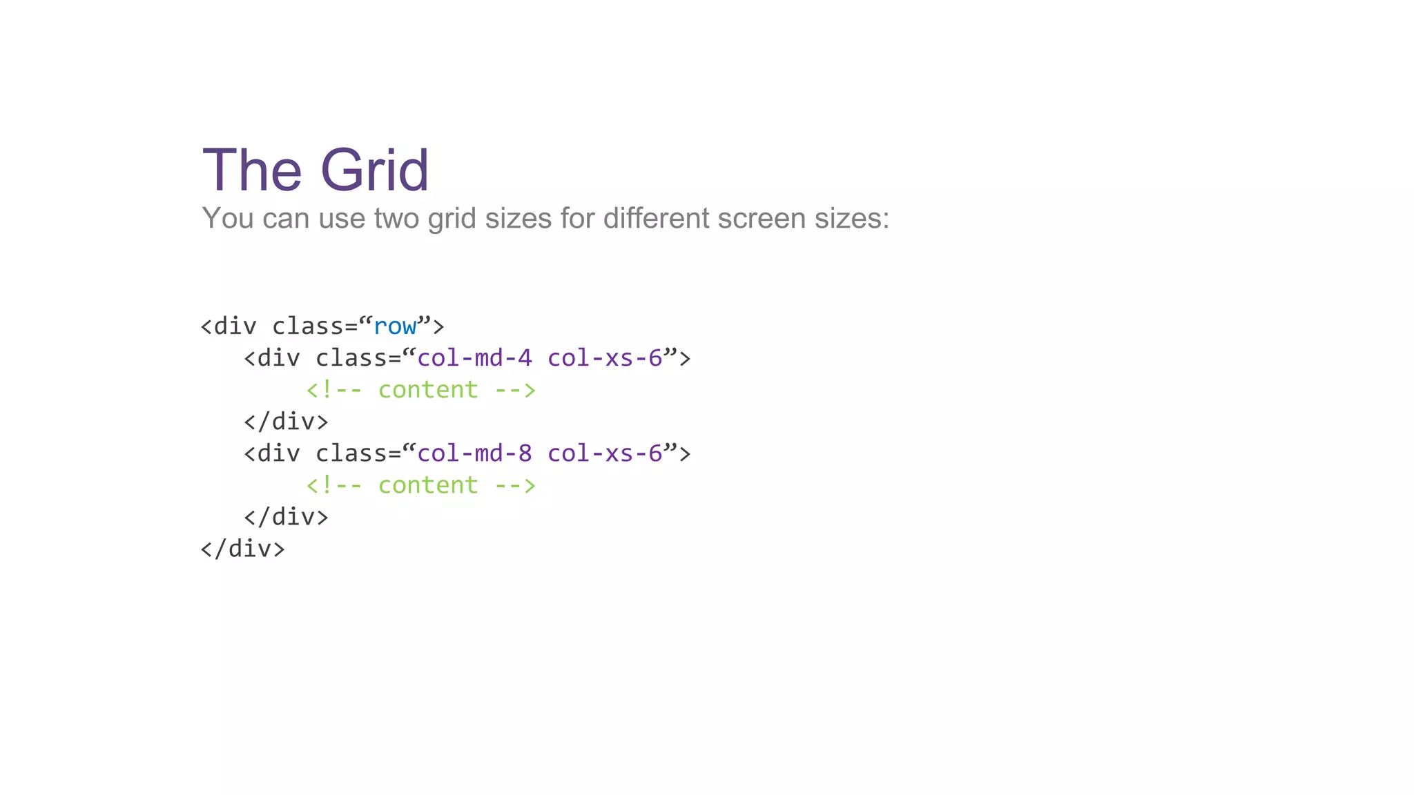
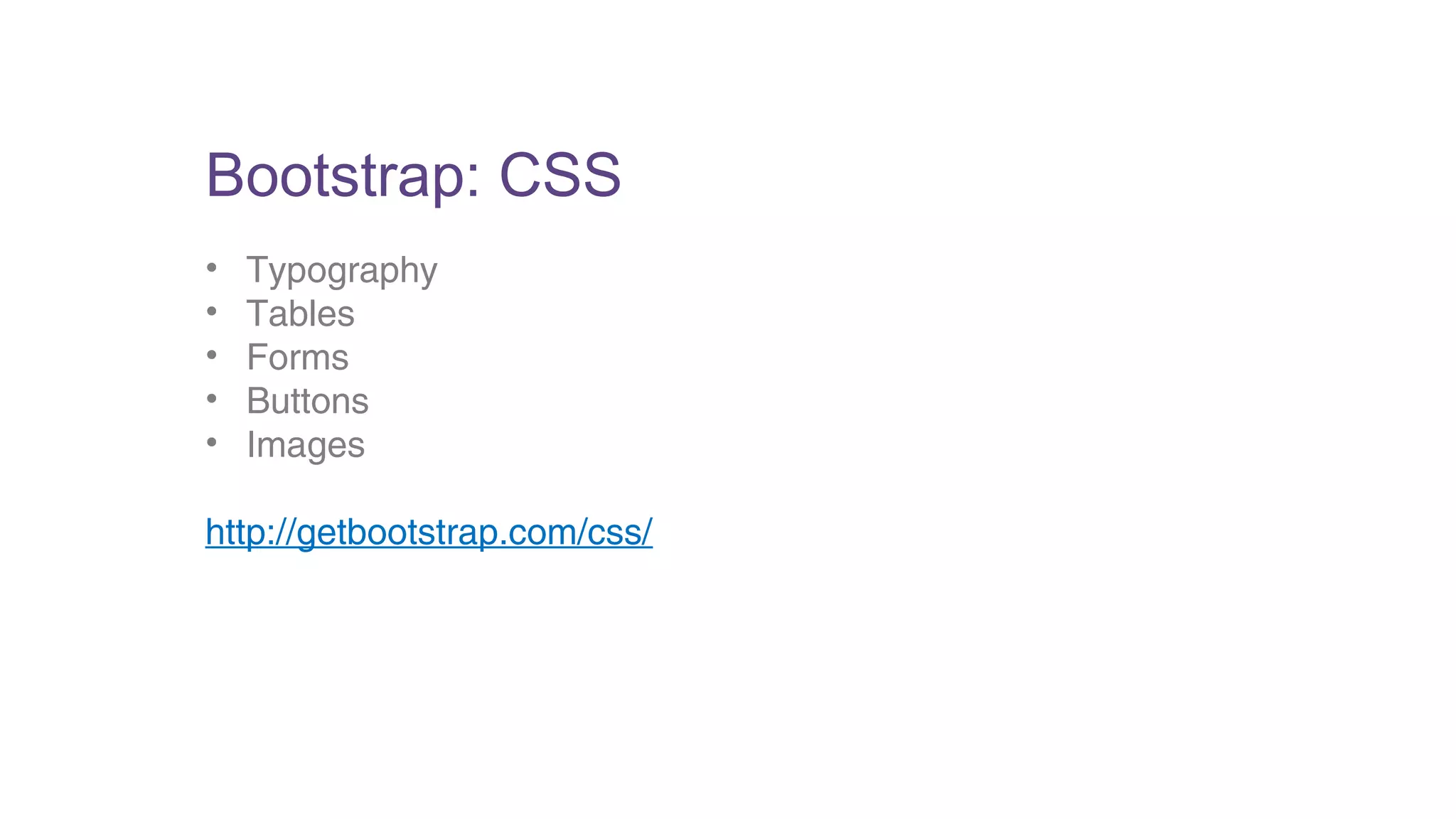
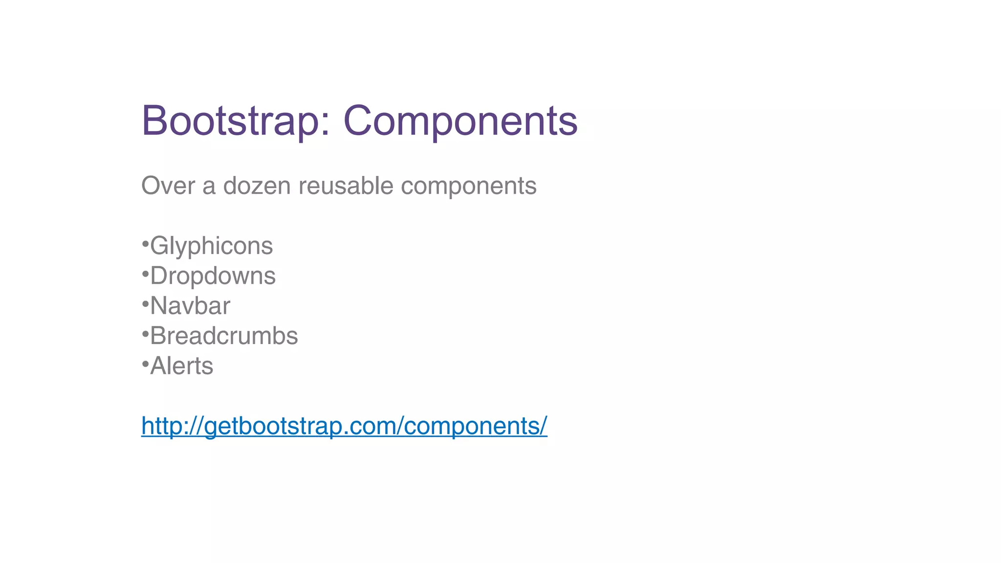
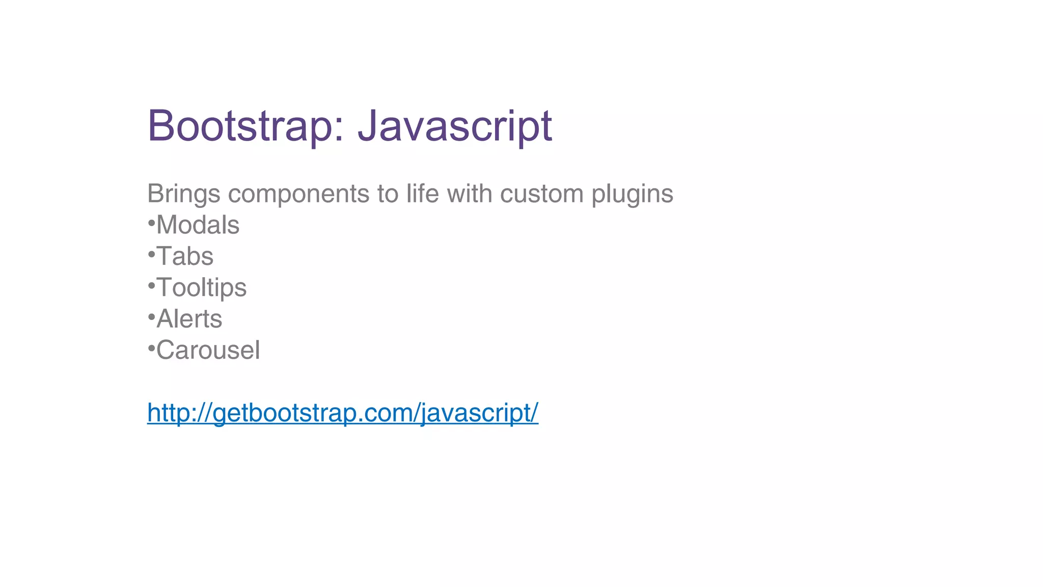
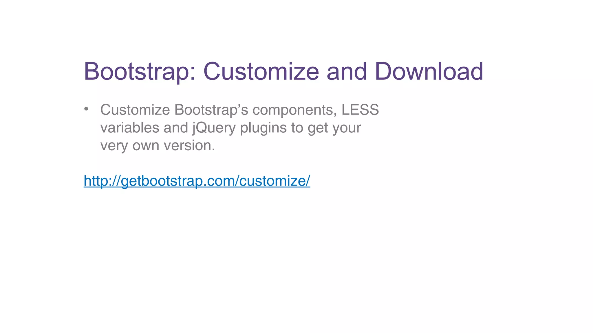
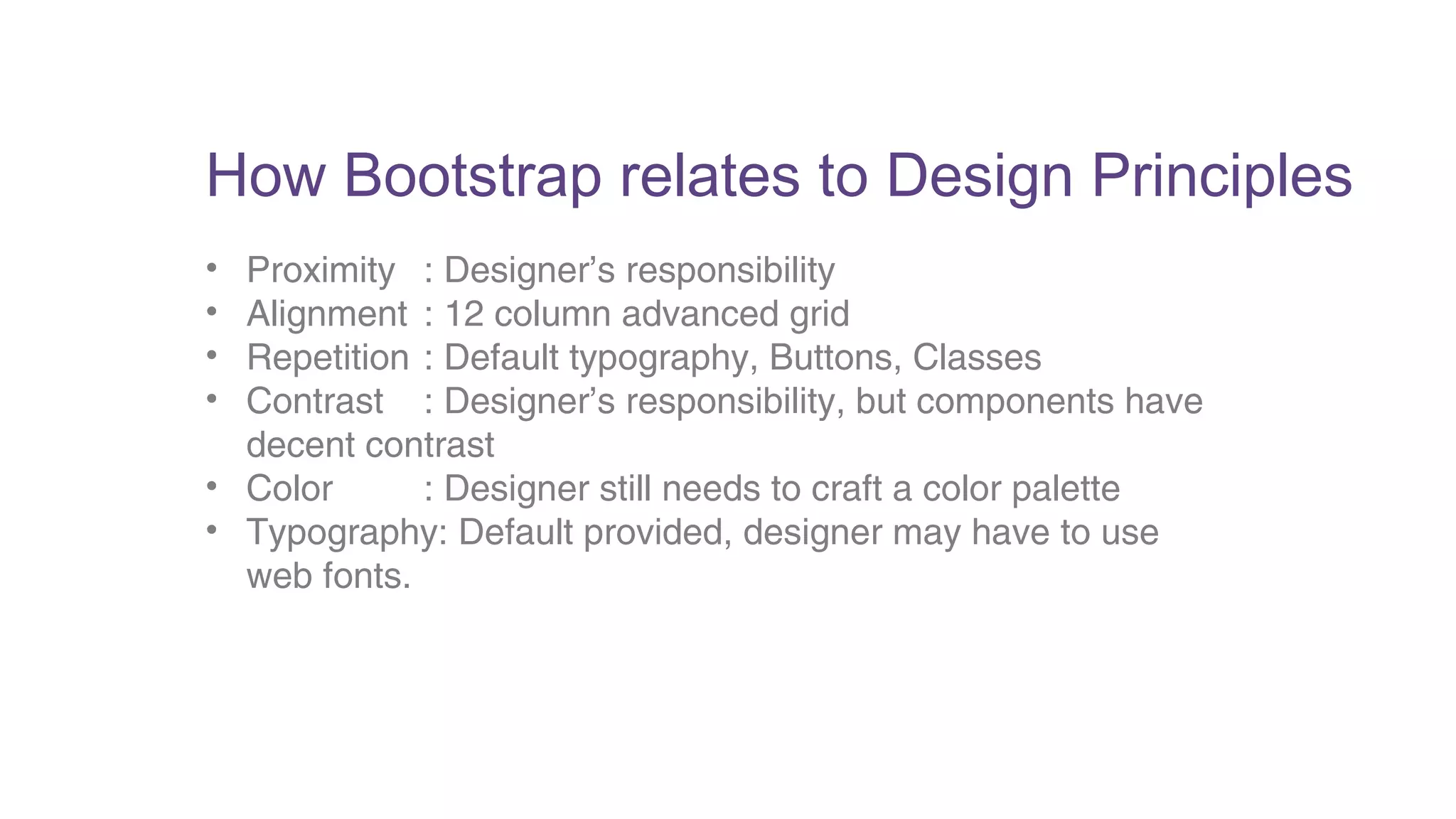
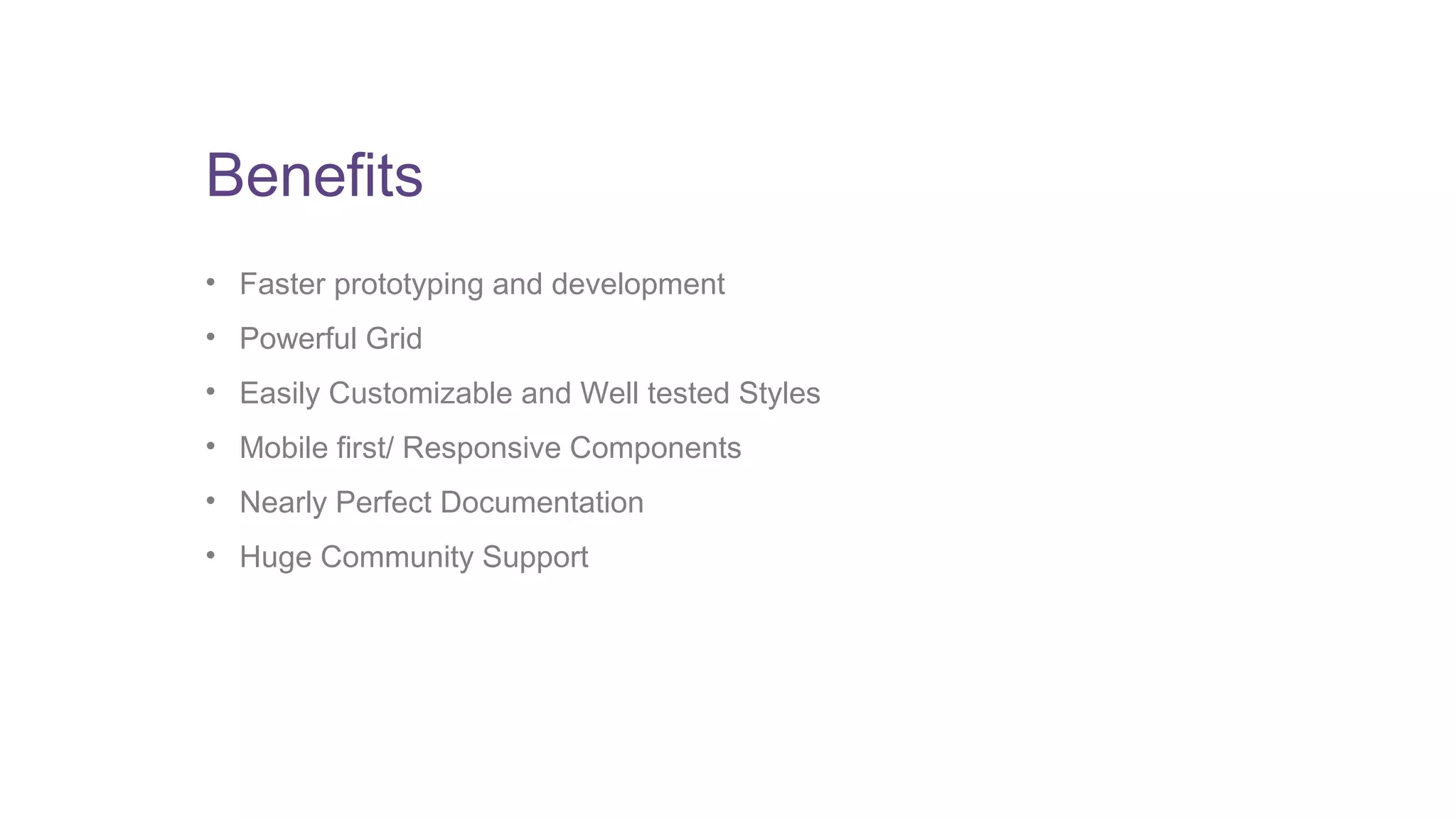
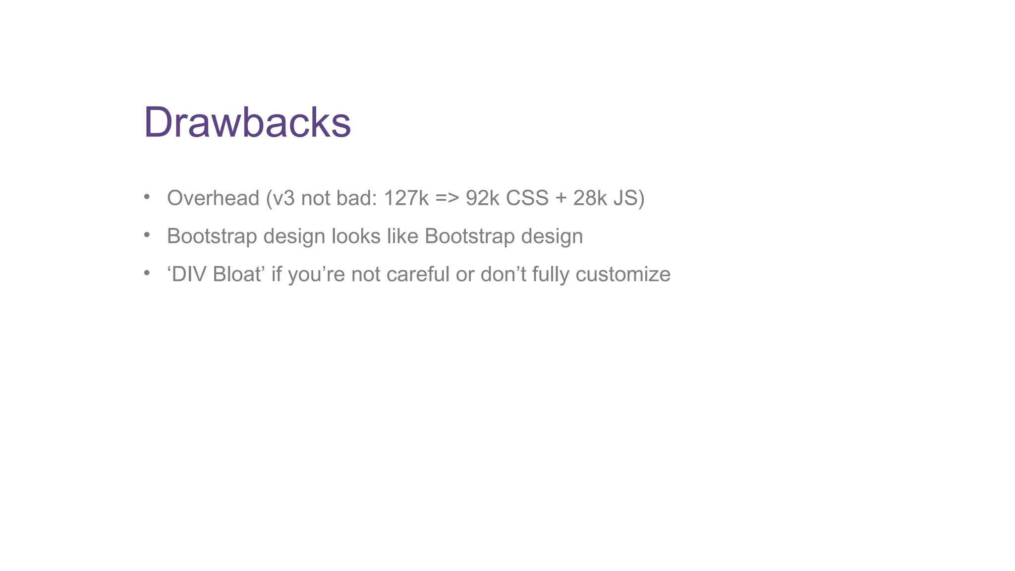


The document provides an introduction to Bootstrap, one of the most popular front-end frameworks. It discusses basic design principles like proximity, alignment, repetition and contrast. It then covers key aspects of Bootstrap like the grid system, CSS components, JavaScript plugins, customization options, and how it relates to basic design principles. The benefits of Bootstrap are faster development, powerful grid system, customizable styles and responsive components, while potential drawbacks include file size overhead and templates looking similar without customization.