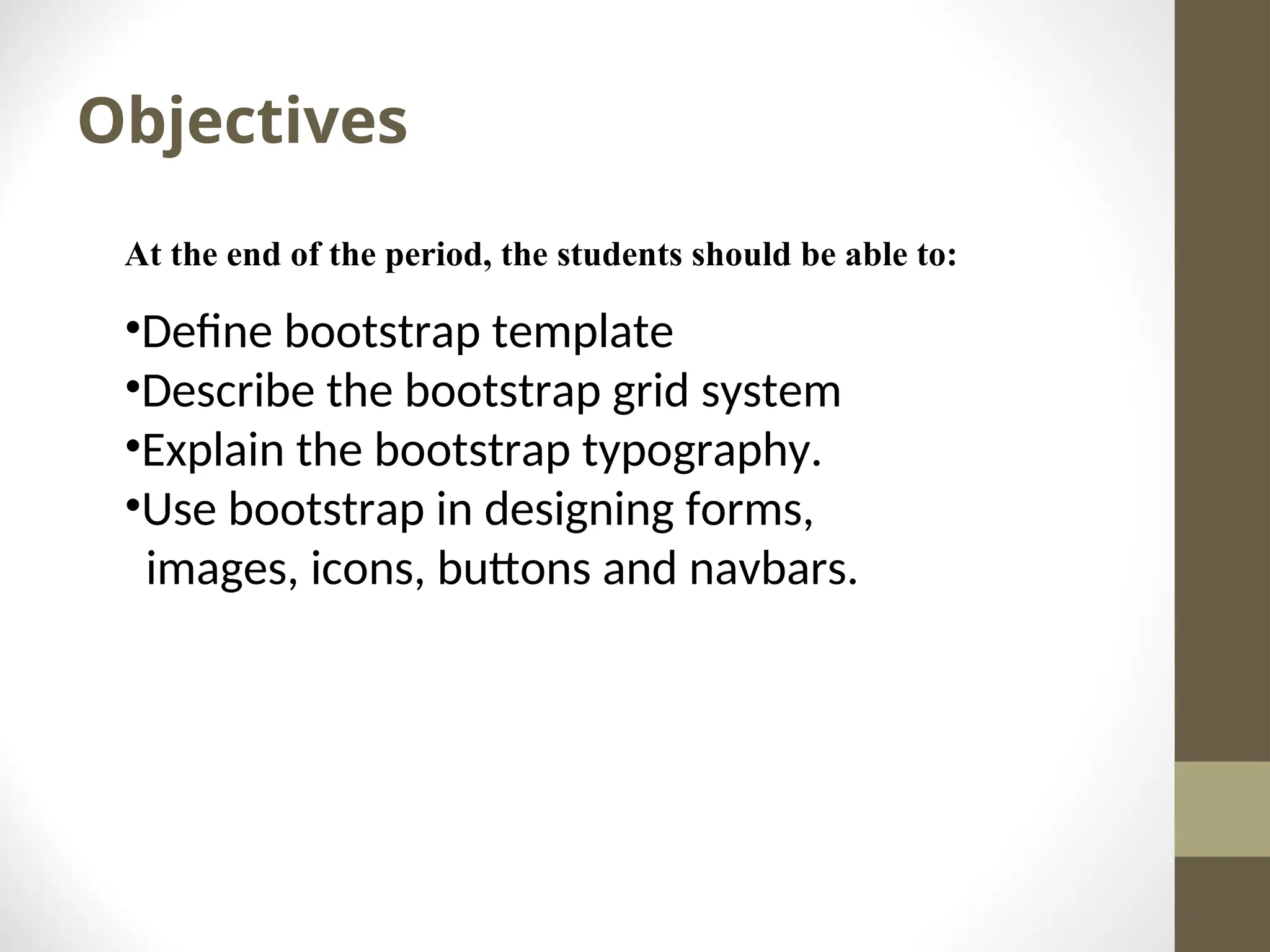
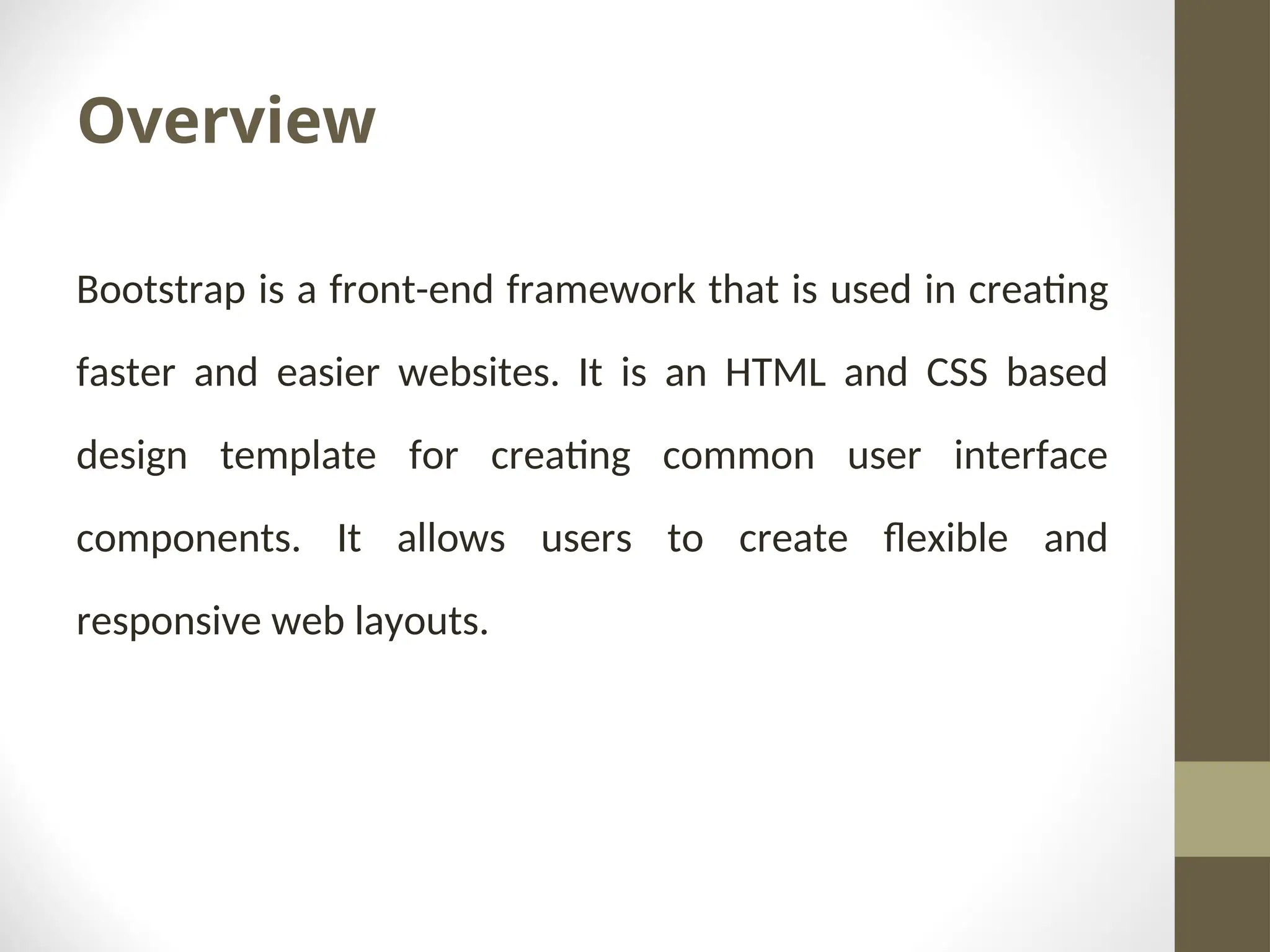
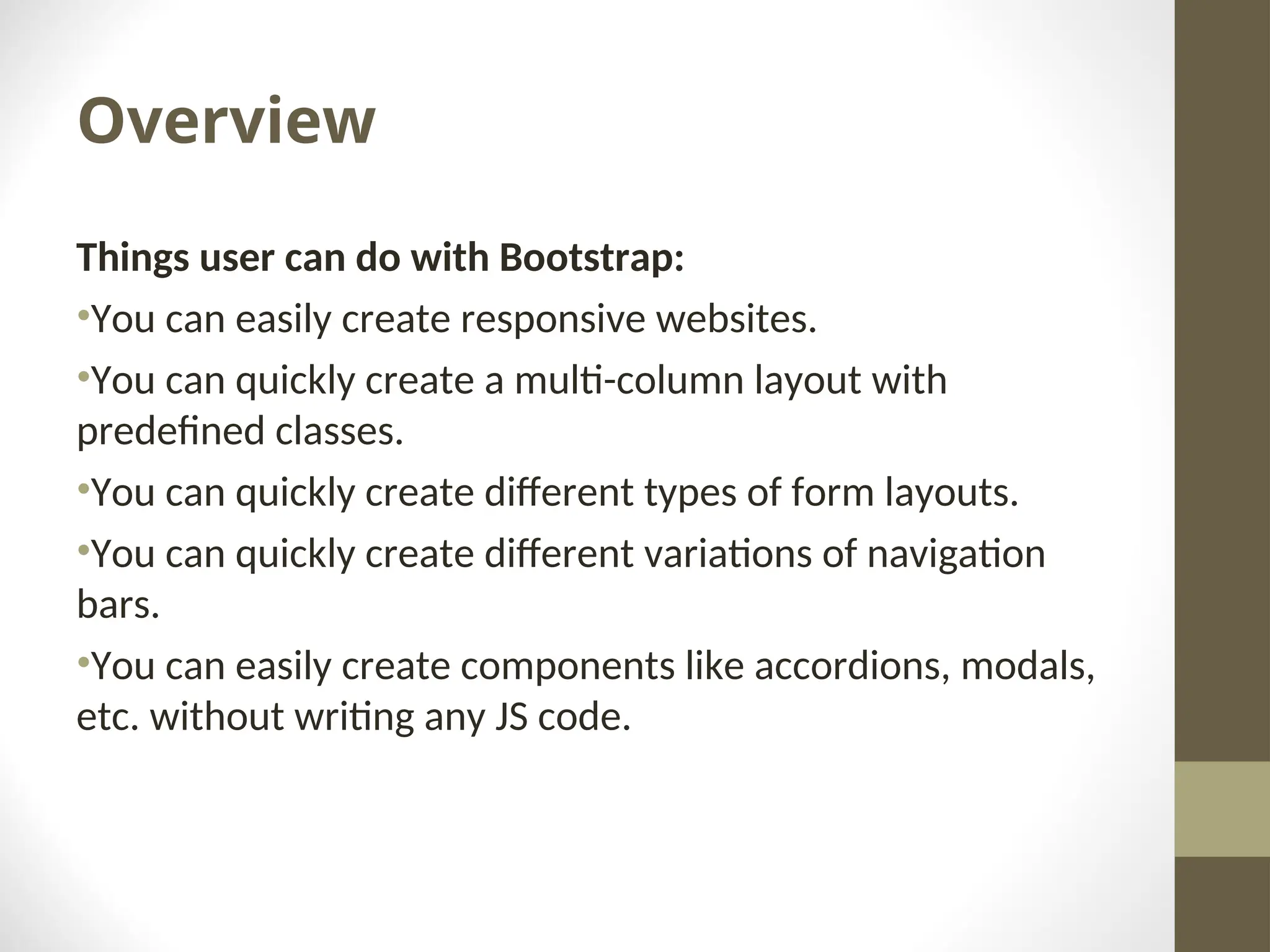
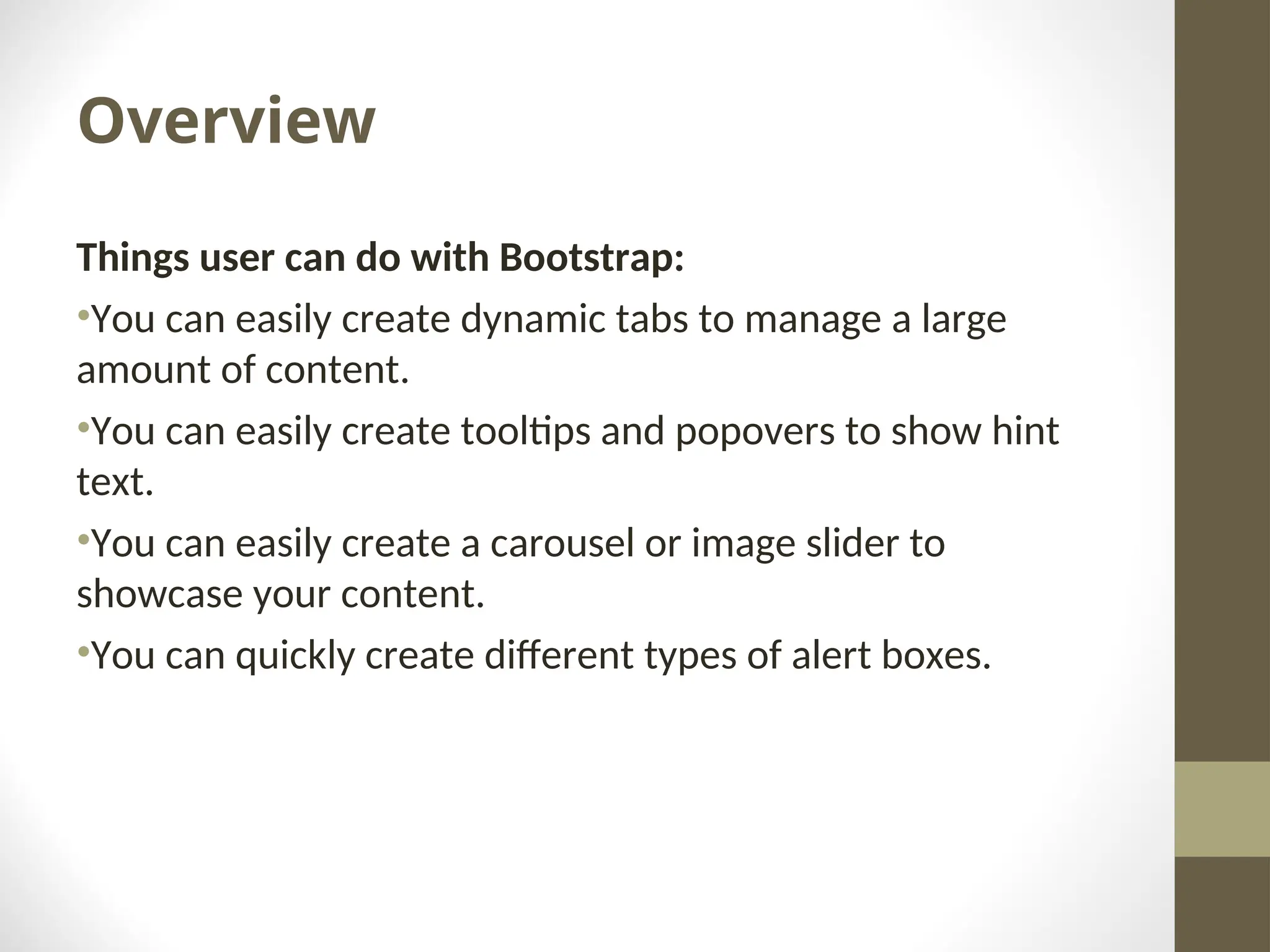
BOOTSRAP
Objectives At the end of the period, the students should be able to: •Define bootstrap template •Describe the bootstrap grid system •Explain the bootstrap typography. •Use bootstrap in designing forms, images, icons, buttons and navbars.
Overview Bootstrap is a front-end framework that is used in creating faster and easier websites. It is an HTML and CSS based design template for creating common user interface components. It allows users to create flexible and responsive web layouts.
Overview Things user can do with Bootstrap: •You can easily create responsive websites. •You can quickly create a multi-column layout with predefined classes. •You can quickly create different types of form layouts. •You can quickly create different variations of navigation bars. •You can easily create components like accordions, modals, etc. without writing any JS code.
Overview Things user can do with Bootstrap: •You can easily create dynamic tabs to manage a large amount of content. •You can easily create tooltips and popovers to show hint text. •You can easily create a carousel or image slider to showcase your content. •You can quickly create different types of alert boxes.
Overview Advantages of using bootstrap •Save time •Responsive feature •Easy to use •Open source
Bootstrap Template • In order to make this plain HTML file a Bootstrap template, just include the Bootstrap CSS and JS files as well as required jQuery and Popper.js using their CDN links. • You should include JavaScript files at the bottom of the page, right before the closing </body> tag to improve the performance of your web pages.
Grid System Provides a quick and convenient way to create responsive website layouts. Bootstrap has 4 predefined grid classes. •.col-sm- •.col-md- •.col-lg •.col-xl-
Grid System The grid system uses 12 columns in creating grid layouts. To create rows and columns using grid, we need to create a container that would act as a wrapper for your rows and columns using the .container class, after that create rows inside the container using the .row class and to create columns inside any row you can use the .col*, .col-sm-*, .col-md-*, .col-lg-* and col- xl-* classes.

BSIT_AdvanceWebDevelopment_file4 -ppt.ppt

  • 1.
  • 2.
    Objectives At the endof the period, the students should be able to: •Define bootstrap template •Describe the bootstrap grid system •Explain the bootstrap typography. •Use bootstrap in designing forms, images, icons, buttons and navbars.
  • 3.
    Overview Bootstrap is afront-end framework that is used in creating faster and easier websites. It is an HTML and CSS based design template for creating common user interface components. It allows users to create flexible and responsive web layouts.
  • 4.
    Overview Things user cando with Bootstrap: •You can easily create responsive websites. •You can quickly create a multi-column layout with predefined classes. •You can quickly create different types of form layouts. •You can quickly create different variations of navigation bars. •You can easily create components like accordions, modals, etc. without writing any JS code.
  • 5.
    Overview Things user cando with Bootstrap: •You can easily create responsive websites. •You can quickly create a multi-column layout with predefined classes. •You can quickly create different types of form layouts. •You can quickly create different variations of navigation bars. •You can easily create components like accordions, modals, etc. without writing any JS code.
  • 6.
    Overview Things user cando with Bootstrap: •You can easily create dynamic tabs to manage a large amount of content. •You can easily create tooltips and popovers to show hint text. •You can easily create a carousel or image slider to showcase your content. •You can quickly create different types of alert boxes.
  • 7.
    Overview Advantages of usingbootstrap •Save time •Responsive feature •Easy to use •Open source
  • 8.
    Bootstrap Template • Inorder to make this plain HTML file a Bootstrap template, just include the Bootstrap CSS and JS files as well as required jQuery and Popper.js using their CDN links. • You should include JavaScript files at the bottom of the page, right before the closing </body> tag to improve the performance of your web pages.
  • 9.
    Grid System Provides aquick and convenient way to create responsive website layouts. Bootstrap has 4 predefined grid classes. •.col-sm- •.col-md- •.col-lg •.col-xl-
  • 10.
    Grid System The gridsystem uses 12 columns in creating grid layouts. To create rows and columns using grid, we need to create a container that would act as a wrapper for your rows and columns using the .container class, after that create rows inside the container using the .row class and to create columns inside any row you can use the .col*, .col-sm-*, .col-md-*, .col-lg-* and col- xl-* classes.