Download to read offline


![PHP Arrays <?php $cars = array("Volvo", "BMW", "Toyota"); echo "I like " . $cars[0] . ", " . $cars[1] . " and " . $cars[2] . "."; ?>](https://image.slidesharecdn.com/it-171022191700/75/Web-development-and-web-design-with-seo-48-2048.jpg)


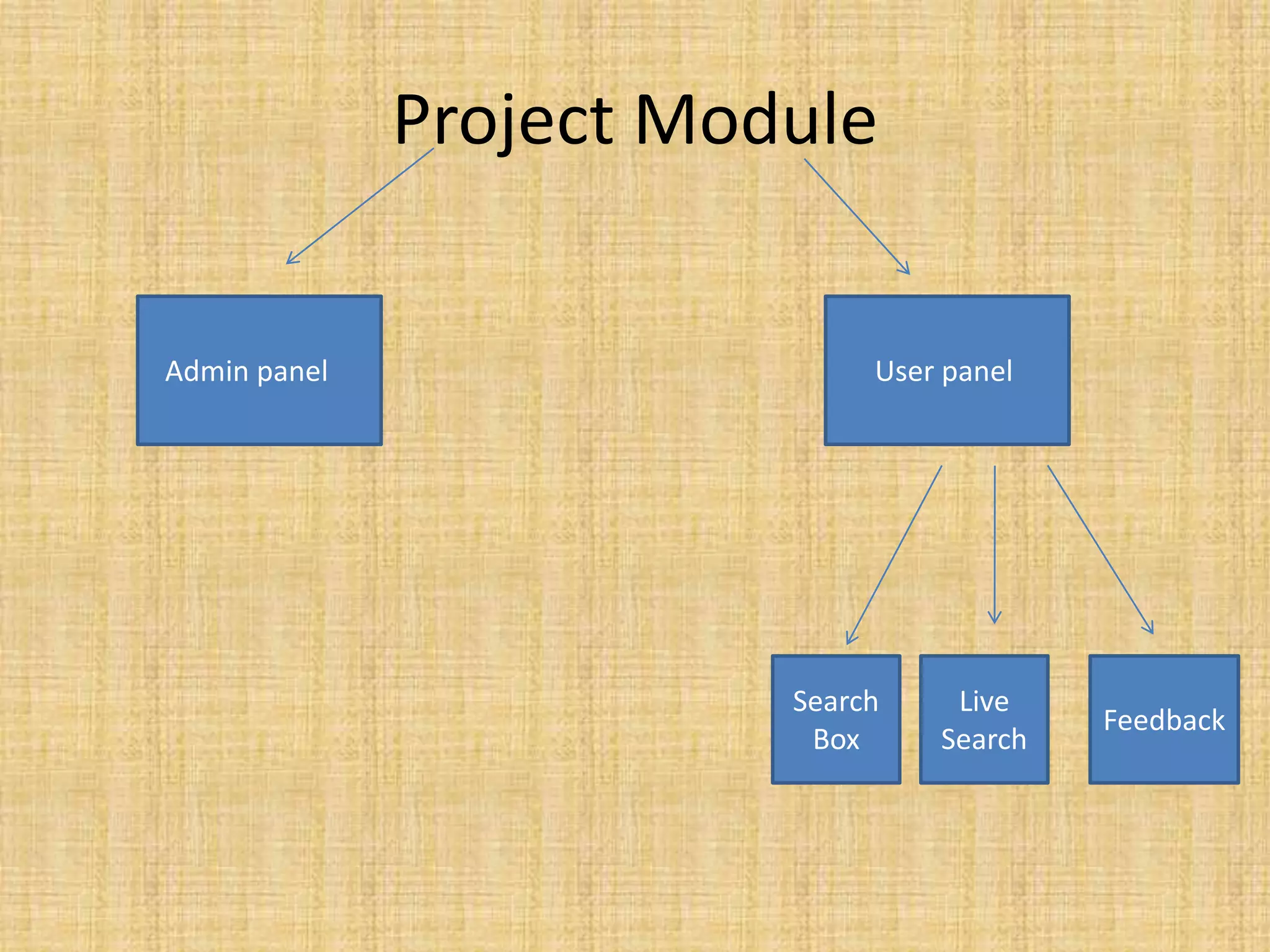


Happy to Help is a website that aims to provide household services like plumbing and electricians to users by connecting them directly to local service providers. The website allows users to find and book these small household services from the comfort of their home by selecting their location and desired service on the website. It provides contact information of different pre-screened service providers to make the process easy for users. The website aims to enhance communication between users and service providers through its online platform.