
ConstraintLayout is a layout that allows you to place composables relative to other composables on the screen. It is an alternative to using multiple nested Row, Column, Box and other custom layout elements. ConstraintLayout is useful when implementing larger layouts with more complicated alignment requirements.
Consider using ConstraintLayout in the following scenarios:
- To avoid nesting multiple
Columns andRows for positioning elements on screen to improve readability of code. - To position composables relative to other composables or to position composables based on guidelines, barriers or chains.
In the View system, ConstraintLayout was the recommended way to create large and complex layouts, as a flat view hierarchy was better for performance than nested views are. However, this is not a concern in Compose, which is able to efficiently handle deep layout hierarchies.
Get started with ConstraintLayout
To use ConstraintLayout in Compose, you need to add this dependency in your build.gradle (in addition to the Compose setup):
implementation "androidx.constraintlayout:constraintlayout-compose:1.0.1" ConstraintLayout in Compose works in the following way using a DSL:
- Create references for each composable in the
ConstraintLayoutusing thecreateRefs()orcreateRefFor() - Constraints are provided using the
constrainAs()modifier, which takes the reference as a parameter and lets you specify its constraints in the body lambda. - Constraints are specified using
linkTo()or other helpful methods. parentis an existing reference that can be used to specify constraints towards theConstraintLayoutcomposable itself.
Here's an example of a composable using a ConstraintLayout:
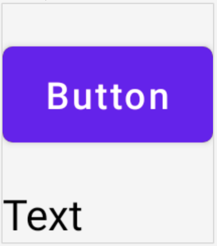
@Composable fun ConstraintLayoutContent() { ConstraintLayout { // Create references for the composables to constrain val (button, text) = createRefs() Button( onClick = { /* Do something */ }, // Assign reference "button" to the Button composable // and constrain it to the top of the ConstraintLayout modifier = Modifier.constrainAs(button) { top.linkTo(parent.top, margin = 16.dp) } ) { Text("Button") } // Assign reference "text" to the Text composable // and constrain it to the bottom of the Button composable Text( "Text", Modifier.constrainAs(text) { top.linkTo(button.bottom, margin = 16.dp) } ) } }
This code constrains the top of the Button to the parent with a margin of 16.dp and a Text to the bottom of the Button also with a margin of 16.dp.
Decoupled API
In the ConstraintLayout example, constraints are specified inline, with a modifier in the composable they're applied to. However, there are situations when it's preferable to decouple the constraints from the layouts they apply to. For example, you might want to change the constraints based on the screen configuration, or animate between two constraint sets.
For cases like these, you can use ConstraintLayout in a different way:
- Pass in a
ConstraintSetas a parameter toConstraintLayout. - Assign references created in the
ConstraintSetto composables using thelayoutIdmodifier.
@Composable fun DecoupledConstraintLayout() { BoxWithConstraints { val constraints = if (minWidth < 600.dp) { decoupledConstraints(margin = 16.dp) // Portrait constraints } else { decoupledConstraints(margin = 32.dp) // Landscape constraints } ConstraintLayout(constraints) { Button( onClick = { /* Do something */ }, modifier = Modifier.layoutId("button") ) { Text("Button") } Text("Text", Modifier.layoutId("text")) } } } private fun decoupledConstraints(margin: Dp): ConstraintSet { return ConstraintSet { val button = createRefFor("button") val text = createRefFor("text") constrain(button) { top.linkTo(parent.top, margin = margin) } constrain(text) { top.linkTo(button.bottom, margin) } } }
Then, when you need to change the constraints, you can just pass a different ConstraintSet.
ConstraintLayout concepts
ConstraintLayout contains concepts such as guidelines, barriers and chains that can help with positioning elements inside your Composable.
Guidelines
Guidelines are small visual helpers to design layouts with. Composables can be constrained to a guideline. Guidelines are useful for positioning elements at a certain dp or percentage inside the parent composable.
There are two different kinds of guidelines, vertical and horizontal. The two horizontal ones are top and bottom, and the two vertical are start and end.
ConstraintLayout { // Create guideline from the start of the parent at 10% the width of the Composable val startGuideline = createGuidelineFromStart(0.1f) // Create guideline from the end of the parent at 10% the width of the Composable val endGuideline = createGuidelineFromEnd(0.1f) // Create guideline from 16 dp from the top of the parent val topGuideline = createGuidelineFromTop(16.dp) // Create guideline from 16 dp from the bottom of the parent val bottomGuideline = createGuidelineFromBottom(16.dp) }
To create a guideline, use createGuidelineFrom* with the type of guideline required. This creates a reference that can be used in the Modifier.constrainAs() block.
Barriers
Barriers reference multiple composables to create a virtual guideline based on the most extreme widget on the specified side.
To create a barrier, use createTopBarrier() (or: createBottomBarrier(), createEndBarrier(), createStartBarrier()), and provide the references that should make up the barrier.
ConstraintLayout { val constraintSet = ConstraintSet { val button = createRefFor("button") val text = createRefFor("text") val topBarrier = createTopBarrier(button, text) } }
The barrier can then be used in a Modifier.constrainAs() block.
Chains
Chains provide group-like behavior in a single axis (horizontally or vertically) . The other axis can be constrained independently.
To create a chain, use either createVerticalChain or createHorizontalChain:
ConstraintLayout { val constraintSet = ConstraintSet { val button = createRefFor("button") val text = createRefFor("text") val verticalChain = createVerticalChain(button, text, chainStyle = ChainStyle.Spread) val horizontalChain = createHorizontalChain(button, text) } }
The chain can then be used in the Modifier.constrainAs() block.
A chain can be configured with different ChainStyles, which decide how to deal with the space surrounding a composable, such as:
ChainStyle.Spread: Space is distributed evenly across all the composables, including free space before the first composable and after the last composable.ChainStyle.SpreadInside: Space is distributed evenly across the all composables, without any free space before the first composable or after the last composable.ChainStyle.Packed: Space is distributed before the first and after the last composable, composables are packed together without space in between each other.
Learn more
Learn more about ConstraintLayout in Compose from the APIs in action in the Compose samples that use ConstraintLayout.
Recommended for you
- Note: link text is displayed when JavaScript is off
- Focus in Compose
- Kotlin for Jetpack Compose
- Compose layout basics