
Material Design 3 is the next evolution of Material Design. It includes updated theming, components, and Material You personalization features like dynamic color. It's an update to Material Design 2 and is cohesive with the new visual style and system UI on Android 12 and higher.
This guide focuses on migrating from the Compose Material (androidx.compose.material) Jetpack library to the Compose Material 3 (androidx.compose.material3) Jetpack library.
Approaches
In general, you should not use both M2 and M3 in a single app long-term. This is because the two design systems and respective libraries differ significantly in terms of their UX/UI designs and Compose implementations.
Your app may use a design system, such as one created using Figma. In such cases, we also highly recommend that you or your design team migrate it from M2 to M3 before starting the Compose migration. It doesn't make sense to migrate an app to M3 if its UX/UI design is based on M2.
Furthermore, your approach to migration should take your app's size, complexity, and UX/UI design into account. Doing so helps you to minimize the impact on your codebase. Take a phased approach to migration.
When to migrate
You should ideally start the migration as soon as possible. However, it's important to consider whether your app is in a realistic position to fully migrate from M2 to M3. There are some blocker scenarios to consider investigating before you start:
| Scenario | Recommended approach |
|---|---|
| Your app has no significant blockers. | Begin phased migration. |
| Your app uses a component from M2 that isn't available in M3 yet. See the Components and layouts section. | Begin phased migration. |
| You or your design team haven't migrated the app's design system from M2 to M3. | Migrate the design system from M2 to M3, then begin phased migration. |
Even if you're affected by the preceding scenarios, you should take a phased approach to migration before committing and releasing an app update. In these cases, you would use M2 and M3 side-by-side, and gradually phase out M2 while migrating to M3.
Phased approach
The general steps to a phased migration are as follows:
- Add the M3 dependency alongside the M2 dependency.
- Add the M3 versions of your app's themes alongside the M2 versions of your app's themes.
- Migrate individual modules, screens, or composables to M3, depending on the size and complexity of your app (see the following sections for details).
- Once fully migrated, remove the M2 versions of your app's themes.
- Remove the M2 dependency.
Dependencies
M3 has a separate package and version from M2:
M2
implementation "androidx.compose.material:material:$m2-version" M3
implementation "androidx.compose.material3:material3:$m3-version" See the latest M3 versions on the Compose Material 3 releases page.
Other Material dependencies outside of the main M2 and M3 libraries have not changed. They use a mix of the M2 and M3 packages and versions, but this has no impact on migration. They can be used as-is with M3:
| Library | Package and version |
|---|---|
| Compose Material Icons | androidx.compose.material:material-icons-*:$m2-version |
| Compose Material Ripple | androidx.compose.material:material-ripple:$m2-version |
Experimental APIs
Some M3 APIs are considered experimental. In such cases, you need to opt in at the function or file level using the ExperimentalMaterial3Api annotation:
import androidx.compose.material3.ExperimentalMaterial3Api @OptIn(ExperimentalMaterial3Api::class) @Composable fun AppComposable() { // M3 composables } Theming
In both M2 and M3, the theme composable is named MaterialTheme but the import packages and parameters differ:
M2
import androidx.compose.material.MaterialTheme MaterialTheme( colors = AppColors, typography = AppTypography, shapes = AppShapes ) { // M2 content } M3
import androidx.compose.material3.MaterialTheme MaterialTheme( colorScheme = AppColorScheme, typography = AppTypography, shapes = AppShapes ) { // M3 content } Color
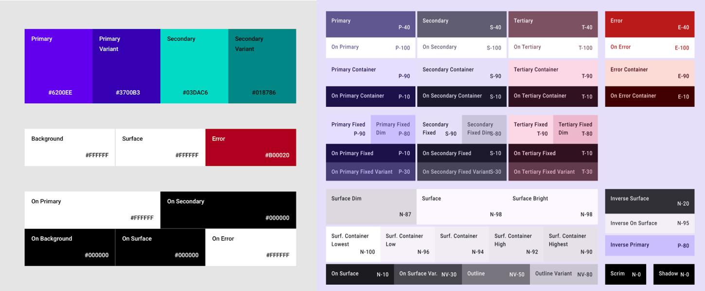
The color system in M3 is significantly different to M2. The number of color parameters has increased, they have different names, and they map differently to M3 components. In Compose, this applies to the M2 Colors class, the M3 ColorScheme class, and related functions:
M2
import androidx.compose.material.lightColors import androidx.compose.material.darkColors val AppLightColors = lightColors( // M2 light Color parameters ) val AppDarkColors = darkColors( // M2 dark Color parameters ) val AppColors = if (darkTheme) { AppDarkColors } else { AppLightColors } M3
import androidx.compose.material3.lightColorScheme import androidx.compose.material3.darkColorScheme val AppLightColorScheme = lightColorScheme( // M3 light Color parameters ) val AppDarkColorScheme = darkColorScheme( // M3 dark Color parameters ) val AppColorScheme = if (darkTheme) { AppDarkColorScheme } else { AppLightColorScheme } Given the significant differences between the M2 and M3 color systems, there's no reasonable mapping for Color parameters. Instead, use the Material Theme Builder tool to generate an M3 color scheme. Use the M2 colors as core source colors in the tool, which the tool expands into tonal palettes used by the M3 color scheme. The following mappings are recommended as a starting point:
| M2 | Material Theme Builder |
|---|---|
primary | Primary |
primaryVariant | Secondary |
secondary | Tertiary |
surface or background | Neutral |
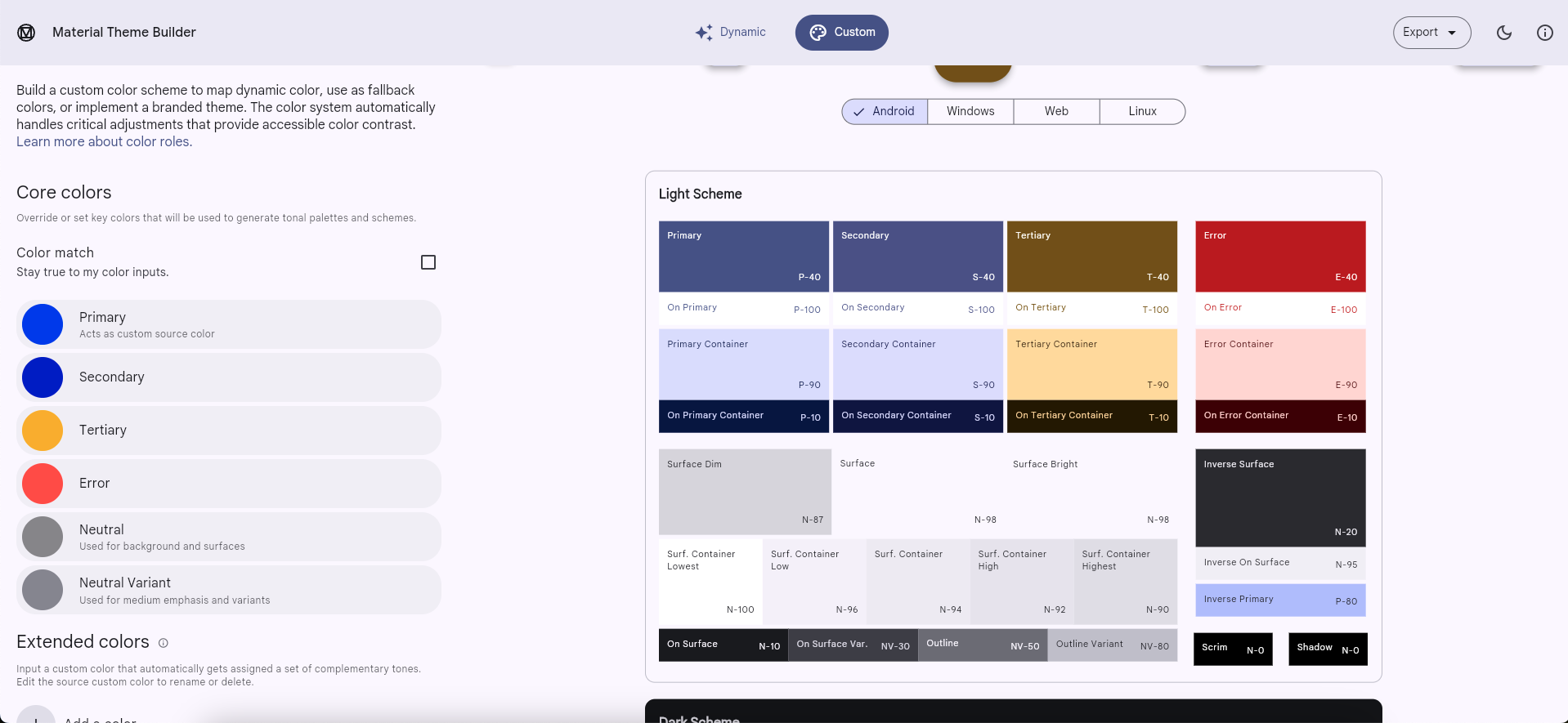
You can copy the color hex code values for light and dark themes from the tool and use them to implement an M3 ColorScheme instance. Alternatively, Material Theme Builder can export Compose code.
isLight
Unlike the M2 Colors class, the M3 ColorScheme class doesn't include an isLight parameter. In general, you should try and model whatever needs this information at the theme level. For example:
M2
import androidx.compose.material.lightColors import androidx.compose.material.darkColors import androidx.compose.material.MaterialTheme @Composable private fun AppTheme( darkTheme: Boolean = isSystemInDarkTheme(), content: @Composable () -> Unit ) { val colors = if (darkTheme) darkColors(…) else lightColors(…) MaterialTheme( colors = colors, content = content ) } @Composable fun AppComposable() { AppTheme { val cardElevation = if (MaterialTheme.colors.isLight) 0.dp else 4.dp … } } M3
import androidx.compose.material3.lightColorScheme import androidx.compose.material3.darkColorScheme import androidx.compose.material3.MaterialTheme val LocalCardElevation = staticCompositionLocalOf { Dp.Unspecified } @Composable private fun AppTheme( darkTheme: Boolean = isSystemInDarkTheme(), content: @Composable () -> Unit ) { val cardElevation = if (darkTheme) 4.dp else 0.dp CompositionLocalProvider(LocalCardElevation provides cardElevation) { val colorScheme = if (darkTheme) darkColorScheme(…) else lightColorScheme(…) MaterialTheme( colorScheme = colorScheme, content = content ) } } @Composable fun AppComposable() { AppTheme { val cardElevation = LocalCardElevation.current … } } See the Custom design systems in Compose guide for more information.
Dynamic color
A new feature in M3 is dynamic color. Instead of using custom colors, an M3 ColorScheme can make use of device wallpaper colors on Android 12 and higher, using the following functions:
Typography
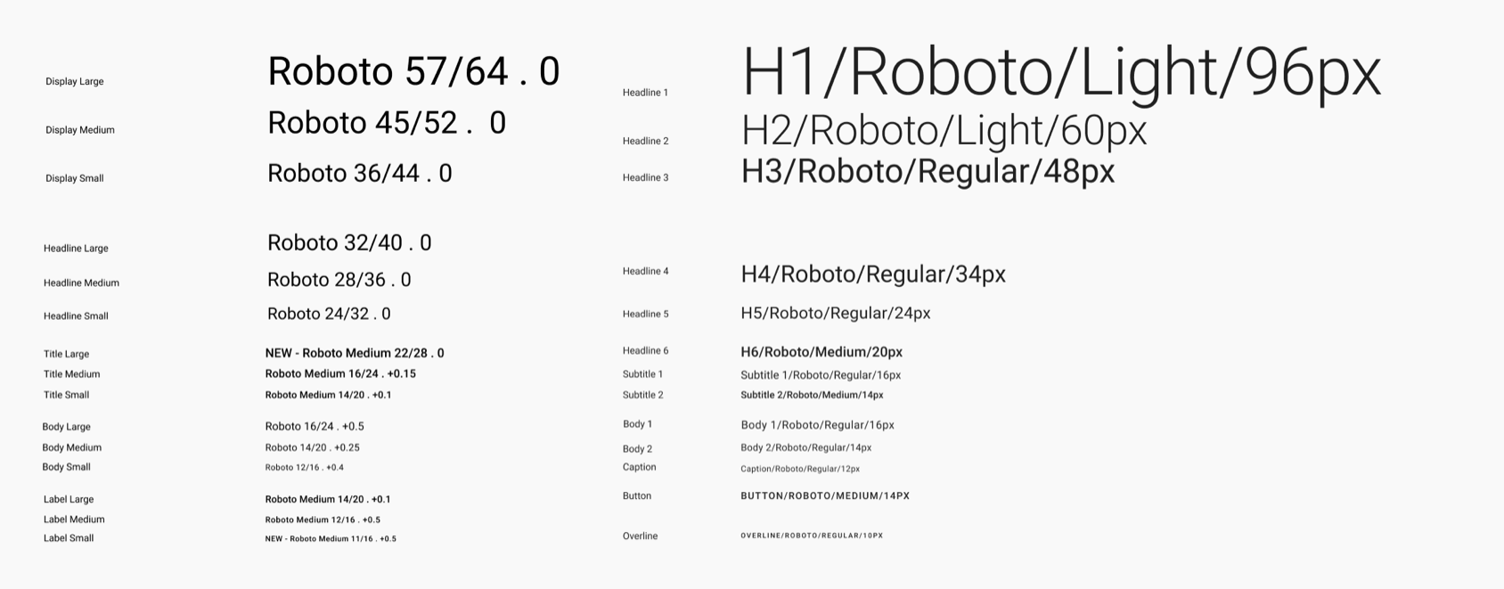
The typography system in M3 is different to M2. The number of typography parameters is roughly the same, but they have different names and they map differently to M3 components. In Compose, this applies to the M2 Typography class and the M3 Typography class:
M2
import androidx.compose.material.Typography val AppTypography = Typography( // M2 TextStyle parameters ) M3
import androidx.compose.material3.Typography val AppTypography = Typography( // M3 TextStyle parameters ) The following TextStyle parameter mappings are recommended as a starting point:
| M2 | M3 |
|---|---|
h1 | displayLarge |
h2 | displayMedium |
h3 | displaySmall |
| N/A | headlineLarge |
h4 | headlineMedium |
h5 | headlineSmall |
h6 | titleLarge |
subtitle1 | titleMedium |
subtitle2 | titleSmall |
body1 | bodyLarge |
body2 | bodyMedium |
caption | bodySmall |
button | labelLarge |
| N/A | labelMedium |
overline | labelSmall |
Shape
The shape system in M3 is different to M2. The number of shape parameters has increased, they're named differently and they map differently to M3 components. In Compose, this applies to the M2 Shapes class and the M3 Shapes class:
M2
import androidx.compose.material.Shapes val AppShapes = Shapes( // M2 Shape parameters ) M3
import androidx.compose.material3.Shapes val AppShapes = Shapes( // M3 Shape parameters ) The following Shape parameter mappings are recommended as a starting point:
| M2 | M3 |
|---|---|
| N/A | extraSmall |
small | small |
medium | medium |
large | large |
| N/A | extraLarge |
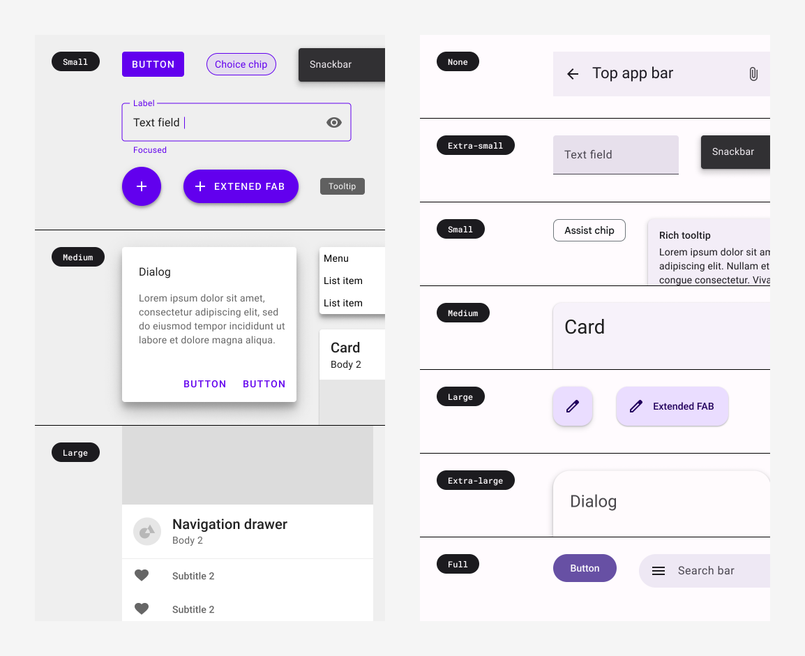
Components and layouts
Most components and layouts from M2 are available in M3. There are, however, some missing as well as new ones that didn't exist in M2. Furthermore, some M3 components have more variations than their equivalents in M2. In general, the M3 API surfaces are designed to be as similar as possible to their closest equivalents in M2.
Given the updated color, typography and shape systems, M3 components tend to map differently to the new theming values. It's a good idea to check out the tokens directory in the Compose Material 3 source code as a source of truth for these mappings.
While some components require special considerations, the following function mappings are recommended as a starting point:
Missing APIs:
| M2 | M3 |
|---|---|
androidx.compose.material.swipeable | Not available yet |
Replaced APIs:
| M2 | M3 |
|---|---|
androidx.compose.material.BackdropScaffold | No M3 equivalent, migrate to Scaffold or BottomSheetScaffold instead |
androidx.compose.material.BottomDrawer | No M3 equivalent, migrate to ModalBottomSheet instead |
Renamed APIs:
All other APIs:
See the latest M3 components and layouts on the Compose Material 3 API reference overview, and keep an eye out on the releases page for new and updated APIs.
Scaffold, snackbars and navigation drawer
Scaffold in M3 is different to M2. In both M2 and M3, the main layout composable is named Scaffold but the import packages and parameters differ:
M2
import androidx.compose.material.Scaffold Scaffold( // M2 scaffold parameters ) M3
import androidx.compose.material3.Scaffold Scaffold( // M3 scaffold parameters ) The M2 Scaffold contains a backgroundColor parameter is now named to containerColor in the M3 Scaffold:
M2
import androidx.compose.material.Scaffold Scaffold( backgroundColor = …, content = { … } ) M3
import androidx.compose.material3.Scaffold Scaffold( containerColor = …, content = { … } ) The M2 ScaffoldState class no longer exists in M3 as it contains a drawerState parameter which is no longer needed. To show snackbars with the M3 Scaffold, use SnackbarHostState instead:
M2
import androidx.compose.material.Scaffold import androidx.compose.material.rememberScaffoldState val scaffoldState = rememberScaffoldState() val scope = rememberCoroutineScope() Scaffold( scaffoldState = scaffoldState, content = { … scope.launch { scaffoldState.snackbarHostState.showSnackbar(…) } } ) M3
import androidx.compose.material3.Scaffold import androidx.compose.material3.SnackbarHost import androidx.compose.material3.SnackbarHostState val snackbarHostState = remember { SnackbarHostState() } val scope = rememberCoroutineScope() Scaffold( snackbarHost = { SnackbarHost(snackbarHostState) }, content = { … scope.launch { snackbarHostState.showSnackbar(…) } } ) All of the drawer* parameters from the M2 Scaffold have been removed from the M3 Scaffold. These include parameters such as drawerShape and drawerContent. To show a drawer with the M3 Scaffold, use a navigation drawer composable, such as ModalNavigationDrawer, instead:
M2
import androidx.compose.material.DrawerValue import import androidx.compose.material.Scaffold import androidx.compose.material.rememberDrawerState import androidx.compose.material.rememberScaffoldState val scaffoldState = rememberScaffoldState( drawerState = rememberDrawerState(DrawerValue.Closed) ) val scope = rememberCoroutineScope() Scaffold( scaffoldState = scaffoldState, drawerContent = { … }, drawerGesturesEnabled = …, drawerShape = …, drawerElevation = …, drawerBackgroundColor = …, drawerContentColor = …, drawerScrimColor = …, content = { … scope.launch { scaffoldState.drawerState.open() } } ) M3
import androidx.compose.material3.DrawerValue import androidx.compose.material3.ModalDrawerSheet import androidx.compose.material3.ModalNavigationDrawer import androidx.compose.material3.Scaffold import androidx.compose.material3.rememberDrawerState val drawerState = rememberDrawerState(DrawerValue.Closed) val scope = rememberCoroutineScope() ModalNavigationDrawer( drawerState = drawerState, drawerContent = { ModalDrawerSheet( drawerShape = …, drawerTonalElevation = …, drawerContainerColor = …, drawerContentColor = …, content = { … } ) }, gesturesEnabled = …, scrimColor = …, content = { Scaffold( content = { … scope.launch { drawerState.open() } } ) } ) Top app bar
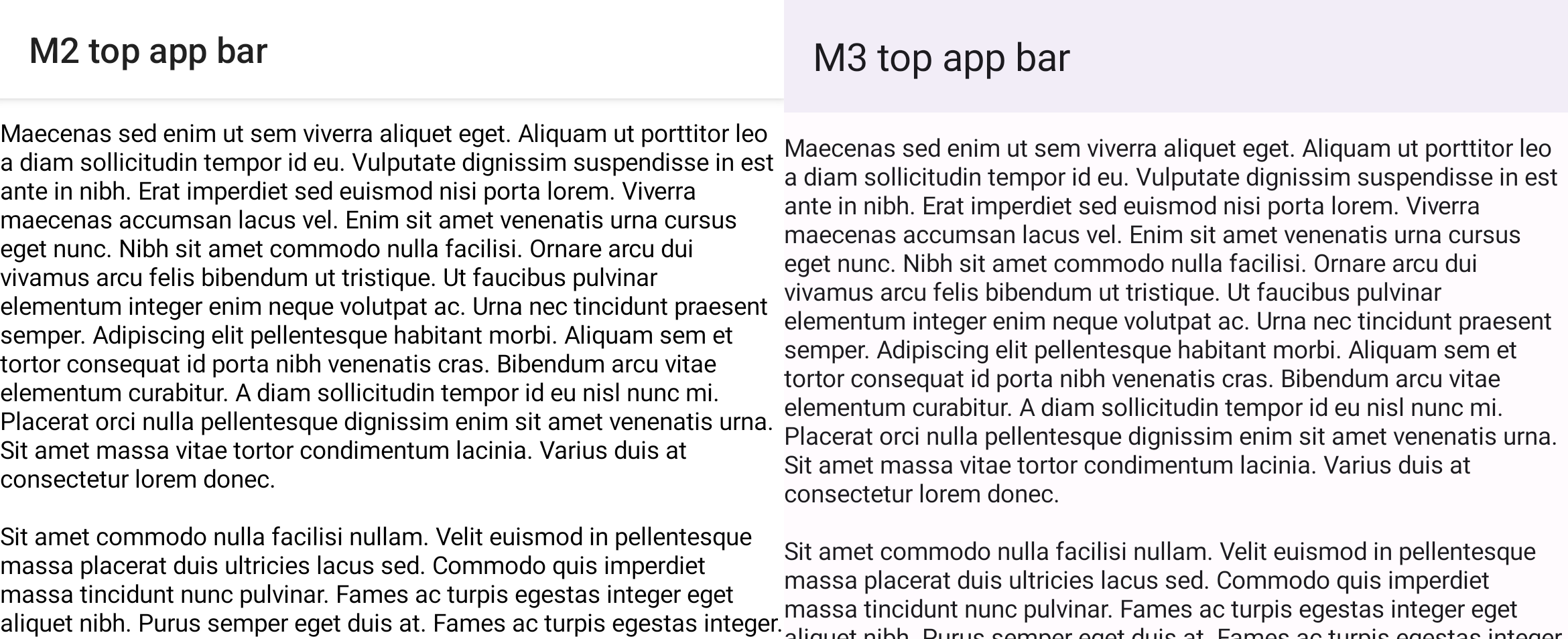
Top app bars in M3 are different to those in M2. In both M2 and M3, the main top app bar composable is named TopAppBar but the import packages and parameters differ:
M2
import androidx.compose.material.TopAppBar TopAppBar(…) M3
import androidx.compose.material3.TopAppBar TopAppBar(…) Consider using the M3 CenterAlignedTopAppBar if you were previously centering content within the M2 TopAppBar. It's good to be aware of the MediumTopAppBar and LargeTopAppBar as well.
M3 top app bars contain a new scrollBehavior parameter to provide different functionality on scroll through the TopAppBarScrollBehavior class, such as changing elevation. This works in conjunction with scrolling content using Modifier.nestedScroll. This was possible in the M2 TopAppBar by manually changing the elevation parameter:
M2
import androidx.compose.material.AppBarDefaults import androidx.compose.material.Scaffold import androidx.compose.material.TopAppBar val state = rememberLazyListState() val isAtTop by remember { derivedStateOf { state.firstVisibleItemIndex == 0 && state.firstVisibleItemScrollOffset == 0 } } Scaffold( topBar = { TopAppBar( elevation = if (isAtTop) { 0.dp } else { AppBarDefaults.TopAppBarElevation }, … ) }, content = { LazyColumn(state = state) { … } } ) M3
import androidx.compose.material3.Scaffold import androidx.compose.material3.TopAppBar import androidx.compose.material3.TopAppBarDefaults val scrollBehavior = TopAppBarDefaults.pinnedScrollBehavior() Scaffold( modifier = Modifier.nestedScroll(scrollBehavior.nestedScrollConnection), topBar = { TopAppBar( scrollBehavior = scrollBehavior, … ) }, content = { LazyColumn { … } } ) Bottom navigation and the navigation bar
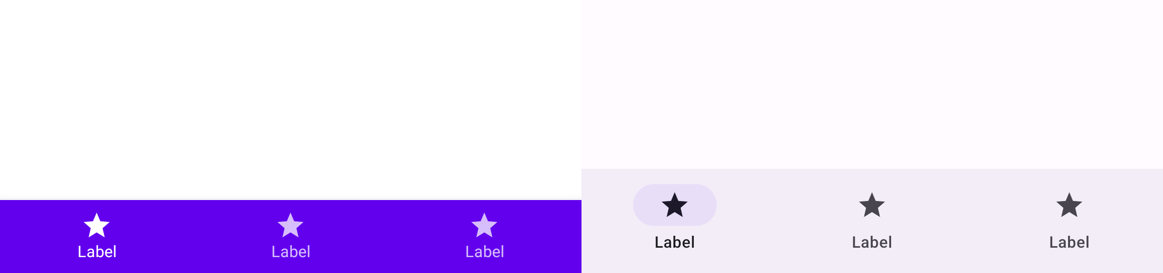
Bottom navigation in M2 has been renamed to navigation bar in M3. In M2 there are the BottomNavigation and BottomNavigationItem composables, while in M3 there are the NavigationBar and NavigationBarItem composables:
M2
import androidx.compose.material.BottomNavigation import androidx.compose.material.BottomNavigationItem BottomNavigation { BottomNavigationItem(…) BottomNavigationItem(…) BottomNavigationItem(…) } M3
import androidx.compose.material3.NavigationBar import androidx.compose.material3.NavigationBarItem NavigationBar { NavigationBarItem(…) NavigationBarItem(…) NavigationBarItem(…) } Buttons, icon buttons and FABs
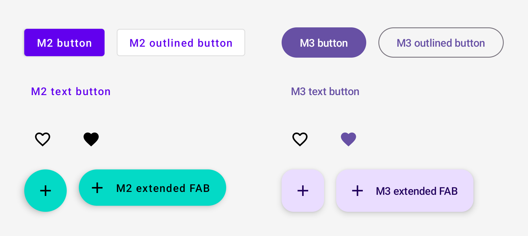
Buttons, icon buttons and floating action buttons (FABs) in M3 are different to those in M2. M3 includes all of the M2 button composables:
M2
import androidx.compose.material.Button import androidx.compose.material.ExtendedFloatingActionButton import androidx.compose.material.FloatingActionButton import androidx.compose.material.IconButton import androidx.compose.material.IconToggleButton import androidx.compose.material.OutlinedButton import androidx.compose.material.TextButton // M2 buttons Button(…) OutlinedButton(…) TextButton(…) // M2 icon buttons IconButton(…) IconToggleButton(…) // M2 FABs FloatingActionButton(…) ExtendedFloatingActionButton(…) M3
import androidx.compose.material3.Button import androidx.compose.material3.ExtendedFloatingActionButton import androidx.compose.material3.FloatingActionButton import androidx.compose.material3.IconButton import androidx.compose.material3.IconToggleButton import androidx.compose.material3.OutlinedButton import androidx.compose.material3.TextButton // M3 buttons Button(…) OutlinedButton(…) TextButton(…) // M3 icon buttons IconButton(…) IconToggleButton(…) // M3 FABs FloatingActionButton(…) ExtendedFloatingActionButton(…) M3 also includes new button variations. Check them out on the Compose Material 3 API reference overview.
Switch
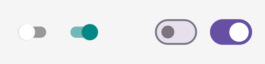
Switch in M3 is different to M2. In both M2 and M3, the switch composable is named Switch but the import packages differ:
M2
import androidx.compose.material.Switch Switch(…) M3
import androidx.compose.material3.Switch Switch(…) Surfaces and elevation
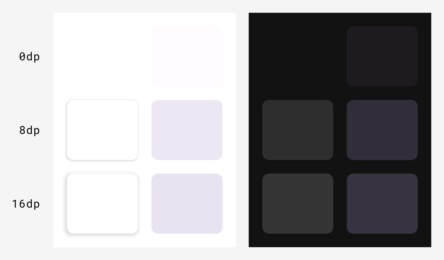
The surface and elevation systems in M3 are different to M2. There are two types of elevation in M3:
- Shadow elevation (casts a shadow, same as M2)
- Tonal elevation (overlays a color, new to M3)
In Compose, this applies to the M2 Surface function and the M3 Surface function:
M2
import androidx.compose.material.Surface Surface( elevation = … ) { … } M3
import androidx.compose.material3.Surface Surface( shadowElevation = …, tonalElevation = … ) { … } You can use the elevation Dp values in M2 for both shadowElevation and/or tonalElevation in M3, depending on the UX/UI design preference. Surface is the backing composable behind most components, so component composables might also expose elevation parameters you must migrate in the same way.
Tonal elevation in M3 replaces the concept of elevation overlays in M2 dark themes. As a result, ElevationOverlay and LocalElevationOverlay don't exist in M3, and LocalAbsoluteElevation in M2 has changed to LocalAbsoluteTonalElevation in M3.
Emphasis and content alpha
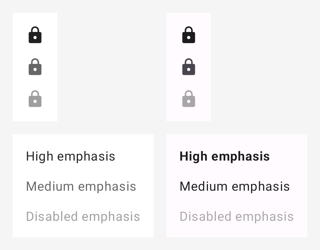
Emphasis in M3 is significantly different to M2. In M2, emphasis involved using on colors with certain alpha values to differentiate content like text and icons. In M3, there are now a couple different approaches:
- Using on colors alongside their variant on colors from the expanded M3 color system.
- Using different font weights for text.
As a result, ContentAlpha and LocalContentAlpha don't exist in M3 and need to be replaced.
The following mappings are recommended as a starting point:
| M2 | M3 |
|---|---|
onSurface with ContentAlpha.high | onSurface in general, FontWeight.Medium - FontWeight.Black for text |
onSurface with ContentAlpha.medium | onSurfaceVariant in general, FontWeight.Thin - FontWeight.Normal for text |
onSurface with ContentAlpha.disabled | onSurface.copy(alpha = 0.38f) |
Here's an example of icon emphasis in M2 versus M3:
M2
import androidx.compose.material.ContentAlpha import androidx.compose.material.LocalContentAlpha // High emphasis CompositionLocalProvider(LocalContentAlpha provides ContentAlpha.high) { Icon(…) } // Medium emphasis CompositionLocalProvider(LocalContentAlpha provides ContentAlpha.medium) { Icon(…) } // Disabled emphasis CompositionLocalProvider(LocalContentAlpha provides ContentAlpha.disabled) { Icon(…) } M3
import androidx.compose.material3.LocalContentColor // High emphasis CompositionLocalProvider(LocalContentColor provides MaterialTheme.colorScheme.onSurface) { Icon(…) } // Medium emphasis CompositionLocalProvider(LocalContentColor provides MaterialTheme.colorScheme.onSurfaceVariant) { Icon(…) } // Disabled emphasis CompositionLocalProvider(LocalContentColor provides MaterialTheme.colorScheme.onSurface.copy(alpha = 0.38f)) { Icon(…) } Here are examples of text emphasis in M2 and M3:
M2
import androidx.compose.material.ContentAlpha import androidx.compose.material.LocalContentAlpha // High emphasis CompositionLocalProvider(LocalContentAlpha provides ContentAlpha.high) { Text(…) } // Medium emphasis CompositionLocalProvider(LocalContentAlpha provides ContentAlpha.medium) { Text(…) } // Disabled emphasis CompositionLocalProvider(LocalContentAlpha provides ContentAlpha.disabled) { Text(…) } M3
import androidx.compose.material3.LocalContentColor // High emphasis Text( …, fontWeight = FontWeight.Bold ) // Medium emphasis Text( …, fontWeight = FontWeight.Normal ) // Disabled emphasis CompositionLocalProvider(LocalContentColor provides MaterialTheme.colorScheme.onSurface.copy(alpha = 0.38f)) { Text( …, fontWeight = FontWeight.Normal ) } Backgrounds and containers
Backgrounds in M2 are named containers in M3. In general, you can replace background* parameters in M2 with container* in M3, using the same values. For example:
M2
Badge( backgroundColor = MaterialTheme.colors.primary ) { … } M3
Badge( containerColor = MaterialTheme.colorScheme.primary ) { … } Useful links
To learn more about migrating from M2 to M3 in Compose, consult the following additional resources.
Docs
Sample apps
- Reply M3 sample app
- Jetchat sample app M2 to M3 migration
- Jetnews sample app M2 to M3 migration
- Now in Android M3 hero app :core-designsystem module
Videos
API reference and source code
Recommended for you
- Note: link text is displayed when JavaScript is off
- Material Design 2 in Compose
- Material Design 3 in Compose
- Custom design systems in Compose