
The navigation drawer component is a slide-in menu that lets users navigate to various sections of your app. Users can activate it by swiping from the side or tapping a menu icon.
Consider these three use cases for implementing a Navigation Drawer:
- Content organization: Enable users to switch between different categories, such as in news or blogging apps.
- Account management: Provide quick links to account settings and profile sections in apps with user accounts.
- Feature discovery: Organize multiple features and settings in a single menu to facilitate user discovery and access in complex apps.
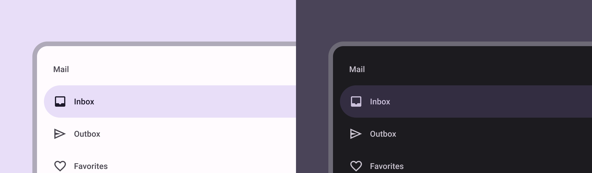
In Material Design, there are two types of navigation drawers:
- Standard: Share space within a screen with other content.
- Modal: Appears over the top of other content within a screen.
Example
You can use the ModalNavigationDrawer composable to implement a navigation drawer.
Use the drawerContent slot to provide a ModalDrawerSheet and provide the drawer's contents, as in the following example:
ModalNavigationDrawer( drawerContent = { ModalDrawerSheet { Text("Drawer title", modifier = Modifier.padding(16.dp)) HorizontalDivider() NavigationDrawerItem( label = { Text(text = "Drawer Item") }, selected = false, onClick = { /*TODO*/ } ) // ...other drawer items } } ) { // Screen content }
ModalNavigationDrawer accepts a number of additional drawer parameters. For example, you can toggle whether or not the drawer responds to drags with the gesturesEnabled parameter as in the following example:
ModalNavigationDrawer( drawerContent = { ModalDrawerSheet { // Drawer contents } }, gesturesEnabled = false ) { // Screen content }
Control behavior
To control how the drawer opens and closes, use DrawerState. You should pass a DrawerState to ModalNavigationDrawer using the drawerState parameter.
DrawerState provides access to the open and close functions, as well as properties related to the current drawer state. These suspending functions require a CoroutineScope, which you can instantiate using rememberCoroutineScope. You can also call the suspending functions in response to UI events.
val drawerState = rememberDrawerState(initialValue = DrawerValue.Closed) val scope = rememberCoroutineScope() ModalNavigationDrawer( drawerState = drawerState, drawerContent = { ModalDrawerSheet { /* Drawer content */ } }, ) { Scaffold( floatingActionButton = { ExtendedFloatingActionButton( text = { Text("Show drawer") }, icon = { Icon(Icons.Filled.Add, contentDescription = "") }, onClick = { scope.launch { drawerState.apply { if (isClosed) open() else close() } } } ) } ) { contentPadding -> // Screen content } }
Create groups within a navigation drawer
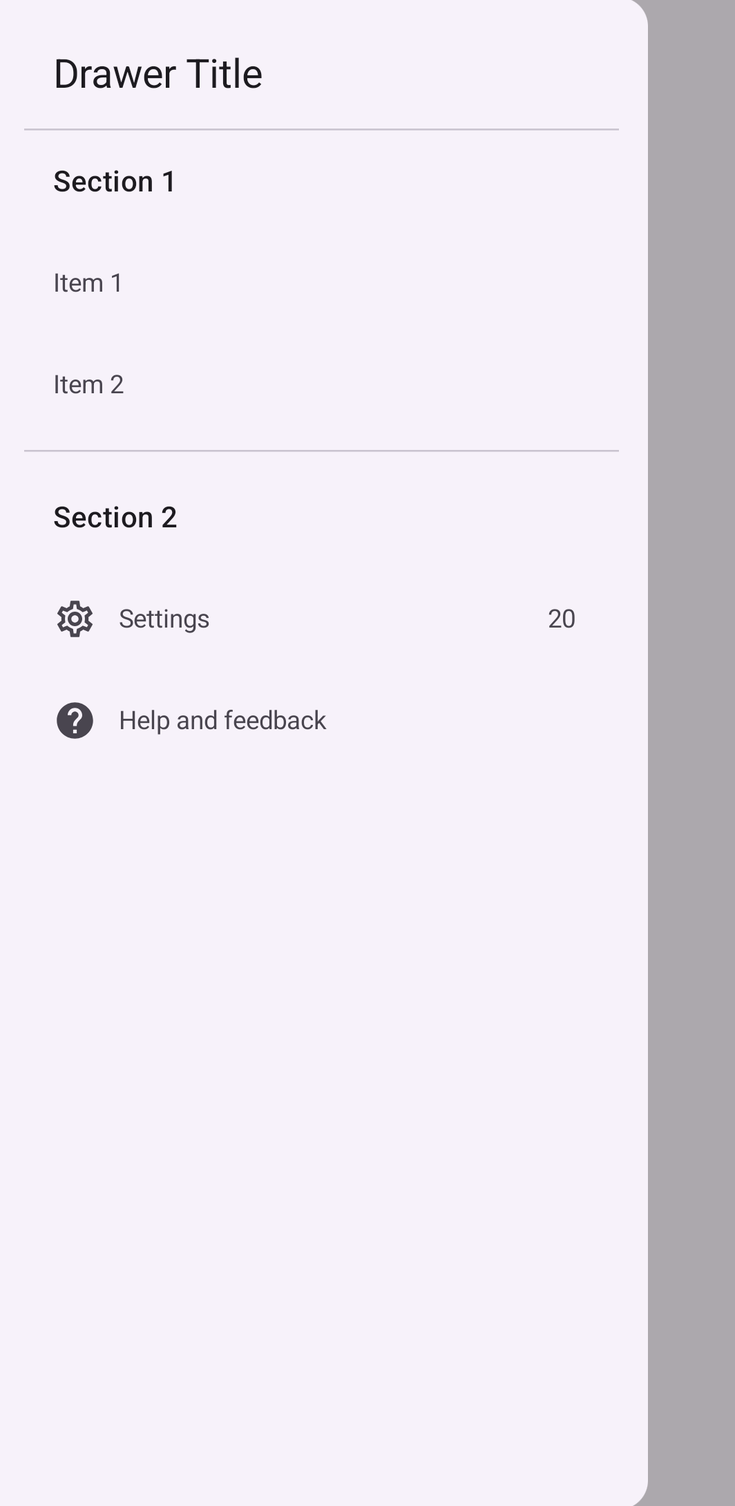
The following snippet shows how to create a detailed navigation drawer, with sections and dividers:
@Composable fun DetailedDrawerExample( content: @Composable (PaddingValues) -> Unit ) { val drawerState = rememberDrawerState(initialValue = DrawerValue.Closed) val scope = rememberCoroutineScope() ModalNavigationDrawer( drawerContent = { ModalDrawerSheet { Column( modifier = Modifier.padding(horizontal = 16.dp) .verticalScroll(rememberScrollState()) ) { Spacer(Modifier.height(12.dp)) Text("Drawer Title", modifier = Modifier.padding(16.dp), style = MaterialTheme.typography.titleLarge) HorizontalDivider() Text("Section 1", modifier = Modifier.padding(16.dp), style = MaterialTheme.typography.titleMedium) NavigationDrawerItem( label = { Text("Item 1") }, selected = false, onClick = { /* Handle click */ } ) NavigationDrawerItem( label = { Text("Item 2") }, selected = false, onClick = { /* Handle click */ } ) HorizontalDivider(modifier = Modifier.padding(vertical = 8.dp)) Text("Section 2", modifier = Modifier.padding(16.dp), style = MaterialTheme.typography.titleMedium) NavigationDrawerItem( label = { Text("Settings") }, selected = false, icon = { Icon(Icons.Outlined.Settings, contentDescription = null) }, badge = { Text("20") }, // Placeholder onClick = { /* Handle click */ } ) NavigationDrawerItem( label = { Text("Help and feedback") }, selected = false, icon = { Icon(Icons.AutoMirrored.Outlined.Help, contentDescription = null) }, onClick = { /* Handle click */ }, ) Spacer(Modifier.height(12.dp)) } } }, drawerState = drawerState ) { Scaffold( topBar = { TopAppBar( title = { Text("Navigation Drawer Example") }, navigationIcon = { IconButton(onClick = { scope.launch { if (drawerState.isClosed) { drawerState.open() } else { drawerState.close() } } }) { Icon(Icons.Default.Menu, contentDescription = "Menu") } } ) } ) { innerPadding -> content(innerPadding) } } }
Key points about the code
- Populates the
drawerContentwith aColumncontaining sections, dividers, and navigation items. ModalDrawerSheetprovides Material Design styling for the drawer.HorizontalDividerseparates sections within the drawer.ModalNavigationDrawercreates the drawer.drawerContentdefines the content of the drawer.- Inside the
ModalDrawerSheet, aColumnarranges the drawer elements vertically. NavigationDrawerItemcomposables represent individual items in the drawer.- The
Scaffoldprovides the basic structure of the screen, including theTopAppBar. - The
navigationIconin theTopAppBarcontrols the drawer's open and close state.
Result
The following image shows how the drawer appears when opened, with sections and items displayed:
Additional resources
- Material Design: Navigation drawer