
In Compose, UI elements are represented by the composable functions that emit a piece of UI when invoked, that is then added to a UI tree that gets rendered on the screen. Each UI element has one parent and potentially many children. Each element is also located within its parent, specified as an (x, y) position, and a size, specified as a width and a height.
Parents define the constraints for their child elements. An element is asked to define its size within those constraints. Constraints restrict the minimum and maximum width and height of an element. If an element has child elements, it may measure each child to help determine its size. Once an element determines and reports its own size, it has an opportunity to define how to place its child elements relative to itself, as described in detail in Creating custom layouts.
Laying out each node in the UI tree is a three step process. Each node must:
- Measure any children
- Decide its own size
- Place its children

The use of scopes defines when you can measure and place your children. Measuring a layout can only be done during the measurement and layout passes, and a child can only be placed during the layout passes (and only after it has been measured). Due to Compose scopes such as MeasureScope, and PlacementScope, this is enforced at compile time.
Use the layout modifier
You can use the layout modifier to modify how an element is measured and laid out. Layout is a lambda; its parameters include the element you can measure, passed as measurable, and that composable's incoming constraints, passed as constraints. A custom layout modifier can look like this:
fun Modifier.customLayoutModifier() = layout { measurable, constraints -> // ... }
Display a Text on the screen and control the distance from the top to the baseline of the first line of text. This is exactly what the paddingFromBaseline modifier does; you're implementing it here as an example. To do that, use the layout modifier to manually place the composable on the screen. Here's the resulting behavior where the Text top padding is set to 24.dp:
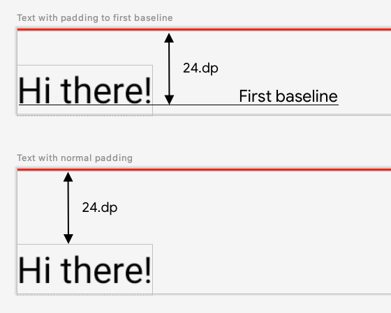
paddingFromBaseline applied. Here's the code to produce that spacing:
fun Modifier.firstBaselineToTop( firstBaselineToTop: Dp ) = layout { measurable, constraints -> // Measure the composable val placeable = measurable.measure(constraints) // Check the composable has a first baseline check(placeable[FirstBaseline] != AlignmentLine.Unspecified) val firstBaseline = placeable[FirstBaseline] // Height of the composable with padding - first baseline val placeableY = firstBaselineToTop.roundToPx() - firstBaseline val height = placeable.height + placeableY layout(placeable.width, height) { // Where the composable gets placed placeable.placeRelative(0, placeableY) } }
Here's what's going on in that code:
- In the
measurablelambda parameter, you measure theTextrepresented by the measurable parameter by callingmeasurable.measure(constraints). - You specify the size of the composable by calling the
layout(width, height)method, which also gives a lambda used for placing the wrapped elements. In this case, it's the height between the last baseline and added top padding. - You position the wrapped elements on the screen by calling
placeable.place(x, y). If the wrapped elements aren't placed, they won't be visible. Theyposition corresponds to the top padding: the position of the first baseline of the text.
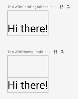
To verify this works as expected, use this modifier on a Text:
@Preview @Composable fun TextWithPaddingToBaselinePreview() { MyApplicationTheme { Text("Hi there!", Modifier.firstBaselineToTop(32.dp)) } } @Preview @Composable fun TextWithNormalPaddingPreview() { MyApplicationTheme { Text("Hi there!", Modifier.padding(top = 32.dp)) } }
Text composable and previewed. Create custom layouts
The layout modifier only changes the calling composable. To measure and layout multiple composables, use the Layout composable instead. This composable lets you measure and lay out children manually. All higher-level layouts like Column and Row are built with the Layout composable.
This example builds a very basic version of Column. Most custom layouts follow this pattern:
@Composable fun MyBasicColumn( modifier: Modifier = Modifier, content: @Composable () -> Unit ) { Layout( modifier = modifier, content = content ) { measurables, constraints -> // measure and position children given constraints logic here // ... } }
Similarly to the layout modifier, measurables is the list of children that need to be measured and constraints are the constraints from the parent. Following the same logic as before, MyBasicColumn can be implemented like this:
@Composable fun MyBasicColumn( modifier: Modifier = Modifier, content: @Composable () -> Unit ) { Layout( modifier = modifier, content = content ) { measurables, constraints -> // Don't constrain child views further, measure them with given constraints // List of measured children val placeables = measurables.map { measurable -> // Measure each children measurable.measure(constraints) } // Set the size of the layout as big as it can layout(constraints.maxWidth, constraints.maxHeight) { // Track the y co-ord we have placed children up to var yPosition = 0 // Place children in the parent layout placeables.forEach { placeable -> // Position item on the screen placeable.placeRelative(x = 0, y = yPosition) // Record the y co-ord placed up to yPosition += placeable.height } } } }
The child composables are constrained by the Layout constraints (without the minHeight constraints), and they're placed based on the yPosition of the previous composable.
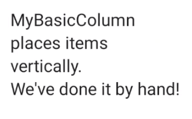
Here's how that custom composable would be used:
@Composable fun CallingComposable(modifier: Modifier = Modifier) { MyBasicColumn(modifier.padding(8.dp)) { Text("MyBasicColumn") Text("places items") Text("vertically.") Text("We've done it by hand!") } }
Column implementation. Layout direction
Change the layout direction of a composable by changing the LocalLayoutDirection composition local.
If you're placing composables manually on the screen, the LayoutDirection is part of the LayoutScope of the layout modifier or Layout composable.
When using layoutDirection, place composables using place. Unlike the placeRelative method, place doesn't change based on the layout direction (left-to-right versus right-to-left).
Custom layouts in action
Learn more about layouts and modifiers in the Basic layouts in Compose, and see custom layouts in action in the Compose samples that create custom layouts.
Learn more
To learn more about custom layouts in Compose, consult the following additional resources.
Videos
Recommended for you
- Note: link text is displayed when JavaScript is off
- Intrinsic measurements in Compose layouts
- Graphics in Compose
- Compose modifiers