
 Data Structure
 Networking
 RDBMS
RDBMS Operating System
 Java
Java MS Excel
 iOS
iOS HTML
HTML CSS
CSS Android
 Python
 C Programming
 C++
C++ C#
C# MongoDB
 MySQL
MySQL Javascript
 PHP
PHP
- Selected Reading
- UPSC IAS Exams Notes
- Developer's Best Practices
- Questions and Answers
- Effective Resume Writing
- HR Interview Questions
- Computer Glossary
- Who is Who
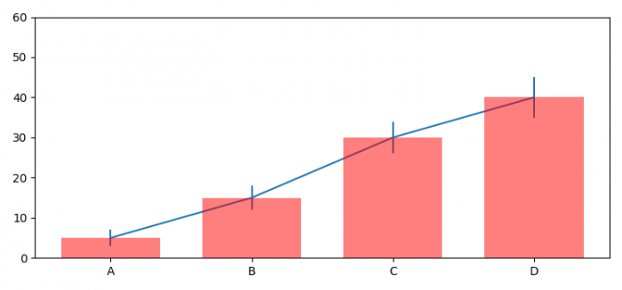
Indicating the statistically significant difference in bar graph (Matplotlib)
To indicate the statistically significant difference in bar graph, we can take the following steps −
- Set the figure size and adjust the padding between and around the subplots.
- Create means, std, index, width and labels data points.
- Create a figure and a set of subplots using subplots() method.
- Make a bar plot using bar() method.
- Plot Y versus X as lines and/or markers with attached errorbars.Scale the Y-axis.
- Get or set the current tick locations and labels of the X-axis.
- To display the figure, use show() method.
Example
import numpy as np import matplotlib.pyplot as plt plt.rcParams["figure.figsize"] = [7.50, 3.50] plt.rcParams["figure.autolayout"] = True means = (5, 15, 30, 40) std = (2, 3, 4, 5) index = np.arange(4) width = 0.7 labels = ('A', 'B', 'C', 'D') fig, ax = plt.subplots() ax.p1 = plt.bar(index, means, width=width, color="red", linewidth=2, zorder=5, alpha=0.5) ax.errs = plt.errorbar(index, means, yerr=std) plt.ylim(ymax=60) plt.xticks(index, labels, color='k') plt.show() Output

Updated on: 2021-06-09T11:41:30+05:30
557 Views

Advertisements