
 Data Structure
 Networking
 RDBMS
RDBMS Operating System
 Java
Java MS Excel
 iOS
iOS HTML
HTML CSS
CSS Android
 Python
 C Programming
 C++
C++ C#
C# MongoDB
 MySQL
MySQL Javascript
 PHP
PHP
- Selected Reading
- UPSC IAS Exams Notes
- Developer's Best Practices
- Questions and Answers
- Effective Resume Writing
- HR Interview Questions
- Computer Glossary
- Who is Who
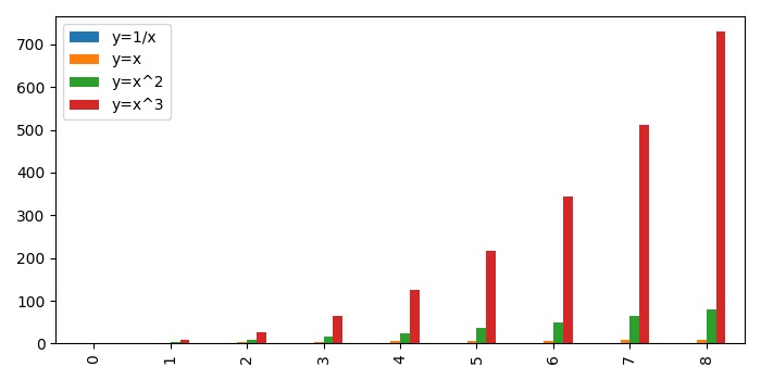
How to plot a bar graph in Matplotlib from a Pandas series?
To plot a bar graph from a Pandas series in matplotlib, we can take the following Steps −
Make a dictionary of different keys, between the range 1 to 10.
Make a dataframe using Pandas data frame.
Create a bar plot using plot() method with kind="bar".
To display the figure, use show() method.
Example
import pandas as pd from matplotlib import pyplot as plt plt.rcParams["figure.figsize"] = [7.00, 3.50] plt.rcParams["figure.autolayout"] = True d = {'y=1/x': [1 / i for i in range(1, 10)], 'y=x': [i for i in range(1, 10)], 'y=x^2': [i * i for i in range(1, 10)], 'y=x^3': [i * i * i for i in range(1, 10)]} df = pd.DataFrame(d) df.plot(kind='bar') plt.show() Output

Updated on: 2021-05-15T12:45:45+05:30
2K+ Views

Advertisements