
 Data Structure
 Networking
 RDBMS
RDBMS Operating System
 Java
Java MS Excel
 iOS
iOS HTML
HTML CSS
CSS Android
 Python
 C Programming
 C++
C++ C#
C# MongoDB
 MySQL
MySQL Javascript
 PHP
PHP
- Selected Reading
- UPSC IAS Exams Notes
- Developer's Best Practices
- Questions and Answers
- Effective Resume Writing
- HR Interview Questions
- Computer Glossary
- Who is Who
Python - How to plot a Pandas DataFrame in a Bar Graph
Let’s say the following are the contents of our CSV file −
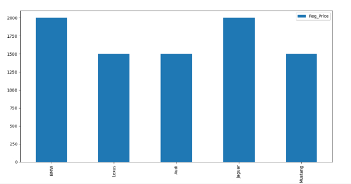
Car Reg_Price 0 BMW 2000 1 Lexus 1500 2 Audi 1500 3 Jaguar 2000 4 Mustang 1500
Import the required libraries −
import pandas as pd import matplotlib.pyplot as mp
Our CSV file is on the Desktop. Load data from a CSV file into a Pandas DataFrame −
d = pd.read_csv("C:\Users\amit_\Desktop\SalesData.csv") dataFrame = pd.DataFrame(d.head(), columns=["Car","Reg_Price"]) Plot the DataFrame −
dataFrame.plot(x="Car", y="Reg_Price", kind="bar", figsize=(10, 9))
Example
Following is the code −
import pandas as pd import matplotlib.pyplot as mp # read csv d = pd.read_csv("C:\Users\amit_\Desktop\SalesData.csv") print("\nReading the CSV file...\n",d) # dataframe dataFrame = pd.DataFrame(d.head(), columns=["Car","Reg_Price"]) # plotting the dataframe dataFrame.plot(x="Car", y="Reg_Price", kind="bar", figsize=(10, 9)) # displaying bar graph mp.show() Output
This will display the following output −

Updated on: 2021-09-29T09:06:36+05:30
3K+ Views

Advertisements