
 Data Structure
 Networking
 RDBMS
RDBMS Operating System
 Java
Java MS Excel
 iOS
iOS HTML
HTML CSS
CSS Android
 Python
 C Programming
 C++
C++ C#
C# MongoDB
 MySQL
MySQL Javascript
 PHP
PHP
- Selected Reading
- UPSC IAS Exams Notes
- Developer's Best Practices
- Questions and Answers
- Effective Resume Writing
- HR Interview Questions
- Computer Glossary
- Who is Who
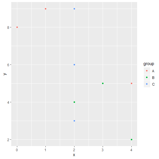
How to create a scatterplot with colors of the group of points in R?
A scatterplot is the plot that has one dependent variable plotted on Y-axis and one independent variable plotted on X-axis. Sometimes the pair of dependent and independent variable are grouped with some characteristics, thus, we might want to create the scatterplot with different colors of the group based on characteristics. For this purpose, we can use colour argument in ggplot function.
Example
Consider the below data frame −
set.seed(123) x <-rpois(10,2) y <-rpois(10,5) group <-c("A","B","C","A","A","A","C","B","B","C") df <-data.frame(x,y,group) df Output
x y group 1 1 9 A 2 3 5 B 3 2 6 C 4 4 5 A 5 4 2 A 6 0 8 A 7 2 3 C 8 4 2 B 9 2 4 B 10 2 9 C
Example
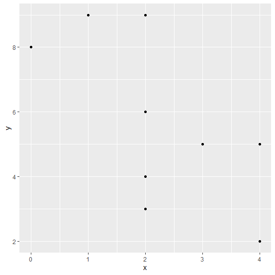
Creating a simple scatterplot −
library(ggplot2) ggplot(df,aes(x,y))+geom_point()
Output
Creating a scatterplot with color of points based on groups −
ggplot(df,aes(x,y,colour=group))+geom_point()
Output

Updated on: 2020-08-24T12:56:05+05:30
728 Views

Advertisements