
 Data Structure
 Networking
 RDBMS
RDBMS Operating System
 Java
Java MS Excel
 iOS
iOS HTML
HTML CSS
CSS Android
 Python
 C Programming
 C++
C++ C#
C# MongoDB
 MySQL
MySQL Javascript
 PHP
PHP
- Selected Reading
- UPSC IAS Exams Notes
- Developer's Best Practices
- Questions and Answers
- Effective Resume Writing
- HR Interview Questions
- Computer Glossary
- Who is Who
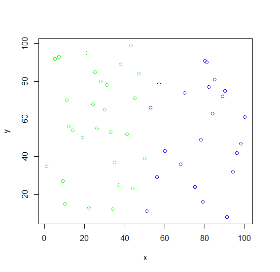
How to create a scatterplot with colors as group in R?
To create a scatterplot with colors as group, we can define the colors in col argument as characters.
For Example, if we have two vectors then we can create scatterplot between x and y with red and blue colors for x and y value by using the below mentioned command −
plot(x,y,col=as.character(cut(x,2,labels=c("red","blue")))) Example
Following snippet creates a sample data frame −
x<-sample(1:100,50) x
The following dataframe is created
[1] 51 85 47 78 96 9 5 94 12 53 81 10 14 34 91 75 35 31 90 [20] 24 41 68 19 28 7 22 100 45 70 98 30 11 56 25 82 26 37 33 [39] 84 50 80 43 1 60 89 38 79 57 44 21
Following snippet creates a sample data frame −
y<-sample(1:100,50) y
The following dataframe is created
[1] 11 81 84 49 42 27 92 32 56 66 90 15 54 12 8 24 37 78 75 68 52 36 50 80 93 [26] 13 61 71 74 47 65 70 29 85 77 55 25 53 63 39 91 99 35 43 72 89 16 79 23 95
To create a scatterplot with colors as group on the above created data frame, add the following code to the above snippet −
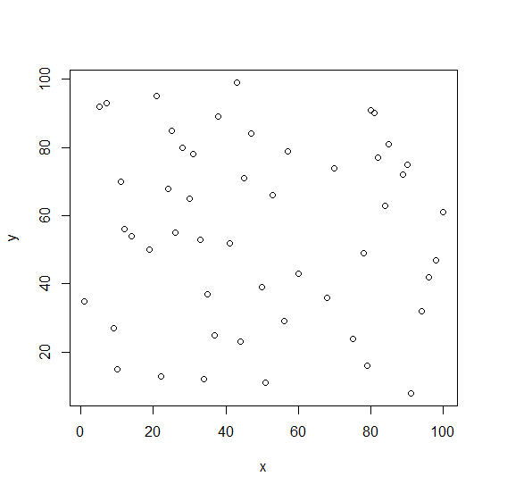
x<-sample(1:100,50) y<-sample(1:100,50) plot(x,y)
Output
If you execute all the above given snippets as a single program, it generates the following Output −
To create a scatterplot with colors as group on the above created data frame, add the following code to the above snippet −
x<-sample(1:100,50) y<-sample(1:100,50) plot(x,y,col=as.character(cut(x,2,labels=c("green","blue")))) Output
If you execute all the above given snippets as a single program, it generates the following Output −

185 Views
