
 Data Structure
 Networking
 RDBMS
RDBMS Operating System
 Java
Java MS Excel
 iOS
iOS HTML
HTML CSS
CSS Android
 Python
 C Programming
 C++
C++ C#
C# MongoDB
 MySQL
MySQL Javascript
 PHP
PHP
- Selected Reading
- UPSC IAS Exams Notes
- Developer's Best Practices
- Questions and Answers
- Effective Resume Writing
- HR Interview Questions
- Computer Glossary
- Who is Who
How to create a scatterplot with log10 of dependent variable in R?
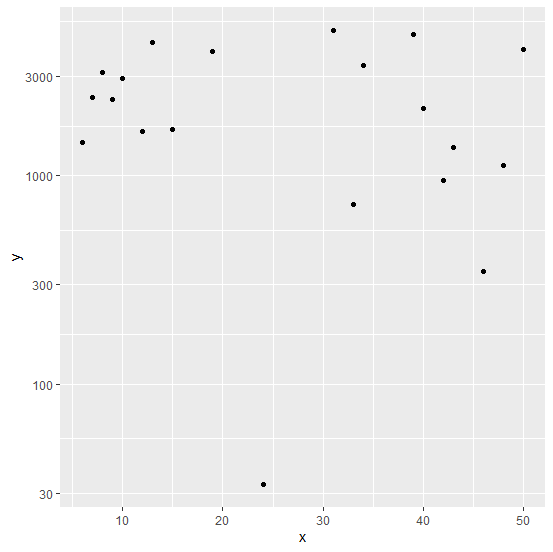
Most of the times, the relationship between independent variable and dependent variable is not linear. Therefore, we want to transform the dependent variable or independent variable based on our experiences. Hence, we also want to plot those transformations to visualize the relationship, one such transformation is taking log10 of the dependent variable. To plot this transformation of the dependent variable, we can use scale_y_continuous(trans='log10').
Example
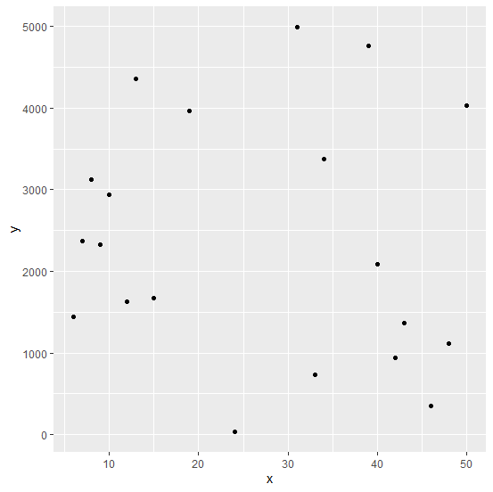
Consider the below data frame −
set.seed(10) x <-sample(1:50,20) y <-sample(1:5000,20) df <-data.frame(x,y)
Creating a scatterplot between x and y −
Example
library(ggplot2) ggplot(df,aes(x,y))+geom_point()
Output
Creating a scatterplot between x and log10 of y &minus
ggplot(df,aes(x,y))+geom_point()+scale_y_continuous(trans='log10')
Output

Updated on: 2020-08-24T12:30:28+05:30
479 Views

Advertisements