
 Data Structure
 Networking
 RDBMS
RDBMS Operating System
 Java
Java MS Excel
 iOS
iOS HTML
HTML CSS
CSS Android
 Python
 C Programming
 C++
C++ C#
C# MongoDB
 MySQL
MySQL Javascript
 PHP
PHP
- Selected Reading
- UPSC IAS Exams Notes
- Developer's Best Practices
- Questions and Answers
- Effective Resume Writing
- HR Interview Questions
- Computer Glossary
- Who is Who
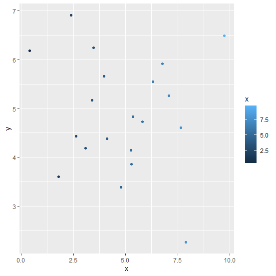
How to change the color of points in a scatterplot using ggplot2 in R?
To color the points in a scatterplot using ggplot2, we can use colour argument inside geom_point with aes. The color can be passed in multiple ways, one such way is to name the particular color and the other way is to giving a range or using a variable. If range or a variable will be used then the color of the points will be in different shades.
Example
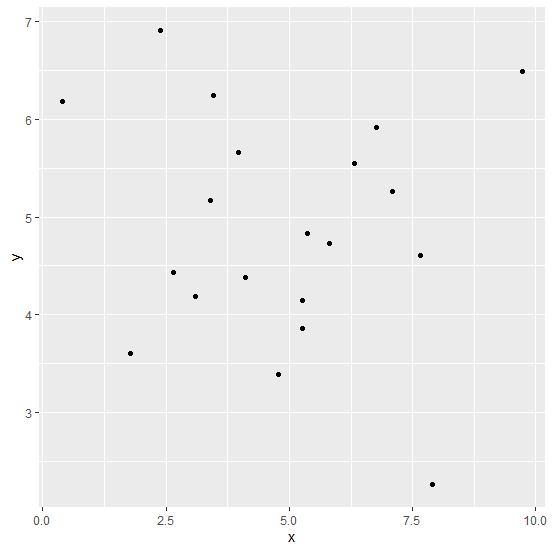
Consider the below data frame −
x<−rnorm(20,5,2) y<−rnorm(20,5,1.25) df<−data.frame(x,y) df
Output
x y 1 6.3184535 5.548867 2 3.4643698 6.247067 3 7.8930528 2.259042 4 7.6517535 4.606704 5 1.7838941 3.605288 6 0.3985215 6.183794 7 5.2738435 3.857376 8 4.7734419 3.389663 9 3.9727197 5.662962 10 3.3976335 5.172815 11 4.1068840 4.379264 12 6.7723590 5.914132 13 3.0944360 4.184177 14 7.0857100 5.266121 15 2.6391362 4.433864 16 5.2571231 4.144391 17 5.8119542 4.725406 18 5.3608015 4.828909 19 9.7308286 6.489042 20 2.3823201 6.916862
Loading ggplot2 package and creating a scatterplot −
library(ggplot2) ggplot(df,aes(x,y,col=x))+geom_point()
Output
Creating the scatterplot by using the variable x −
Example
ggplot(df,aes(x,y))+geom_point(aes(colour=x))
Output

Updated on: 2021-02-05T08:45:38+05:30
20K+ Views

Advertisements