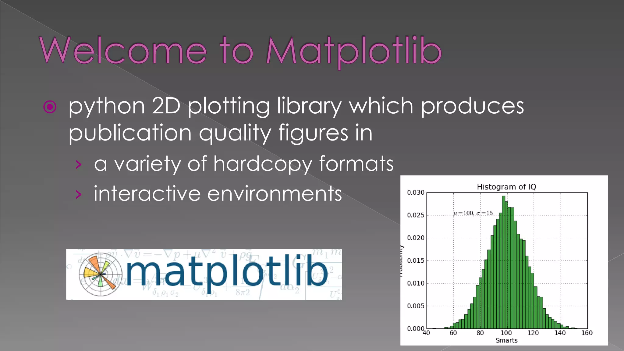
Matplotlib is a 2D plotting library for Python that can generate publication-quality figures in both hardcopy and interactive formats. The document provides examples of using Matplotlib to plot lines, histograms, pie charts, scatter plots, subplots, and mathematical functions. Additional resources are also listed for learning more about Matplotlib and an example dataset on apple production by variety.

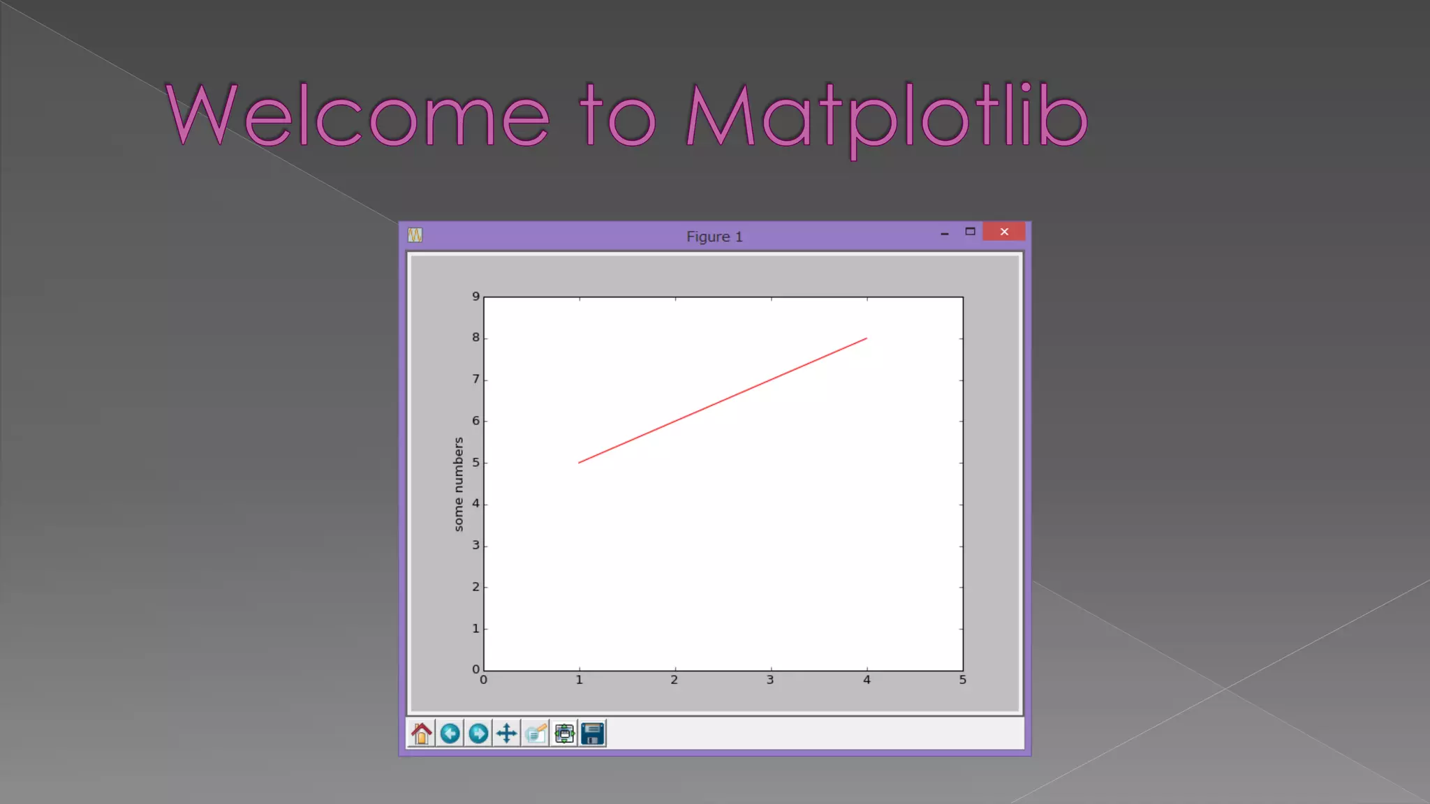
![import matplotlib.pyplot as plt # x data, y data, style plt.plot([1,2,3,4], [5,6,7,8], 'r-') # [x min, x max, y min, y max] plt.axis([0, 5, 0, 9]) plt.ylabel('some numbers') plt.show()](https://image.slidesharecdn.com/pylecture5pythonplots-150624045419-lva1-app6891/75/Py-lecture5-python-plots-3-2048.jpg)
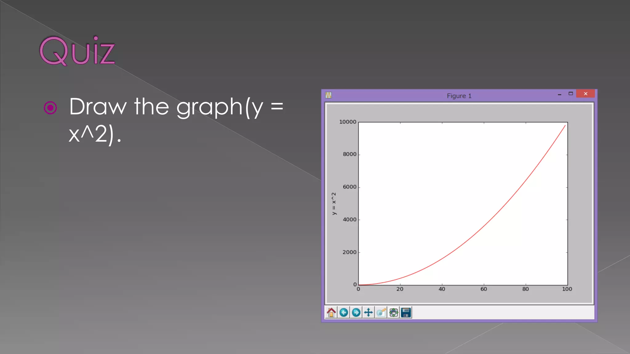
![x = range(100) y = [i * i for i in x] plt.plot(x, y, 'r-') plt.ylabel('y = x^2') plt.show()](https://image.slidesharecdn.com/pylecture5pythonplots-150624045419-lva1-app6891/75/Py-lecture5-python-plots-6-2048.jpg)
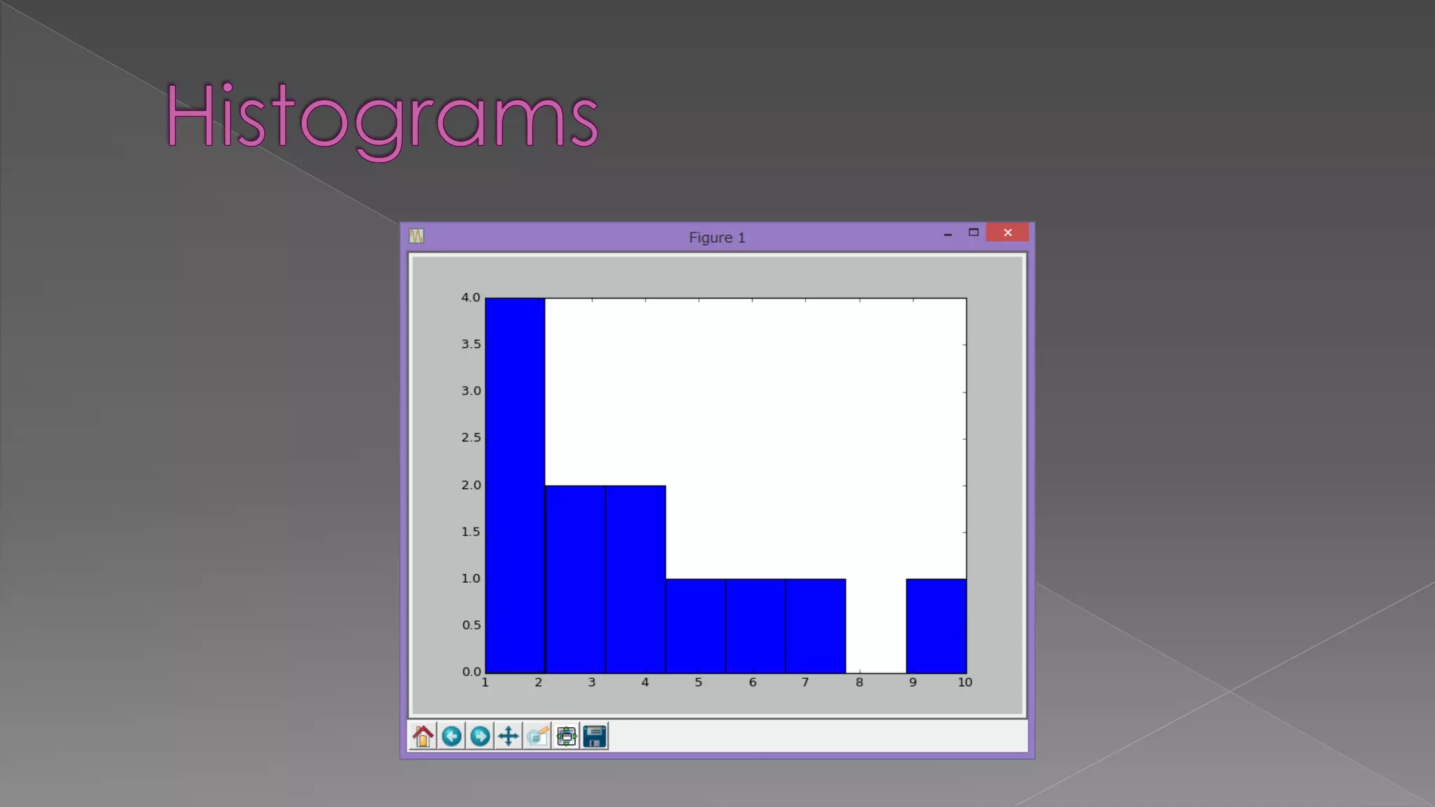
![import matplotlib.pyplot as plt data = [2, 7, 6, 4, 1, 10, 3, 2, 4, 5, 3, 1] plt.hist(data, bins=8, facecolor='blue') plt.show()](https://image.slidesharecdn.com/pylecture5pythonplots-150624045419-lva1-app6891/75/Py-lecture5-python-plots-7-2048.jpg)
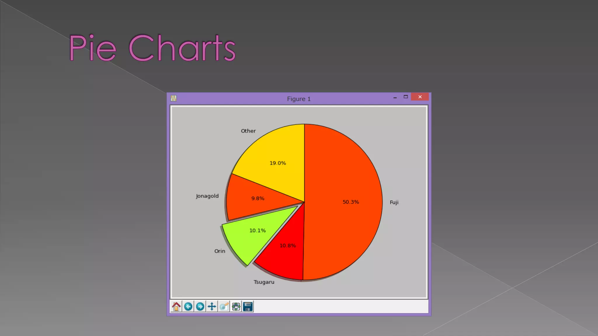
![import matplotlib.pyplot as plt # The slices will be ordered and plotted counter-clockwise. labels = 'Fuji', 'Tsugaru', 'Orin', 'Jonagold', 'Other' sizes = [235500, 50600, 47100, 45700, 89100] colors = ['orangered', 'red', 'greenyellow', 'orangered', 'gold'] explode = (0, 0, 0.1, 0, 0) # only "explode" the 3rd slice (i.e. 'Orin') plt.pie(sizes, explode=explode, labels=labels, colors=colors, autopct='%1.1f%%', shadow=True, startangle=90, counterclock=False) # Set aspect ratio to be equal so that pie is drawn as a circle. plt.axis('equal') plt.show()](https://image.slidesharecdn.com/pylecture5pythonplots-150624045419-lva1-app6891/75/Py-lecture5-python-plots-9-2048.jpg)

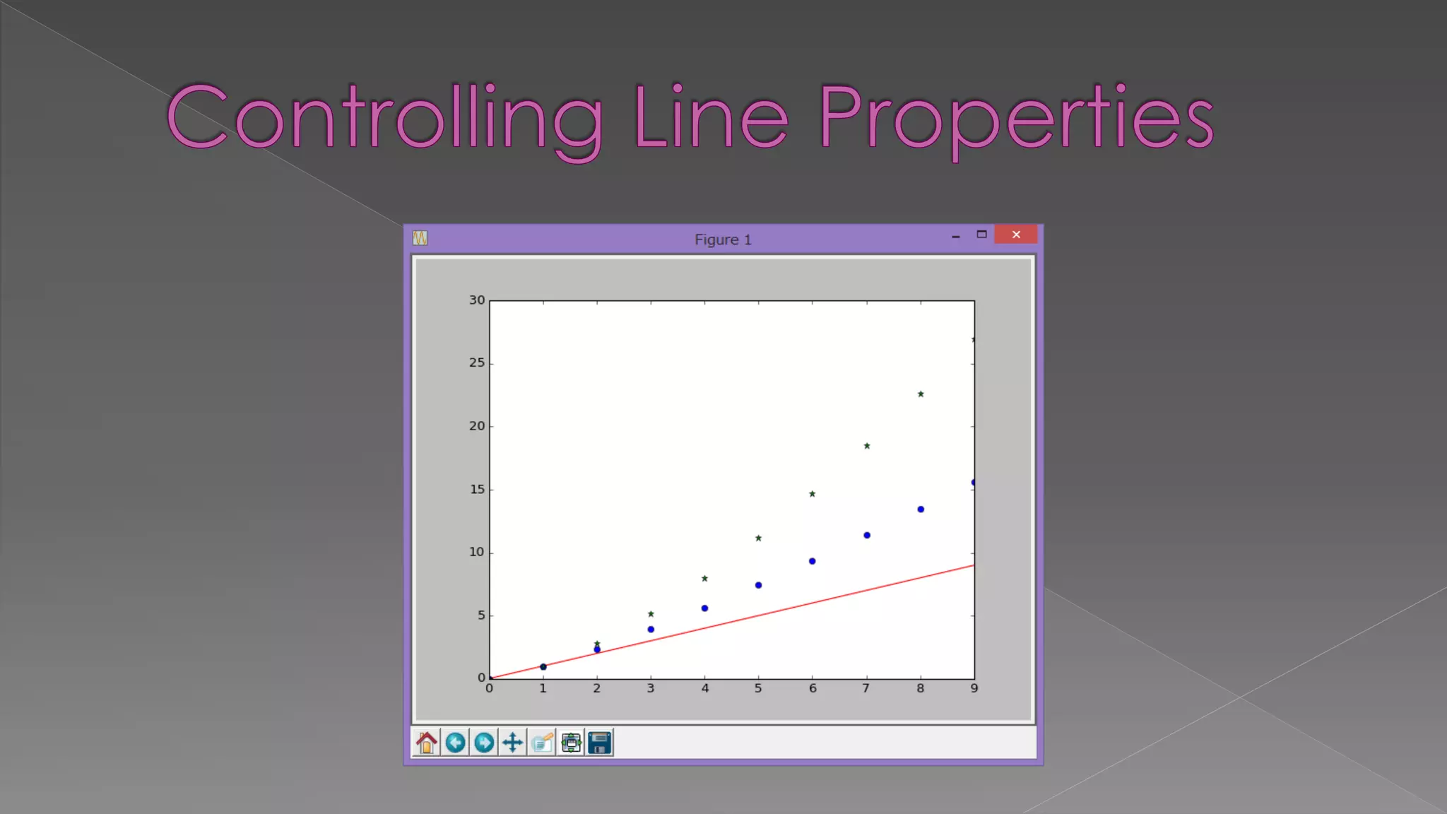
![ For more properties, do › lines=plt.plot([1, 2, 3]) › plt.setp(lines)](https://image.slidesharecdn.com/pylecture5pythonplots-150624045419-lva1-app6891/75/Py-lecture5-python-plots-13-2048.jpg)