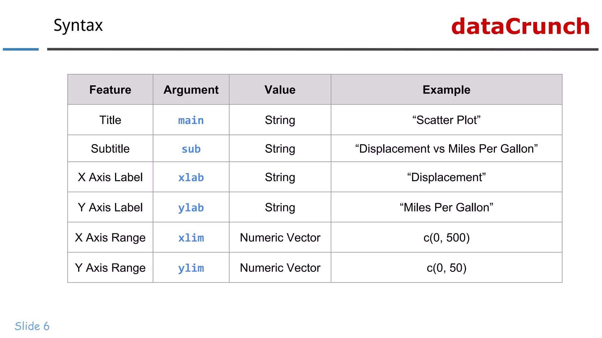
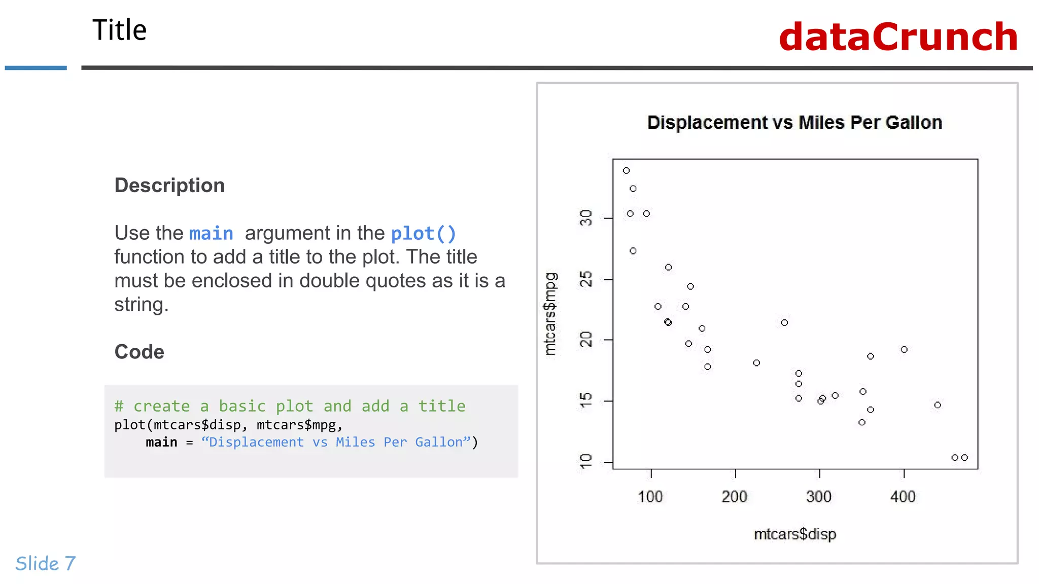
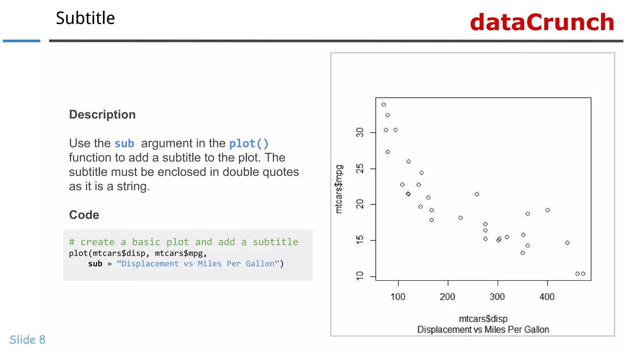
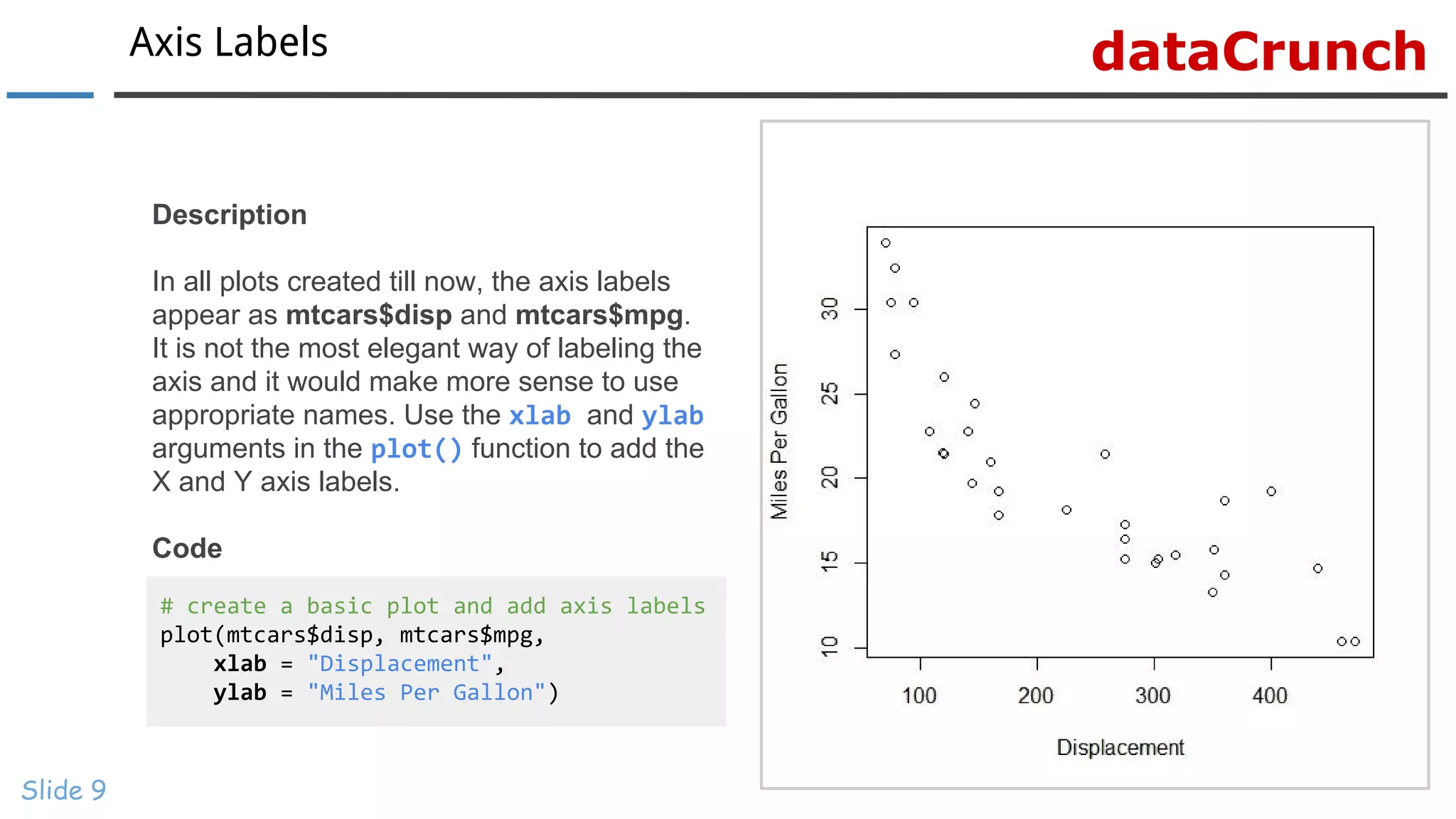
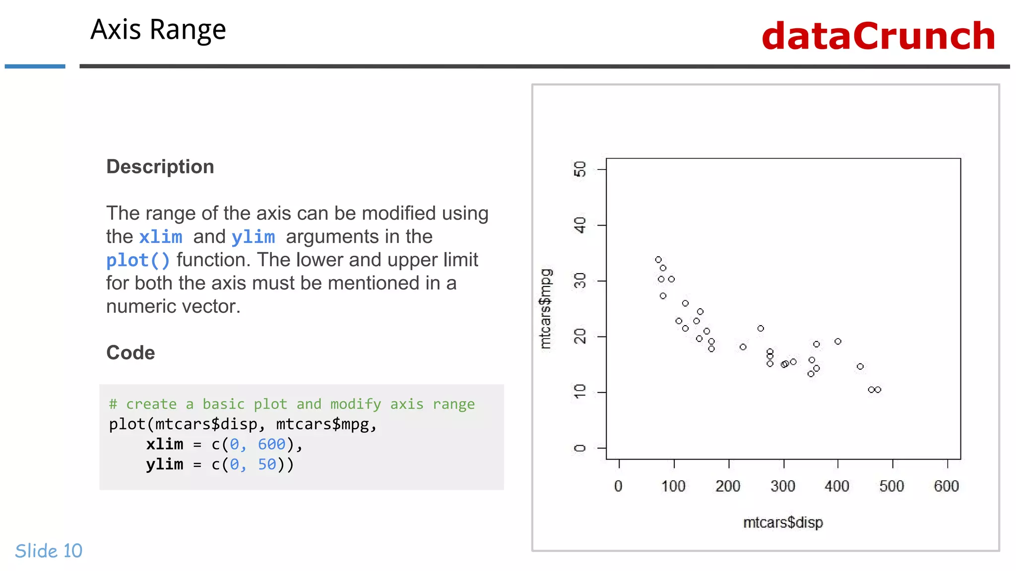
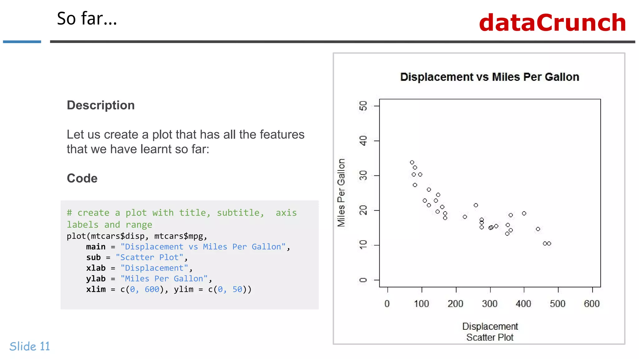
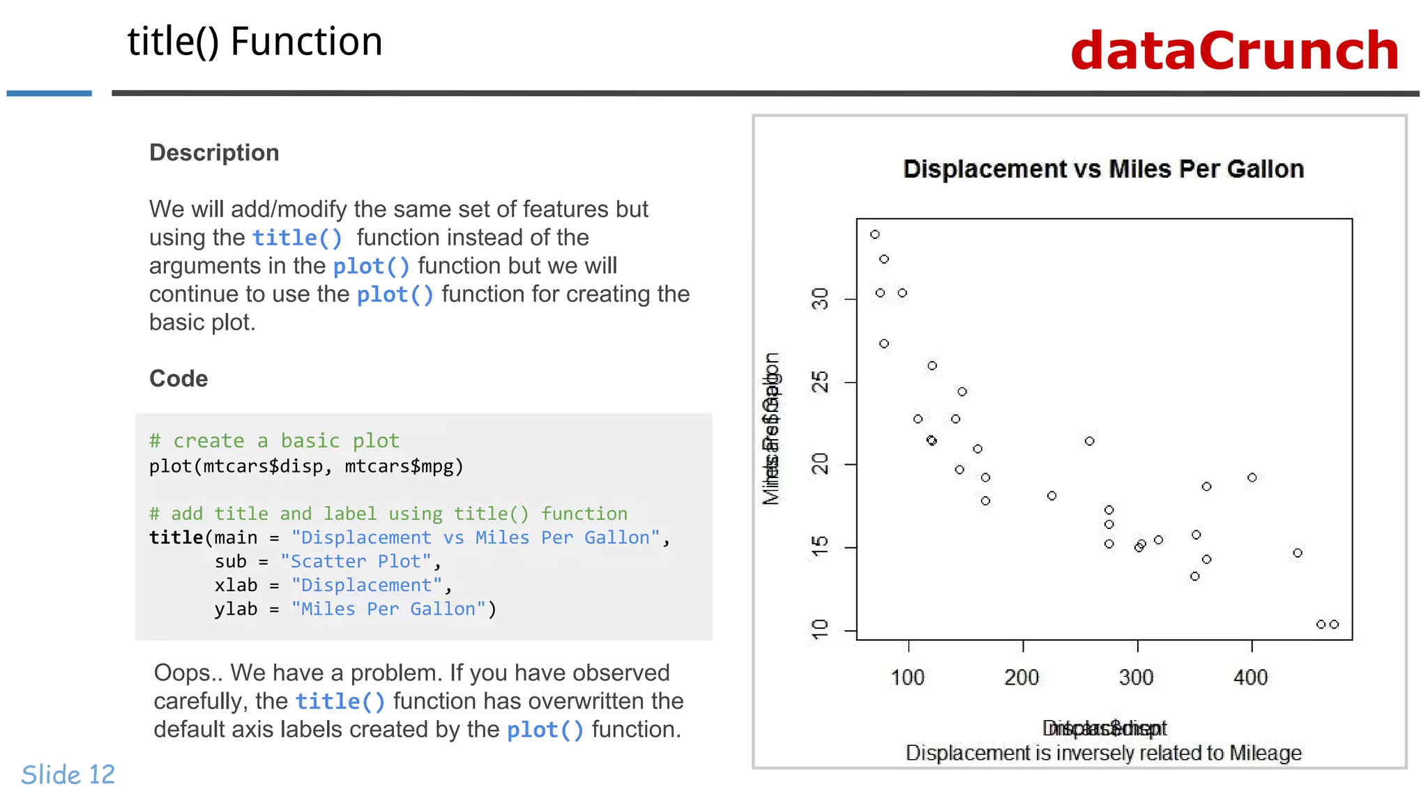
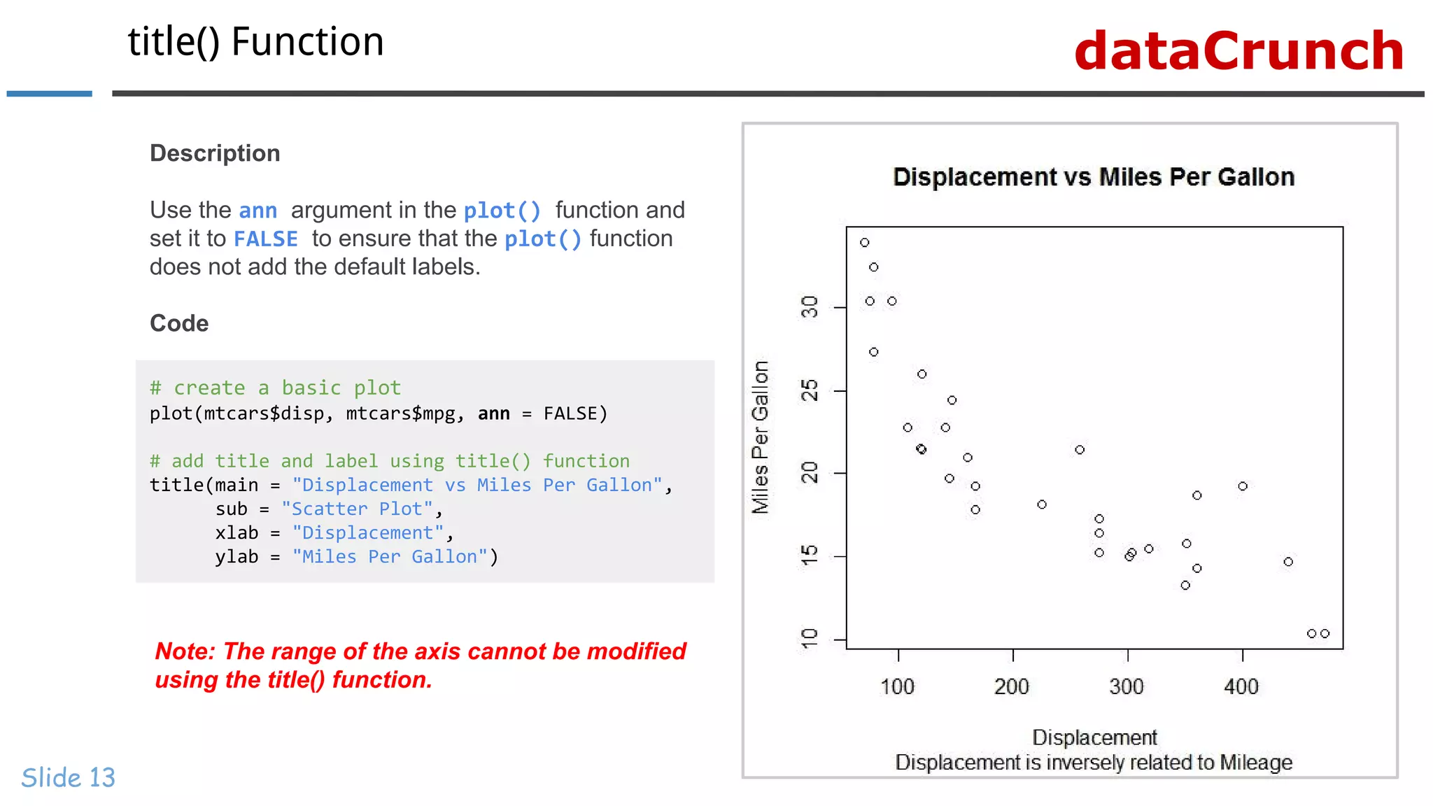
www.r-squared.in/git-hub dataCrunch Data Visualization With R Learn To Modify Title, Axis Labels & Range
dataCrunchCourse Material Slide 2 All the material related to this course are available at our Website Slides can be viewed at SlideShare Scripts can be downloaded from GitHub Videos can be viewed on our Youtube Channel
dataCrunch Title, Axis Labels & Range Slide 3
dataCrunchTitle & Labels Slide 4 In this section, we will learn to enhance the plot by adding/modifying the following features: ● Title ● Subtitle ● Axis Labels ● Axis Range
dataCrunchIntroduction Slide 5 In the previous section, we created plots which did not have any title or labels. A new user of a plot should know what the X and Y axis represent as well as the primary information being communicated by the plot. The title, axis labels and range play an important role in making the plot holistic. There are two ways of adding the above mentioned elements to a plot: ● Use the relevant arguments within the plot() function. ● Use the title() function. We will explore both the methods one by one and you can choose the method that you find most convenient. Let us begin by adding the features using the plot() function.
dataCrunchSyntax Slide 6 Feature Argument Value Example Title main String “Scatter Plot” Subtitle sub String “Displacement vs Miles Per Gallon” X Axis Label xlab String “Displacement” Y Axis Label ylab String “Miles Per Gallon” X Axis Range xlim Numeric Vector c(0, 500) Y Axis Range ylim Numeric Vector c(0, 50)
dataCrunchTitle Slide 7 # create a basic plot and add a title plot(mtcars$disp, mtcars$mpg, main = “Displacement vs Miles Per Gallon”) Description Use the main argument in the plot() function to add a title to the plot. The title must be enclosed in double quotes as it is a string. Code
dataCrunchSubtitle Slide 8 # create a basic plot and add a subtitle plot(mtcars$disp, mtcars$mpg, sub = “Displacement vs Miles Per Gallon”) Description Use the sub argument in the plot() function to add a subtitle to the plot. The subtitle must be enclosed in double quotes as it is a string. Code
dataCrunchAxis Labels Slide 9 # create a basic plot and add axis labels plot(mtcars$disp, mtcars$mpg, xlab = "Displacement", ylab = "Miles Per Gallon") Description In all plots created till now, the axis labels appear as mtcars$disp and mtcars$mpg. It is not the most elegant way of labeling the axis and it would make more sense to use appropriate names. Use the xlab and ylab arguments in the plot() function to add the X and Y axis labels. Code
dataCrunchAxis Range Slide 10 # create a basic plot and modify axis range plot(mtcars$disp, mtcars$mpg, xlim = c(0, 600), ylim = c(0, 50)) Description The range of the axis can be modified using the xlim and ylim arguments in the plot() function. The lower and upper limit for both the axis must be mentioned in a numeric vector. Code
dataCrunchSo far... Slide 11 # create a plot with title, subtitle, axis labels and range plot(mtcars$disp, mtcars$mpg, main = "Displacement vs Miles Per Gallon", sub = "Scatter Plot", xlab = "Displacement", ylab = "Miles Per Gallon", xlim = c(0, 600), ylim = c(0, 50)) Description Let us create a plot that has all the features that we have learnt so far: Code
dataCrunchtitle() Function Slide 12 # create a basic plot plot(mtcars$disp, mtcars$mpg) # add title and label using title() function title(main = "Displacement vs Miles Per Gallon", sub = "Scatter Plot", xlab = "Displacement", ylab = "Miles Per Gallon") Description We will add/modify the same set of features but using the title() function instead of the arguments in the plot() function but we will continue to use the plot() function for creating the basic plot. Code Oops.. We have a problem. If you have observed carefully, the title() function has overwritten the default axis labels created by the plot() function.
dataCrunchtitle() Function Slide 13 # create a basic plot plot(mtcars$disp, mtcars$mpg, ann = FALSE) # add title and label using title() function title(main = "Displacement vs Miles Per Gallon", sub = "Scatter Plot", xlab = "Displacement", ylab = "Miles Per Gallon") Description Use the ann argument in the plot() function and set it to FALSE to ensure that the plot() function does not add the default labels. Code Note: The range of the axis cannot be modified using the title() function.
dataCrunch Slide 14 Visit dataCrunch for tutorials on: → R Programming → Business Analytics → Data Visualization → Web Applications → Package Development → Git & GitHub

Data Visualization With R: Learn To Modify Title, Axis Labels & Range

  • 1.
    www.r-squared.in/git-hub dataCrunch Data VisualizationWith R Learn To Modify Title, Axis Labels & Range
  • 2.
    dataCrunchCourse Material Slide 2 Allthe material related to this course are available at our Website Slides can be viewed at SlideShare Scripts can be downloaded from GitHub Videos can be viewed on our Youtube Channel
  • 3.
  • 4.
    dataCrunchTitle & Labels Slide4 In this section, we will learn to enhance the plot by adding/modifying the following features: ● Title ● Subtitle ● Axis Labels ● Axis Range
  • 5.
    dataCrunchIntroduction Slide 5 In theprevious section, we created plots which did not have any title or labels. A new user of a plot should know what the X and Y axis represent as well as the primary information being communicated by the plot. The title, axis labels and range play an important role in making the plot holistic. There are two ways of adding the above mentioned elements to a plot: ● Use the relevant arguments within the plot() function. ● Use the title() function. We will explore both the methods one by one and you can choose the method that you find most convenient. Let us begin by adding the features using the plot() function.
  • 6.
    dataCrunchSyntax Slide 6 Feature ArgumentValue Example Title main String “Scatter Plot” Subtitle sub String “Displacement vs Miles Per Gallon” X Axis Label xlab String “Displacement” Y Axis Label ylab String “Miles Per Gallon” X Axis Range xlim Numeric Vector c(0, 500) Y Axis Range ylim Numeric Vector c(0, 50)
  • 7.
    dataCrunchTitle Slide 7 # createa basic plot and add a title plot(mtcars$disp, mtcars$mpg, main = “Displacement vs Miles Per Gallon”) Description Use the main argument in the plot() function to add a title to the plot. The title must be enclosed in double quotes as it is a string. Code
  • 8.
    dataCrunchSubtitle Slide 8 # createa basic plot and add a subtitle plot(mtcars$disp, mtcars$mpg, sub = “Displacement vs Miles Per Gallon”) Description Use the sub argument in the plot() function to add a subtitle to the plot. The subtitle must be enclosed in double quotes as it is a string. Code
  • 9.
    dataCrunchAxis Labels Slide 9 #create a basic plot and add axis labels plot(mtcars$disp, mtcars$mpg, xlab = "Displacement", ylab = "Miles Per Gallon") Description In all plots created till now, the axis labels appear as mtcars$disp and mtcars$mpg. It is not the most elegant way of labeling the axis and it would make more sense to use appropriate names. Use the xlab and ylab arguments in the plot() function to add the X and Y axis labels. Code
  • 10.
    dataCrunchAxis Range Slide 10 #create a basic plot and modify axis range plot(mtcars$disp, mtcars$mpg, xlim = c(0, 600), ylim = c(0, 50)) Description The range of the axis can be modified using the xlim and ylim arguments in the plot() function. The lower and upper limit for both the axis must be mentioned in a numeric vector. Code
  • 11.
    dataCrunchSo far... Slide 11 #create a plot with title, subtitle, axis labels and range plot(mtcars$disp, mtcars$mpg, main = "Displacement vs Miles Per Gallon", sub = "Scatter Plot", xlab = "Displacement", ylab = "Miles Per Gallon", xlim = c(0, 600), ylim = c(0, 50)) Description Let us create a plot that has all the features that we have learnt so far: Code
  • 12.
    dataCrunchtitle() Function Slide 12 #create a basic plot plot(mtcars$disp, mtcars$mpg) # add title and label using title() function title(main = "Displacement vs Miles Per Gallon", sub = "Scatter Plot", xlab = "Displacement", ylab = "Miles Per Gallon") Description We will add/modify the same set of features but using the title() function instead of the arguments in the plot() function but we will continue to use the plot() function for creating the basic plot. Code Oops.. We have a problem. If you have observed carefully, the title() function has overwritten the default axis labels created by the plot() function.
  • 13.
    dataCrunchtitle() Function Slide 13 #create a basic plot plot(mtcars$disp, mtcars$mpg, ann = FALSE) # add title and label using title() function title(main = "Displacement vs Miles Per Gallon", sub = "Scatter Plot", xlab = "Displacement", ylab = "Miles Per Gallon") Description Use the ann argument in the plot() function and set it to FALSE to ensure that the plot() function does not add the default labels. Code Note: The range of the axis cannot be modified using the title() function.
  • 14.
    dataCrunch Slide 14 Visit dataCrunchfor tutorials on: → R Programming → Business Analytics → Data Visualization → Web Applications → Package Development → Git & GitHub