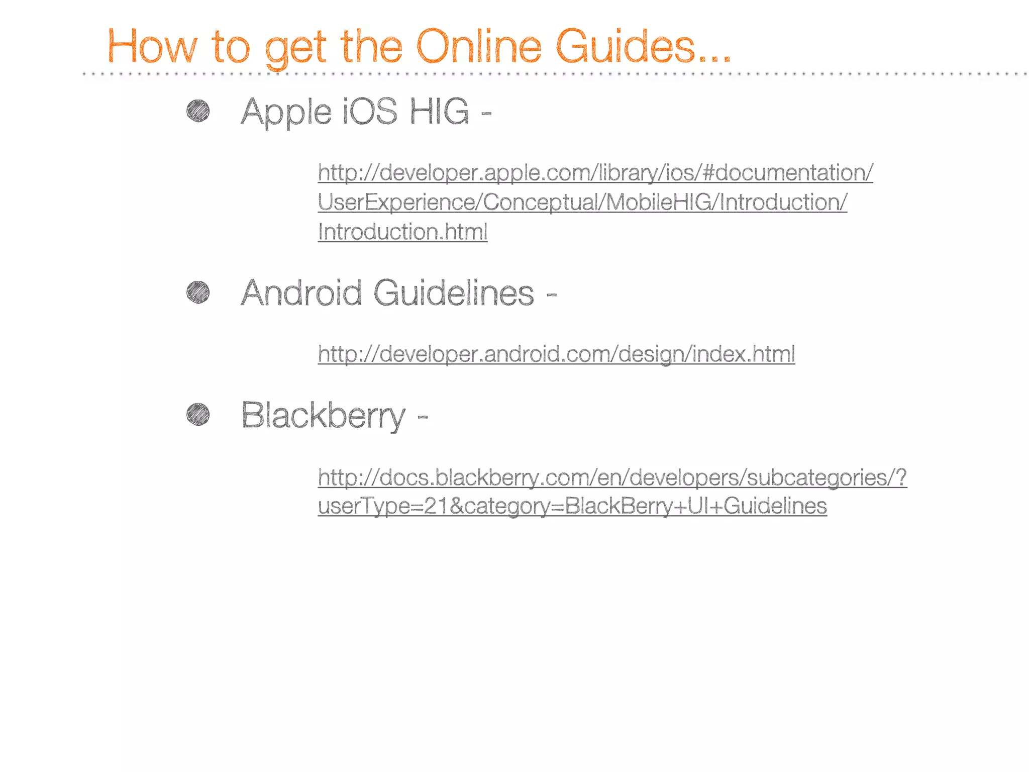
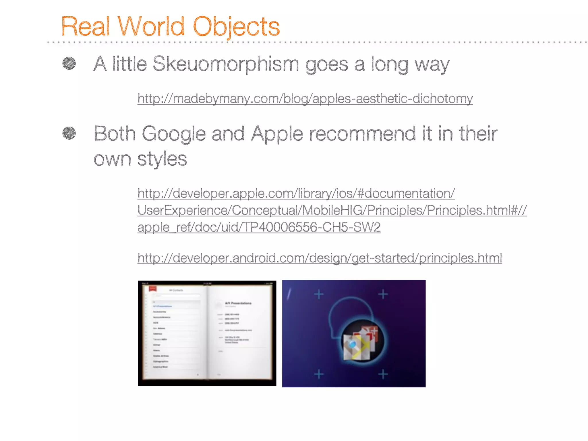
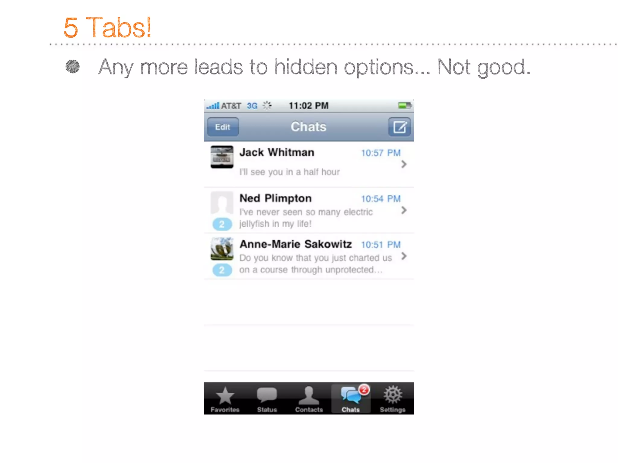
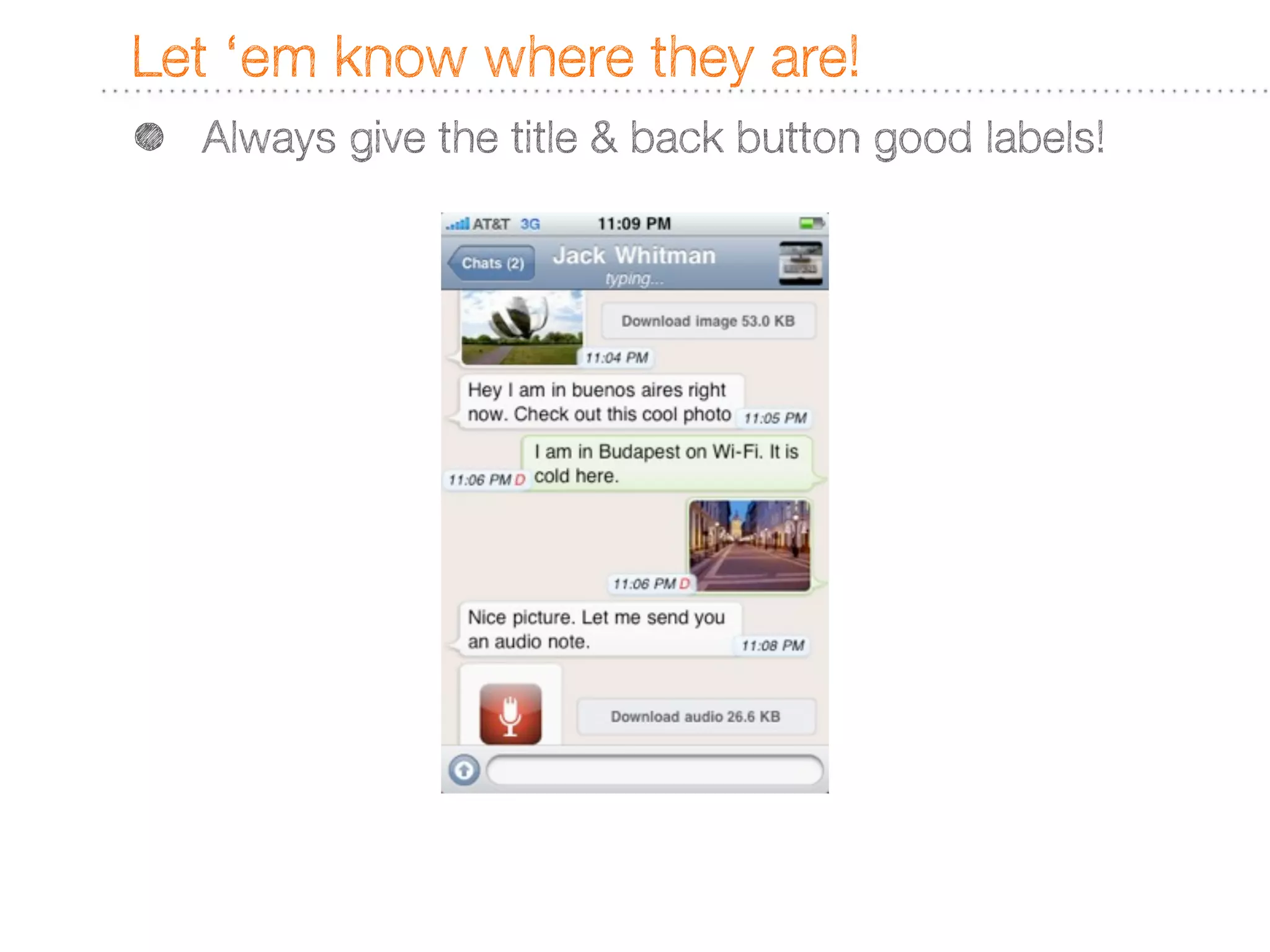
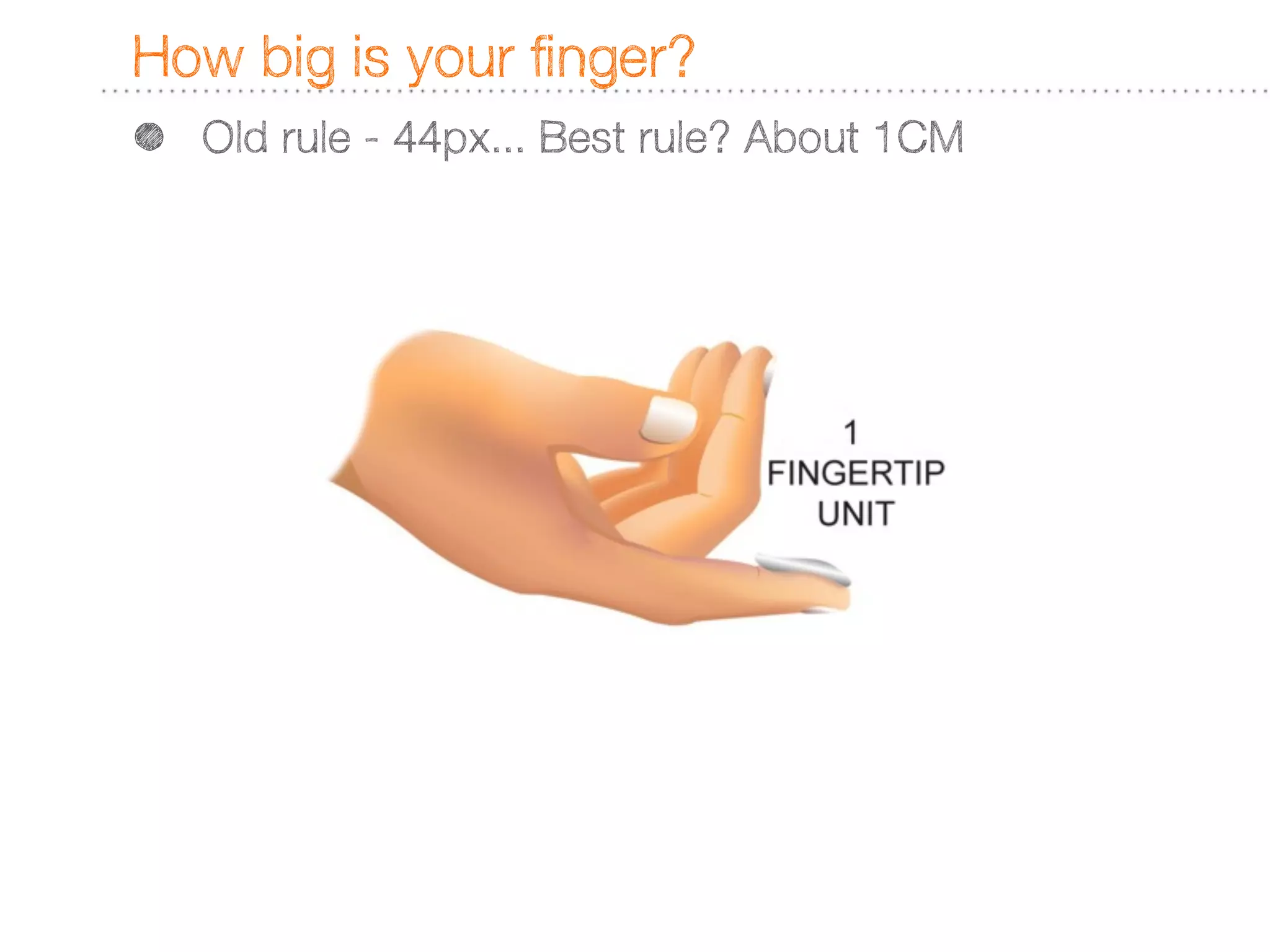
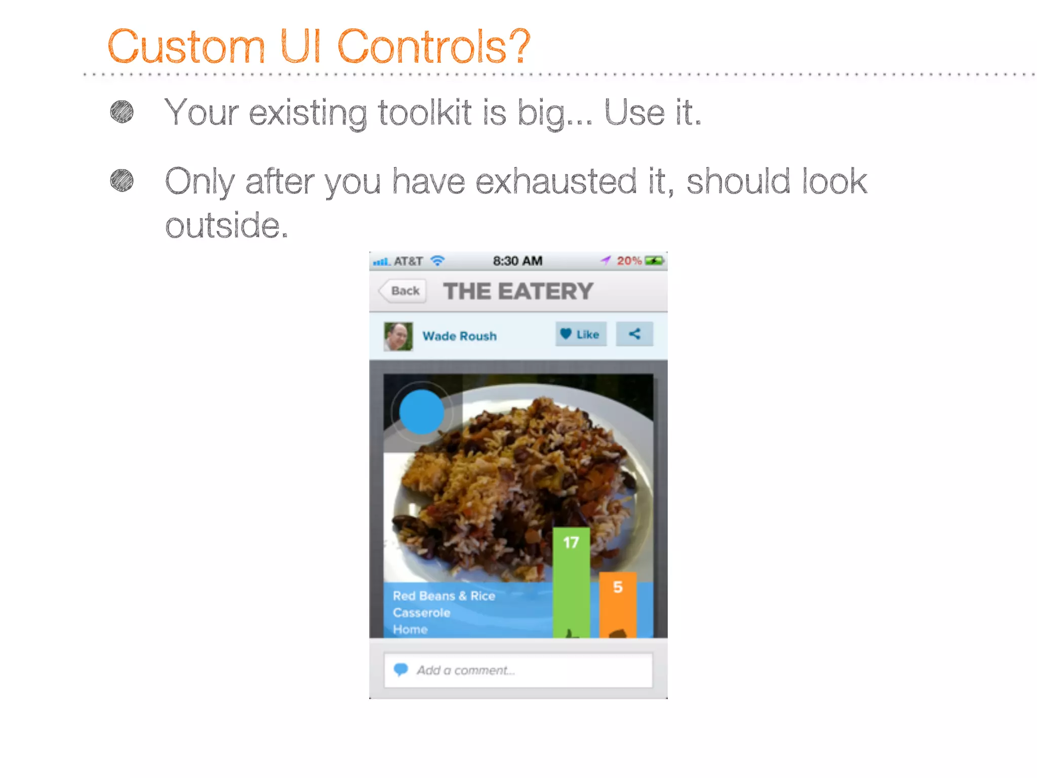
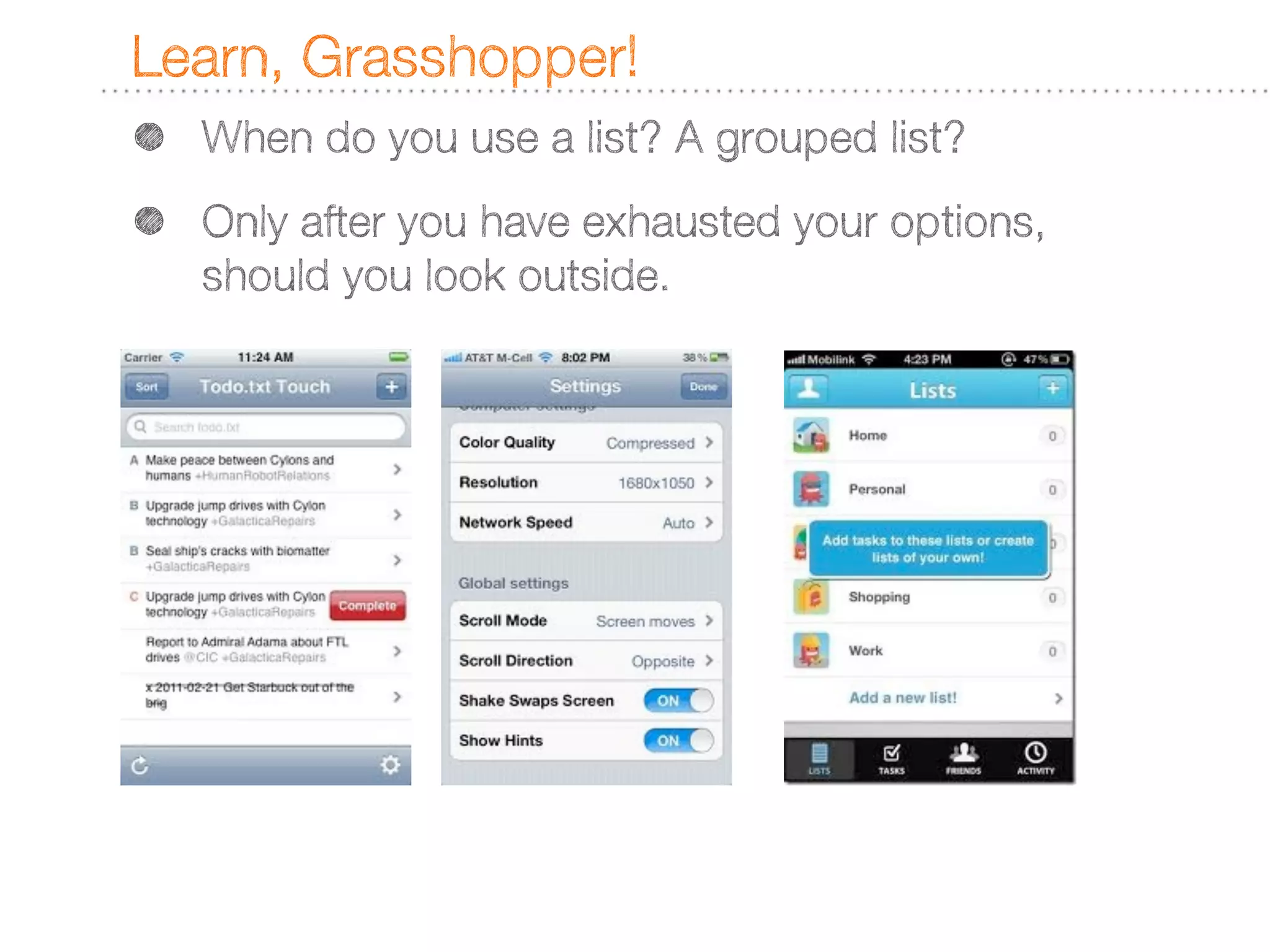
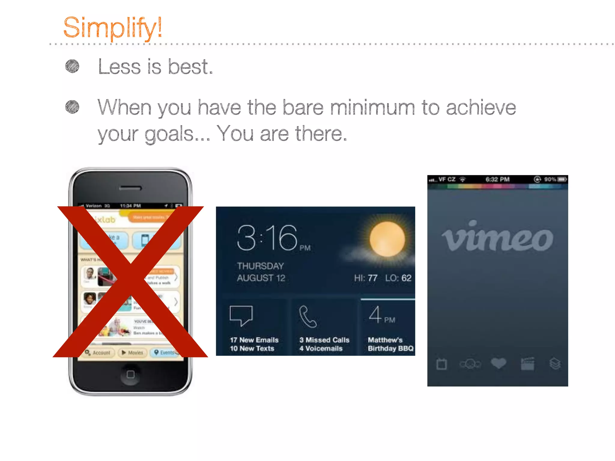
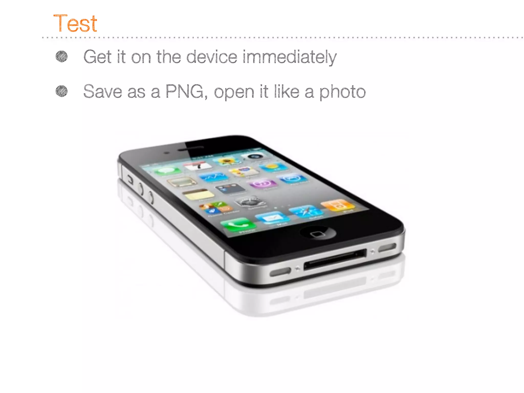
Design with virtually no budget and no tech skills!
Design for Mobile • There’s no rules • How do I know where to start • Lots of recommendations
No rules for mobile design? • There are only considerations and constraints - Josh Campbell, Magic + Might http://floatlearning.com/2011/06/josh-campbell-multiscreen-design-strategies/ • The landscape is fragmented. • Analyze your market - design for the biggest chunk • Is the next biggest chunk worth a customized design?
Build your library • Online Interface guides • Updated often • Word is straight from the source • Lots of examples
How to get the Online Guides... • Apple iOS HIG - http://developer.apple.com/library/ios/#documentation/ UserExperience/Conceptual/MobileHIG/Introduction/ Introduction.html • Android Guidelines - http://developer.android.com/design/index.html • Blackberry - http://docs.blackberry.com/en/developers/subcategories/? userType=21&category=BlackBerry+UI+Guidelines
Build your library • Great Books on the Topic • Constantly coming out! • Look for generalities, not OS or version specific titles
Some Key Thoughts • Real world objects are the metaphor du jour • Don’t stray too far unless you’re a star • More than 5 tabs? You’re doing it wrong • Let people know where they are! • Design for the finger. 1CM or thereabouts • Custom UI controls should be used sparingly • Learn, Internalize and Synthesize Design Patterns • Simplify, Simplify, Simplify
Real World Objects • A little Skeuomorphism goes a long way http://madebymany.com/blog/apples-aesthetic-dichotomy • Both Google and Apple recommend it in their own styles http://developer.apple.com/library/ios/#documentation/ UserExperience/Conceptual/MobileHIG/Principles/Principles.html#// apple_ref/doc/uid/TP40006556-CH5-SW2 http://developer.android.com/design/get-started/principles.html
Don’t stray too far • Usability trumps all else (except beautiful usability) http://www.useit.com/alertbox/20030825.html http://www.markboulton.co.uk/journal/comments/aesthetic- usability-effect&#13 • The HIG pretty much lays it out for usability, Hoober’s book also give great tips on this.
5 Tabs! • Any more leads to hidden options... Not good.
Let ‘em know where they are! • Always give the title & back button good labels!
How big is your finger? • Old rule - 44px... Best rule? About 1CM
Custom UI Controls? • Your existing toolkit is big... Use it. • Only after you have exhausted it, should look outside.
Learn, Grasshopper! • When do you use a list? A grouped list? • Only after you have exhausted your options, should you look outside.
Simplify! • Less is best. • When you have the bare minimum to achieve your goals... You are there. X
Test • Get it on the device immediately • Save as a PNG, open it like a photo
15 Minutes

Design concepts for Mobile Learnng

  • 1.
    Design with virtually nobudget and no tech skills!
  • 2.
    Design for Mobile • There’s no rules • How do I know where to start • Lots of recommendations
  • 3.
    No rules formobile design? • There are only considerations and constraints - Josh Campbell, Magic + Might http://floatlearning.com/2011/06/josh-campbell-multiscreen-design-strategies/ • The landscape is fragmented. • Analyze your market - design for the biggest chunk • Is the next biggest chunk worth a customized design?
  • 4.
    Build your library • Online Interface guides • Updated often • Word is straight from the source • Lots of examples
  • 5.
    How to getthe Online Guides... • Apple iOS HIG - http://developer.apple.com/library/ios/#documentation/ UserExperience/Conceptual/MobileHIG/Introduction/ Introduction.html • Android Guidelines - http://developer.android.com/design/index.html • Blackberry - http://docs.blackberry.com/en/developers/subcategories/? userType=21&category=BlackBerry+UI+Guidelines
  • 6.
    Build your library • Great Books on the Topic • Constantly coming out! • Look for generalities, not OS or version specific titles
  • 7.
    Some Key Thoughts • Real world objects are the metaphor du jour • Don’t stray too far unless you’re a star • More than 5 tabs? You’re doing it wrong • Let people know where they are! • Design for the finger. 1CM or thereabouts • Custom UI controls should be used sparingly • Learn, Internalize and Synthesize Design Patterns • Simplify, Simplify, Simplify
  • 8.
    Real World Objects • A little Skeuomorphism goes a long way http://madebymany.com/blog/apples-aesthetic-dichotomy • Both Google and Apple recommend it in their own styles http://developer.apple.com/library/ios/#documentation/ UserExperience/Conceptual/MobileHIG/Principles/Principles.html#// apple_ref/doc/uid/TP40006556-CH5-SW2 http://developer.android.com/design/get-started/principles.html
  • 9.
    Don’t stray toofar • Usability trumps all else (except beautiful usability) http://www.useit.com/alertbox/20030825.html http://www.markboulton.co.uk/journal/comments/aesthetic- usability-effect&#13 • The HIG pretty much lays it out for usability, Hoober’s book also give great tips on this.
  • 10.
    5 Tabs! • Any more leads to hidden options... Not good.
  • 11.
    Let ‘em knowwhere they are! • Always give the title & back button good labels!
  • 12.
    How big isyour finger? • Old rule - 44px... Best rule? About 1CM
  • 13.
    Custom UI Controls? • Your existing toolkit is big... Use it. • Only after you have exhausted it, should look outside.
  • 14.
    Learn, Grasshopper! • When do you use a list? A grouped list? • Only after you have exhausted your options, should you look outside.
  • 15.
    Simplify! • Less is best. • When you have the bare minimum to achieve your goals... You are there. X
  • 16.
    Test • Get it on the device immediately • Save as a PNG, open it like a photo
  • 17.