


The document provides tips for designing user interfaces for Android applications, emphasizing the importance of a user-centered approach and adherence to design principles. Key recommendations include using appropriate resource qualifiers, leveraging new UI patterns like dashboards and action bars, and ensuring visibility and feedback for user actions. The document also stresses avoiding rigid layouts and utilizing scalable design elements to adapt across various device screens.
Introduction to UI design, importance of better UI, its direct impact on app rating and user engagement.
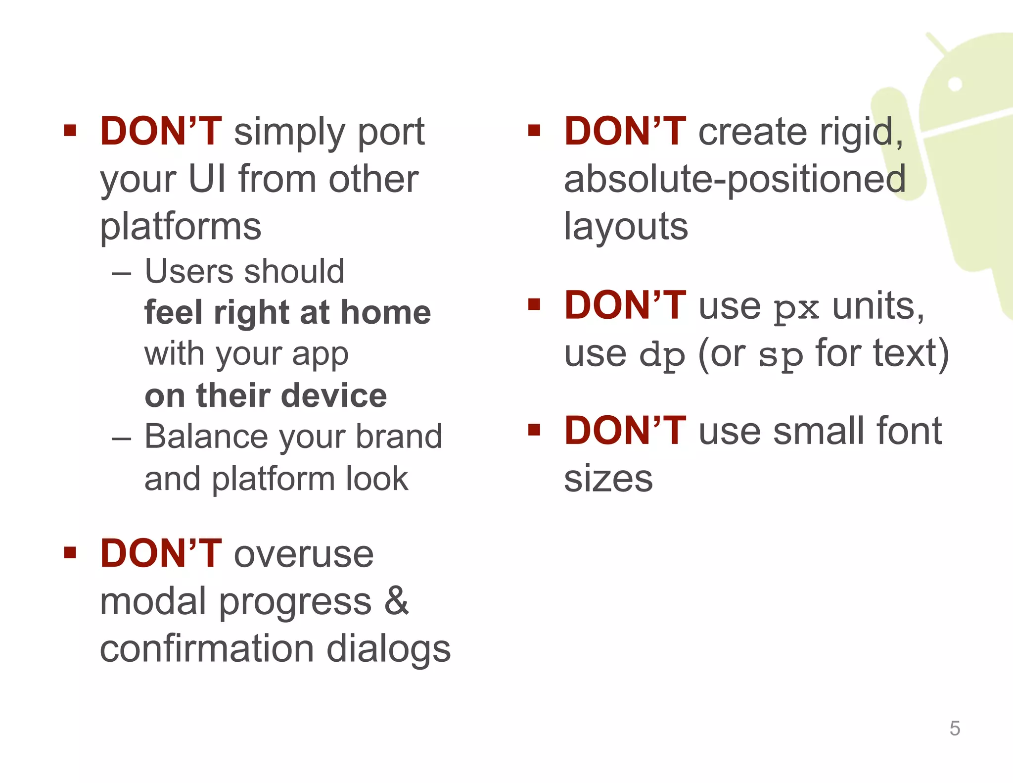
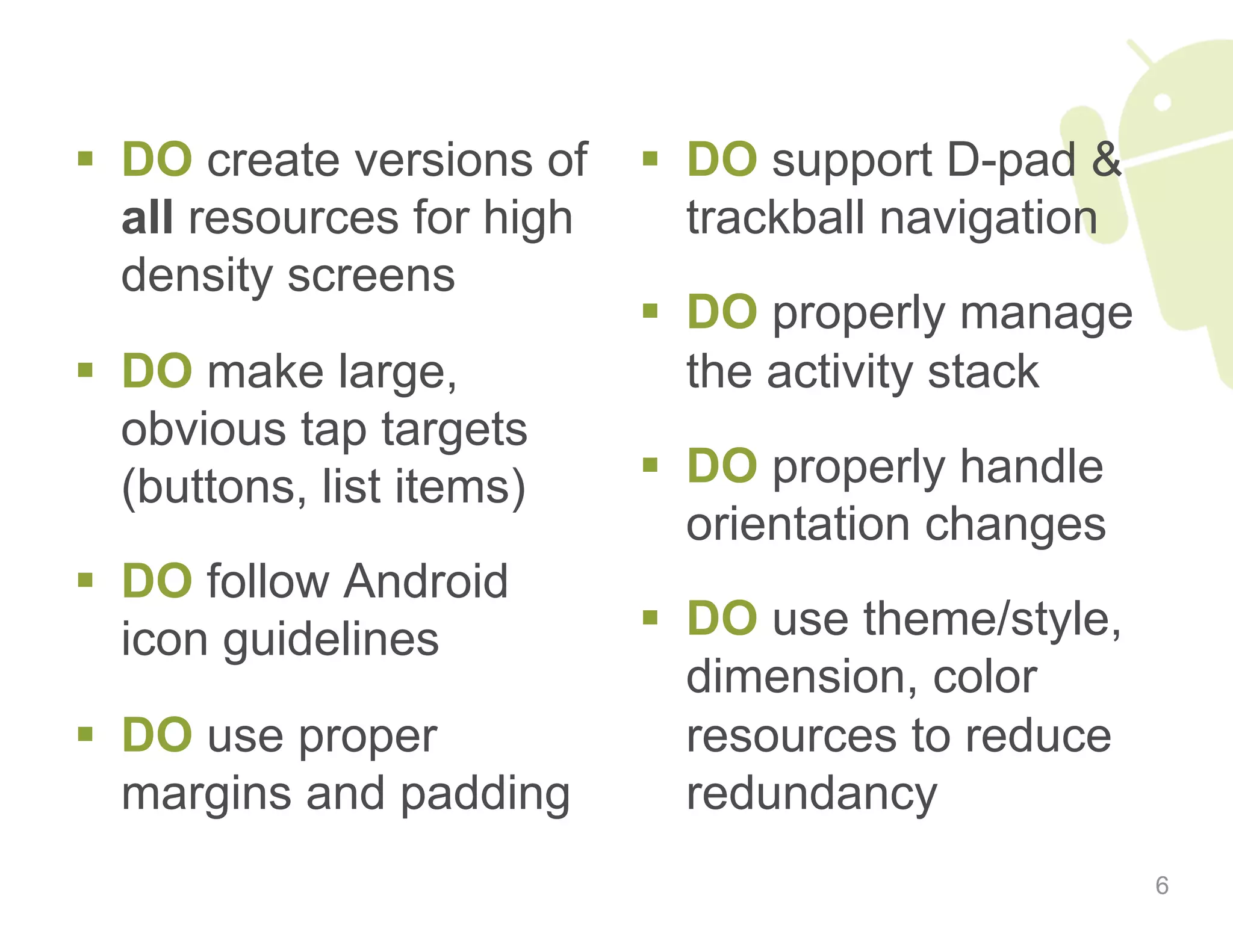
Best practices for UI design, including layout flexibility, user comfort, and proper resource management.
Importance of working with visual and interaction designers for effective UI development.
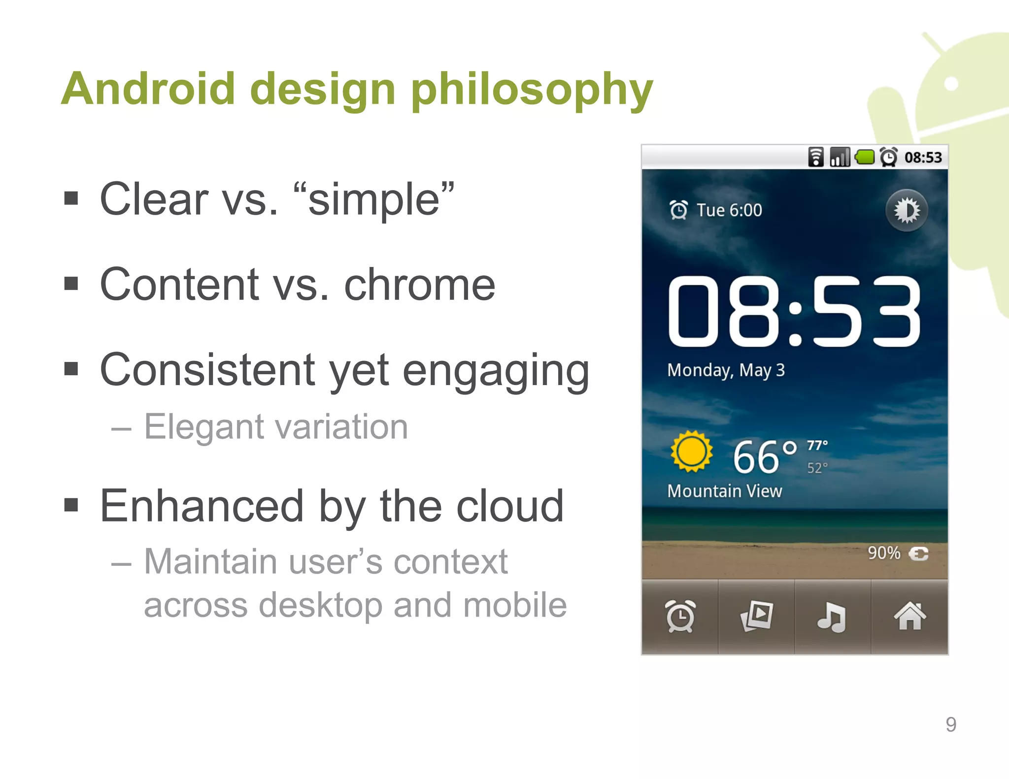
Principles defining good UI design, emphasizing user focus and creating engaging experiences.
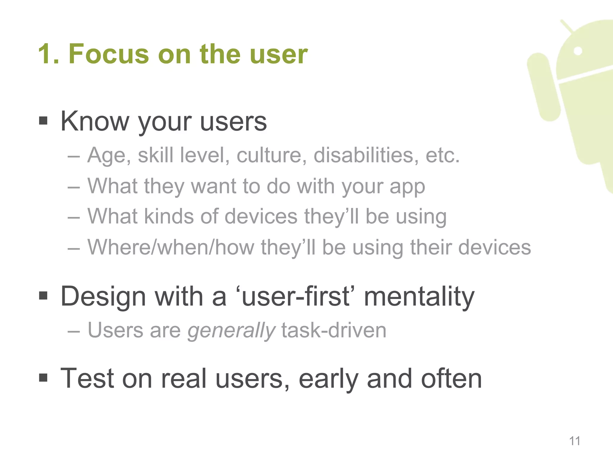
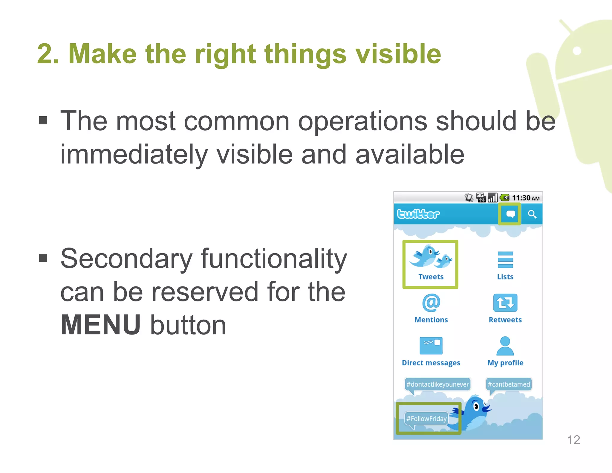
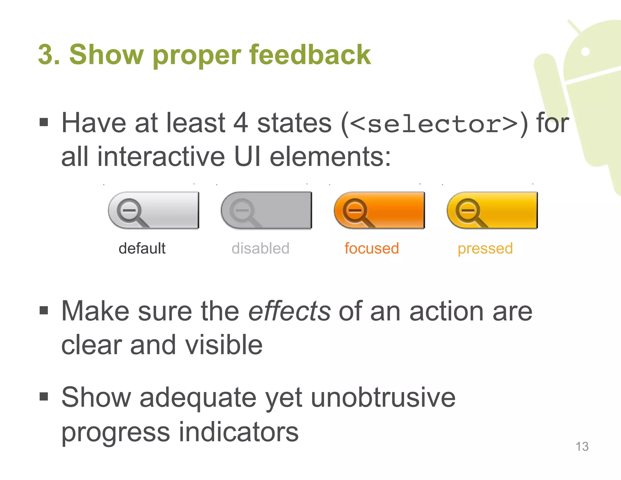
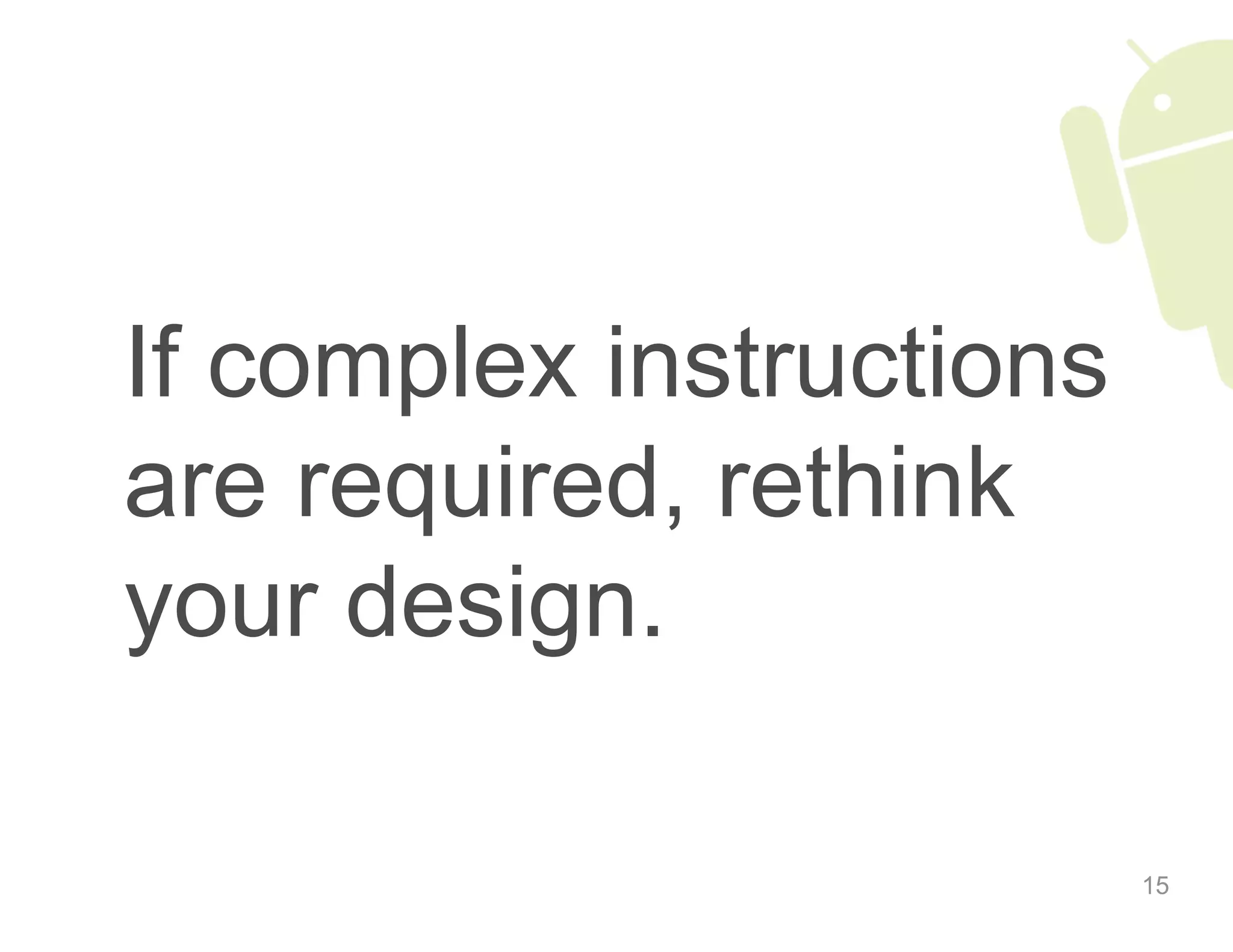
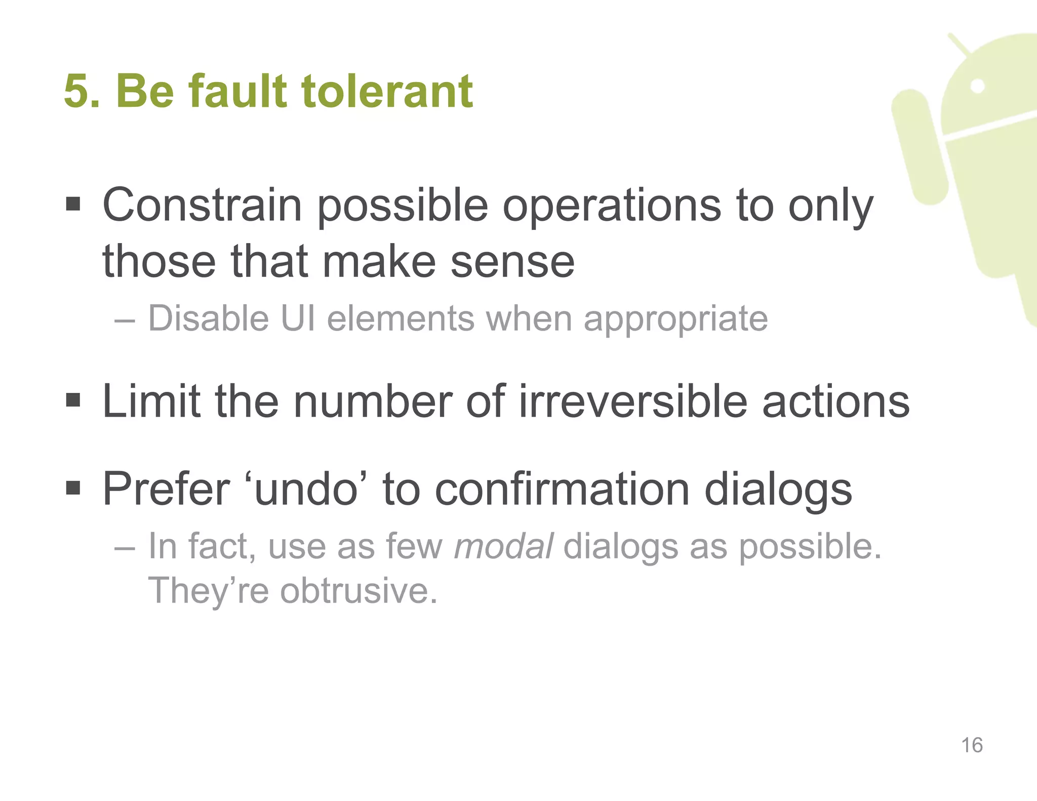
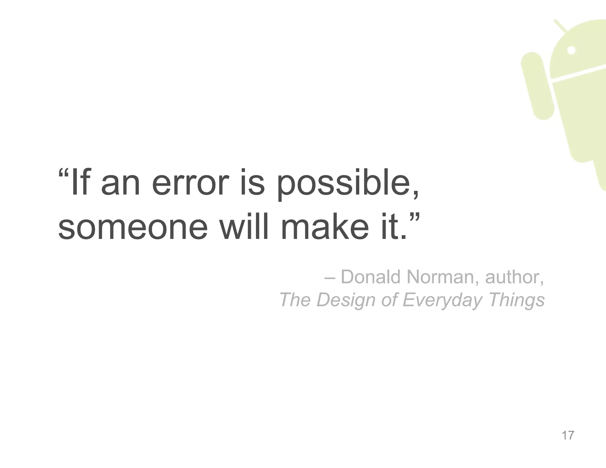
Key principles of effective interface design that focus on user needs, visibility, feedback, predictability, and fault tolerance.
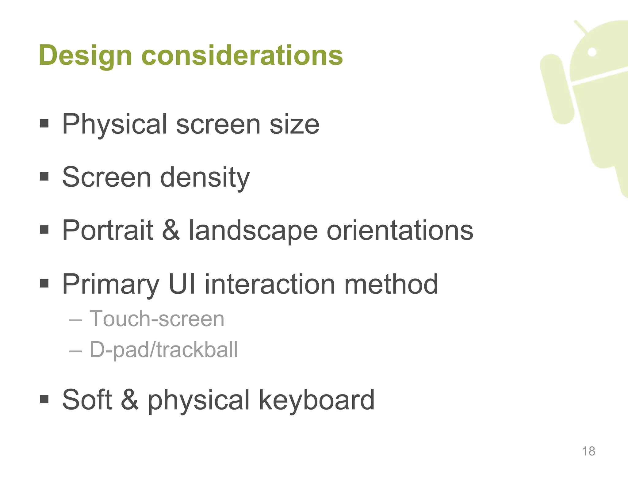
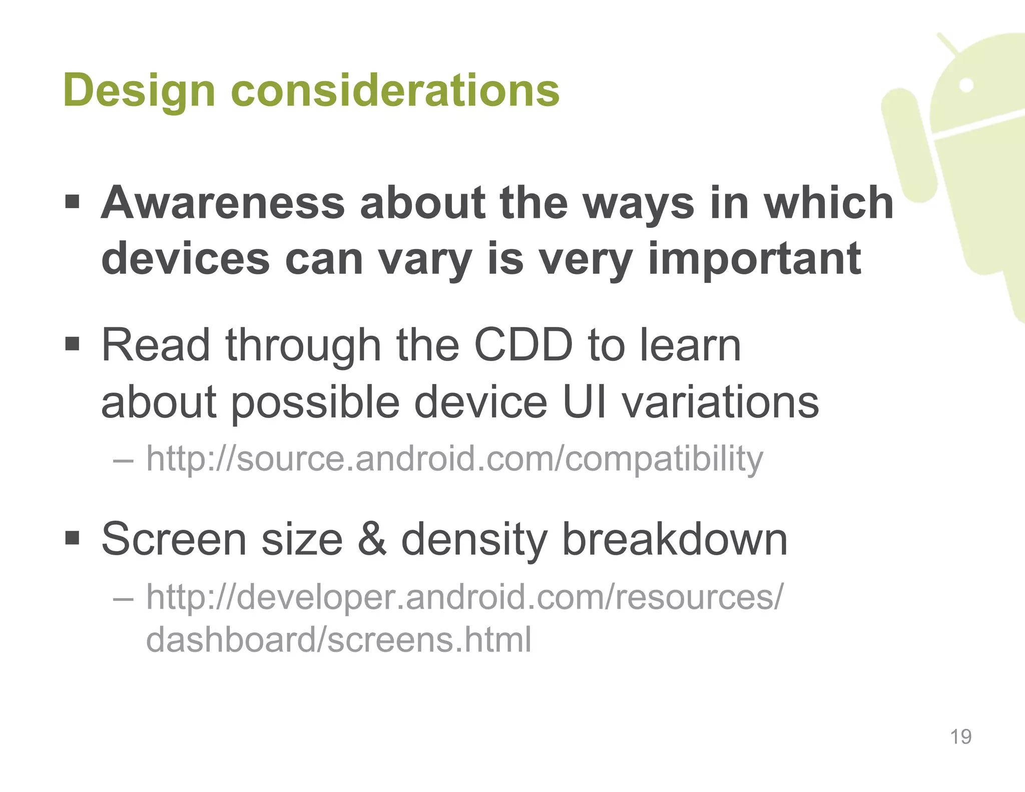
Factors affecting design choices, including screen sizes, densities, and user interaction methods.
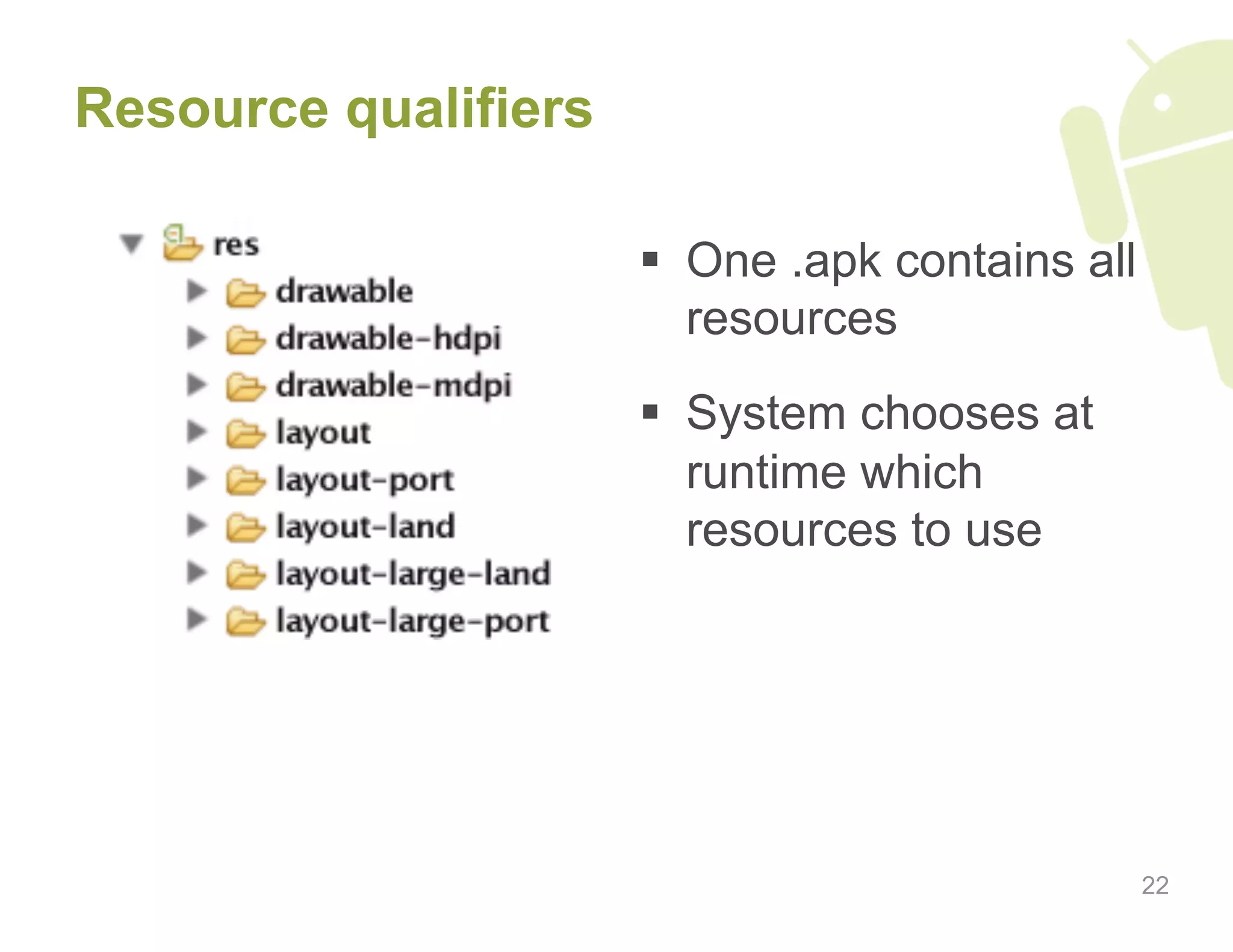
Introduction to important Android UI features like RelativeLayout and resource qualifiers.
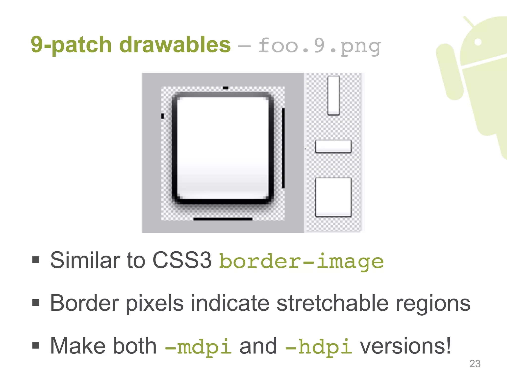
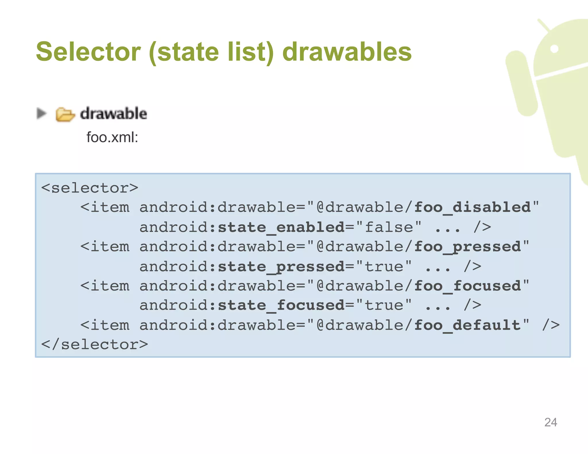
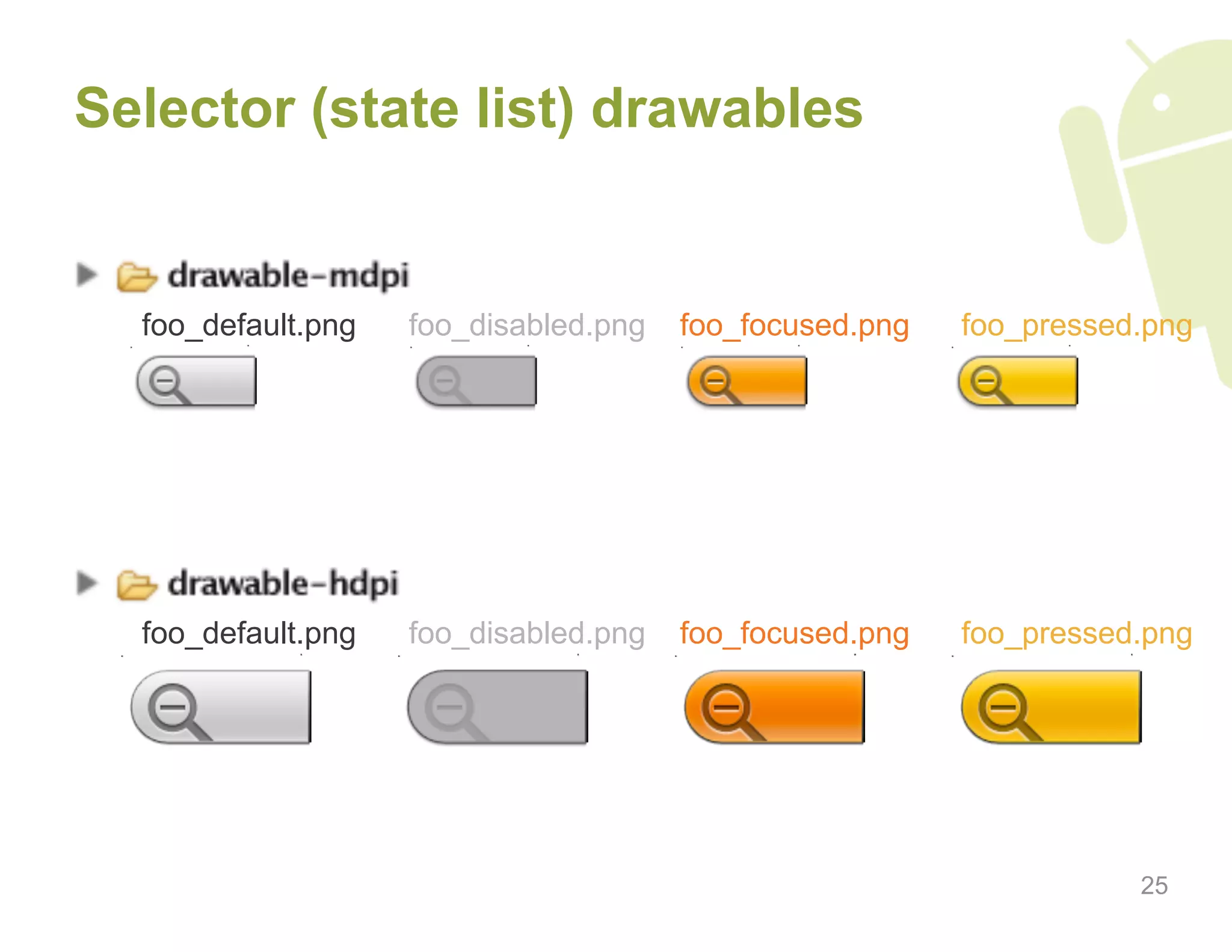
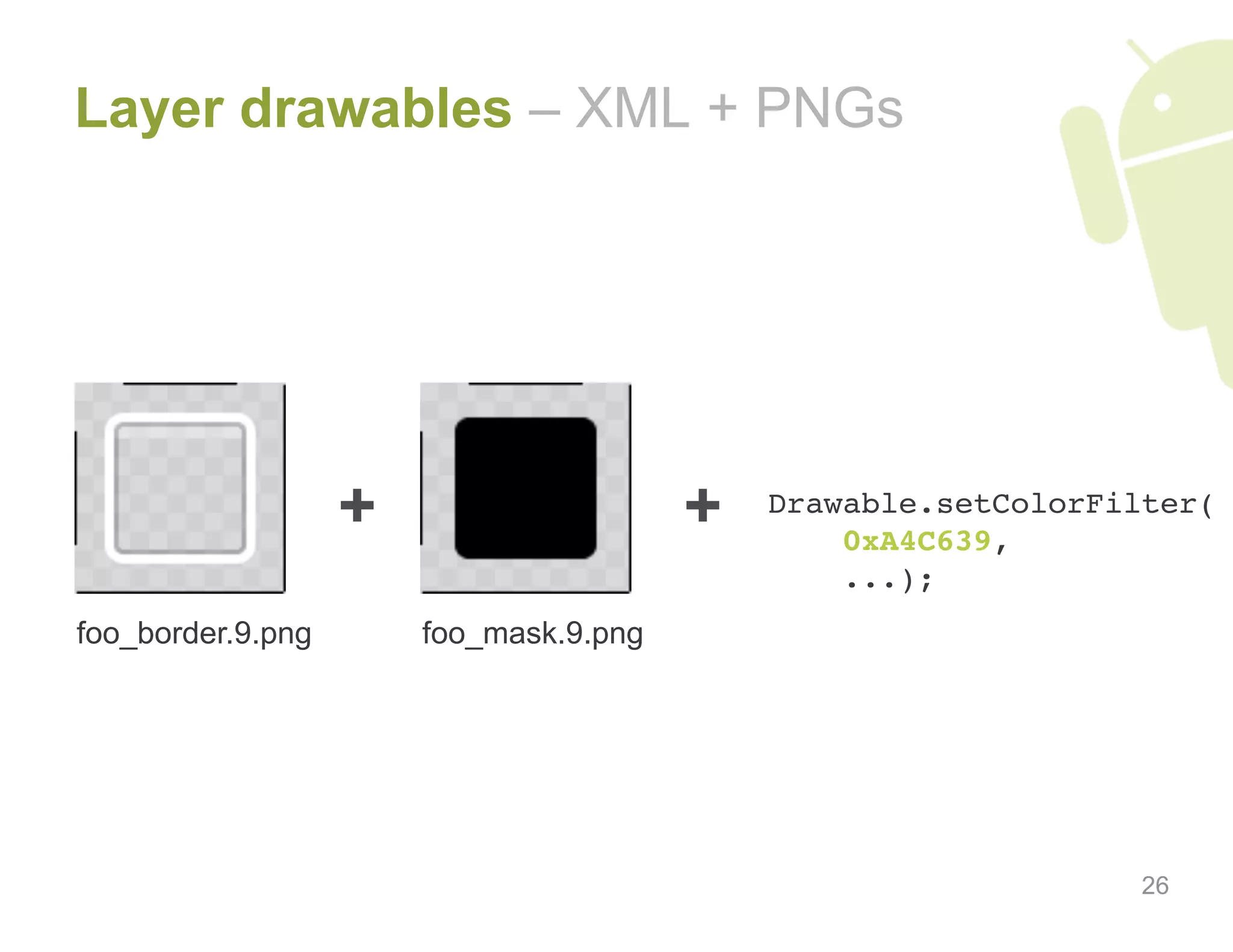
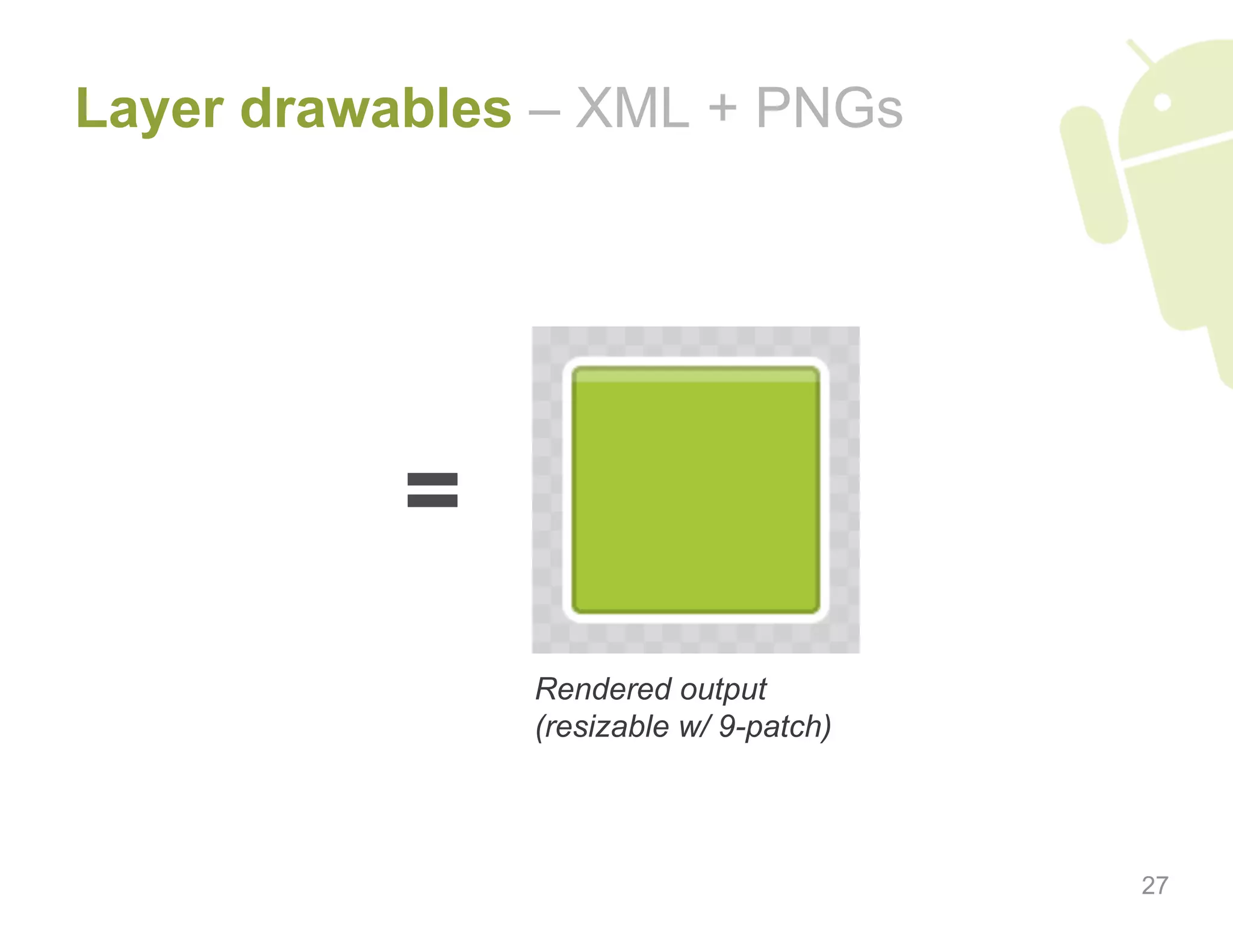
Details about using 9-patch and layer drawables with key examples for effective UI design.
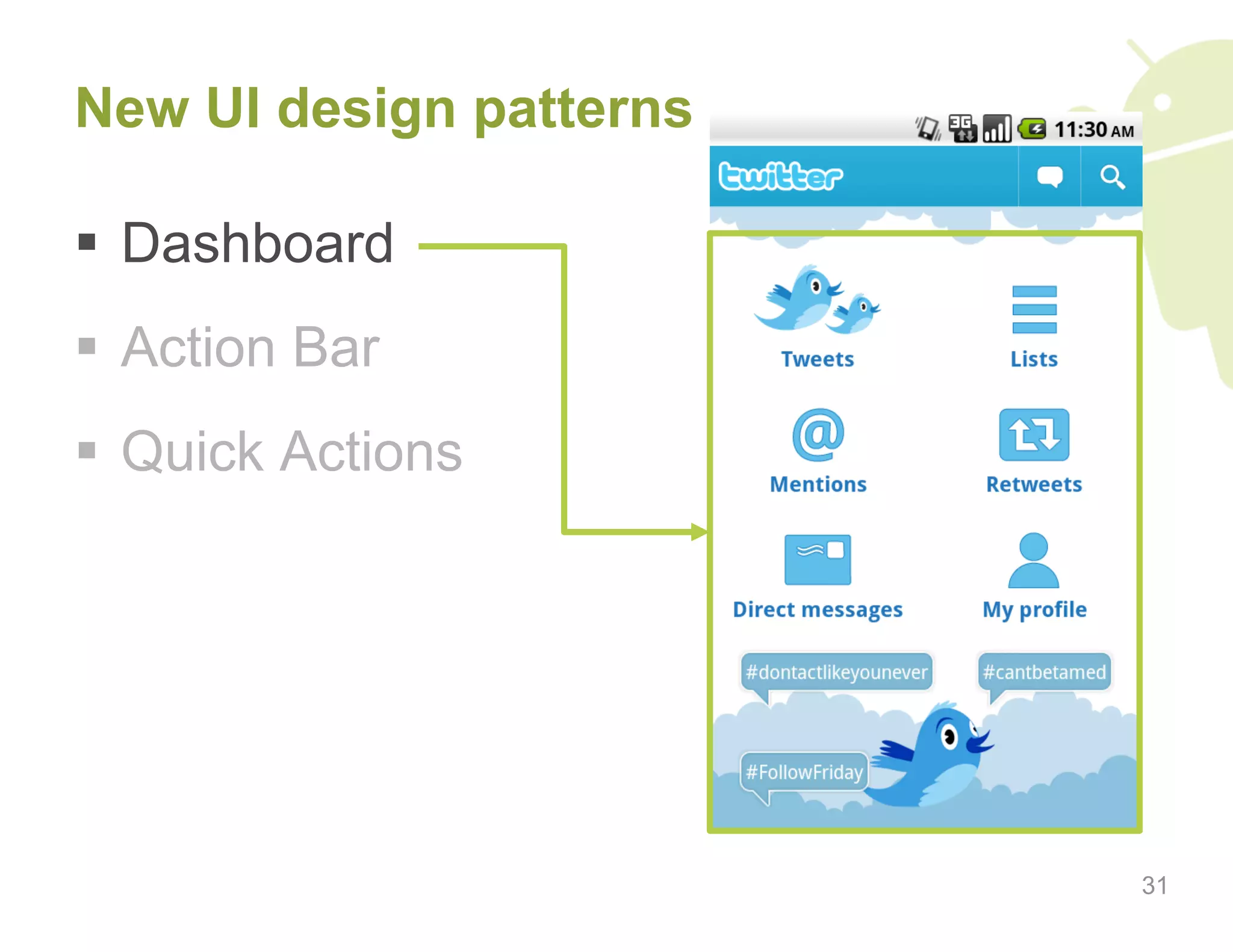
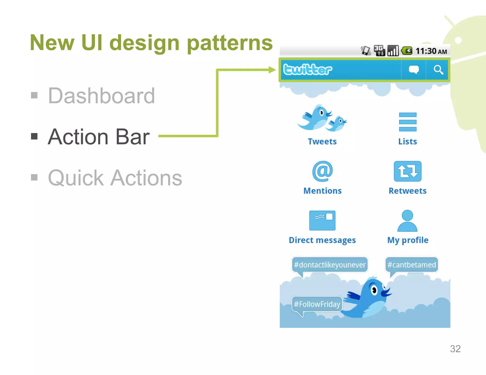
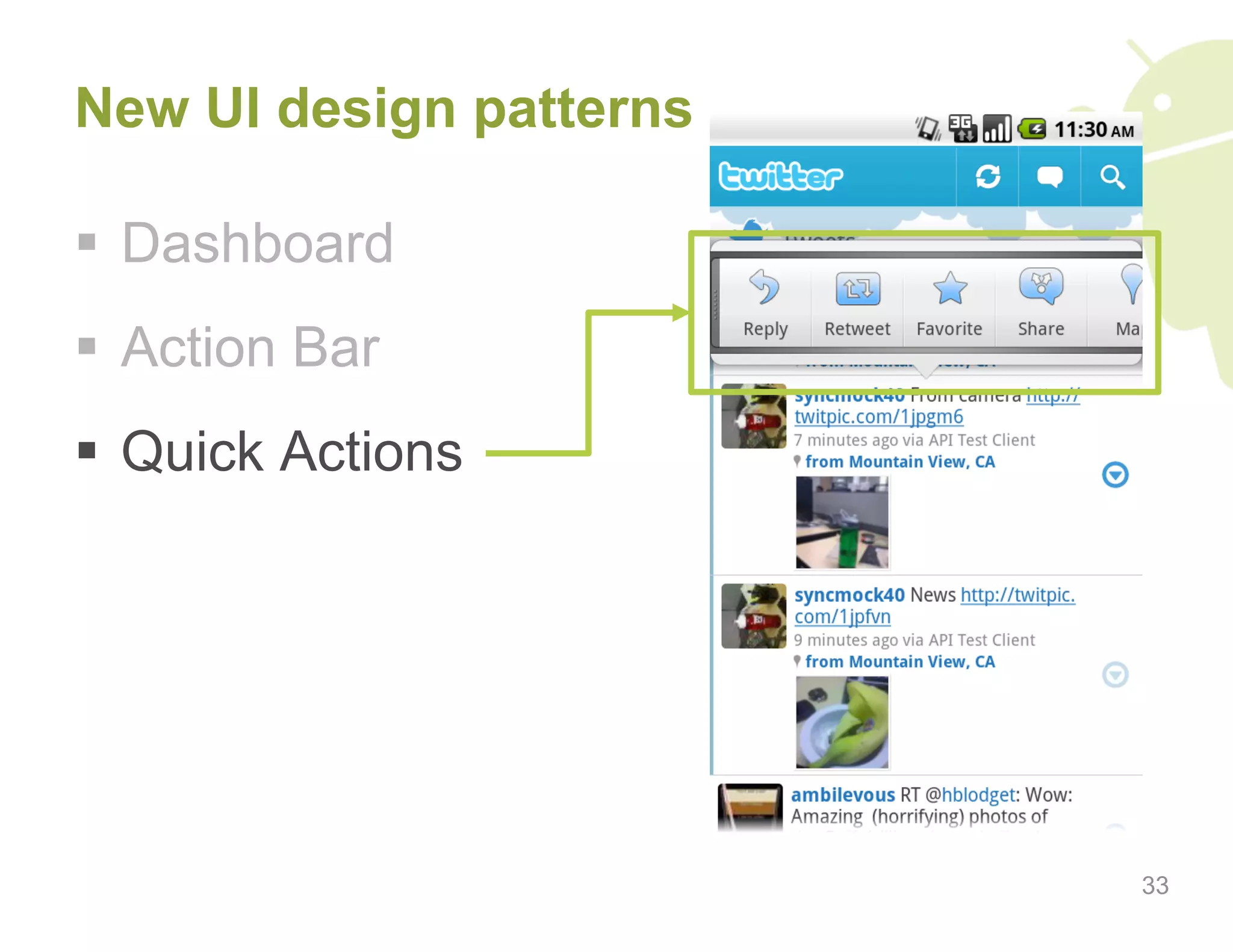
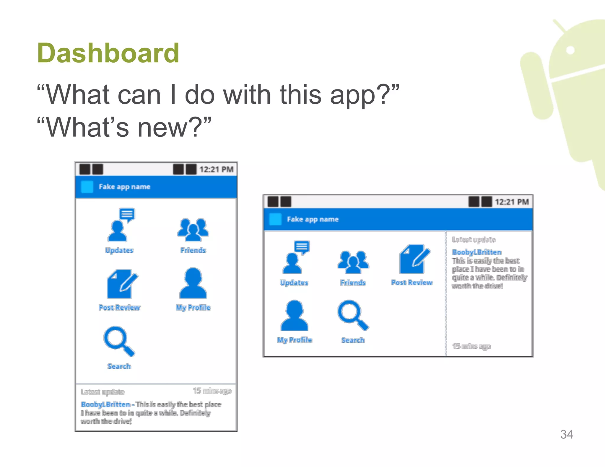
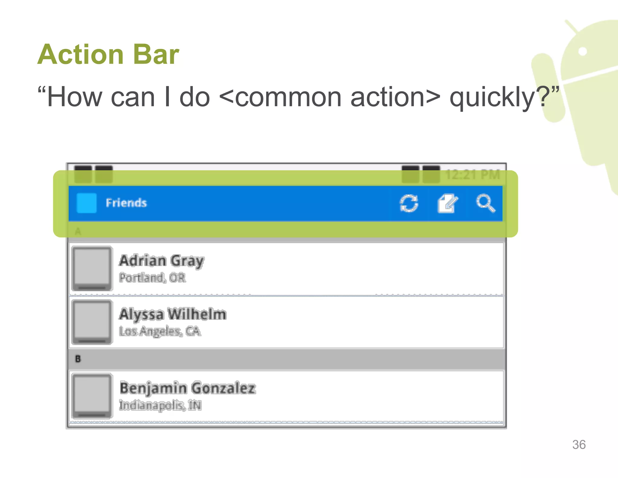
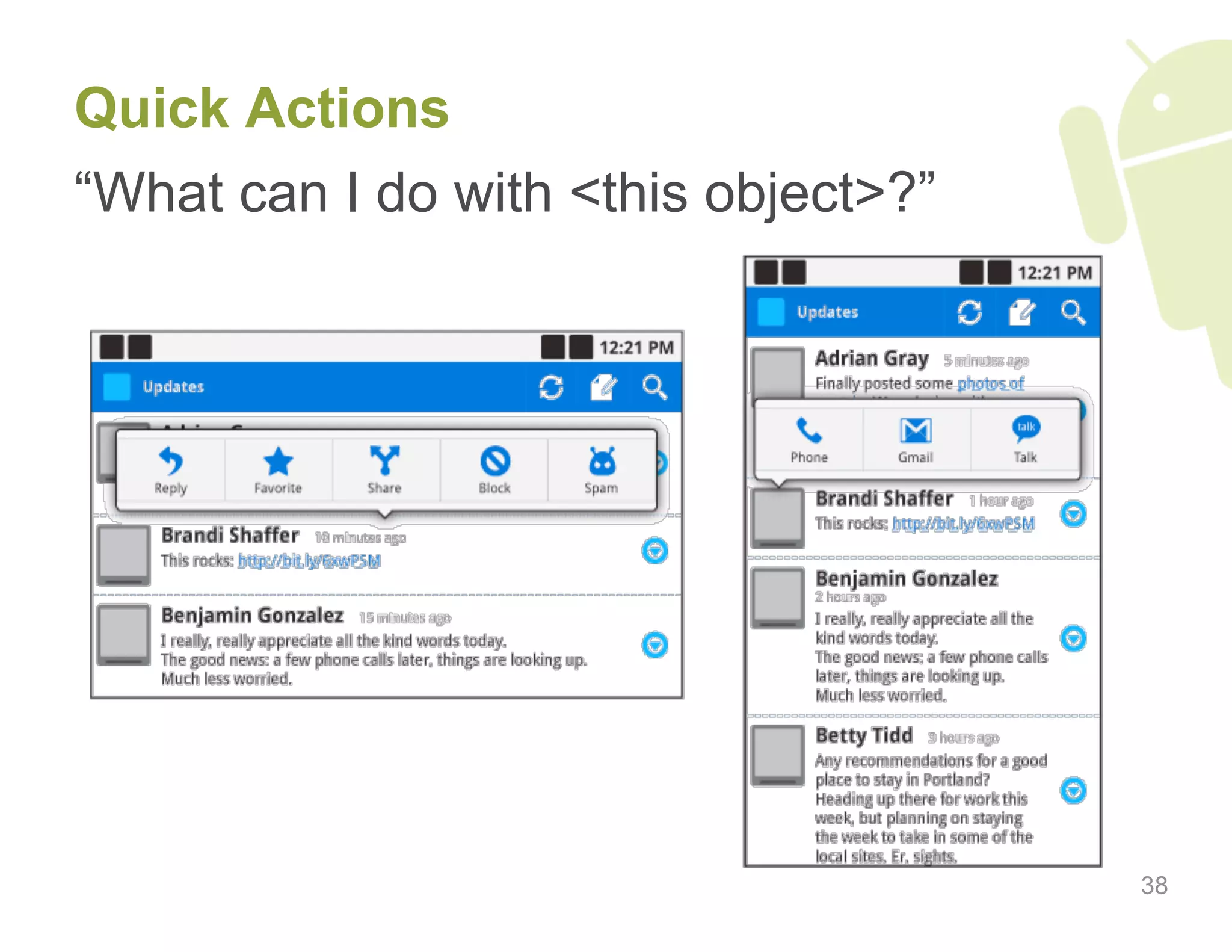
Emerging design patterns such as Dashboard, Action Bar, and Quick Actions for enhancing user experience.
Strategies for creating impactful dashboards, focusing on key app sections and novelty.
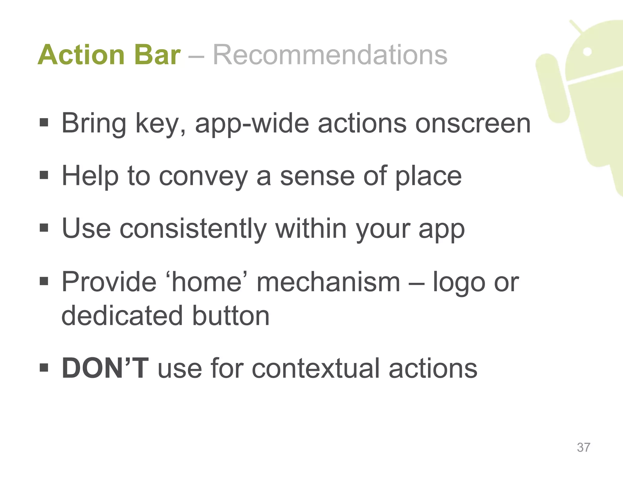
Guidelines for maximizing the Action Bar's effectiveness for user navigation and interaction.
Definition and importance of Quick Actions in improving user interaction with app objects.
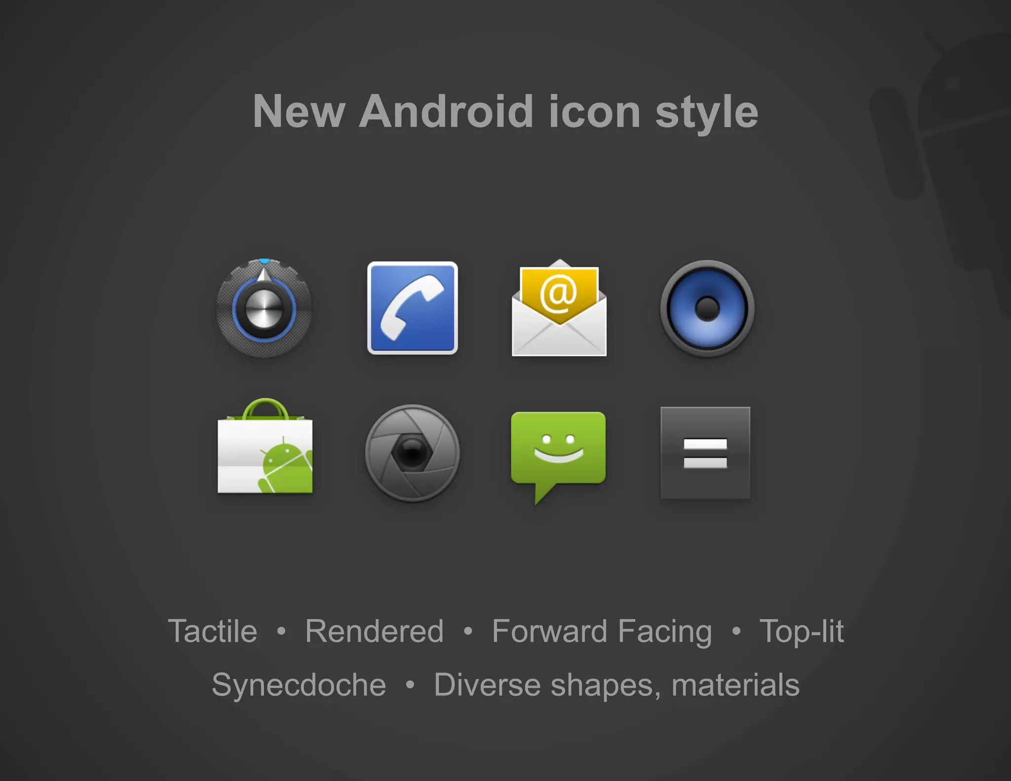
New styles and guidelines for Android icons, emphasizing tactile and visual appeal.
Final remarks on the presentation including copyrights and trademarks.