Download as PDF, PPTX
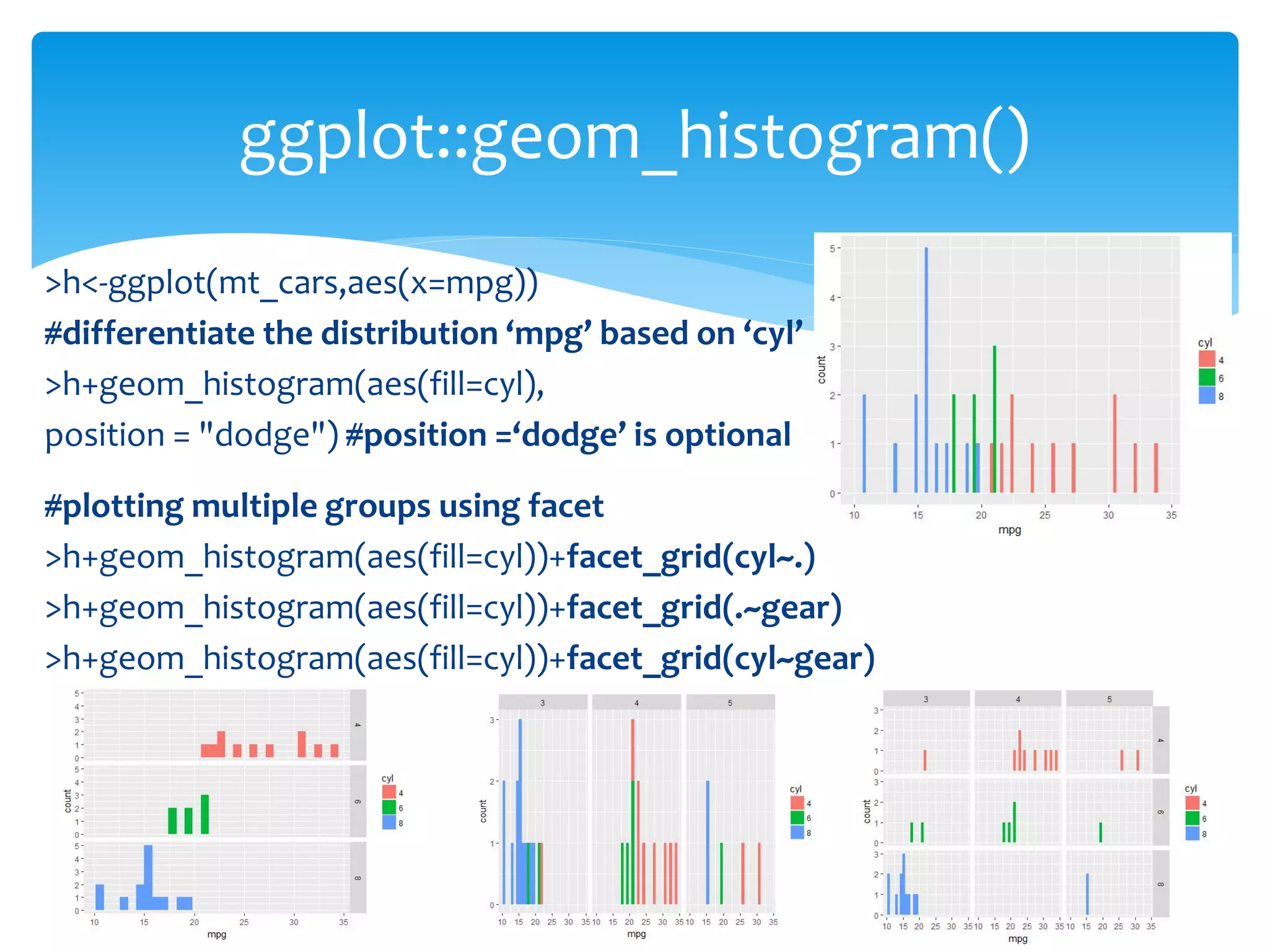
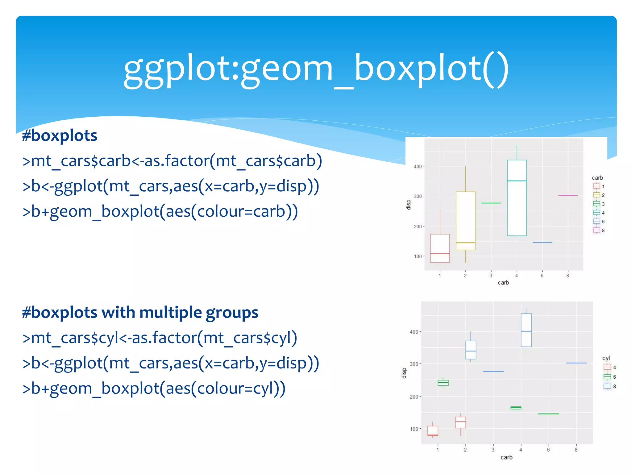
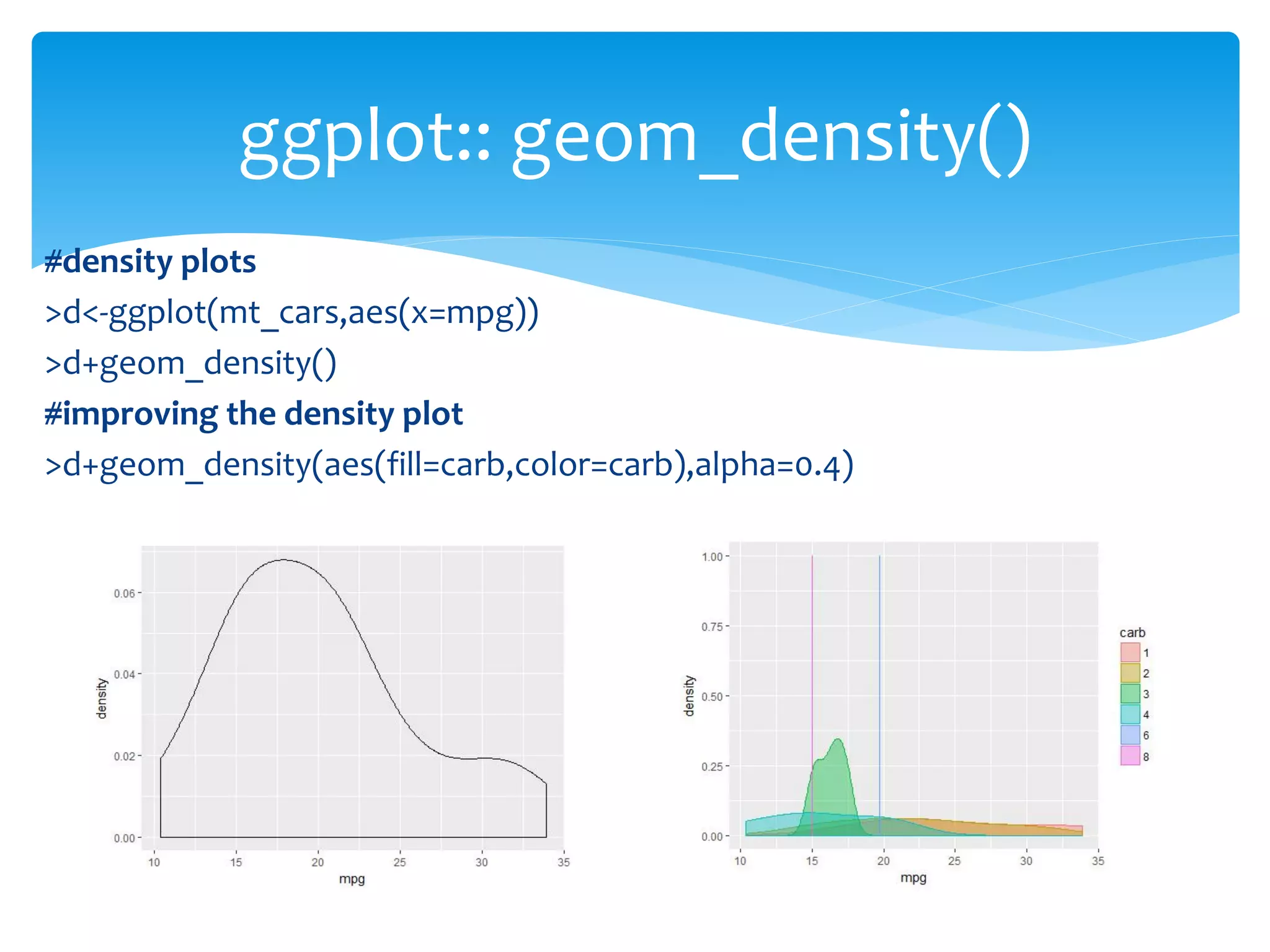

This document provides instructions on data visualization techniques using R's ggplot2 package, including creating histograms, boxplots, density plots, and bin2d plots. It demonstrates how to differentiate data distributions based on factors such as 'cyl', 'gear', and 'carb' in the mt_cars dataset. The document concludes with a mention of an upcoming case study to apply these visualization methods.