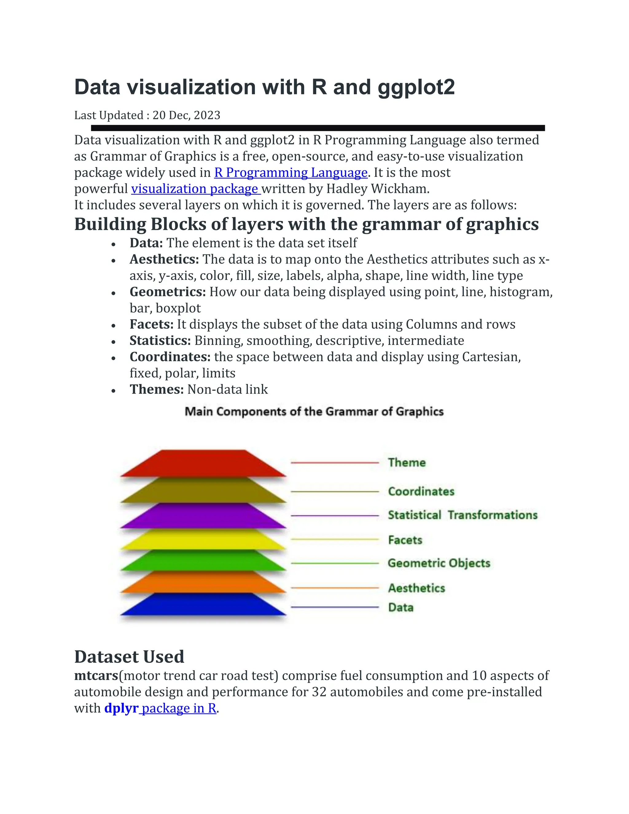
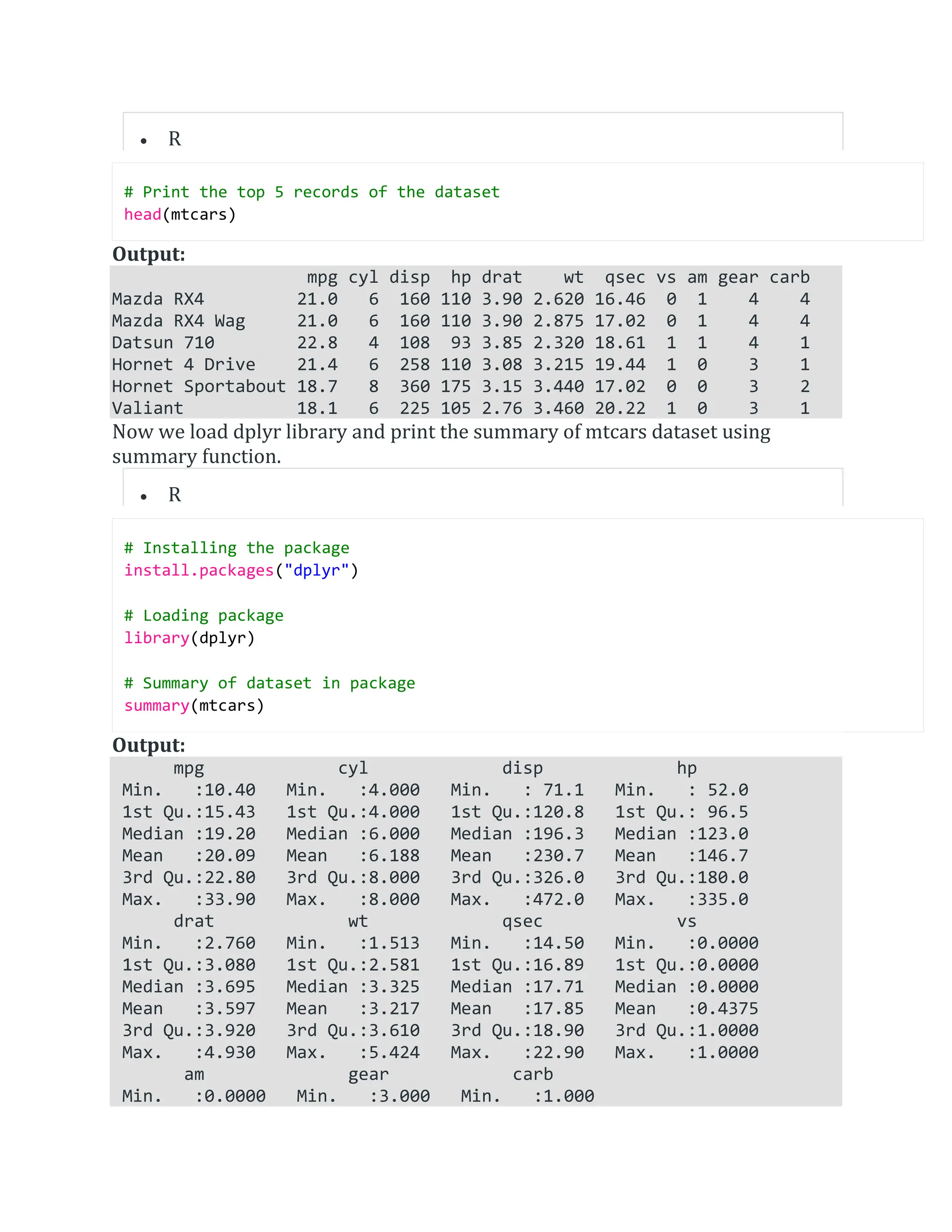
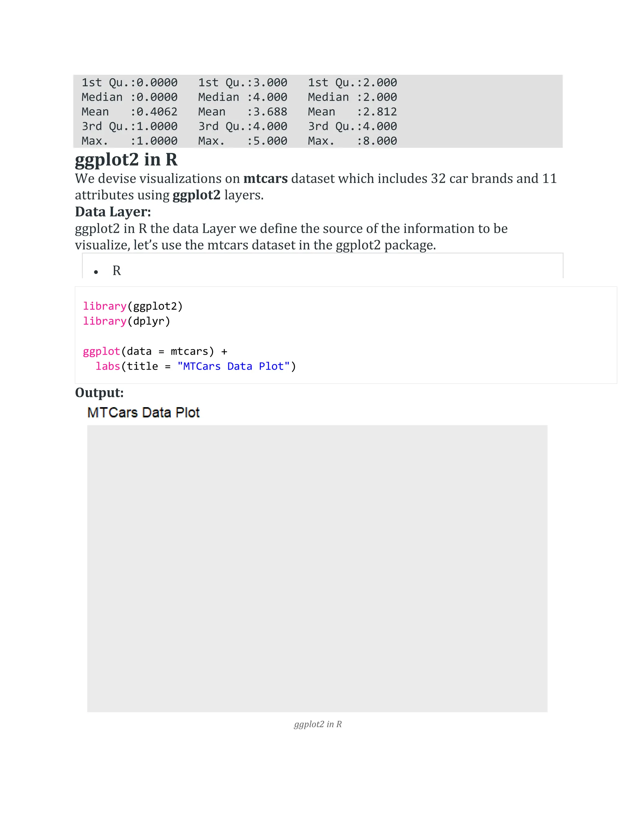
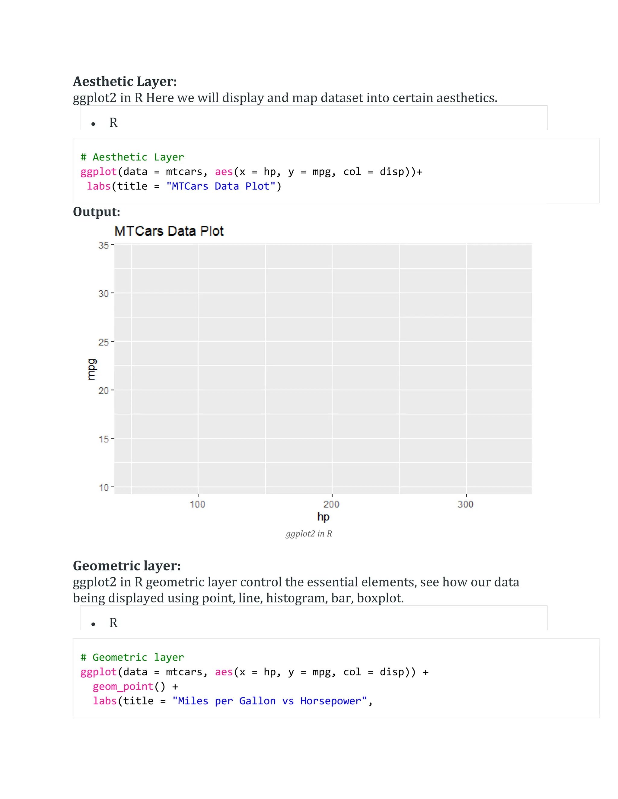
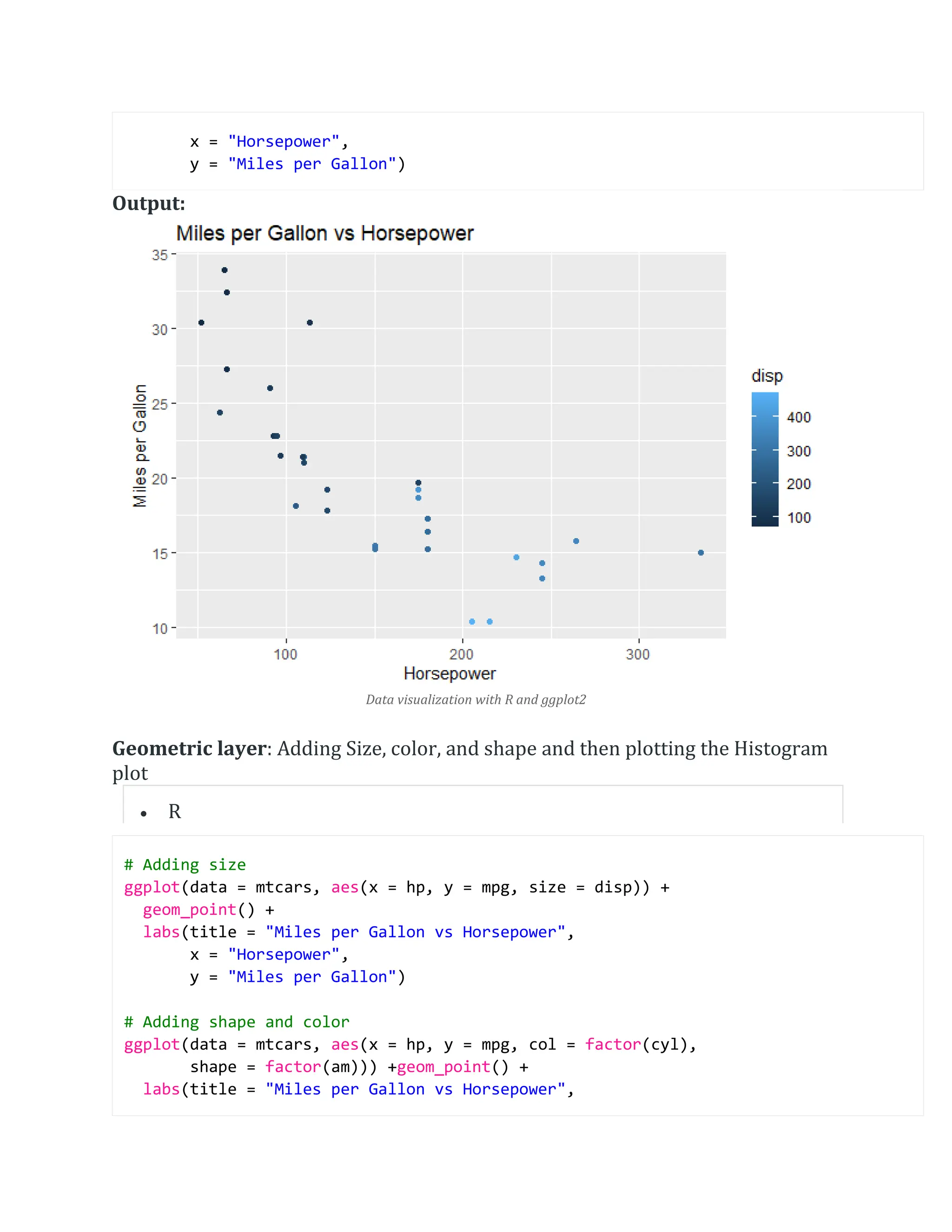
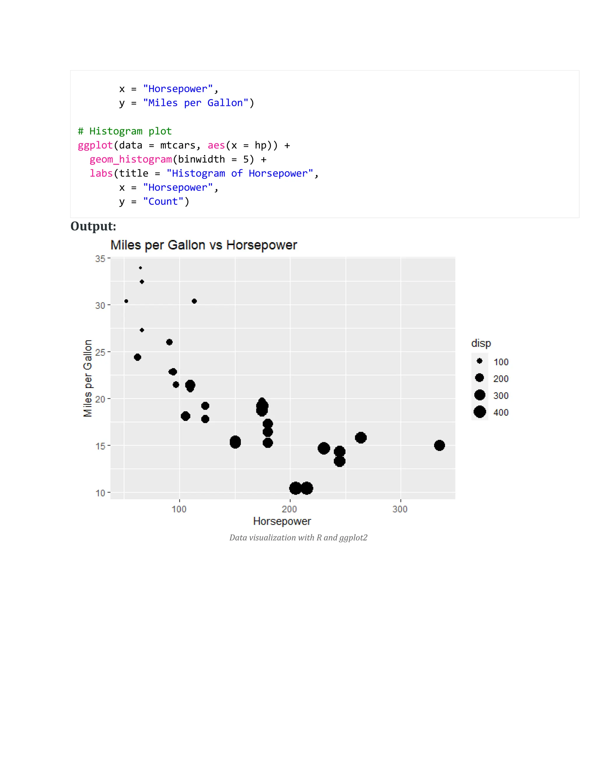
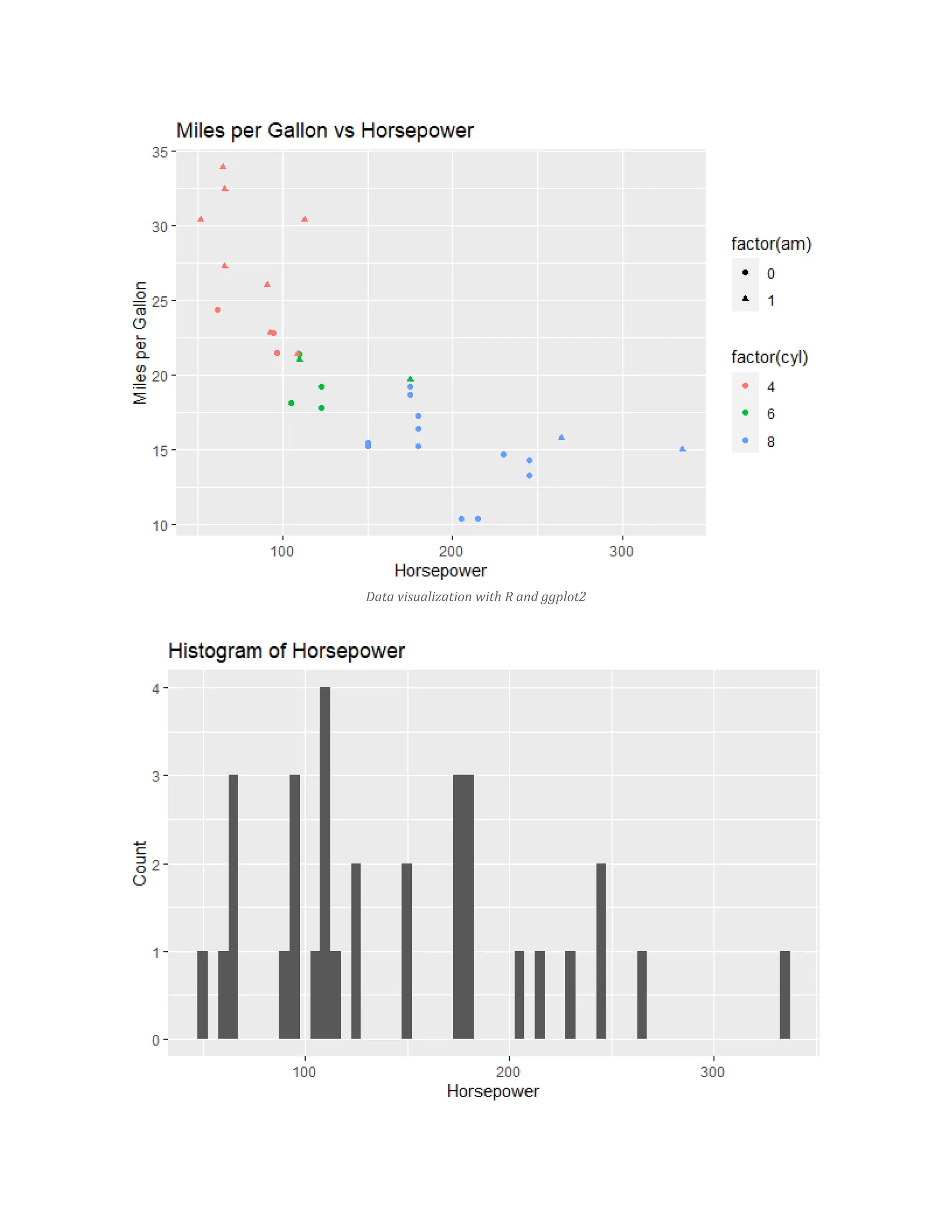
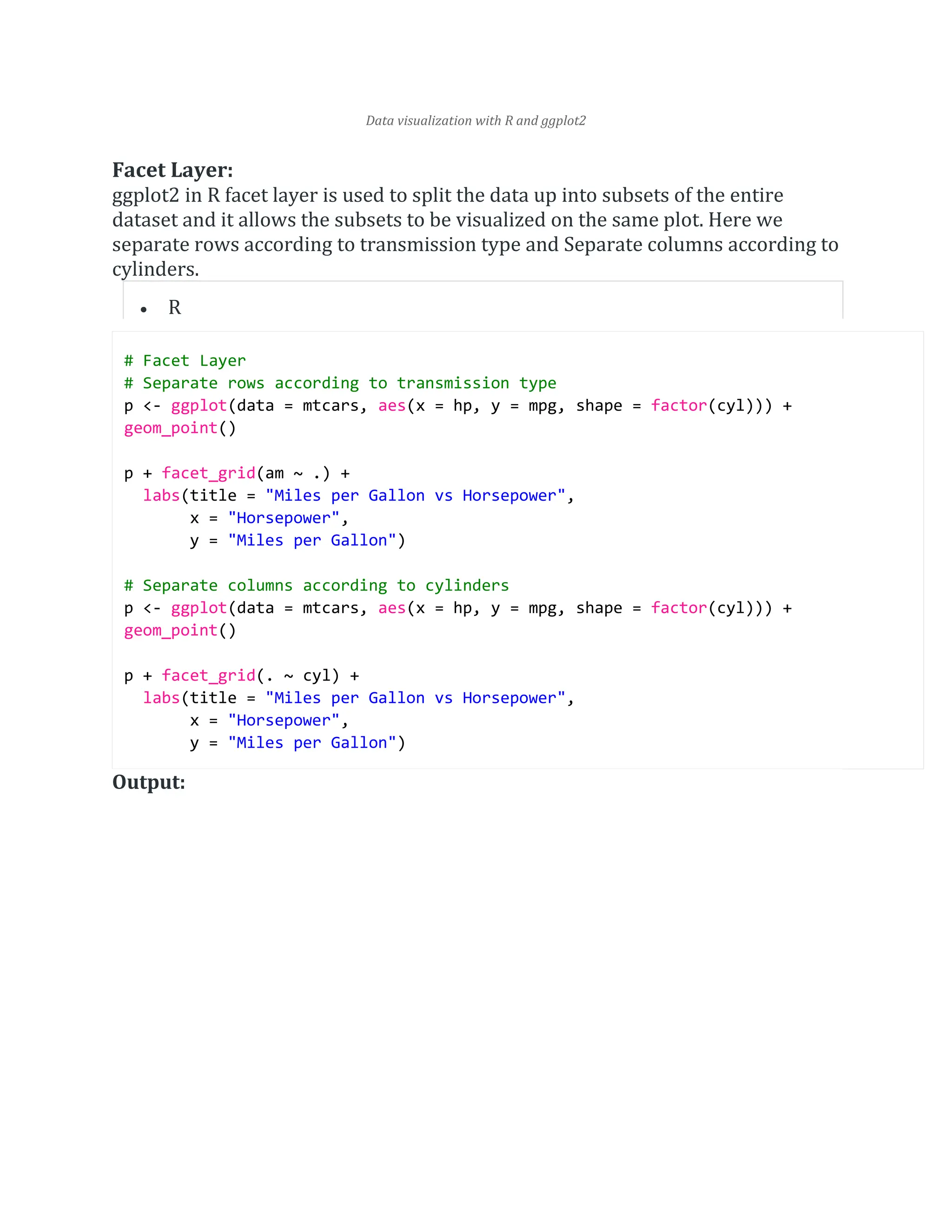
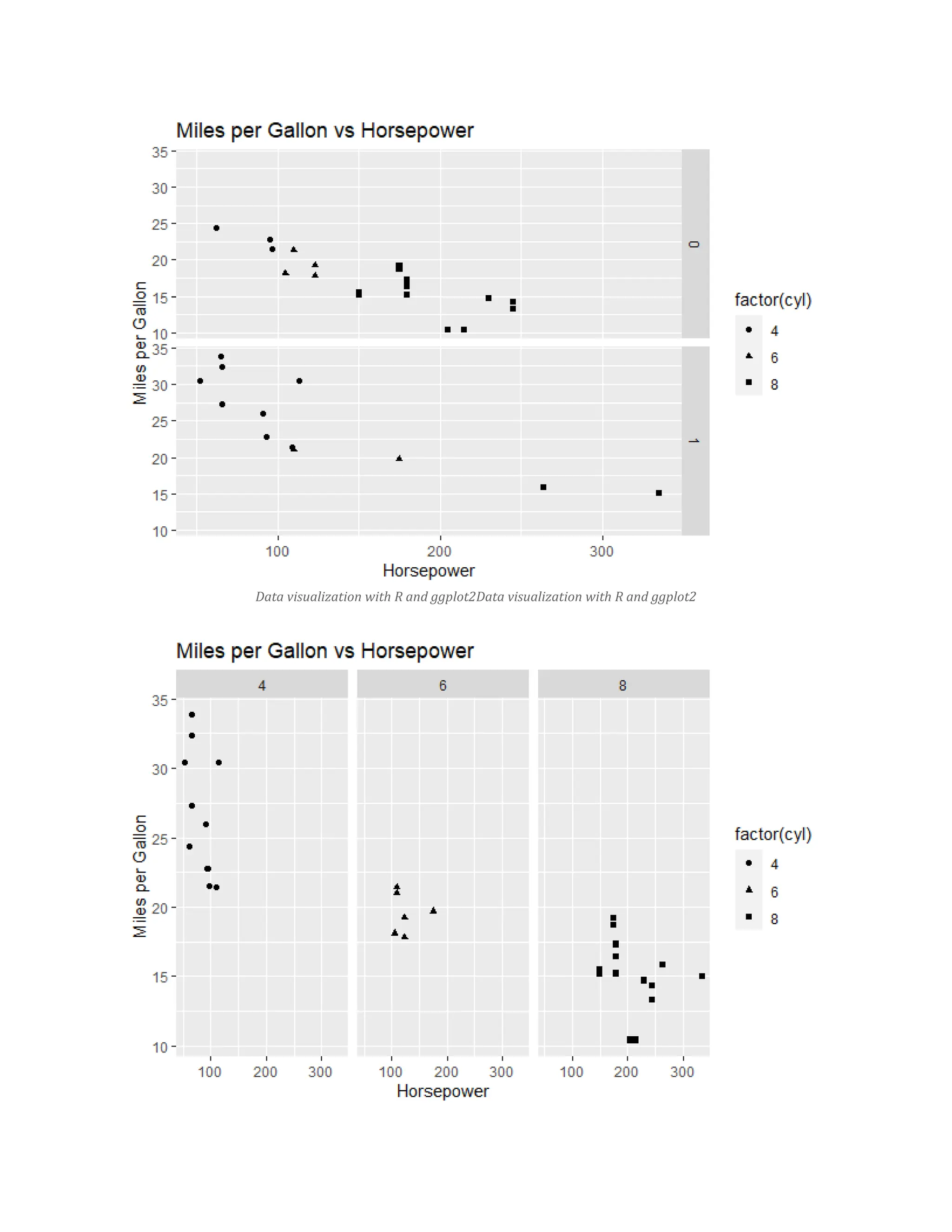
The document explains data visualization in R using the ggplot2 package, which is based on the grammar of graphics and provides multiple layering components for building visualizations. It covers key concepts such as data layers, aesthetics, geometrics, facets, statistics, coordinates, and themes using the mtcars dataset. Additionally, it demonstrates creating different plot types, saving plots, and using various packages to enhance ggplot2 visualizations.
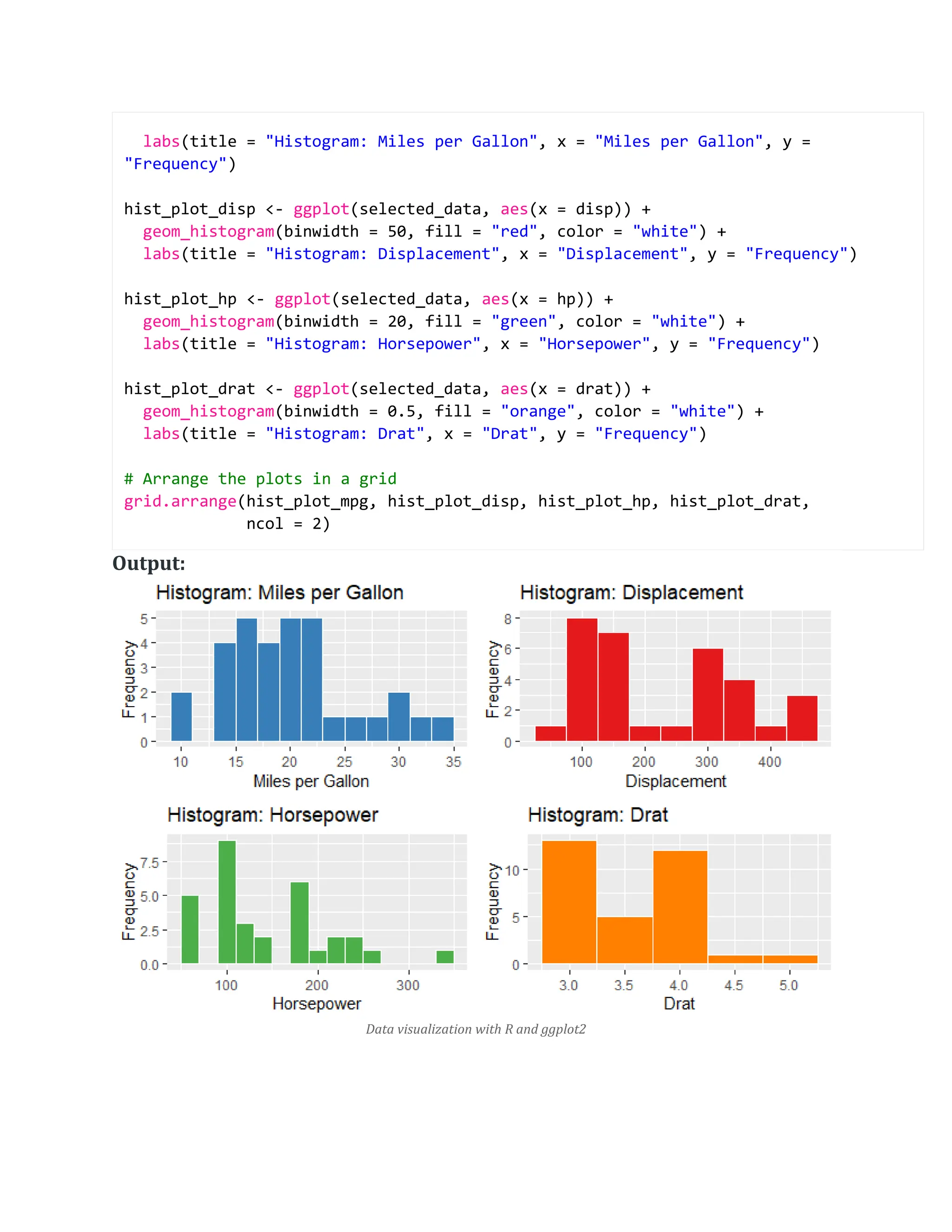
![theme_minimal() Output: Data visualization with R and ggplot2 In ggplot2 in R stat_density_2d to generate the 2D density contour plot. The aesthetics x and y specify the variables on the x-axis and y-axis, respectively. The fill aesthetic is set to ..level.. to map fill color to density levels. Creating a panel of different plots R library(ggplot2) library(gridExtra) # Selecting specific columns from mtcars dataset selected_cols <- c("mpg", "disp", "hp", "drat") selected_data <- mtcars[, selected_cols] # Create histograms for individual variables hist_plot_mpg <- ggplot(selected_data, aes(x = mpg)) + geom_histogram(binwidth = 2, fill = "blue", color = "white") +](https://image.slidesharecdn.com/datavisualizationwithrandggplot2-240615090255-dfd1c905/75/Data-visualization-with-R-and-ggplot2-docx-15-2048.jpg)