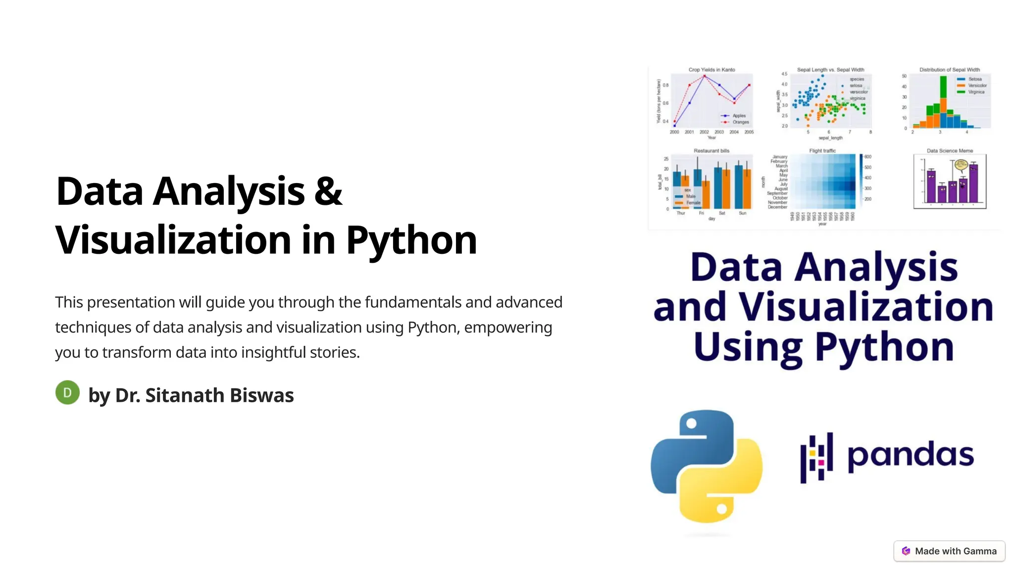
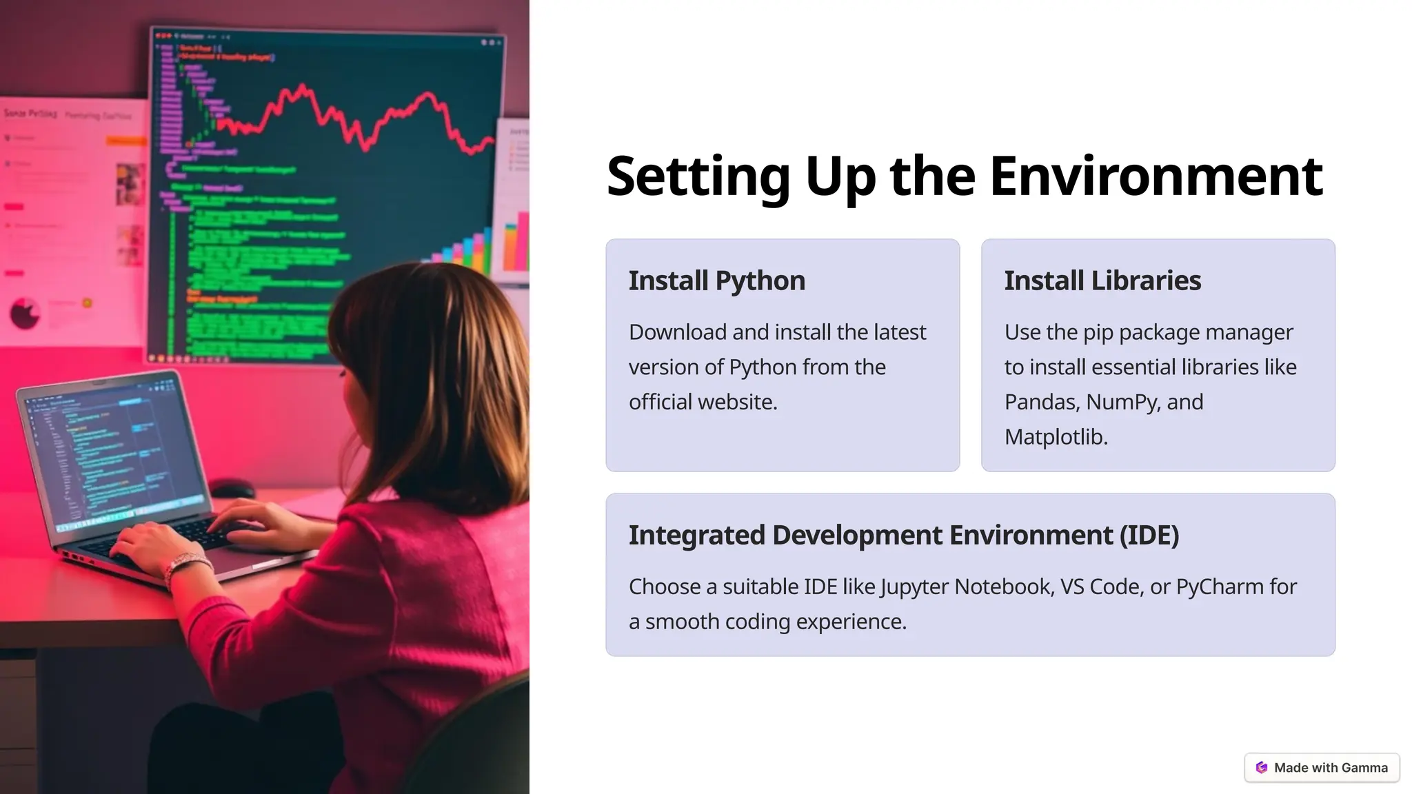
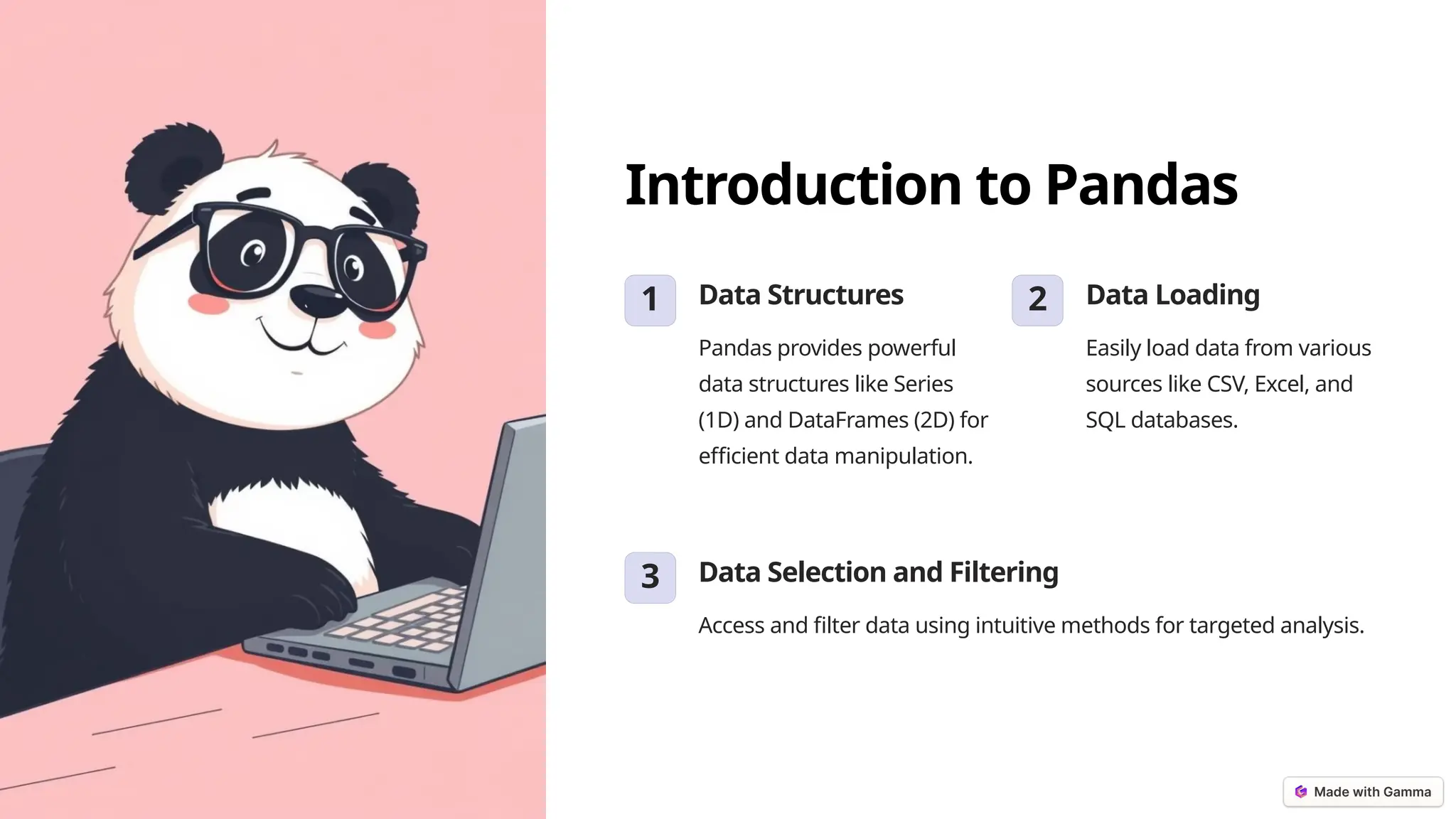
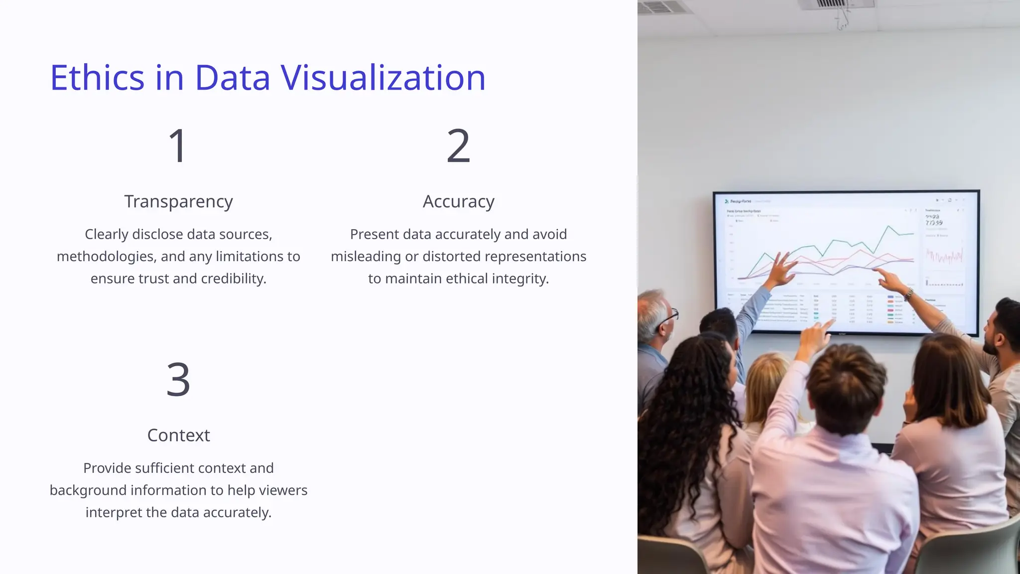
Data Analysis & Visualization in Python This presentation will guide you through the fundamentals and advanced techniques of data analysis and visualization using Python, empowering you to transform data into insightful stories. by Dr. Sitanath Biswas
Overview of Python for Data Analysis Open-source Python is free to use and modify, fostering collaboration and innovation. Extensive Libraries A rich ecosystem of libraries for data analysis, visualization, and machine learning. Beginner-friendly Python's syntax is relatively simple, making it accessible for beginners.
Setting Up the Environment Install Python Download and install the latest version of Python from the official website. Install Libraries Use the pip package manager to install essential libraries like Pandas, NumPy, and Matplotlib. Integrated Development Environment (IDE) Choose a suitable IDE like Jupyter Notebook, VS Code, or PyCharm for a smooth coding experience.
Introduction to Pandas 1 Data Structures Pandas provides powerful data structures like Series (1D) and DataFrames (2D) for efficient data manipulation. 2 Data Loading Easily load data from various sources like CSV, Excel, and SQL databases. 3 Data Selection and Filtering Access and filter data using intuitive methods for targeted analysis.
Data Cleaning and Preprocessing Handling Missing Data Identify and address missing values using techniques like imputation or removal. Data Transformation Convert data types, standardize units, and apply necessary transformations. Removing Duplicates Identify and eliminate redundant entries to ensure data integrity.
Exploratory Data Analysis (EDA) 1 Descriptive Statistics Calculate summary statistics like mean, median, and standard deviation to understand data distributions. 2 Data Visualization Create various charts and plots to identify trends, patterns, and relationships in the data. 3 Hypothesis Testing Formulate and test hypotheses based on the observed data patterns.
Data Visualization Basics Bar Charts Ideal for comparing categorical data. Line Charts Illustrate trends and patterns over time. Scatter Plots Show the relationship between two numerical variables. Histograms Visualize the distribution of a single numerical variable.
Advanced Visualization with Matplotlib 1 Customization Fine-tune plot elements, labels, colors, and styles. 2 Interactive Plots Create interactive plots that respond to user input. 3 3D Plots Visualize data in three dimensions for a deeper understanding.
Seaborn for Statistical Plots 1 Statistical Relationships Create plots that highlight statistical relationships and distributions. 2 Aesthetically Pleasing Seaborn provides high-level functions for visually appealing plots. 3 Seaborn Gallery Explore the Seaborn gallery for inspiration and discover a wide range of plot types.
Working with Time Series Data 1 Data Preparation Load, clean, and transform time series data into a suitable format. 2 Trend Analysis Identify patterns and trends in the data over time. 3 Forecasting Use statistical models to predict future values based on historical data.
Unveiling Insights: Data Visualization with Python Welcome to a journey into the captivating realm of data visualization using Python. This presentation will guide you through the art of transforming raw data into compelling visual stories.
Interactive Visualizations with Plotly Interactive Exploration Plotly empowers users to delve deeper into data by allowing for zooming, panning, and hovering over specific data points. Customization It offers extensive customization options, enabling you to fine- tune the appearance and interactivity of your visualizations.
Geospatial Data Visualization 1 Mapping Libraries Python libraries like Geopandas and Folium facilitate the creation of interactive maps. 2 Data Integration Integrating geographical data with other datasets enables spatial analysis and visualization. 3 Visual Insights Geospatial visualizations help identify trends, patterns, and relationships within geographical contexts.
Handling Large Datasets 1 Data Chunking Large datasets can be processed in chunks to manage memory usage effectively. 2 Optimized Libraries Libraries like Dask and Pandas offer optimized functions for handling large datasets. 3 Parallel Processing Leveraging parallel processing can significantly accelerate data analysis tasks.
Machine Learning and Visualization 1 Model Training Visualizations help monitor model training progress and identify potential issues. 2 Feature Engineering Data visualizations guide feature selection and transformation for optimal model performance. 3 Model Evaluation Visualizing model predictions and performance metrics facilitates model evaluation and comparison.
Case Study: Analyzing Real- world Dataset Data Acquisition The process of collecting and preparing the real-world dataset is crucial. Data Exploration Visualizations help identify patterns, trends, and outliers in the dataset. Insight Generation Data visualizations lead to meaningful insights and actionable conclusions.
Best Practices in Data Visualization Clarity Use clear labels, consistent color schemes, and appropriate chart types for effective communication. Conciseness Avoid information overload by focusing on key insights and minimizing unnecessary details. Context Provide context and background information to help the audience understand the data and its implications.
Tools for Dashboard Creation Dash A powerful framework for building interactive web dashboards. Plotly Dash A popular library for creating customizable and interactive dashboards. Streamlit A lightweight framework for building web applications, including dashboards.
Sharing and Presenting Data Insights 1 Visual Storytelling Transform data insights into engaging narratives for effective communication. 2 Interactive Reports Share interactive reports that allow users to explore data on their own. 3 Data Collaboration Enable data sharing and collaboration among team members.
Future Trends in Data Visualization
Data Analysis and Visualization with Python This session dives into the captivating world of data analysis and visualization using Python. From fundamental concepts to advanced techniques, you will gain the skills necessary to transform raw data into insightful visual stories. Whether you're a beginner or looking to refine your skills, this talk will equip you with the tools to unlock the full potential of your data. by Dr. Sitanath Biswas
Data Aggregation and Group Operations Summarizing Data Learn how to aggregate data from various sources, combining and summarizing information to extract meaningful insights. This involves applying techniques like grouping, sorting, and calculating summary statistics. Understanding Data Trends Explore powerful group operations to analyze data across different dimensions, revealing patterns, trends, and relationships hidden within your datasets. These methods provide a structured way to understand your data.
Data Merging and Joining Combining Datasets Discover the art of merging and joining data from multiple sources, enriching your analysis by combining complementary information. Understand different types of joins like inner, outer, left, and right. Enhancing Insights By effectively merging data, you can unlock deeper insights and create comprehensive analyses. Learn how to identify the optimal join strategies based on your specific data needs and goals.
Advanced Statistical Analysis Hypothesis Testing Delve into the world of hypothesis testing to determine whether your observations are statistically significant or simply random fluctuations. Learn to formulate hypotheses and test them using various statistical tests. Regression Analysis Uncover the relationships between variables using regression analysis. Explore linear and non- linear models to predict and understand how changes in one variable impact another. Statistical Distributions Gain a deeper understanding of data patterns by recognizing and applying different statistical distributions. Learn how to interpret and analyze data based on the underlying distribution.
Creating Custom Visualizations Bar Charts Visualize data using bar charts to compare categories, showing the magnitude of different values. Explore various customizations to highlight specific trends and patterns. Pie Charts Represent parts of a whole using pie charts to visualize proportions and percentages. Learn how to choose appropriate data for pie charts and design them effectively. Scatter Plots Analyze relationships between variables using scatter plots. Discover trends and patterns in your data by visualizing the relationship between two or more variables.
Advanced Time Series Analysis 1 Time Series Decomposition Learn how to break down time series data into its underlying components, including trend, seasonality, and noise. This helps you understand the driving forces behind the data and forecast future trends. 2 Forecasting Techniques Explore advanced forecasting techniques like ARIMA, Prophet, and LSTM to predict future values based on historical patterns. Discover how to choose the right method for your specific time series data. 3 Seasonality and Trends Understand how to identify and model seasonal patterns and long-term trends in your time series data. Learn to adjust your forecasts based on seasonal variations and changing trends.
Network Analysis and Visualization Network Graphs Discover how to visualize relationships and connections between entities using network graphs. Learn to build and interpret these graphs, revealing insights into the structure and dynamics of complex systems. Centrality Measures Explore various centrality measures to understand the importance and influence of nodes within a network. Identify key players and influential nodes within your network based on their connections and relationships. Community Detection Learn how to identify groups and communities within a network based on the density of connections. Understand how community detection can reveal hidden structures and patterns in your data.
Interactive Widgets for Data Visualization 1 Sliders 2 Dropdowns 3 Buttons 4 Text Input Explore the power of interactive widgets to create dynamic and engaging data visualizations. Learn how to integrate widgets like sliders, buttons, and dropdowns to allow users to explore and manipulate data in real time.
Advanced Plotly Features 1 3D Plots Create immersive and insightful visualizations with Plotly's 3D plotting capabilities. Discover how to visualize data in three dimensions, revealing patterns and relationships not visible in 2D plots. 2 Animations Bring your visualizations to life by adding animations. Learn how to create dynamic transitions and transformations within your plots, capturing attention and conveying data trends effectively. 3 Customizability Explore the extensive range of customization options available within Plotly to tailor your visualizations to your specific needs. Learn to adjust colors, styles, and layouts to create impactful and visually appealing plots.
Automating Data Analysis Tasks 1 Script Discover how to create reusable scripts to automate repetitive tasks in data analysis, such as data cleaning, transformation, and visualization. This saves time and reduces errors. 2 Pipeline Build automated data pipelines to streamline your workflow, connecting different steps in the analysis process. This ensures consistent and reliable data analysis results. 3 Dashboard Create interactive dashboards that automatically update with the latest data, providing a central hub for monitoring key metrics and visualizing trends. This enables data-driven decision making.
Data Visualization with Python This session will guide you through the exciting world of data visualization in Python. From basic principles to cutting-edge techniques, you'll learn how to turn raw data into compelling visual stories. Whether you're a beginner or a seasoned analyst, this talk will provide you with the knowledge and skills to elevate your data analysis journey.
Introduction to Bokeh for Interactive Plots Interactive Plots Bokeh empowers you to create visually appealing and highly interactive plots. Through its user-friendly interface, you can craft plots that respond to user input, offering an engaging data exploration experience. Web-based Visualizations Bokeh specializes in creating interactive plots for web applications. It seamlessly integrates with web frameworks, enabling you to share your visualizations with a broader audience.
Creating Interactive Web Applications with Dash User-Friendly Dashboards Dash simplifies the creation of web- based dashboards, allowing you to combine multiple charts, graphs, and other interactive components into a unified user interface. Interactive Components Dash offers a rich library of interactive components, including sliders, dropdowns, and buttons. These components enable user interaction and exploration of your data. Real-time Data Updates Dash excels in handling real-time data updates. It automatically refreshes your dashboard whenever new data becomes available, providing a dynamic and up-to-date view of your information.
Visualization with Altair Declarative Syntax Altair employs a declarative syntax, allowing you to focus on describing what your visualization should look like rather than the underlying implementation details. Elegant and Concise Altair promotes a concise and elegant code style, resulting in readable and maintainable visualizations. You can create sophisticated charts with minimal code. Data-driven Aesthetics Altair empowers you to create visualizations where the visual elements, such as color, size, and shape, are automatically determined by the data itself, enhancing data exploration.
Data Storytelling Techniques 1 Understanding Your Audience Know your audience's background, interests, and desired outcomes. Tailor your story to their needs and perspectives. 2 Crafting a Narrative Arc Develop a compelling storyline that guides the audience through the data, using a clear beginning, middle, and end. 3 Using Visual Cues Employ visual elements like color, shape, and size to emphasize key points and highlight patterns in the data.
Ethics in Data Visualization 1 Transparency Clearly disclose data sources, methodologies, and any limitations to ensure trust and credibility. 2 Accuracy Present data accurately and avoid misleading or distorted representations to maintain ethical integrity. 3 Context Provide sufficient context and background information to help viewers interpret the data accurately.
Real-time Data Visualization Streaming Data Sources Integrate real-time data streams from sources such as APIs, databases, or sensor networks. Dynamic Updates Ensure visualizations dynamically update as new data arrives, providing a continuous view of changing trends. Interactive Exploration Enable users to interact with visualizations, filtering, zooming, and drilling down into the data.
Integrating Data Visualization in Web Applications 1 Frontend Integration Embed visualization libraries into your web application using Javascript frameworks like React or Vue.js. 2 Data Communication Establish communication channels between your backend and frontend to exchange data efficiently. 3 User Interaction Implement interactive components that allow users to explore and manipulate visualizations.
Collaborative Data Analysis 1 Shared Workspace Use platforms like JupyterHub or Google Colab to enable collaborative editing and sharing of code and visualizations. 2 Version Control Employ Git to manage code changes and track different versions of your visualizations. 3 Communication Tools Utilize communication tools like Slack or Zoom to facilitate discussions and knowledge sharing.
Performance Optimization for Large-scale Visualizations
Data Visualization: Transforming Data into Insights In this session, we'll explore the captivating world of data visualization using Python. From fundamental concepts to cutting-edge techniques, you'll gain the skills to transform raw data into insightful visual narratives. Whether you're a beginner or seeking to sharpen your skills, this talk will equip you with the tools to harness the power of your data.
The Power of Visualization in Research Communicate Complex Ideas Visualization translates intricate data into understandable visuals, making it easier for researchers to communicate their findings to colleagues, collaborators, and the wider research community. Uncover Hidden Patterns Data visualization allows researchers to identify trends, anomalies, and patterns that may be missed by traditional analysis methods, leading to new insights and discoveries. Gain Deeper Understanding Visual representations provide a more intuitive and interactive way to explore data, enabling researchers to gain a deeper understanding of their research findings and their implications.
Case Study: A Real-World Visualization Project Project Goal Analyze customer purchase data to understand buying habits and identify key factors influencing sales. Visualizations Interactive dashboards, heatmaps, and scatter plots were created to highlight trends and patterns in customer behavior. Results The visualizations provided actionable insights that led to targeted marketing campaigns, resulting in increased sales and customer satisfaction.
Immersive Data Visualization: AR and VR 1 Enhanced Interaction AR and VR offer interactive experiences, allowing users to explore data in immersive environments, manipulating objects and gaining a deeper understanding. 2 Spatial Data Representation AR and VR excel at visualizing spatial data, enabling users to understand complex relationships and patterns in 3D space. 3 New Insights These technologies have the potential to revolutionize data analysis and visualization, opening up new possibilities for discovery and problem-solving.
Geospatial Analysis: Unveiling Location-Based Insights Mapping Data Geovisualization allows researchers to visualize spatial data, revealing patterns and trends across geographic areas. Spatial Relationships Visualizing data on maps provides insights into spatial relationships and correlations, allowing for a deeper understanding of geographical phenomena. Data-Driven Decisions Geospatial analysis supports informed decision-making in areas like urban planning, environmental monitoring, and resource management.
Exploring the World of Text Data Visualization 1 Word Clouds 2 Sentiment Analysis Visualizing sentiment trends and patterns within text data. 3 Network Graphs Analyzing relationships between words or entities within a text corpus. 4 Topic Modeling Visualizing the themes and topics that emerge from a collection of texts.
Building Custom Visualization Libraries 1 Customization Develop tailored visualizations that perfectly fit the specific requirements of your data and research. 2 Reusability Create libraries that can be reused for future projects, streamlining the visualization process and ensuring consistency. 3 Innovation Pioneering new ways to visualize data, pushing the boundaries of data visualization and expanding its capabilities.
Data Visualization for Social Media Analytics 2.5B Active Users Understanding audience demographics, interests, and behavior. $100B Market Size Tracking brand performance, measuring campaign effectiveness, and analyzing competitor activity.
Hands-On Session: Building a Complete Dashboard
Conclusion: Unlocking the Potential of Your Data As you've learned, data visualization is a powerful tool for unlocking the potential of your data. By leveraging the techniques and insights shared in this session, you'll be equipped to communicate complex information, uncover hidden patterns, and make data-driven decisions.

DATA ANALYSIS AND VISUALISATION using python 2

  • 1.
    Data Analysis & Visualizationin Python This presentation will guide you through the fundamentals and advanced techniques of data analysis and visualization using Python, empowering you to transform data into insightful stories. by Dr. Sitanath Biswas
  • 2.
    Overview of Pythonfor Data Analysis Open-source Python is free to use and modify, fostering collaboration and innovation. Extensive Libraries A rich ecosystem of libraries for data analysis, visualization, and machine learning. Beginner-friendly Python's syntax is relatively simple, making it accessible for beginners.
  • 3.
    Setting Up theEnvironment Install Python Download and install the latest version of Python from the official website. Install Libraries Use the pip package manager to install essential libraries like Pandas, NumPy, and Matplotlib. Integrated Development Environment (IDE) Choose a suitable IDE like Jupyter Notebook, VS Code, or PyCharm for a smooth coding experience.
  • 4.
    Introduction to Pandas 1Data Structures Pandas provides powerful data structures like Series (1D) and DataFrames (2D) for efficient data manipulation. 2 Data Loading Easily load data from various sources like CSV, Excel, and SQL databases. 3 Data Selection and Filtering Access and filter data using intuitive methods for targeted analysis.
  • 5.
    Data Cleaning and Preprocessing HandlingMissing Data Identify and address missing values using techniques like imputation or removal. Data Transformation Convert data types, standardize units, and apply necessary transformations. Removing Duplicates Identify and eliminate redundant entries to ensure data integrity.
  • 6.
    Exploratory Data Analysis (EDA) 1Descriptive Statistics Calculate summary statistics like mean, median, and standard deviation to understand data distributions. 2 Data Visualization Create various charts and plots to identify trends, patterns, and relationships in the data. 3 Hypothesis Testing Formulate and test hypotheses based on the observed data patterns.
  • 7.
    Data Visualization Basics BarCharts Ideal for comparing categorical data. Line Charts Illustrate trends and patterns over time. Scatter Plots Show the relationship between two numerical variables. Histograms Visualize the distribution of a single numerical variable.
  • 8.
    Advanced Visualization withMatplotlib 1 Customization Fine-tune plot elements, labels, colors, and styles. 2 Interactive Plots Create interactive plots that respond to user input. 3 3D Plots Visualize data in three dimensions for a deeper understanding.
  • 9.
    Seaborn for StatisticalPlots 1 Statistical Relationships Create plots that highlight statistical relationships and distributions. 2 Aesthetically Pleasing Seaborn provides high-level functions for visually appealing plots. 3 Seaborn Gallery Explore the Seaborn gallery for inspiration and discover a wide range of plot types.
  • 10.
    Working with TimeSeries Data 1 Data Preparation Load, clean, and transform time series data into a suitable format. 2 Trend Analysis Identify patterns and trends in the data over time. 3 Forecasting Use statistical models to predict future values based on historical data.
  • 11.
    Unveiling Insights: Data Visualizationwith Python Welcome to a journey into the captivating realm of data visualization using Python. This presentation will guide you through the art of transforming raw data into compelling visual stories.
  • 12.
    Interactive Visualizations withPlotly Interactive Exploration Plotly empowers users to delve deeper into data by allowing for zooming, panning, and hovering over specific data points. Customization It offers extensive customization options, enabling you to fine- tune the appearance and interactivity of your visualizations.
  • 13.
    Geospatial Data Visualization 1 MappingLibraries Python libraries like Geopandas and Folium facilitate the creation of interactive maps. 2 Data Integration Integrating geographical data with other datasets enables spatial analysis and visualization. 3 Visual Insights Geospatial visualizations help identify trends, patterns, and relationships within geographical contexts.
  • 14.
    Handling Large Datasets 1 DataChunking Large datasets can be processed in chunks to manage memory usage effectively. 2 Optimized Libraries Libraries like Dask and Pandas offer optimized functions for handling large datasets. 3 Parallel Processing Leveraging parallel processing can significantly accelerate data analysis tasks.
  • 15.
    Machine Learning and Visualization 1Model Training Visualizations help monitor model training progress and identify potential issues. 2 Feature Engineering Data visualizations guide feature selection and transformation for optimal model performance. 3 Model Evaluation Visualizing model predictions and performance metrics facilitates model evaluation and comparison.
  • 16.
    Case Study: AnalyzingReal- world Dataset Data Acquisition The process of collecting and preparing the real-world dataset is crucial. Data Exploration Visualizations help identify patterns, trends, and outliers in the dataset. Insight Generation Data visualizations lead to meaningful insights and actionable conclusions.
  • 17.
    Best Practices inData Visualization Clarity Use clear labels, consistent color schemes, and appropriate chart types for effective communication. Conciseness Avoid information overload by focusing on key insights and minimizing unnecessary details. Context Provide context and background information to help the audience understand the data and its implications.
  • 18.
    Tools for DashboardCreation Dash A powerful framework for building interactive web dashboards. Plotly Dash A popular library for creating customizable and interactive dashboards. Streamlit A lightweight framework for building web applications, including dashboards.
  • 19.
    Sharing and PresentingData Insights 1 Visual Storytelling Transform data insights into engaging narratives for effective communication. 2 Interactive Reports Share interactive reports that allow users to explore data on their own. 3 Data Collaboration Enable data sharing and collaboration among team members.
  • 20.
    Future Trends inData Visualization
  • 21.
    Data Analysis and Visualizationwith Python This session dives into the captivating world of data analysis and visualization using Python. From fundamental concepts to advanced techniques, you will gain the skills necessary to transform raw data into insightful visual stories. Whether you're a beginner or looking to refine your skills, this talk will equip you with the tools to unlock the full potential of your data. by Dr. Sitanath Biswas
  • 22.
    Data Aggregation andGroup Operations Summarizing Data Learn how to aggregate data from various sources, combining and summarizing information to extract meaningful insights. This involves applying techniques like grouping, sorting, and calculating summary statistics. Understanding Data Trends Explore powerful group operations to analyze data across different dimensions, revealing patterns, trends, and relationships hidden within your datasets. These methods provide a structured way to understand your data.
  • 23.
    Data Merging andJoining Combining Datasets Discover the art of merging and joining data from multiple sources, enriching your analysis by combining complementary information. Understand different types of joins like inner, outer, left, and right. Enhancing Insights By effectively merging data, you can unlock deeper insights and create comprehensive analyses. Learn how to identify the optimal join strategies based on your specific data needs and goals.
  • 24.
    Advanced Statistical Analysis HypothesisTesting Delve into the world of hypothesis testing to determine whether your observations are statistically significant or simply random fluctuations. Learn to formulate hypotheses and test them using various statistical tests. Regression Analysis Uncover the relationships between variables using regression analysis. Explore linear and non- linear models to predict and understand how changes in one variable impact another. Statistical Distributions Gain a deeper understanding of data patterns by recognizing and applying different statistical distributions. Learn how to interpret and analyze data based on the underlying distribution.
  • 25.
    Creating Custom Visualizations BarCharts Visualize data using bar charts to compare categories, showing the magnitude of different values. Explore various customizations to highlight specific trends and patterns. Pie Charts Represent parts of a whole using pie charts to visualize proportions and percentages. Learn how to choose appropriate data for pie charts and design them effectively. Scatter Plots Analyze relationships between variables using scatter plots. Discover trends and patterns in your data by visualizing the relationship between two or more variables.
  • 26.
    Advanced Time SeriesAnalysis 1 Time Series Decomposition Learn how to break down time series data into its underlying components, including trend, seasonality, and noise. This helps you understand the driving forces behind the data and forecast future trends. 2 Forecasting Techniques Explore advanced forecasting techniques like ARIMA, Prophet, and LSTM to predict future values based on historical patterns. Discover how to choose the right method for your specific time series data. 3 Seasonality and Trends Understand how to identify and model seasonal patterns and long-term trends in your time series data. Learn to adjust your forecasts based on seasonal variations and changing trends.
  • 27.
    Network Analysis andVisualization Network Graphs Discover how to visualize relationships and connections between entities using network graphs. Learn to build and interpret these graphs, revealing insights into the structure and dynamics of complex systems. Centrality Measures Explore various centrality measures to understand the importance and influence of nodes within a network. Identify key players and influential nodes within your network based on their connections and relationships. Community Detection Learn how to identify groups and communities within a network based on the density of connections. Understand how community detection can reveal hidden structures and patterns in your data.
  • 28.
    Interactive Widgets forData Visualization 1 Sliders 2 Dropdowns 3 Buttons 4 Text Input Explore the power of interactive widgets to create dynamic and engaging data visualizations. Learn how to integrate widgets like sliders, buttons, and dropdowns to allow users to explore and manipulate data in real time.
  • 29.
    Advanced Plotly Features 1 3DPlots Create immersive and insightful visualizations with Plotly's 3D plotting capabilities. Discover how to visualize data in three dimensions, revealing patterns and relationships not visible in 2D plots. 2 Animations Bring your visualizations to life by adding animations. Learn how to create dynamic transitions and transformations within your plots, capturing attention and conveying data trends effectively. 3 Customizability Explore the extensive range of customization options available within Plotly to tailor your visualizations to your specific needs. Learn to adjust colors, styles, and layouts to create impactful and visually appealing plots.
  • 30.
    Automating Data AnalysisTasks 1 Script Discover how to create reusable scripts to automate repetitive tasks in data analysis, such as data cleaning, transformation, and visualization. This saves time and reduces errors. 2 Pipeline Build automated data pipelines to streamline your workflow, connecting different steps in the analysis process. This ensures consistent and reliable data analysis results. 3 Dashboard Create interactive dashboards that automatically update with the latest data, providing a central hub for monitoring key metrics and visualizing trends. This enables data-driven decision making.
  • 31.
    Data Visualization with Python Thissession will guide you through the exciting world of data visualization in Python. From basic principles to cutting-edge techniques, you'll learn how to turn raw data into compelling visual stories. Whether you're a beginner or a seasoned analyst, this talk will provide you with the knowledge and skills to elevate your data analysis journey.
  • 32.
    Introduction to Bokehfor Interactive Plots Interactive Plots Bokeh empowers you to create visually appealing and highly interactive plots. Through its user-friendly interface, you can craft plots that respond to user input, offering an engaging data exploration experience. Web-based Visualizations Bokeh specializes in creating interactive plots for web applications. It seamlessly integrates with web frameworks, enabling you to share your visualizations with a broader audience.
  • 33.
    Creating Interactive WebApplications with Dash User-Friendly Dashboards Dash simplifies the creation of web- based dashboards, allowing you to combine multiple charts, graphs, and other interactive components into a unified user interface. Interactive Components Dash offers a rich library of interactive components, including sliders, dropdowns, and buttons. These components enable user interaction and exploration of your data. Real-time Data Updates Dash excels in handling real-time data updates. It automatically refreshes your dashboard whenever new data becomes available, providing a dynamic and up-to-date view of your information.
  • 34.
    Visualization with Altair DeclarativeSyntax Altair employs a declarative syntax, allowing you to focus on describing what your visualization should look like rather than the underlying implementation details. Elegant and Concise Altair promotes a concise and elegant code style, resulting in readable and maintainable visualizations. You can create sophisticated charts with minimal code. Data-driven Aesthetics Altair empowers you to create visualizations where the visual elements, such as color, size, and shape, are automatically determined by the data itself, enhancing data exploration.
  • 35.
    Data Storytelling Techniques 1 UnderstandingYour Audience Know your audience's background, interests, and desired outcomes. Tailor your story to their needs and perspectives. 2 Crafting a Narrative Arc Develop a compelling storyline that guides the audience through the data, using a clear beginning, middle, and end. 3 Using Visual Cues Employ visual elements like color, shape, and size to emphasize key points and highlight patterns in the data.
  • 36.
    Ethics in DataVisualization 1 Transparency Clearly disclose data sources, methodologies, and any limitations to ensure trust and credibility. 2 Accuracy Present data accurately and avoid misleading or distorted representations to maintain ethical integrity. 3 Context Provide sufficient context and background information to help viewers interpret the data accurately.
  • 37.
    Real-time Data Visualization StreamingData Sources Integrate real-time data streams from sources such as APIs, databases, or sensor networks. Dynamic Updates Ensure visualizations dynamically update as new data arrives, providing a continuous view of changing trends. Interactive Exploration Enable users to interact with visualizations, filtering, zooming, and drilling down into the data.
  • 38.
    Integrating Data Visualizationin Web Applications 1 Frontend Integration Embed visualization libraries into your web application using Javascript frameworks like React or Vue.js. 2 Data Communication Establish communication channels between your backend and frontend to exchange data efficiently. 3 User Interaction Implement interactive components that allow users to explore and manipulate visualizations.
  • 39.
    Collaborative Data Analysis 1 SharedWorkspace Use platforms like JupyterHub or Google Colab to enable collaborative editing and sharing of code and visualizations. 2 Version Control Employ Git to manage code changes and track different versions of your visualizations. 3 Communication Tools Utilize communication tools like Slack or Zoom to facilitate discussions and knowledge sharing.
  • 40.
    Performance Optimization forLarge-scale Visualizations
  • 41.
    Data Visualization: Transforming Datainto Insights In this session, we'll explore the captivating world of data visualization using Python. From fundamental concepts to cutting-edge techniques, you'll gain the skills to transform raw data into insightful visual narratives. Whether you're a beginner or seeking to sharpen your skills, this talk will equip you with the tools to harness the power of your data.
  • 42.
    The Power ofVisualization in Research Communicate Complex Ideas Visualization translates intricate data into understandable visuals, making it easier for researchers to communicate their findings to colleagues, collaborators, and the wider research community. Uncover Hidden Patterns Data visualization allows researchers to identify trends, anomalies, and patterns that may be missed by traditional analysis methods, leading to new insights and discoveries. Gain Deeper Understanding Visual representations provide a more intuitive and interactive way to explore data, enabling researchers to gain a deeper understanding of their research findings and their implications.
  • 43.
    Case Study: AReal-World Visualization Project Project Goal Analyze customer purchase data to understand buying habits and identify key factors influencing sales. Visualizations Interactive dashboards, heatmaps, and scatter plots were created to highlight trends and patterns in customer behavior. Results The visualizations provided actionable insights that led to targeted marketing campaigns, resulting in increased sales and customer satisfaction.
  • 44.
    Immersive Data Visualization: ARand VR 1 Enhanced Interaction AR and VR offer interactive experiences, allowing users to explore data in immersive environments, manipulating objects and gaining a deeper understanding. 2 Spatial Data Representation AR and VR excel at visualizing spatial data, enabling users to understand complex relationships and patterns in 3D space. 3 New Insights These technologies have the potential to revolutionize data analysis and visualization, opening up new possibilities for discovery and problem-solving.
  • 45.
    Geospatial Analysis: Unveiling Location-BasedInsights Mapping Data Geovisualization allows researchers to visualize spatial data, revealing patterns and trends across geographic areas. Spatial Relationships Visualizing data on maps provides insights into spatial relationships and correlations, allowing for a deeper understanding of geographical phenomena. Data-Driven Decisions Geospatial analysis supports informed decision-making in areas like urban planning, environmental monitoring, and resource management.
  • 46.
    Exploring the Worldof Text Data Visualization 1 Word Clouds 2 Sentiment Analysis Visualizing sentiment trends and patterns within text data. 3 Network Graphs Analyzing relationships between words or entities within a text corpus. 4 Topic Modeling Visualizing the themes and topics that emerge from a collection of texts.
  • 47.
    Building Custom VisualizationLibraries 1 Customization Develop tailored visualizations that perfectly fit the specific requirements of your data and research. 2 Reusability Create libraries that can be reused for future projects, streamlining the visualization process and ensuring consistency. 3 Innovation Pioneering new ways to visualize data, pushing the boundaries of data visualization and expanding its capabilities.
  • 48.
    Data Visualization forSocial Media Analytics 2.5B Active Users Understanding audience demographics, interests, and behavior. $100B Market Size Tracking brand performance, measuring campaign effectiveness, and analyzing competitor activity.
  • 49.
    Hands-On Session: Buildinga Complete Dashboard
  • 50.
    Conclusion: Unlocking the Potentialof Your Data As you've learned, data visualization is a powerful tool for unlocking the potential of your data. By leveraging the techniques and insights shared in this session, you'll be equipped to communicate complex information, uncover hidden patterns, and make data-driven decisions.