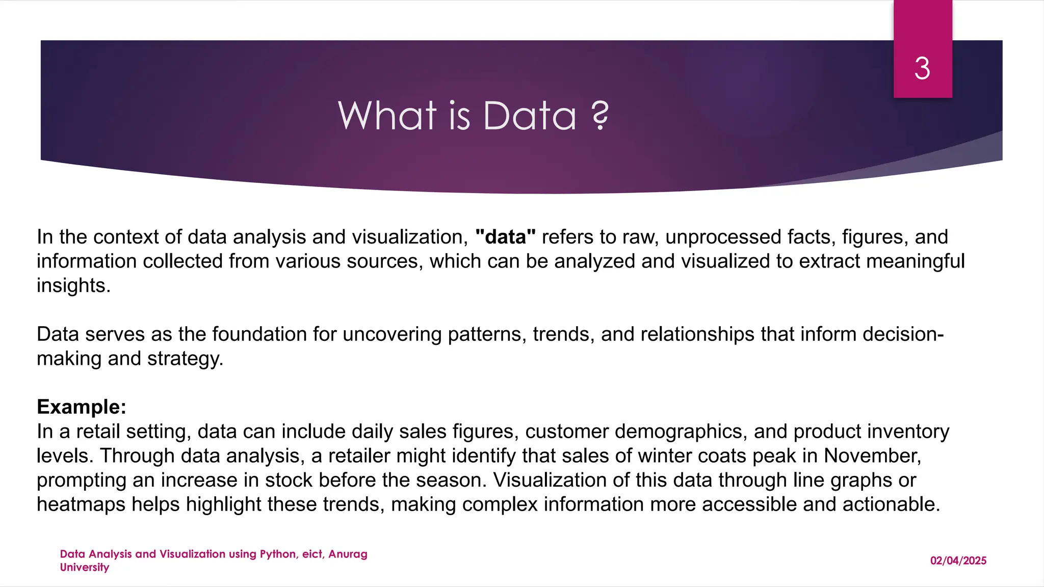
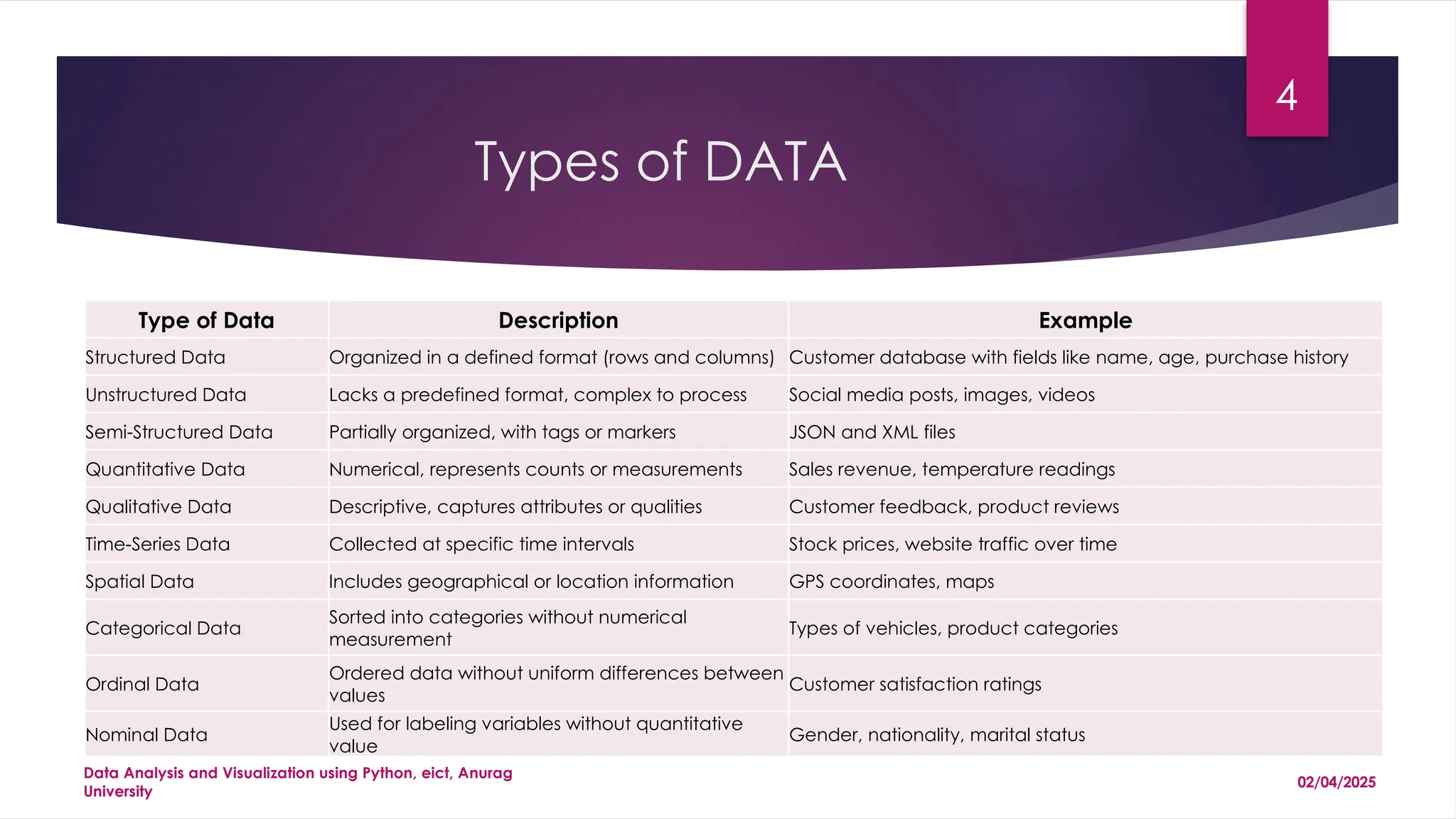
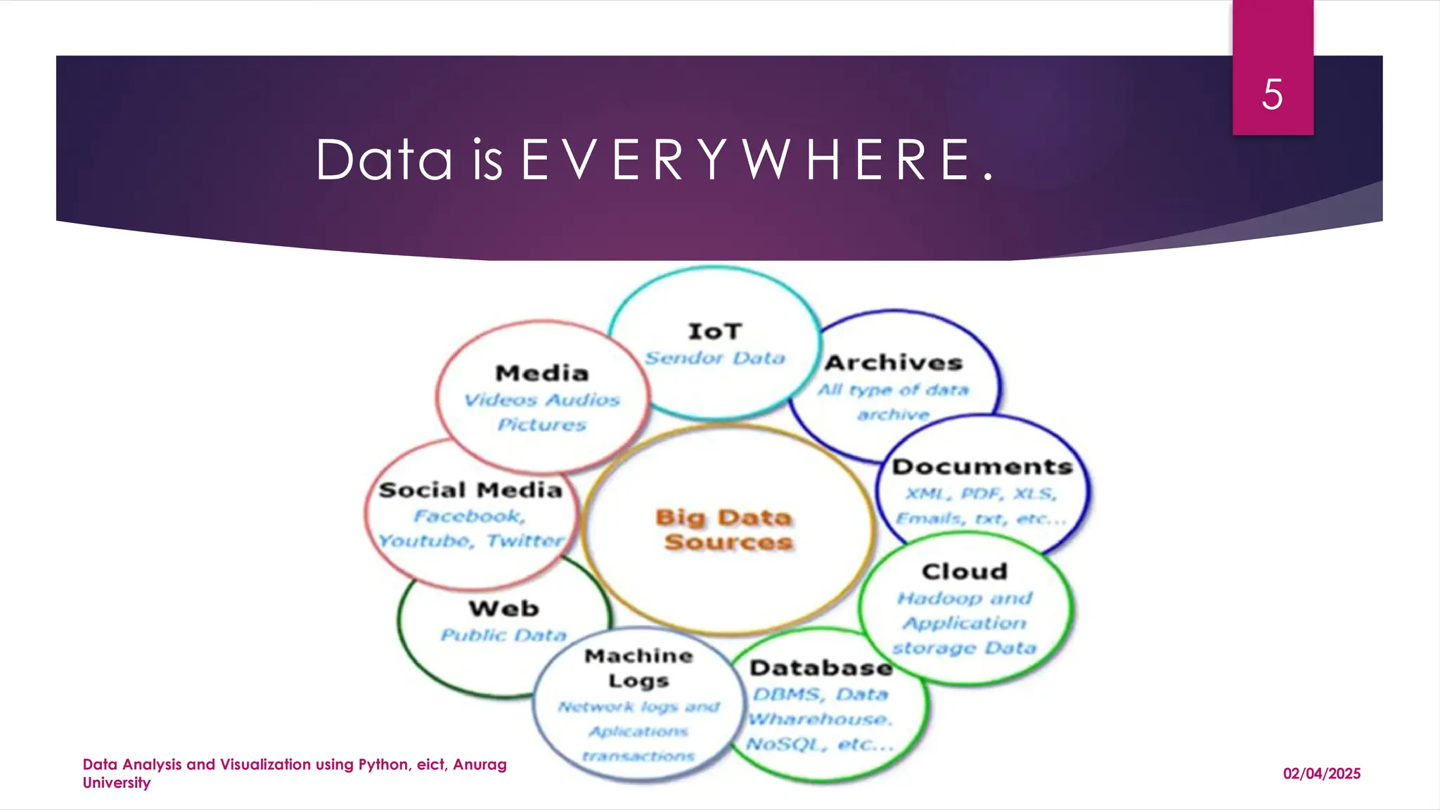
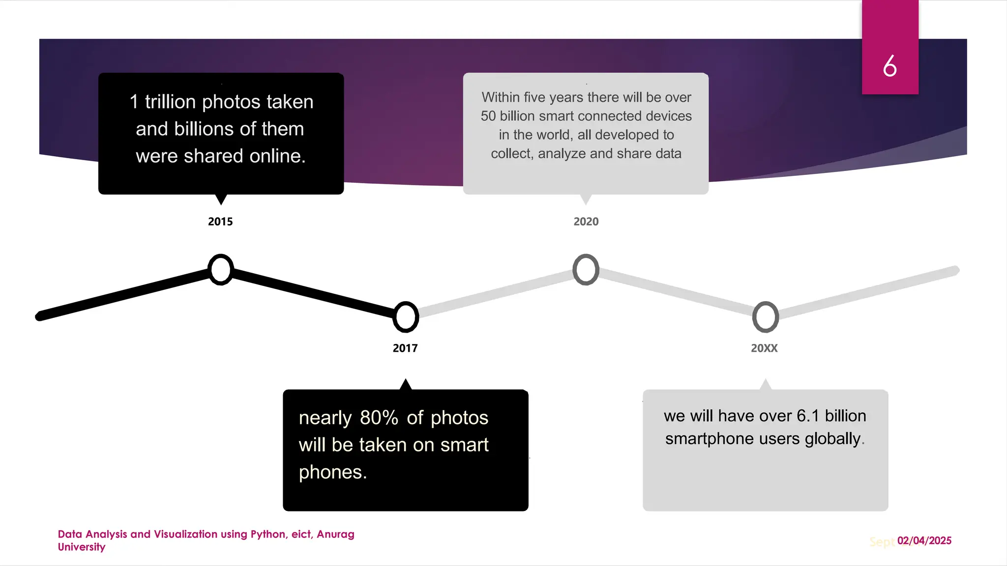
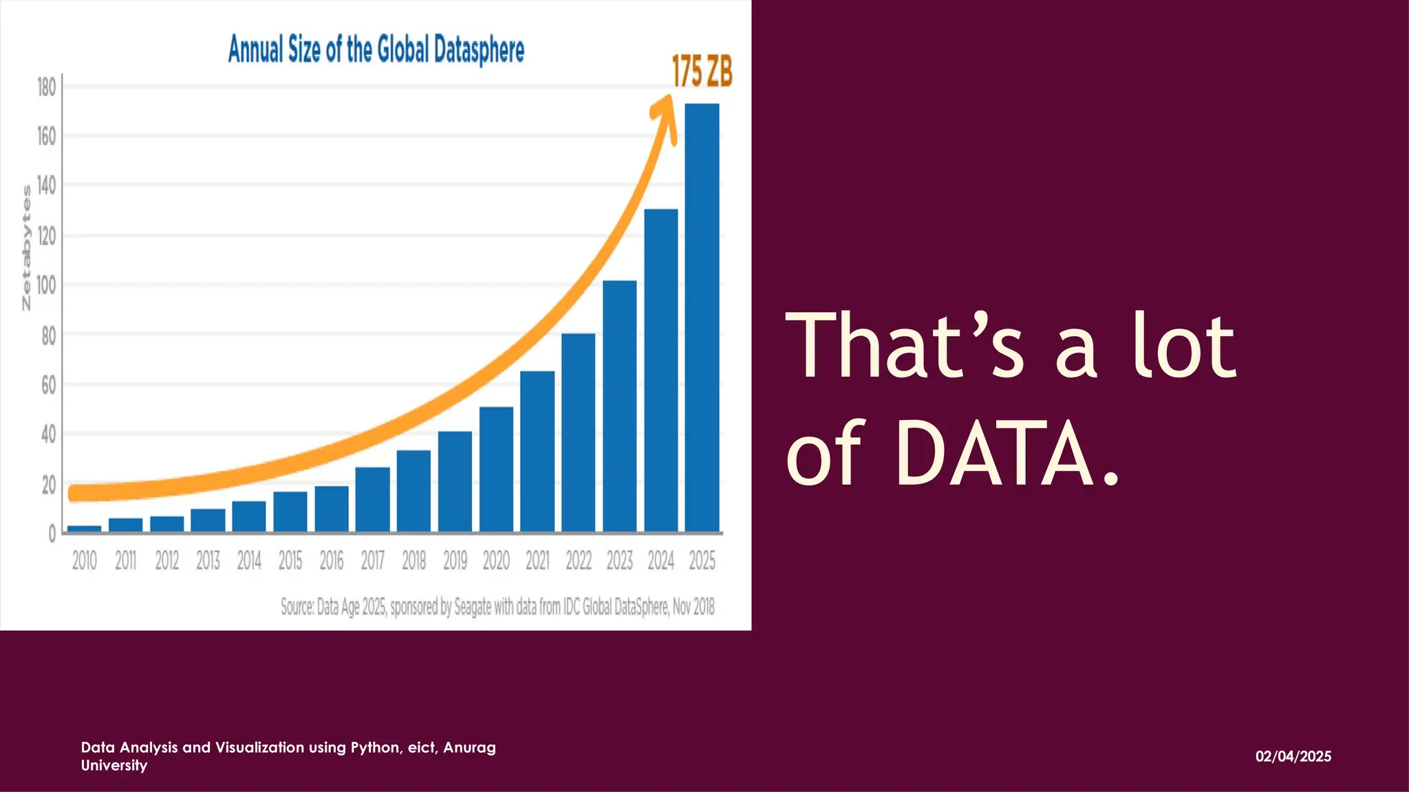
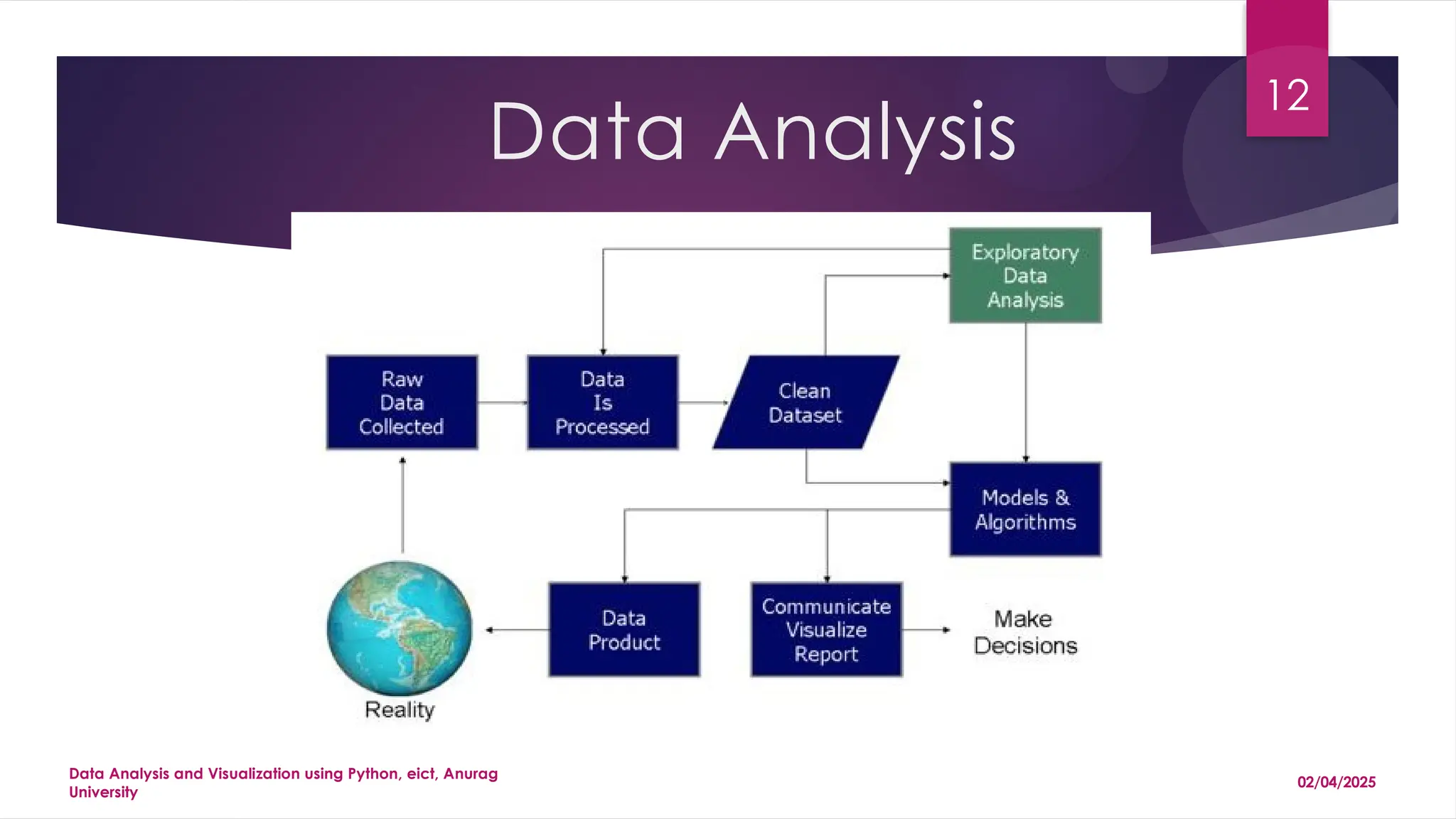
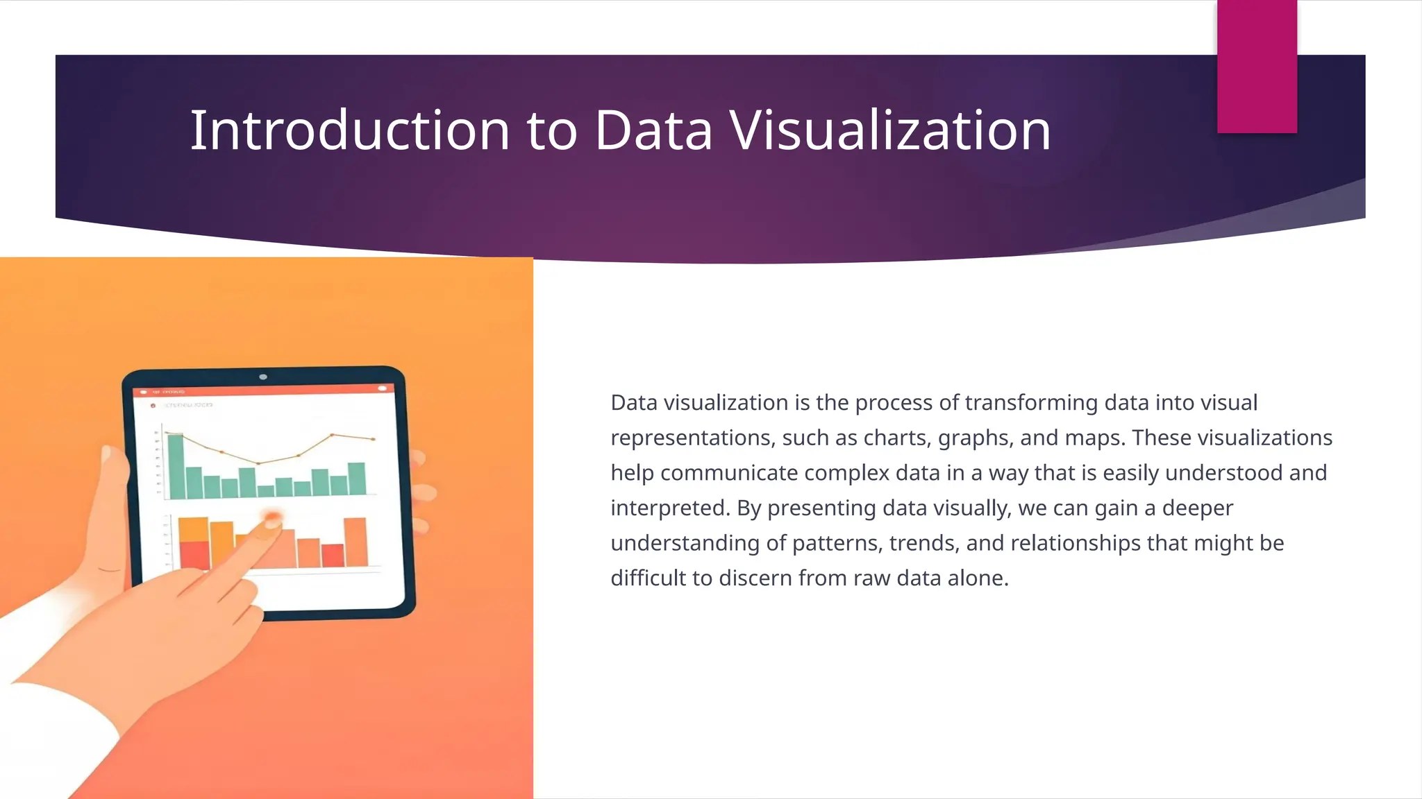
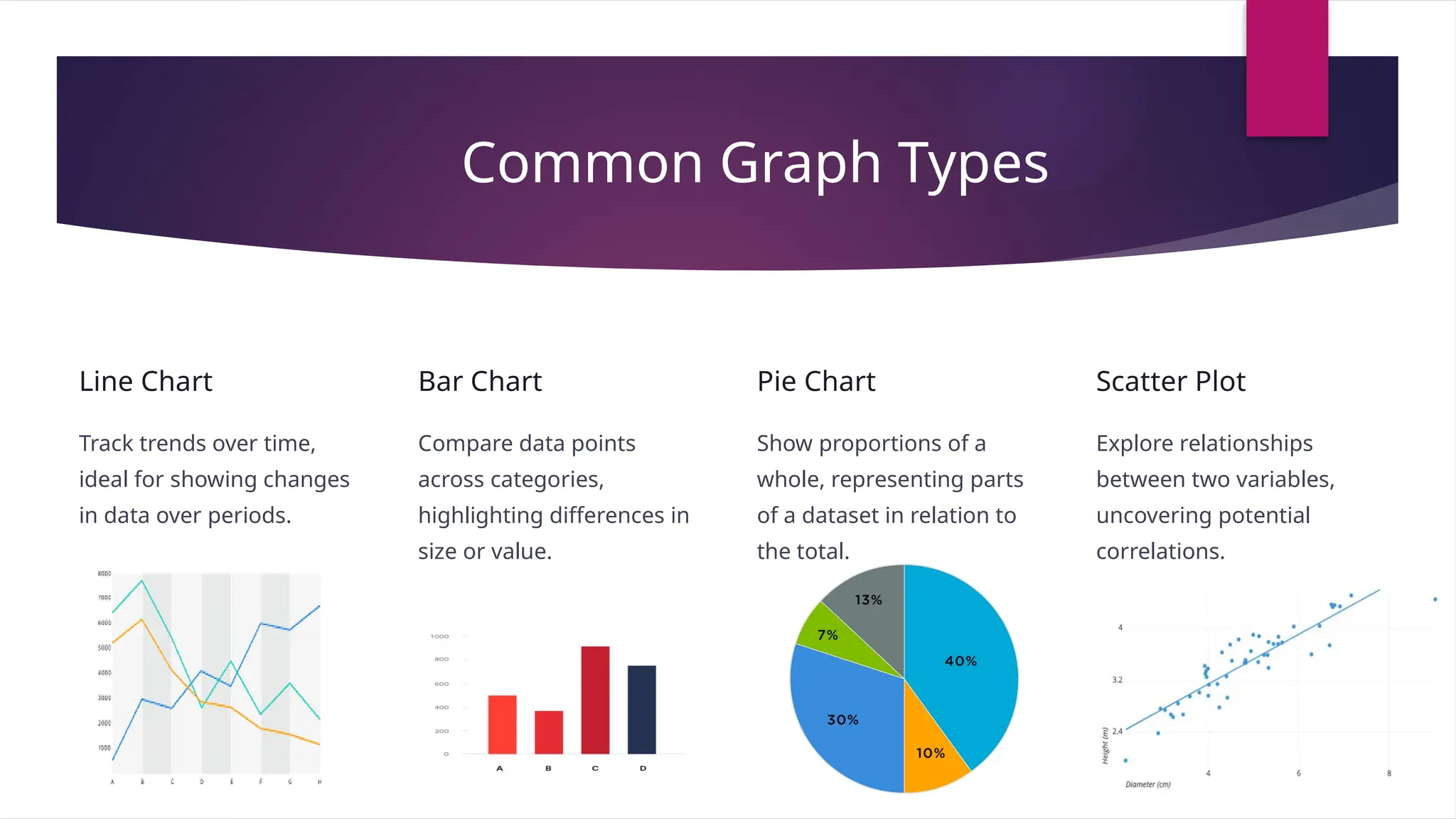
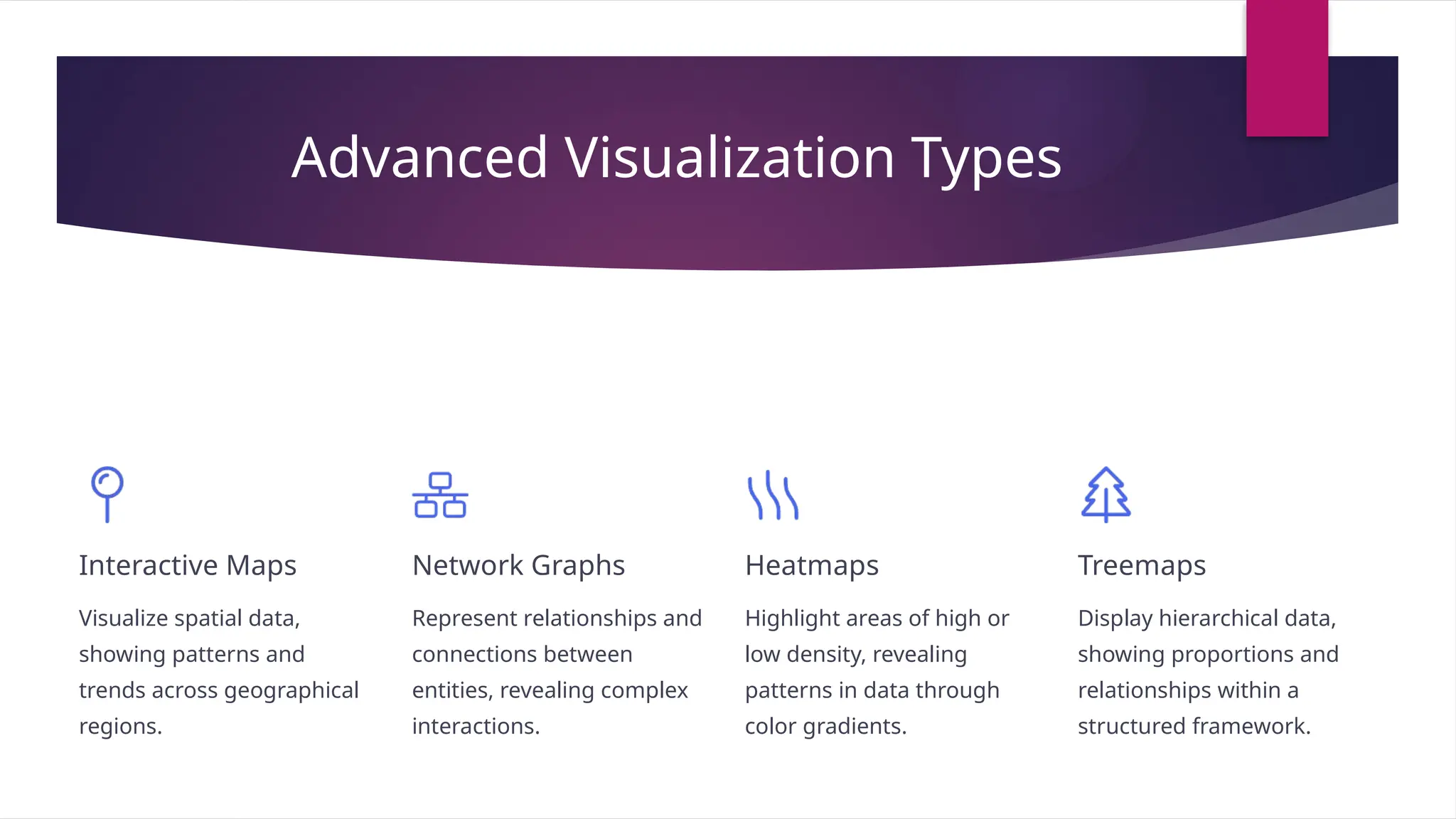
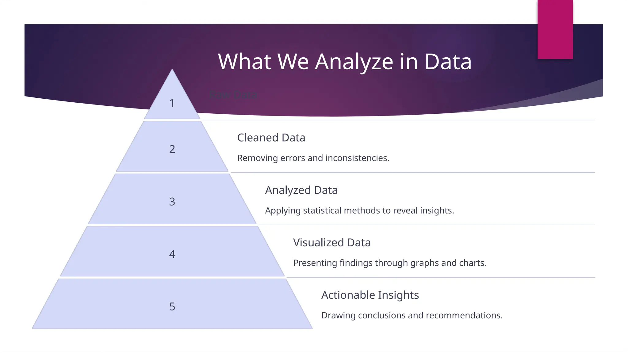
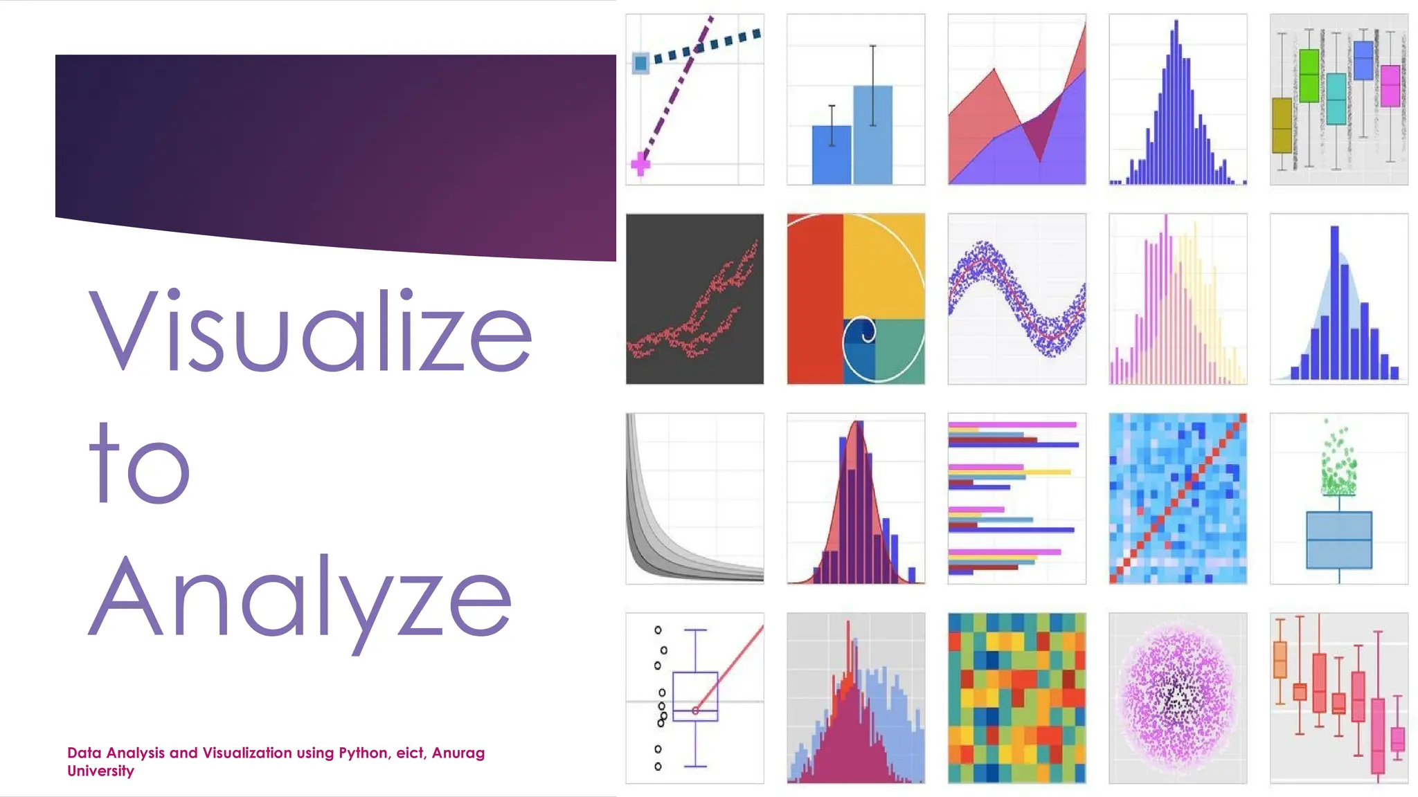
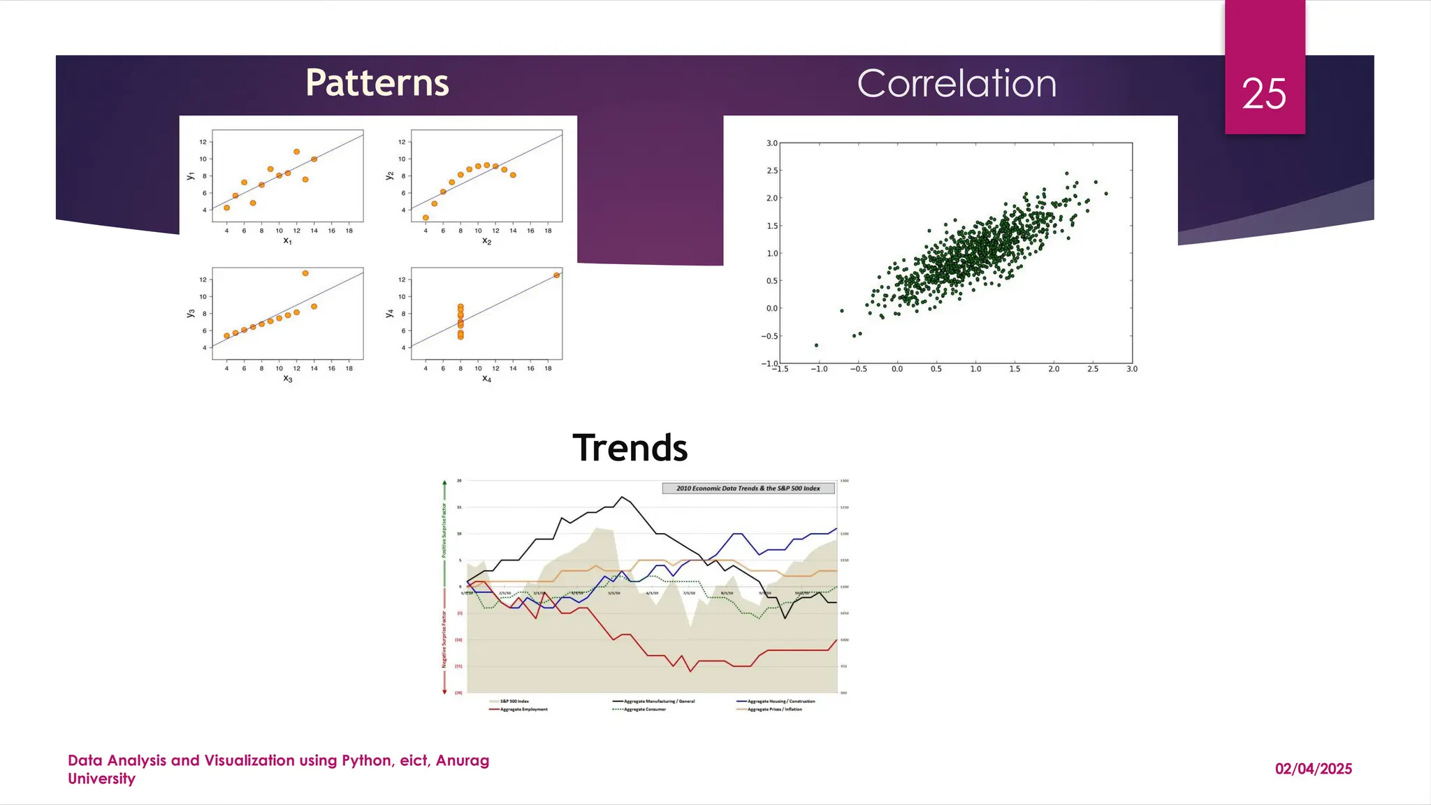
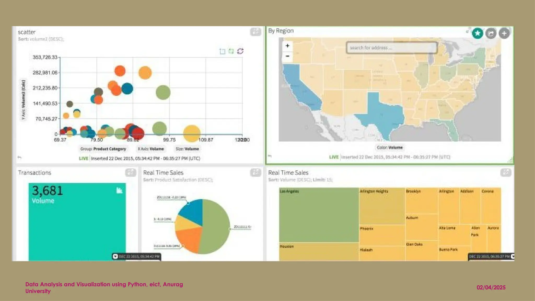
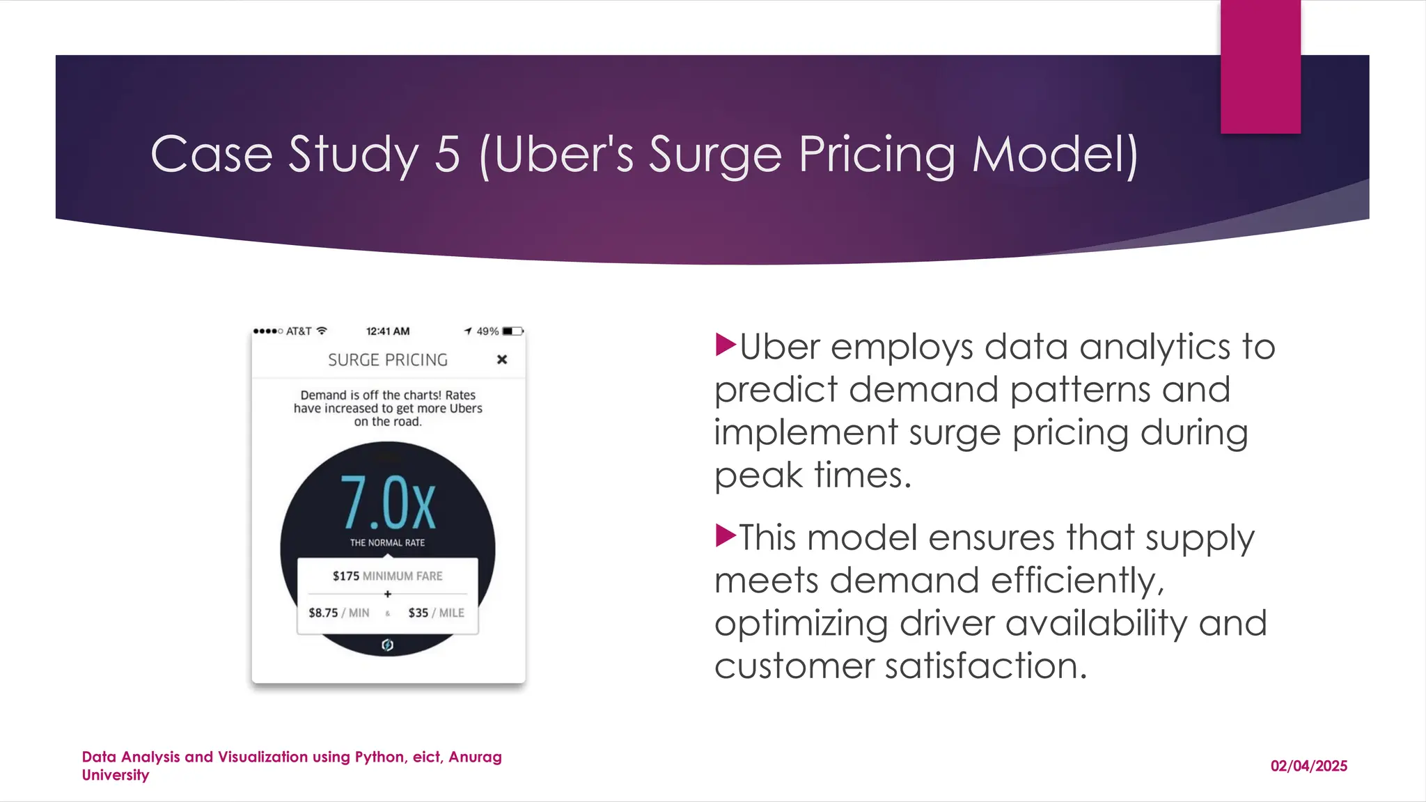
1 Data Analysis And Visualization using Python Dr. Sitanath Biswas Asst. Prof. & Head (Dept. of CST & AIML) JIS College of Engineering, West Bengal, India 02/04/2025 Data Analysis and Visualization using Python, eict, Anurag University
2 AGENDA  Data  Data Analysis  Data Analytics  Market Size  Opportunities  Data Visualization  Case Studies  Jupyter  Python Libraries 02/04/2025 Data Analysis and Visualization using Python, eict, Anurag University
3 What is Data ? In the context of data analysis and visualization, "data" refers to raw, unprocessed facts, figures, and information collected from various sources, which can be analyzed and visualized to extract meaningful insights. Data serves as the foundation for uncovering patterns, trends, and relationships that inform decision- making and strategy. Example: In a retail setting, data can include daily sales figures, customer demographics, and product inventory levels. Through data analysis, a retailer might identify that sales of winter coats peak in November, prompting an increase in stock before the season. Visualization of this data through line graphs or heatmaps helps highlight these trends, making complex information more accessible and actionable. 02/04/2025 Data Analysis and Visualization using Python, eict, Anurag University
4 Types of DATA Type of Data Description Example Structured Data Organized in a defined format (rows and columns) Customer database with fields like name, age, purchase history Unstructured Data Lacks a predefined format, complex to process Social media posts, images, videos Semi-Structured Data Partially organized, with tags or markers JSON and XML files Quantitative Data Numerical, represents counts or measurements Sales revenue, temperature readings Qualitative Data Descriptive, captures attributes or qualities Customer feedback, product reviews Time-Series Data Collected at specific time intervals Stock prices, website traffic over time Spatial Data Includes geographical or location information GPS coordinates, maps Categorical Data Sorted into categories without numerical measurement Types of vehicles, product categories Ordinal Data Ordered data without uniform differences between values Customer satisfaction ratings Nominal Data Used for labeling variables without quantitative value Gender, nationality, marital status 02/04/2025 Data Analysis and Visualization using Python, eict, Anurag University
5 Data is E V E R Y W H E R E . 02/04/2025 Data Analysis and Visualization using Python, eict, Anurag University
6 Sept 2017 20XX we will have over 6.1 billion smartphone users globally. 2020 Within five years there will be over 50 billion smart connected devices in the world, all developed to collect, analyze and share data 2017 nearly 80% of photos will be taken on smart phones. 2015 1 trillion photos taken and billions of them were shared online. 02/04/2025 Data Analysis and Visualization using Python, eict, Anurag University
That’s a lot of DATA. 02/04/2025 Data Analysis and Visualization using Python, eict, Anurag University
The Importance of Data Analysis Uncovering Insights Data analysis allows us to extract meaningful insights from raw data, identifying trends, patterns, and anomalies that might otherwise remain hidden. This enables organizations to make data-driven decisions, optimize operations, and achieve better outcomes. Improving Efficiency By analyzing data, organizations can identify areas for improvement, optimize processes, and streamline workflows. This leads to increased efficiency, reduced costs, and improved productivity.
Market Trends in Data Analytics 1 Growing Demand The demand for data analytics professionals continues to rise as organizations increasingly rely on data to guide their strategies and operations. This growing demand creates promising job opportunities for skilled professionals in the field. 2 Advancements in Technology Technological advancements in areas such as cloud computing, artificial intelligence, and machine learning are transforming data analysis, enabling more sophisticated methods and providing deeper insights. 3 Focus on Data Privacy As data privacy concerns grow, organizations are focusing on ethical data handling practices, ensuring responsible data collection, analysis, and usage, fostering trust and confidence.
Market Size and CAGR 100B Market Size The global data analytics market is expected to reach $100 billion by 2025, demonstrating significant potential. This market is driven by rising demand for data-driven insights and advancements in technology. 10% CAGR The data analytics market is to grow at a CAGR of 10% during the forecast period. This steady growth reflects the increasing adoption of data analytics across industries.
Opportunities in Data Analytics Business Intelligence Data analytics plays a crucial role in business intelligence, providing insights into customer behavior, market trends, and competitor analysis. This enables businesses to make informed decisions, optimize strategies, and gain a competitive edge. Healthcare Data analysis is transforming healthcare by enabling personalized medicine, disease prediction, and drug discovery. It helps improve patient outcomes, optimize resource allocation, and enhance healthcare delivery. Finance Data analytics is essential for financial institutions, enabling fraud detection, risk assessment, and investment strategies. It empowers financial professionals to make informed decisions and manage risks effectively.
12 Data Analysis Data Analysis and Visualization using Python, eict, Anurag University 02/04/2025
13 Tools for data analysis and visualization 02/04/2025 Data Analysis and Visualization using Python, eict, Anurag University Tool Purpose Key Features Python Programming language for data analysis Extensive libraries like Pandas, NumPy, Matplotlib, Seaborn, and Plotly R Statistical computing and graphics Comprehensive statistical analysis, visualization, and modeling capabilities Tableau Data visualization tool Drag-and-drop interface, interactive dashboards, and a wide range of visualizations Power BI Business analytics service Integration with Microsoft products, real-time dashboards, and reports Excel Spreadsheet software Data manipulation, analysis, and visualization through charts and pivot tables MATLAB Numerical computing environment Advanced mathematical functions, data analysis, and visualization SQL Query language for databases Efficient data retrieval, manipulation, and simple visualizations through queries SAS Statistical analysis system Advanced analytics, multivariate analysis, business intelligence, and data management Google Data Studio Free data visualization tool Integration with Google services, interactive reports, and dashboards D3.js JavaScript library for data visualization Creation of interactive and dynamic data visualizations for web pages QlikView Business intelligence and analytics Data integration, real-time analytics, and customizable dashboards
14 The Way to a Better Decision Making Data Analysis and Visualization using Python, eict, Anurag University 5 I n t e r p r e t R e s u l t s 4 A n a l y z e D a t a 3 C o l l e c t D a t a S e t C l e a r M e a s u r e m e n t P r i o r i t i e s 2 1 D e f i n e Y o u r Q u e s t i o n s 02/04/2025
15 Why visualize Data Analysis and Visualization using Python, eict, Anurag University 02/04/2025
Introduction to Data Visualization Data visualization is the process of transforming data into visual representations, such as charts, graphs, and maps. These visualizations help communicate complex data in a way that is easily understood and interpreted. By presenting data visually, we can gain a deeper understanding of patterns, trends, and relationships that might be difficult to discern from raw data alone.
The Importance of Data Visualization Improved Comprehension Visualizations make it easier for people to understand complex data by presenting information in a clear, concise, and engaging way. Enhanced Decision-Making Visualizations help identify trends, patterns, and outliers, enabling informed decision-making by providing a clear and actionable understanding of the data. Effective Communication Data visualizations facilitate effective communication of data-driven insights to stakeholders, fostering collaboration, understanding, and shared decision-making.
Expectations from Data Visualization Clarity Data visualizations should be clear and easy to understand, avoiding clutter and unnecessary complexity. Accuracy Visualizations should accurately represent the data, avoiding misleading or deceptive representations. Insights Data visualizations should reveal insights, highlighting trends, patterns, and relationships that might not be apparent in raw data. Engagement Visualizations should be engaging and visually appealing, attracting attention and encouraging exploration of the data.
Types of Data Visualizations Text Word clouds, sentiment analysis charts, and network graphs effectively visualize textual data, revealing patterns, trends, and key themes. They help understand the emotional tone, identify frequently used words, and map relationships between concepts. Images Heatmaps, color palettes, and image segmentation are powerful for understanding image data. They highlight areas of interest, analyze color distribution, and segment images into meaningful regions, enabling image analysis and pattern recognition.
Types of Data Visualizations 1 Bar charts are used for comparing categories or groups of data, displaying the magnitude of each category with rectangular bars. 2 Line charts are ideal for showing trends over time, connecting data points with lines to illustrate the change in a variable over a period. 3 Pie charts are used for representing proportions or percentages of a whole, dividing a circle into slices that represent different parts of the whole.
Common Graph Types Line Chart Track trends over time, ideal for showing changes in data over periods. Bar Chart Compare data points across categories, highlighting differences in size or value. Pie Chart Show proportions of a whole, representing parts of a dataset in relation to the total. Scatter Plot Explore relationships between two variables, uncovering potential correlations.
Advanced Visualization Types Interactive Maps Visualize spatial data, showing patterns and trends across geographical regions. Network Graphs Represent relationships and connections between entities, revealing complex interactions. Heatmaps Highlight areas of high or low density, revealing patterns in data through color gradients. Treemaps Display hierarchical data, showing proportions and relationships within a structured framework.
What We Analyze in Data 1 Raw Data 2 Cleaned Data Removing errors and inconsistencies. 3 Analyzed Data Applying statistical methods to reveal insights. 4 Visualized Data Presenting findings through graphs and charts. 5 Actionable Insights Drawing conclusions and recommendations.
24 Visualize to Analyze 02/04/2025 Data Analysis and Visualization using Python, eict, Anurag University
25 Patterns Correlation Data Analysis and Visualization using Python, eict, Anurag University Trends 02/04/2025
Make decision based on a massive dataset Data Analysis and Visualization using Python, eict, Anurag University IN ONE 02/04/2025
Data Analysis and Visualization using Python, eict, Anurag University 02/04/2025
28 Visualize to Discover Data Analysis and Visualization using Python, eict, Anurag University 02/04/2025
Interactive data visualizations let you mine data to discover information. Data Analysis and Visualization using Python, eict, Anurag University 02/04/2025
30 Data Analysis and Visualization using Python, eict, Anurag University 02/04/2025
31 Case Study 1 (Netflix's Personalized Recommendation System)  Netflix utilizes data analytics to analyze user behavior, viewing history, and preferences to provide personalized content recommendations.  This approach has significantly enhanced user engagement and retention. 02/04/2025 Data Analysis and Visualization using Python, eict, Anurag University
32 Case Study 2 (Walmart's Inventory Optimization)  Walmart employs sophisticated predictive analytics to manage and optimize inventory across its extensive network of stores globally.  This system uses historical sales data, weather predictions, and trending consumer behavior to forecast demand accurately. 02/04/2025 Data Analysis and Visualization using Python, eict, Anurag University
33 Case Study 3 (Amazon's Dynamic Pricing Strategy )  Amazon leverages data analytics to adjust product prices dynamically based on factors like demand, competition, and market trends.  This strategy maximizes sales and profitability by responding swiftly to market changes. 02/04/2025 Data Analysis and Visualization using Python, eict, Anurag University
34 Case Study 4 (IBM Watson Health's Medical Predictions) IBM Watson Health uses data analytics to predict patient outcomes and assist in diagnosing diseases. By analyzing vast amounts of medical data, it provides healthcare professionals with insights that improve patient care and operational efficiency. 02/04/2025 Data Analysis and Visualization using Python, eict, Anurag University
35 Case Study 5 (Uber's Surge Pricing Model) Uber employs data analytics to predict demand patterns and implement surge pricing during peak times. This model ensures that supply meets demand efficiently, optimizing driver availability and customer satisfaction. 02/04/2025 Data Analysis and Visualization using Python, eict, Anurag University
36 Introduction to Python3 and Jupyter Notebook 02/04/2025 Data Analysis and Visualization using Python, eict, Anurag University
37 beautiful notebook that lets you write and execute code, analyze data, embed content, and share reproducible work. Jupyter 02/04/2025 Data Analysis and Visualization using Python, eict, Anurag University
38 Install Jupyter $ pip install jupyter. Windows users can install with setuptools. Anaconda and Enthought allow you to download a desktop version of Jupyter Notebook. Microsoft Azure provides hosted access to Jupyter Notebooks. 02/04/2025 Data Analysis and Visualization using Python, eict, Anurag University
39 Power Python Libraries for Data Visualization 02/04/2025 Data Analysis and Visualization using Python, eict, Anurag University
40 matplotlib Python 2D plotting library which produces publication quality figures in a variety of hardcopy formats and interactive environments across platforms. Python forerunner library for data visualization. “is extremely powerful but with that power comes complexity.” 02/04/2025 Data Analysis and Visualization using Python, eict, Anurag University
41 Data Analysis and Visualization using Python, eict, Anurag University 02/04/2025
42 Seaborn Seaborn is a Python data visualization library built on top of Matplotlib, designed to make creating attractive and informative statistical graphics easy. It provides a high- level interface for drawing a variety of plots, including: •Distribution Plots (e.g., histograms, KDE plots) •Categorical Plots (e.g., box plots, bar plots) •Relational Plots (e.g., scatter plots, line plots) •Regression Plots (e.g., linear regression fits) •Heatmaps (e.g., correlation matrices) Seaborn simplifies complex visualizations and enhances the aesthetics with default themes, making it a popular choice for data analysis and exploration. 02/04/2025 Data Analysis and Visualization using Python, eict, Anurag University
43 Data Analysis and Visualization using Python, eict, Anurag University 02/04/2025
44 Bokeh Bokeh is a Python library for creating interactive, web-ready visualizations. It is designed to handle large datasets and produce high-quality, interactive plots that can be embedded in web applications. Key features include: •Interactive Tools: Supports zooming, panning, and hover tools for exploring data. •High-Performance: Efficiently handles large and streaming datasets. •Versatile Plotting: Offers a wide range of plots (scatter, line, bar, heatmaps, etc.). •Web Integration: Generates plots as HTML, making it easy to embed them in web pages. Bokeh is ideal for creating dashboards and visualizations that require user interaction and real-time updates. 02/04/2025 Data Analysis and Visualization using Python, eict, Anurag University
45 Data Analysis and Visualization using Python, eict, Anurag University 02/04/2025
46 pygal offers interactive plots that can be embedded in the web browser. Its prime differentiator is the ability to output charts as SVGs. Since each chart type is packaged into a method and the built-in styles are pretty, it’s easy to create a nice-looking chart in a few lines of code. 02/04/2025 Data Analysis and Visualization using Python, eict, Anurag University
47 Data Analysis and Visualization using Python, eict, Anurag University 02/04/2025
48 plotly Plotly is a versatile Python library for creating interactive, publication-quality visualizations. It supports a wide range of chart types and is known for its ease of integration with web applications. Key features include: •Interactivity: Built-in tools for zooming, panning, and hover interactions. •Wide Variety of Charts: Supports scatter plots, line charts, bar charts, 3D plots, and more. •Cross-Language Support: Works with Python, R, and JavaScript. •Web Integration: Plots are rendered as interactive HTML, easily shareable online. Plotly is commonly used for creating dashboards and complex visual analytics, offering powerful customization and user interaction capabilities. 02/04/2025 Data Analysis and Visualization using Python, eict, Anurag University
49 Data Analysis and Visualization using Python, eict, Anurag University 3d surface graphs Parallel Coordinates Plot 02/04/2025
50 geoplotlib Geoplotlib is a Python library for creating visualizations of geospatial data. It is built on top of Pyglet and provides tools to easily create maps and spatial plots. Key features include: •Geospatial Visualizations: Supports heatmaps, point clouds, choropleths, and other spatial plots. •Ease of Use: Simplifies the process of mapping and analyzing geospatial data. •Customizable: Offers flexibility in styling and customizing visual elements. Geoplotlib is particularly useful for visualizing large sets of geographical data, making it a valuable tool for geographic data analysis and spatial pattern discovery. 02/04/2025 Data Analysis and Visualization using Python, eict, Anurag University
51 Data Analysis and Visualization using Python, eict, Anurag University Plotting Geographical Data w ith Geopandas & Geoplot 02/04/2025
Q/A Data Analysis and Visualization using Python, eict, Anurag University 02/04/2025
Thank you :) Contact : +916370427934 sitanathbiswas2006@gmail.com head_cst.jisce@jisgroup.org

Data Analysis And Visualization using Python

  • 1.
    1 Data Analysis And Visualization using Python Dr.Sitanath Biswas Asst. Prof. & Head (Dept. of CST & AIML) JIS College of Engineering, West Bengal, India 02/04/2025 Data Analysis and Visualization using Python, eict, Anurag University
  • 2.
    2 AGENDA  Data  DataAnalysis  Data Analytics  Market Size  Opportunities  Data Visualization  Case Studies  Jupyter  Python Libraries 02/04/2025 Data Analysis and Visualization using Python, eict, Anurag University
  • 3.
    3 What is Data? In the context of data analysis and visualization, "data" refers to raw, unprocessed facts, figures, and information collected from various sources, which can be analyzed and visualized to extract meaningful insights. Data serves as the foundation for uncovering patterns, trends, and relationships that inform decision- making and strategy. Example: In a retail setting, data can include daily sales figures, customer demographics, and product inventory levels. Through data analysis, a retailer might identify that sales of winter coats peak in November, prompting an increase in stock before the season. Visualization of this data through line graphs or heatmaps helps highlight these trends, making complex information more accessible and actionable. 02/04/2025 Data Analysis and Visualization using Python, eict, Anurag University
  • 4.
    4 Types of DATA Typeof Data Description Example Structured Data Organized in a defined format (rows and columns) Customer database with fields like name, age, purchase history Unstructured Data Lacks a predefined format, complex to process Social media posts, images, videos Semi-Structured Data Partially organized, with tags or markers JSON and XML files Quantitative Data Numerical, represents counts or measurements Sales revenue, temperature readings Qualitative Data Descriptive, captures attributes or qualities Customer feedback, product reviews Time-Series Data Collected at specific time intervals Stock prices, website traffic over time Spatial Data Includes geographical or location information GPS coordinates, maps Categorical Data Sorted into categories without numerical measurement Types of vehicles, product categories Ordinal Data Ordered data without uniform differences between values Customer satisfaction ratings Nominal Data Used for labeling variables without quantitative value Gender, nationality, marital status 02/04/2025 Data Analysis and Visualization using Python, eict, Anurag University
  • 5.
    5 Data is EV E R Y W H E R E . 02/04/2025 Data Analysis and Visualization using Python, eict, Anurag University
  • 6.
    6 Sept 2017 20XX we willhave over 6.1 billion smartphone users globally. 2020 Within five years there will be over 50 billion smart connected devices in the world, all developed to collect, analyze and share data 2017 nearly 80% of photos will be taken on smart phones. 2015 1 trillion photos taken and billions of them were shared online. 02/04/2025 Data Analysis and Visualization using Python, eict, Anurag University
  • 7.
    That’s a lot ofDATA. 02/04/2025 Data Analysis and Visualization using Python, eict, Anurag University
  • 8.
    The Importance ofData Analysis Uncovering Insights Data analysis allows us to extract meaningful insights from raw data, identifying trends, patterns, and anomalies that might otherwise remain hidden. This enables organizations to make data-driven decisions, optimize operations, and achieve better outcomes. Improving Efficiency By analyzing data, organizations can identify areas for improvement, optimize processes, and streamline workflows. This leads to increased efficiency, reduced costs, and improved productivity.
  • 9.
    Market Trends inData Analytics 1 Growing Demand The demand for data analytics professionals continues to rise as organizations increasingly rely on data to guide their strategies and operations. This growing demand creates promising job opportunities for skilled professionals in the field. 2 Advancements in Technology Technological advancements in areas such as cloud computing, artificial intelligence, and machine learning are transforming data analysis, enabling more sophisticated methods and providing deeper insights. 3 Focus on Data Privacy As data privacy concerns grow, organizations are focusing on ethical data handling practices, ensuring responsible data collection, analysis, and usage, fostering trust and confidence.
  • 10.
    Market Size andCAGR 100B Market Size The global data analytics market is expected to reach $100 billion by 2025, demonstrating significant potential. This market is driven by rising demand for data-driven insights and advancements in technology. 10% CAGR The data analytics market is to grow at a CAGR of 10% during the forecast period. This steady growth reflects the increasing adoption of data analytics across industries.
  • 11.
    Opportunities in DataAnalytics Business Intelligence Data analytics plays a crucial role in business intelligence, providing insights into customer behavior, market trends, and competitor analysis. This enables businesses to make informed decisions, optimize strategies, and gain a competitive edge. Healthcare Data analysis is transforming healthcare by enabling personalized medicine, disease prediction, and drug discovery. It helps improve patient outcomes, optimize resource allocation, and enhance healthcare delivery. Finance Data analytics is essential for financial institutions, enabling fraud detection, risk assessment, and investment strategies. It empowers financial professionals to make informed decisions and manage risks effectively.
  • 12.
    12 Data Analysis Data Analysisand Visualization using Python, eict, Anurag University 02/04/2025
  • 13.
    13 Tools for dataanalysis and visualization 02/04/2025 Data Analysis and Visualization using Python, eict, Anurag University Tool Purpose Key Features Python Programming language for data analysis Extensive libraries like Pandas, NumPy, Matplotlib, Seaborn, and Plotly R Statistical computing and graphics Comprehensive statistical analysis, visualization, and modeling capabilities Tableau Data visualization tool Drag-and-drop interface, interactive dashboards, and a wide range of visualizations Power BI Business analytics service Integration with Microsoft products, real-time dashboards, and reports Excel Spreadsheet software Data manipulation, analysis, and visualization through charts and pivot tables MATLAB Numerical computing environment Advanced mathematical functions, data analysis, and visualization SQL Query language for databases Efficient data retrieval, manipulation, and simple visualizations through queries SAS Statistical analysis system Advanced analytics, multivariate analysis, business intelligence, and data management Google Data Studio Free data visualization tool Integration with Google services, interactive reports, and dashboards D3.js JavaScript library for data visualization Creation of interactive and dynamic data visualizations for web pages QlikView Business intelligence and analytics Data integration, real-time analytics, and customizable dashboards
  • 14.
    14 The Way toa Better Decision Making Data Analysis and Visualization using Python, eict, Anurag University 5 I n t e r p r e t R e s u l t s 4 A n a l y z e D a t a 3 C o l l e c t D a t a S e t C l e a r M e a s u r e m e n t P r i o r i t i e s 2 1 D e f i n e Y o u r Q u e s t i o n s 02/04/2025
  • 15.
    15 Why visualize Data Analysis andVisualization using Python, eict, Anurag University 02/04/2025
  • 16.
    Introduction to DataVisualization Data visualization is the process of transforming data into visual representations, such as charts, graphs, and maps. These visualizations help communicate complex data in a way that is easily understood and interpreted. By presenting data visually, we can gain a deeper understanding of patterns, trends, and relationships that might be difficult to discern from raw data alone.
  • 17.
    The Importance ofData Visualization Improved Comprehension Visualizations make it easier for people to understand complex data by presenting information in a clear, concise, and engaging way. Enhanced Decision-Making Visualizations help identify trends, patterns, and outliers, enabling informed decision-making by providing a clear and actionable understanding of the data. Effective Communication Data visualizations facilitate effective communication of data-driven insights to stakeholders, fostering collaboration, understanding, and shared decision-making.
  • 18.
    Expectations from DataVisualization Clarity Data visualizations should be clear and easy to understand, avoiding clutter and unnecessary complexity. Accuracy Visualizations should accurately represent the data, avoiding misleading or deceptive representations. Insights Data visualizations should reveal insights, highlighting trends, patterns, and relationships that might not be apparent in raw data. Engagement Visualizations should be engaging and visually appealing, attracting attention and encouraging exploration of the data.
  • 19.
    Types of DataVisualizations Text Word clouds, sentiment analysis charts, and network graphs effectively visualize textual data, revealing patterns, trends, and key themes. They help understand the emotional tone, identify frequently used words, and map relationships between concepts. Images Heatmaps, color palettes, and image segmentation are powerful for understanding image data. They highlight areas of interest, analyze color distribution, and segment images into meaningful regions, enabling image analysis and pattern recognition.
  • 20.
    Types of DataVisualizations 1 Bar charts are used for comparing categories or groups of data, displaying the magnitude of each category with rectangular bars. 2 Line charts are ideal for showing trends over time, connecting data points with lines to illustrate the change in a variable over a period. 3 Pie charts are used for representing proportions or percentages of a whole, dividing a circle into slices that represent different parts of the whole.
  • 21.
    Common Graph Types LineChart Track trends over time, ideal for showing changes in data over periods. Bar Chart Compare data points across categories, highlighting differences in size or value. Pie Chart Show proportions of a whole, representing parts of a dataset in relation to the total. Scatter Plot Explore relationships between two variables, uncovering potential correlations.
  • 22.
    Advanced Visualization Types InteractiveMaps Visualize spatial data, showing patterns and trends across geographical regions. Network Graphs Represent relationships and connections between entities, revealing complex interactions. Heatmaps Highlight areas of high or low density, revealing patterns in data through color gradients. Treemaps Display hierarchical data, showing proportions and relationships within a structured framework.
  • 23.
    What We Analyzein Data 1 Raw Data 2 Cleaned Data Removing errors and inconsistencies. 3 Analyzed Data Applying statistical methods to reveal insights. 4 Visualized Data Presenting findings through graphs and charts. 5 Actionable Insights Drawing conclusions and recommendations.
  • 24.
    24 Visualize to Analyze 02/04/2025 Data Analysis andVisualization using Python, eict, Anurag University
  • 25.
    25 Patterns Correlation Data Analysisand Visualization using Python, eict, Anurag University Trends 02/04/2025
  • 26.
    Make decision based ona massive dataset Data Analysis and Visualization using Python, eict, Anurag University IN ONE 02/04/2025
  • 27.
    Data Analysis andVisualization using Python, eict, Anurag University 02/04/2025
  • 28.
    28 Visualize to Discover Data Analysisand Visualization using Python, eict, Anurag University 02/04/2025
  • 29.
    Interactive data visualizations letyou mine data to discover information. Data Analysis and Visualization using Python, eict, Anurag University 02/04/2025
  • 30.
    30 Data Analysis andVisualization using Python, eict, Anurag University 02/04/2025
  • 31.
    31 Case Study 1(Netflix's Personalized Recommendation System)  Netflix utilizes data analytics to analyze user behavior, viewing history, and preferences to provide personalized content recommendations.  This approach has significantly enhanced user engagement and retention. 02/04/2025 Data Analysis and Visualization using Python, eict, Anurag University
  • 32.
    32 Case Study 2(Walmart's Inventory Optimization)  Walmart employs sophisticated predictive analytics to manage and optimize inventory across its extensive network of stores globally.  This system uses historical sales data, weather predictions, and trending consumer behavior to forecast demand accurately. 02/04/2025 Data Analysis and Visualization using Python, eict, Anurag University
  • 33.
    33 Case Study 3(Amazon's Dynamic Pricing Strategy )  Amazon leverages data analytics to adjust product prices dynamically based on factors like demand, competition, and market trends.  This strategy maximizes sales and profitability by responding swiftly to market changes. 02/04/2025 Data Analysis and Visualization using Python, eict, Anurag University
  • 34.
    34 Case Study 4(IBM Watson Health's Medical Predictions) IBM Watson Health uses data analytics to predict patient outcomes and assist in diagnosing diseases. By analyzing vast amounts of medical data, it provides healthcare professionals with insights that improve patient care and operational efficiency. 02/04/2025 Data Analysis and Visualization using Python, eict, Anurag University
  • 35.
    35 Case Study 5(Uber's Surge Pricing Model) Uber employs data analytics to predict demand patterns and implement surge pricing during peak times. This model ensures that supply meets demand efficiently, optimizing driver availability and customer satisfaction. 02/04/2025 Data Analysis and Visualization using Python, eict, Anurag University
  • 36.
    36 Introduction to Python3 and JupyterNotebook 02/04/2025 Data Analysis and Visualization using Python, eict, Anurag University
  • 37.
    37 beautiful notebook thatlets you write and execute code, analyze data, embed content, and share reproducible work. Jupyter 02/04/2025 Data Analysis and Visualization using Python, eict, Anurag University
  • 38.
    38 Install Jupyter $ pipinstall jupyter. Windows users can install with setuptools. Anaconda and Enthought allow you to download a desktop version of Jupyter Notebook. Microsoft Azure provides hosted access to Jupyter Notebooks. 02/04/2025 Data Analysis and Visualization using Python, eict, Anurag University
  • 39.
    39 Power Python Librariesfor Data Visualization 02/04/2025 Data Analysis and Visualization using Python, eict, Anurag University
  • 40.
    40 matplotlib Python 2D plotting librarywhich produces publication quality figures in a variety of hardcopy formats and interactive environments across platforms. Python forerunner library for data visualization. “is extremely powerful but with that power comes complexity.” 02/04/2025 Data Analysis and Visualization using Python, eict, Anurag University
  • 41.
    41 Data Analysis andVisualization using Python, eict, Anurag University 02/04/2025
  • 42.
    42 Seaborn Seaborn is aPython data visualization library built on top of Matplotlib, designed to make creating attractive and informative statistical graphics easy. It provides a high- level interface for drawing a variety of plots, including: •Distribution Plots (e.g., histograms, KDE plots) •Categorical Plots (e.g., box plots, bar plots) •Relational Plots (e.g., scatter plots, line plots) •Regression Plots (e.g., linear regression fits) •Heatmaps (e.g., correlation matrices) Seaborn simplifies complex visualizations and enhances the aesthetics with default themes, making it a popular choice for data analysis and exploration. 02/04/2025 Data Analysis and Visualization using Python, eict, Anurag University
  • 43.
    43 Data Analysis andVisualization using Python, eict, Anurag University 02/04/2025
  • 44.
    44 Bokeh Bokeh is aPython library for creating interactive, web-ready visualizations. It is designed to handle large datasets and produce high-quality, interactive plots that can be embedded in web applications. Key features include: •Interactive Tools: Supports zooming, panning, and hover tools for exploring data. •High-Performance: Efficiently handles large and streaming datasets. •Versatile Plotting: Offers a wide range of plots (scatter, line, bar, heatmaps, etc.). •Web Integration: Generates plots as HTML, making it easy to embed them in web pages. Bokeh is ideal for creating dashboards and visualizations that require user interaction and real-time updates. 02/04/2025 Data Analysis and Visualization using Python, eict, Anurag University
  • 45.
    45 Data Analysis andVisualization using Python, eict, Anurag University 02/04/2025
  • 46.
    46 pygal offers interactive plotsthat can be embedded in the web browser. Its prime differentiator is the ability to output charts as SVGs. Since each chart type is packaged into a method and the built-in styles are pretty, it’s easy to create a nice-looking chart in a few lines of code. 02/04/2025 Data Analysis and Visualization using Python, eict, Anurag University
  • 47.
    47 Data Analysis andVisualization using Python, eict, Anurag University 02/04/2025
  • 48.
    48 plotly Plotly is aversatile Python library for creating interactive, publication-quality visualizations. It supports a wide range of chart types and is known for its ease of integration with web applications. Key features include: •Interactivity: Built-in tools for zooming, panning, and hover interactions. •Wide Variety of Charts: Supports scatter plots, line charts, bar charts, 3D plots, and more. •Cross-Language Support: Works with Python, R, and JavaScript. •Web Integration: Plots are rendered as interactive HTML, easily shareable online. Plotly is commonly used for creating dashboards and complex visual analytics, offering powerful customization and user interaction capabilities. 02/04/2025 Data Analysis and Visualization using Python, eict, Anurag University
  • 49.
    49 Data Analysis andVisualization using Python, eict, Anurag University 3d surface graphs Parallel Coordinates Plot 02/04/2025
  • 50.
    50 geoplotlib Geoplotlib is aPython library for creating visualizations of geospatial data. It is built on top of Pyglet and provides tools to easily create maps and spatial plots. Key features include: •Geospatial Visualizations: Supports heatmaps, point clouds, choropleths, and other spatial plots. •Ease of Use: Simplifies the process of mapping and analyzing geospatial data. •Customizable: Offers flexibility in styling and customizing visual elements. Geoplotlib is particularly useful for visualizing large sets of geographical data, making it a valuable tool for geographic data analysis and spatial pattern discovery. 02/04/2025 Data Analysis and Visualization using Python, eict, Anurag University
  • 51.
    51 Data Analysis andVisualization using Python, eict, Anurag University Plotting Geographical Data w ith Geopandas & Geoplot 02/04/2025
  • 52.
    Q/A Data Analysis andVisualization using Python, eict, Anurag University 02/04/2025
  • 53.
    Thank you :) Contact: +916370427934 sitanathbiswas2006@gmail.com head_cst.jisce@jisgroup.org