Download as PDF, PPTX
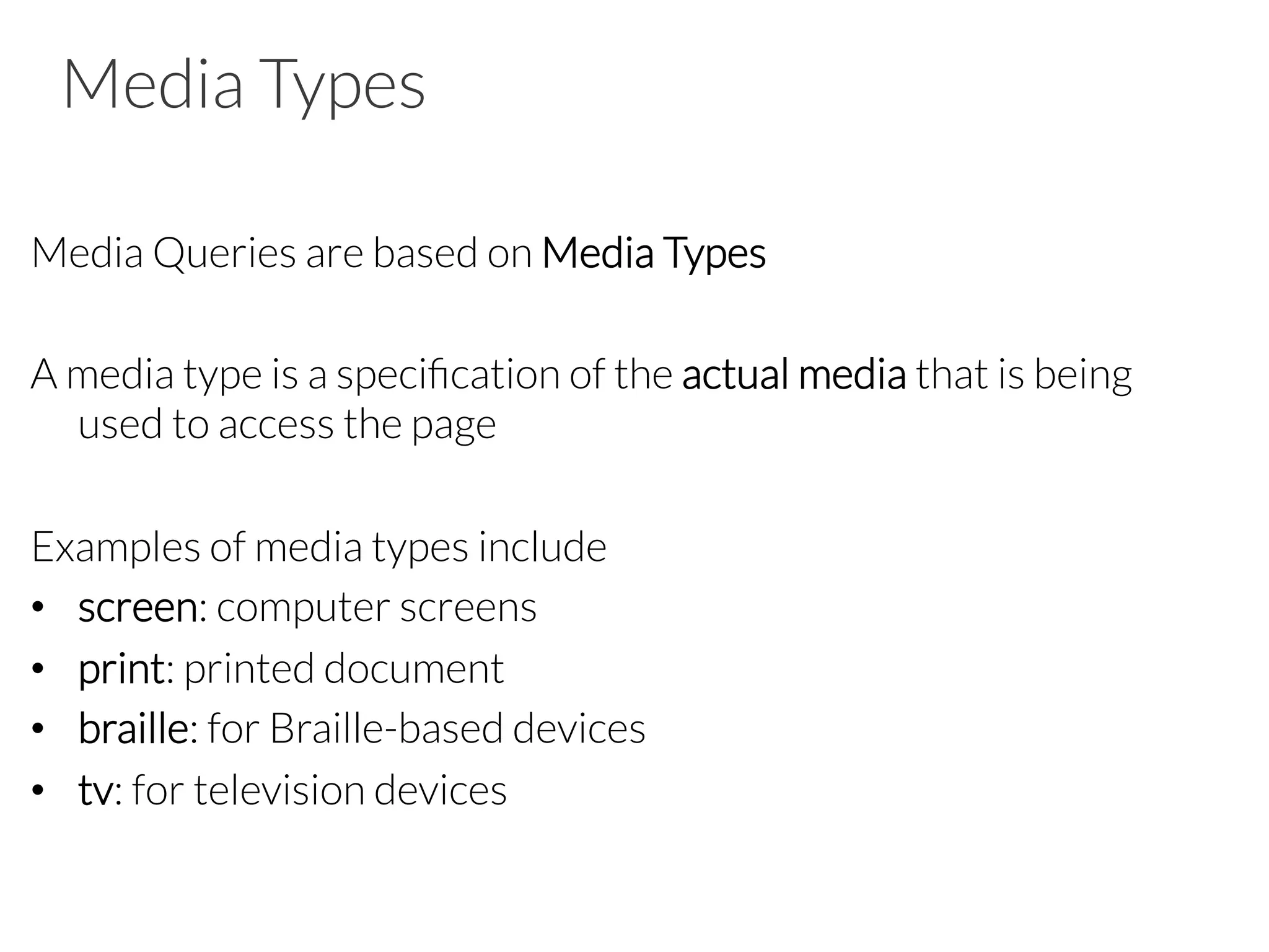
![Other Selectors from CSS1 & CSS2 • div p à all <p> elements inside a <div> • div>p à all <p> elements where the parent is a <div> • div+p à all <p> elements that are placed immediately after <div> • [target] à all elements with a target attribute • [target=_blank] à all elements with target= "_blank“ • p:first-child à every <p> element that is the first child of its parent](https://image.slidesharecdn.com/d2html5css3-150323105325-conversion-gate01/75/HTML5-CSS3-refresher-for-mobile-apps-62-2048.jpg)
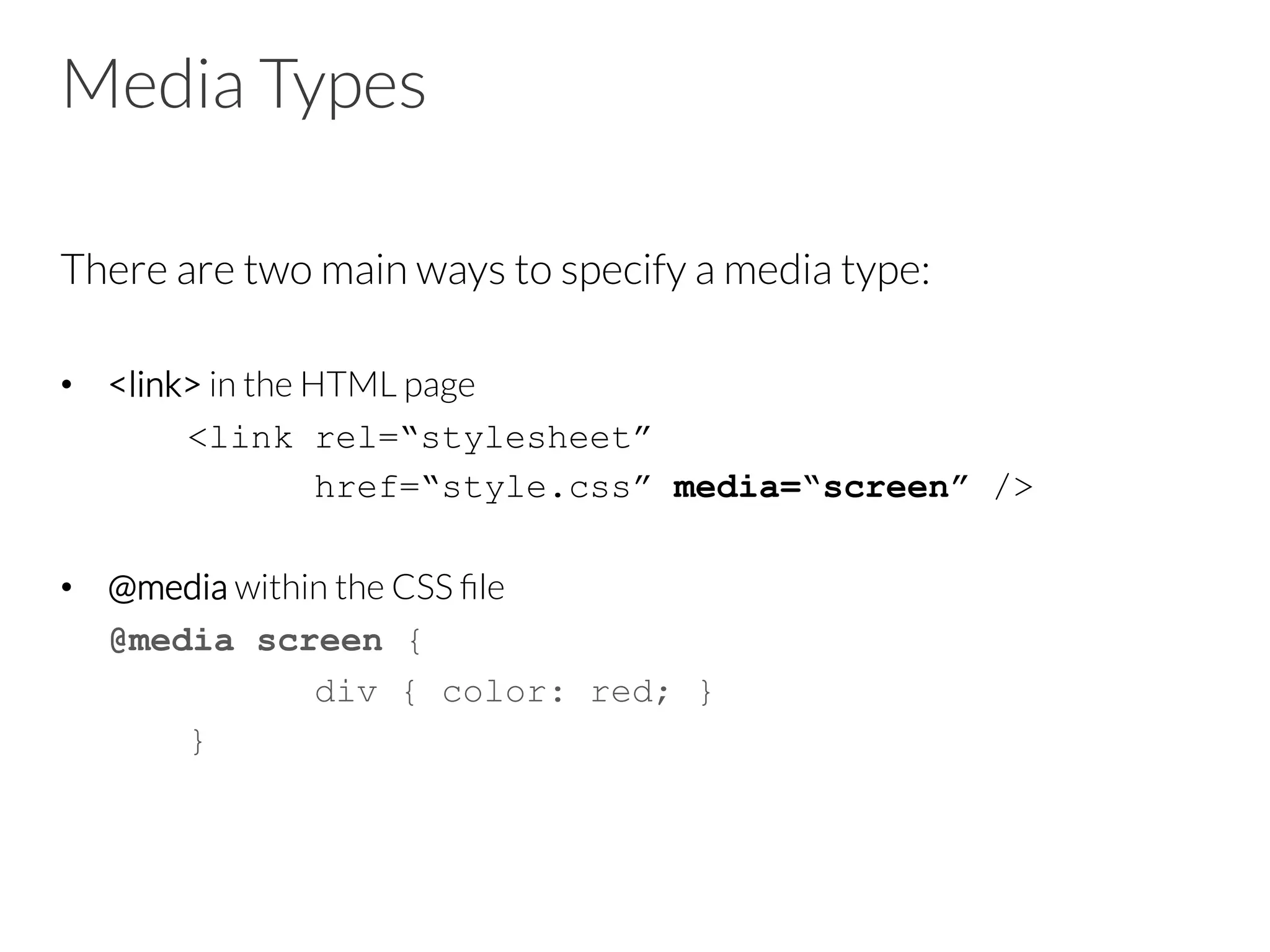
![Some selectors introduced in CSS3 • a[src^="https"] à every <a> element whose src attribute value begins with "https” • a[src$=".pdf"] à every <a> element whose src attribute value ends with ".pdf” • a[src*=“mobile"] à every <a> element whose src attribute value contains the substring “mobile“ • p:nth-child(2) à every <p> element that is the second child of its parent • p:nth-last-child(2) à every <p> element that is the second child of its parent, counting from the last child • :not(p) à every element that is not a <p> element](https://image.slidesharecdn.com/d2html5css3-150323105325-conversion-gate01/75/HTML5-CSS3-refresher-for-mobile-apps-63-2048.jpg)
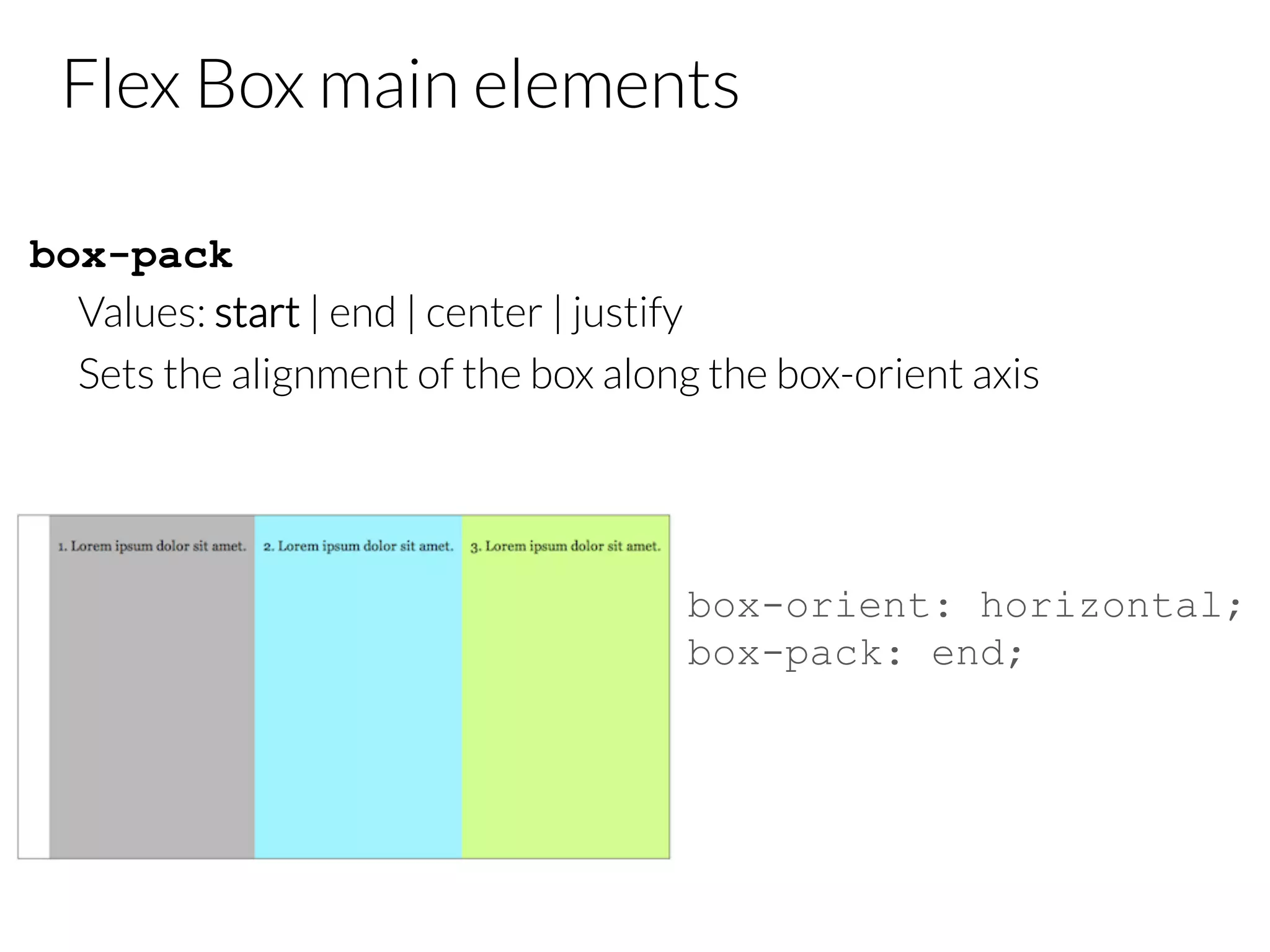
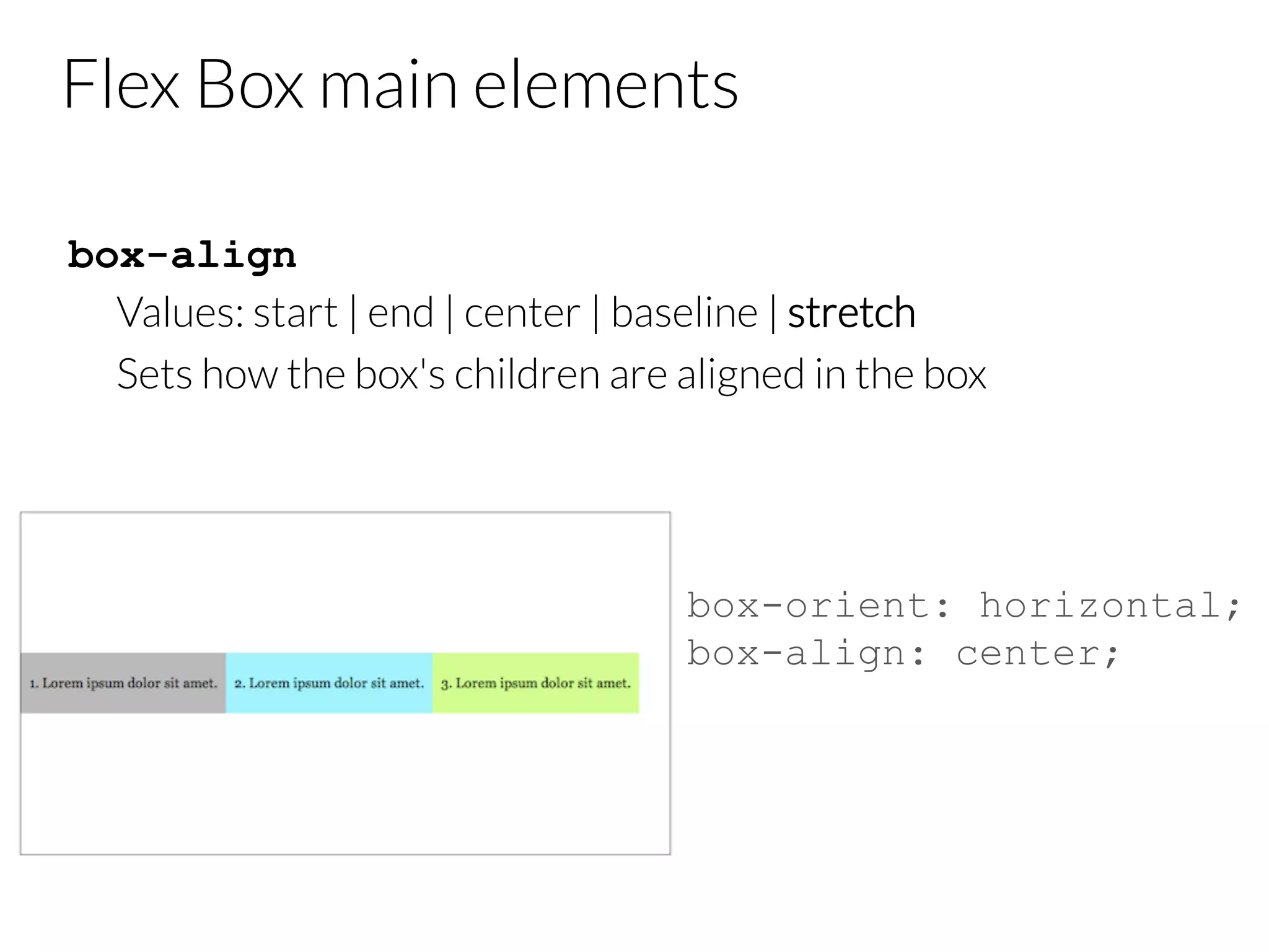
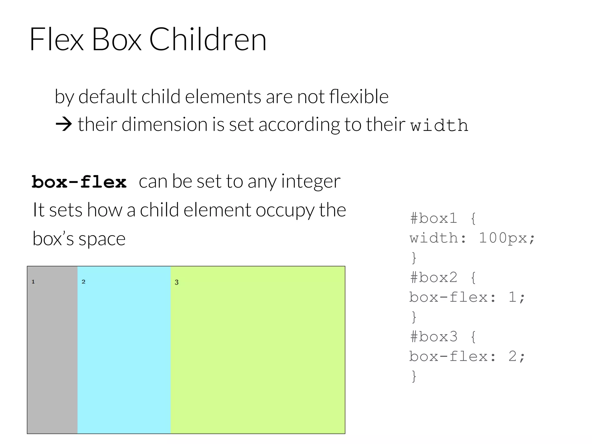
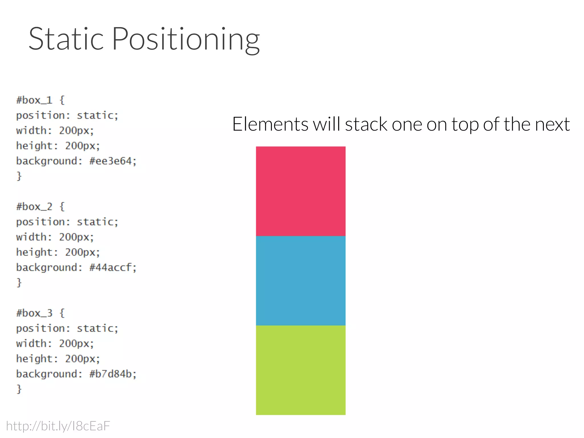
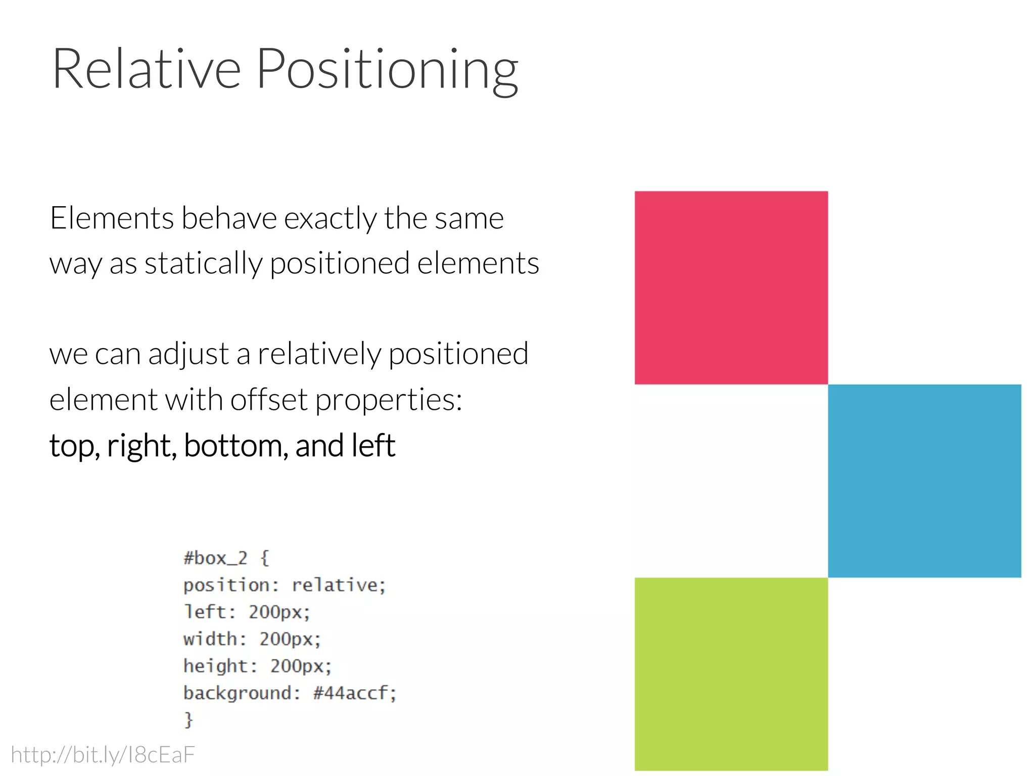
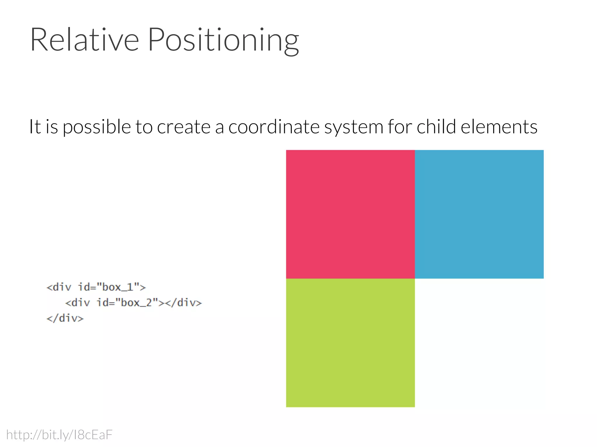
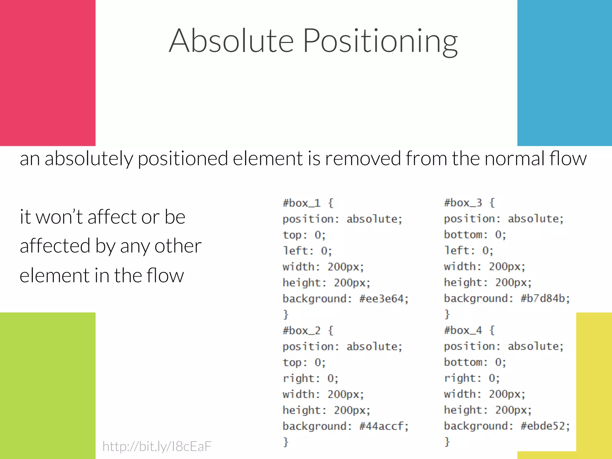
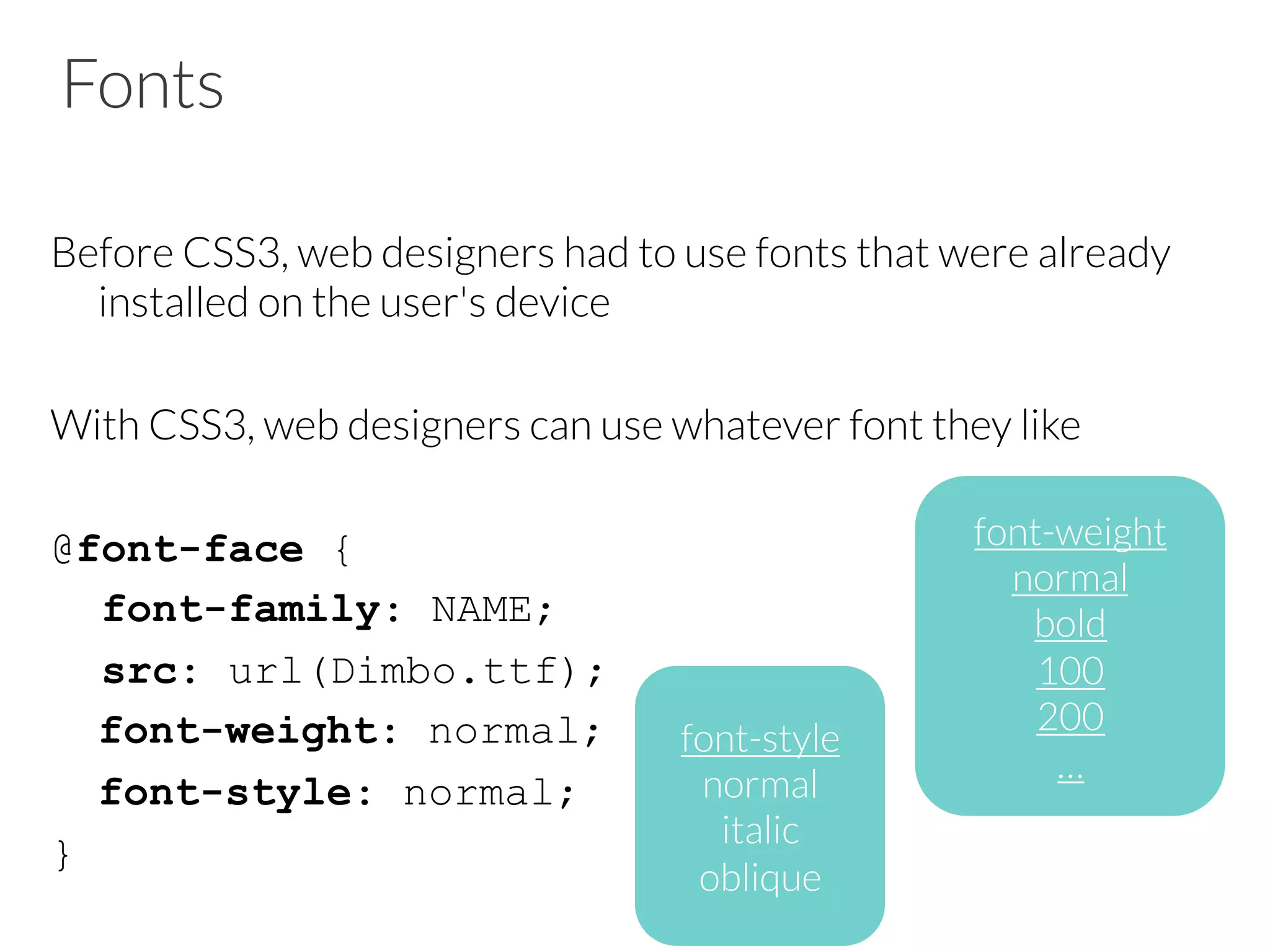
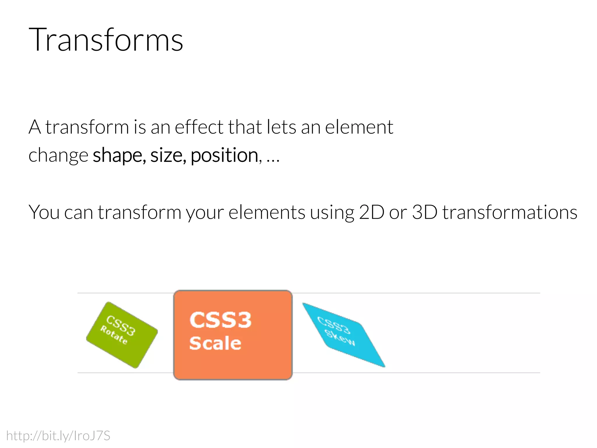
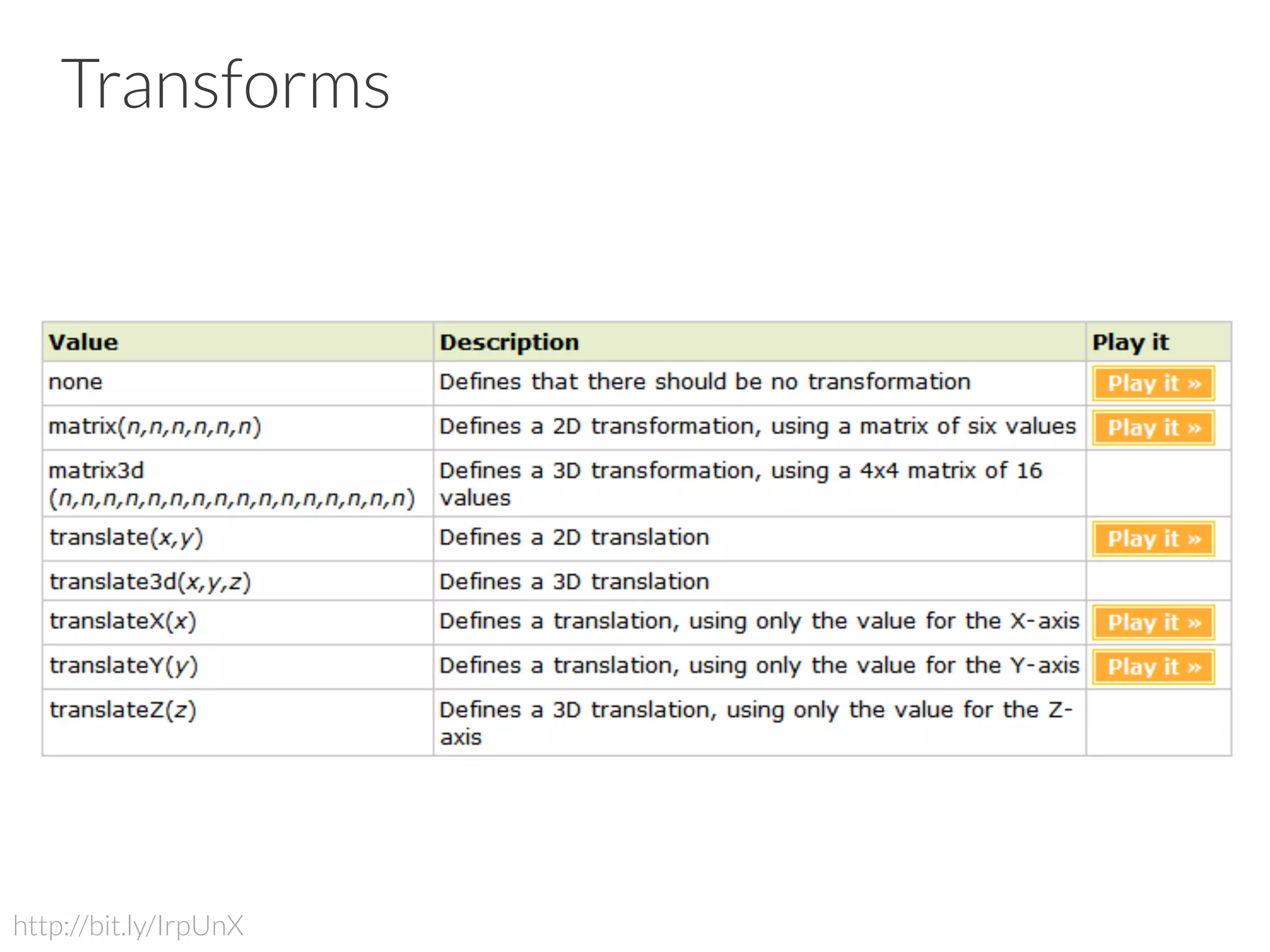
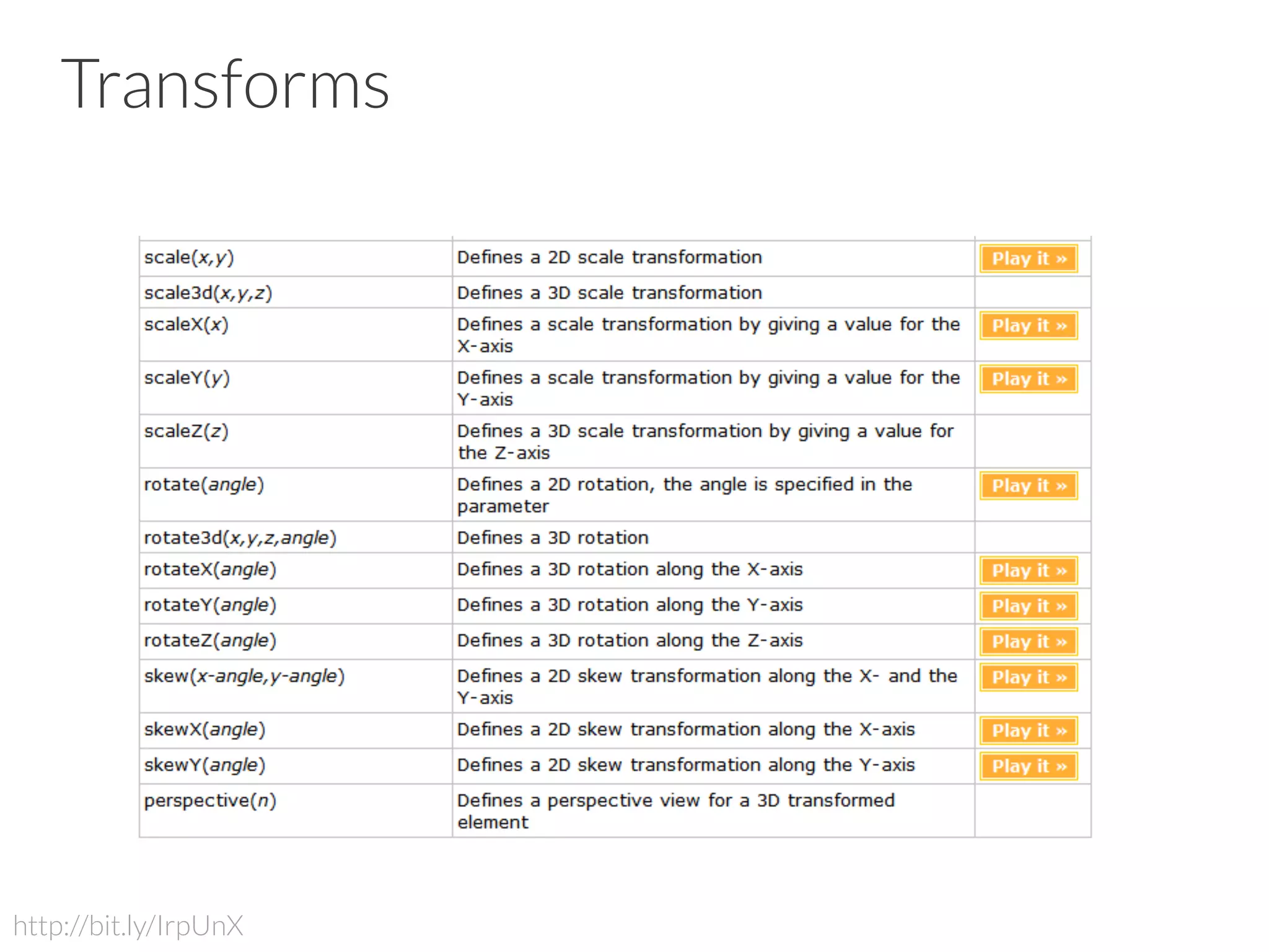
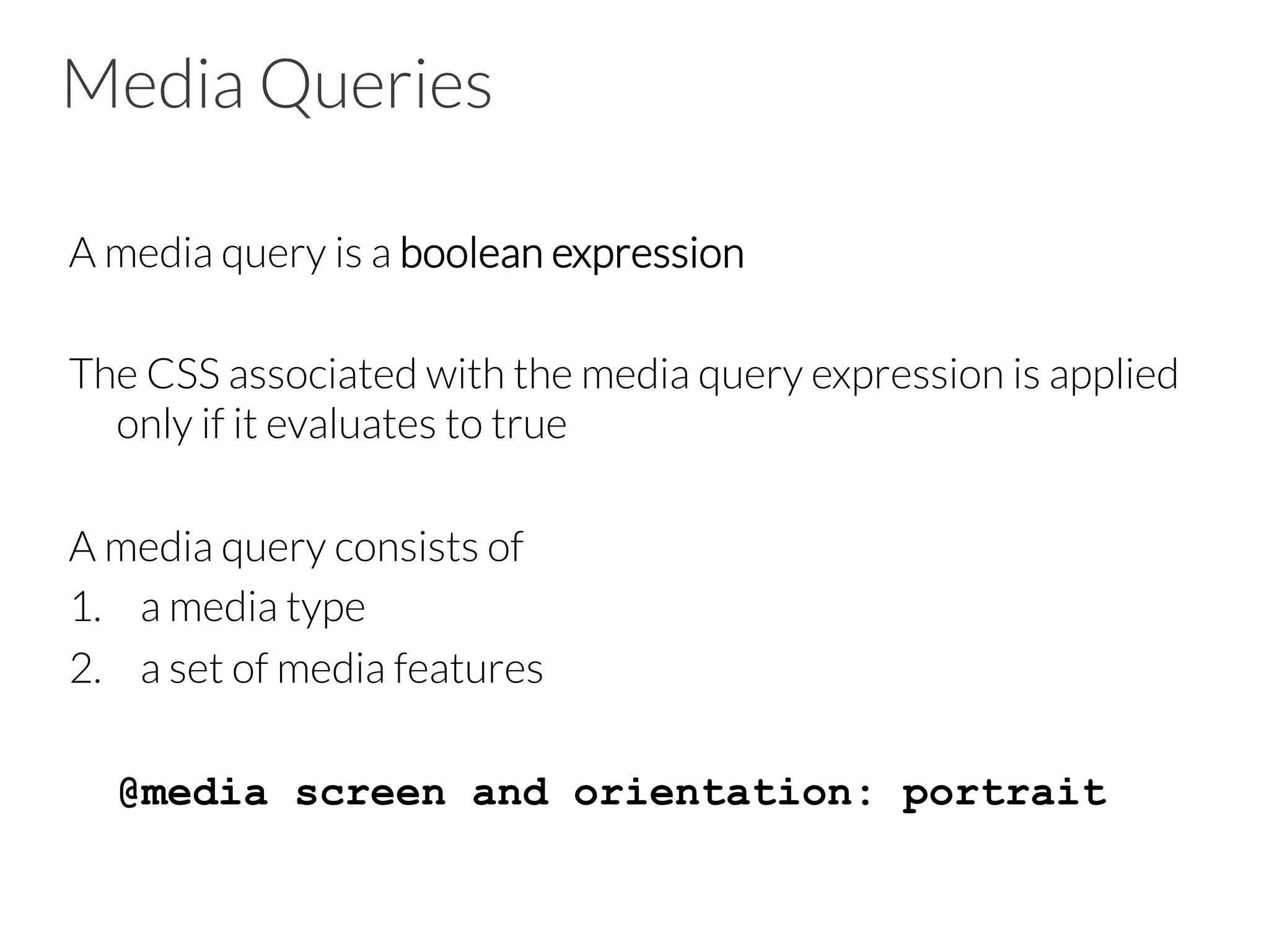
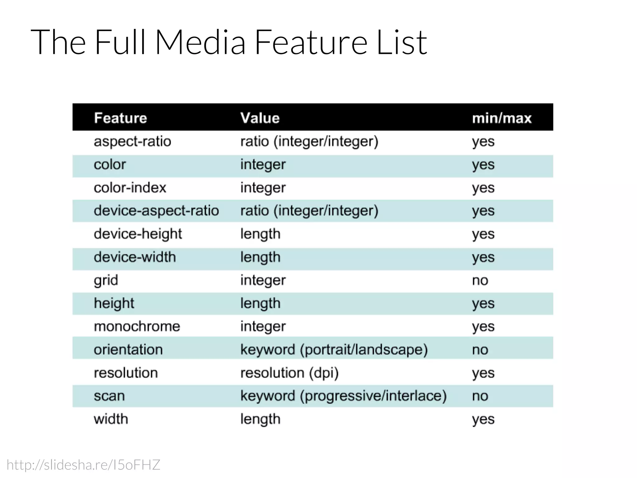
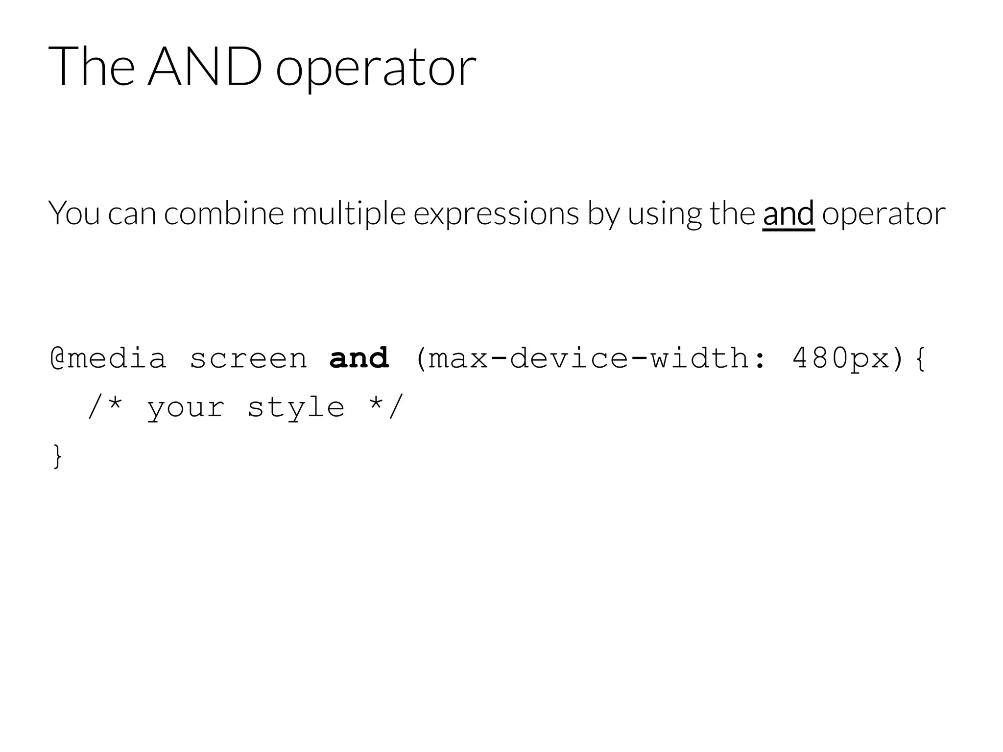

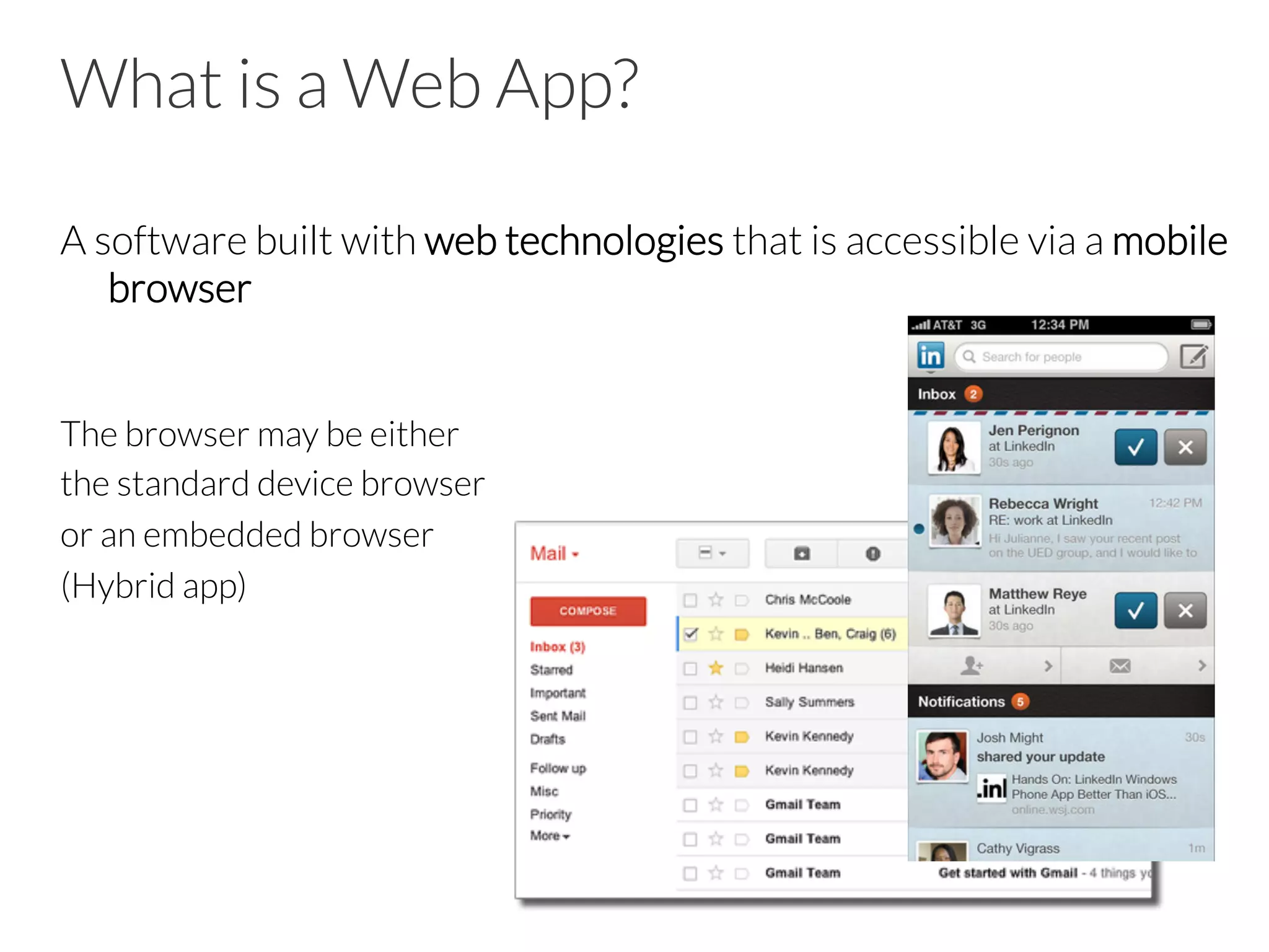
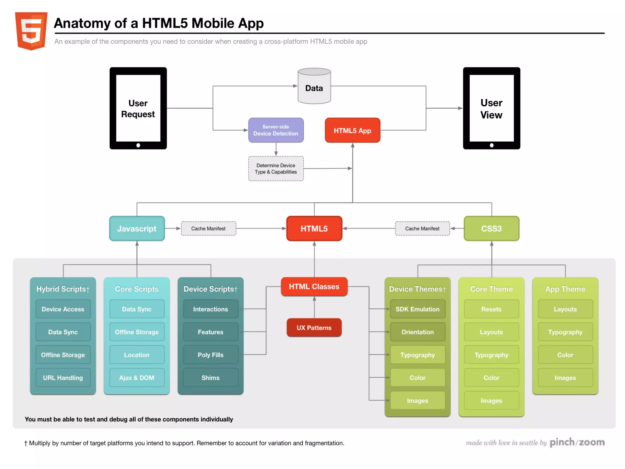
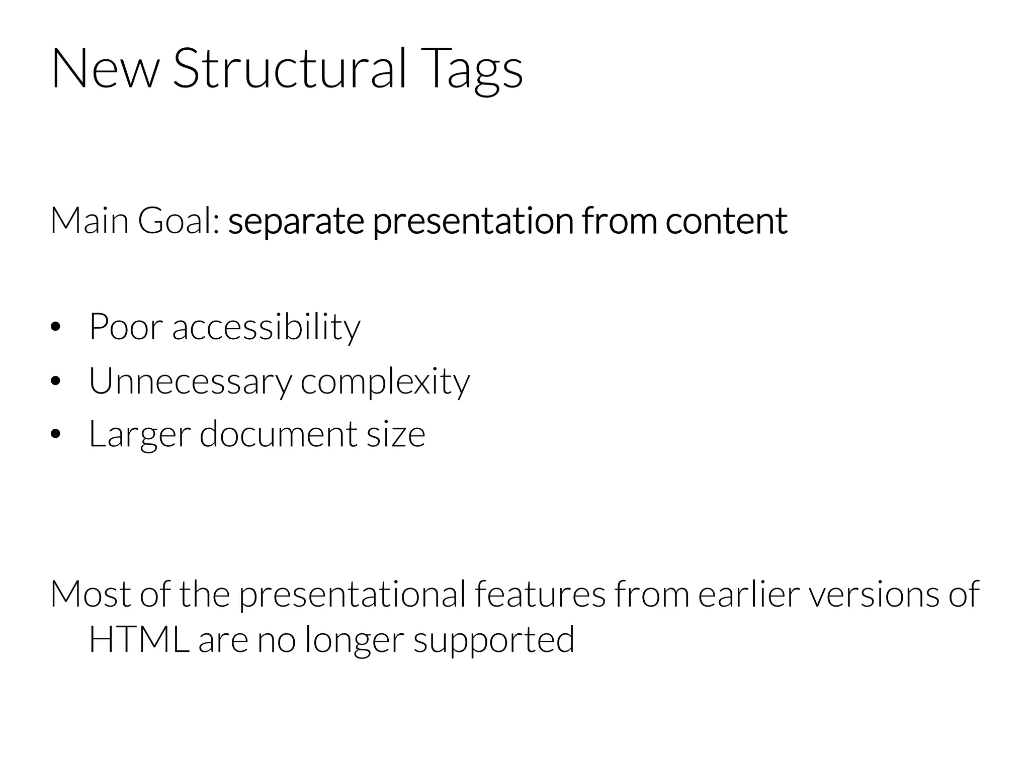
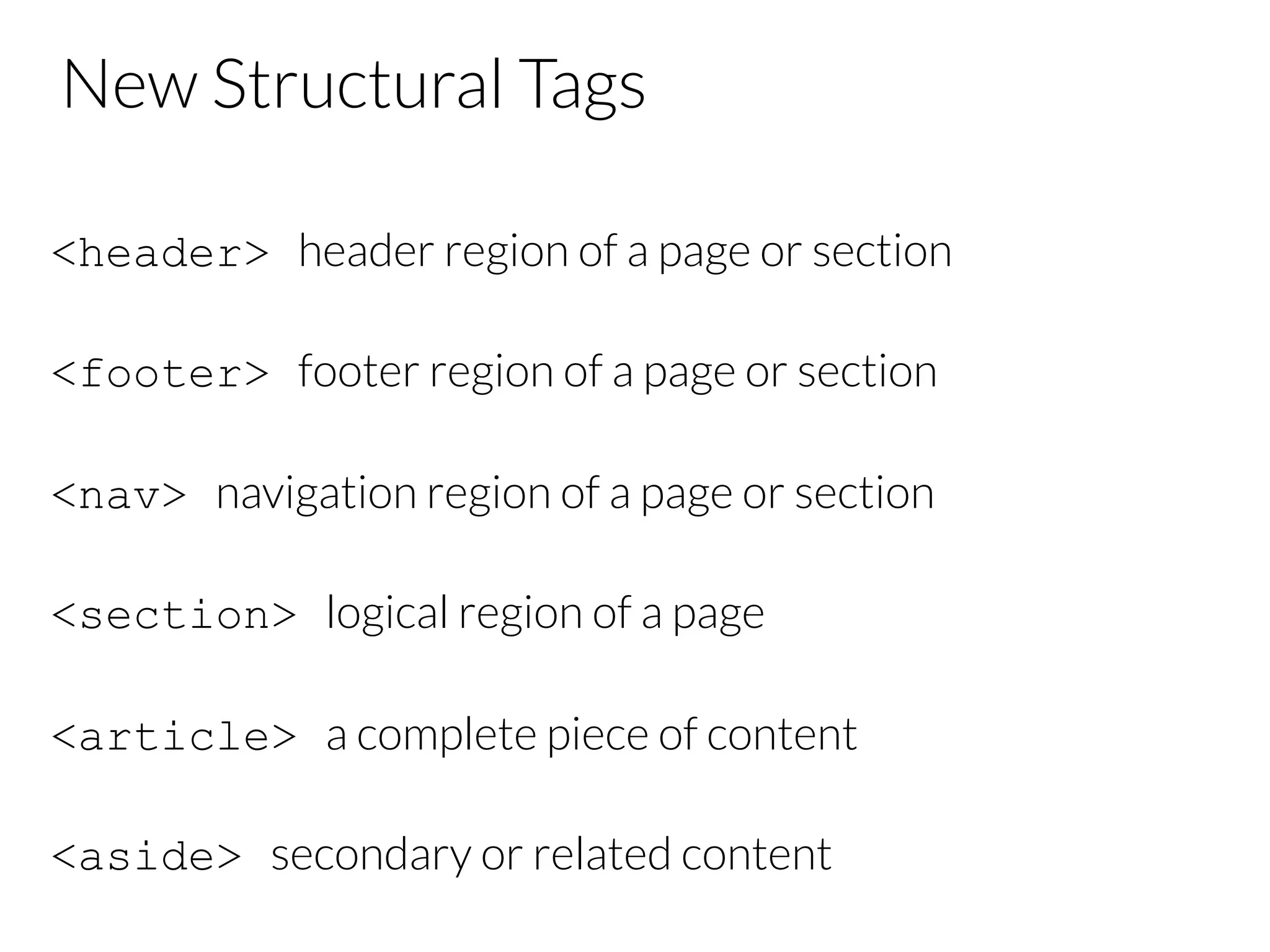
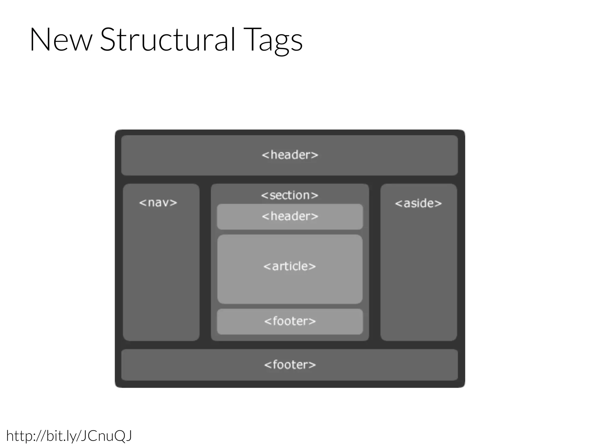
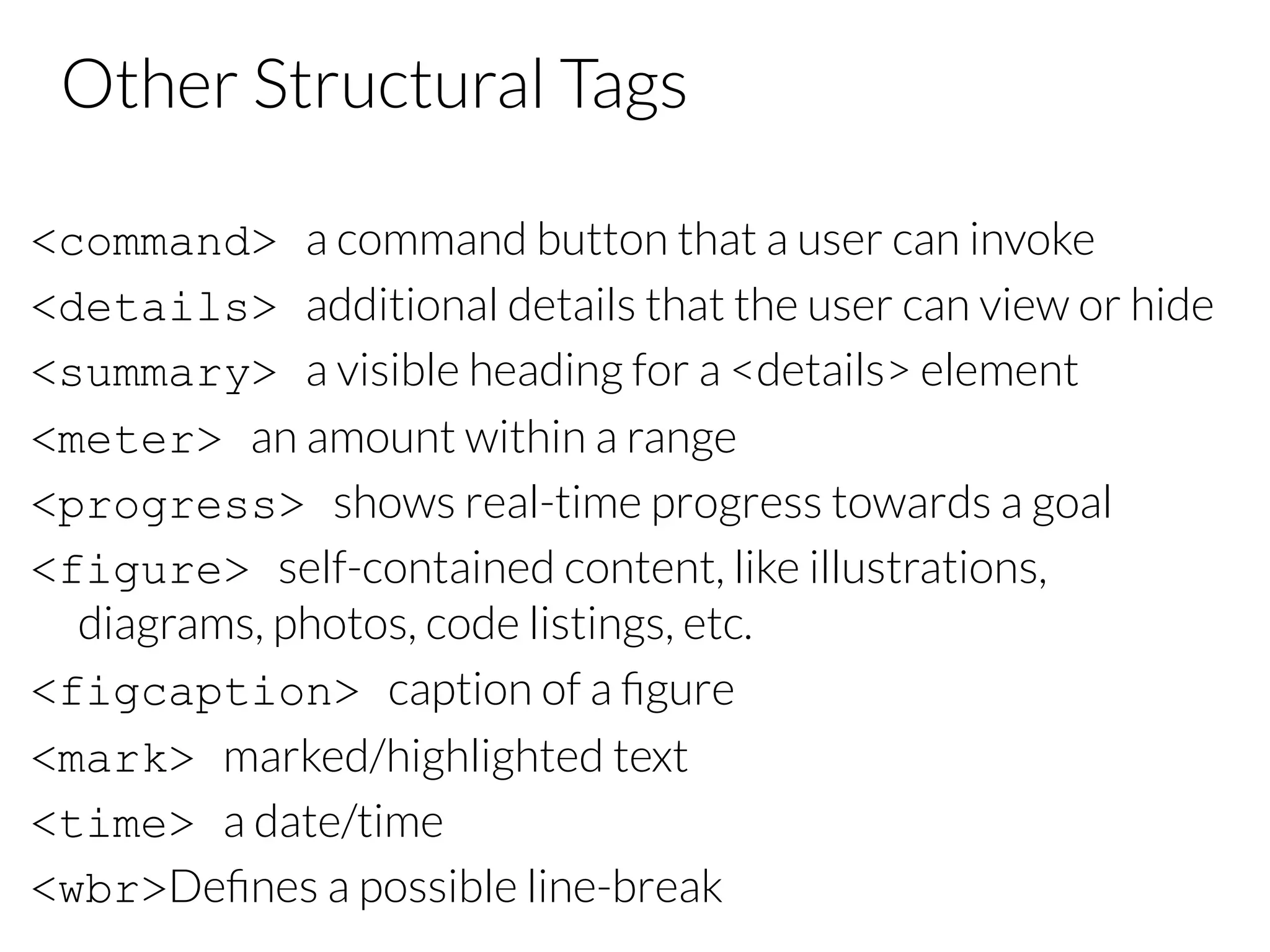
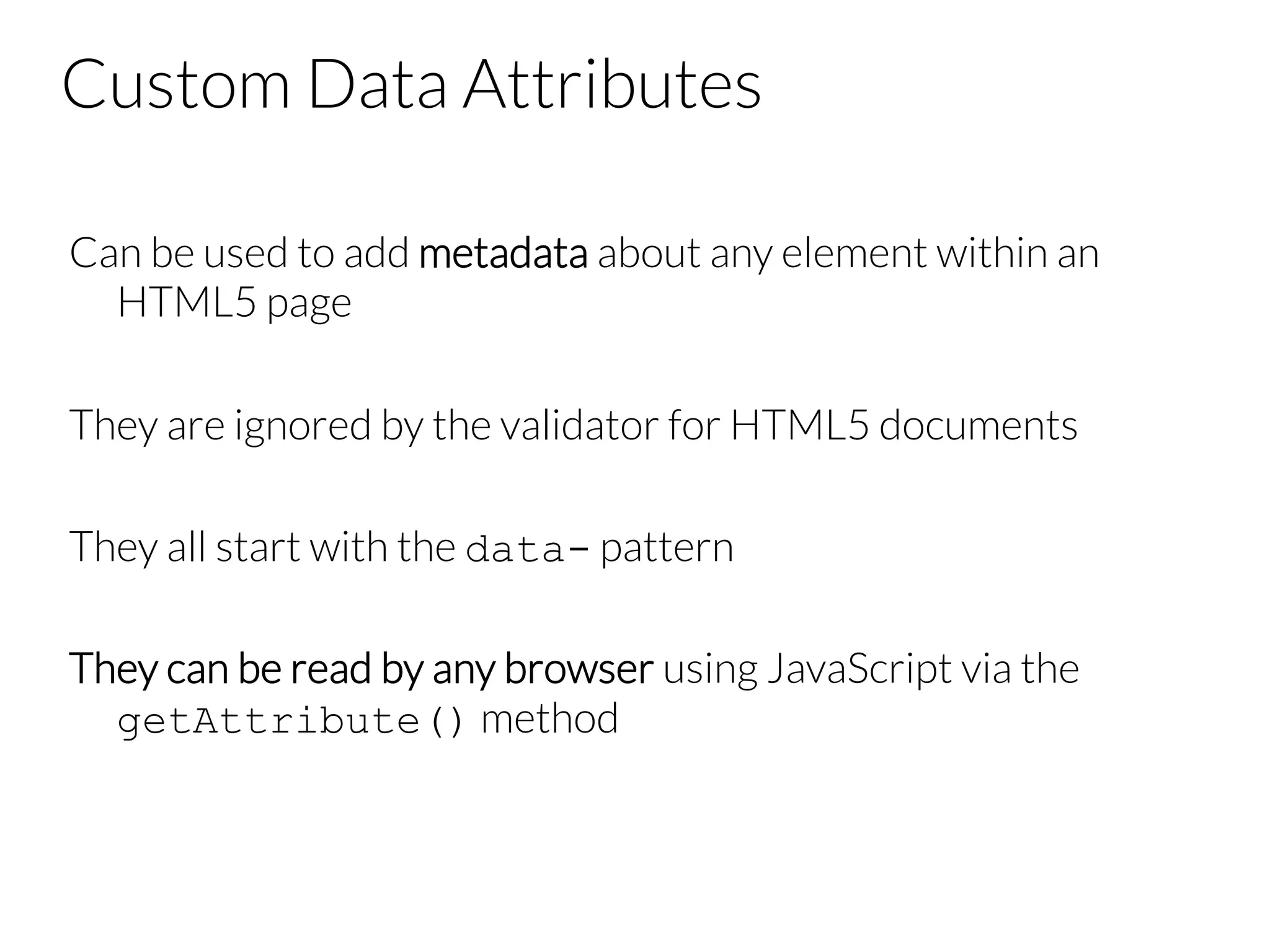
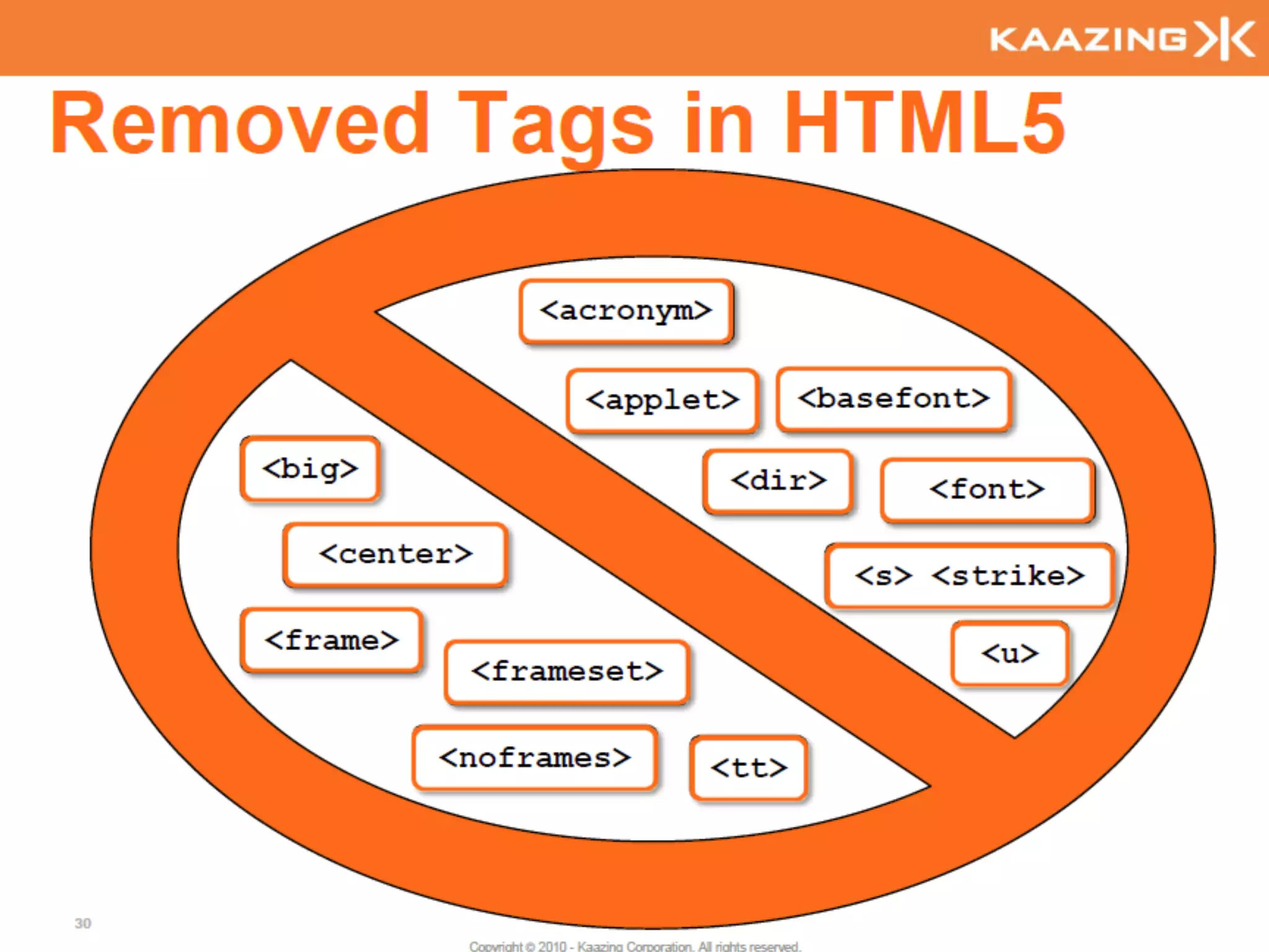
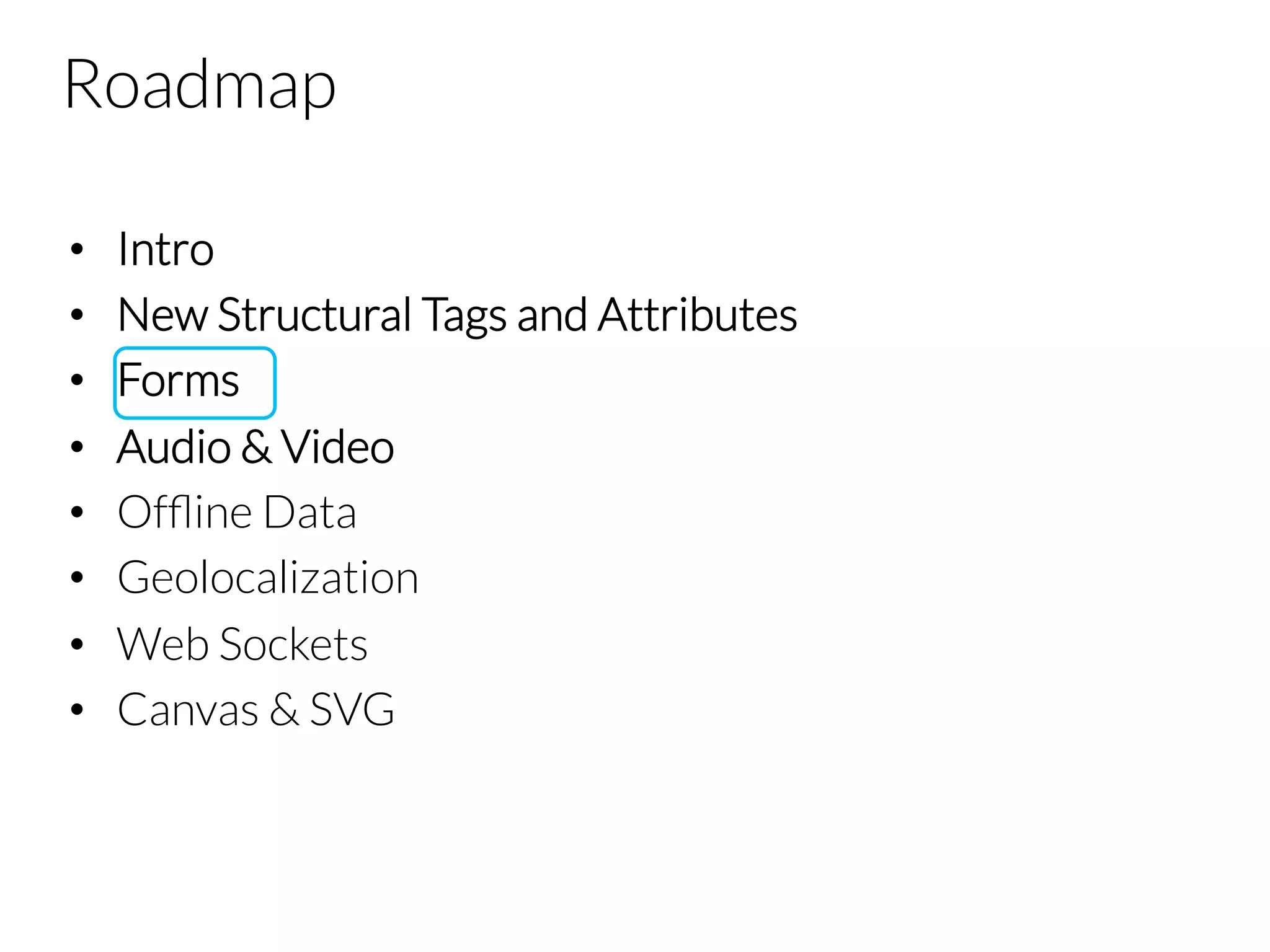
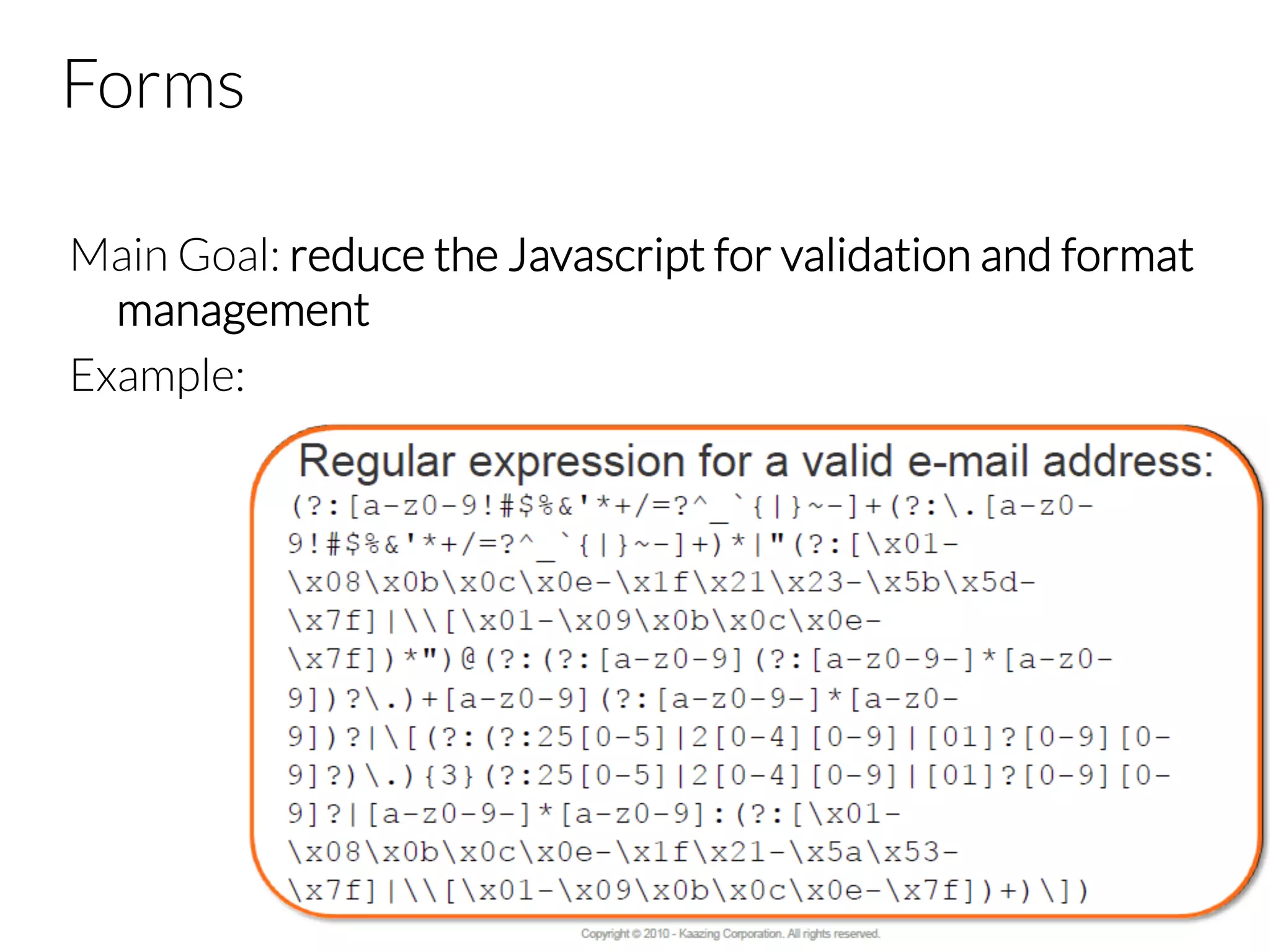
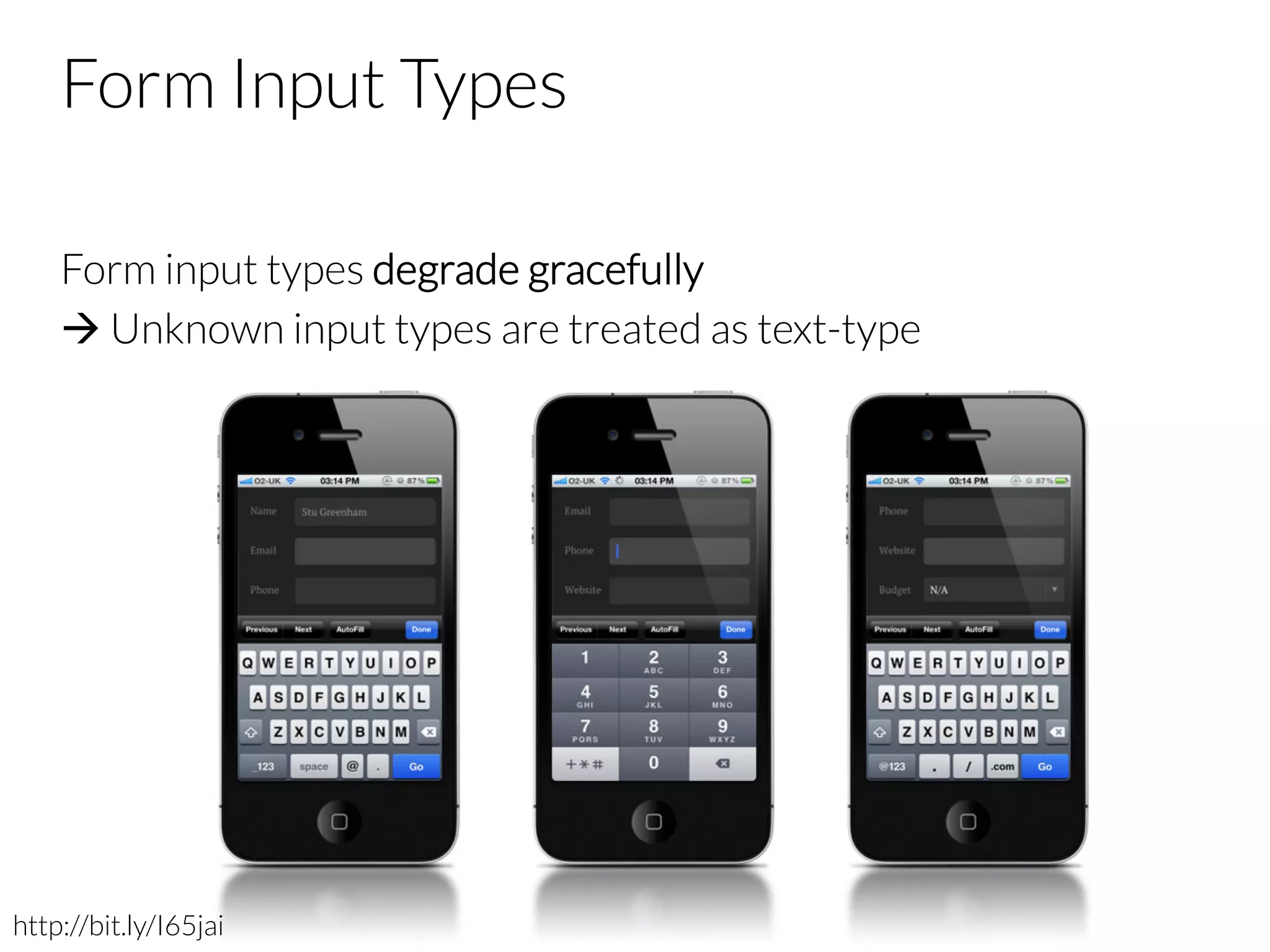
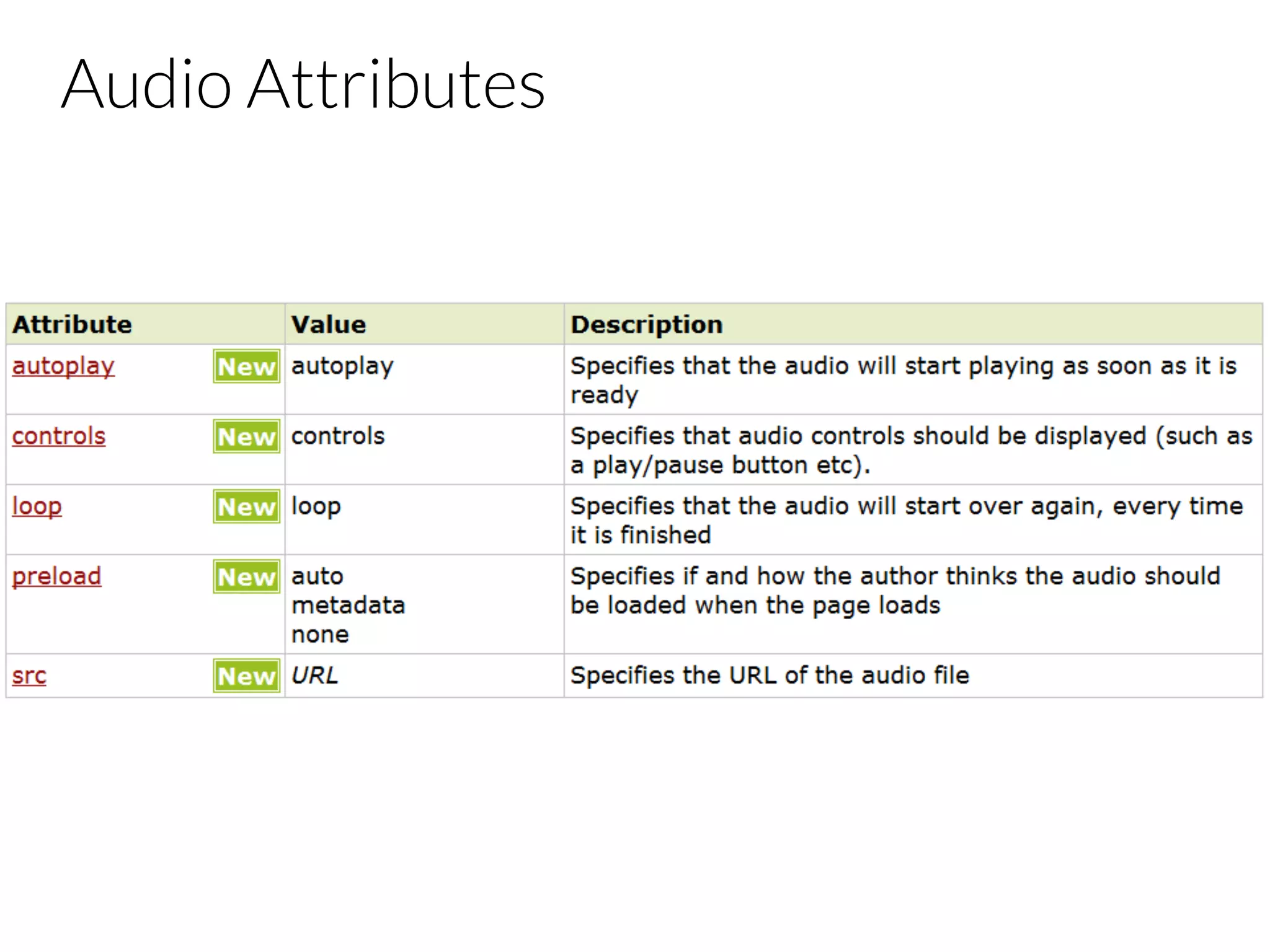
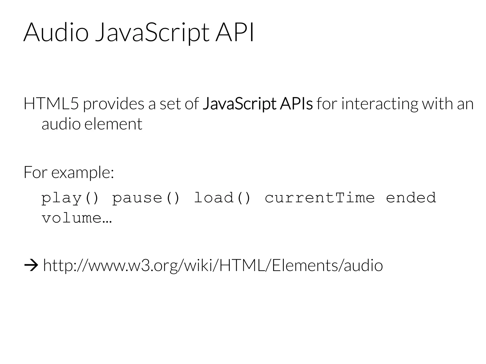
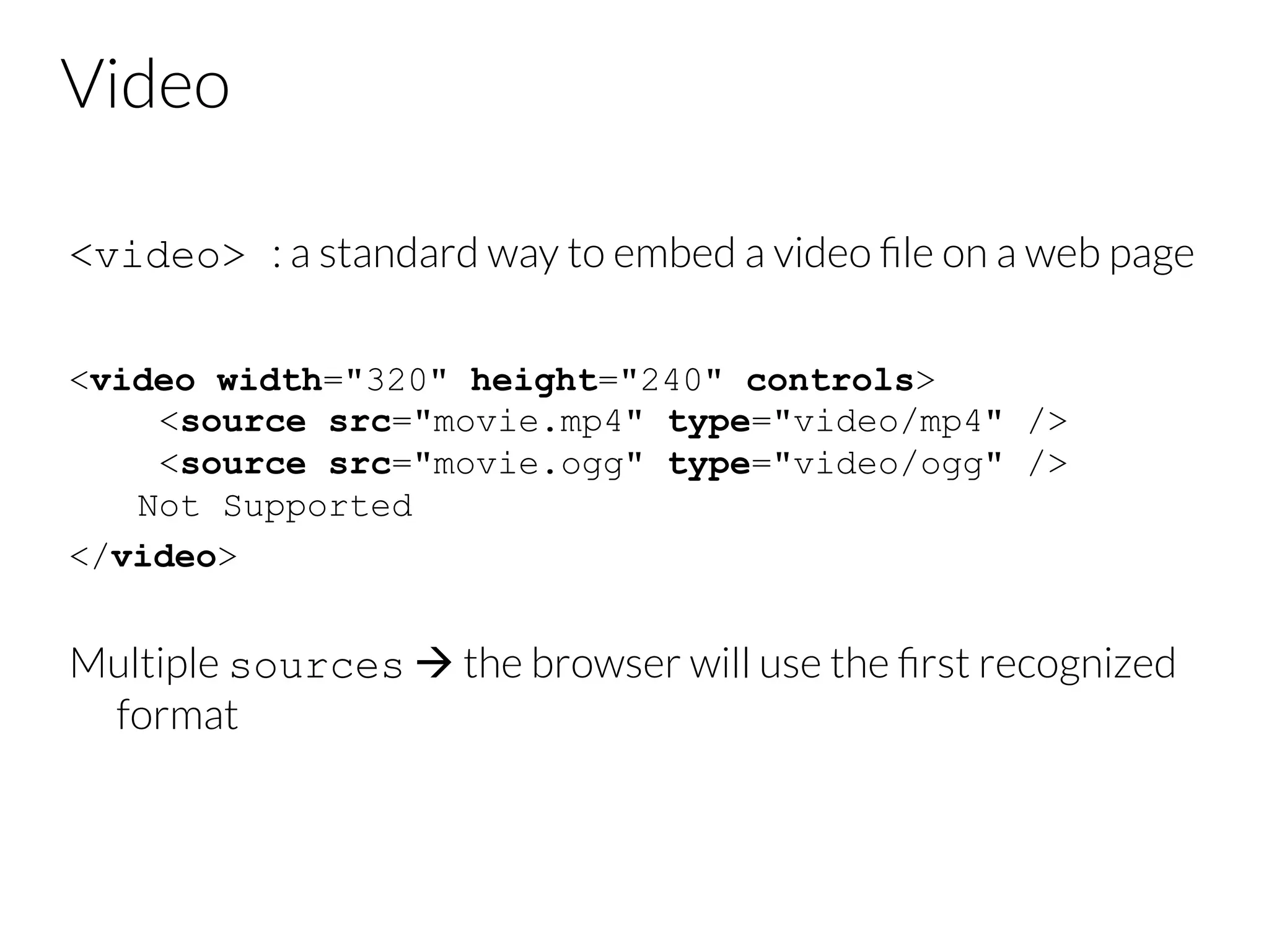
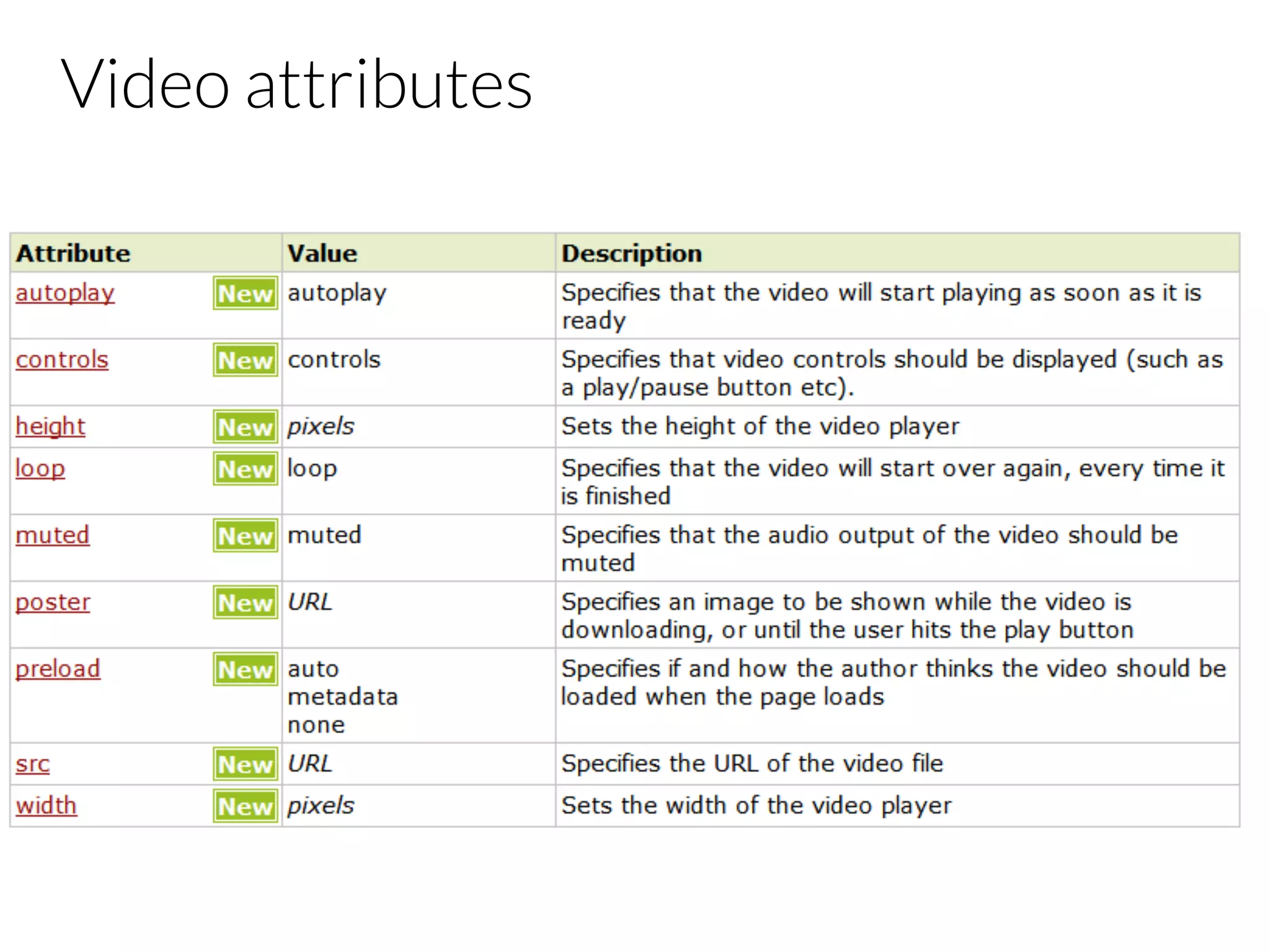
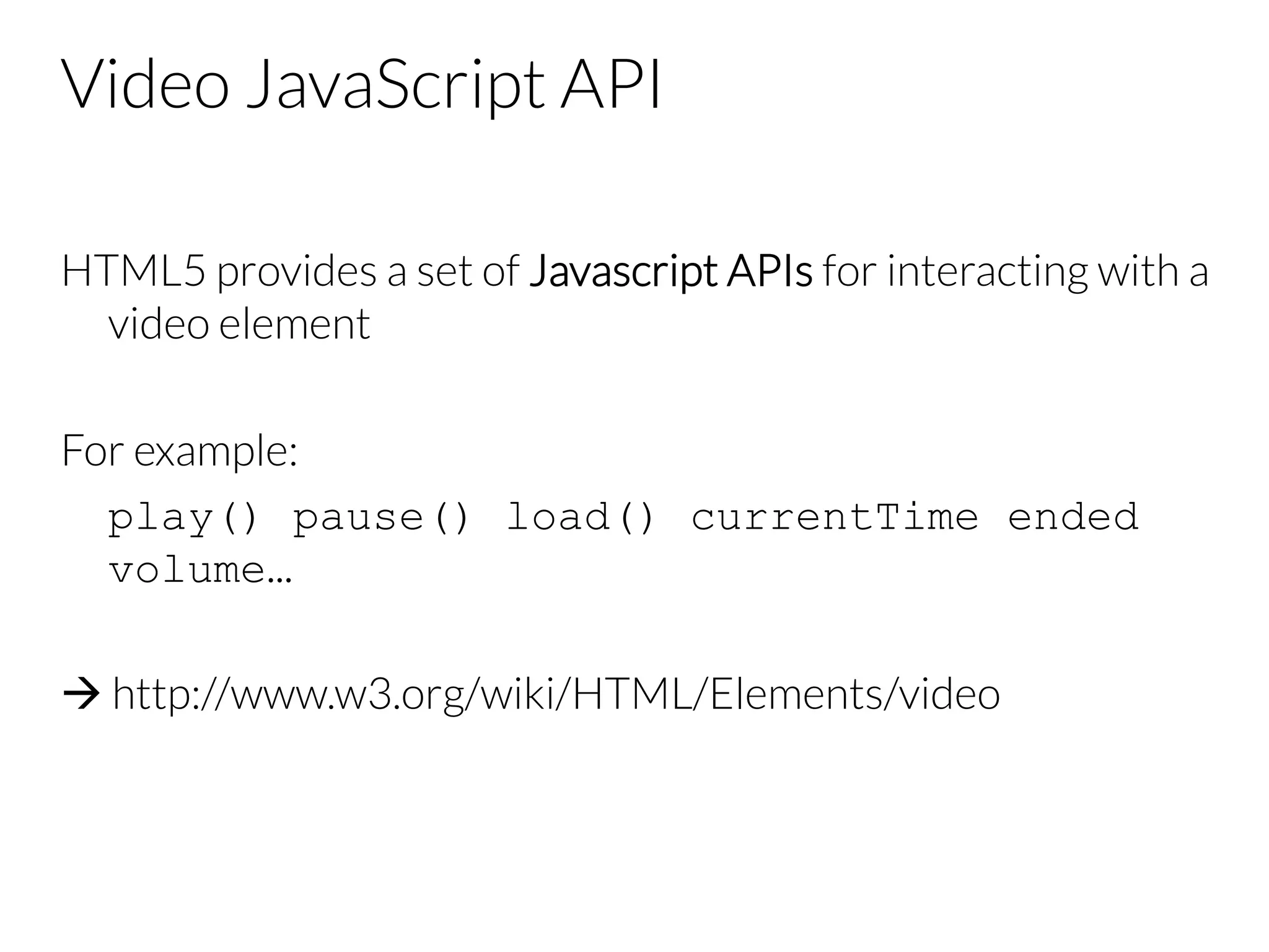
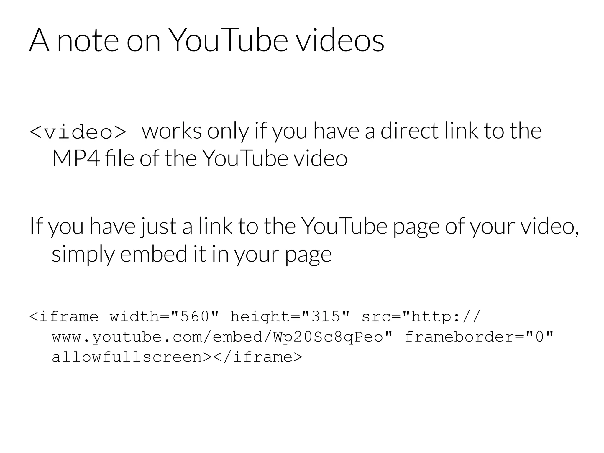
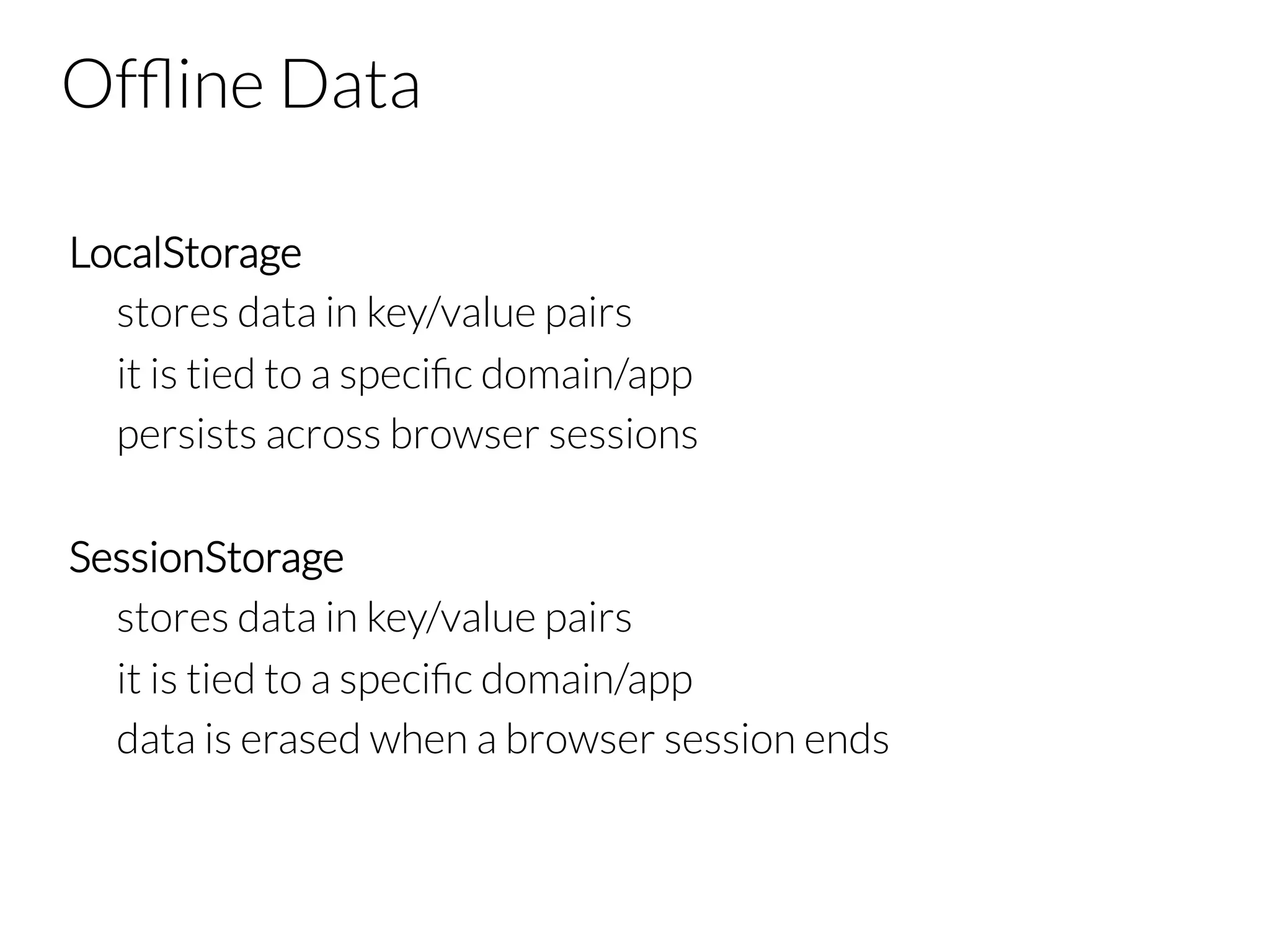
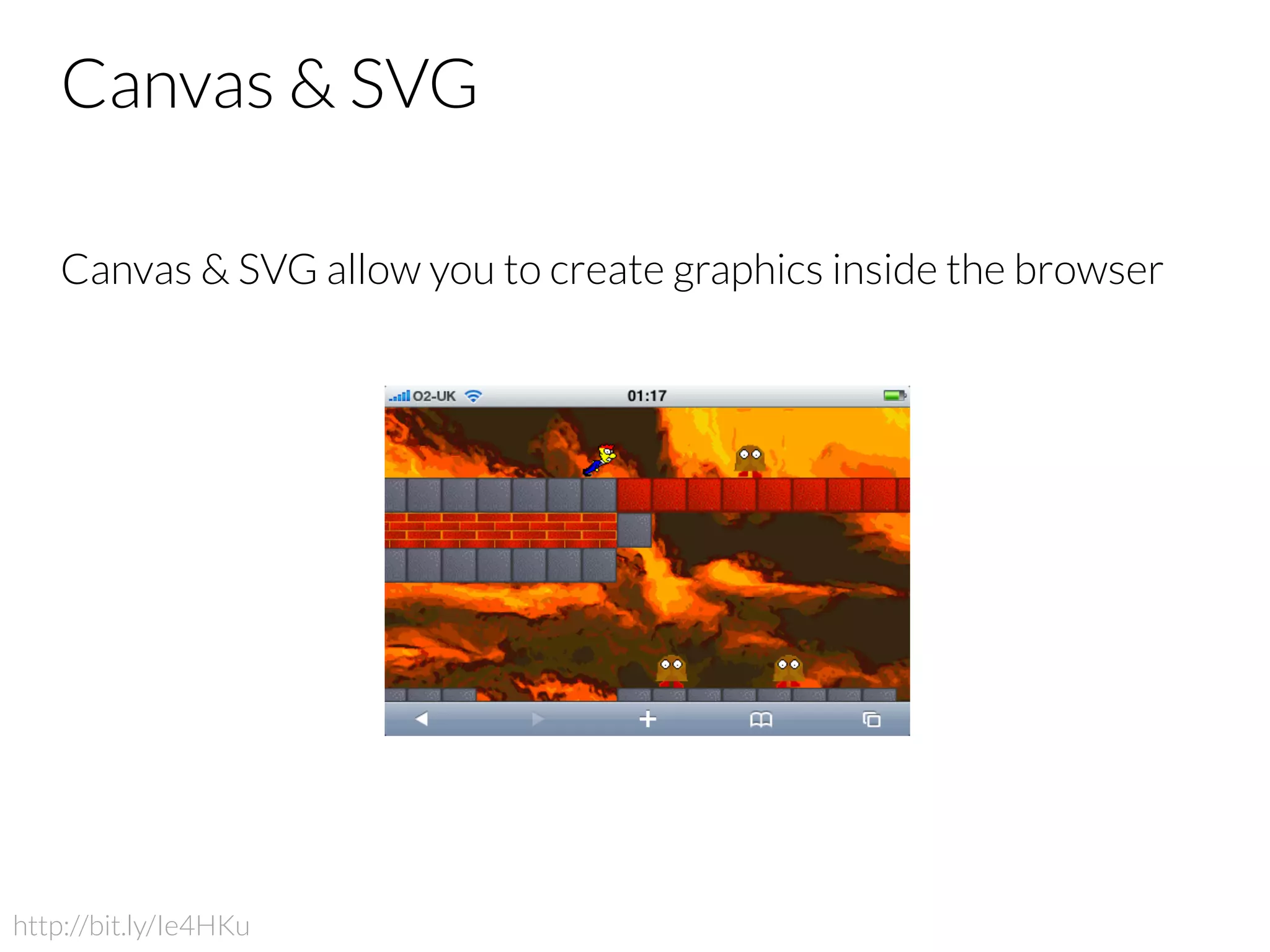
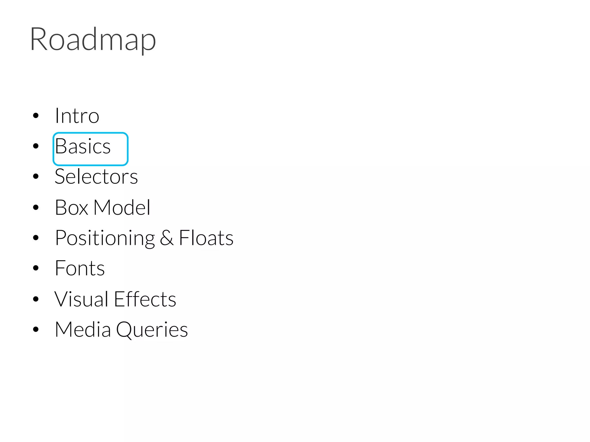
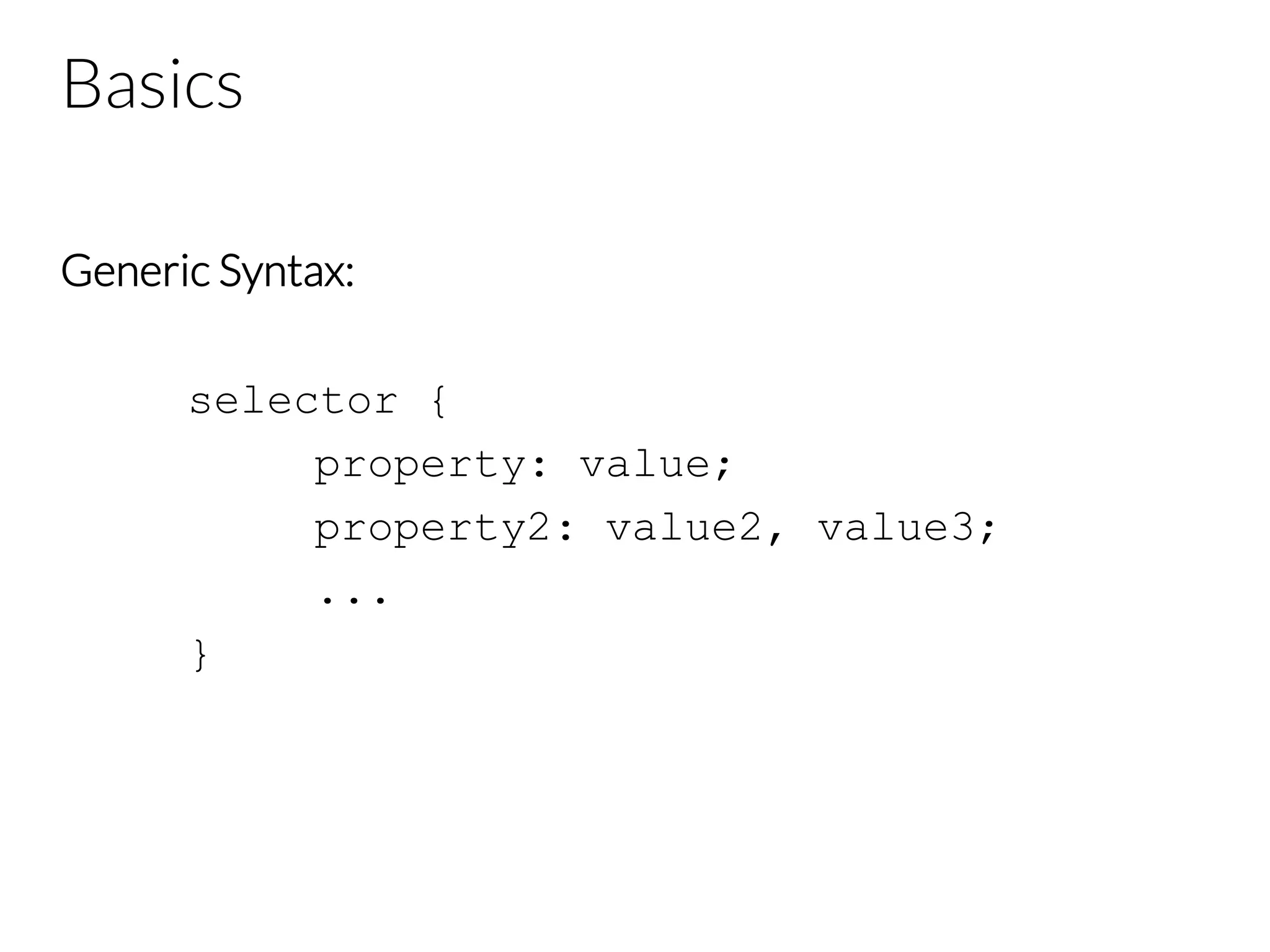
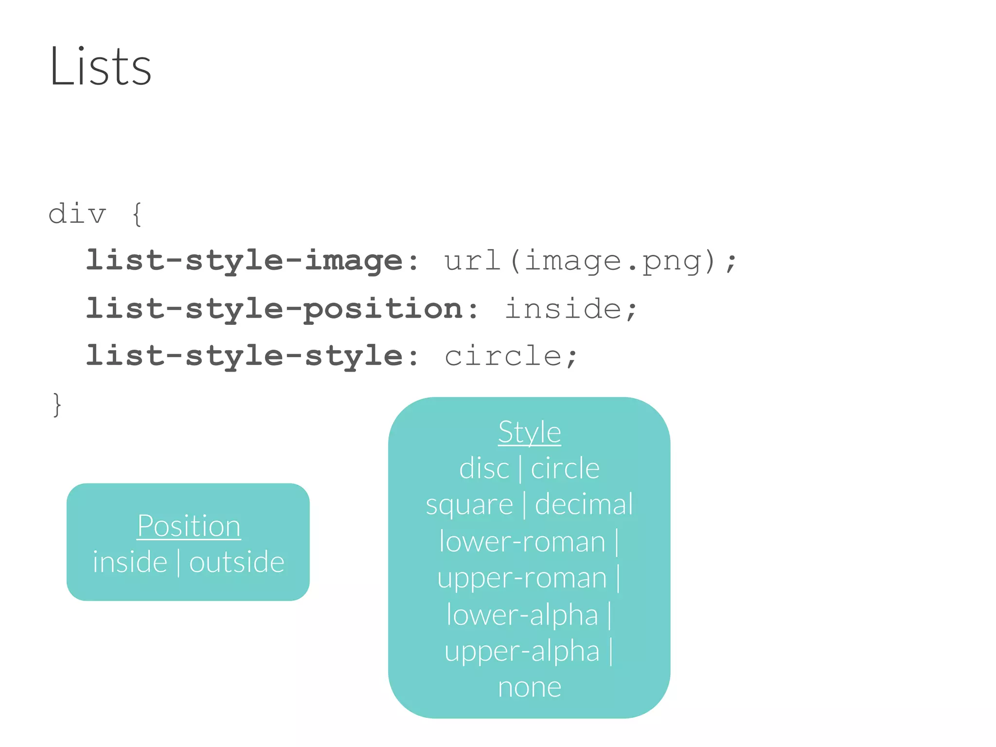
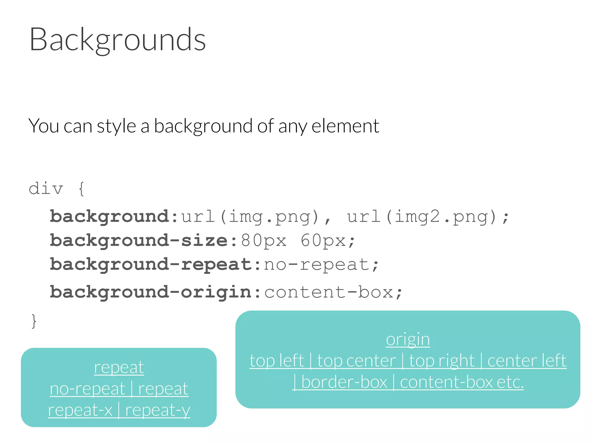
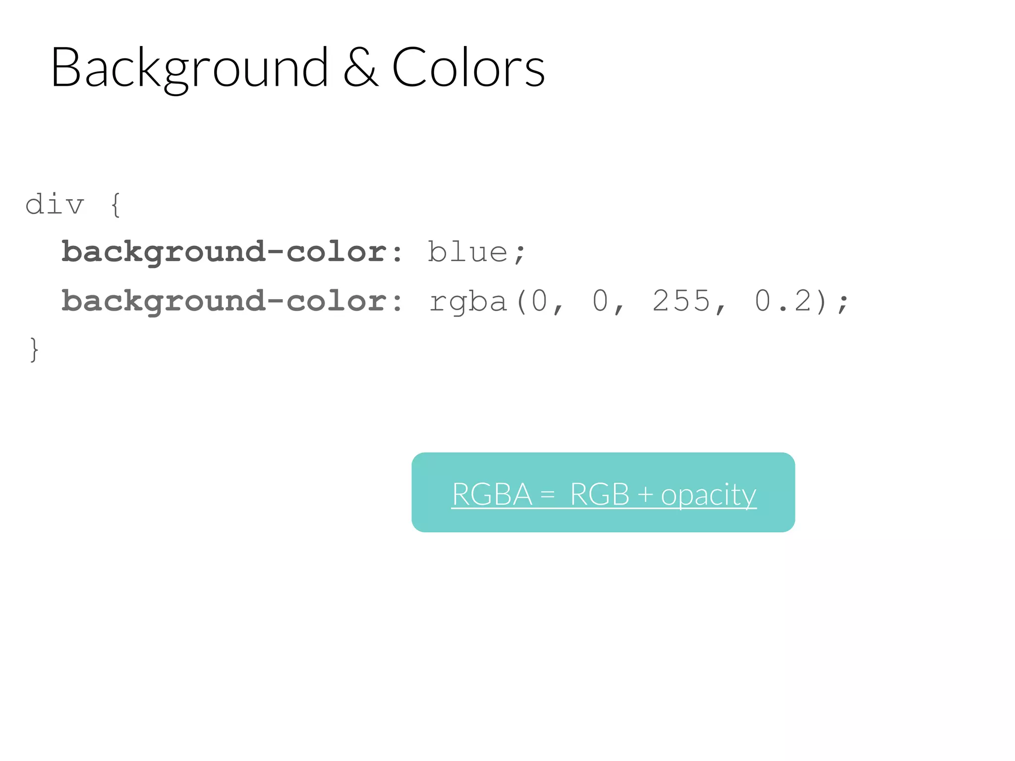
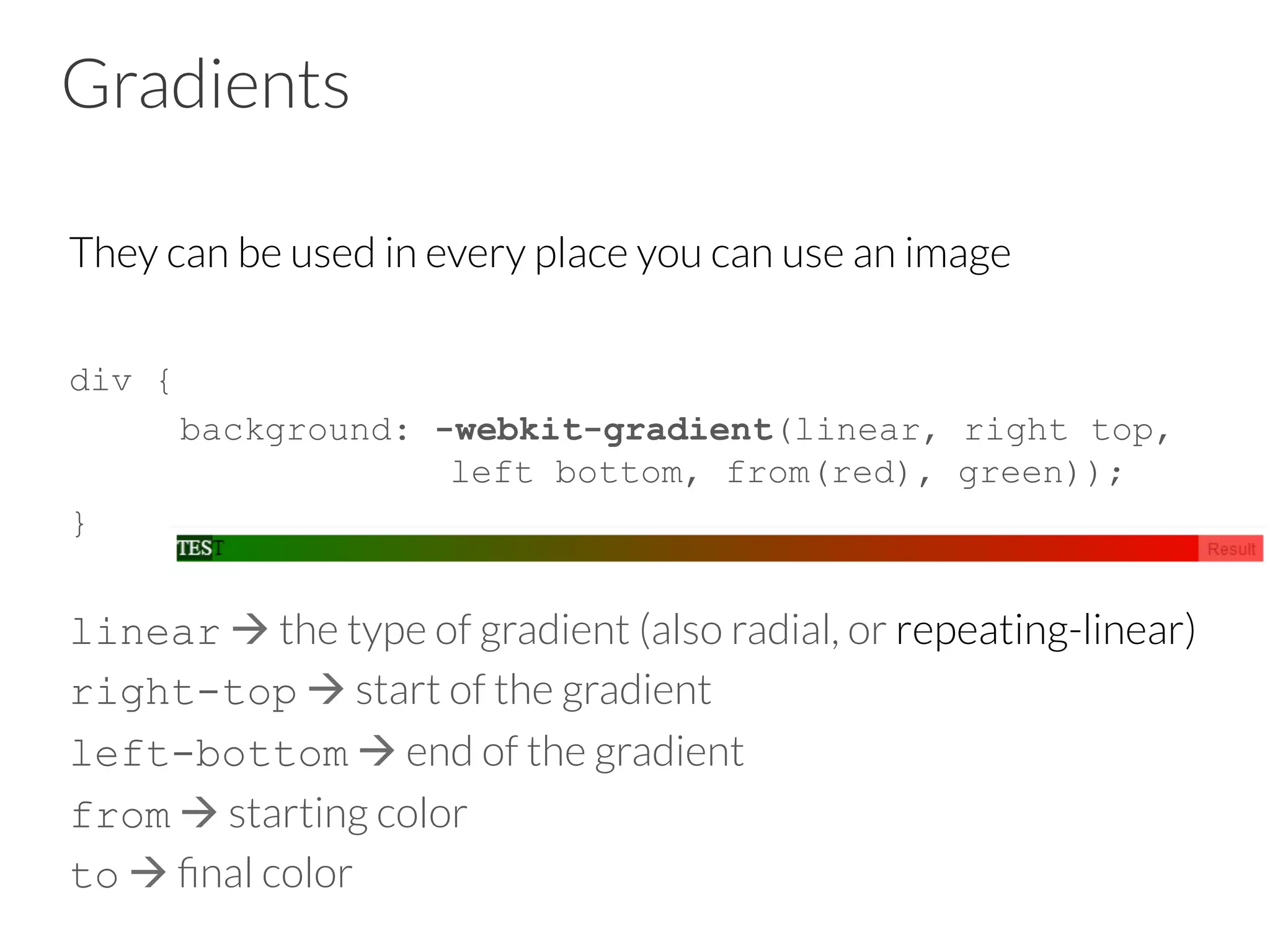
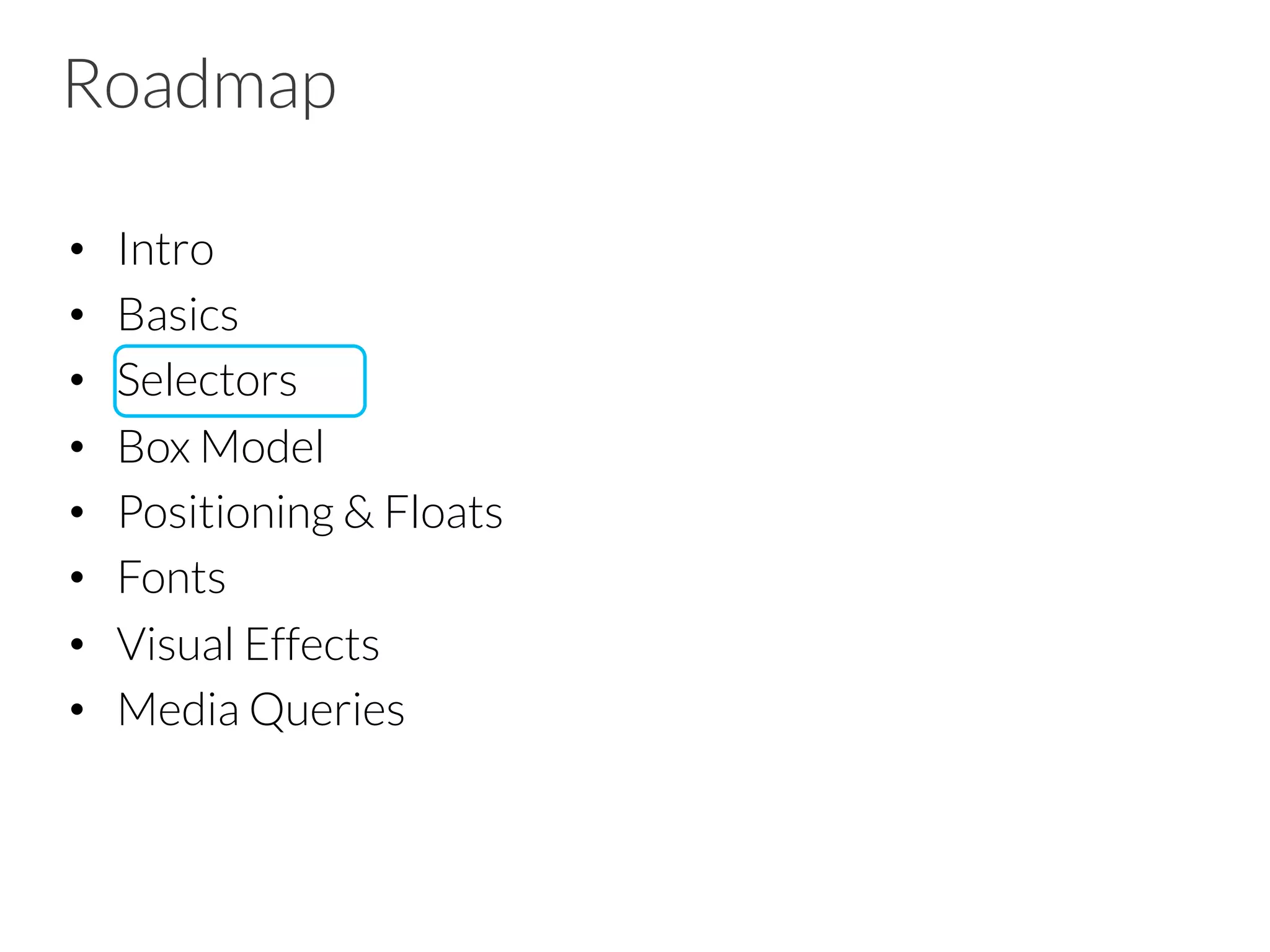
This document provides an overview of HTML5 and CSS3 concepts for building web applications. It begins with defining what a web app is and its basic anatomy. It then covers new HTML5 structural tags, forms, multimedia capabilities like audio and video, offline data storage, geolocation, and canvas/SVG graphics. For CSS3, it discusses new selectors, the box model, positioning, fonts, visual effects, and media queries. Key topics are presented at a high level with examples to illustrate the main capabilities and uses of HTML5 and CSS3 for mobile web development.