Android Graphical User Interface
Agenda Basic Widgets Labels Buttons Edit Text Check Box Spinner RadioGroup
Basic Widgets
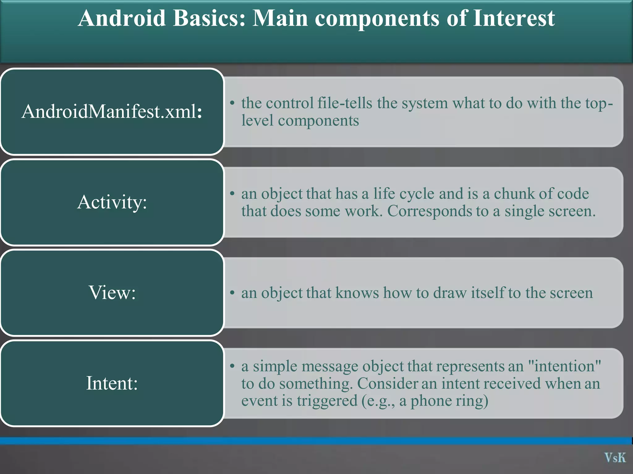
Android Basics: Main components of Interest • the control file-tells the system what to do with the top- level componentsAndroidManifest.xml: • an object that has a life cycle and is a chunk of code that does some work. Corresponds to a single screen.Activity: • an object that knows how to draw itself to the screenView: • a simple message object that represents an "intention" to do something. Consider an intent received when an event is triggered (e.g., a phone ring) Intent:
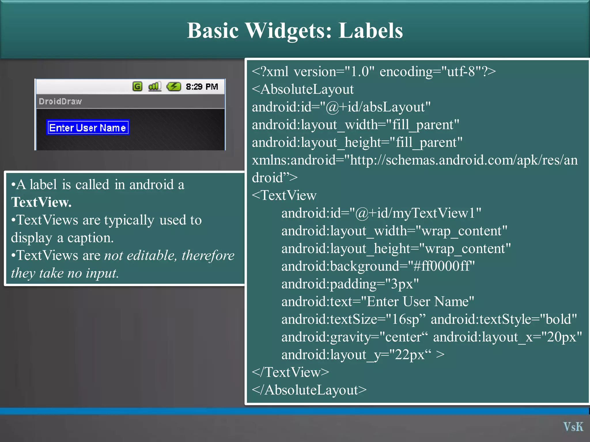
Basic Widgets: Labels •A label is called in android a TextView. •TextViews are typically used to display a caption. •TextViews are not editable, therefore they take no input. <?xml version="1.0" encoding="utf-8"?> <AbsoluteLayout android:id="@+id/absLayout" android:layout_width="fill_parent" android:layout_height="fill_parent" xmlns:android="http://schemas.android.com/apk/res/an droid”> <TextView android:id="@+id/myTextView1" android:layout_width="wrap_content" android:layout_height="wrap_content" android:background="#ff0000ff" android:padding="3px" android:text="Enter User Name" android:textSize="16sp” android:textStyle="bold" android:gravity="center“ android:layout_x="20px" android:layout_y="22px“ > </TextView> </AbsoluteLayout>
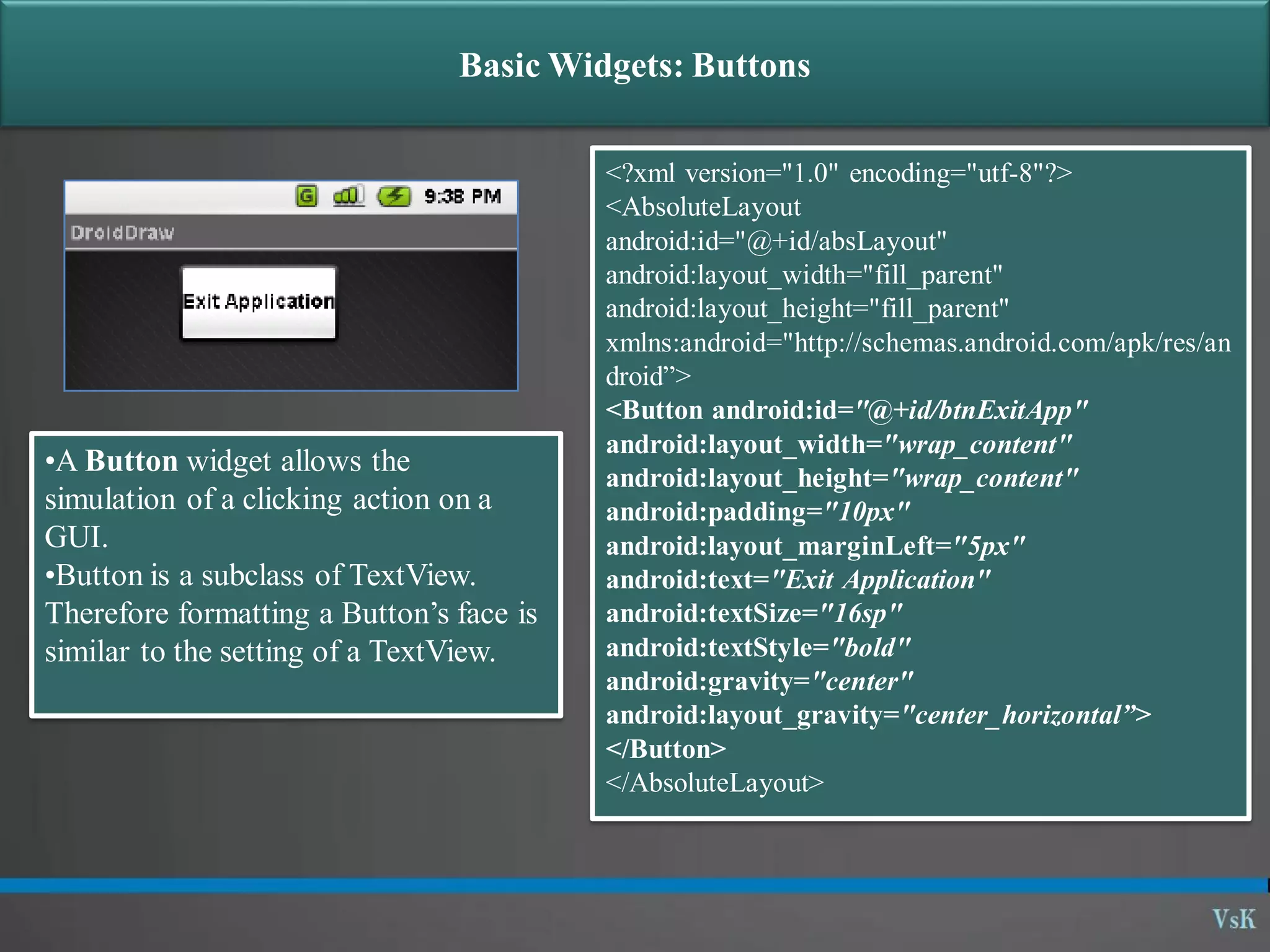
Basic Widgets: Buttons •A Button widget allows the simulation of a clicking action on a GUI. •Button is a subclass of TextView. Therefore formatting a Button’s face is similar to the setting of a TextView. <?xml version="1.0" encoding="utf-8"?> <AbsoluteLayout android:id="@+id/absLayout" android:layout_width="fill_parent" android:layout_height="fill_parent" xmlns:android="http://schemas.android.com/apk/res/an droid”> <Button android:id="@+id/btnExitApp" android:layout_width="wrap_content" android:layout_height="wrap_content" android:padding="10px" android:layout_marginLeft="5px" android:text="Exit Application" android:textSize="16sp" android:textStyle="bold" android:gravity="center" android:layout_gravity="center_horizontal”> </Button> </AbsoluteLayout>
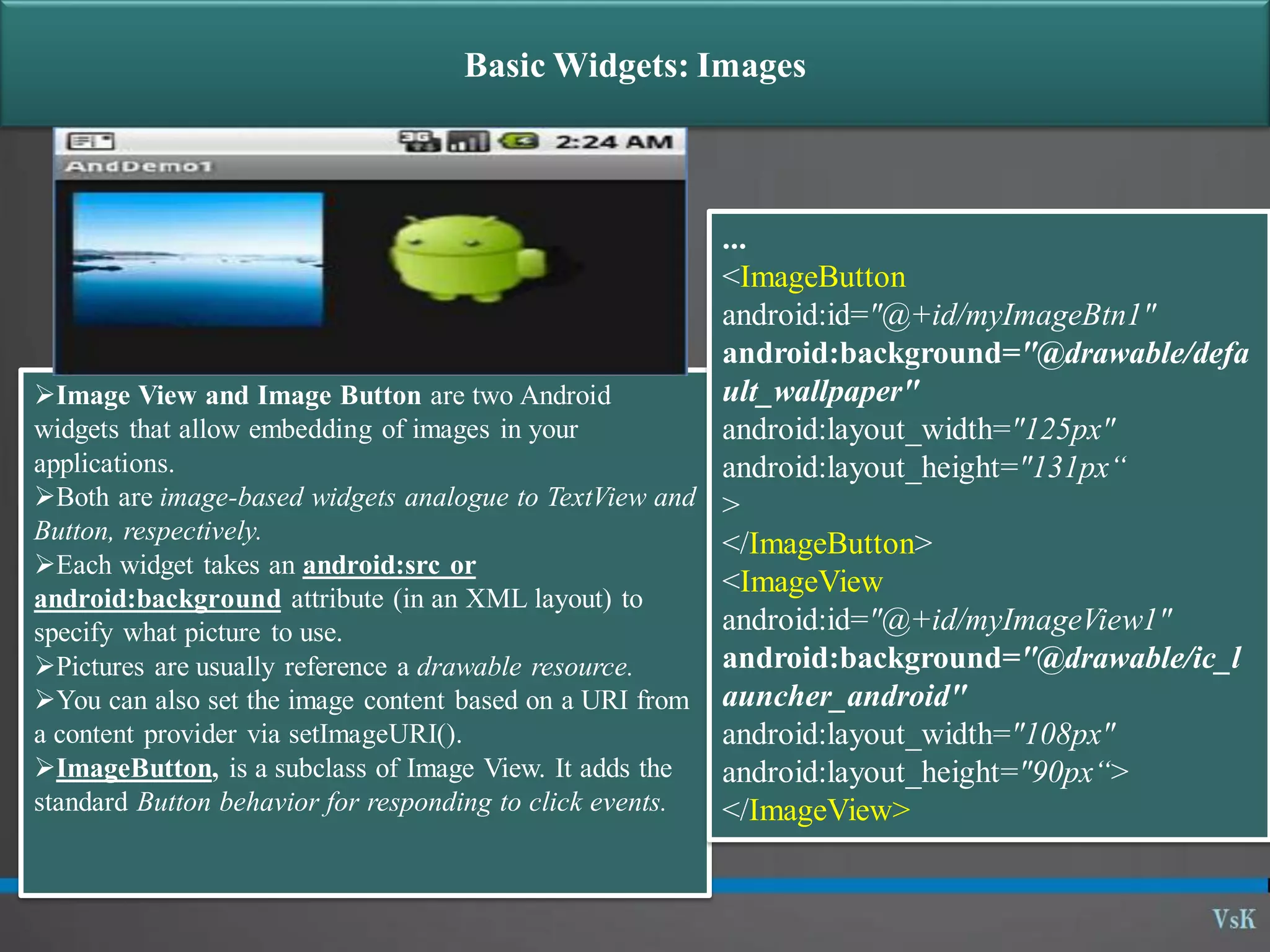
Basic Widgets: Images Image View and Image Button are two Android widgets that allow embedding of images in your applications. Both are image-based widgets analogue to TextView and Button, respectively. Each widget takes an android:src or android:background attribute (in an XML layout) to specify what picture to use. Pictures are usually reference a drawable resource. You can also set the image content based on a URI from a content provider via setImageURI(). ImageButton, is a subclass of Image View. It adds the standard Button behavior for responding to click events. ... <ImageButton android:id="@+id/myImageBtn1" android:background="@drawable/defa ult_wallpaper" android:layout_width="125px" android:layout_height="131px“ > </ImageButton> <ImageView android:id="@+id/myImageView1" android:background="@drawable/ic_l auncher_android" android:layout_width="108px" android:layout_height="90px“> </ImageView>
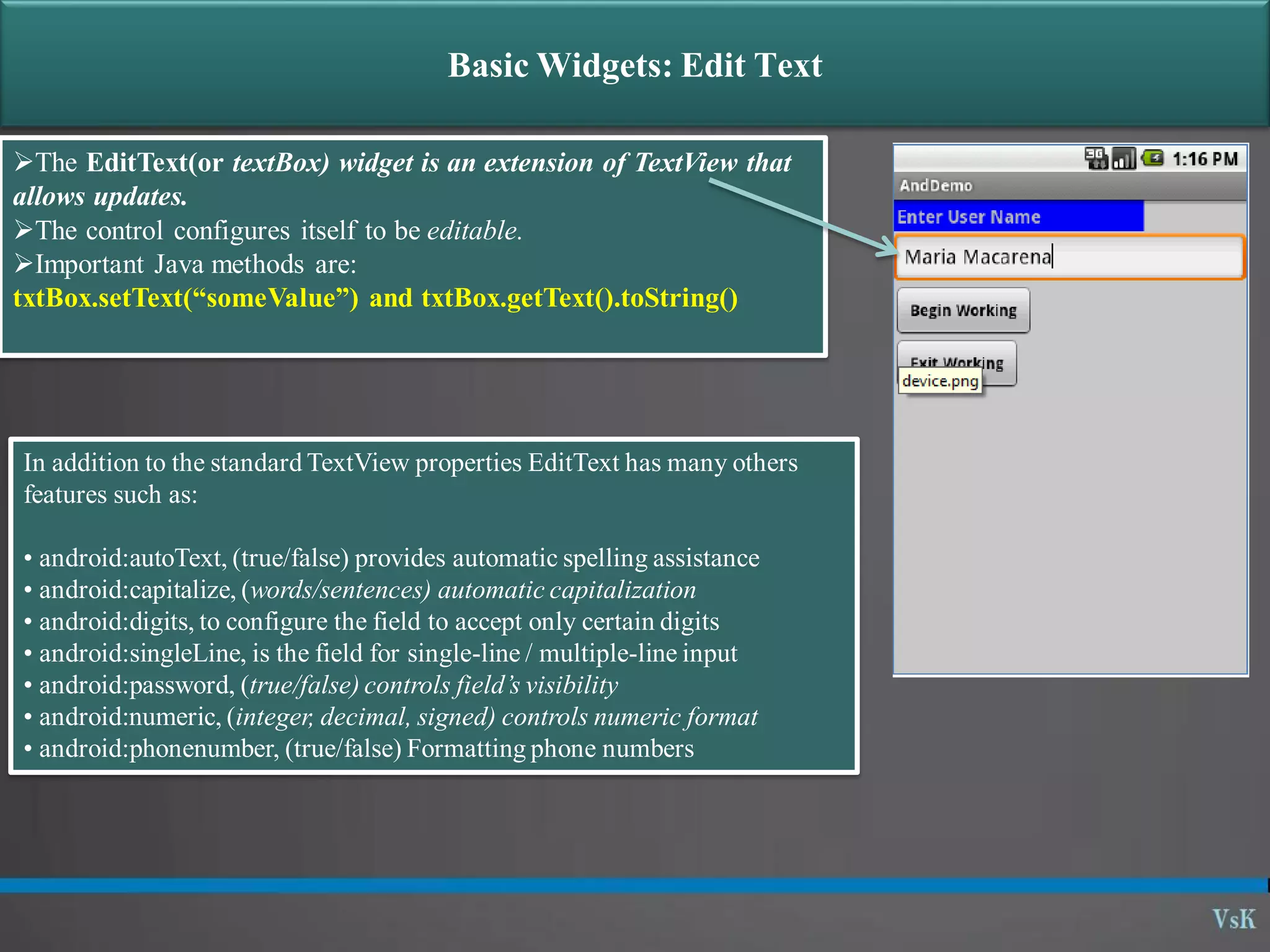
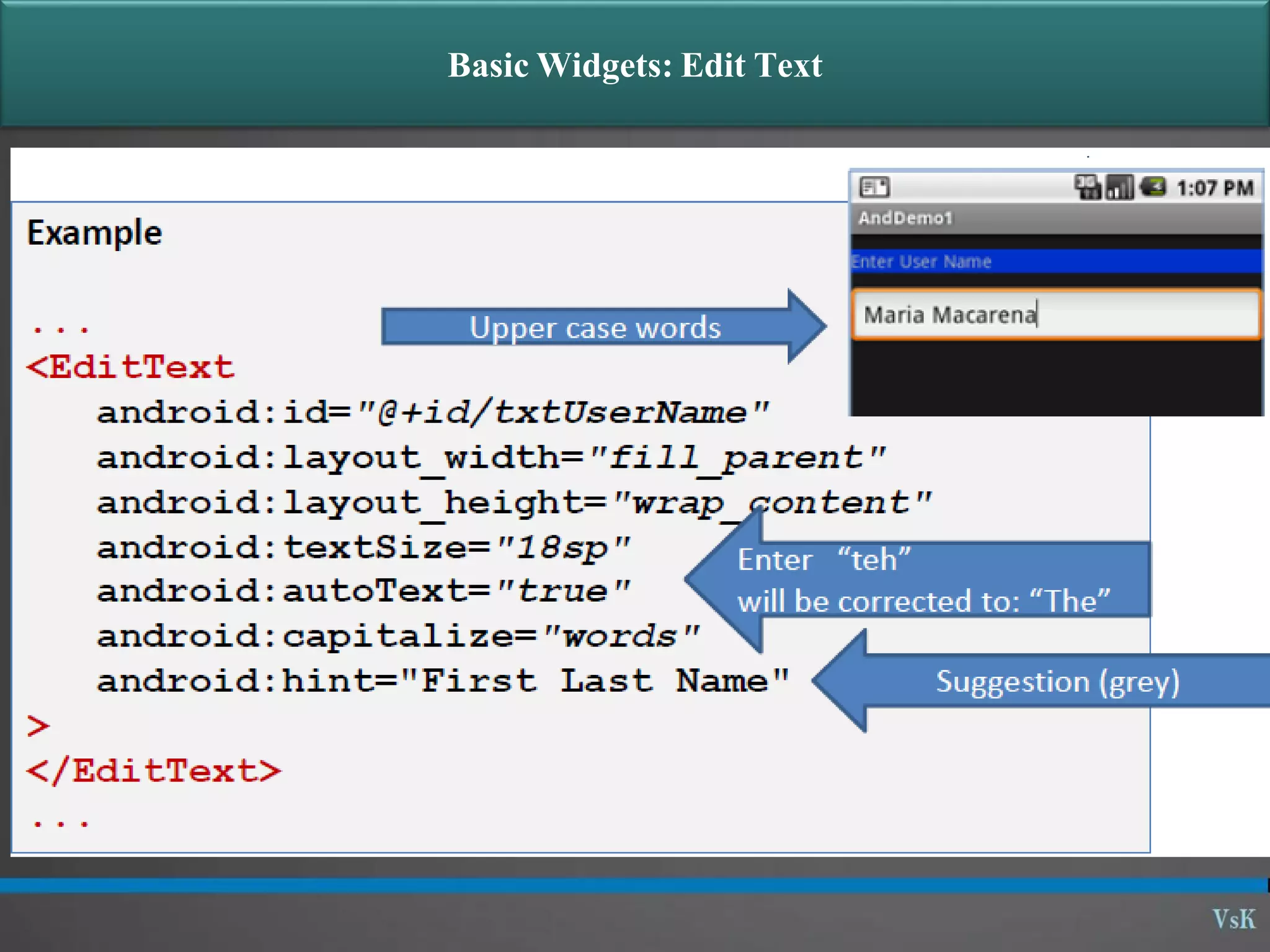
Basic Widgets: Edit Text The EditText(or textBox) widget is an extension of TextView that allows updates. The control configures itself to be editable. Important Java methods are: txtBox.setText(“someValue”) and txtBox.getText().toString() In addition to the standard TextView properties EditText has many others features such as: • android:autoText, (true/false) provides automatic spelling assistance • android:capitalize, (words/sentences) automatic capitalization • android:digits, to configure the field to accept only certain digits • android:singleLine, is the field for single-line / multiple-line input • android:password, (true/false) controls field’s visibility • android:numeric, (integer, decimal, signed) controls numeric format • android:phonenumber, (true/false) Formatting phone numbers
Basic Widgets: Edit Text
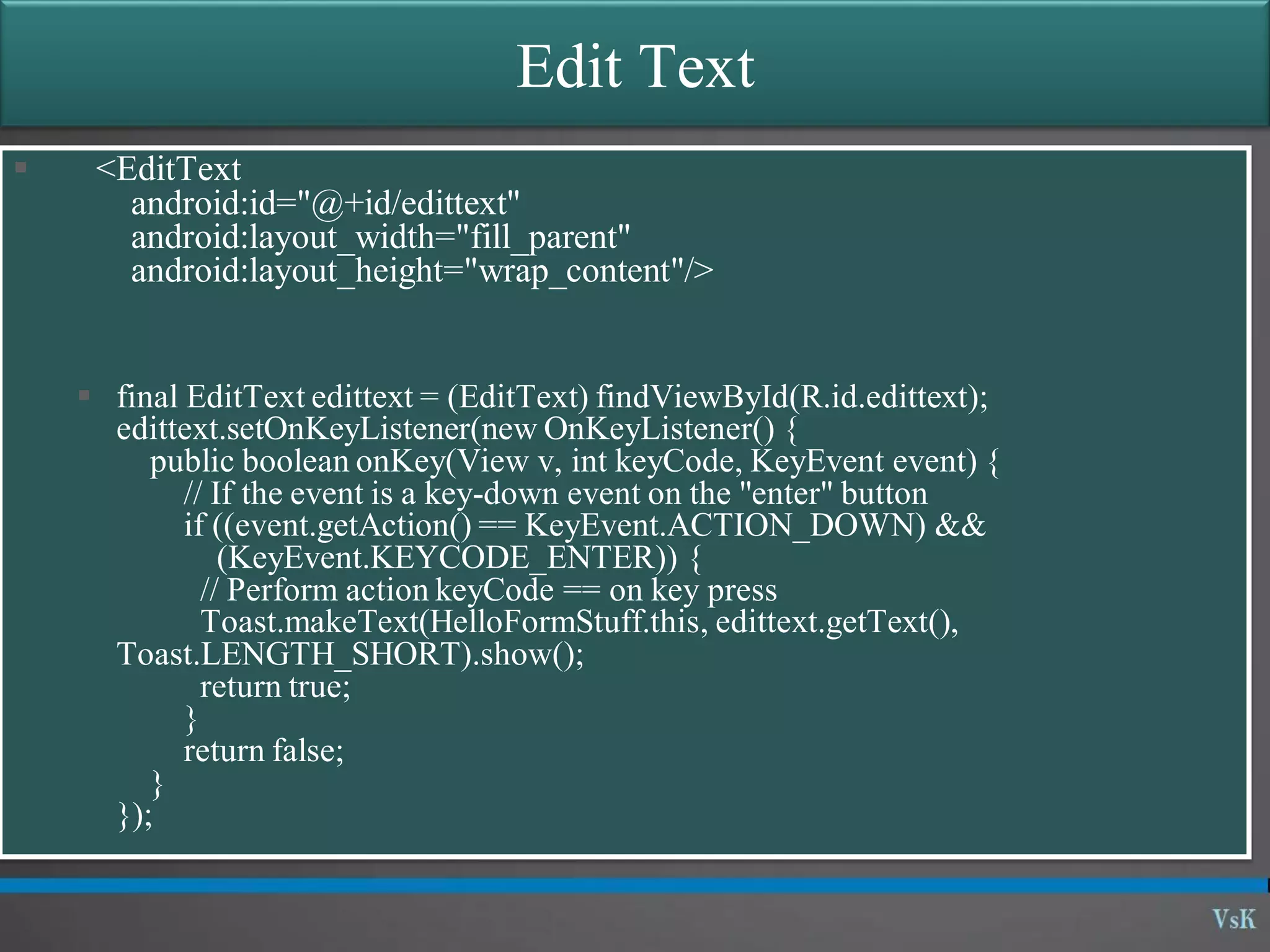
Edit Text  <EditText android:id="@+id/edittext" android:layout_width="fill_parent" android:layout_height="wrap_content"/>  final EditText edittext = (EditText) findViewById(R.id.edittext); edittext.setOnKeyListener(new OnKeyListener() { public boolean onKey(View v, int keyCode, KeyEvent event) { // If the event is a key-down event on the "enter" button if ((event.getAction() == KeyEvent.ACTION_DOWN) && (KeyEvent.KEYCODE_ENTER)) { // Perform action keyCode == on key press Toast.makeText(HelloFormStuff.this, edittext.getText(), Toast.LENGTH_SHORT).show(); return true; } return false; } });
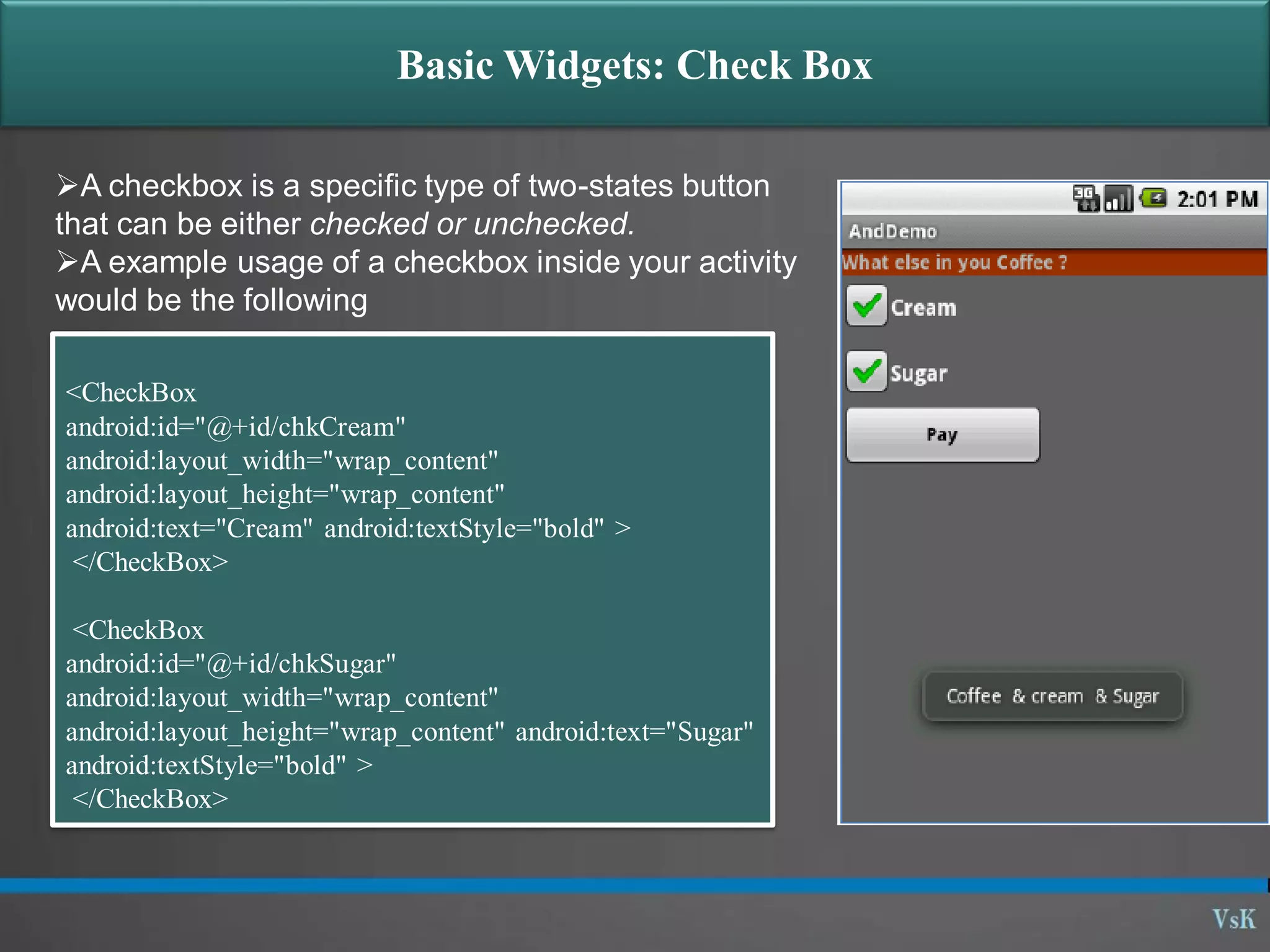
Basic Widgets: Check Box A checkbox is a specific type of two-states button that can be either checked or unchecked. A example usage of a checkbox inside your activity would be the following <CheckBox android:id="@+id/chkCream" android:layout_width="wrap_content" android:layout_height="wrap_content" android:text="Cream" android:textStyle="bold" > </CheckBox> <CheckBox android:id="@+id/chkSugar" android:layout_width="wrap_content" android:layout_height="wrap_content" android:text="Sugar" android:textStyle="bold" > </CheckBox>
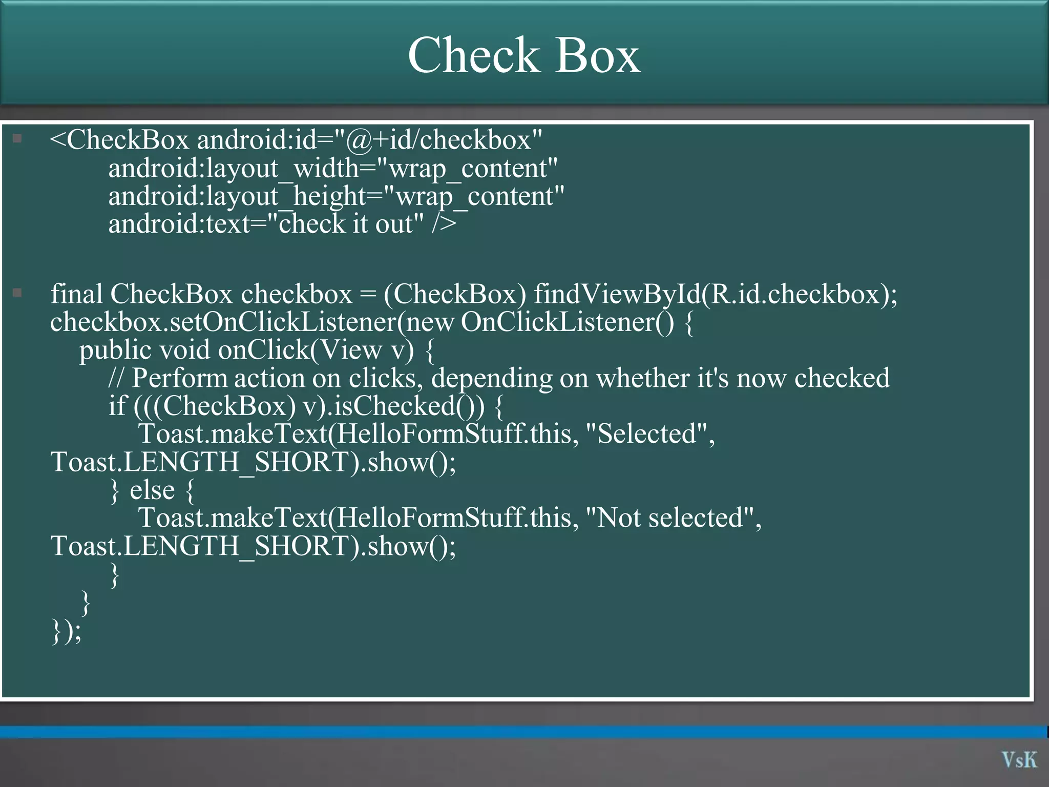
Check Box  <CheckBox android:id="@+id/checkbox" android:layout_width="wrap_content" android:layout_height="wrap_content" android:text="check it out" />  final CheckBox checkbox = (CheckBox) findViewById(R.id.checkbox); checkbox.setOnClickListener(new OnClickListener() { public void onClick(View v) { // Perform action on clicks, depending on whether it's now checked if (((CheckBox) v).isChecked()) { Toast.makeText(HelloFormStuff.this, "Selected", Toast.LENGTH_SHORT).show(); } else { Toast.makeText(HelloFormStuff.this, "Not selected", Toast.LENGTH_SHORT).show(); } } });
Basic Widgets: Spinner [listbox] A view that displays one child at a time and lets the user pick among them. The items in the Spinner come from the Adapter associated with this view. <Spinner android:layout_height="wrap_content" android:layout_width="wrap_content" android:id="@+id/State"/>
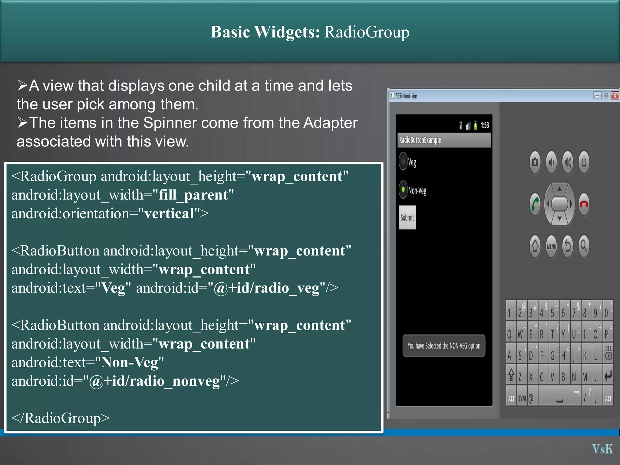
Basic Widgets: RadioGroup A view that displays one child at a time and lets the user pick among them. The items in the Spinner come from the Adapter associated with this view. <RadioGroup android:layout_height="wrap_content" android:layout_width="fill_parent" android:orientation="vertical"> <RadioButton android:layout_height="wrap_content" android:layout_width="wrap_content" android:text="Veg" android:id="@+id/radio_veg"/> <RadioButton android:layout_height="wrap_content" android:layout_width="wrap_content" android:text="Non-Veg" android:id="@+id/radio_nonveg"/> </RadioGroup>
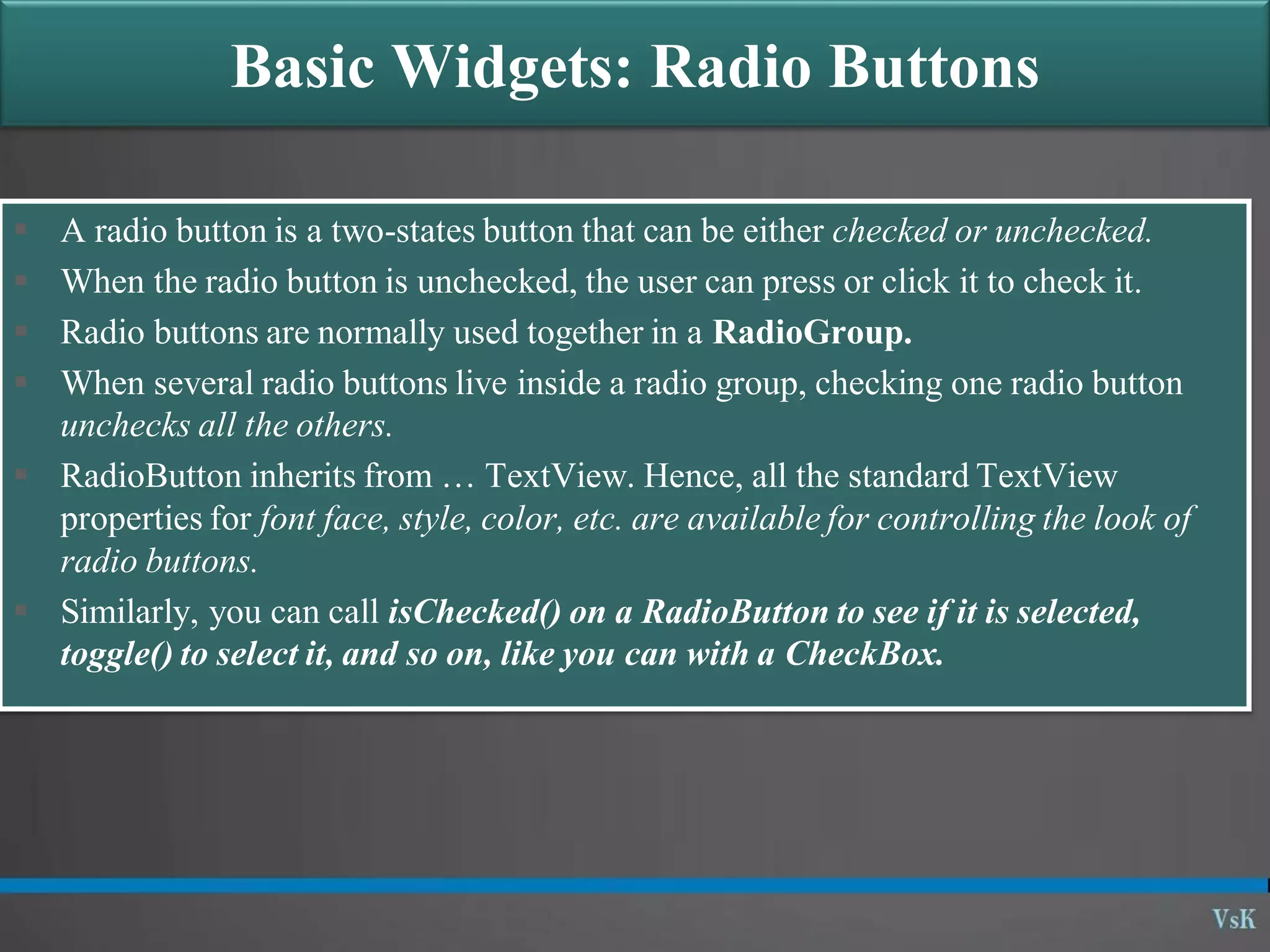
Basic Widgets: Radio Buttons  A radio button is a two-states button that can be either checked or unchecked.  When the radio button is unchecked, the user can press or click it to check it.  Radio buttons are normally used together in a RadioGroup.  When several radio buttons live inside a radio group, checking one radio button unchecks all the others.  RadioButton inherits from … TextView. Hence, all the standard TextView properties for font face, style, color, etc. are available for controlling the look of radio buttons.  Similarly, you can call isChecked() on a RadioButton to see if it is selected, toggle() to select it, and so on, like you can with a CheckBox.
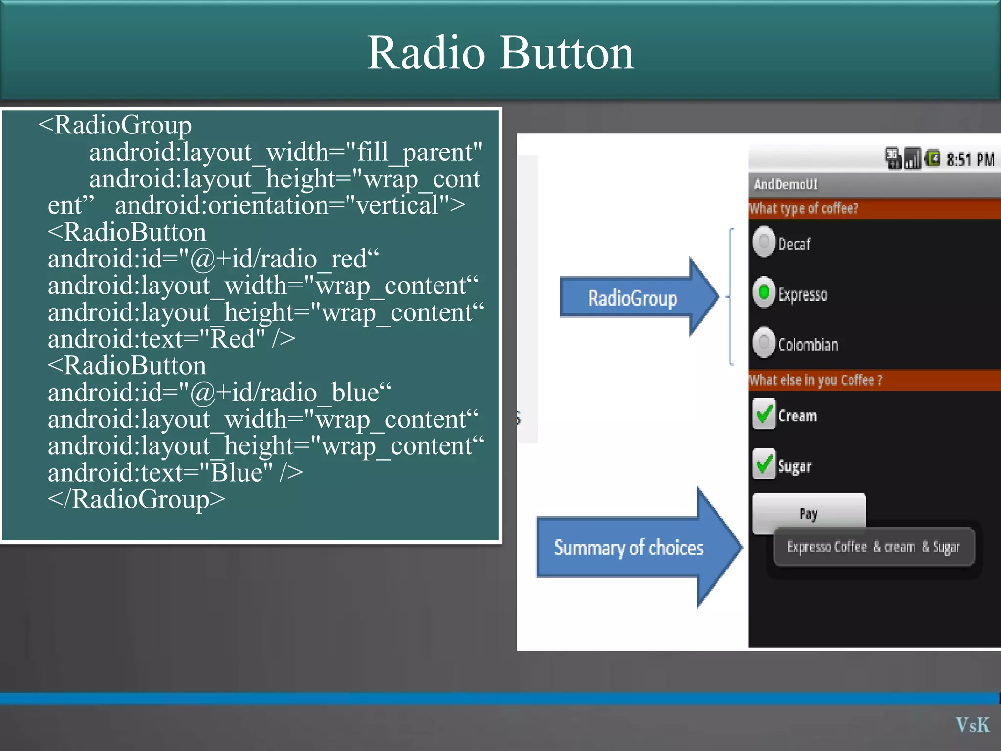
Radio Button <RadioGroup android:layout_width="fill_parent" android:layout_height="wrap_cont ent” android:orientation="vertical"> <RadioButton android:id="@+id/radio_red“ android:layout_width="wrap_content“ android:layout_height="wrap_content“ android:text="Red" /> <RadioButton android:id="@+id/radio_blue“ android:layout_width="wrap_content“ android:layout_height="wrap_content“ android:text="Blue" /> </RadioGroup>
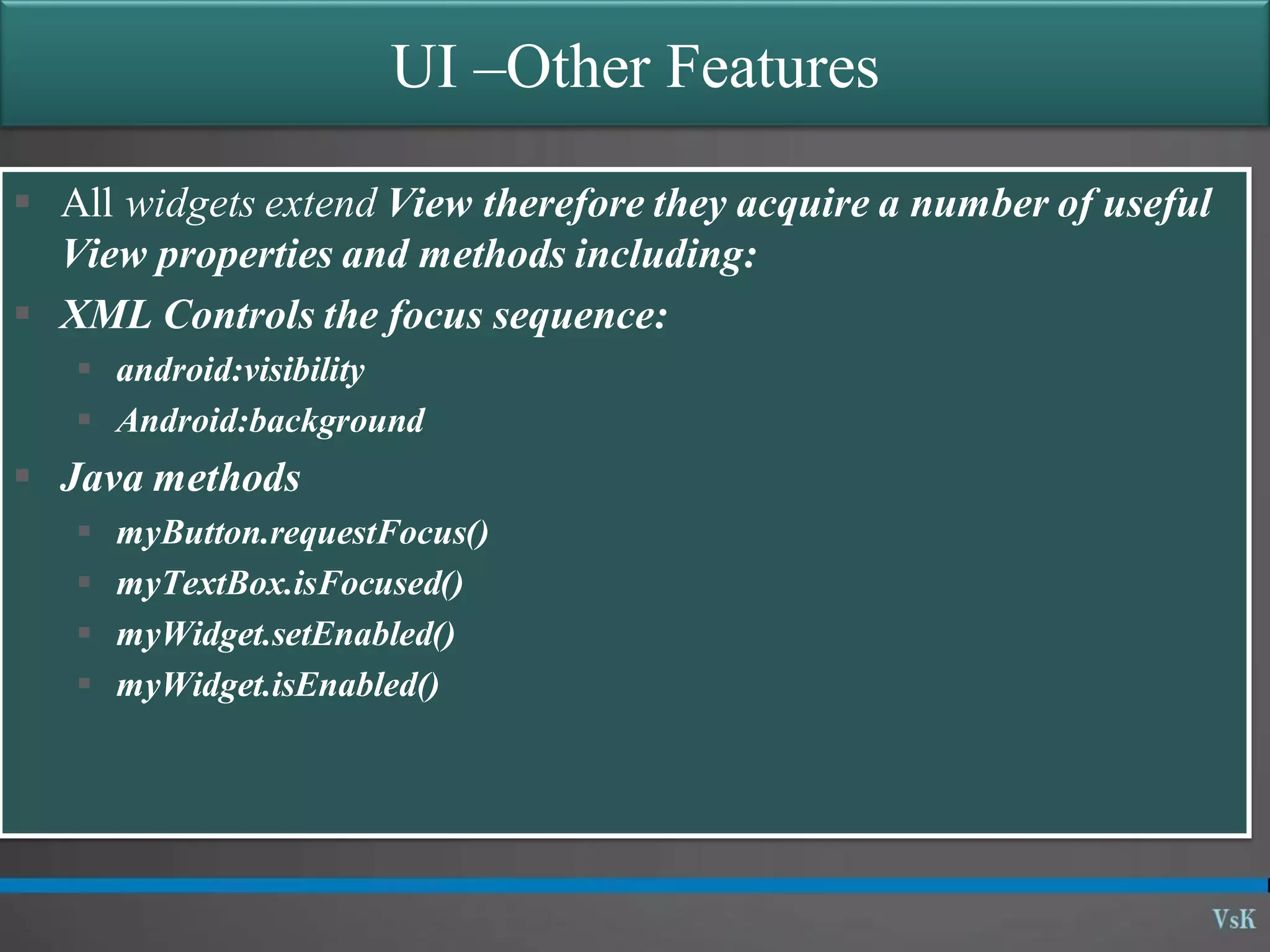
UI –Other Features  All widgets extend View therefore they acquire a number of useful View properties and methods including:  XML Controls the focus sequence:  android:visibility  Android:background  Java methods  myButton.requestFocus()  myTextBox.isFocused()  myWidget.setEnabled()  myWidget.isEnabled()
Questions?

01 09 - graphical user interface - basic widgets

  • 1.
  • 2.
  • 3.
  • 4.
    Android Basics: Maincomponents of Interest • the control file-tells the system what to do with the top- level componentsAndroidManifest.xml: • an object that has a life cycle and is a chunk of code that does some work. Corresponds to a single screen.Activity: • an object that knows how to draw itself to the screenView: • a simple message object that represents an "intention" to do something. Consider an intent received when an event is triggered (e.g., a phone ring) Intent:
  • 5.
    Basic Widgets: Labels •Alabel is called in android a TextView. •TextViews are typically used to display a caption. •TextViews are not editable, therefore they take no input. <?xml version="1.0" encoding="utf-8"?> <AbsoluteLayout android:id="@+id/absLayout" android:layout_width="fill_parent" android:layout_height="fill_parent" xmlns:android="http://schemas.android.com/apk/res/an droid”> <TextView android:id="@+id/myTextView1" android:layout_width="wrap_content" android:layout_height="wrap_content" android:background="#ff0000ff" android:padding="3px" android:text="Enter User Name" android:textSize="16sp” android:textStyle="bold" android:gravity="center“ android:layout_x="20px" android:layout_y="22px“ > </TextView> </AbsoluteLayout>
  • 6.
    Basic Widgets: Buttons •AButton widget allows the simulation of a clicking action on a GUI. •Button is a subclass of TextView. Therefore formatting a Button’s face is similar to the setting of a TextView. <?xml version="1.0" encoding="utf-8"?> <AbsoluteLayout android:id="@+id/absLayout" android:layout_width="fill_parent" android:layout_height="fill_parent" xmlns:android="http://schemas.android.com/apk/res/an droid”> <Button android:id="@+id/btnExitApp" android:layout_width="wrap_content" android:layout_height="wrap_content" android:padding="10px" android:layout_marginLeft="5px" android:text="Exit Application" android:textSize="16sp" android:textStyle="bold" android:gravity="center" android:layout_gravity="center_horizontal”> </Button> </AbsoluteLayout>
  • 7.
    Basic Widgets: Images ImageView and Image Button are two Android widgets that allow embedding of images in your applications. Both are image-based widgets analogue to TextView and Button, respectively. Each widget takes an android:src or android:background attribute (in an XML layout) to specify what picture to use. Pictures are usually reference a drawable resource. You can also set the image content based on a URI from a content provider via setImageURI(). ImageButton, is a subclass of Image View. It adds the standard Button behavior for responding to click events. ... <ImageButton android:id="@+id/myImageBtn1" android:background="@drawable/defa ult_wallpaper" android:layout_width="125px" android:layout_height="131px“ > </ImageButton> <ImageView android:id="@+id/myImageView1" android:background="@drawable/ic_l auncher_android" android:layout_width="108px" android:layout_height="90px“> </ImageView>
  • 8.
    Basic Widgets: EditText The EditText(or textBox) widget is an extension of TextView that allows updates. The control configures itself to be editable. Important Java methods are: txtBox.setText(“someValue”) and txtBox.getText().toString() In addition to the standard TextView properties EditText has many others features such as: • android:autoText, (true/false) provides automatic spelling assistance • android:capitalize, (words/sentences) automatic capitalization • android:digits, to configure the field to accept only certain digits • android:singleLine, is the field for single-line / multiple-line input • android:password, (true/false) controls field’s visibility • android:numeric, (integer, decimal, signed) controls numeric format • android:phonenumber, (true/false) Formatting phone numbers
  • 9.
  • 10.
    Edit Text  <EditText android:id="@+id/edittext" android:layout_width="fill_parent" android:layout_height="wrap_content"/> final EditText edittext = (EditText) findViewById(R.id.edittext); edittext.setOnKeyListener(new OnKeyListener() { public boolean onKey(View v, int keyCode, KeyEvent event) { // If the event is a key-down event on the "enter" button if ((event.getAction() == KeyEvent.ACTION_DOWN) && (KeyEvent.KEYCODE_ENTER)) { // Perform action keyCode == on key press Toast.makeText(HelloFormStuff.this, edittext.getText(), Toast.LENGTH_SHORT).show(); return true; } return false; } });
  • 11.
    Basic Widgets: CheckBox A checkbox is a specific type of two-states button that can be either checked or unchecked. A example usage of a checkbox inside your activity would be the following <CheckBox android:id="@+id/chkCream" android:layout_width="wrap_content" android:layout_height="wrap_content" android:text="Cream" android:textStyle="bold" > </CheckBox> <CheckBox android:id="@+id/chkSugar" android:layout_width="wrap_content" android:layout_height="wrap_content" android:text="Sugar" android:textStyle="bold" > </CheckBox>
  • 12.
    Check Box  <CheckBoxandroid:id="@+id/checkbox" android:layout_width="wrap_content" android:layout_height="wrap_content" android:text="check it out" />  final CheckBox checkbox = (CheckBox) findViewById(R.id.checkbox); checkbox.setOnClickListener(new OnClickListener() { public void onClick(View v) { // Perform action on clicks, depending on whether it's now checked if (((CheckBox) v).isChecked()) { Toast.makeText(HelloFormStuff.this, "Selected", Toast.LENGTH_SHORT).show(); } else { Toast.makeText(HelloFormStuff.this, "Not selected", Toast.LENGTH_SHORT).show(); } } });
  • 13.
    Basic Widgets: Spinner[listbox] A view that displays one child at a time and lets the user pick among them. The items in the Spinner come from the Adapter associated with this view. <Spinner android:layout_height="wrap_content" android:layout_width="wrap_content" android:id="@+id/State"/>
  • 14.
    Basic Widgets: RadioGroup Aview that displays one child at a time and lets the user pick among them. The items in the Spinner come from the Adapter associated with this view. <RadioGroup android:layout_height="wrap_content" android:layout_width="fill_parent" android:orientation="vertical"> <RadioButton android:layout_height="wrap_content" android:layout_width="wrap_content" android:text="Veg" android:id="@+id/radio_veg"/> <RadioButton android:layout_height="wrap_content" android:layout_width="wrap_content" android:text="Non-Veg" android:id="@+id/radio_nonveg"/> </RadioGroup>
  • 15.
    Basic Widgets: RadioButtons  A radio button is a two-states button that can be either checked or unchecked.  When the radio button is unchecked, the user can press or click it to check it.  Radio buttons are normally used together in a RadioGroup.  When several radio buttons live inside a radio group, checking one radio button unchecks all the others.  RadioButton inherits from … TextView. Hence, all the standard TextView properties for font face, style, color, etc. are available for controlling the look of radio buttons.  Similarly, you can call isChecked() on a RadioButton to see if it is selected, toggle() to select it, and so on, like you can with a CheckBox.
  • 16.
  • 17.
    UI –Other Features All widgets extend View therefore they acquire a number of useful View properties and methods including:  XML Controls the focus sequence:  android:visibility  Android:background  Java methods  myButton.requestFocus()  myTextBox.isFocused()  myWidget.setEnabled()  myWidget.isEnabled()
  • 18.