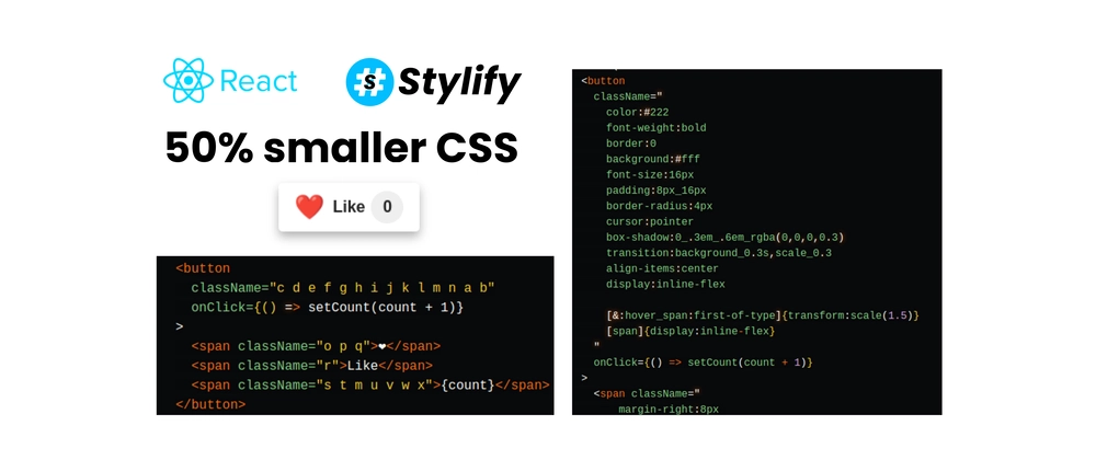
Write CSS-like selectors directly into the template and style your React app quickly with Stylify CSS.
Learn how to use Stylify CSS. to style a button quickly using only utilities and then clean the template using components. Learn why the output in production can be 50% and more smaller🔥.
Table of content
- The Code
- Production build - 50% smaller
- Template cleanup
- Syntax explanation
- Checkout Stackblitz Playground
Introduction
Stylify is a library that uses CSS-like selectors to generate optimized utility-first CSS based on what you write.
- ✨ CSS-like selectors
- 💎 No framework to study
- 💡 Less time spent in docs
- 🧰 Mangled & Extremely small CSS
- 🤘 No purge needed
- 🚀 Components, Variables, Custom selectors
- 📦 It can generate multiple CSS bundles
Also we have a page about what problems Stylify CSS solves and why you should give it a try!
The Code
Here is the code behind the button:
import { useState } from 'react'; import './stylify.css'; function LikeButton() { const [count, setCount] = useState(0); return ( <button className=" color:#222 font-weight:bold border:0 background:#fff font-size:16px padding:8px_16px border-radius:4px cursor:pointer box-shadow:0_.3em_.6em_rgba(0,0,0,0.3) transition:background_0.3s,scale_0.3 align-items:center display:inline-flex [&:hover_span:first-of-type]{transform:scale(1.5)} [span]{display:inline-flex} " onClick={() => setCount(count + 1)} > <span className=" margin-right:8px font-size:24px transition:transform_0.3s ">❤️</span> <span className="margin-right:6px">Like</span> <span className=" background:#eee padding:4px align-items:center justify-content:center border-radius:50% min-width:24px min-height:24px ">{count}</span> </button> ); } export default LikeButton; The generated CSS for example above:
.color\:\#222{color: #222} .font-weight\:bold{font-weight: bold} .border\:0{border: 0} .background\:\#fff{background: #fff} .font-size\:16px{font-size: 16px} .padding\:8px_16px{padding: 8px 16px} .border-radius\:4px{border-radius: 4px} .cursor\:pointer{cursor: pointer} .box-shadow\:0_\.3em_\.6em_rgba\(0\,0\,0\,0\.3\){box-shadow: 0 .3em .6em rgba(0,0,0,0.3)} .transition\:background_0\.3s\,scale_0\.3{transition: background 0.3s,scale 0.3} .align-items\:center{align-items: center} .\[span\]\{display\:inline\-flex\} span, .display\:inline-flex{display: inline-flex} .margin-right\:8px{margin-right: 8px} .font-size\:24px{font-size: 24px} .transition\:transform_0\.3s{transition: transform 0.3s} .margin-right\:6px{margin-right: 6px} .background\:\#eee{background: #eee} .padding\:4px{padding: 4px} .justify-content\:center{justify-content: center} .border-radius\:50\%{border-radius: 50%} .min-width\:24px{min-width: 24px} .min-height\:24px{min-height: 24px} .\[\&\:hover\_span\:first\-of\-type\]\{transform\:scale\(1\.5\)\}:hover span:first-of-type, .transform\:scale\(1\.5\){transform: scale(1.5)} Production build - 50% smaller
When you allow Stylify to mangle selectors, then the output looks like this:
.c{color:#222} .d{font-weight:bold} .e{border:0} .f{background:#fff} .g{font-size:16px} .h{padding:8px 16px} .i{border-radius:4px} .j{cursor:pointer} .k{box-shadow:0 .3em .6em rgba(0,0,0,0.3)} .l{transition:background 0.3s,scale 0.3} .m{align-items:center} .b span,.n{display:inline-flex} .o{margin-right:8px} .p{font-size:24px} .q{transition:transform 0.3s} .r{margin-right:6px} .s{background:#eee} .t{padding:4px} .u{justify-content:center} .v{border-radius:50%} .w{min-width:24px} .x{min-height:24px} .a:hover span:first-of-type,.y{transform:scale(1.5)} Also the selectors in JSX are minified
<button className="c d e f g h i j k l m n a b" onClick={() => setCount(count + 1)} > <span className="o p q">❤️</span> <span className="r">Like</span> <span className="s t m u v w x">{count}</span> </button> CSS size:
- Dev: 1101 bytes
- Production: 556 bytes
The size savings are around 50% (The size is similar in gzipped mode). If we take the mangled HTML, the difference will be even bigger.
Template cleanup
What if we have a lot of utilities and want to move them out of the template? With Stylify you can do that using reusable components. They can be defined within a comment (expects js object without surrounding brackets) in the file where they are used or in a global config.
// ... /* stylify-components 'like-button': ` color:#222 font-weight:bold border:0 background:#fff font-size:16px padding:8px_16px border-radius:4px cursor:pointer box-shadow:0_.3em_.6em_rgba(0,0,0,0.3) transition:background_0.3s,scale_0.3 align-items:center display:inline-flex span { display:inline-flex } &:hover span:first-of-type { transform:scale(1.5) } `, 'like-button__hearth': 'margin-right:8px font-size:24px transition:transform_0.3s', 'like-button__counter': ` background:#eee padding:4px align-items:center justify-content:center border-radius:50% min-width:24px min-height:24px ` /stylify-components */ function LikeButton() { // ... return ( <button className="like-button" onClick={() => setCount(count + 1)}> <span className="like-button__hearth">❤️</span> <span className="margin-right:6px">Like</span> <span className="like-button__counter">{count}</span> </button> ); } // ... In production, the components are also mangled.
Syntax explanation
In the example above, you can see Stylify using CSS-like selectors. With a few differences.
-
_within a selector is used instead of space -
[span]{display:inline-flex}is an inline custom selector. This allows you to style custom selectors. -
&inside[&:hover_span:first-of-type]always refers to the upper level like in SCSS - The indented syntax in components is also like in SCSS. Except, to keep things simple, it supports only nesting and chaining
span { display:inline-flex } &:hover span:first-of-type { transform:scale(1.5) } Checkout Stackblitz Playground
You can try the playground on Stackblitz.
Let me know what you think!
If you like the idea, let me know that by starring Stylify repo ❤️.
I will also be happy for any feedback! The Stylify is still a new Library and there is a lot of space for improvement 🙂.
Stay in touch:
👉 @8machy
👉 @stylifycss
👉 stylifycss.com
👉 dev.to/machy8
👉 medium.com/@8machy


Top comments (1)
Hi @jordan, and thanks! However Stylify is not "focused" on any tool. This way it works in any framework, tool and environment (it just needs node tu be executed). It's just a default behavior. Compile => generate => mangle.