
 Data Structure
 Networking
 RDBMS
RDBMS Operating System
 Java
Java MS Excel
 iOS
iOS HTML
HTML CSS
CSS Android
 Python
 C Programming
 C++
C++ C#
C# MongoDB
 MySQL
MySQL Javascript
 PHP
PHP
- Selected Reading
- UPSC IAS Exams Notes
- Developer's Best Practices
- Questions and Answers
- Effective Resume Writing
- HR Interview Questions
- Computer Glossary
- Who is Who
Plotting profile histograms in Python Matplotlib
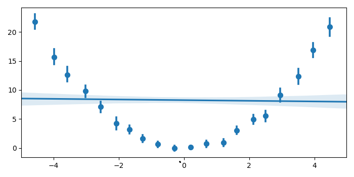
In a profile histogram, each bin contains the mean of its entries. To plot profile histograms in Python, we can use the regplot method from Seaborn.
Steps
Set the figure size and adjust the padding between and around the subplots.
Create x and y data points using numpy.
Use seaborn.regplot to plot the data and a linear regress model fit. Use the parameter x_bins to bin the x variable into discrete bins. Use fit_reg=True to plot the regression model relating the x and y variables.
To display the figure, use Show() method.
Example
import numpy as np import seaborn as sns from matplotlib import pyplot as plt plt.rcParams["figure.figsize"] = [7.00, 3.50] plt.rcParams["figure.autolayout"] = True x = np.random.uniform(-5, 5, 1000) y = np.random.normal(x**2, np.abs(x) + 1) sns.regplot(x=x, y=y, x_bins=20, marker='o', fit_reg=True) plt.show()
Output
It will produce the following output −

Updated on: 2021-10-19T07:48:42+05:30
739 Views

Advertisements