
 Data Structure
 Networking
 RDBMS
RDBMS Operating System
 Java
Java MS Excel
 iOS
iOS HTML
HTML CSS
CSS Android
 Python
 C Programming
 C++
C++ C#
C# MongoDB
 MySQL
MySQL Javascript
 PHP
PHP
- Selected Reading
- UPSC IAS Exams Notes
- Developer's Best Practices
- Questions and Answers
- Effective Resume Writing
- HR Interview Questions
- Computer Glossary
- Who is Who
Plotting a cumulative graph of Python datetimes in Matplotlib
To plot a cumulative graph of python datetimes, we can take the following steps −
Set the figure size and adjust the padding between and around the subplots.
Make a Pandas dataframe with some college data, where one key for time difference and another key for number students have admissioned in the subsequent year.
Plot the dataframe using plot() method where kind='bar', i.e., class by name.
To display the figure, use show() method.
Example
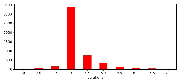
import pandas as pd from matplotlib import pyplot as plt plt.rcParams["figure.figsize"] = [7.50, 3.50] plt.rcParams["figure.autolayout"] = True college_student_data = {'durations': [1, 2, 2.5, 3, 4.5, 5, 5.5, 6, 6.5, 7], 'admissions': [5, 50, 150, 3380, 760, 340, 115, 80, 40, 10]} df = pd.DataFrame(data=college_student_data) df.plot(kind='bar', x='durations', y='admissions', legend=False, color='red', rot=0,) plt.show() Output

Updated on: 2021-06-03T13:32:12+05:30
628 Views

Advertisements