
 Data Structure
 Networking
 RDBMS
RDBMS Operating System
 Java
Java MS Excel
 iOS
iOS HTML
HTML CSS
CSS Android
 Python
 C Programming
 C++
C++ C#
C# MongoDB
 MySQL
MySQL Javascript
 PHP
PHP
- Selected Reading
- UPSC IAS Exams Notes
- Developer's Best Practices
- Questions and Answers
- Effective Resume Writing
- HR Interview Questions
- Computer Glossary
- Who is Who
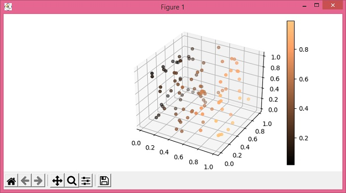
How to plot scatter points in a 3D figure with a colorbar in Matplotlib?
To plot scatter points in a 3D figure with a colorbar in matplotlib, we can use the scatter() and colorbar() methods.
Steps
Set the figure size and adjust the padding between and around the subplots.
Create a new figure or activate an existing figure using figure() method.
Add an axis as a subplot arrangement.
Create xs, ys and zs data points using numpy.
Use scatter() method to create a scatter plot.
Use colorbar() method with scatter scalar mappable instance for colorbar.
To display the figure, use show() method.
Example
import numpy as np from matplotlib import pyplot as plt plt.rcParams["figure.figsize"] = [7.50, 3.50] plt.rcParams["figure.autolayout"] = True fig = plt.figure() ax = fig.add_subplot(projection="3d") xs = np.random.rand(100) ys = np.random.rand(100) zs = np.random.rand(100) sc = ax.scatter(xs, ys, zs, c=xs, cmap="copper") plt.colorbar(sc) plt.show()
Output

Updated on: 2021-06-03T12:55:07+05:30
3K+ Views

Advertisements