
 Data Structure
 Networking
 RDBMS
RDBMS Operating System
 Java
Java MS Excel
 iOS
iOS HTML
HTML CSS
CSS Android
 Python
 C Programming
 C++
C++ C#
C# MongoDB
 MySQL
MySQL Javascript
 PHP
PHP
- Selected Reading
- UPSC IAS Exams Notes
- Developer's Best Practices
- Questions and Answers
- Effective Resume Writing
- HR Interview Questions
- Computer Glossary
- Who is Who
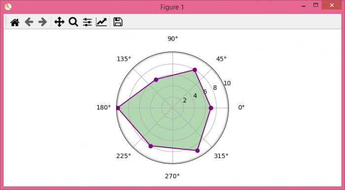
How to make a polygon radar (spider) chart in Python Matplotlib?
To make a polygon radar (spider) chart in Python, we can take the following steps −
Steps
Set the figure size and adjust the padding between and around the subplots.
Create a Pandas dataframe with sports and values columns.
Create a new figure or activate an existing figure.
Add an 'ax' to the figure as part of a subplot arrangement.
Based on data frame values, get the theta value.
Get the values list of the data frame.
Make a bar plot with theta and values data points.
Fill the area between polygon.
To display the figure, use show() method.
Example
import pandas as pd import matplotlib.pyplot as plt import numpy as np plt.rcParams["figure.figsize"] = [7.50, 3.50] plt.rcParams["figure.autolayout"] = True df = pd.DataFrame({'sports': ['Strength', 'Speed', 'Power', 'Agility', 'Endurance', 'Analytical Aptitude'], 'values': [7, 8, 6, 10, 8, 9]}) fig = plt.figure() ax = fig.add_subplot(111, projection="polar") theta = np.arange(len(df) + 1) / float(len(df)) * 2 * np.pi values = df['values'].values values = np.append(values, values[0]) l1, = ax.plot(theta, values, color="purple", marker="o", label="Name of values") ax.tick_params(pad=10) ax.fill(theta, values, 'green', alpha=0.3) plt.show() Output
It will produce the following output −

Updated on: 2022-02-01T11:57:55+05:30
2K+ Views

Advertisements