
 Data Structure
 Networking
 RDBMS
RDBMS Operating System
 Java
Java MS Excel
 iOS
iOS HTML
HTML CSS
CSS Android
 Python
 C Programming
 C++
C++ C#
C# MongoDB
 MySQL
MySQL Javascript
 PHP
PHP
- Selected Reading
- UPSC IAS Exams Notes
- Developer's Best Practices
- Questions and Answers
- Effective Resume Writing
- HR Interview Questions
- Computer Glossary
- Who is Who
How to animate a Seaborn heatmap or correlation matrix(Matplotlib)?
To animate a Seaborn heatmap or correlation matrix, we can take the following steps −
- Set the figure size and adjust the padding between and around the subplots.
- Create a new figure or activate an existing figure.
- Make a dimension tuple.
- Make a Seaborn heatmap.
- Create an init() method for the first heatmap.
- Use FuncAnimation() class to make an animation by repeatedly calling a function animate that will create a random dataset and create a heatmap.
- To display the figure, use show() method.
Example
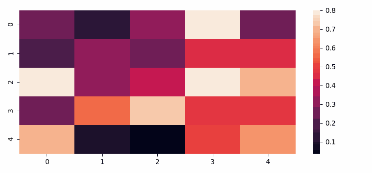
import numpy as np import seaborn as sns import matplotlib.pyplot as plt from matplotlib import animation plt.rcParams["figure.figsize"] = [7.50, 3.50] plt.rcParams["figure.autolayout"] = True fig = plt.figure() dimension = (5, 5) data = np.random.rand(dimension[0], dimension[1]) sns.heatmap(data, vmax=.8) def init(): sns.heatmap(np.zeros(dimension), vmax=.8, cbar=False) def animate(i): data = np.random.rand(dimension[0], dimension[1]) sns.heatmap(data, vmax=.8, cbar=False) anim = animation.FuncAnimation(fig, animate, init_func=init, frames=20, repeat=False) plt.show()
Output


Updated on: 2021-08-04T12:20:53+05:30
3K+ Views

Advertisements