
 Data Structure
 Networking
 RDBMS
RDBMS Operating System
 Java
Java MS Excel
 iOS
iOS HTML
HTML CSS
CSS Android
 Python
 C Programming
 C++
C++ C#
C# MongoDB
 MySQL
MySQL Javascript
 PHP
PHP
- Selected Reading
- UPSC IAS Exams Notes
- Developer's Best Practices
- Questions and Answers
- Effective Resume Writing
- HR Interview Questions
- Computer Glossary
- Who is Who
Data visualization with different Charts in Python?
Python provides various easy to use libraries for data visualization. Good thing is that these libraries works with small or large datasets.
Some of the most commonly used python libraries for data visualizations are −
Matplotlib
Pandas
Plotly
Seaborn
Below we are going to plot different types of visualization chart for one fixed data to better analyse that data.
We are going to analyze below data set to visualize through different charts −
| Country or Area | Year(s) | Variant | Value |
|---|---|---|---|
| India | 2019 | Medium | 1368737.513 |
| India | 2019 | High | 1378419.072 |
| India | 2019 | Low | 1359043.965 |
| India | 2019 | Constant fertility | 1373707.838 |
| India | 2019 | Instant replacement | 1366687.871 |
| India | 2019 | Zero migration | 1370868.782 |
| India | 2019 | Constant mortality | 1366282.778 |
| India | 2019 | No change | 1371221.64 |
| India | 2019 | Momentum | 1367400.614 |
Basic Plot
Let's create some basic plots: Line plots, scatter plots and histograms
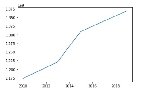
Line Plots
Line graphs are plots where a line is drawn to indicate a relationship between a particular set of x and y values.
import matplotlib.pyplot as plt Year = [2010, 2011, 2012, 2013, 2014, 2015, 2016, 2017, 2018, 2019] India_Population = [1173108018,1189172906,1205073612,1220800359,1266344631,1309053980,1324171354,1339180127,1354051854,1368737513] plt.plot(Year, India_Population) plt.show()
Output
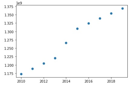
Scatter Plots
Alternatively, you might want to plot quantities with 2 positions as data points.
Consider the same data as for line graph, to create scatter plots we just need to modify one line in the above code −
plt.plot(Year, India_Population,'o')
Output
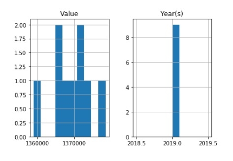
Histogram
Histograms are very often used in science applications and it's highly likely that you will need to plot them at some point. They are very useful to plot distributions.
import pandas as pd import matplotlib.pyplot as plt data = [ ['India', 2019, 'Medium', 1368737.513], ['India', 2019, 'High', 1378419.072], ['India', 2019, 'Low', 1359043.965], ['India', 2019, 'Constant fertility', 1373707.838], ['India', 2019,'Instant replacement', 1366687.871], ['India', 2019, 'Zero migration', 1370868.782], ['India', 2019,'Constant mortality', 1366282.778], ['India', 2019, 'No change', 1371221.64], ['India', 2019, 'Momentum', 1367400.614],] df = pd.DataFrame(data, columns = ([ 'Country or Area', 'Year(s)', 'Variant', 'Value'])) df.hist() plt.show()
Output
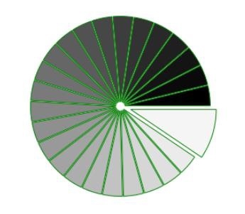
Pie Charts
import numpy as np import matplotlib.pyplot as plt n = 25 Z = np.ones(n) Z[-1] *= 2.5 plt.axes([0.05, 0.05, 0.95, 0.95]) plt.pie(Z, explode = Z*.05, colors = ['%f' % (i/float(n)) for i in range(n)], wedgeprops = {"linewidth": 1, "edgecolor": "green"}) plt.gca().set_aspect('equal') plt.xticks([]), plt.yticks([]) plt.show() Output
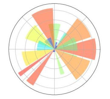
Polar plot
Code:
import numpy as np import matplotlib.pyplot as plt ax = plt.axes([0.5,0.05,0.95,0.95], polar=True) N = 25 theta = np.arange(0.0, 2.5*np.pi, 2.5*np.pi/N) radii = 10*np.random.rand(N) width = np.pi/4*np.random.rand(N) bars = plt.bar(theta, radii, width=width, bottom=0.0) for r,bar in zip(radii, bars): bar.set_facecolor( plt.cm.jet(r/10.)) bar.set_alpha(0.5) ax.set_xticklabels([]) ax.set_yticklabels([]) plt.show()
Output

364 Views
