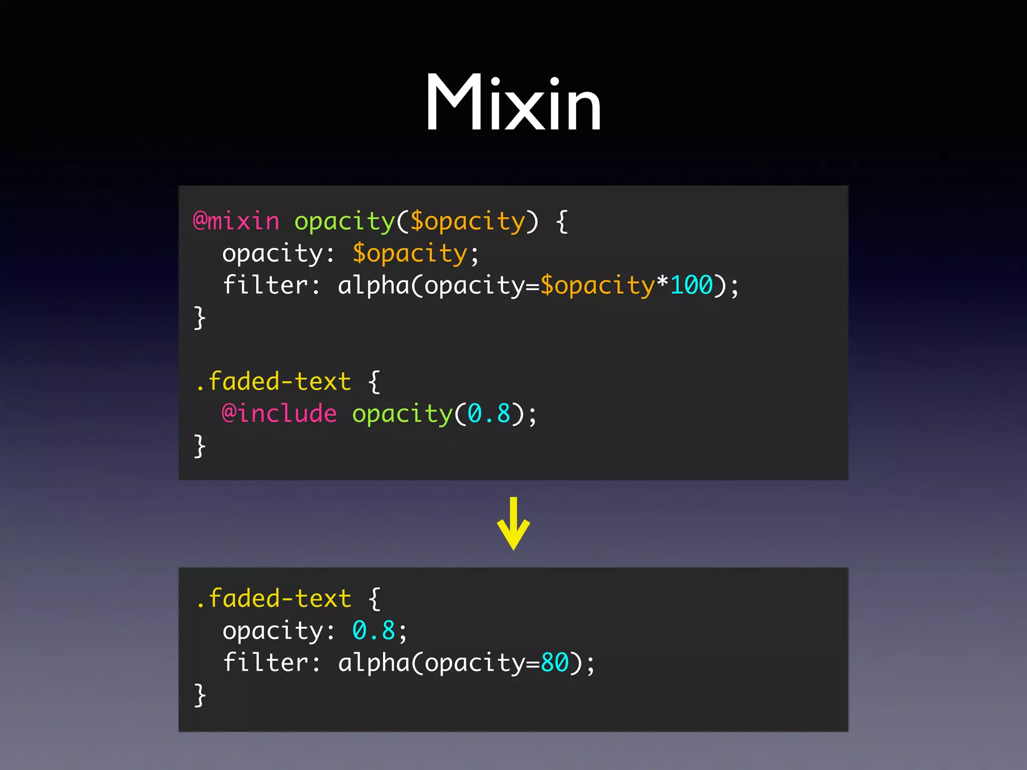
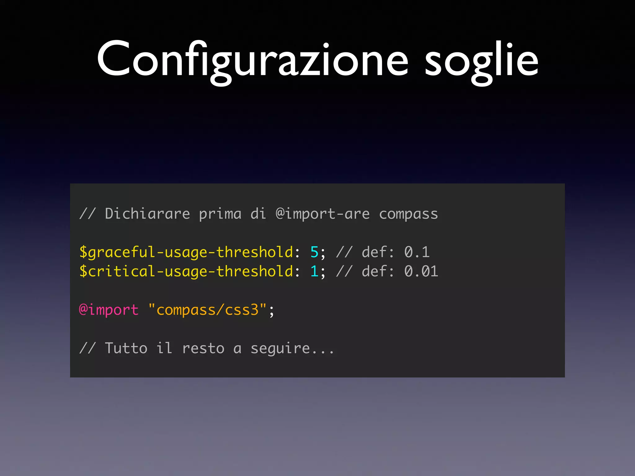
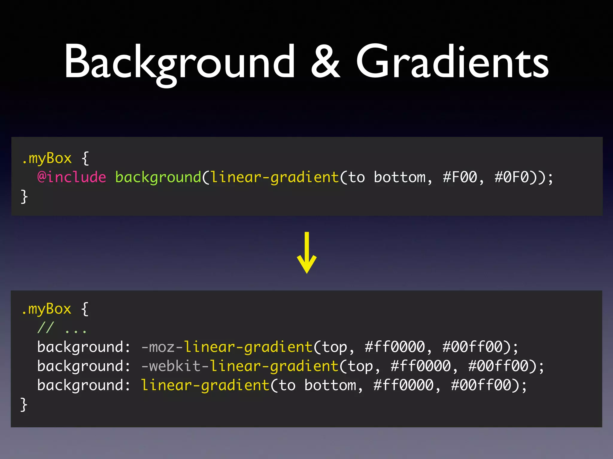
Configurazione soglie // Dichiarareprima di @import-are compass $graceful-usage-threshold: 5; // def: 0.1 $critical-usage-threshold: 1; // def: 0.01 @import "compass/css3"; // Tutto il resto a seguire...
SASS vs LESS @verlok#cssday https://css-tricks.com/sass-vs-less/ http://www.zingdesign.com/less-vs-sass-its-time-to- switch-to-sass/
64.
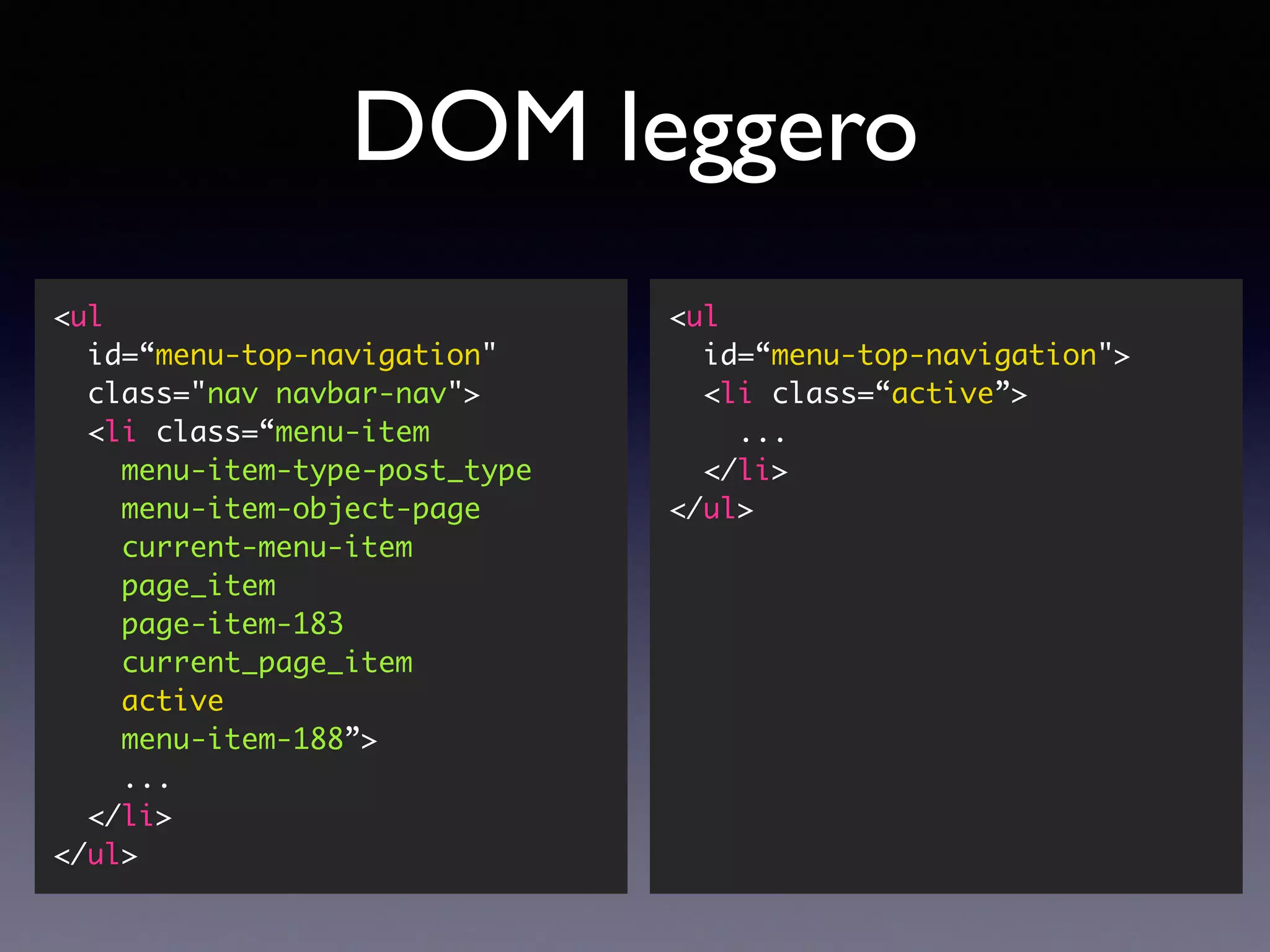
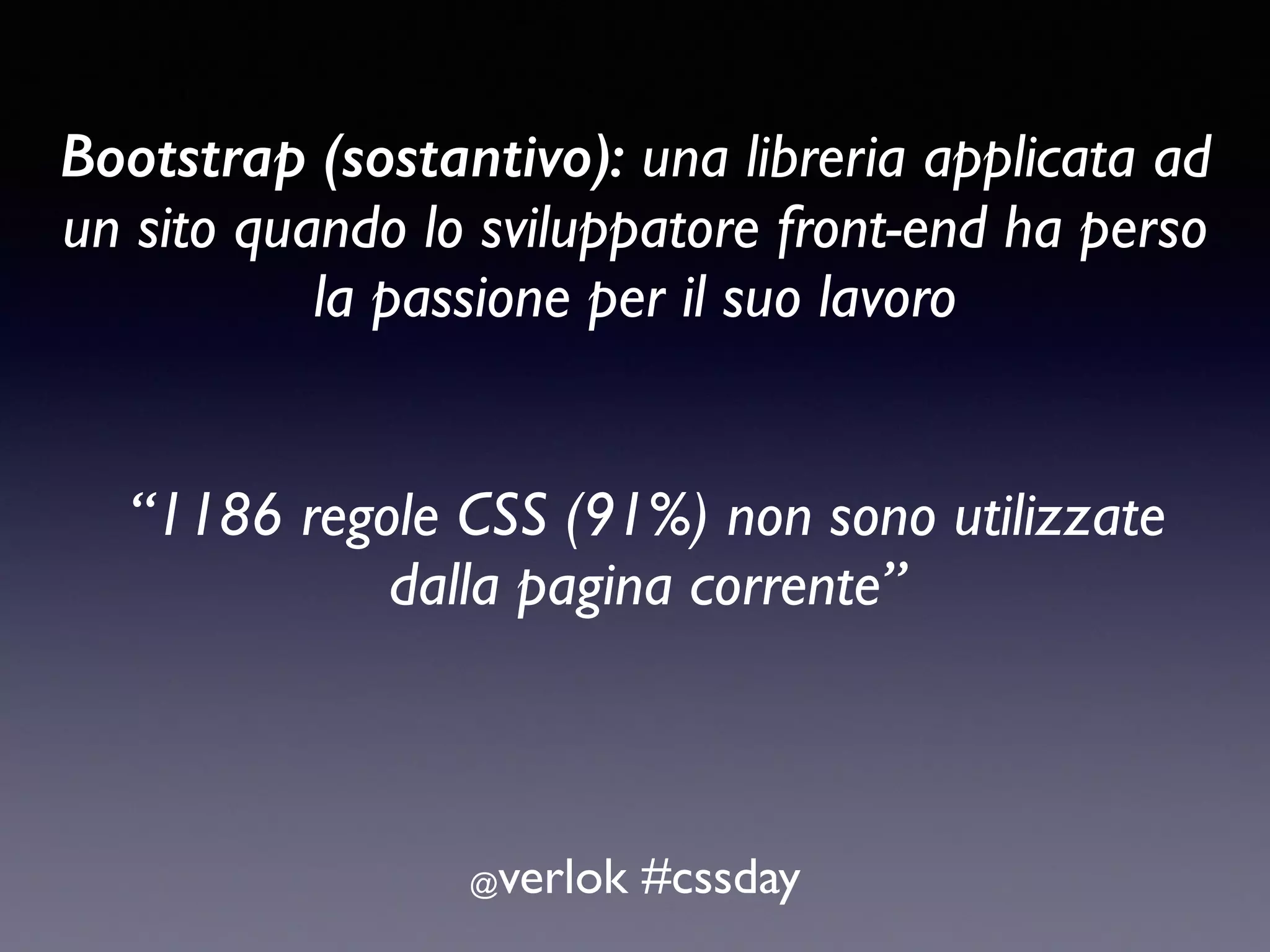
Bootstrap (sostantivo): unalibreria applicata ad un sito quando lo sviluppatore front-end ha perso la passione per il suo lavoro @verlok #cssday “1186 regole CSS (91%) non sono utilizzate dalla pagina corrente”
65.
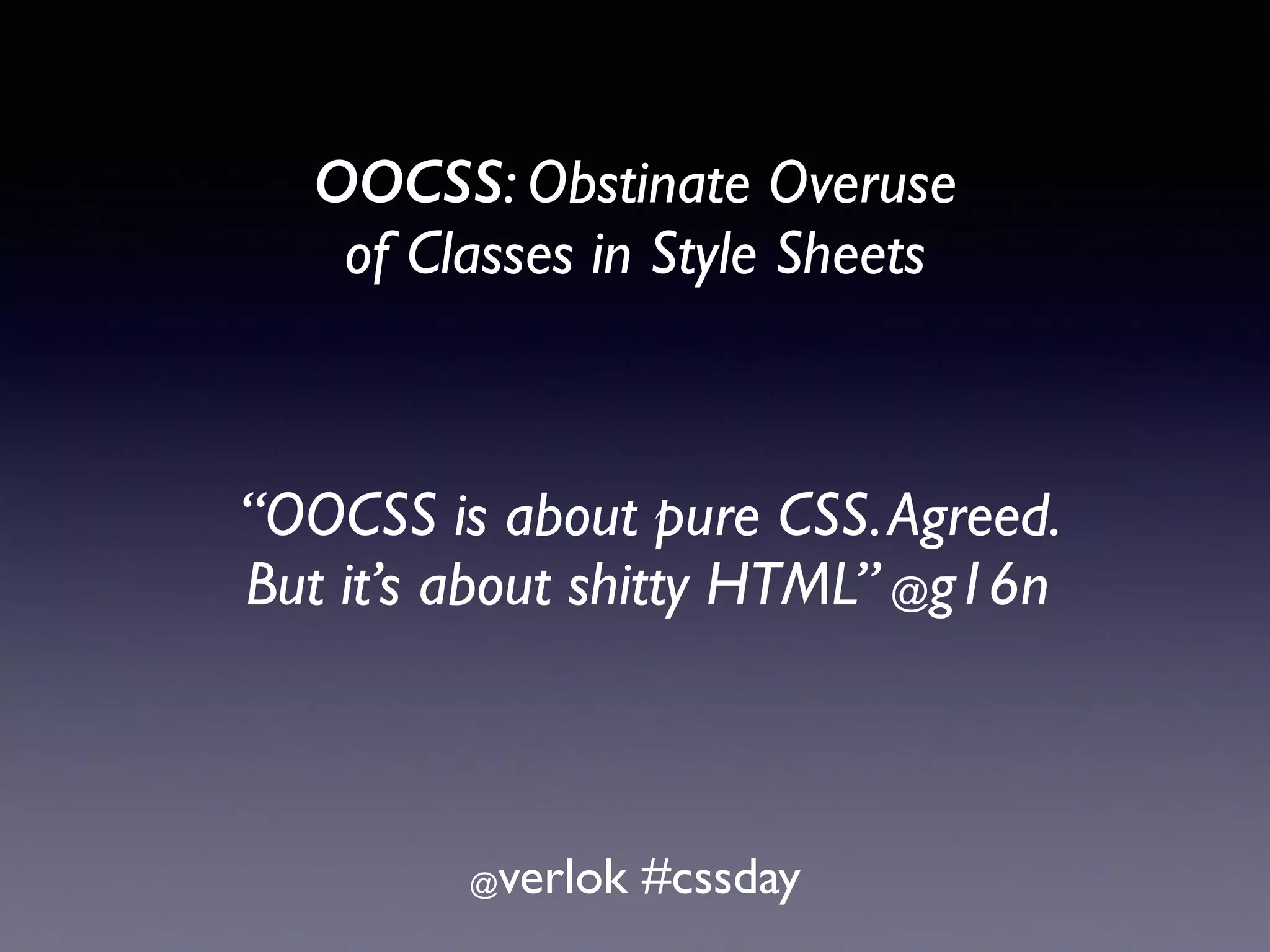
OOCSS: Obstinate Overuse of Classes in Style Sheets @verlok #cssday “OOCSS is about pure CSS.Agreed. But it’s about shitty HTML” @g16n


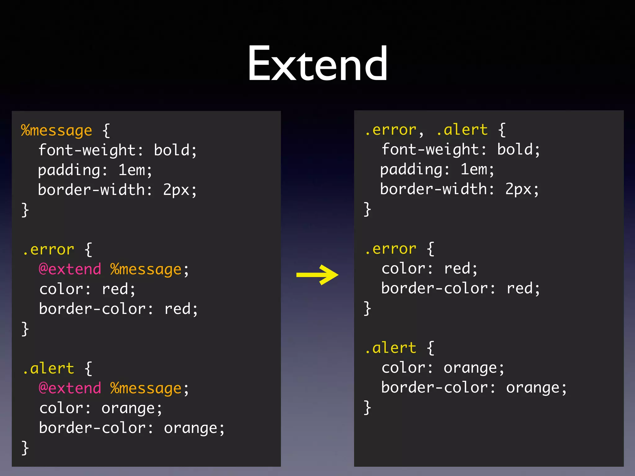
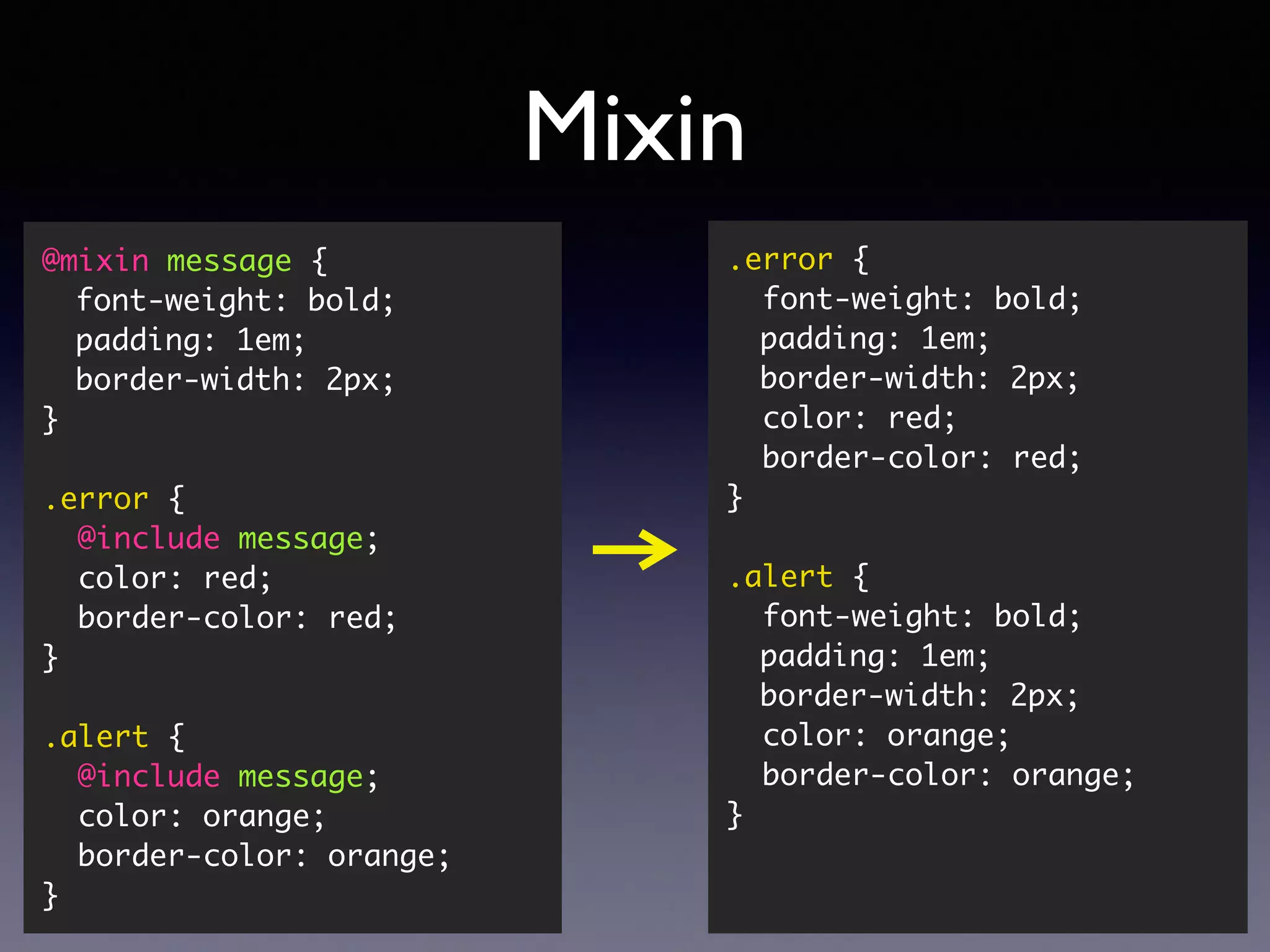
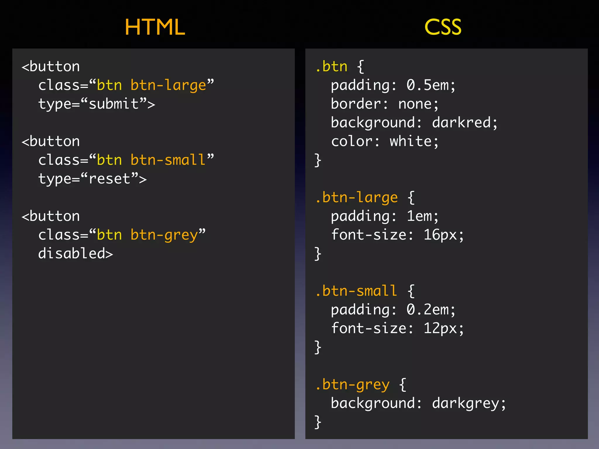
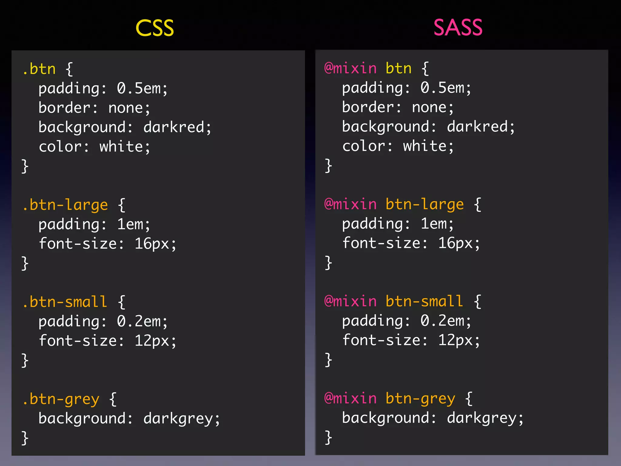
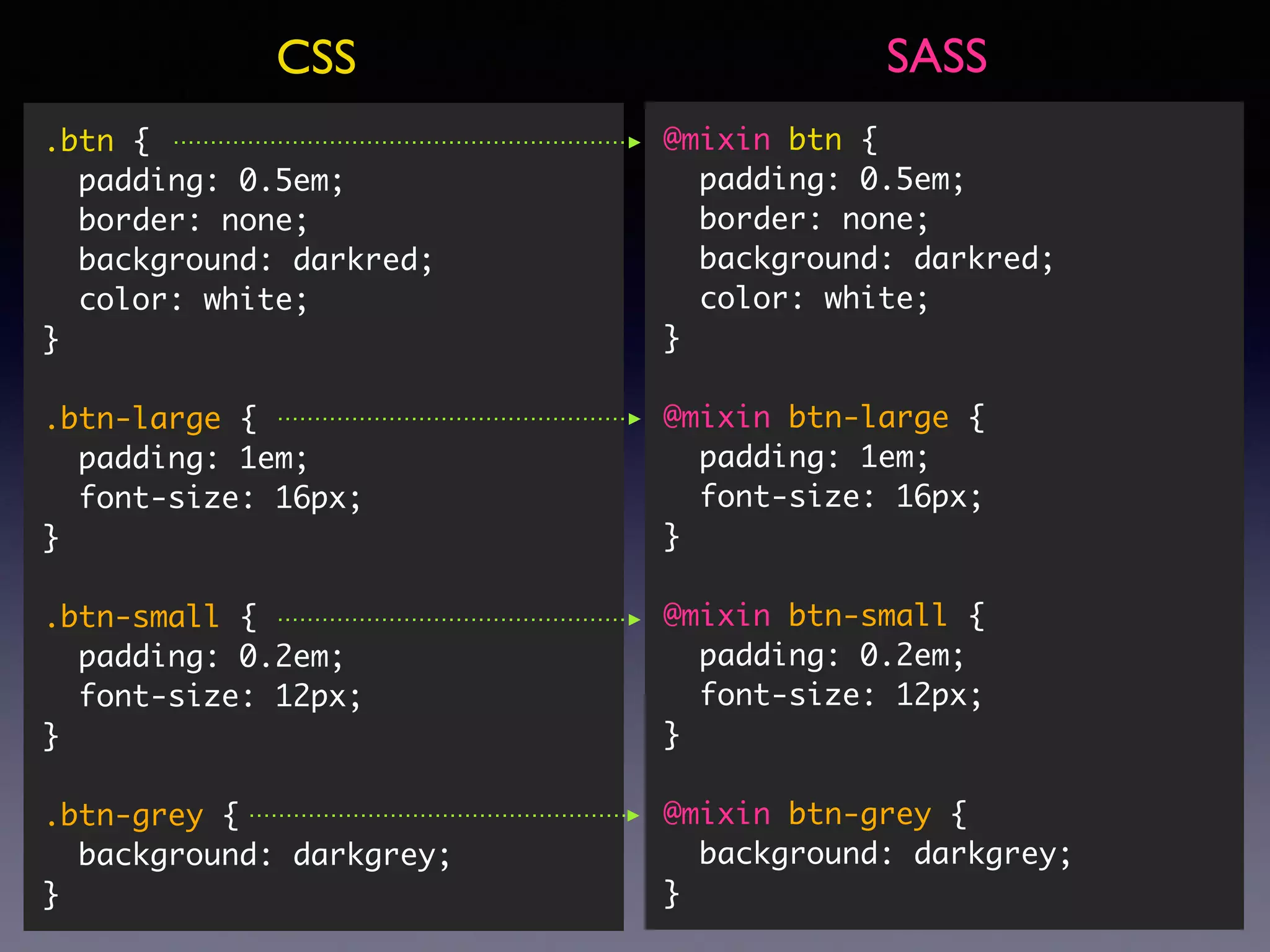
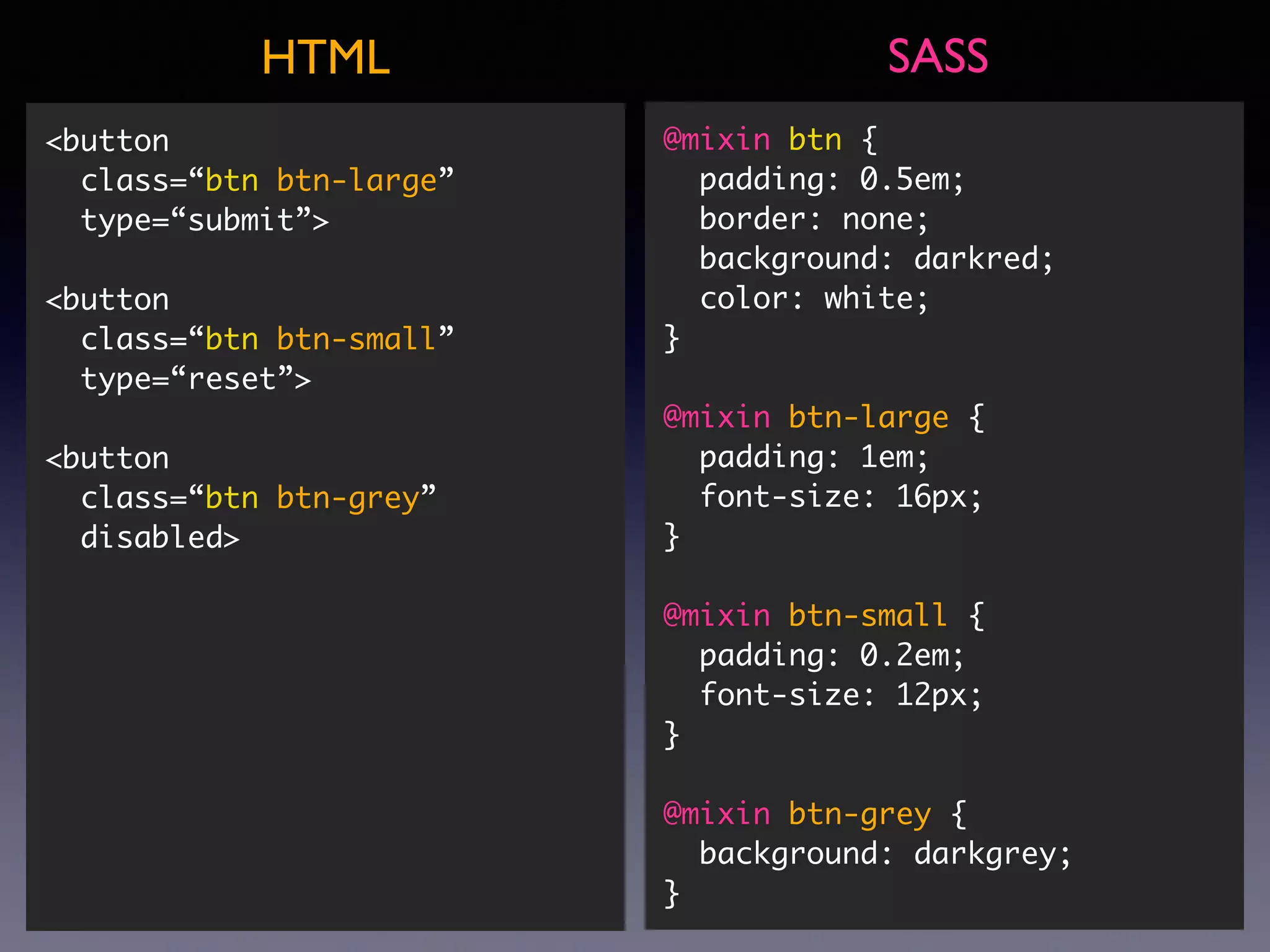
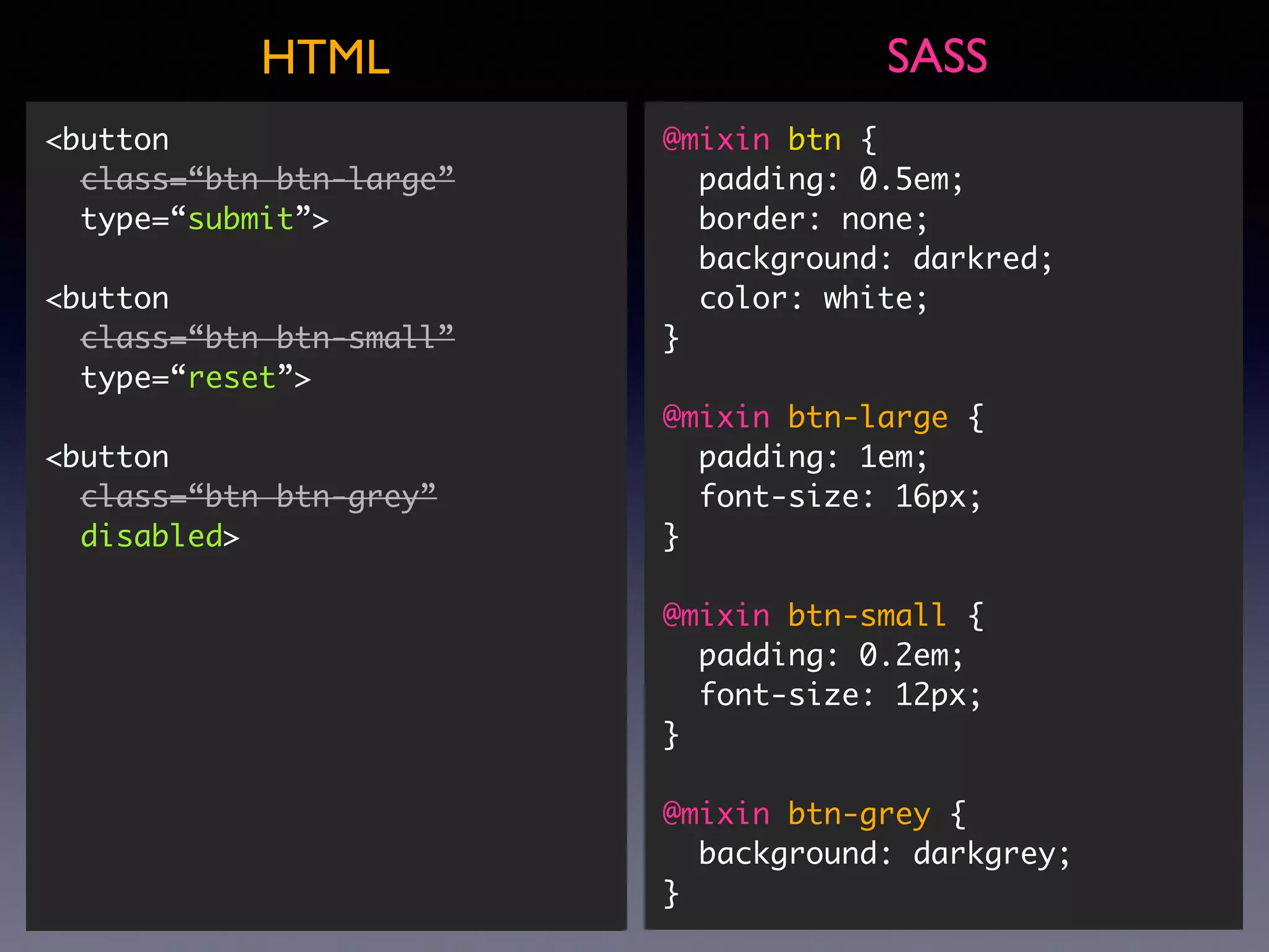
![@mixin btn { padding: 0.5em; border: none; background: darkred; color: white; } @mixin btn-large { padding: 1em; font-size: 16px; } @mixin btn-small { padding: 0.2em; font-size: 12px; } @mixin btn-grey { background: darkgrey; } button { @include btn; } button[type=“submit”] { @include btn; @include btn-large; } button[type=“reset”] { @include btn; @include btn-small; } button[disabled] { @include btn; @include btn-grey; } SASSHTML <button class=“btn btn-large”
type=“submit”> <button class=“btn btn-small” type=“reset”> <button class=“btn btn-grey” disabled> <button class=“btn btn-large”
type=“submit”> <button class=“btn btn-small” type=“reset”> <button class=“btn btn-grey” disabled>](https://image.slidesharecdn.com/sviluppocssagileconsassecompass-cssday2015faenza-150328014648-conversion-gate01/75/Sviluppo-CSS-agile-con-SASS-e-Compass-CSS-Day-2015-Faenza-57-2048.jpg)