
![63 Scatterplot Matrices Matrix of scatterplots (x-y-diagrams) of the k-dim. data [total of (k2/2-k) scatterplots] Used by ermission of M. Ward, Worcester Polytechnic Institute](https://image.slidesharecdn.com/module2introductiontodataminingdataexplorationanddatapre-processing-230827153635-49c58244/75/Module-2_-Introduction-to-Data-Mining-Data-Exploration-and-Data-Pre-processing-pptx-63-2048.jpg)
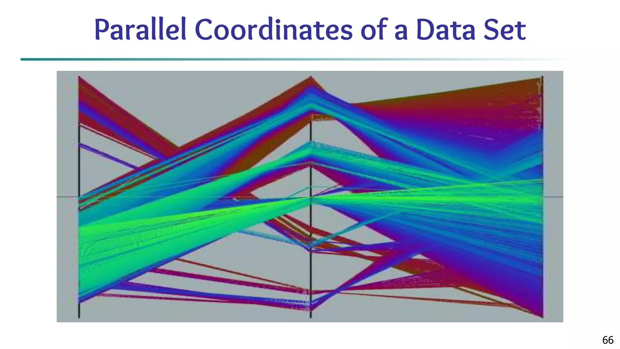
![65 Parallel Coordinates ■ n equidistant axes which are parallel to one of the screen axes and correspond to the attributes ■ The axes are scaled to the [minimum, maximum]: range of the corresponding attribute ■ Every data item corresponds to a polygonal line which intersects each of the axes at the point which corresponds to the value for the attribute](https://image.slidesharecdn.com/module2introductiontodataminingdataexplorationanddatapre-processing-230827153635-49c58244/75/Module-2_-Introduction-to-Data-Mining-Data-Exploration-and-Data-Pre-processing-pptx-65-2048.jpg)
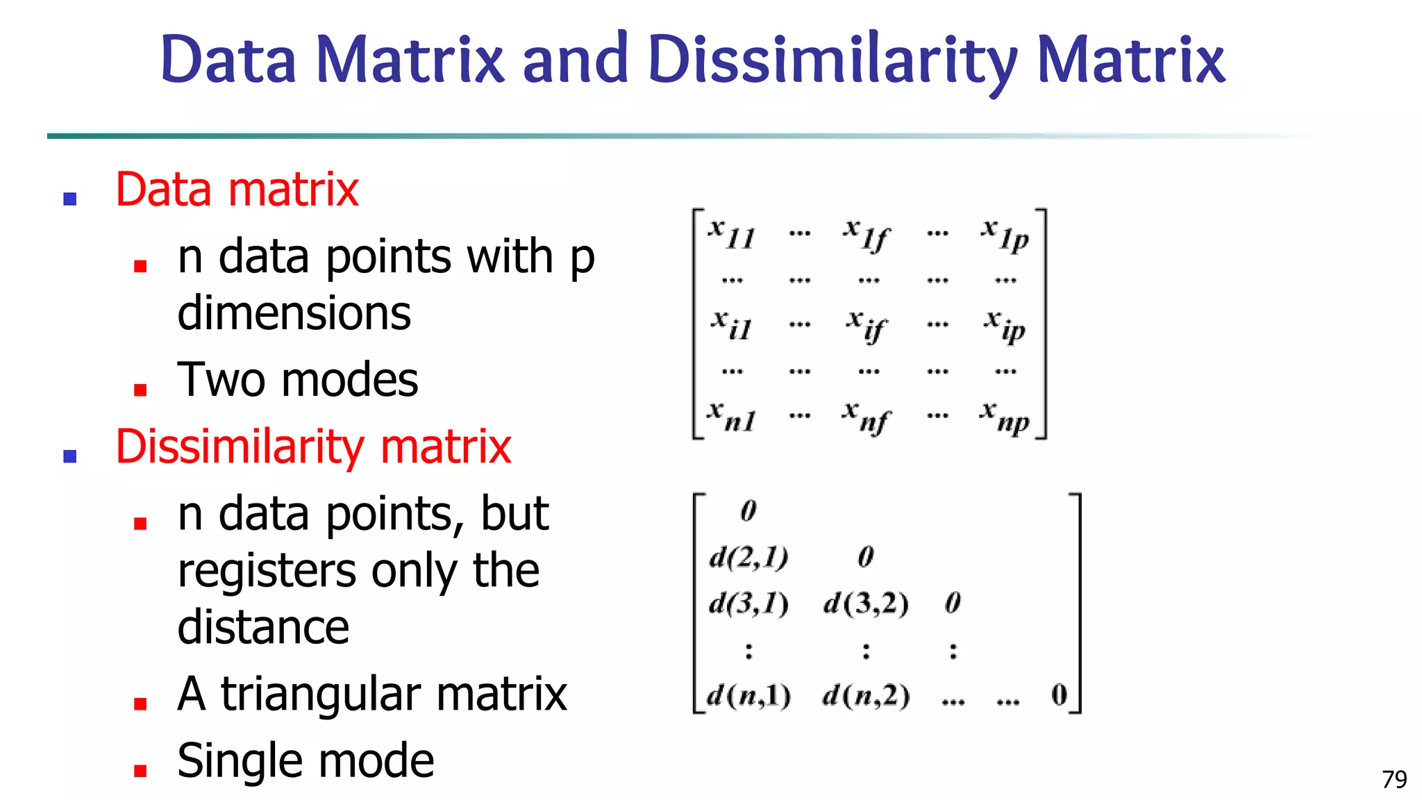
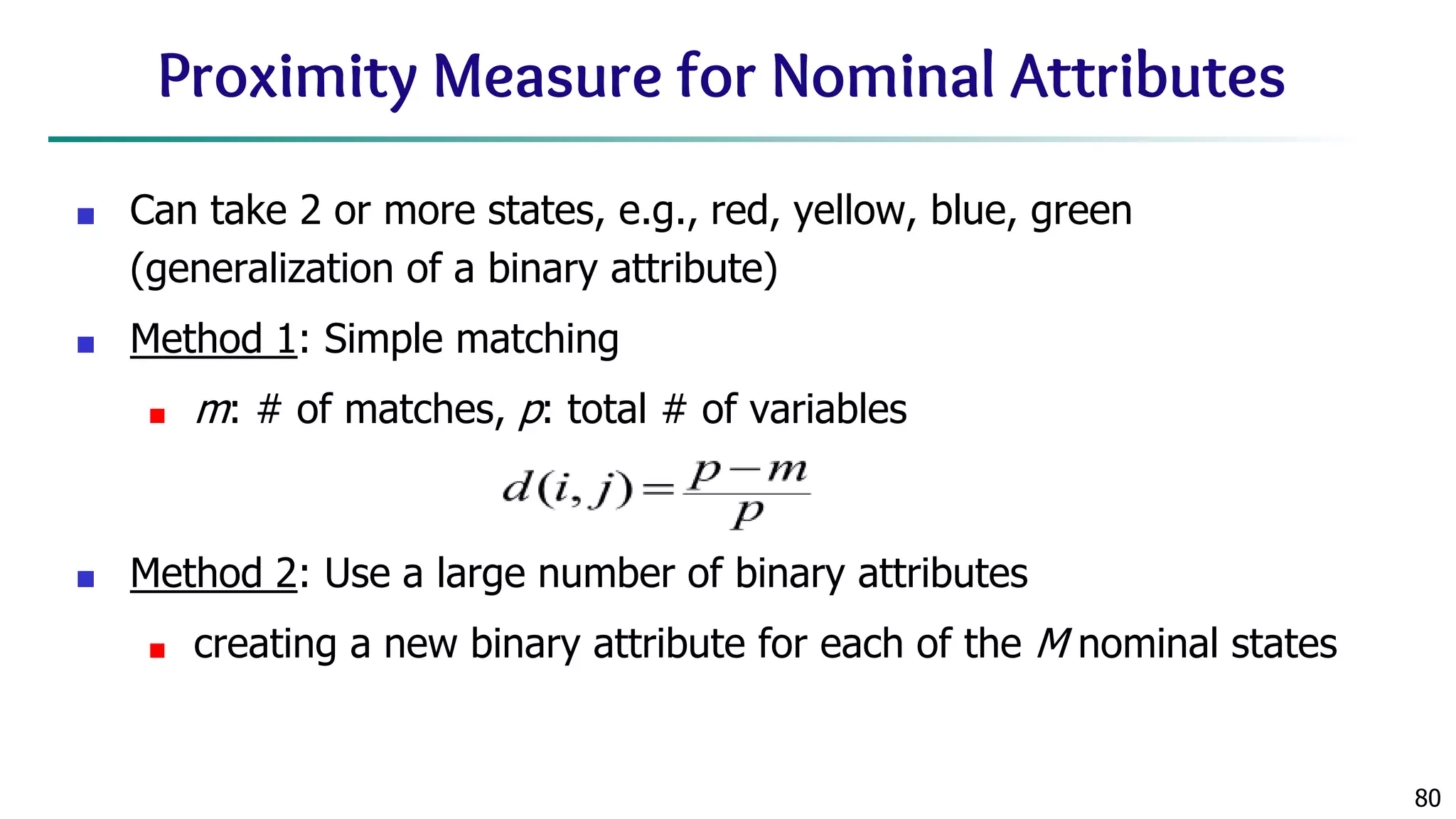
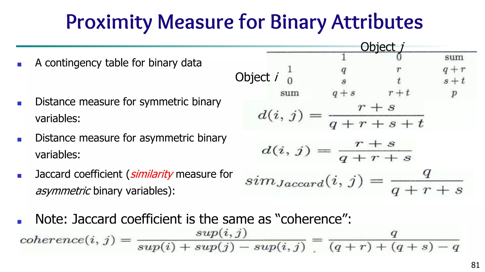
![78 Similarity and Dissimilarity ■ Similarity ■ Numerical measure of how alike two data objects are ■ Value is higher when objects are more alike ■ Often falls in the range [0,1] ■ Dissimilarity (e.g., distance) ■ Numerical measure of how different two data objects are ■ Lower when objects are more alike ■ Minimum dissimilarity is often 0 ■ Upper limit varies ■ Proximity refers to a similarity or dissimilarity](https://image.slidesharecdn.com/module2introductiontodataminingdataexplorationanddatapre-processing-230827153635-49c58244/75/Module-2_-Introduction-to-Data-Mining-Data-Exploration-and-Data-Pre-processing-pptx-78-2048.jpg)
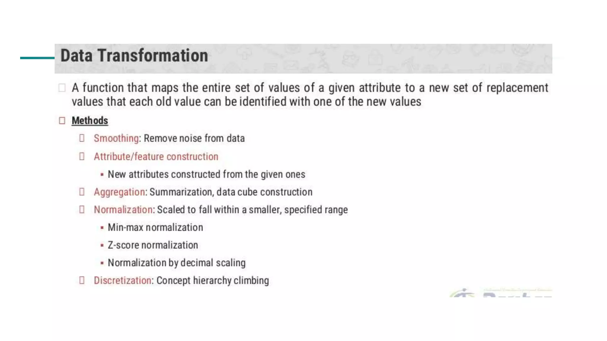
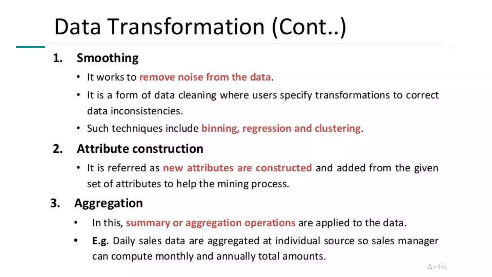

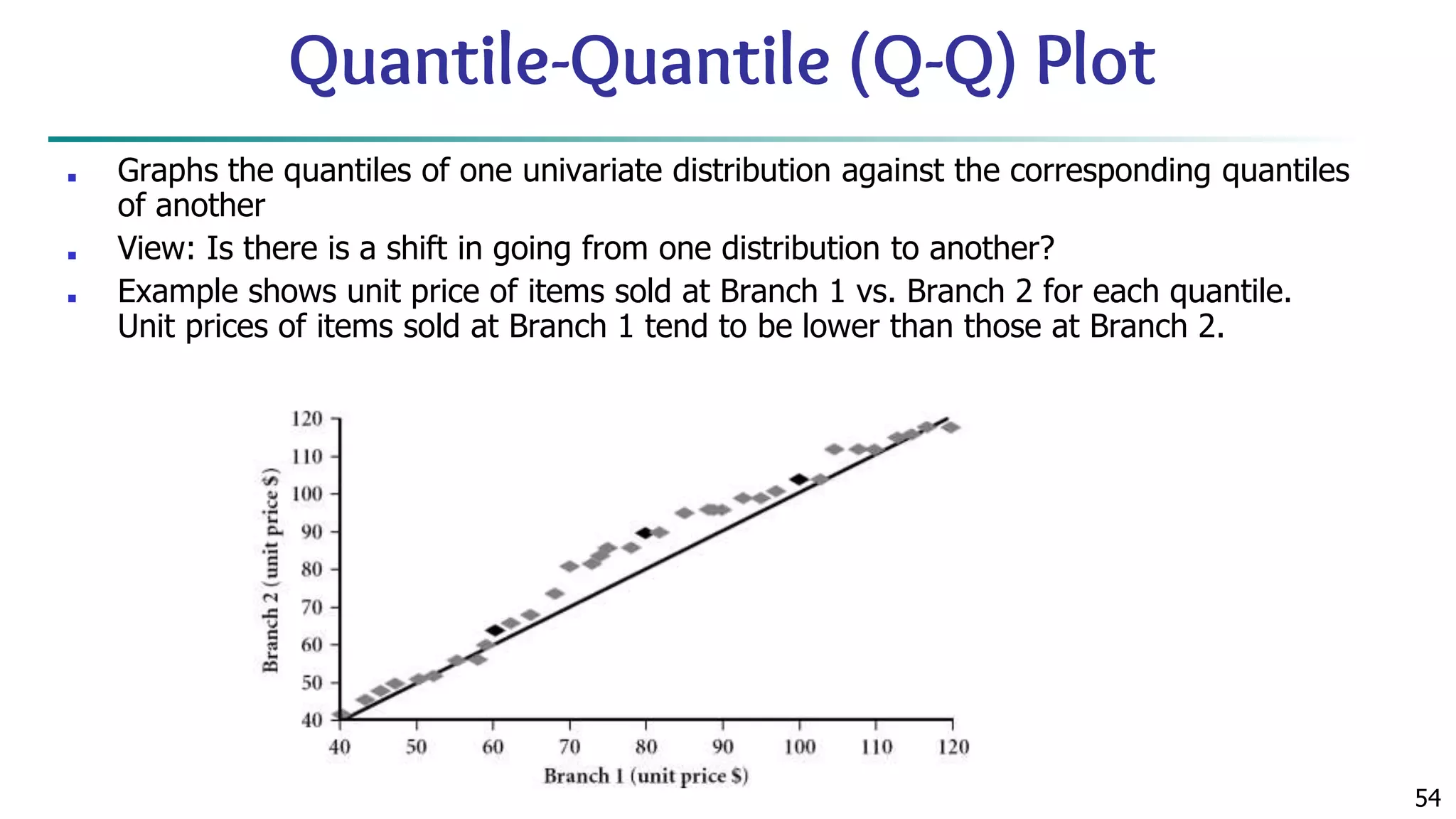
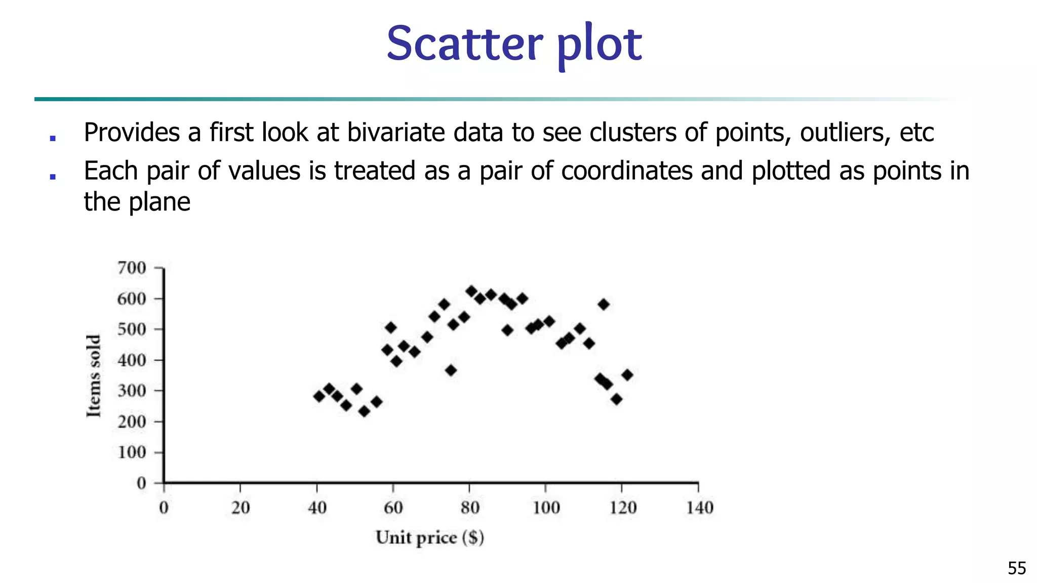
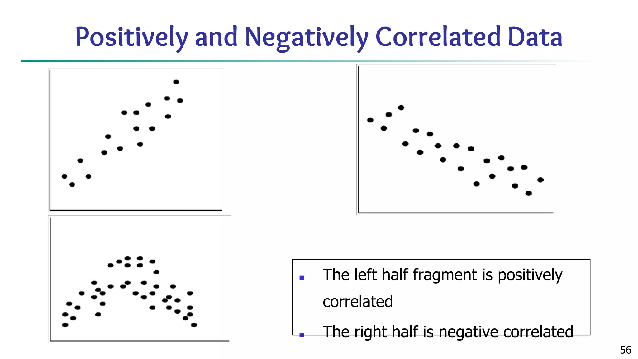
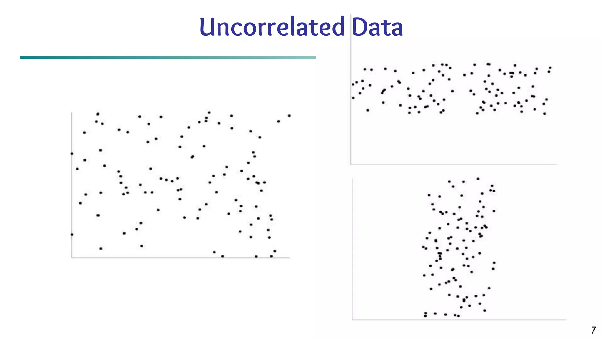
The document discusses data mining architecture, tasks, and data exploration and preprocessing techniques. It describes the KDD process and issues in data mining. It also covers data types, attributes, statistical descriptions of data, and various data visualization techniques like histograms, boxplots, scatter plots and quantile plots to explore patterns in data. Data preprocessing steps discussed are data cleaning, integration, transformation, reduction and discretization.