CSS (Cascading Style Sheets) is a language used to style and design HTML pages. It controls how web elements look — including their colors, fonts, layout, spacing, and positioning.
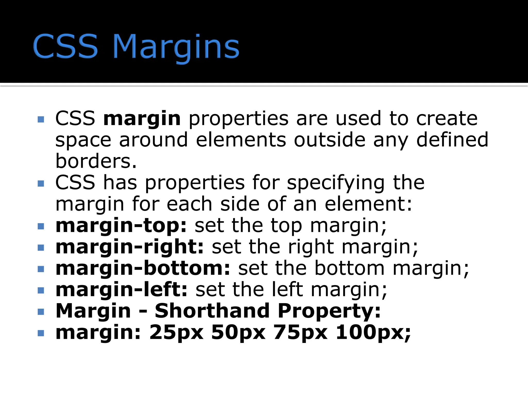
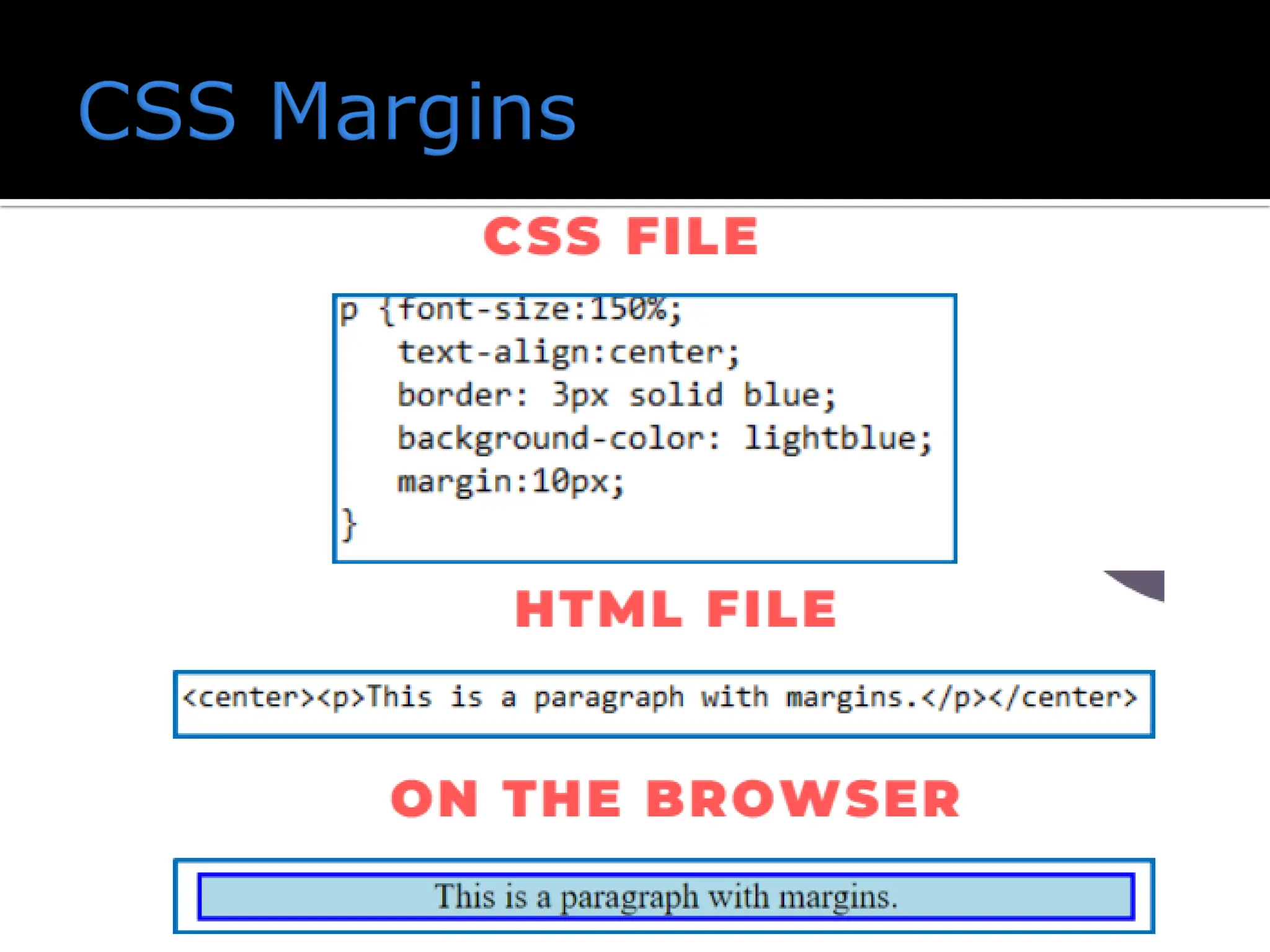
CSS marginproperties are used to create space around elements outside any defined borders. CSS has properties for specifying the margin for each side of an element: margin-top: set the top margin; margin-right: set the right margin; margin-bottom: set the bottom margin; margin-left: set the left margin; Margin - Shorthand Property: margin: 25px 50px 75px 100px;
3.
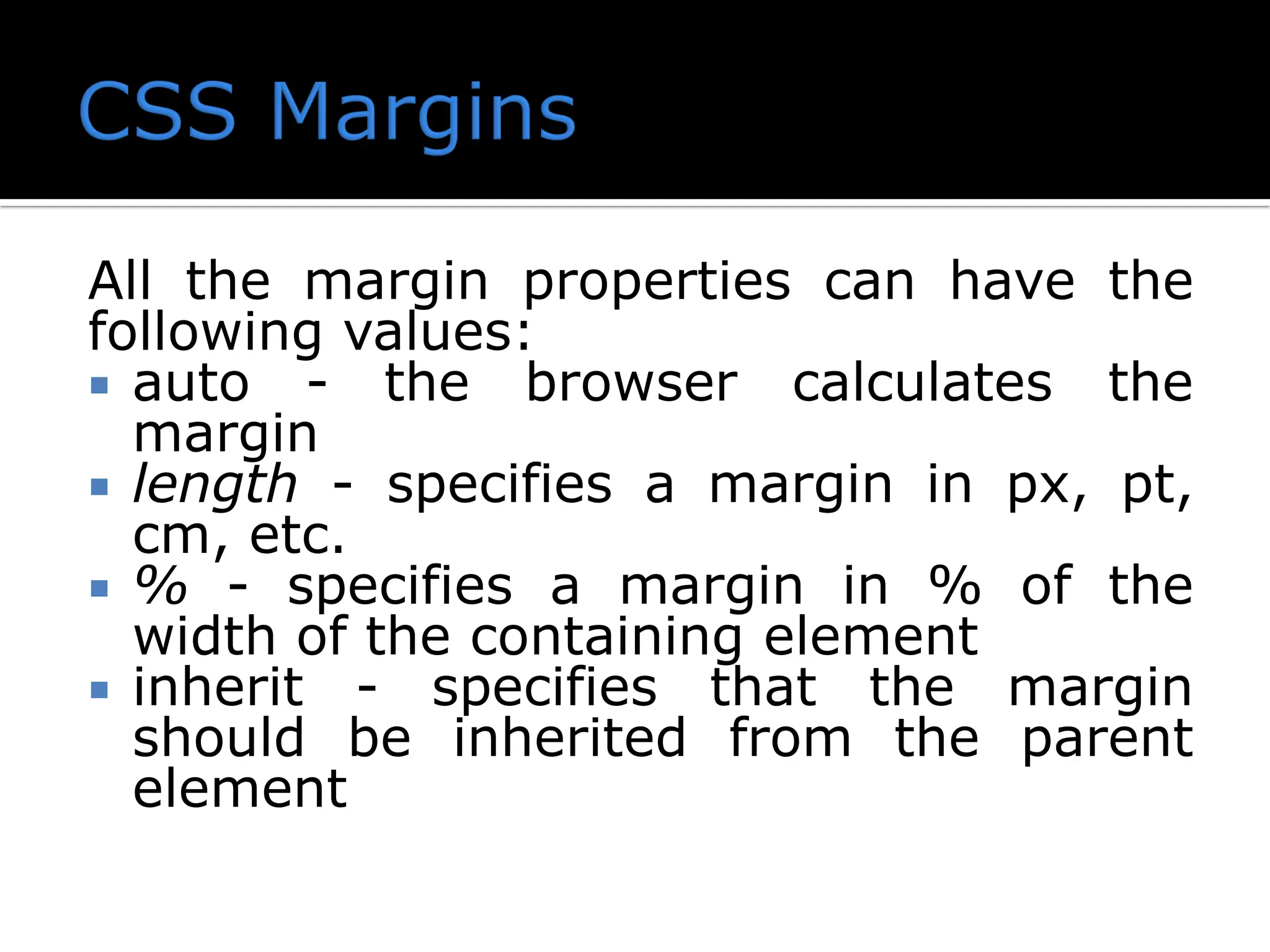
All the marginproperties can have the following values: auto - the browser calculates the margin length - specifies a margin in px, pt, cm, etc. % - specifies a margin in % of the width of the containing element inherit - specifies that the margin should be inherited from the parent element
4.
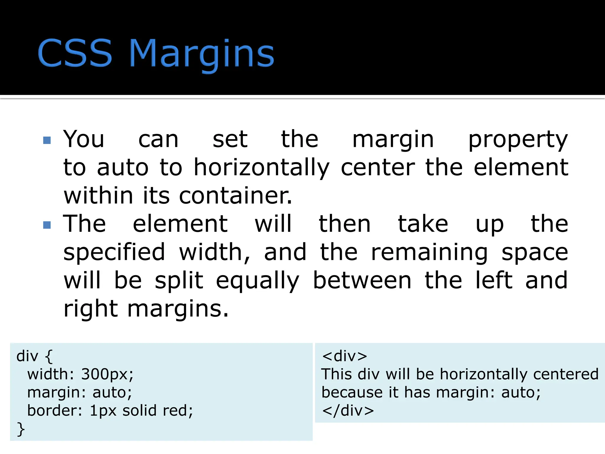
You canset the margin property to auto to horizontally center the element within its container. The element will then take up the specified width, and the remaining space will be split equally between the left and right margins. div { width: 300px; margin: auto; border: 1px solid red; } <div> This div will be horizontally centered because it has margin: auto; </div>
5.
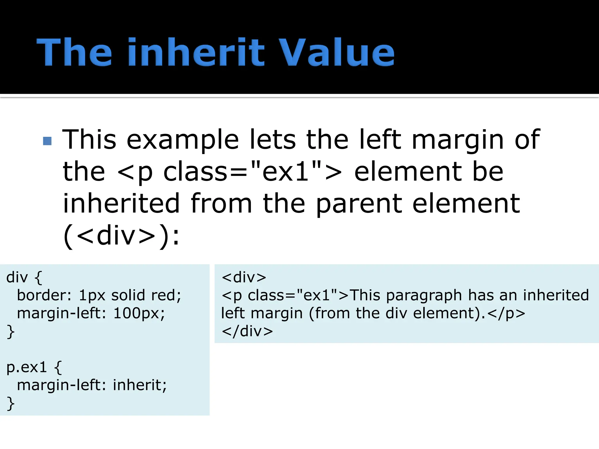
This examplelets the left margin of the <p class="ex1"> element be inherited from the parent element (<div>): div { border: 1px solid red; margin-left: 100px; } p.ex1 { margin-left: inherit; } <div> <p class="ex1">This paragraph has an inherited left margin (from the div element).</p> </div>
7.
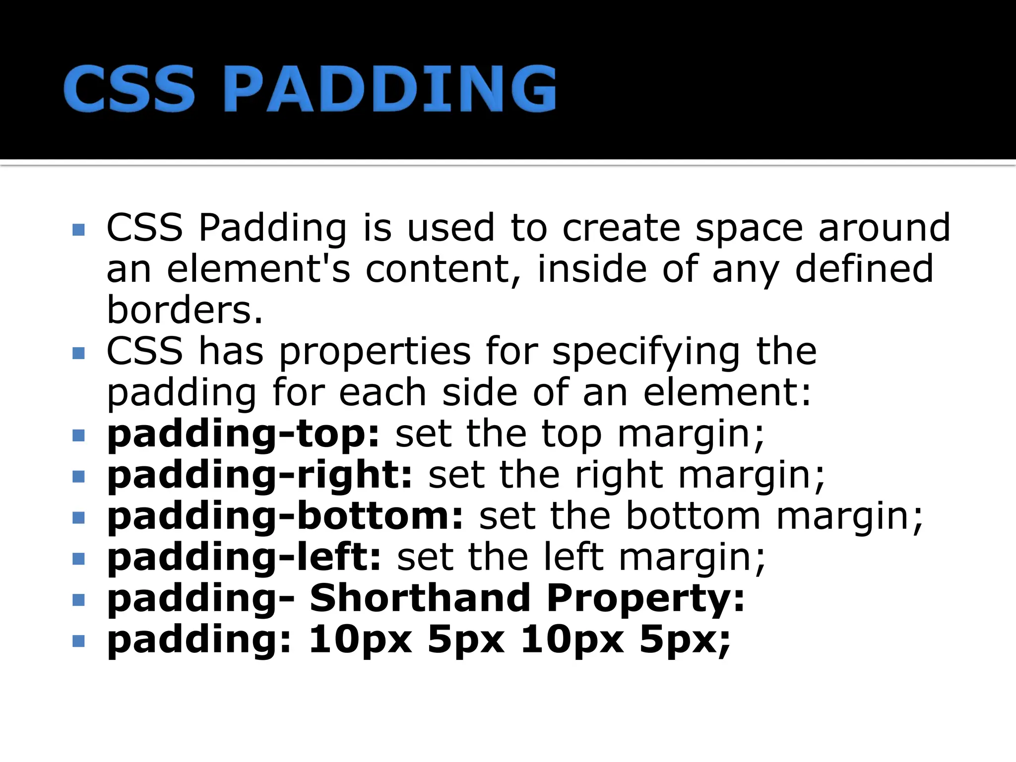
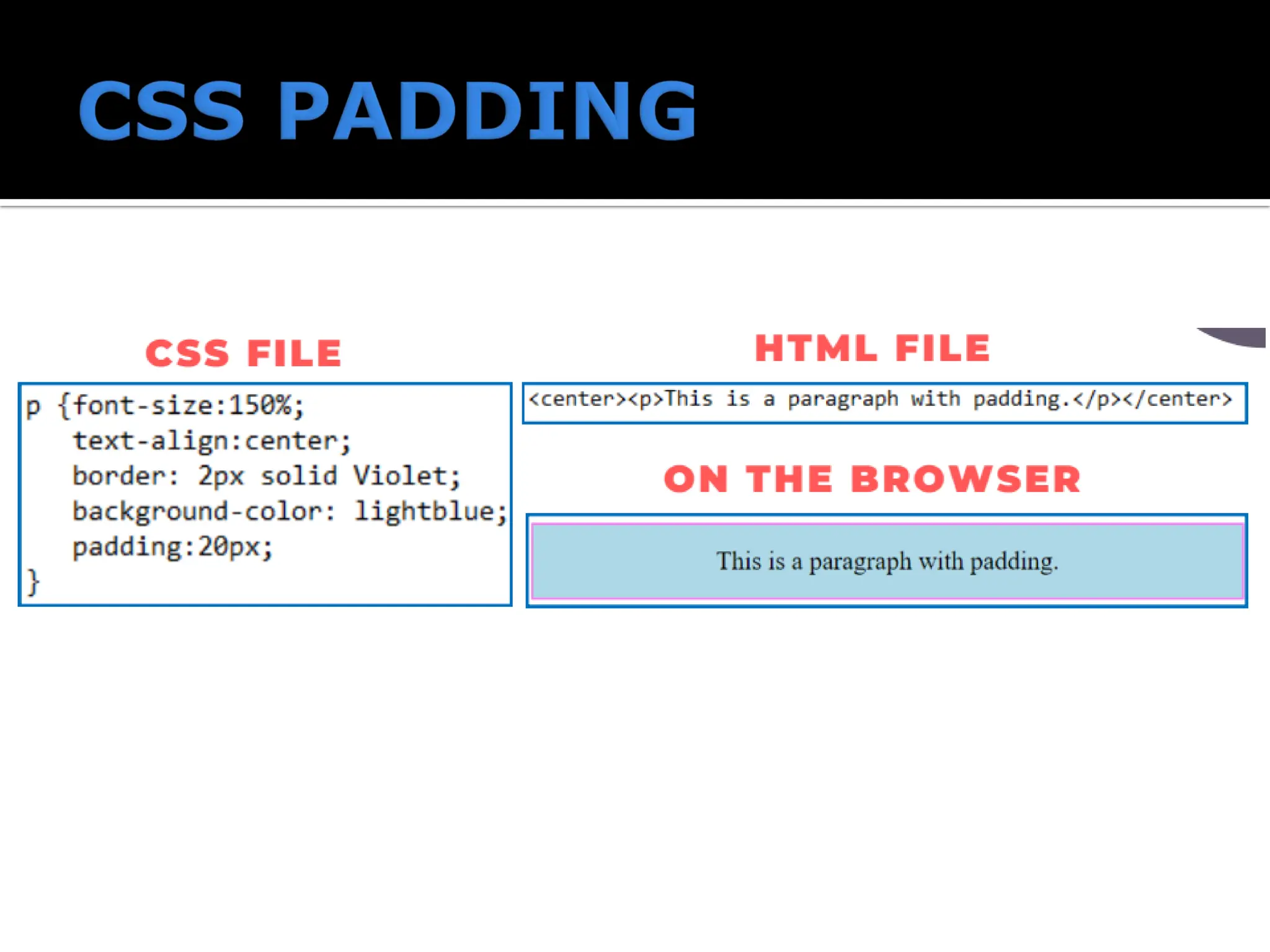
CSS Paddingis used to create space around an element's content, inside of any defined borders. CSS has properties for specifying the padding for each side of an element: padding-top: set the top margin; padding-right: set the right margin; padding-bottom: set the bottom margin; padding-left: set the left margin; padding- Shorthand Property: padding: 10px 5px 10px 5px;
9.
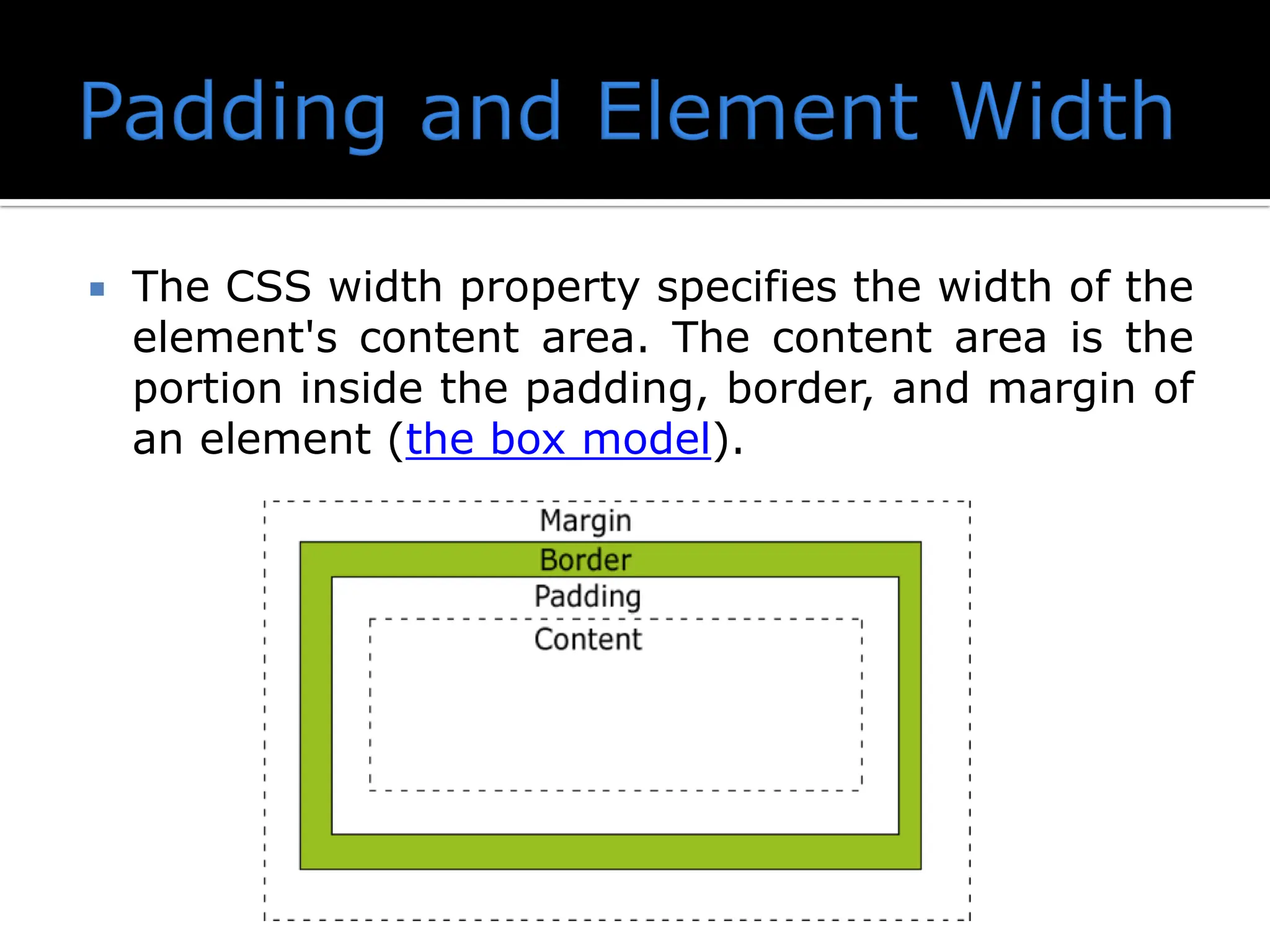
The CSSwidth property specifies the width of the element's content area. The content area is the portion inside the padding, border, and margin of an element (the box model).
10.
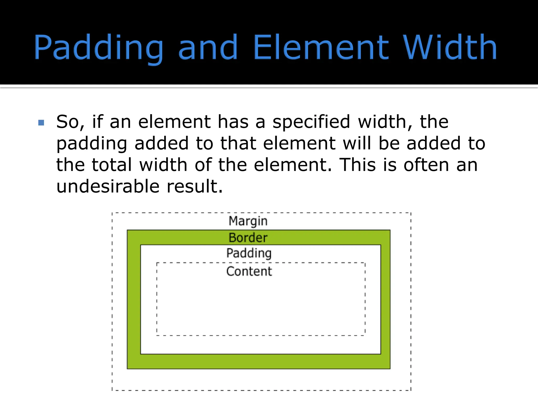
So, ifan element has a specified width, the padding added to that element will be added to the total width of the element. This is often an undesirable result.
11.
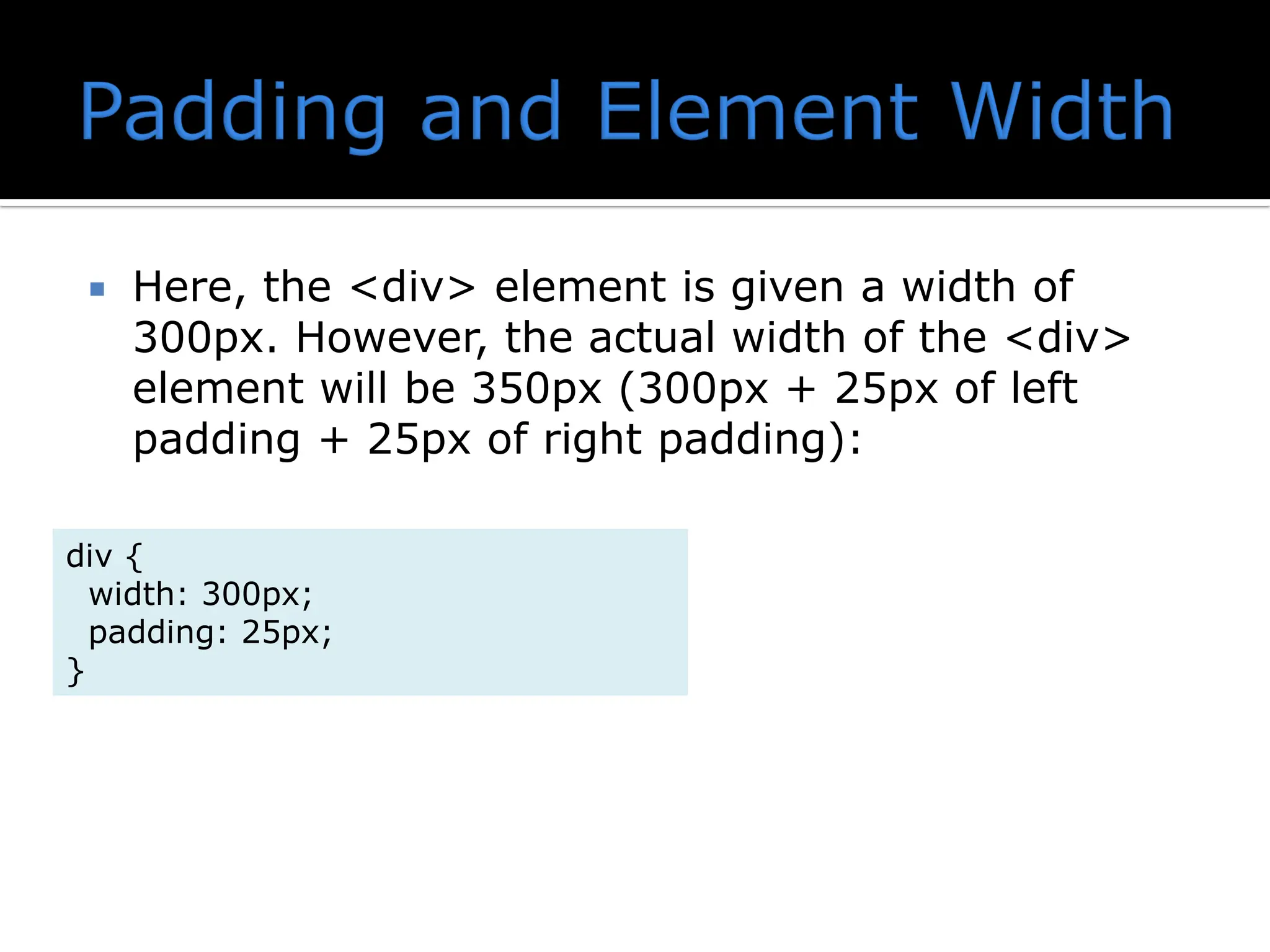
Here, the<div> element is given a width of 300px. However, the actual width of the <div> element will be 350px (300px + 25px of left padding + 25px of right padding): div { width: 300px; padding: 25px; }
12.
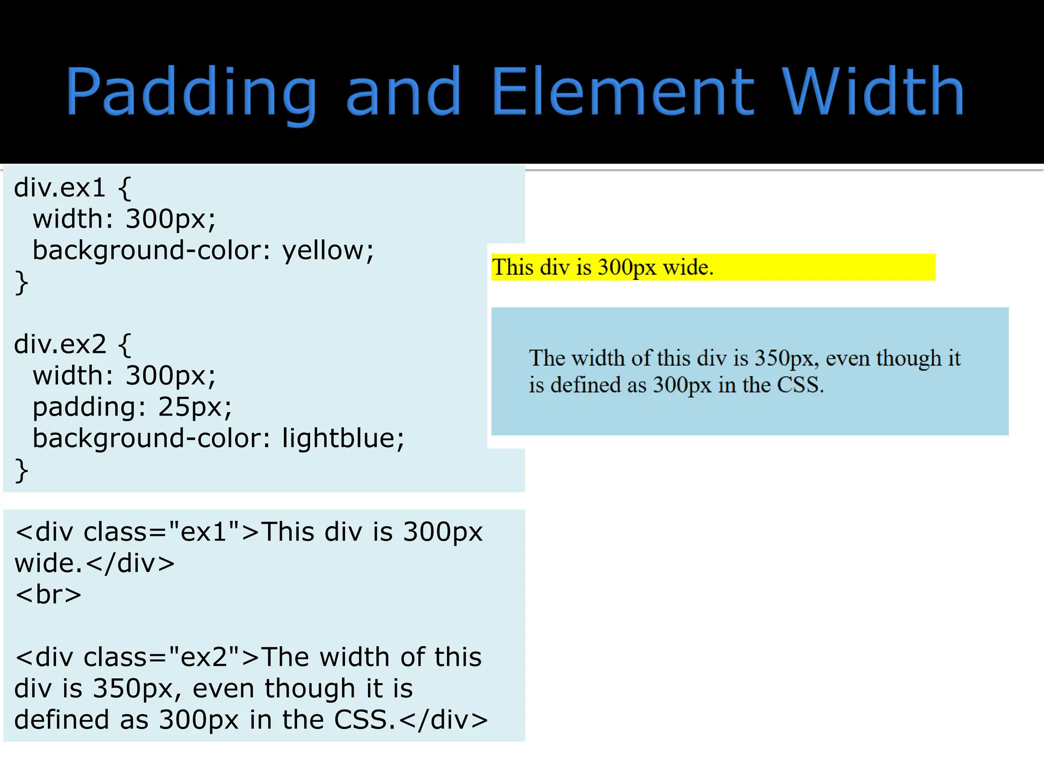
div.ex1 { width: 300px; background-color:yellow; } div.ex2 { width: 300px; padding: 25px; background-color: lightblue; } <div class="ex1">This div is 300px wide.</div> <br> <div class="ex2">The width of this div is 350px, even though it is defined as 300px in the CSS.</div>
13.
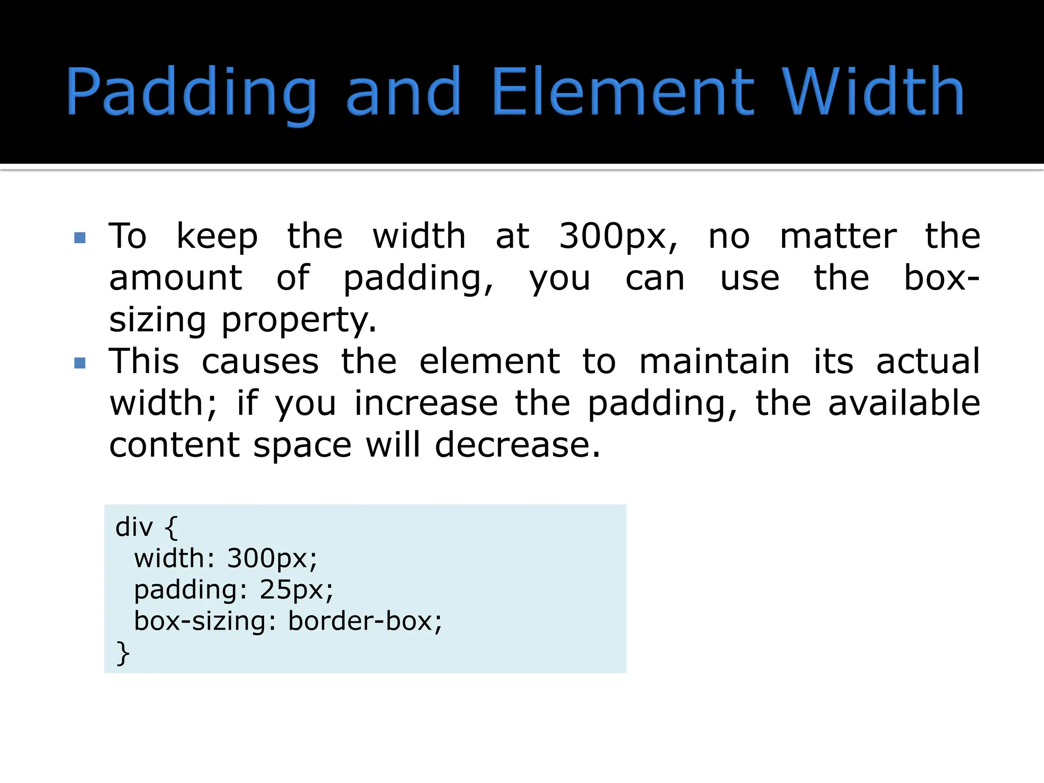
To keepthe width at 300px, no matter the amount of padding, you can use the box- sizing property. This causes the element to maintain its actual width; if you increase the padding, the available content space will decrease. div { width: 300px; padding: 25px; box-sizing: border-box; }
14.
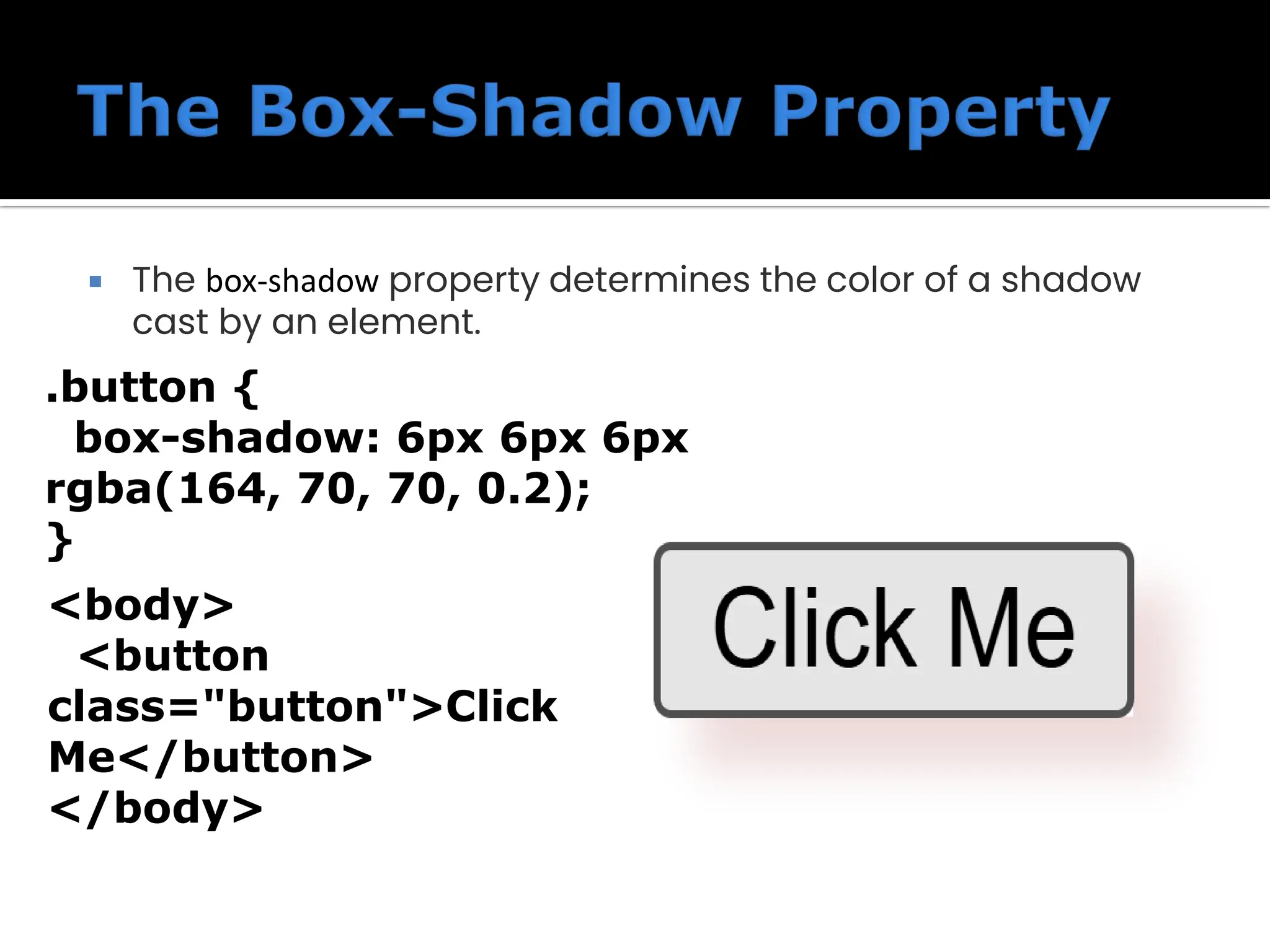
The box-shadowproperty determines the color of a shadow cast by an element. .button { box-shadow: 6px 6px 6px rgba(164, 70, 70, 0.2); } <body> <button class="button">Click Me</button> </body>
15.
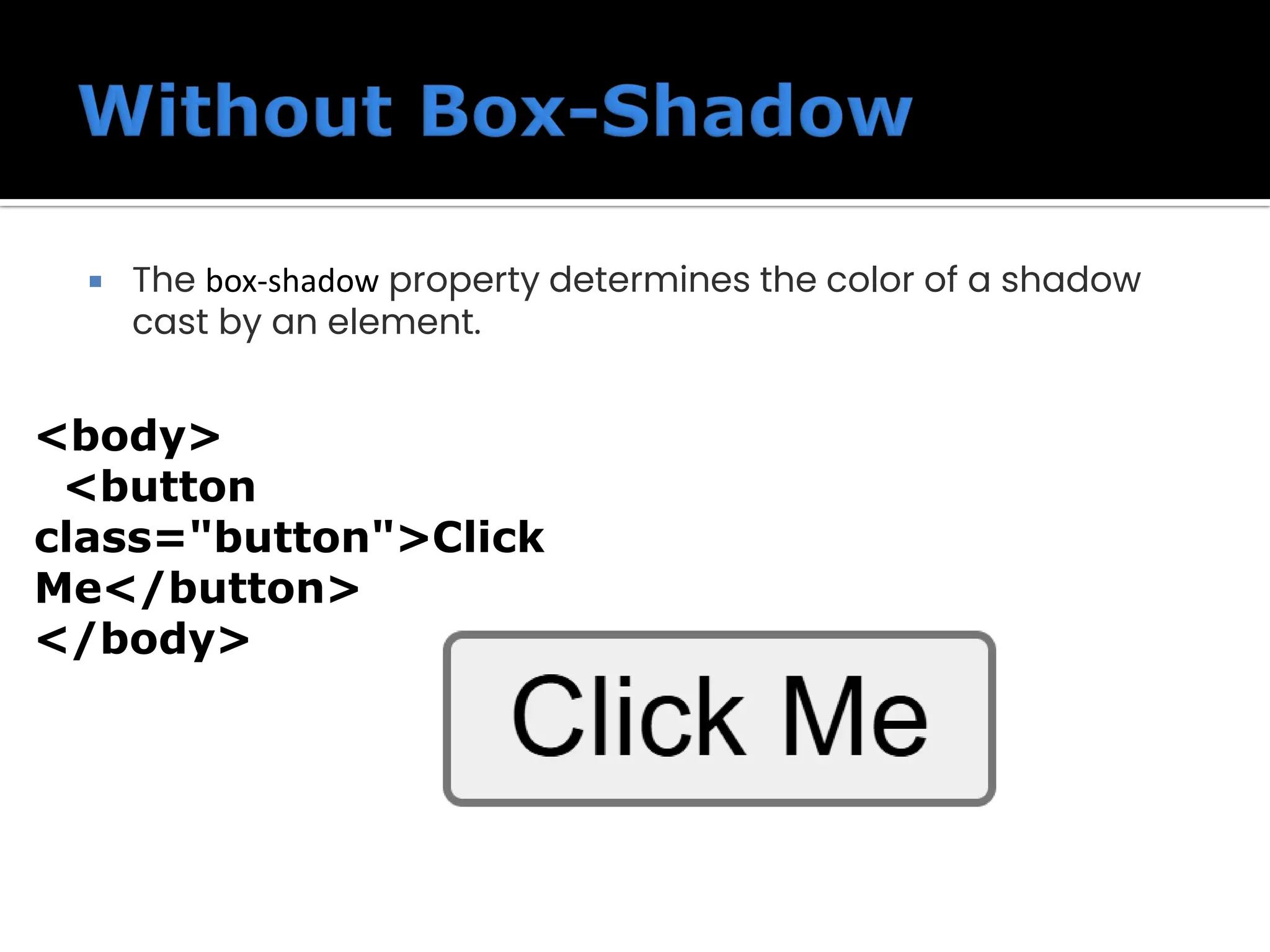
The box-shadowproperty determines the color of a shadow cast by an element. <body> <button class="button">Click Me</button> </body>
16.
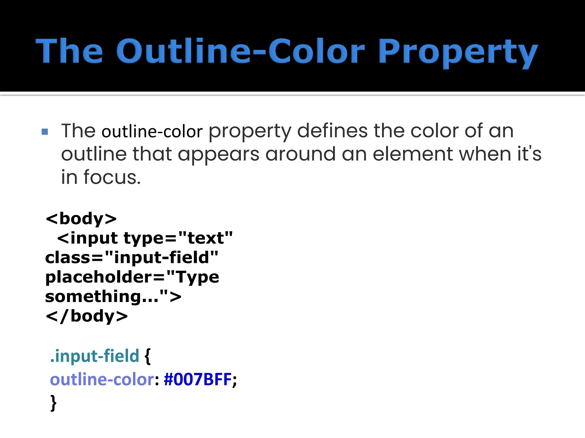
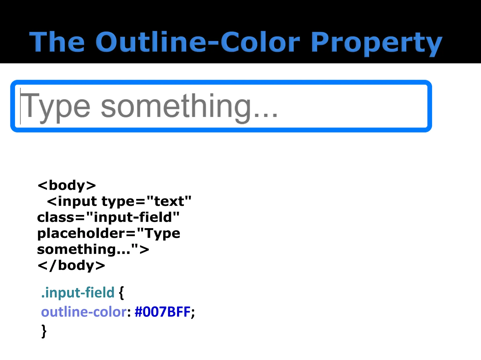
The outline-colorproperty defines the color of an outline that appears around an element when it's in focus. .input-field { outline-color: #007BFF; } <body> <input type="text" class="input-field" placeholder="Type something..."> </body>
17.
The outline-colorproperty defines the color of an outline that appears around an element when it's in focus. .input-field { outline-color: #007BFF; } <body> <input type="text" class="input-field" placeholder="Type something..."> </body>
18.
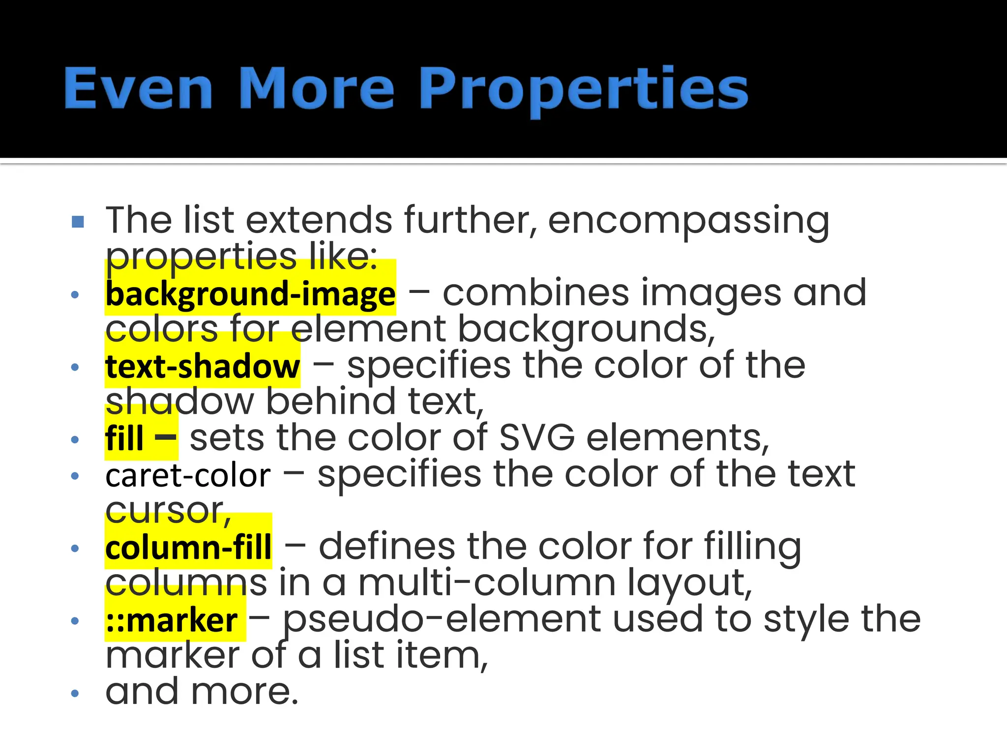
The listextends further, encompassing properties like: • background-image – combines images and colors for element backgrounds, • text-shadow – specifies the color of the shadow behind text, • fill – sets the color of SVG elements, • caret-color – specifies the color of the text cursor, • column-fill – defines the color for filling columns in a multi-column layout, • ::marker – pseudo-element used to style the marker of a list item, • and more.
19.
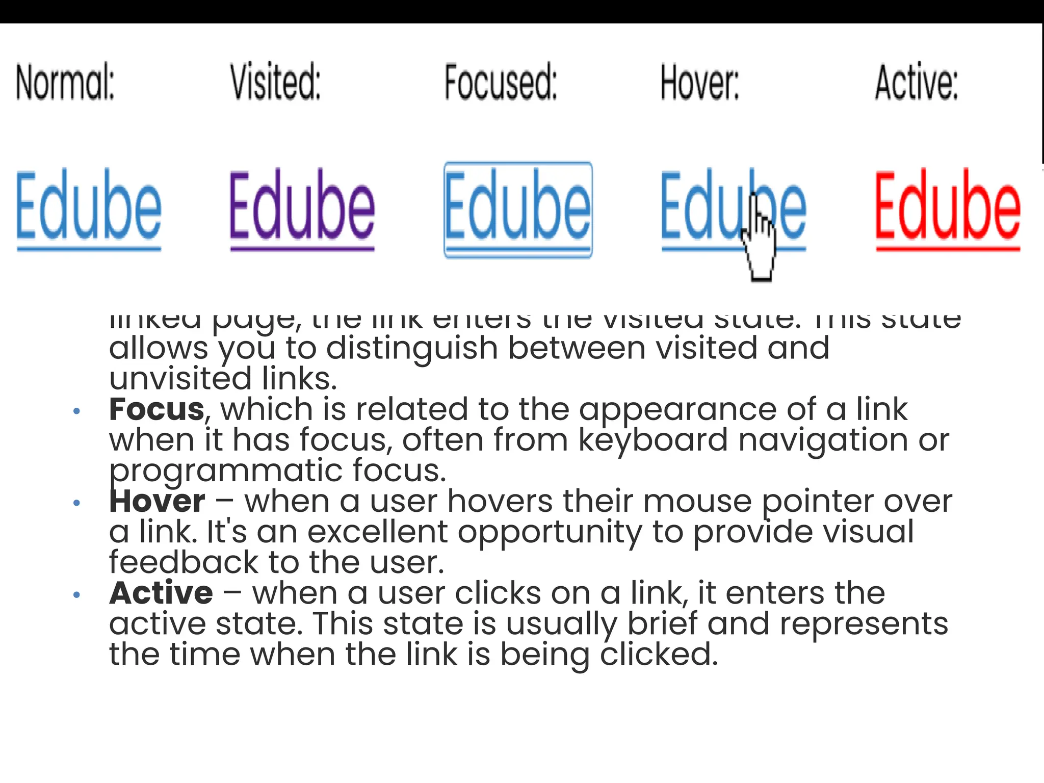
• Normal, whichis the default appearance of a link when it hasn't been interacted with. • Visited – after a user clicks on a link and visits the linked page, the link enters the visited state. This state allows you to distinguish between visited and unvisited links. • Focus, which is related to the appearance of a link when it has focus, often from keyboard navigation or programmatic focus. • Hover – when a user hovers their mouse pointer over a link. It's an excellent opportunity to provide visual feedback to the user. • Active – when a user clicks on a link, it enters the active state. This state is usually brief and represents the time when the link is being clicked.
20.
• Normal, whichis the default appearance of a link when it hasn't been interacted with. • Visited – after a user clicks on a link and visits the linked page, the link enters the visited state. This state allows you to distinguish between visited and unvisited links. • Focus, which is related to the appearance of a link when it has focus, often from keyboard navigation or programmatic focus. • Hover – when a user hovers their mouse pointer over a link. It's an excellent opportunity to provide visual feedback to the user. • Active – when a user clicks on a link, it enters the active state. This state is usually brief and represents the time when the link is being clicked.
21.
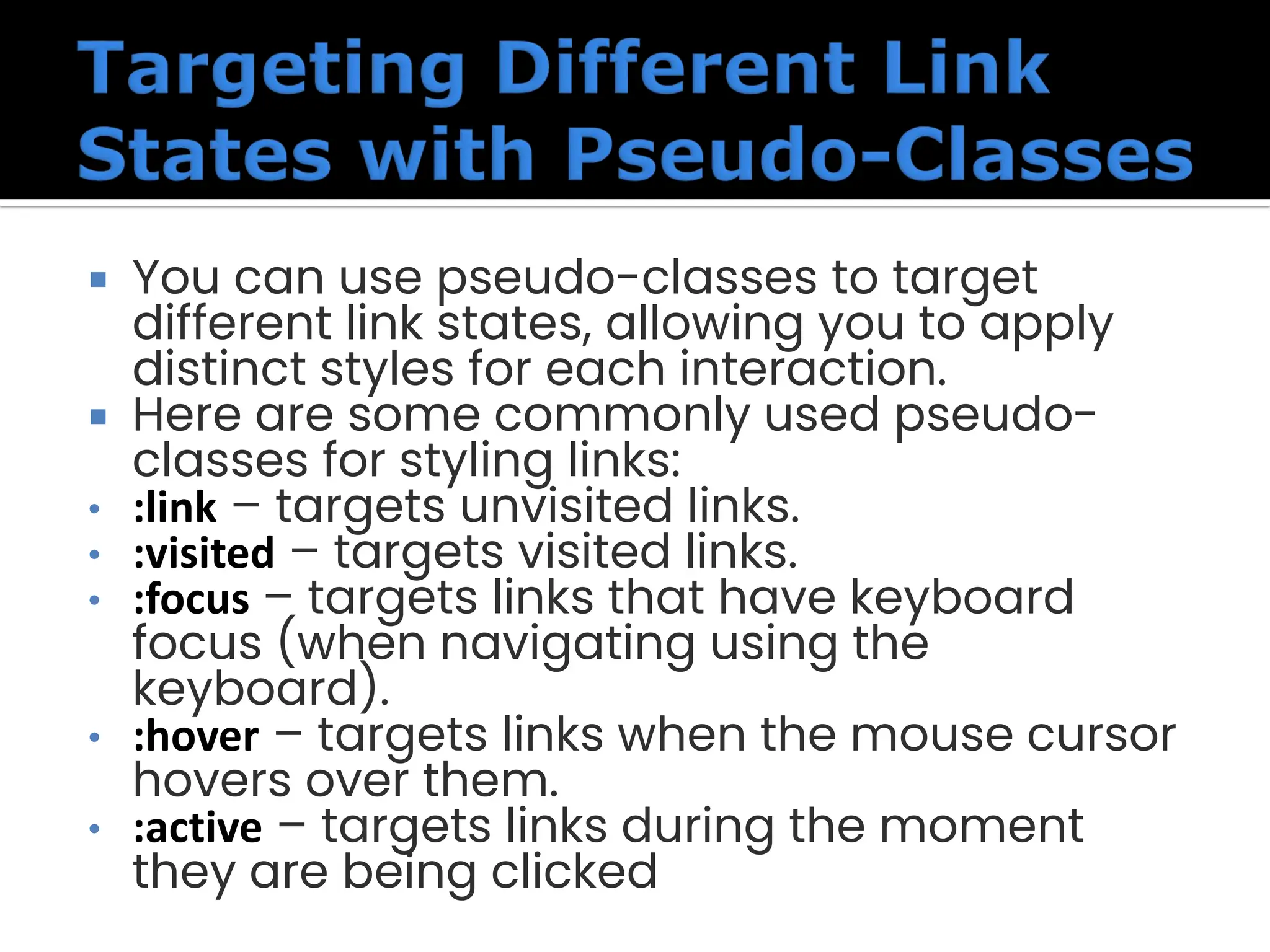
You canuse pseudo-classes to target different link states, allowing you to apply distinct styles for each interaction. Here are some commonly used pseudo- classes for styling links: • :link – targets unvisited links. • :visited – targets visited links. • :focus – targets links that have keyboard focus (when navigating using the keyboard). • :hover – targets links when the mouse cursor hovers over them. • :active – targets links during the moment they are being clicked
22.
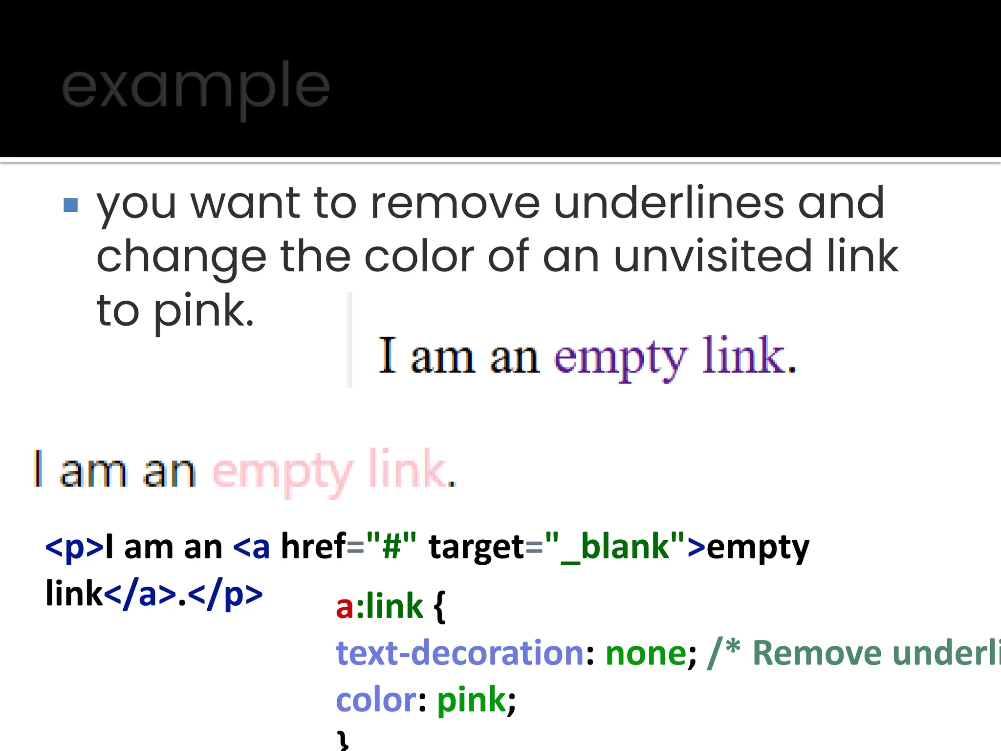
you wantto remove underlines and change the color of an unvisited link to pink. <p>I am an <a href="#" target="_blank">empty link</a>.</p> a:link { text-decoration: none; /* Remove underli color: pink;
23.
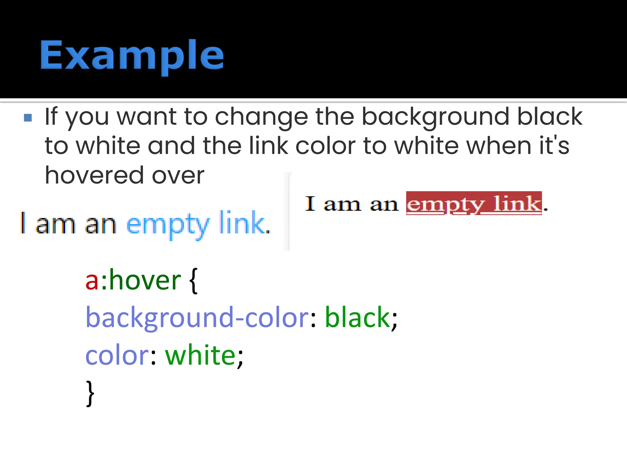
If youwant to change the background black to white and the link color to white when it's hovered over a:hover { background-color: black; color: white; }
24.
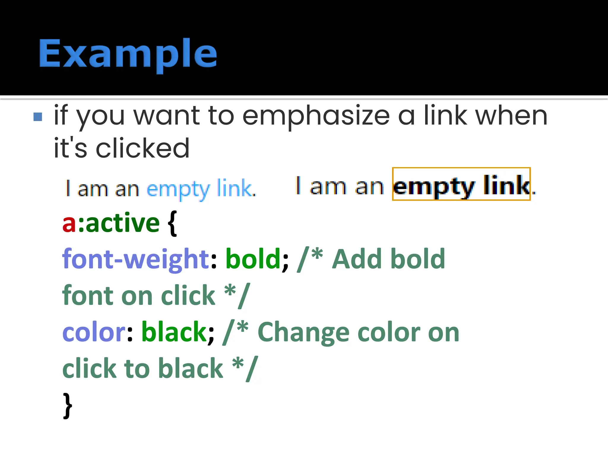
if youwant to emphasize a link when it's clicked a:active { font-weight: bold; /* Add bold font on click */ color: black; /* Change color on click to black */ }
25.
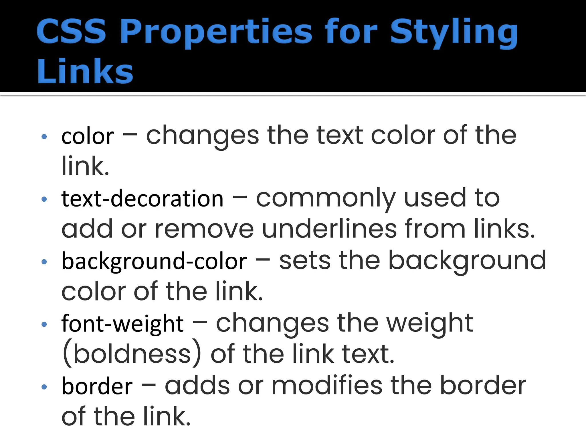
• color –changes the text color of the link. • text-decoration – commonly used to add or remove underlines from links. • background-color – sets the background color of the link. • font-weight – changes the weight (boldness) of the link text. • border – adds or modifies the border of the link.
26.
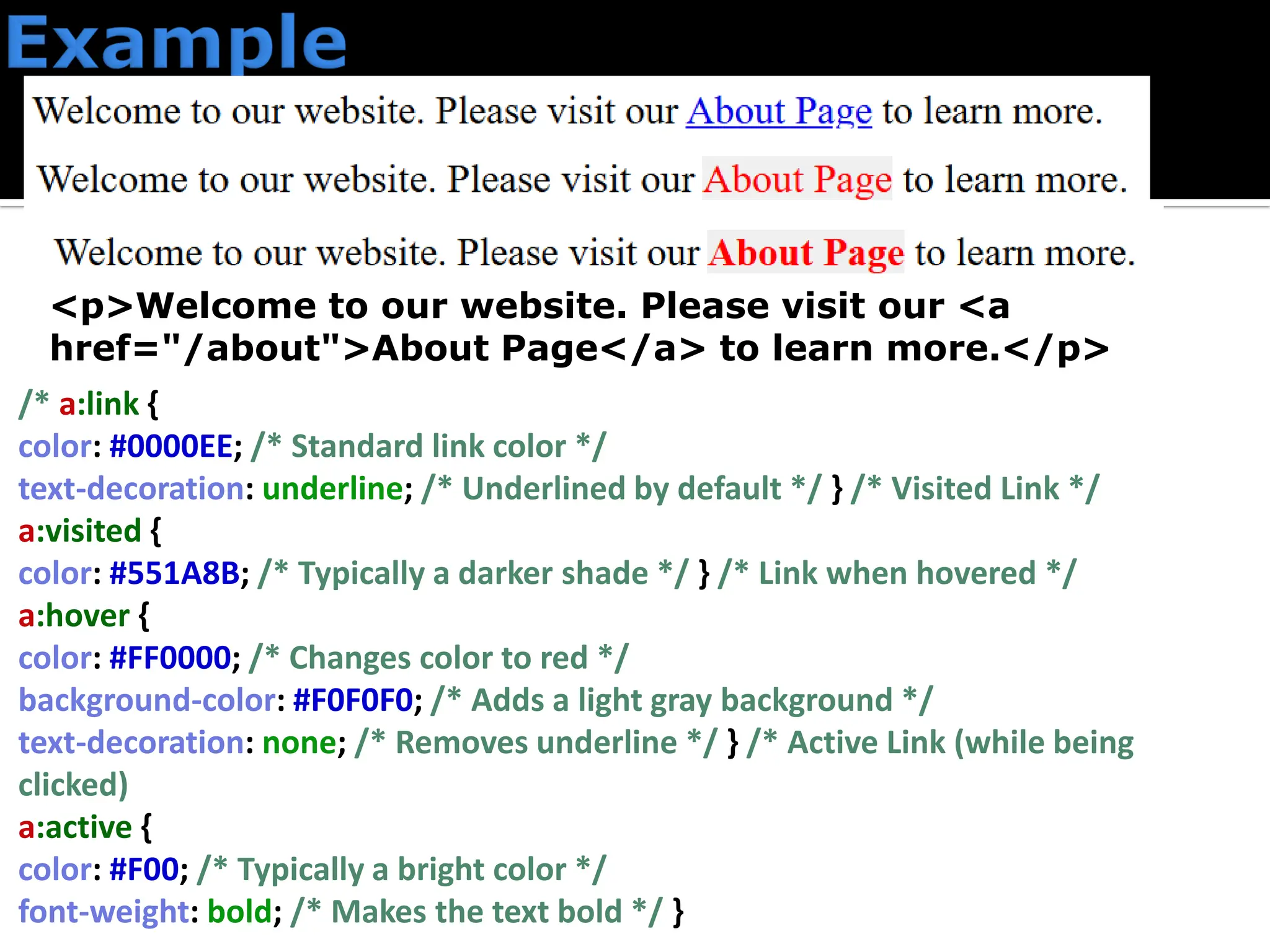
<p>Welcome to ourwebsite. Please visit our <a href="/about">About Page</a> to learn more.</p> /* a:link { color: #0000EE; /* Standard link color */ text-decoration: underline; /* Underlined by default */ } /* Visited Link */ a:visited { color: #551A8B; /* Typically a darker shade */ } /* Link when hovered */ a:hover { color: #FF0000; /* Changes color to red */ background-color: #F0F0F0; /* Adds a light gray background */ text-decoration: none; /* Removes underline */ } /* Active Link (while being clicked) a:active { color: #F00; /* Typically a bright color */ font-weight: bold; /* Makes the text bold */ }
28.
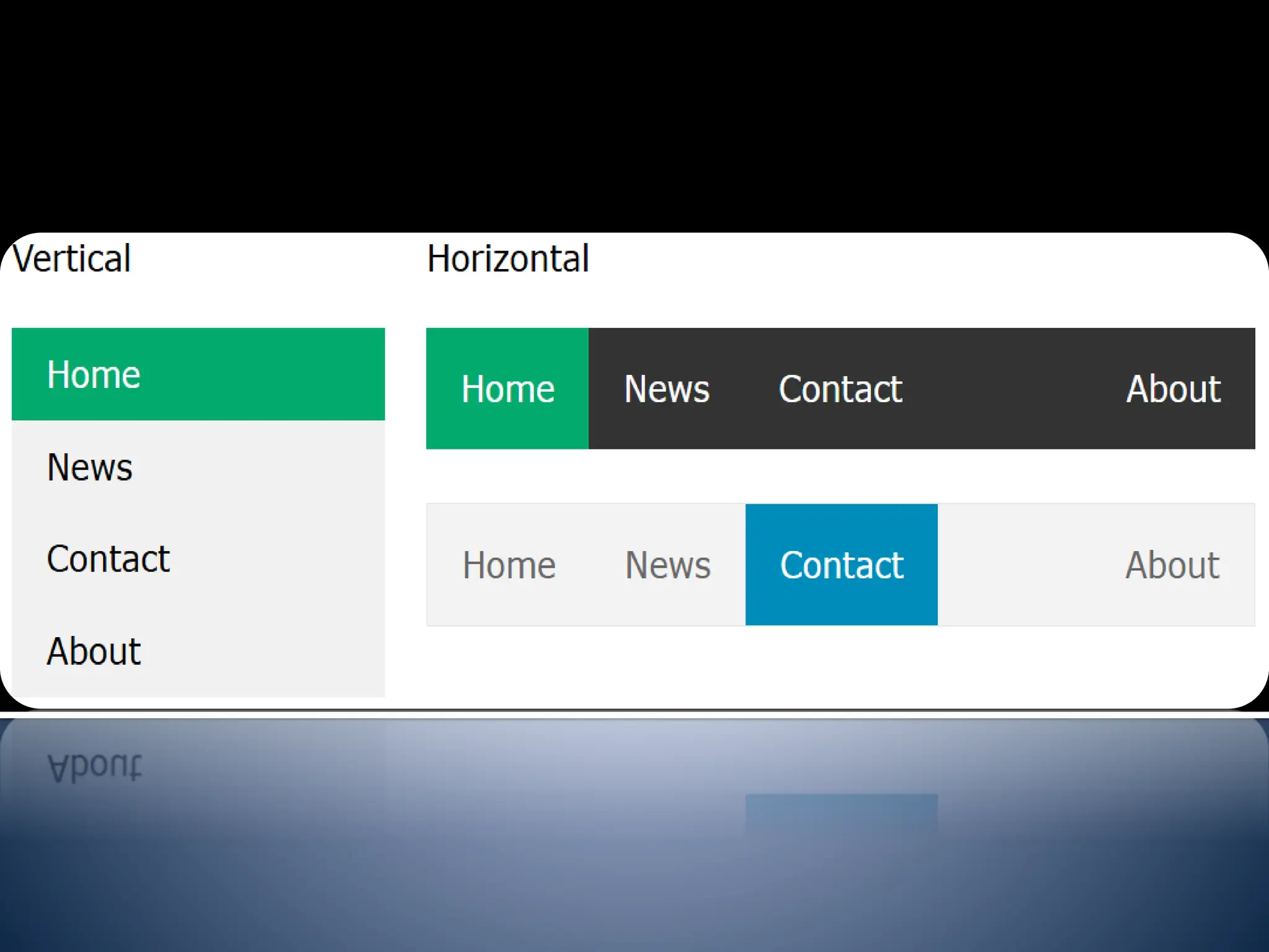
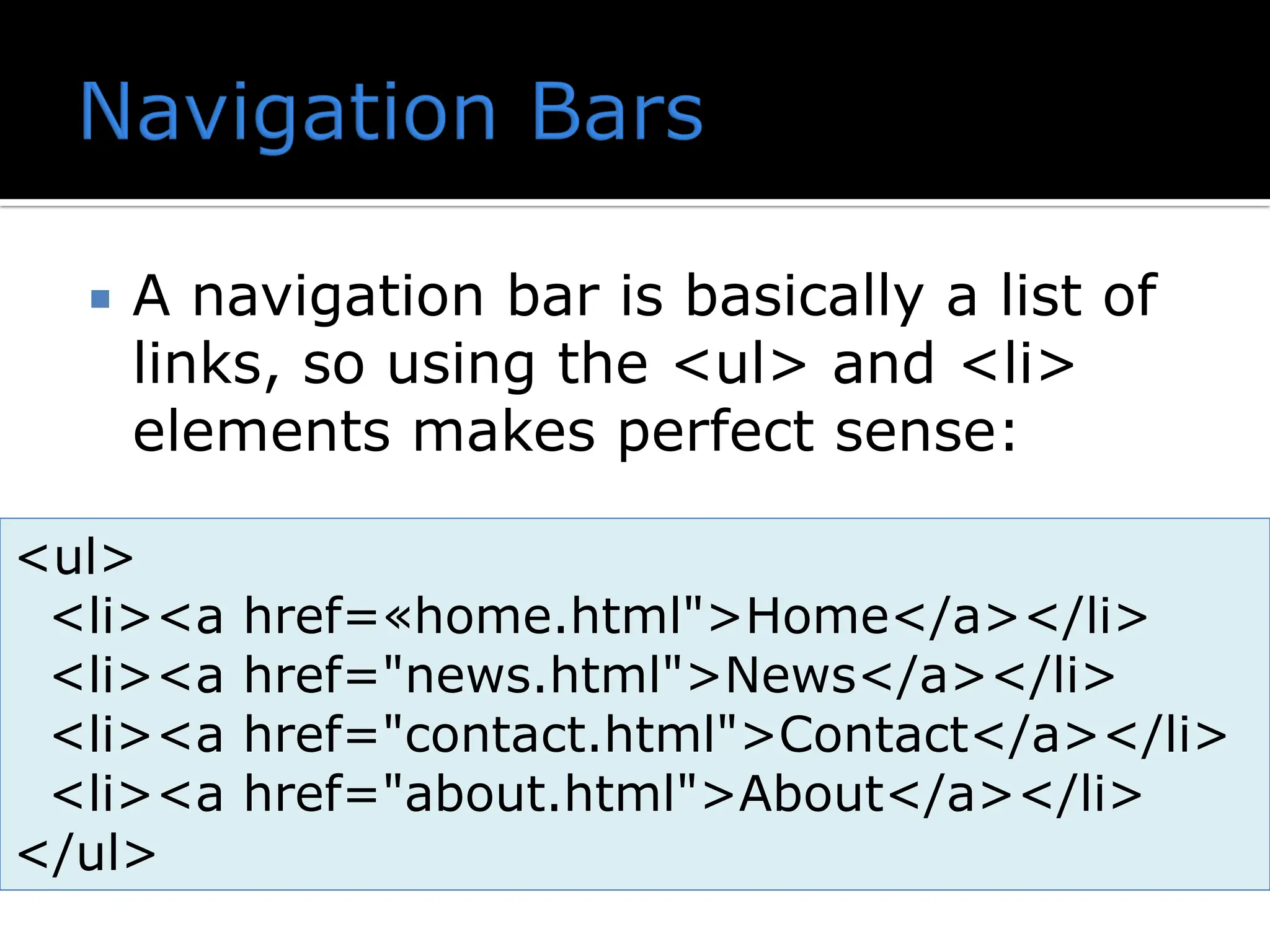
Having easy-to-usenavigation is important for any web site. With CSS you can transform boring HTML menus into good-looking navigation bars. A navigation bar needs standard HTML as a base. Navigation Bar = List of Links
29.
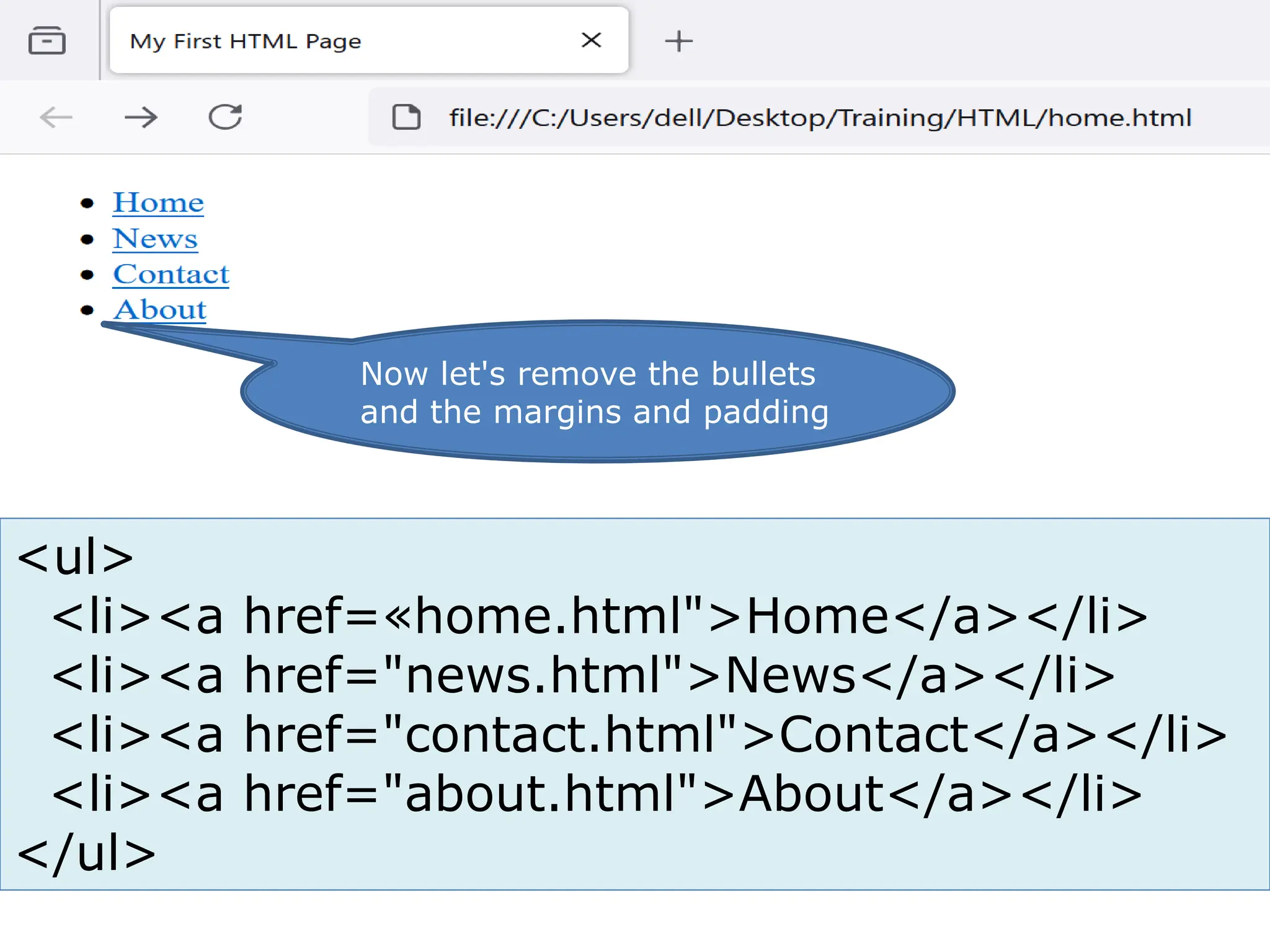
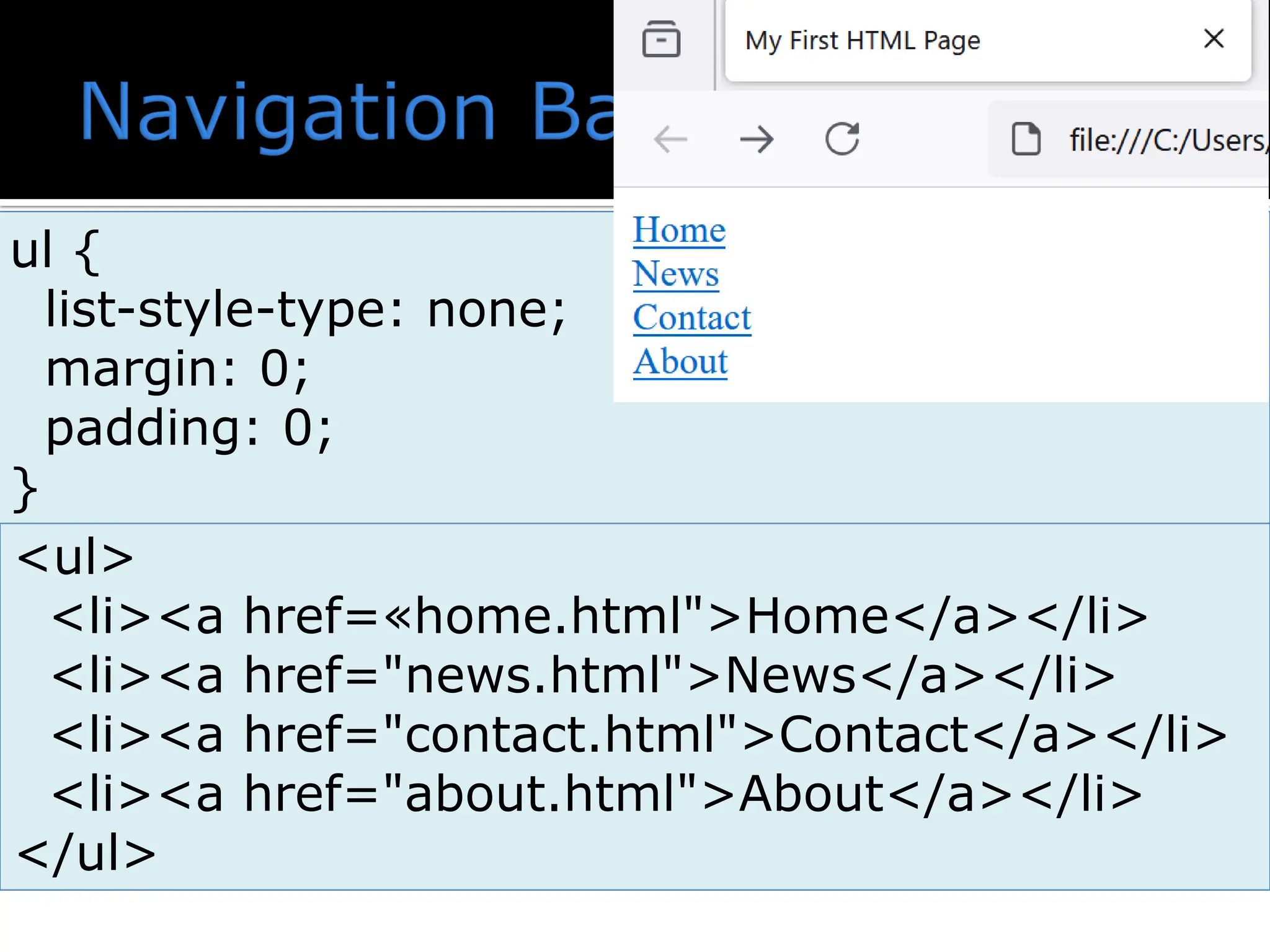
A navigationbar is basically a list of links, so using the <ul> and <li> elements makes perfect sense: <ul> <li><a href=«home.html">Home</a></li> <li><a href="news.html">News</a></li> <li><a href="contact.html">Contact</a></li> <li><a href="about.html">About</a></li> </ul>
list-style-type: none;- Removes the bullets. A navigation bar does not need list markers Set margin: 0; and padding: 0; to remove browser default settings
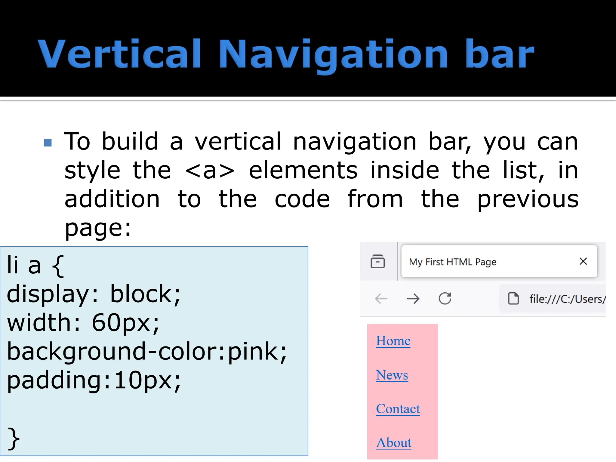
33.
To builda vertical navigation bar, you can style the <a> elements inside the list, in addition to the code from the previous page: li a { display: block; width: 60px; background-color:pink; padding:10px; }
34.
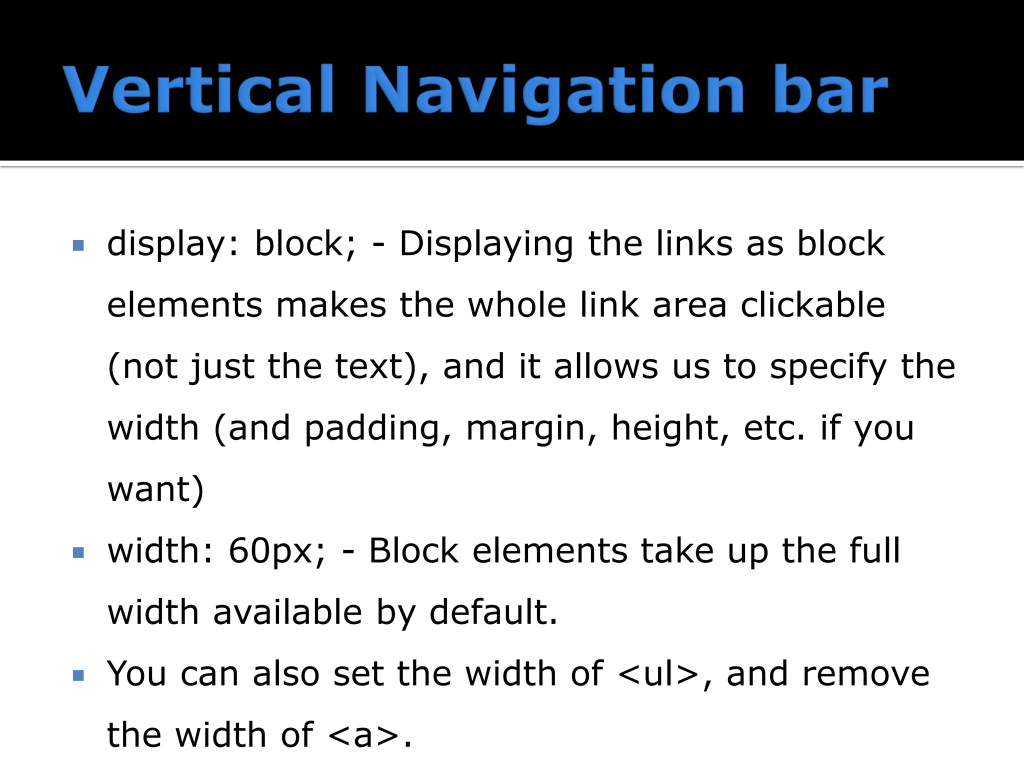
display: block;- Displaying the links as block elements makes the whole link area clickable (not just the text), and it allows us to specify the width (and padding, margin, height, etc. if you want) width: 60px; - Block elements take up the full width available by default. You can also set the width of <ul>, and remove the width of <a>.
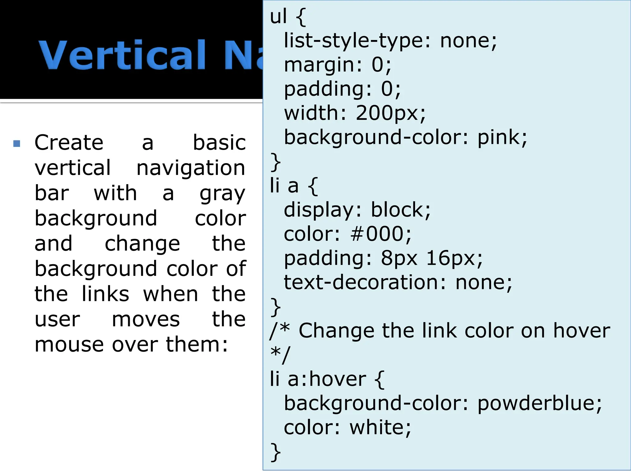
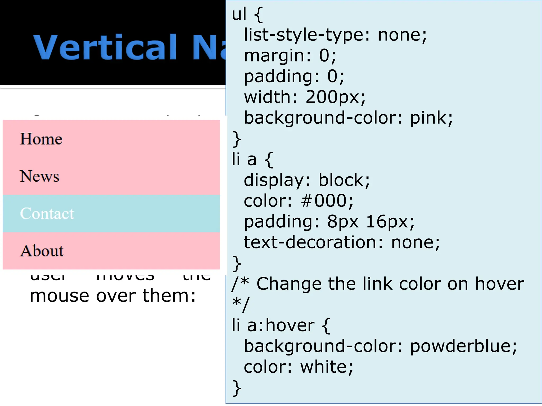
35.
Create abasic vertical navigation bar with a gray background color and change the background color of the links when the user moves the mouse over them: ul { list-style-type: none; margin: 0; padding: 0; width: 200px; background-color: pink; } li a { display: block; color: #000; padding: 8px 16px; text-decoration: none; } /* Change the link color on hover */ li a:hover { background-color: powderblue; color: white; }
36.
Create abasic vertical navigation bar with a gray background color and change the background color of the links when the user moves the mouse over them: ul { list-style-type: none; margin: 0; padding: 0; width: 200px; background-color: pink; } li a { display: block; color: #000; padding: 8px 16px; text-decoration: none; } /* Change the link color on hover */ li a:hover { background-color: powderblue; color: white; }
37.
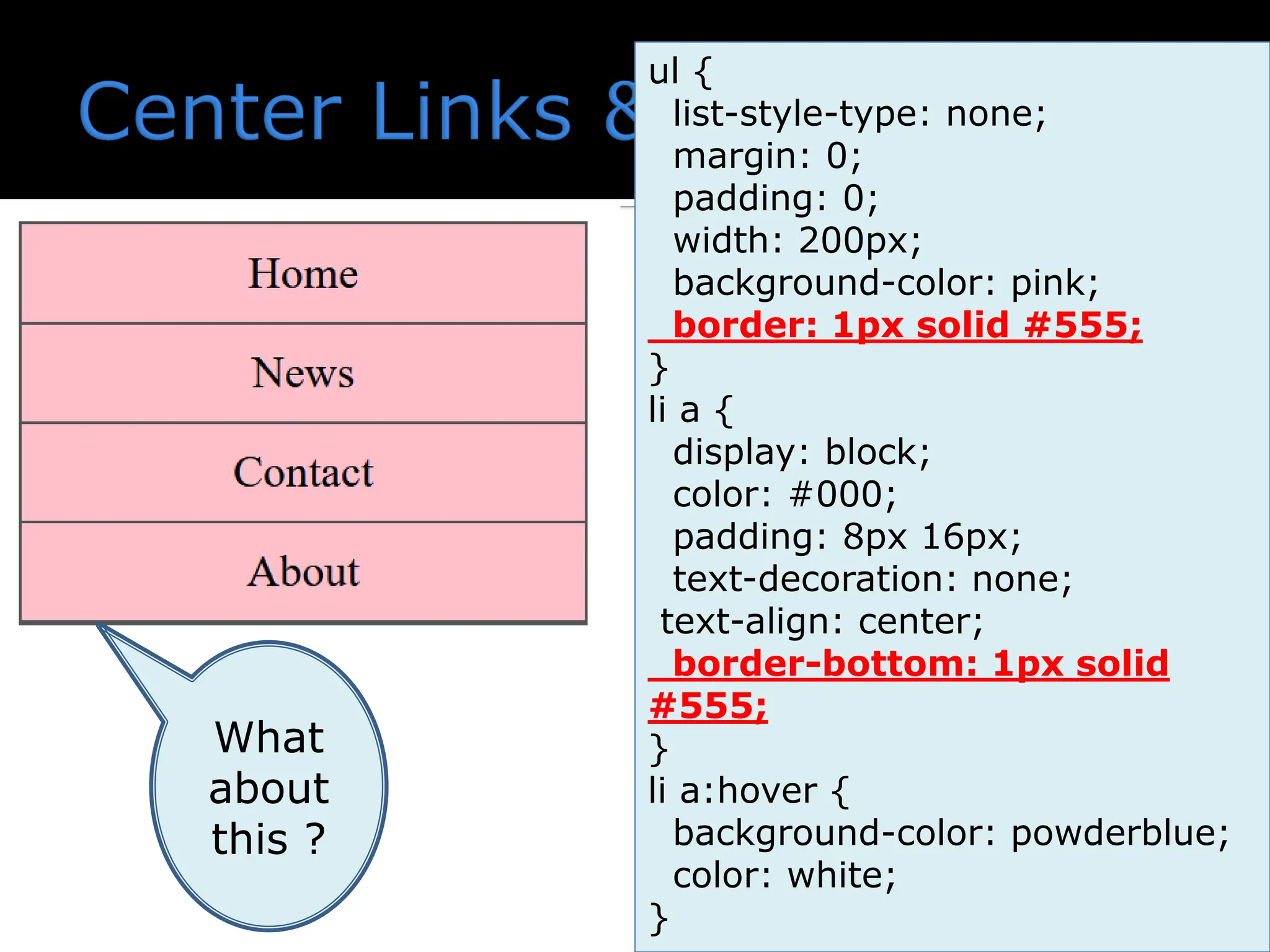
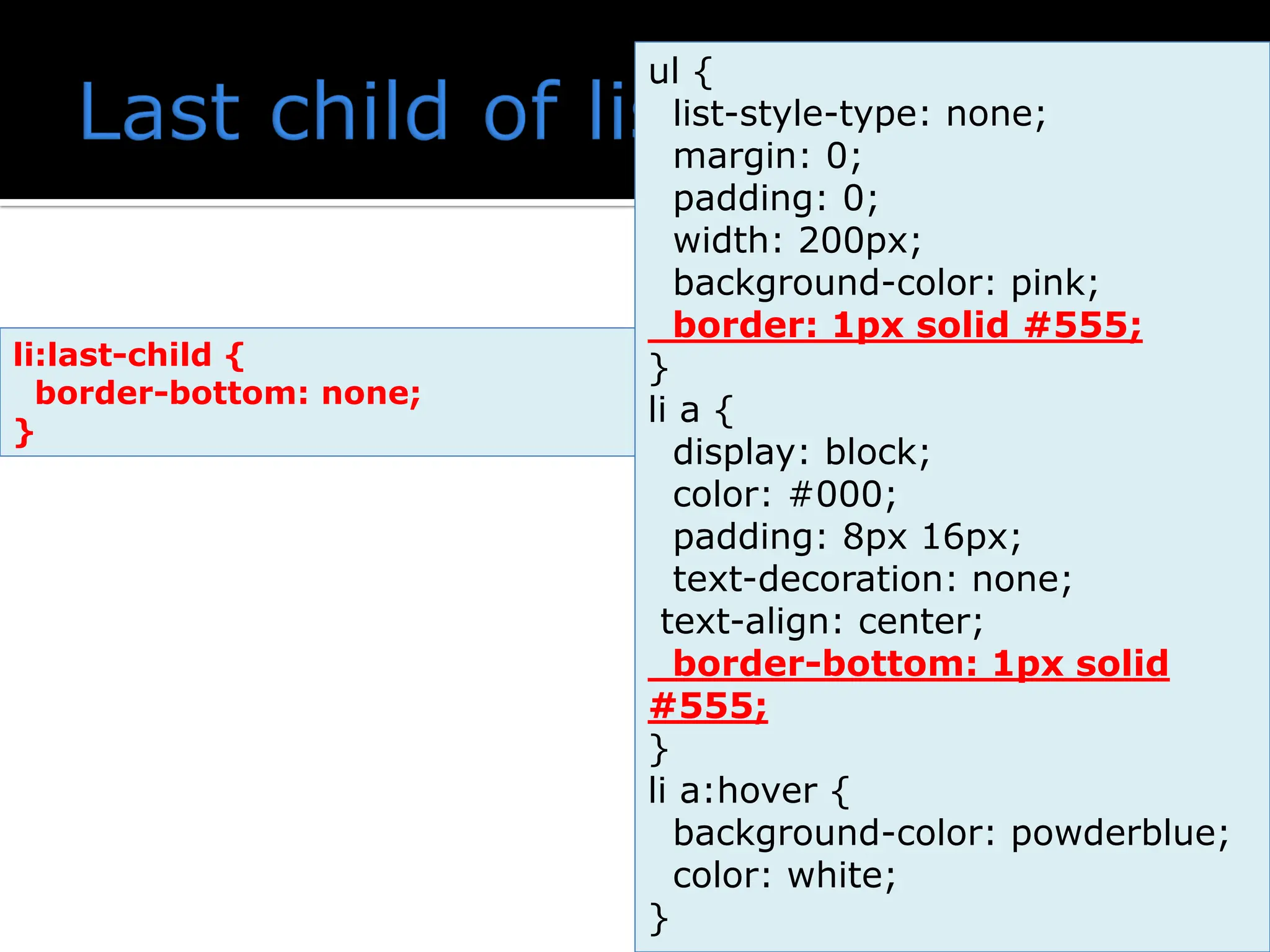
Add text-align:center to <li> or <a> to center the links. Add the border property to <ul> add a border around the navbar. If you also want borders inside the navbar, add a border-bottom to all <li> elements, except for the last one:
38.
ul { list-style-type: none; margin:0; padding: 0; width: 200px; background-color: pink; border: 1px solid #555; } li a { display: block; color: #000; padding: 8px 16px; text-decoration: none; text-align: center; border-bottom: 1px solid #555; } li a:hover { background-color: powderblue; color: white; } What about this ?
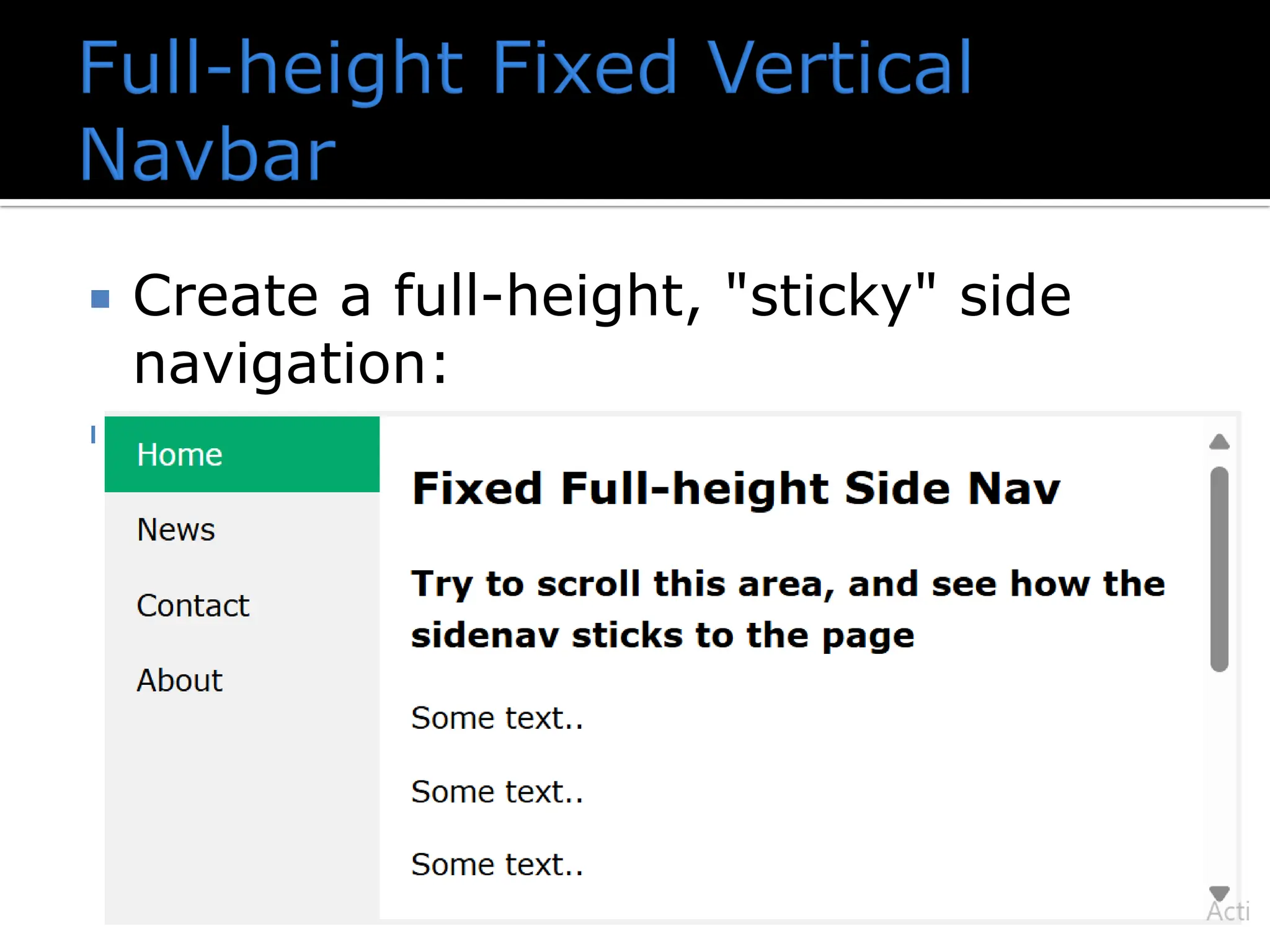
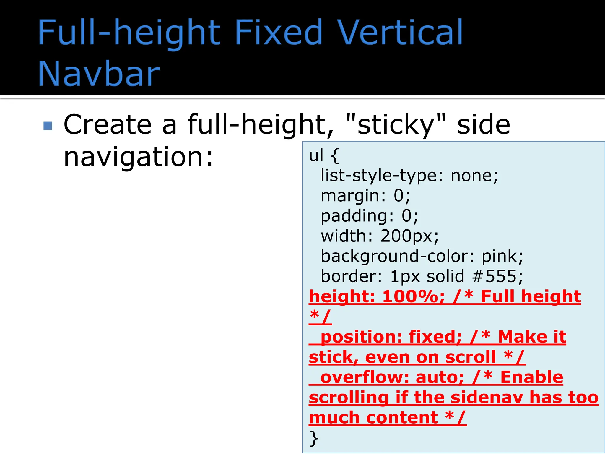
Create afull-height, "sticky" side navigation:
41.
Create afull-height, "sticky" side navigation: ul { list-style-type: none; margin: 0; padding: 0; width: 200px; background-color: pink; border: 1px solid #555; height: 100%; /* Full height */ position: fixed; /* Make it stick, even on scroll */ overflow: auto; /* Enable scrolling if the sidenav has too much content */ }
43.
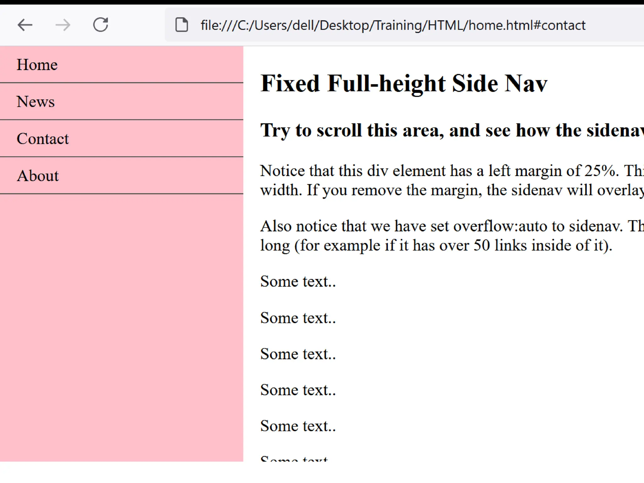
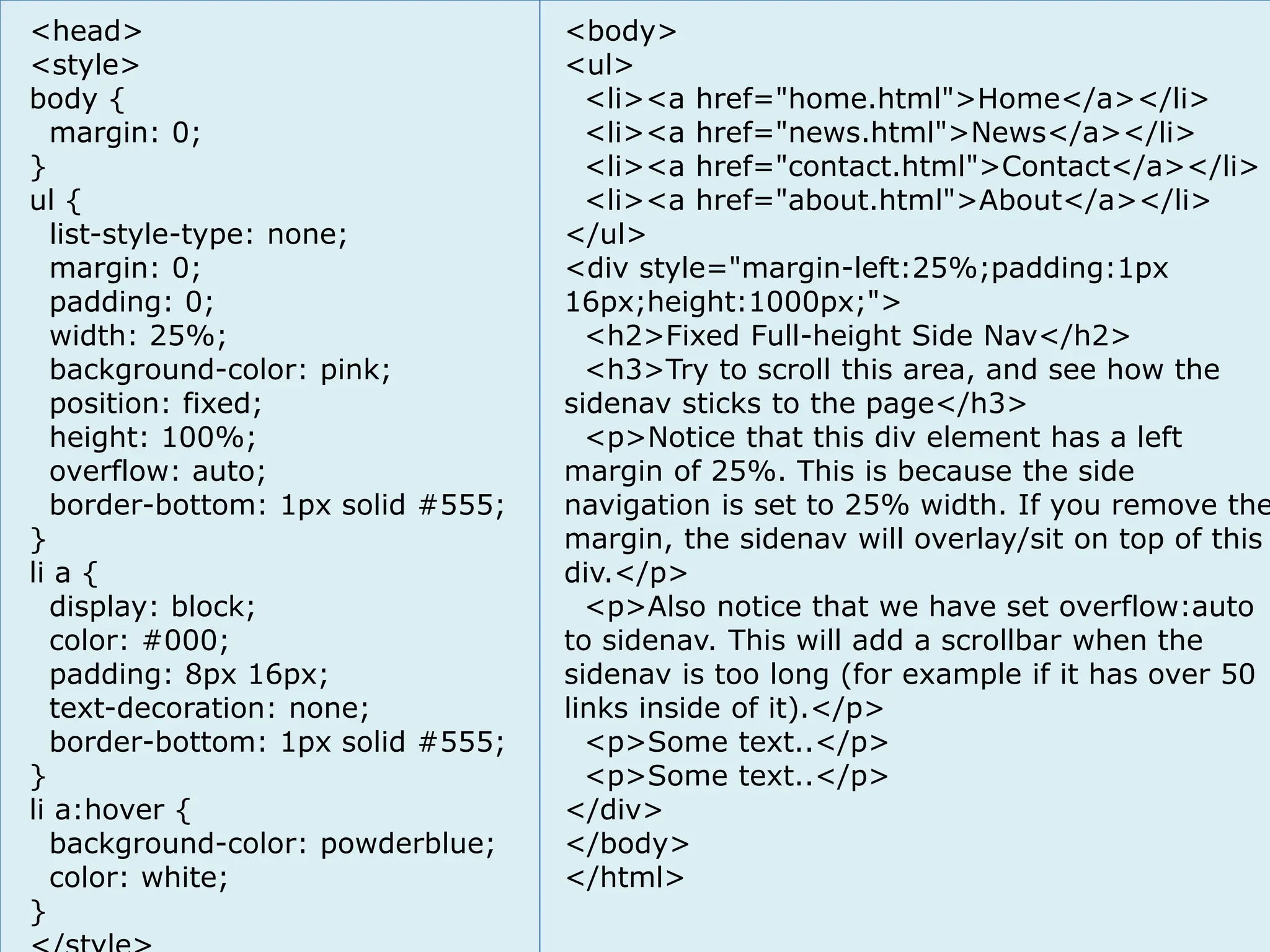
<head> <style> body { margin: 0; } ul{ list-style-type: none; margin: 0; padding: 0; width: 25%; background-color: pink; position: fixed; height: 100%; overflow: auto; border-bottom: 1px solid #555; } li a { display: block; color: #000; padding: 8px 16px; text-decoration: none; border-bottom: 1px solid #555; } li a:hover { background-color: powderblue; color: white; } <body> <ul> <li><a href="home.html">Home</a></li> <li><a href="news.html">News</a></li> <li><a href="contact.html">Contact</a></li> <li><a href="about.html">About</a></li> </ul> <div style="margin-left:25%;padding:1px 16px;height:1000px;"> <h2>Fixed Full-height Side Nav</h2> <h3>Try to scroll this area, and see how the sidenav sticks to the page</h3> <p>Notice that this div element has a left margin of 25%. This is because the side navigation is set to 25% width. If you remove the margin, the sidenav will overlay/sit on top of this div.</p> <p>Also notice that we have set overflow:auto to sidenav. This will add a scrollbar when the sidenav is too long (for example if it has over 50 links inside of it).</p> <p>Some text..</p> <p>Some text..</p> </div> </body> </html>
44.
форум програмиране, форумуеб дизайн курсове и уроци по програмиране, уеб дизайн – безплатно програмиране за деца – безплатни курсове и уроци безплатен SEO курс - оптимизация за търсачки уроци по уеб дизайн, HTML, CSS, JavaScript, Photoshop уроци по програмиране и уеб дизайн за ученици ASP.NET MVC курс – HTML, SQL, C#, .NET, ASP.NET MVC безплатен курс "Разработка на софтуер в cloud среда" BG Coder - онлайн състезателна система - online judge курсове и уроци по програмиране, книги – безплатно от Наков безплатен курс "Качествен програмен код" алго академия – състезателно програмиране, състезания ASP.NET курс - уеб програмиране, бази данни, C#, .NET, ASP.NET курсове и уроци по програмиране – Телерик академия курс мобилни приложения с iPhone, Android, WP7, PhoneGap free C# book, безплатна книга C#, книга Java, книга C# Дончо Минков - сайт за програмиране Николай Костов - блог за програмиране C# курс, програмиране, безплатно форум програмиране, форум уеб дизайн форум програмиране, форум уеб дизайн курсове и уроци по програмиране, уеб дизайн – безплатно курсове и уроци по програмиране,уеб дизайн – безплатно програмиране за деца – безплатни курсове и уроци програмиранеза деца – безплатни курсове и уроци безплатен SEO курс - оптимизация за търсачки безплатен SEO курс - оптимизация за търсачки уроци по уеб дизайн, HTML, CSS, JavaScript, Photoshop уроци по уеб дизайн, HTML, CSS, JavaScript, Photoshop уроци по програмиране и уеб дизайн за ученици уроци по програмиранеи уеб дизайн за ученици ASP.NET MVC курс – HTML, SQL, C#, .NET, ASP.NET MVC ASP.NET MVC курс – HTML, SQL, C#, .NET, ASP.NET MVC безплатен курс "Разработка на софтуер в cloud среда" безплатен курс"Разработка на софтуер в cloud среда" BG Coder - онлайн състезателна система - online judge BG Coder - онлайн състезателна система - online judge курсове и уроци по програмиране, книги – безплатно от Наков курсове и уроци по програмиране, книги – безплатно от Наков безплатен курс "Качествен програмен код" безплатен курс"Качествен програменкод" алго академия – състезателно програмиране, състезания алго академия – състезателно програмиране, състезания ASP.NET курс - уеб програмиране, бази данни, C#, .NET, ASP.NET ASP.NET курс - уеб програмиране, бази данни, C#, .NET, ASP.NET курсове и уроци по програмиране – Телерик академия курсове и уроци по програмиране– Телерик академия курс мобилни приложения с iPhone, Android, WP7, PhoneGap курс мобилни приложения с iPhone, Android, WP7, PhoneGap free C# book, безплатна книга C#, книга Java, книга C# freeC#book, безплатна книга C#,книга Java,книга C# Дончо Минков - сайт за програмиране Дончо Минков - сайт за програмиране Николай Костов - блог за програмиране Николай Костов -блог за програмиране C# курс, програмиране, безплатно C# курс, програмиране, безплатно ? ? ? ? ? ? ? ? ? ? ? ? ? ? ? ? ? ? ? ? ?