Downloaded 130 times
![GRID TEMPLATE ROWS Defines the height of the grid rows. grid-template-rows: [row1-start] 224px [row2-start] 224px [end];](https://image.slidesharecdn.com/css-grid-180123160844/75/Introducing-CSS-Grid-11-2048.jpg)
![GRID TEMPLATE AREA Allows you to name sections of the grid. grid-template-columns: 100px auto 200px; grid-template-rows: [row1-start] 224px [row2-start] 224px [end]; grid-template-areas: "header header header" "content content sidebar";](https://image.slidesharecdn.com/css-grid-180123160844/75/Introducing-CSS-Grid-15-2048.jpg)


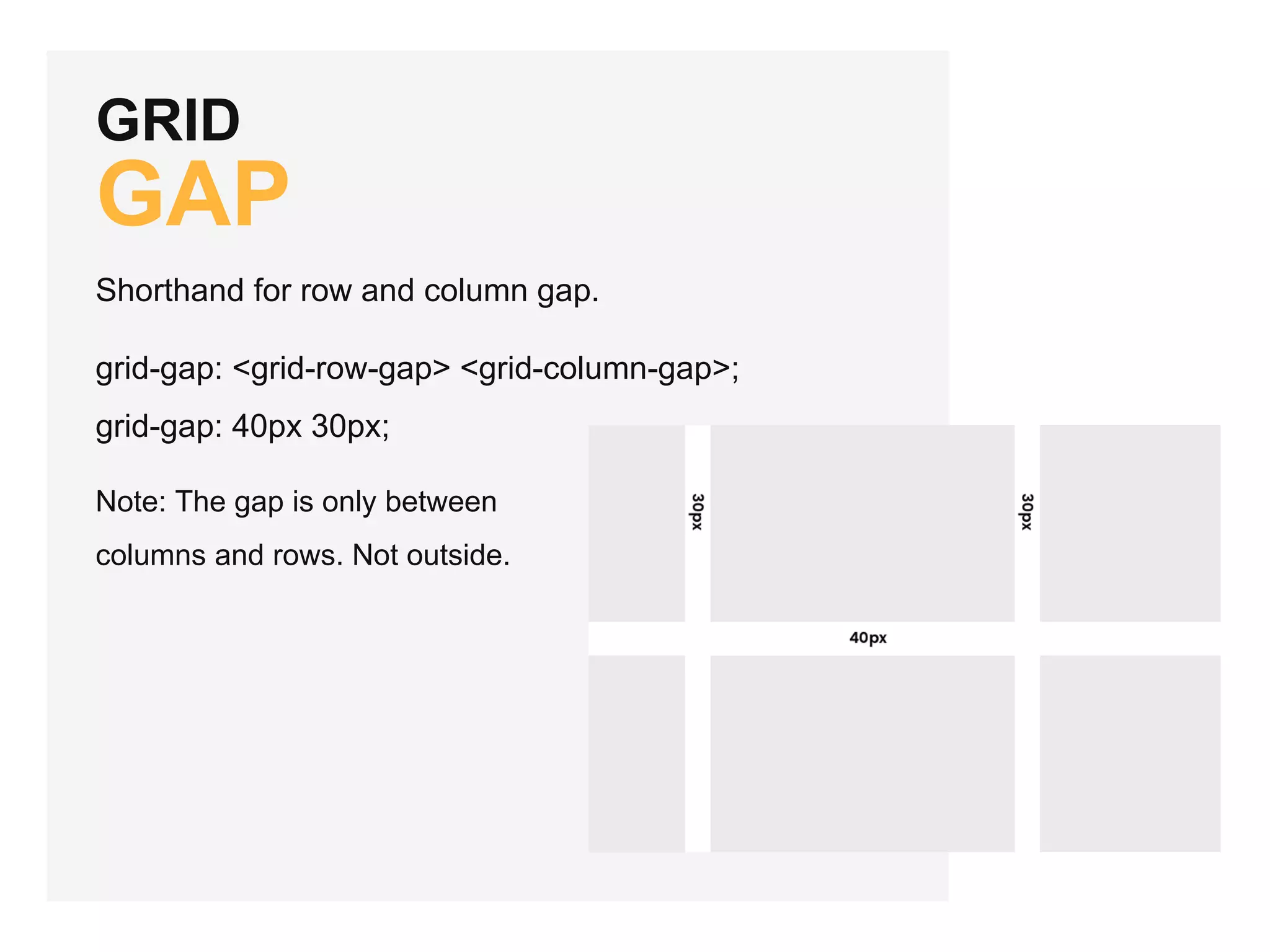
CSS Grid is a 2-dimensional layout system that manages both rows and columns, supported by all major browsers. Key concepts include grid containers, items, lines, tracks, and areas, with specific rules for defining column and row sizes, gaps, and placements. The document also discusses best practices for fallback support and provides additional resources for learning about CSS Grid.