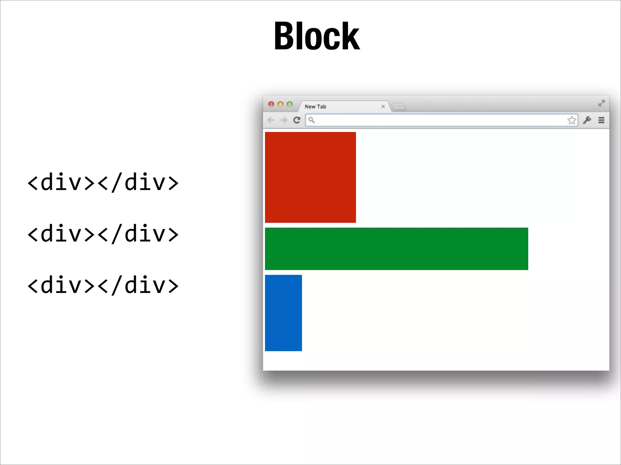
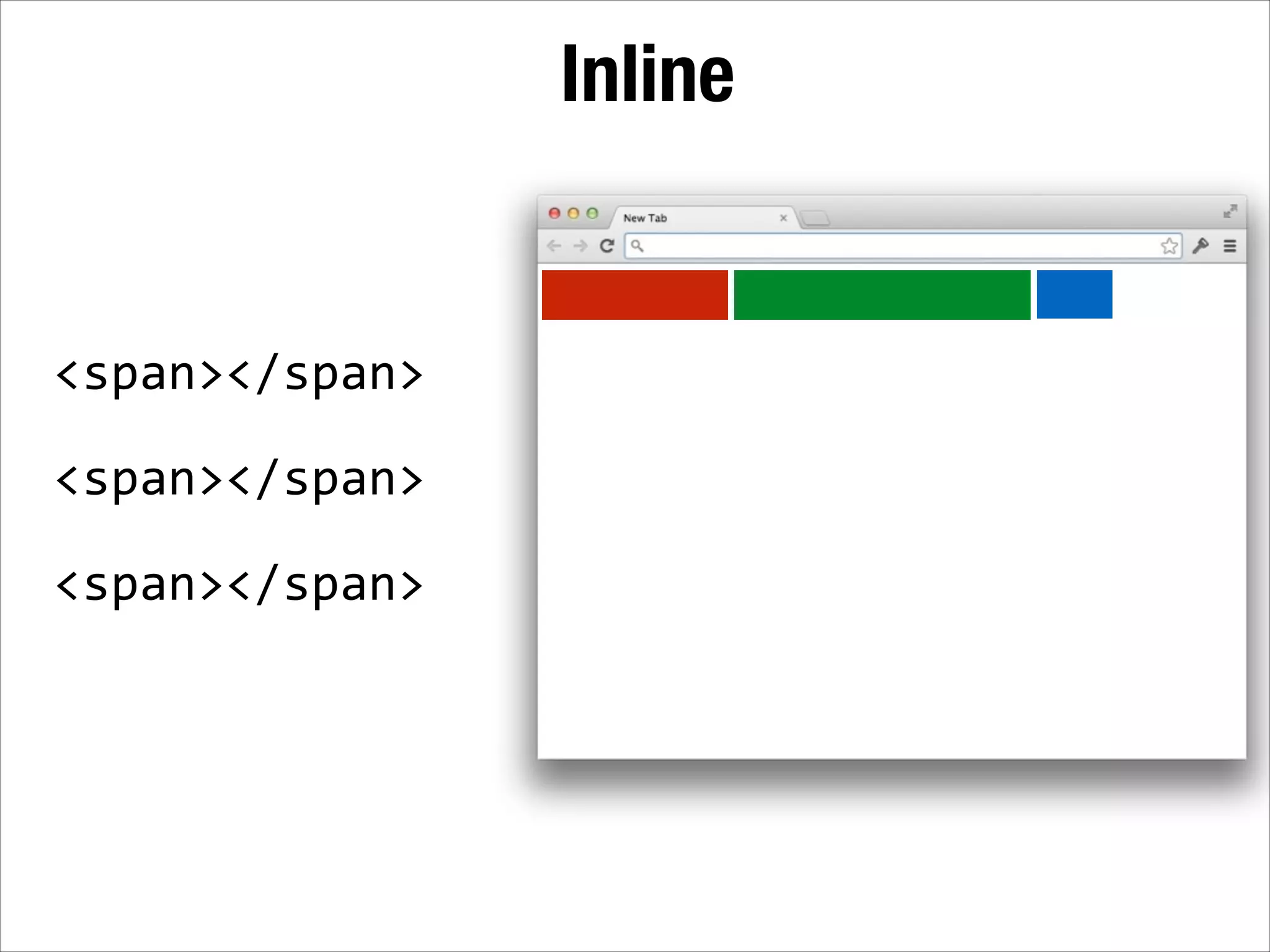
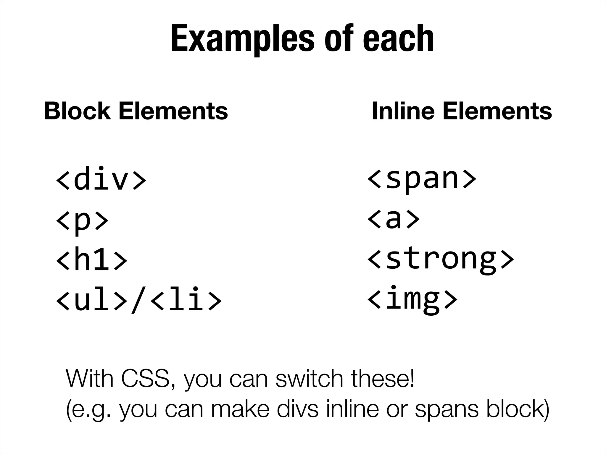
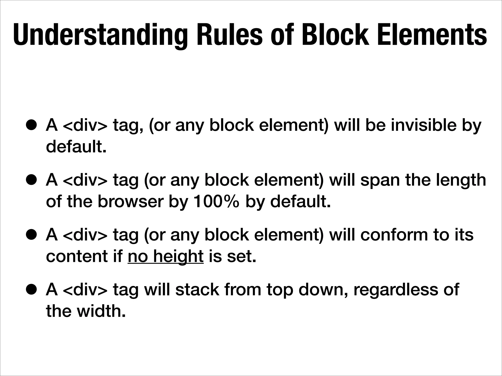
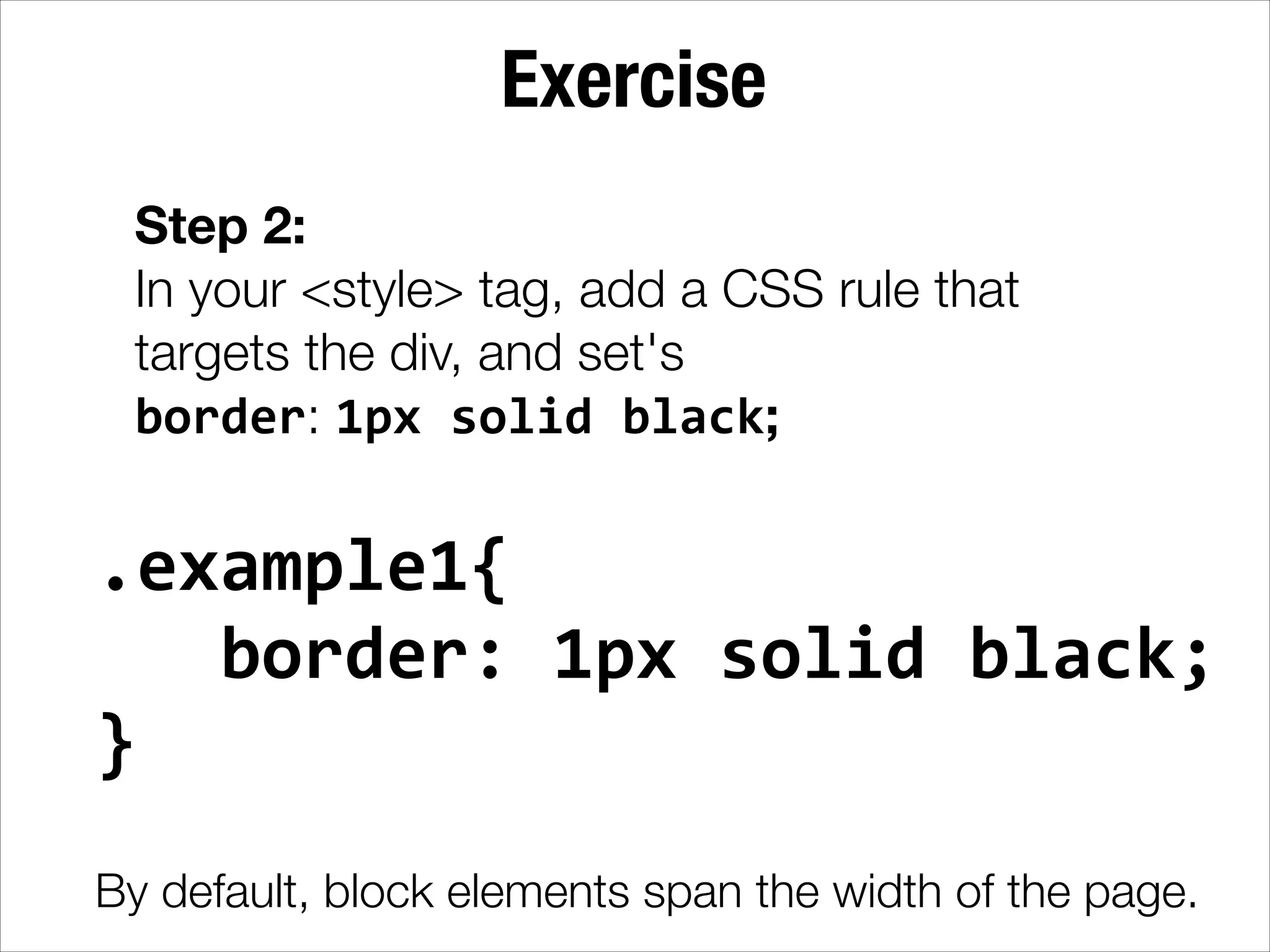
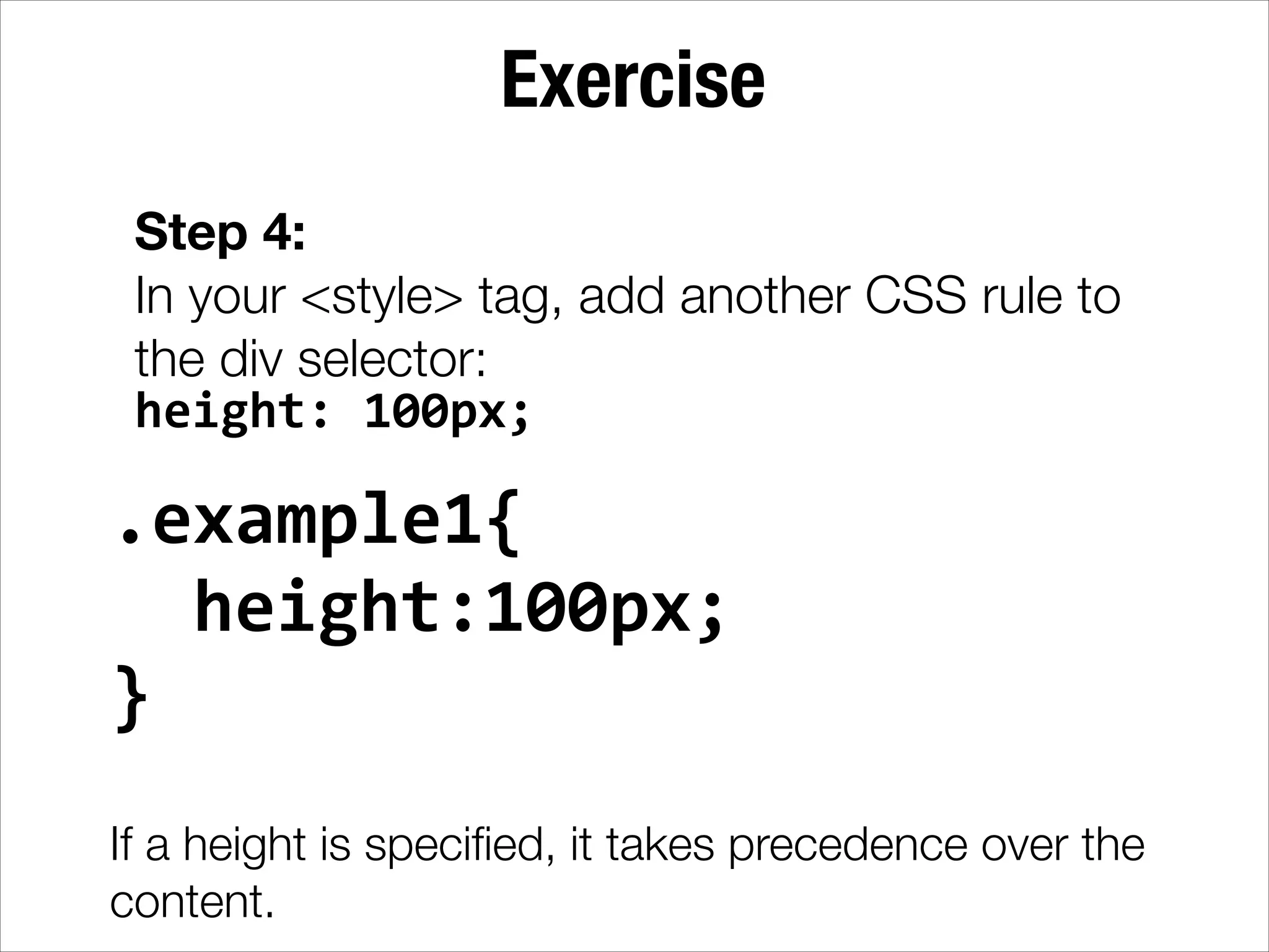
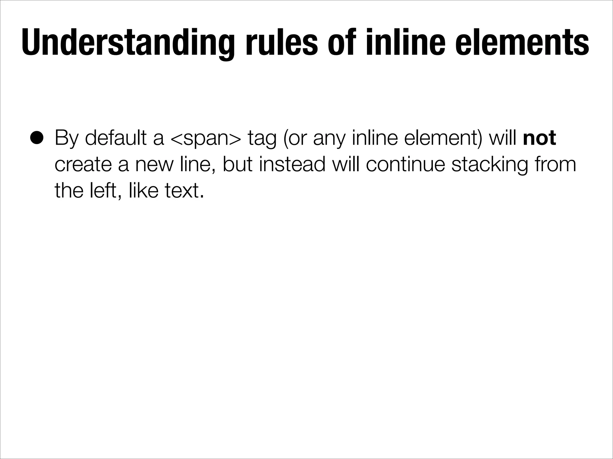
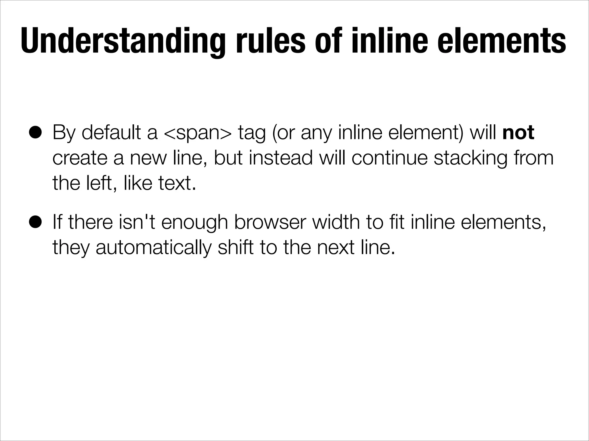
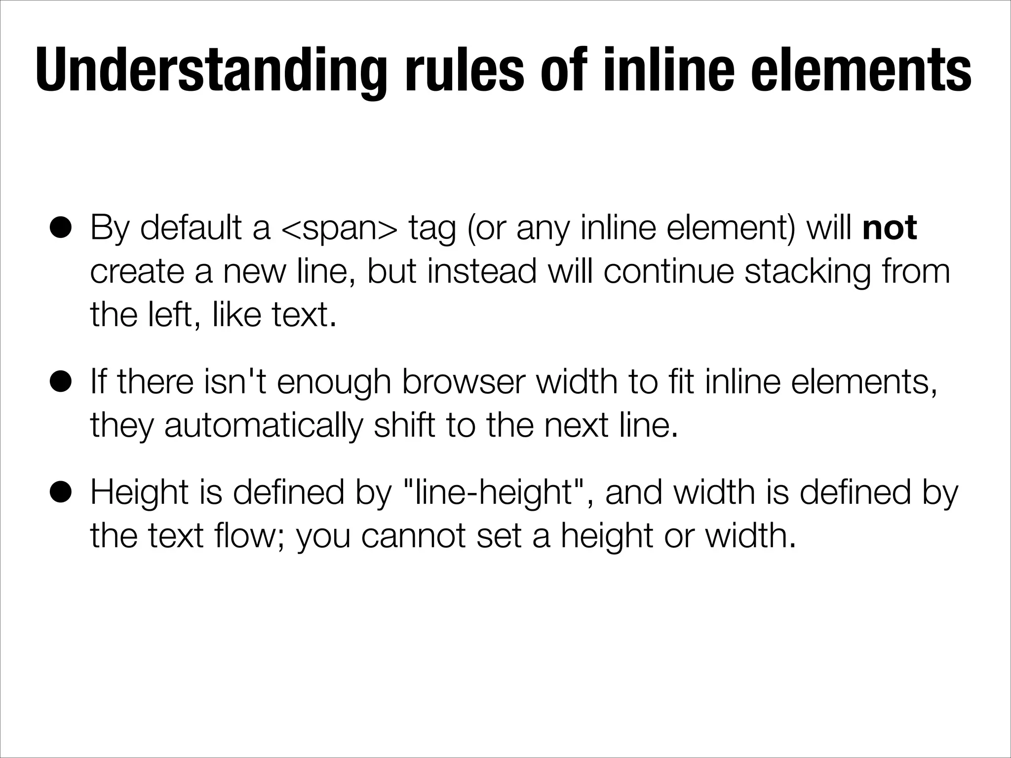
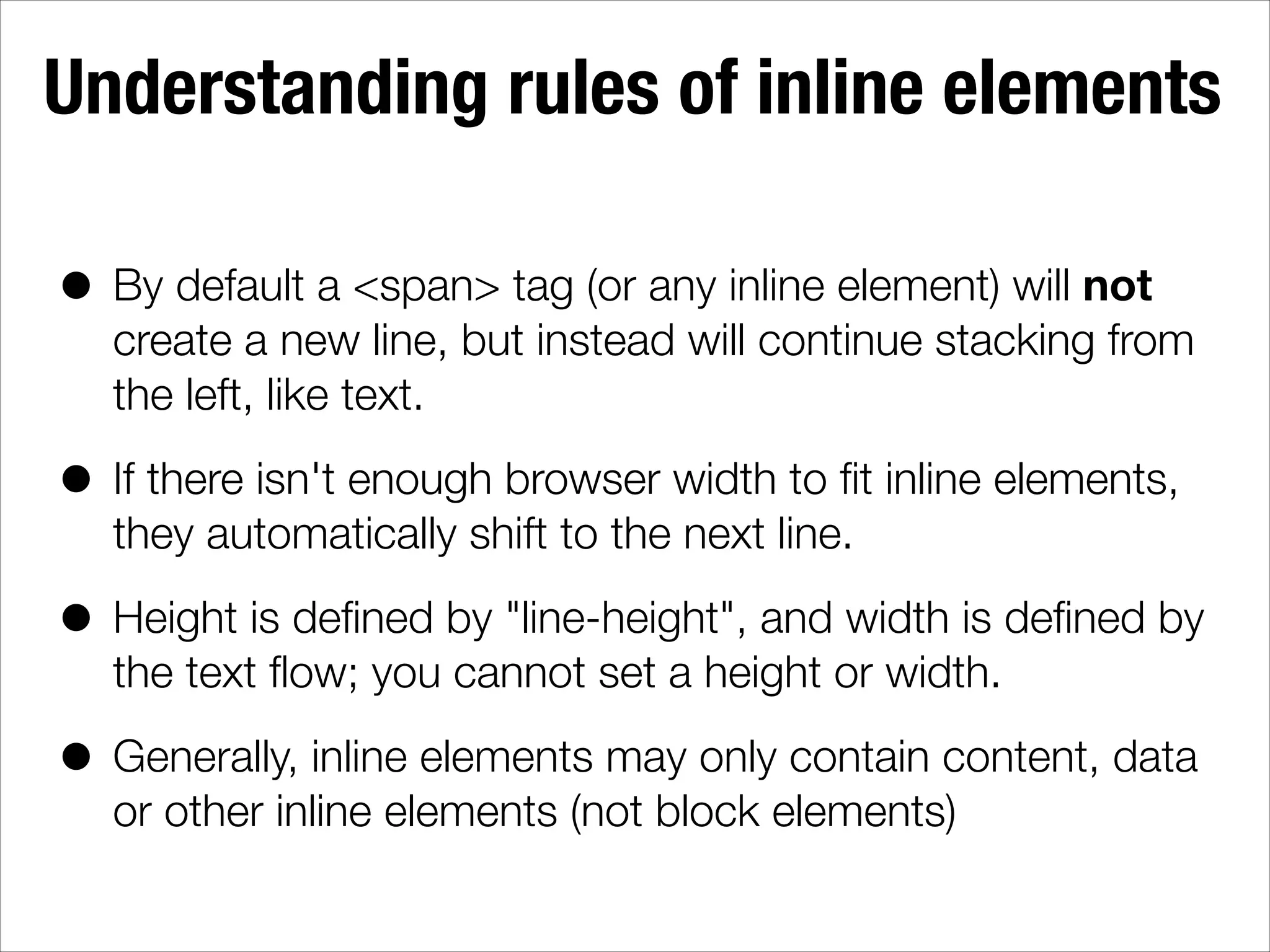
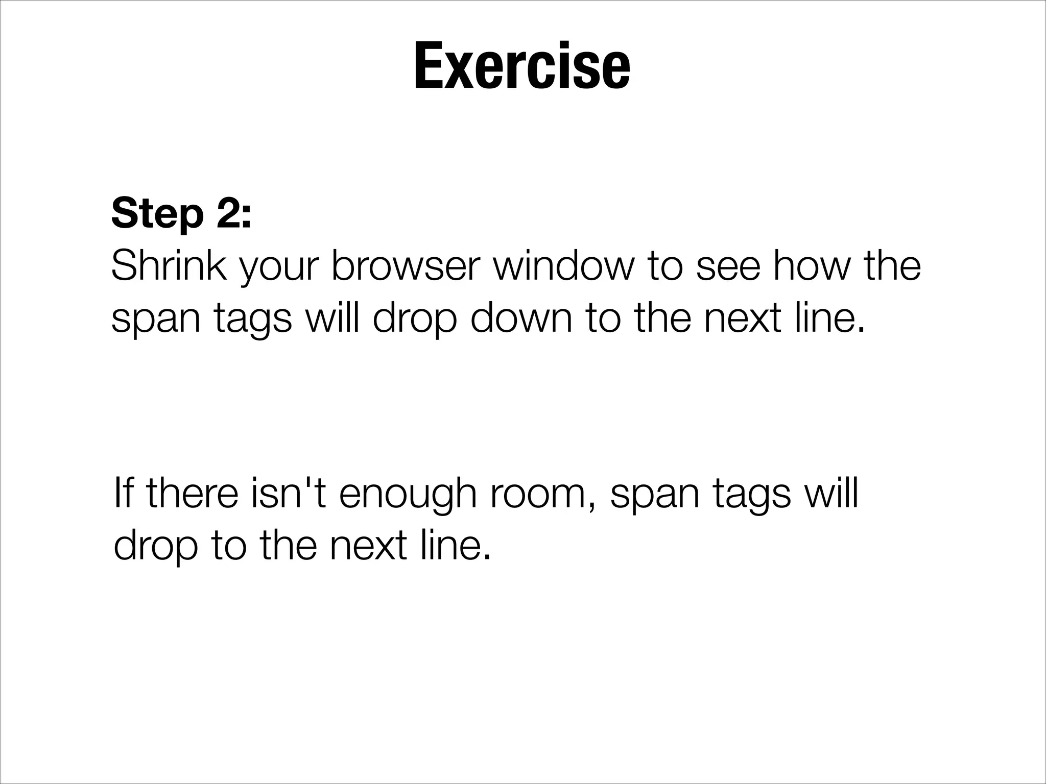
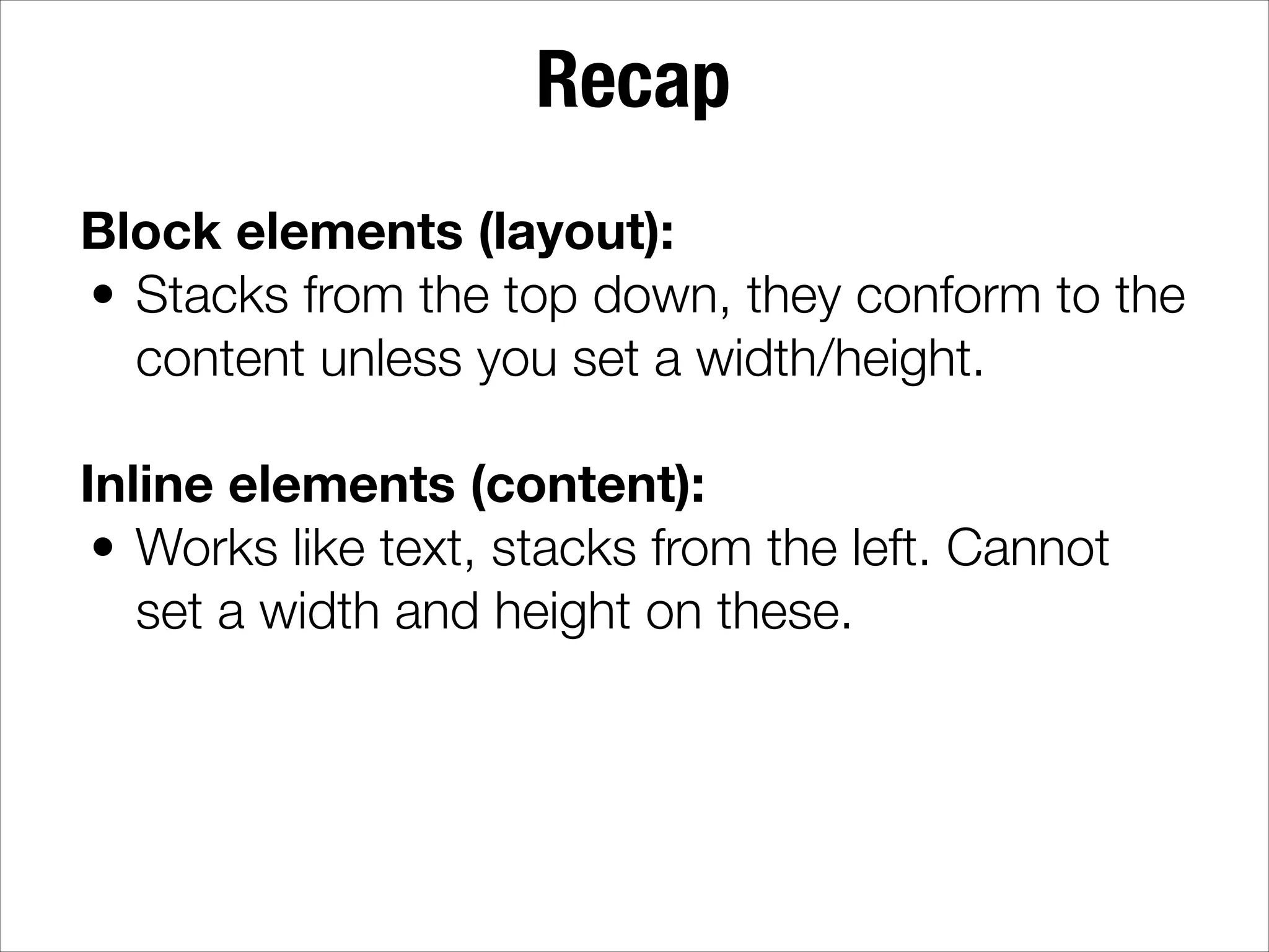
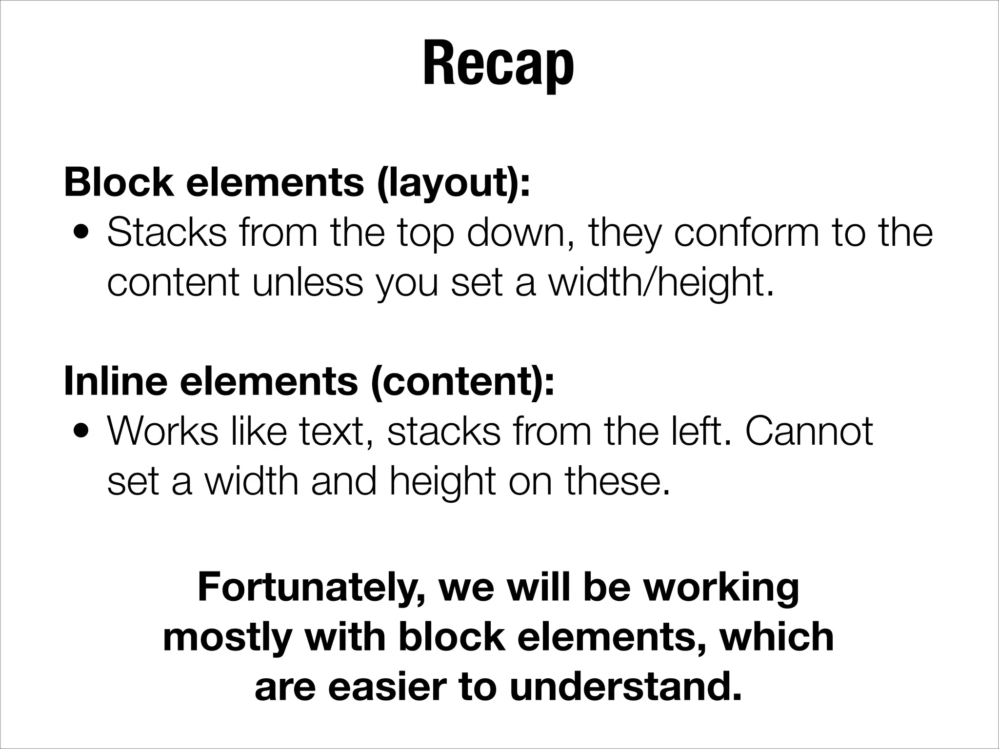
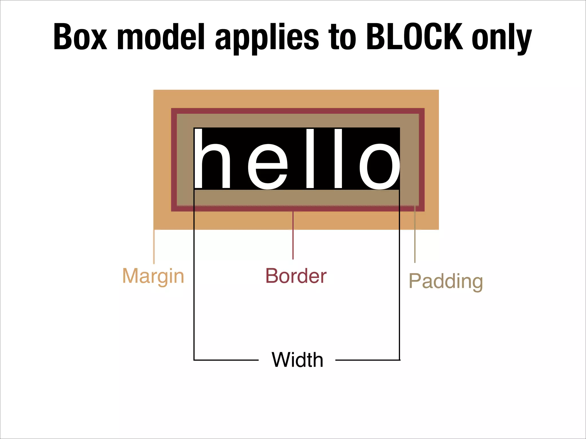
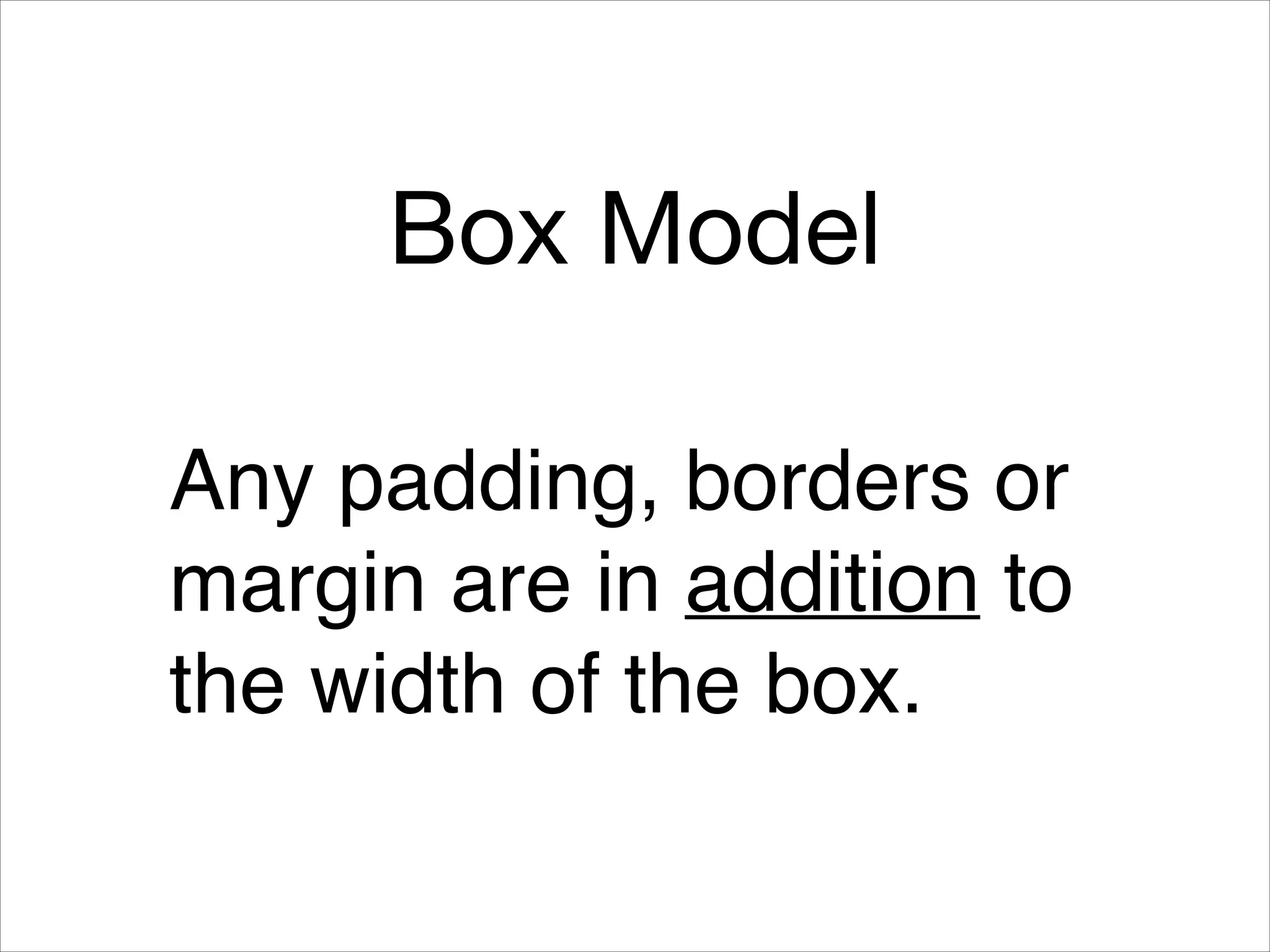
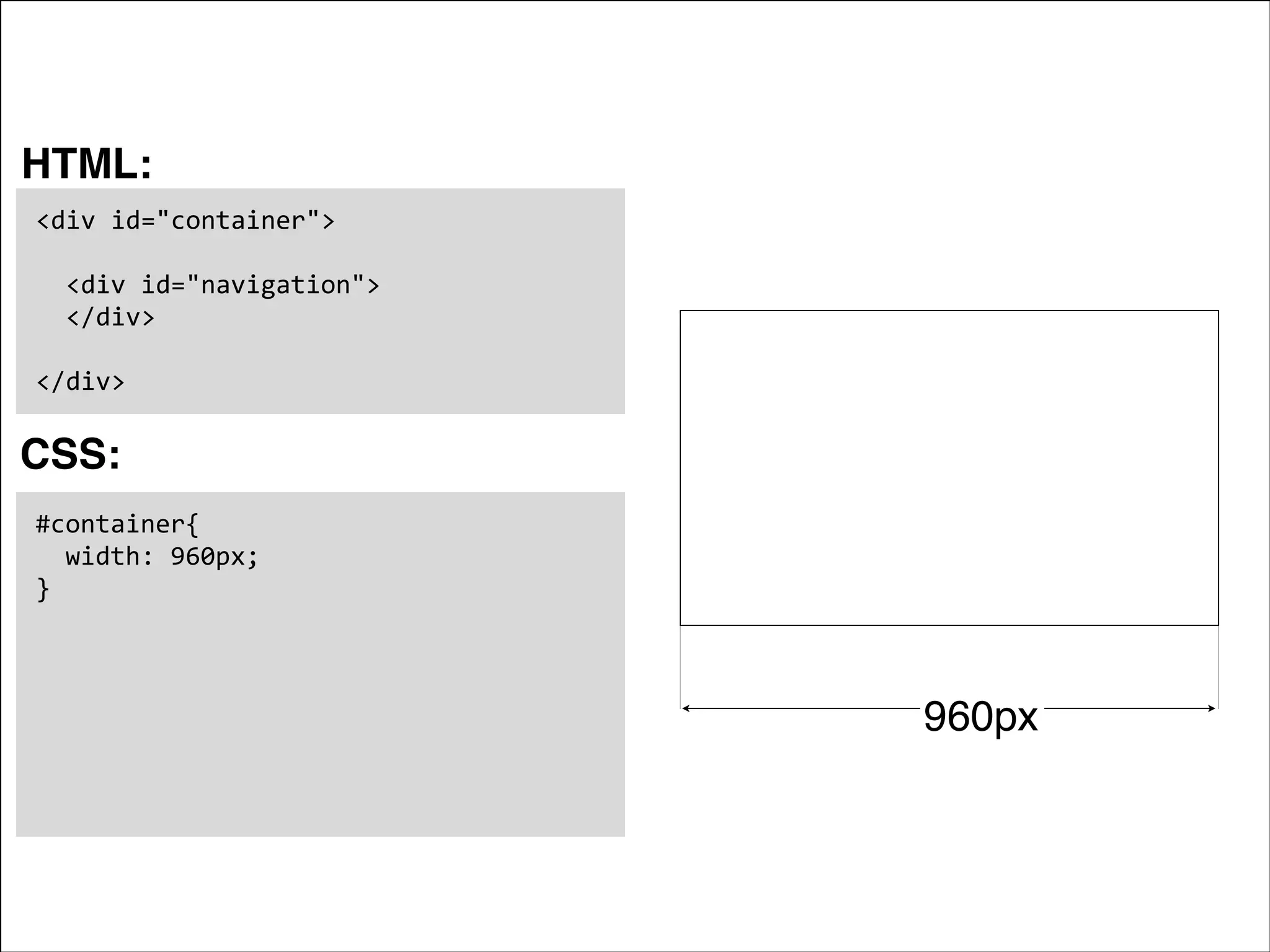
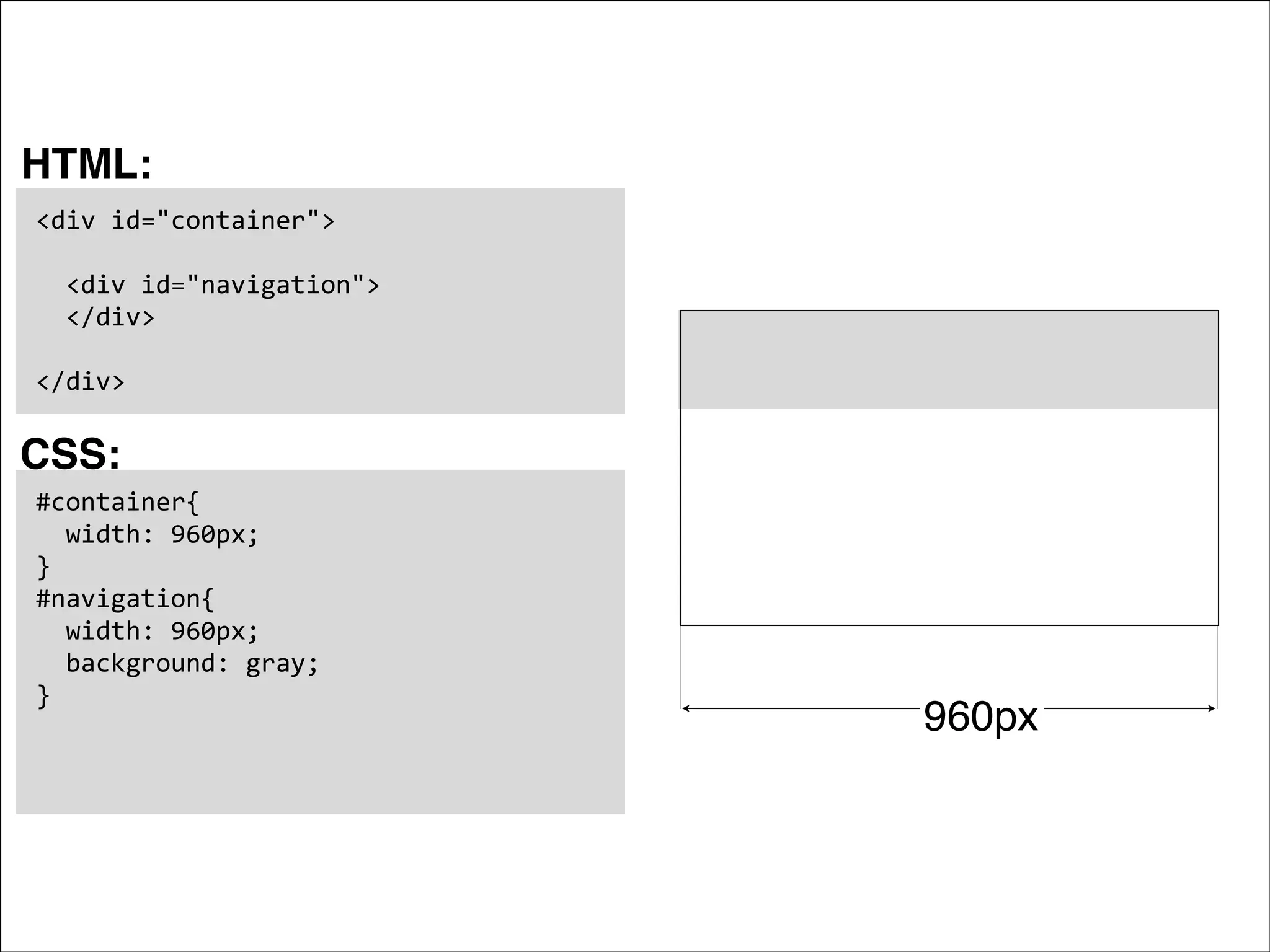
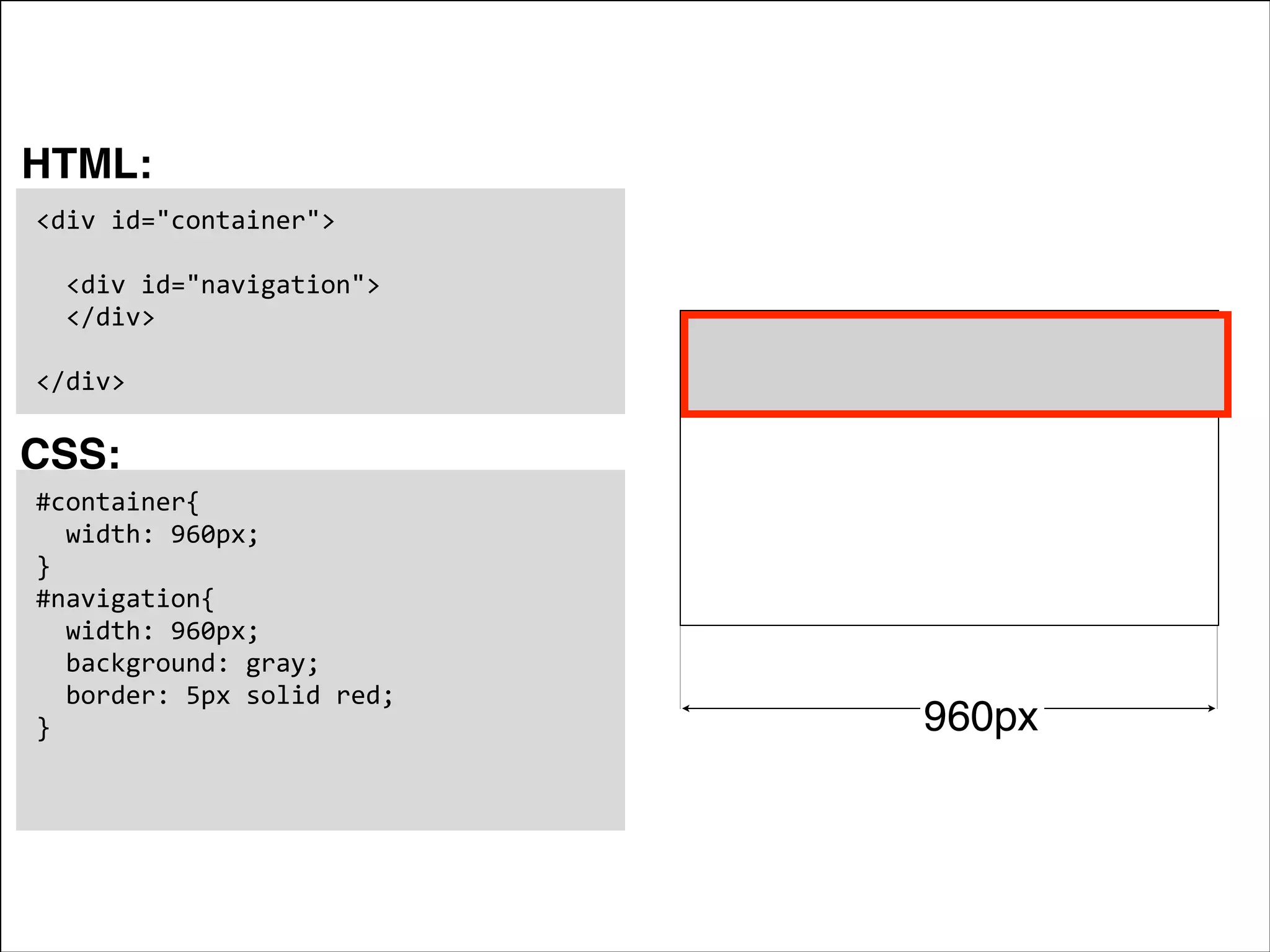
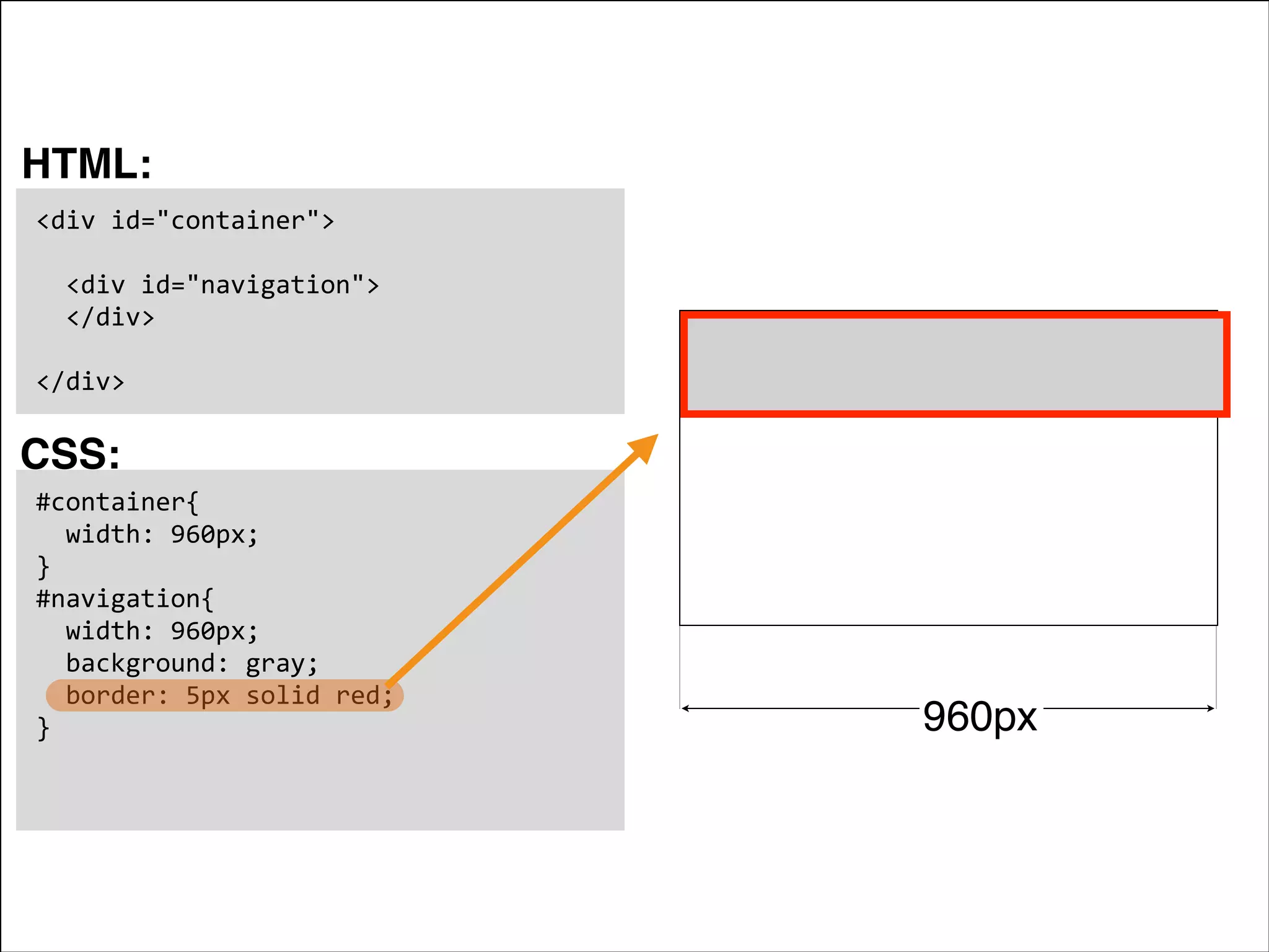
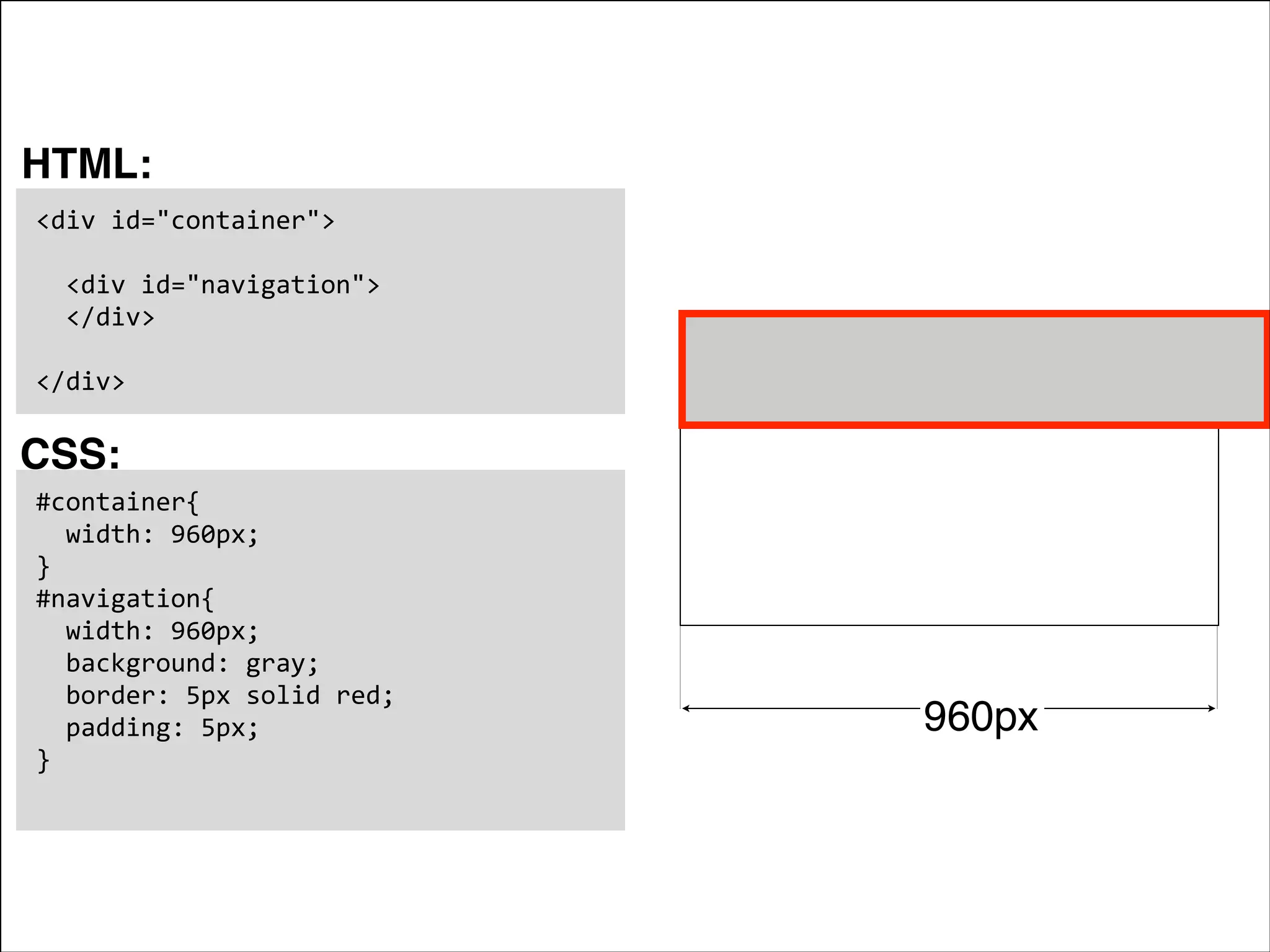
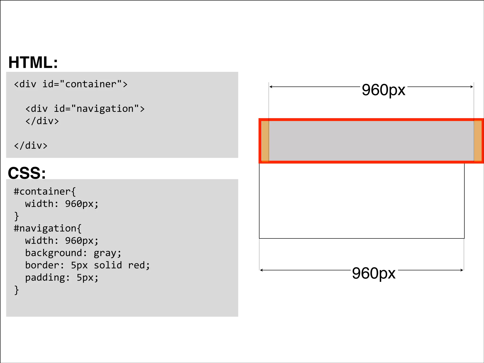
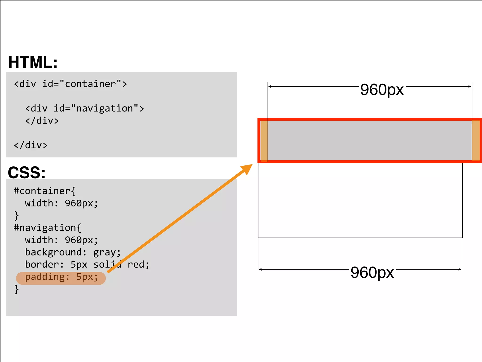
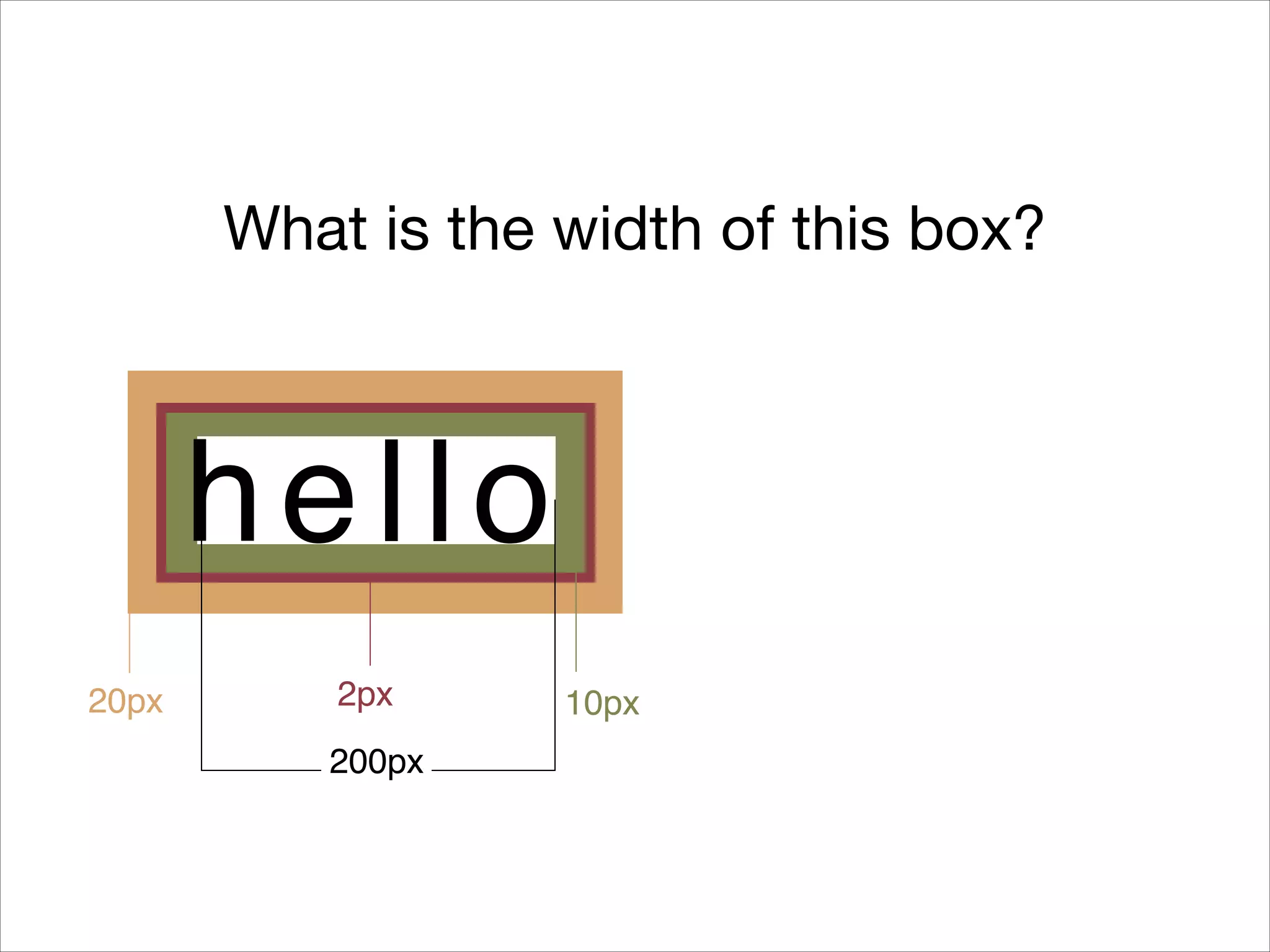
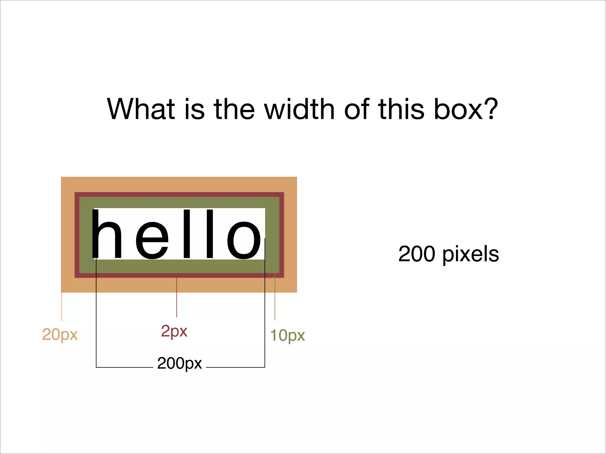
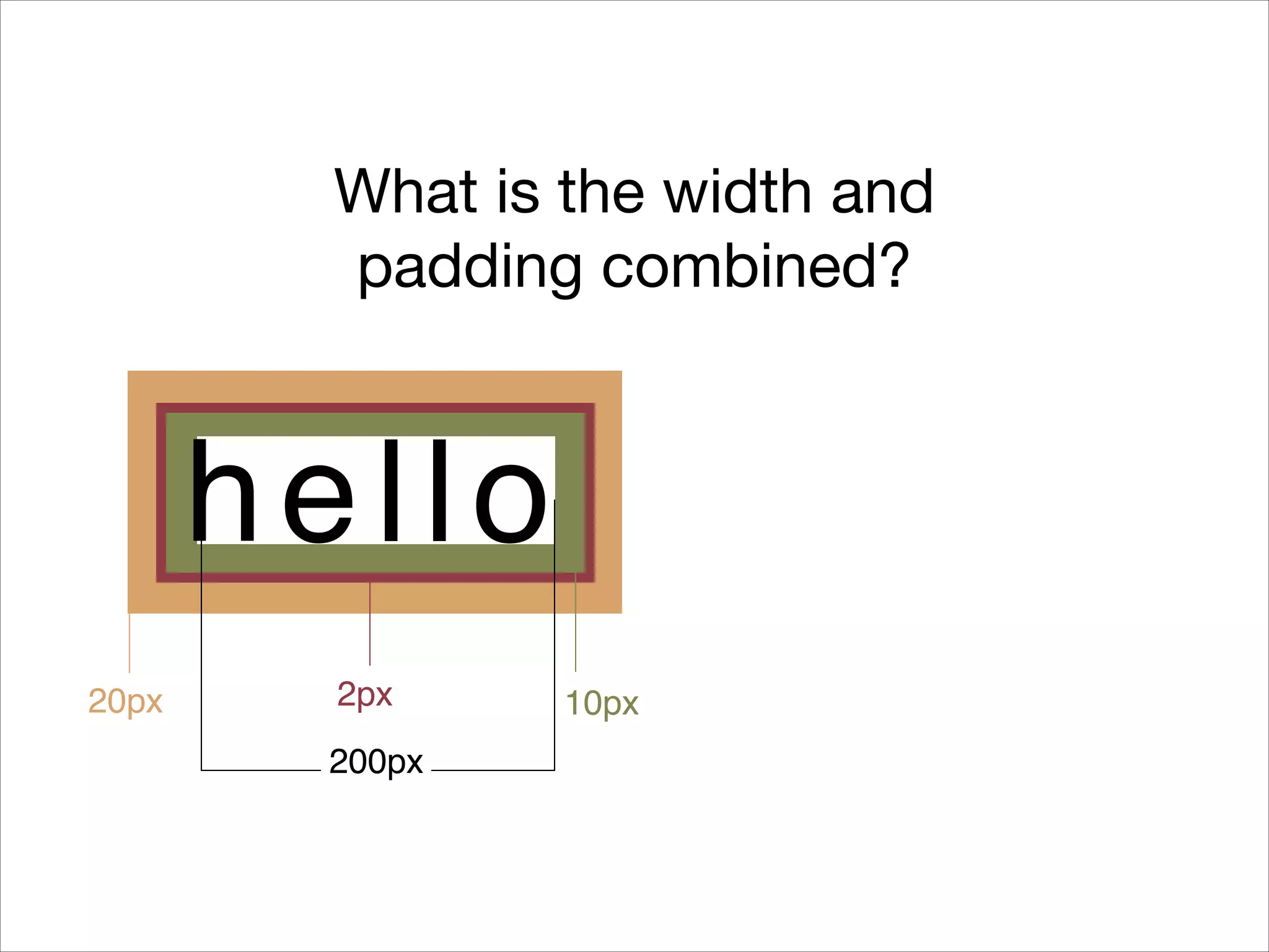
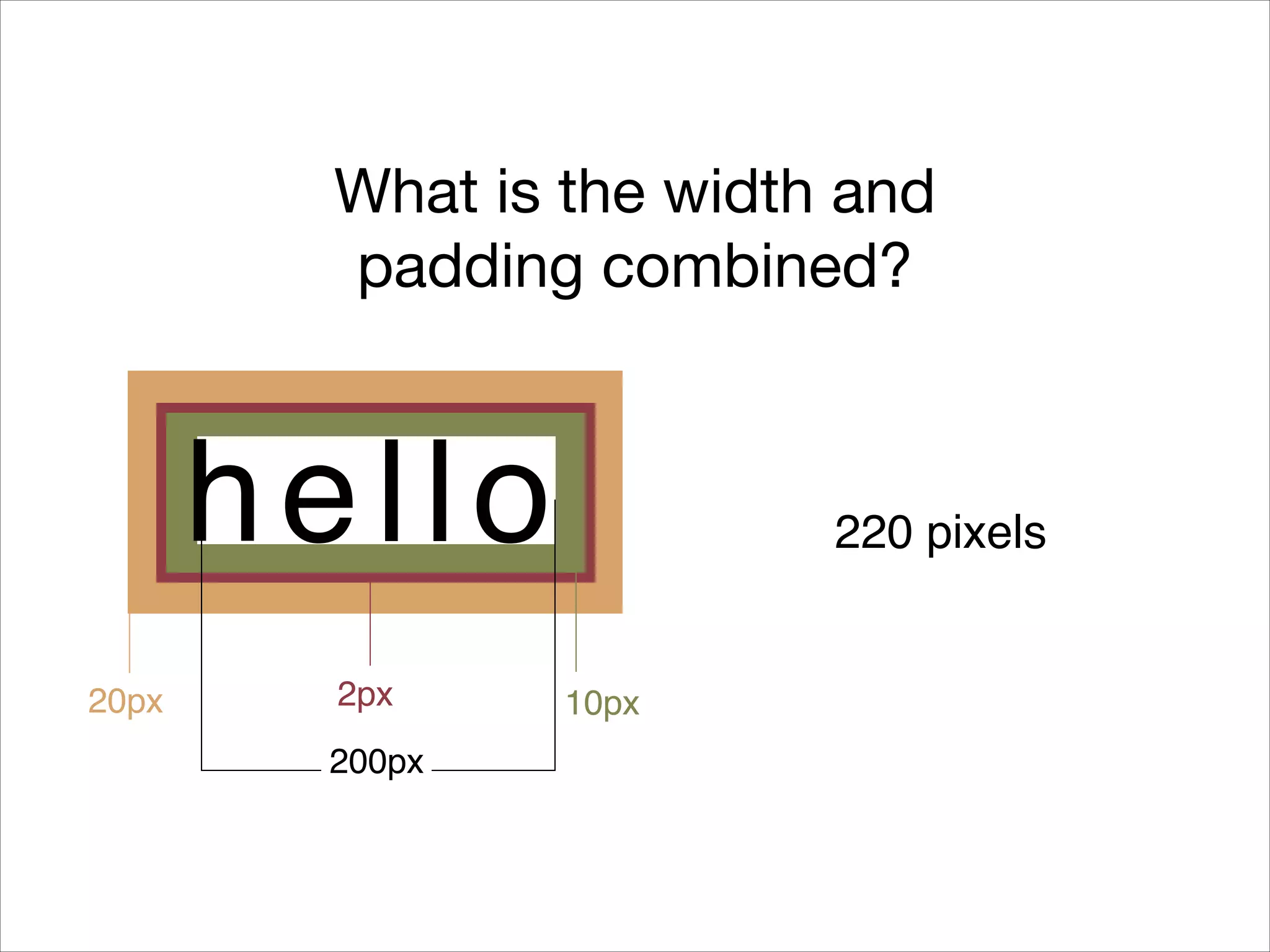
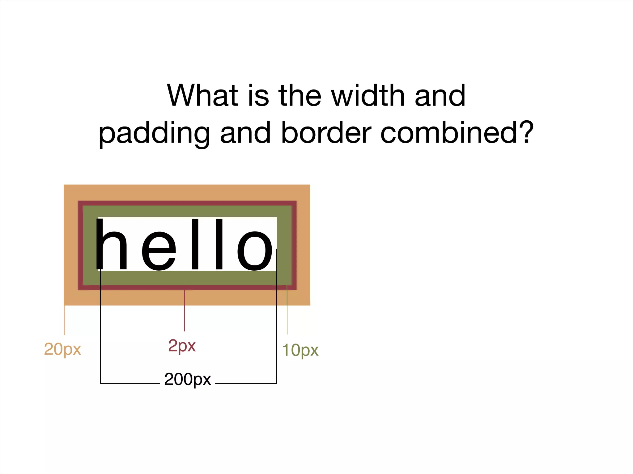
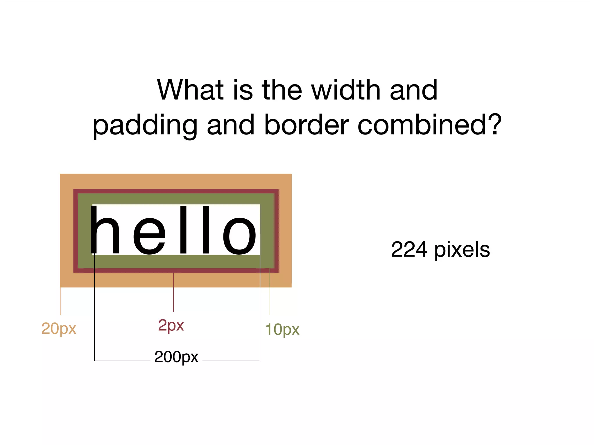
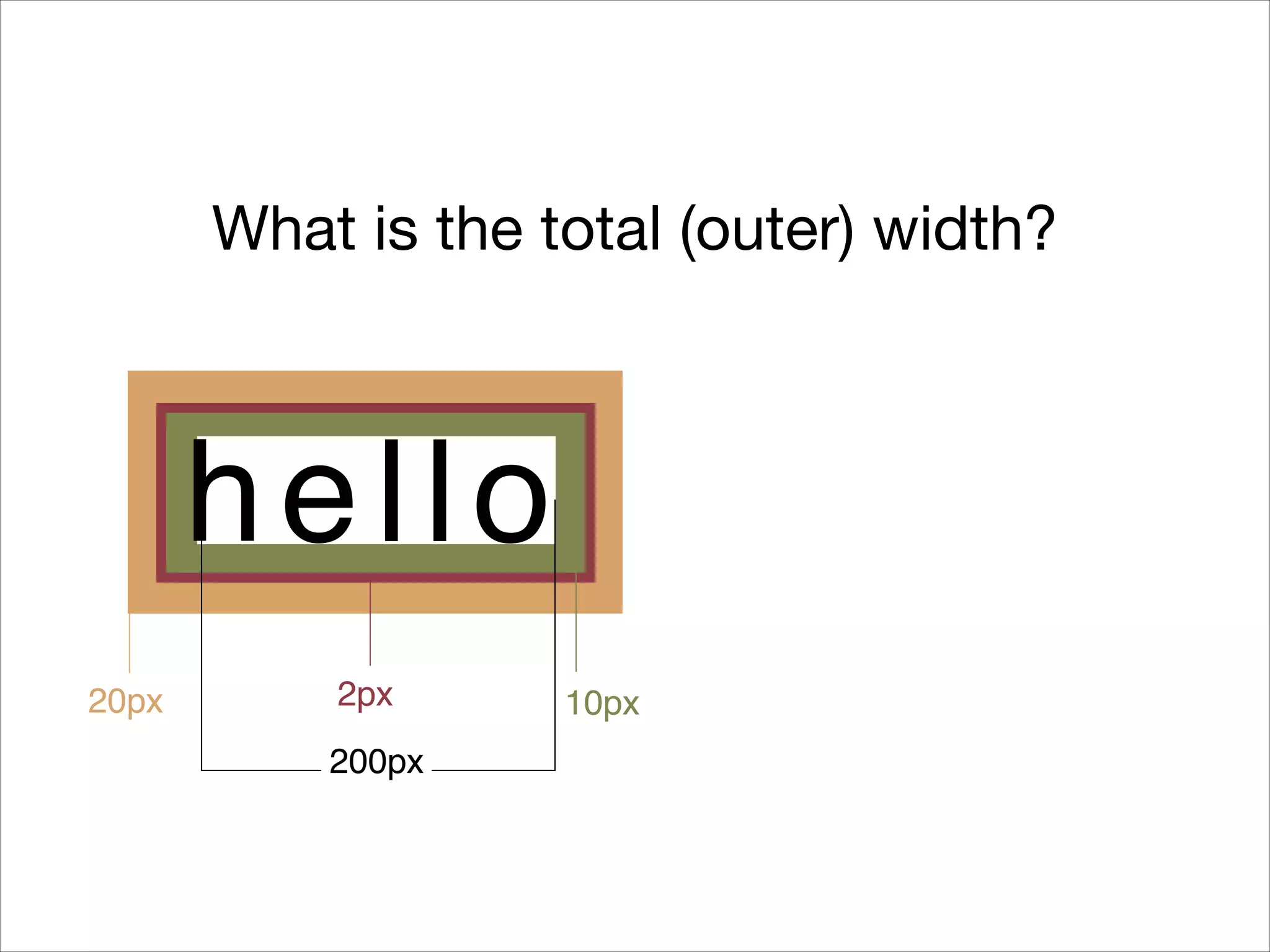
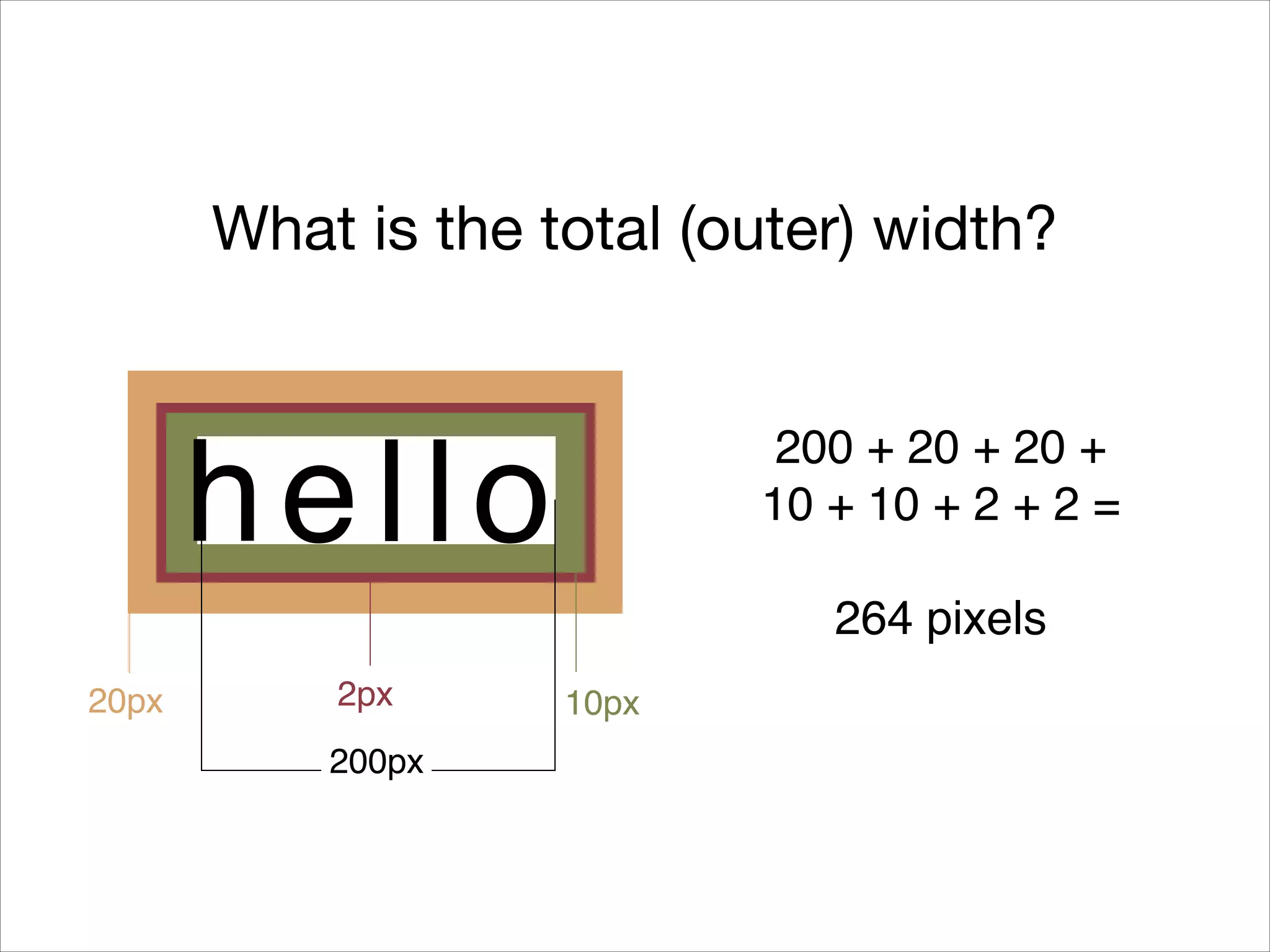
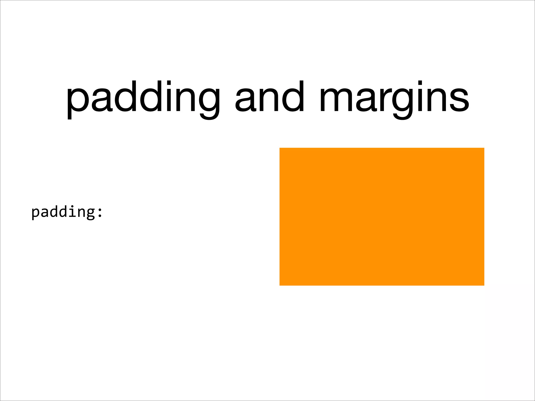
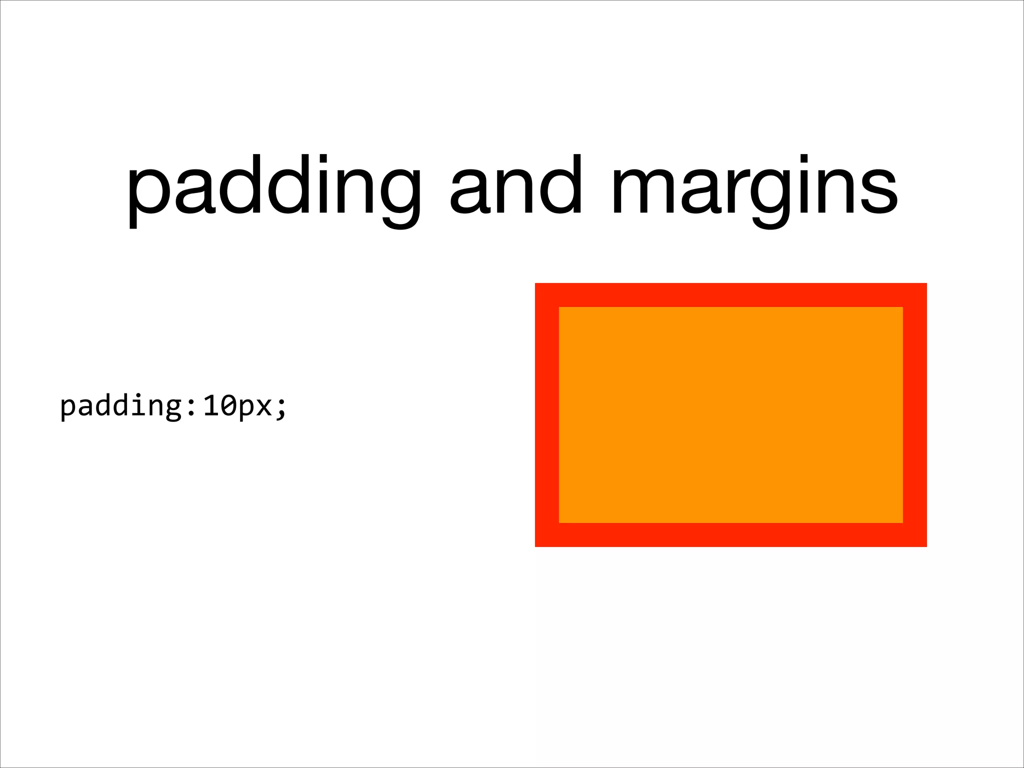
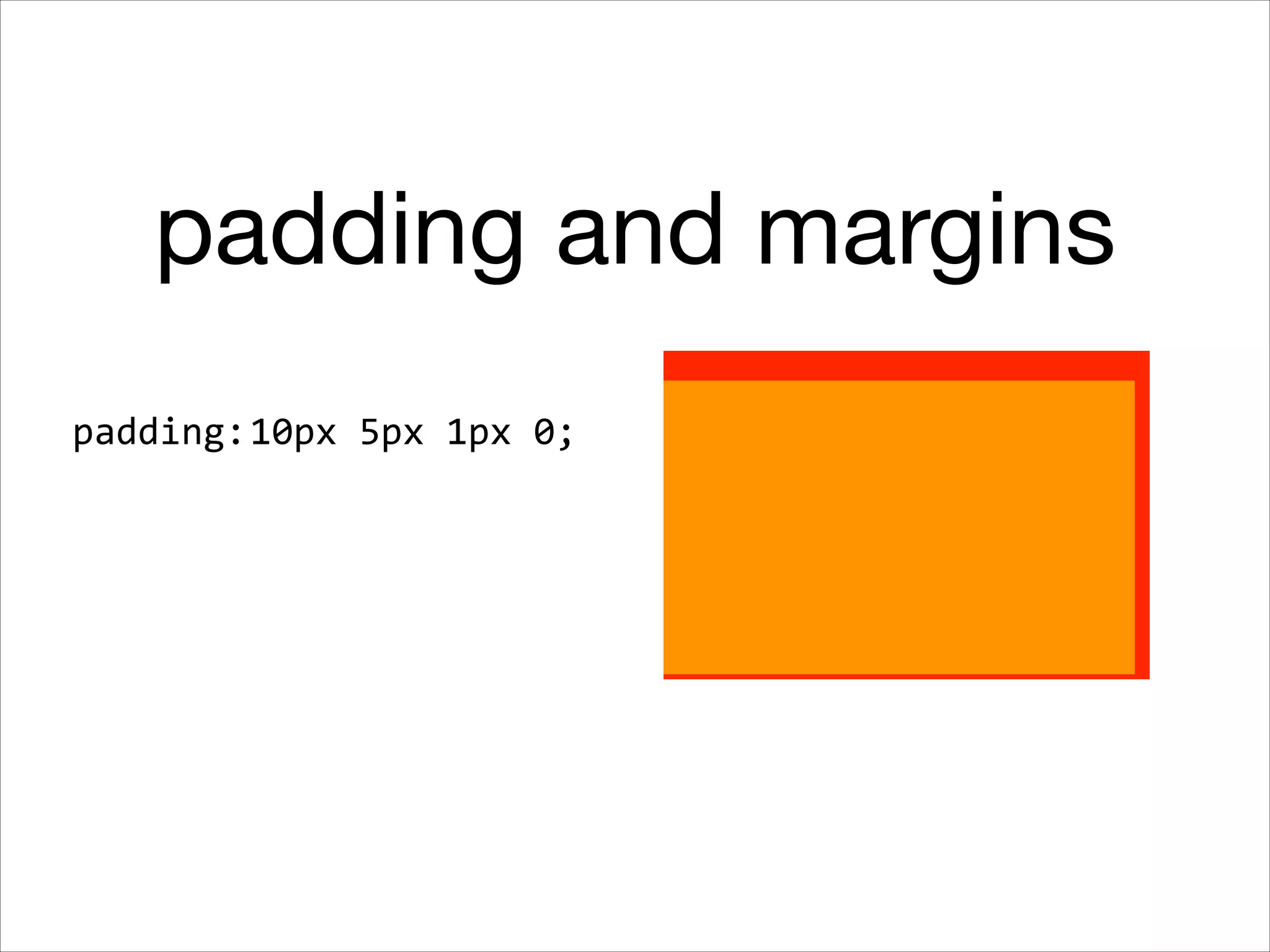
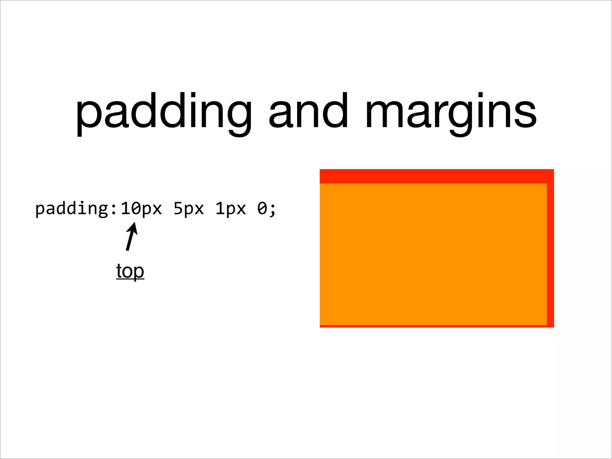
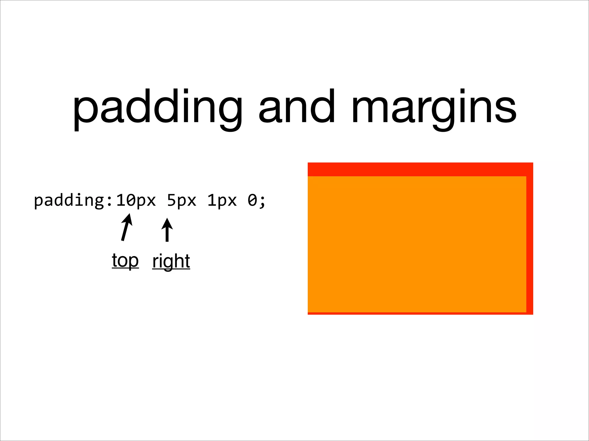
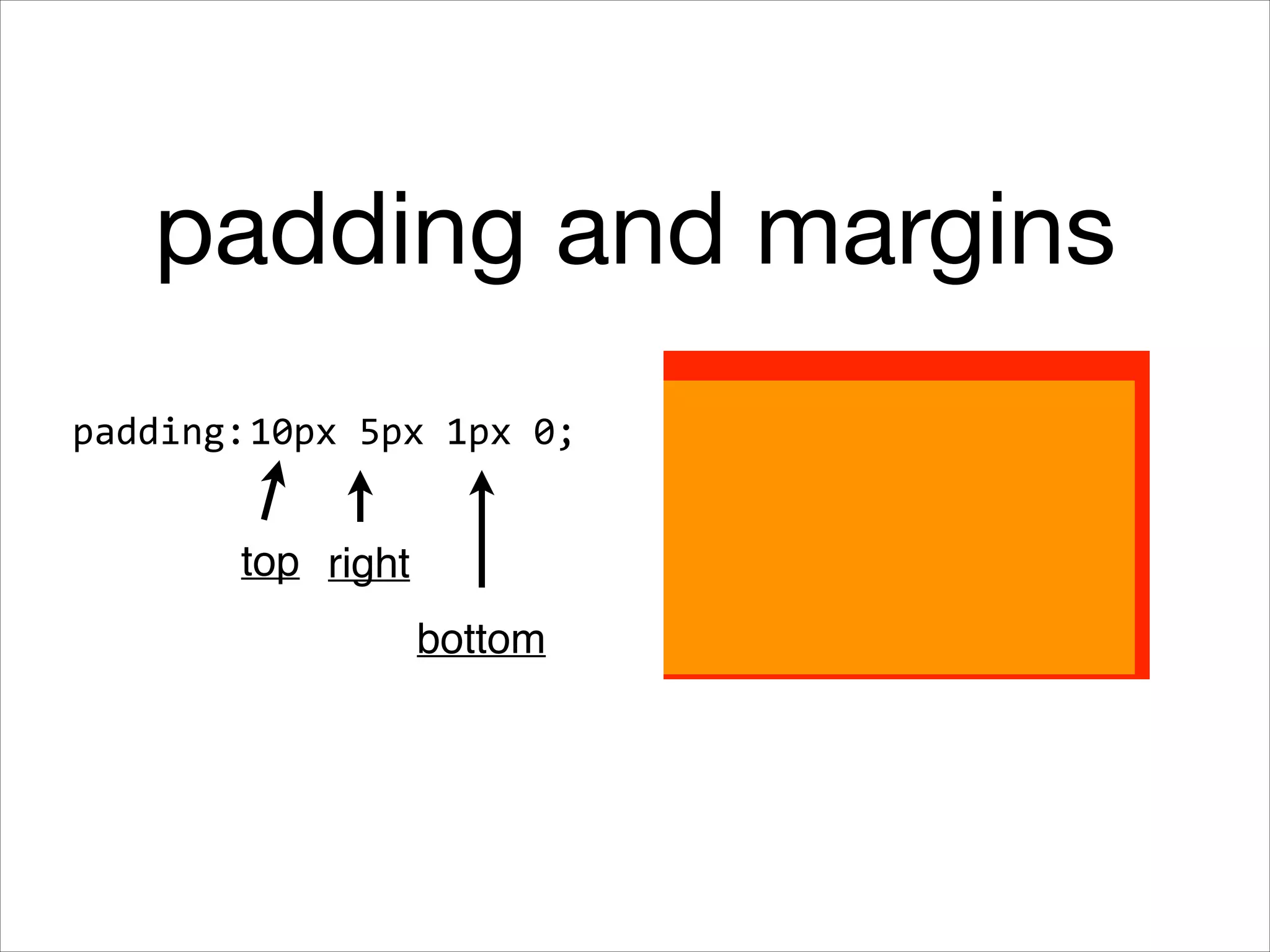
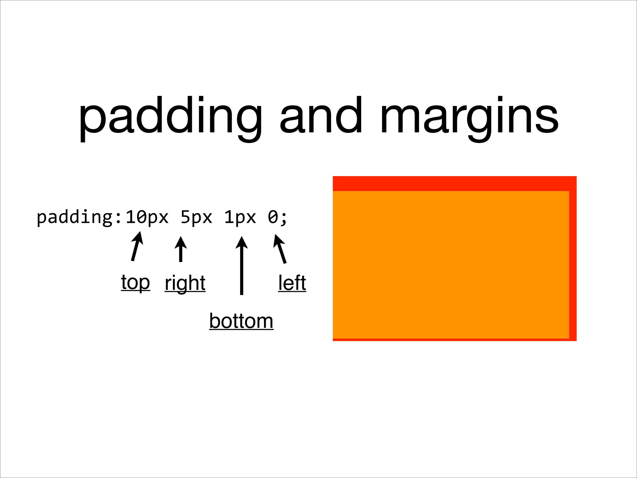
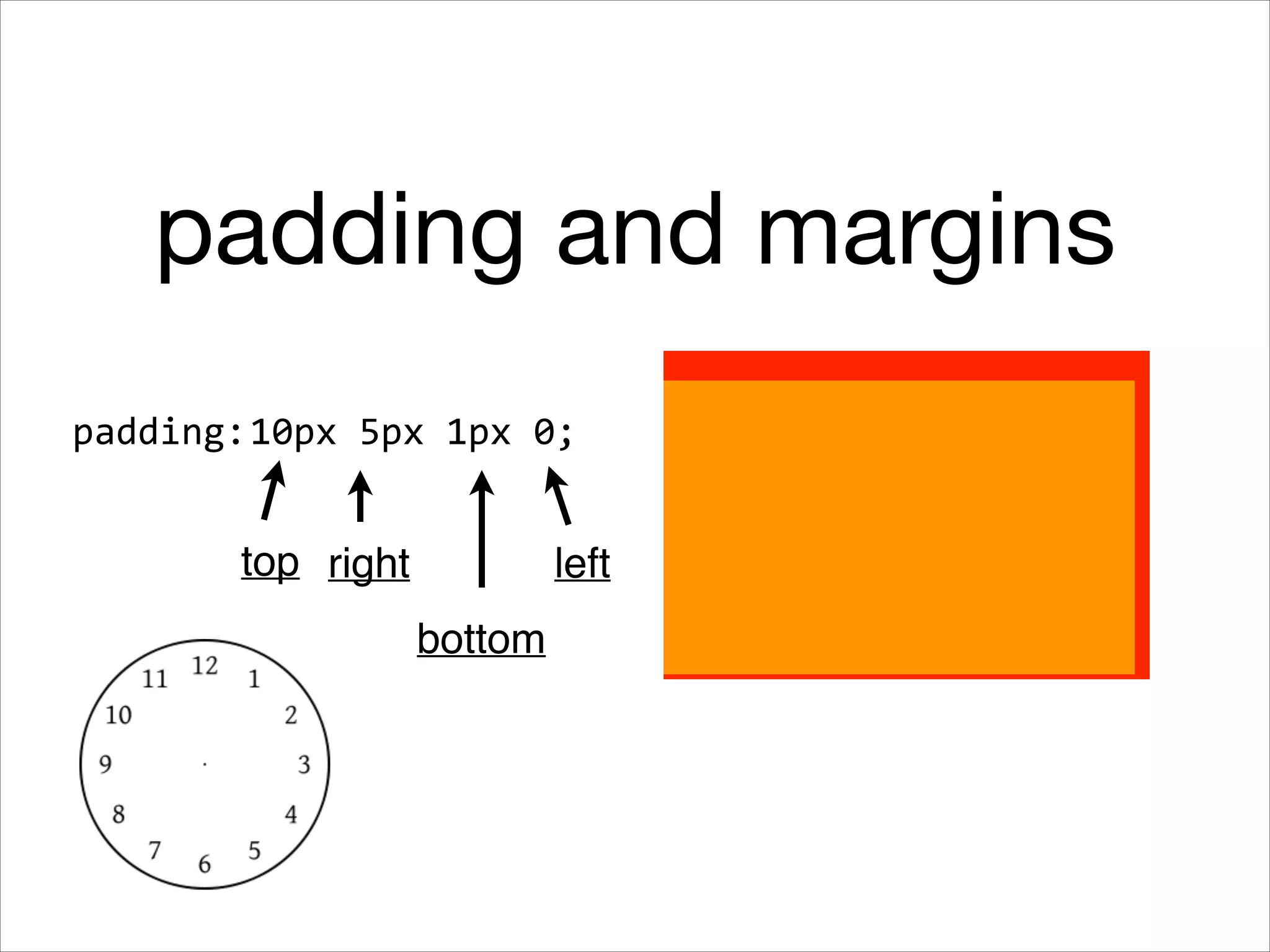
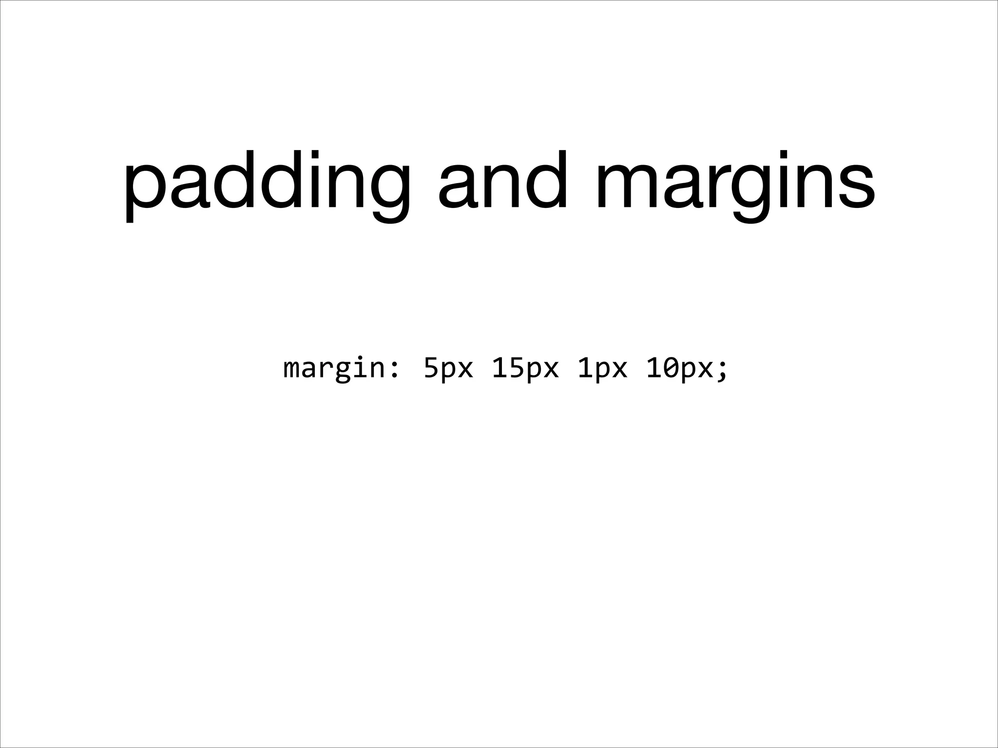
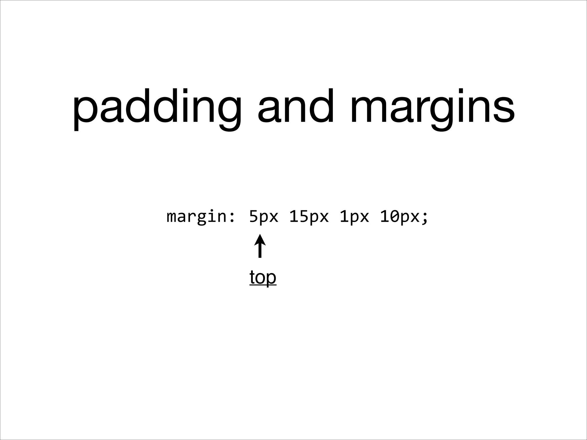
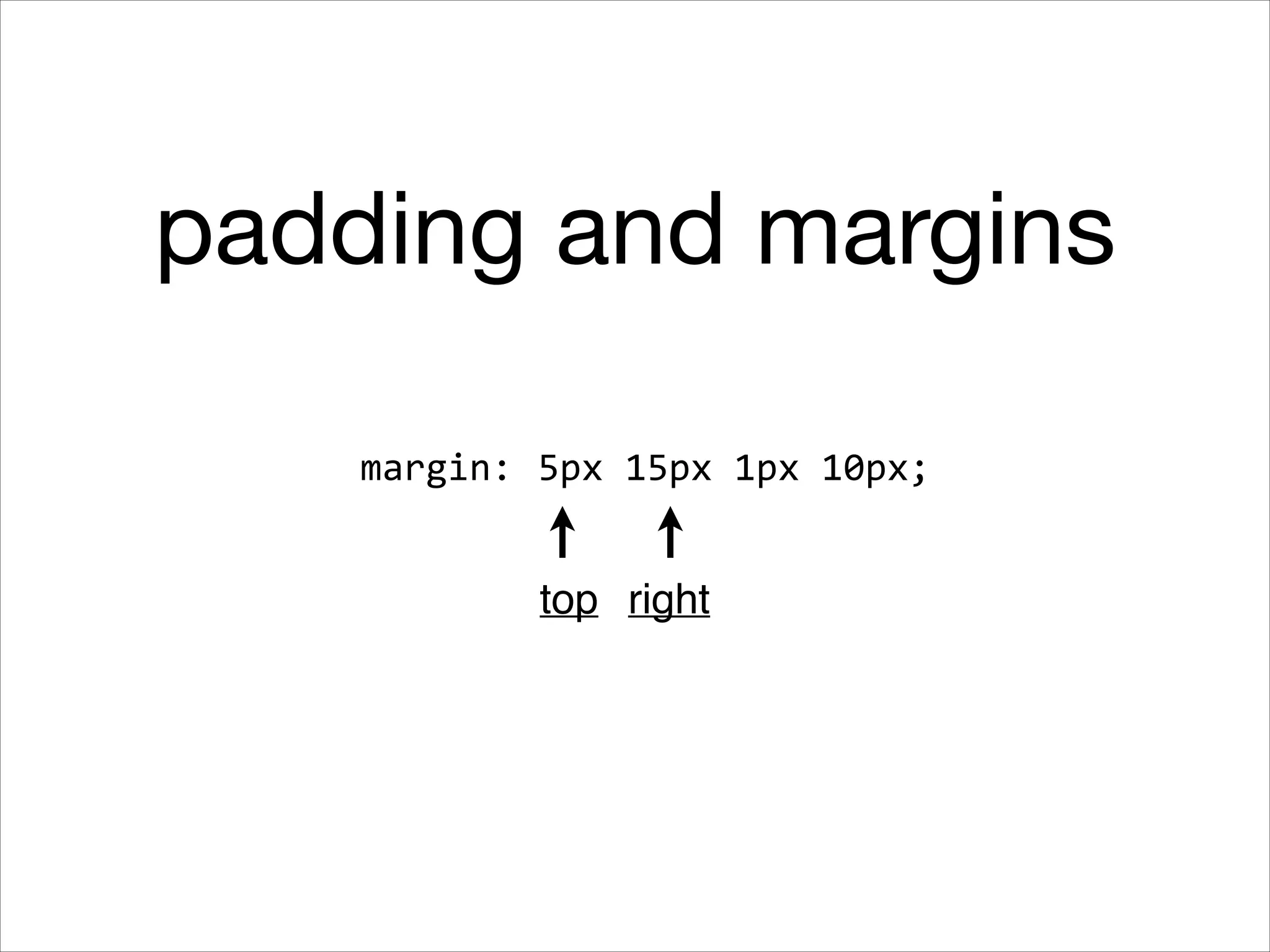
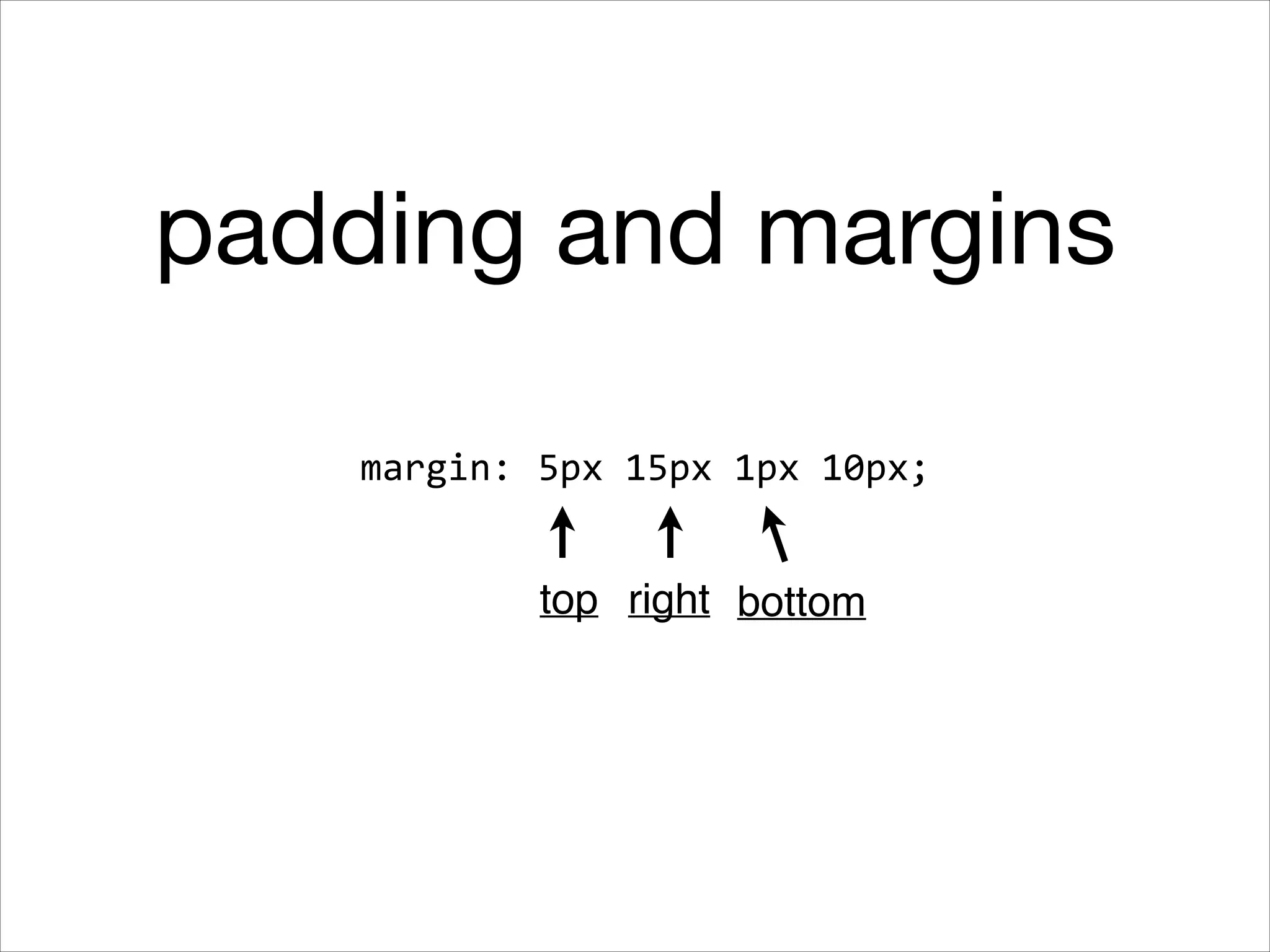
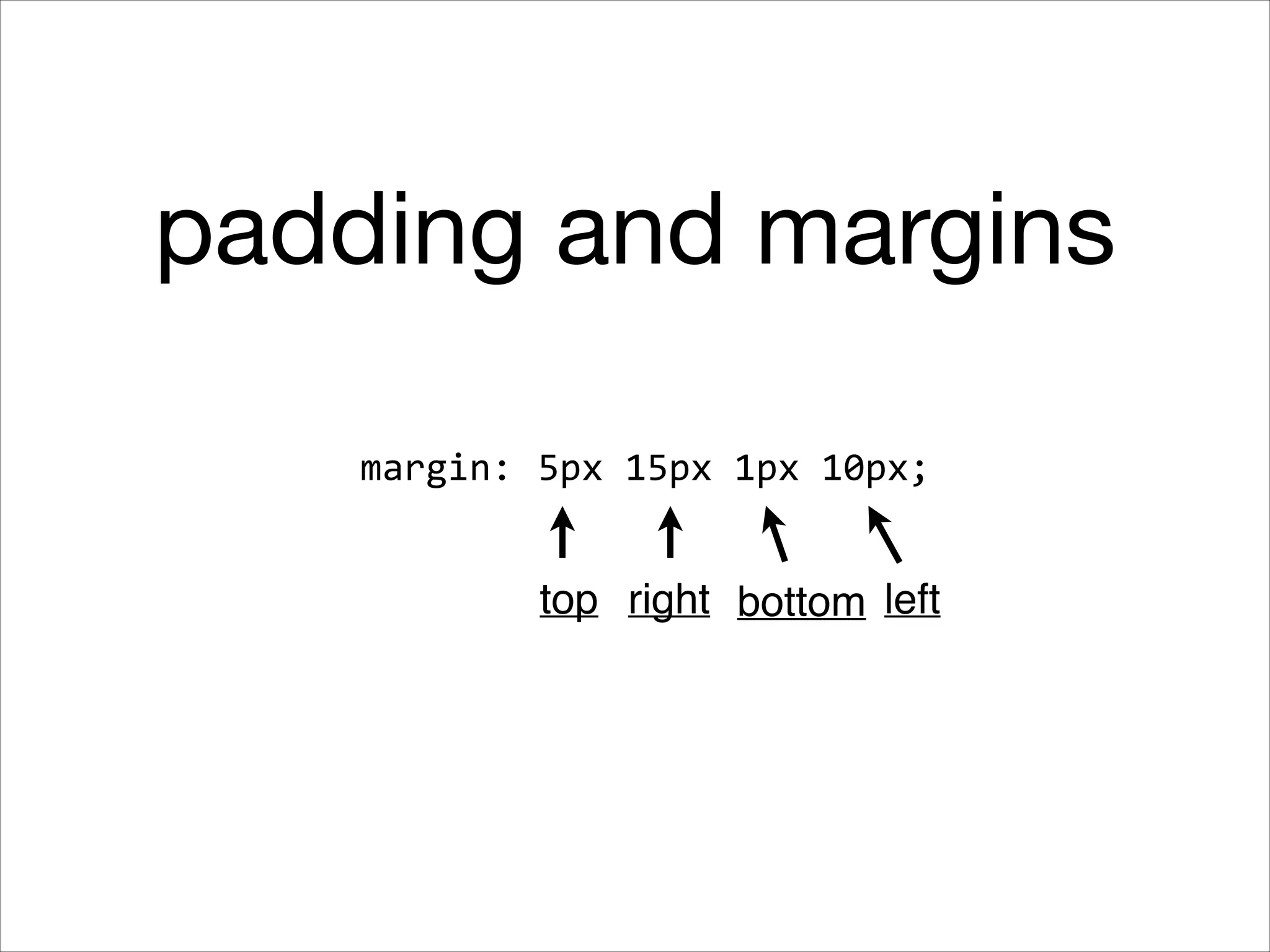
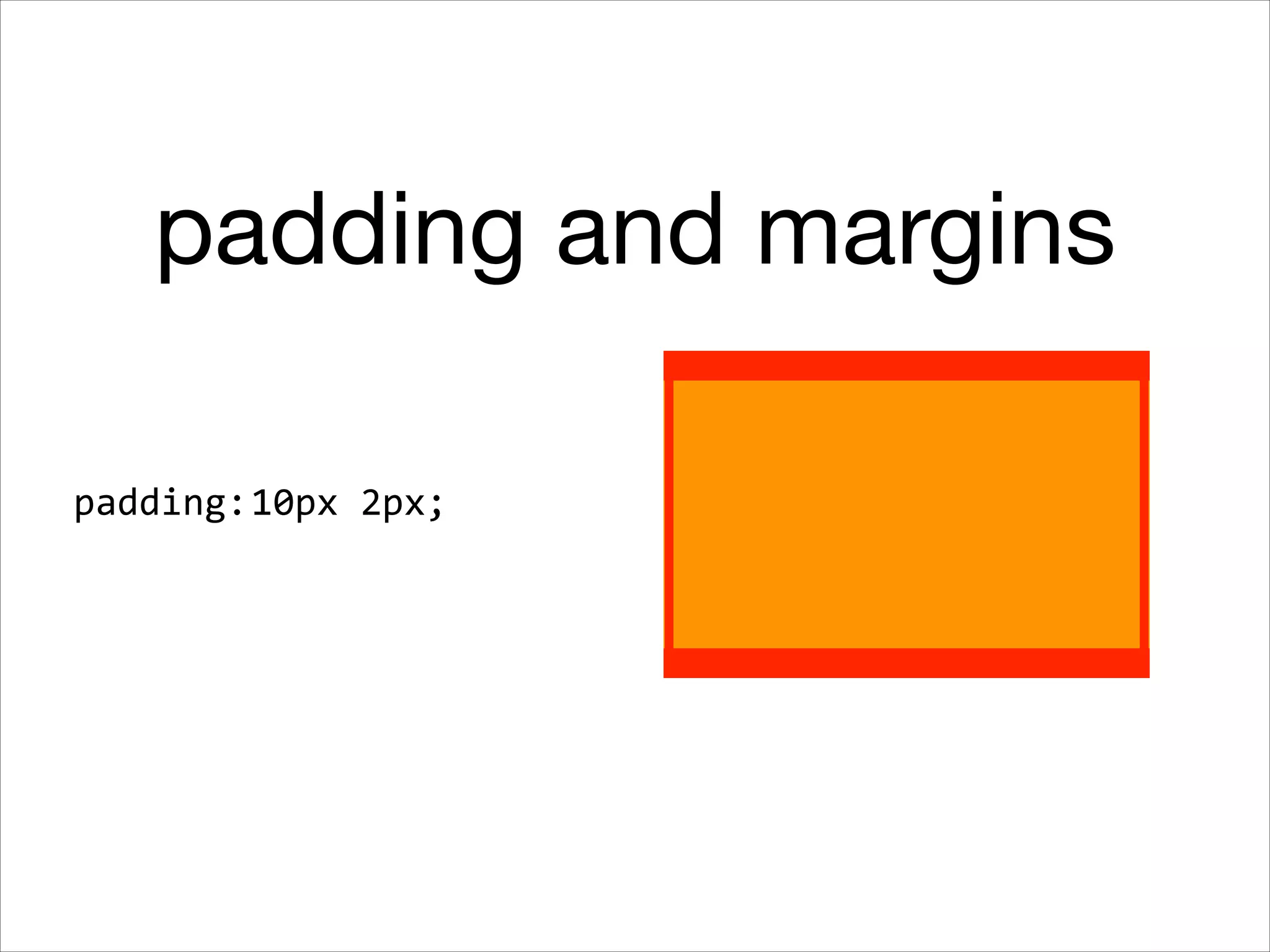
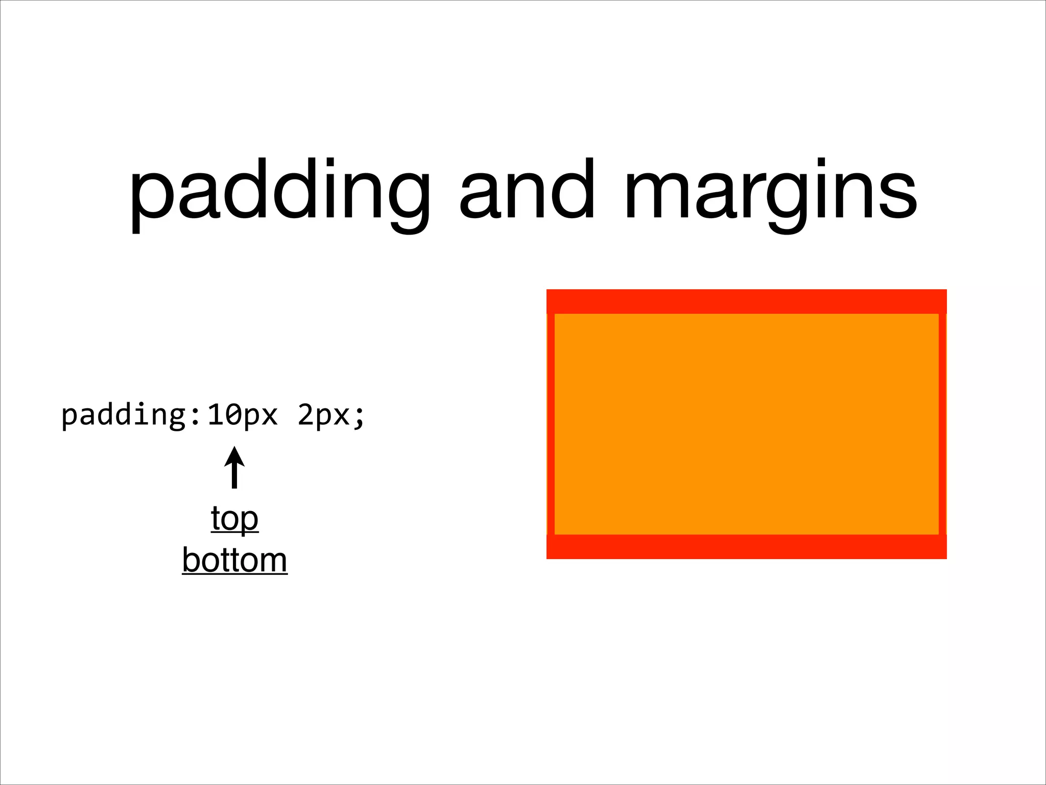
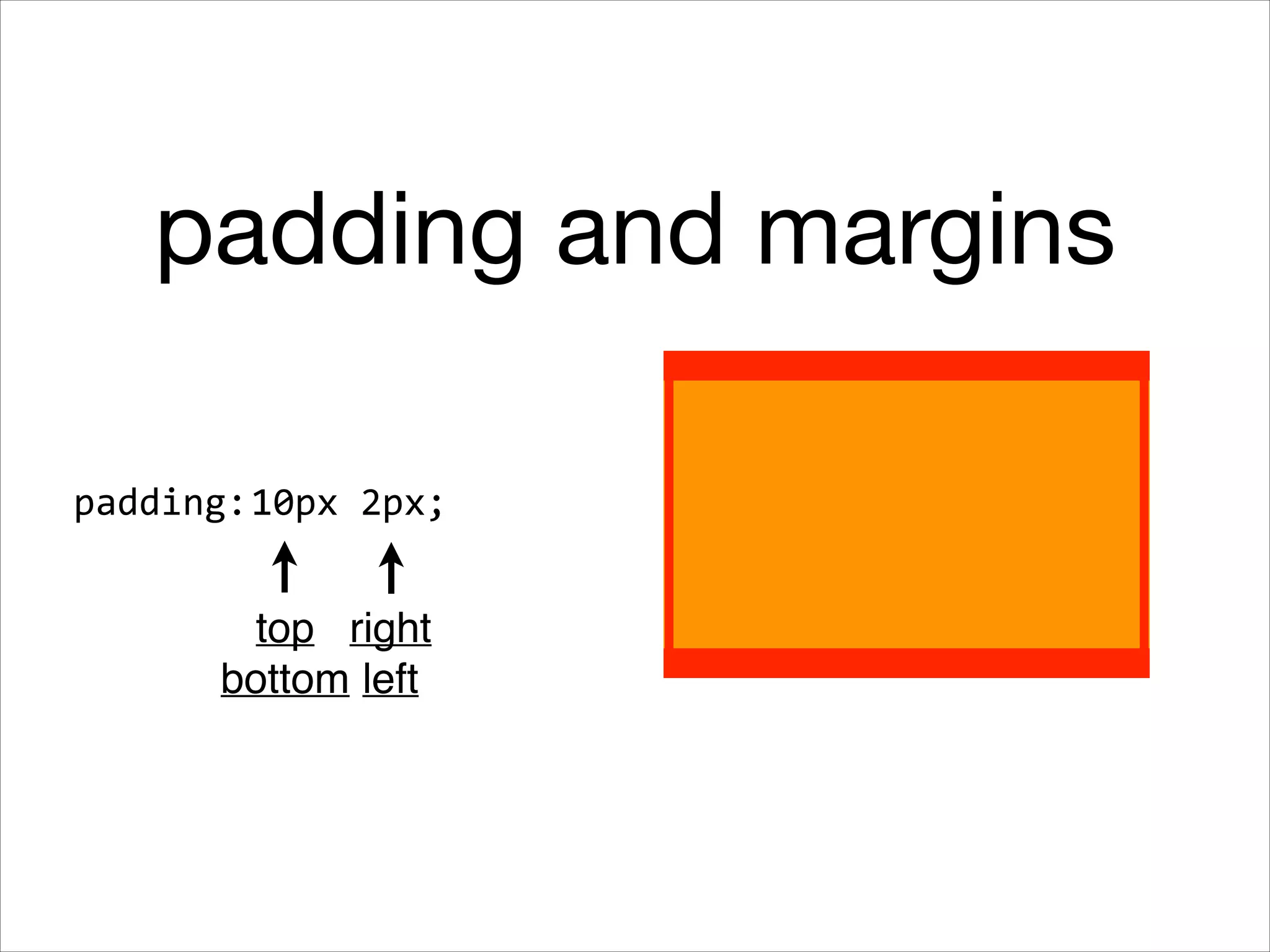
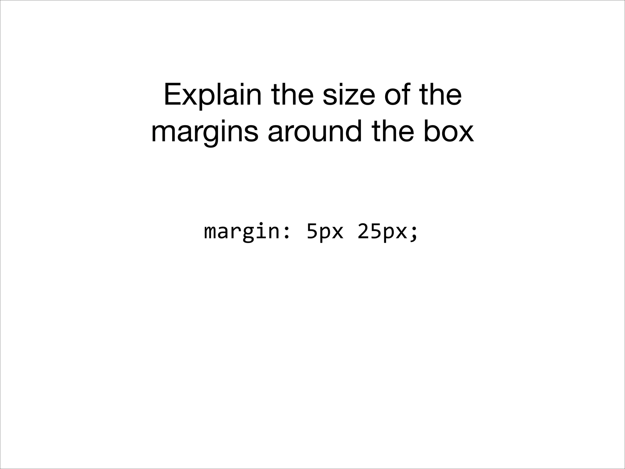
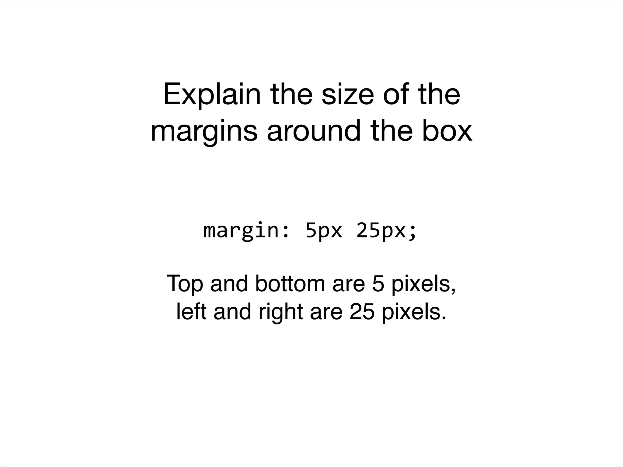
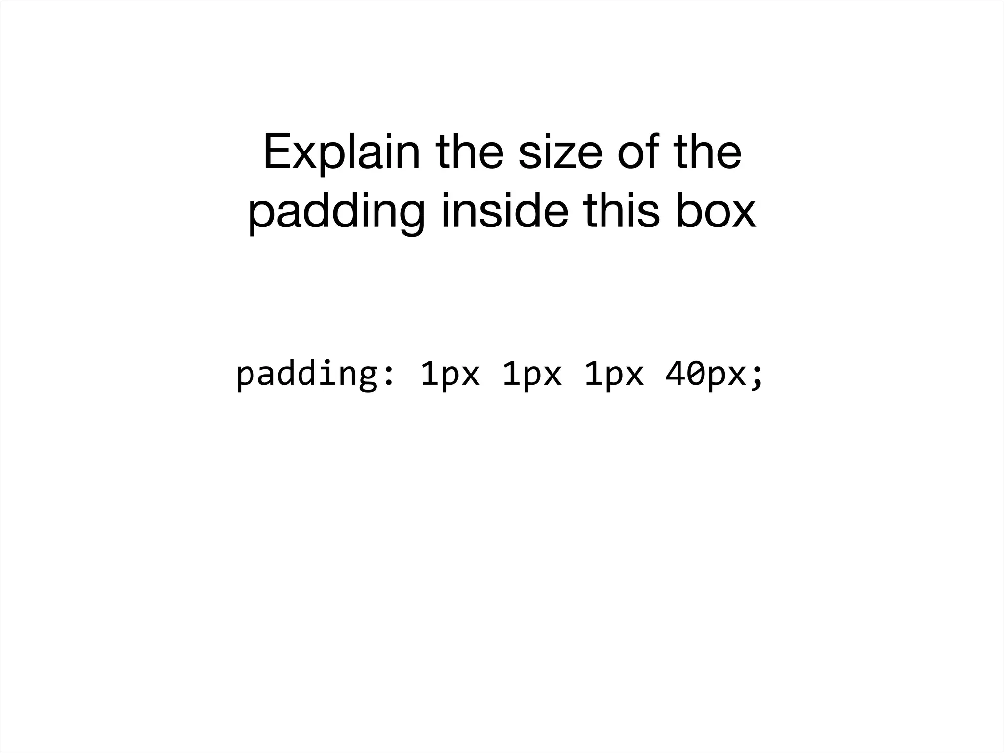
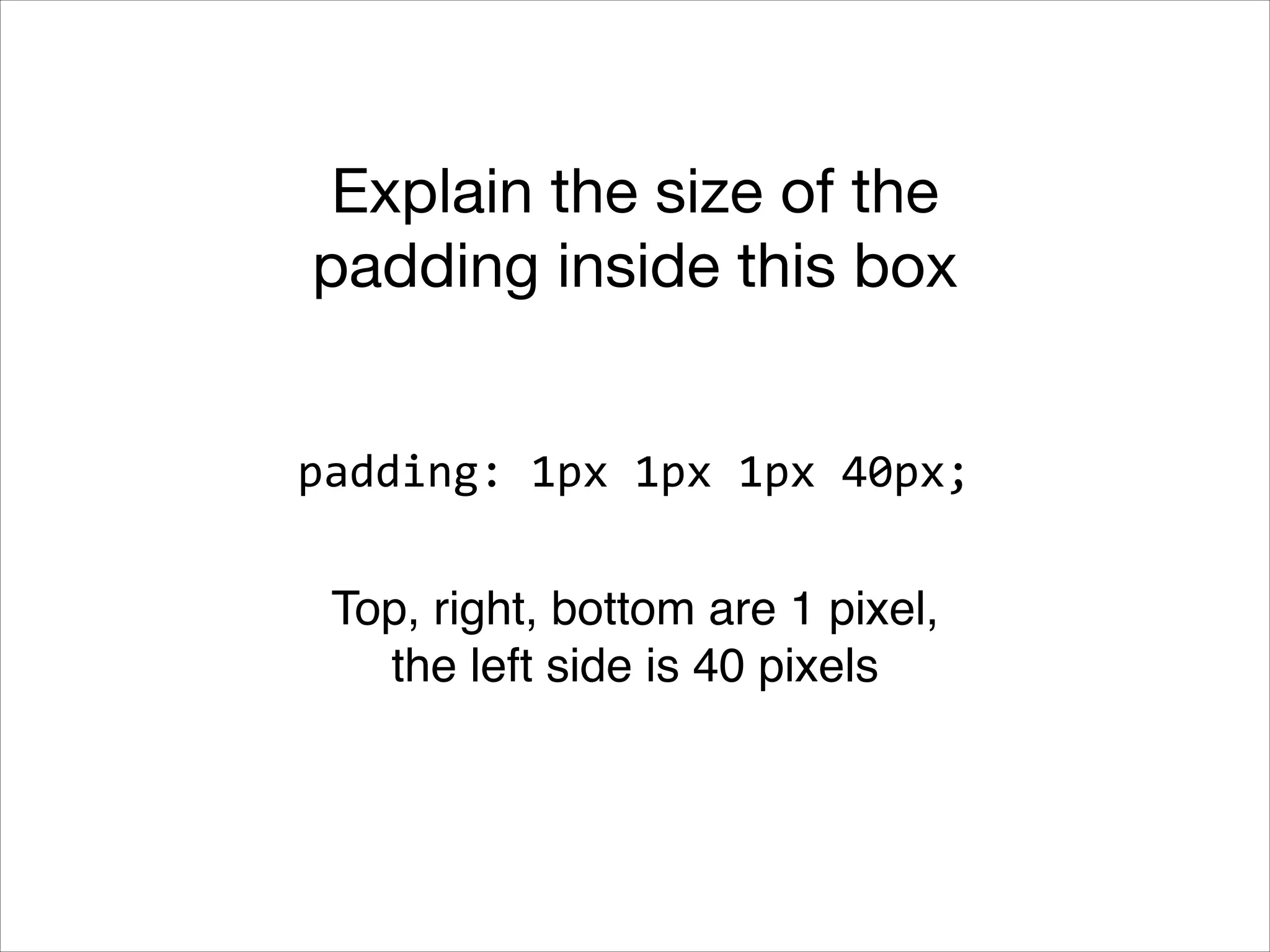
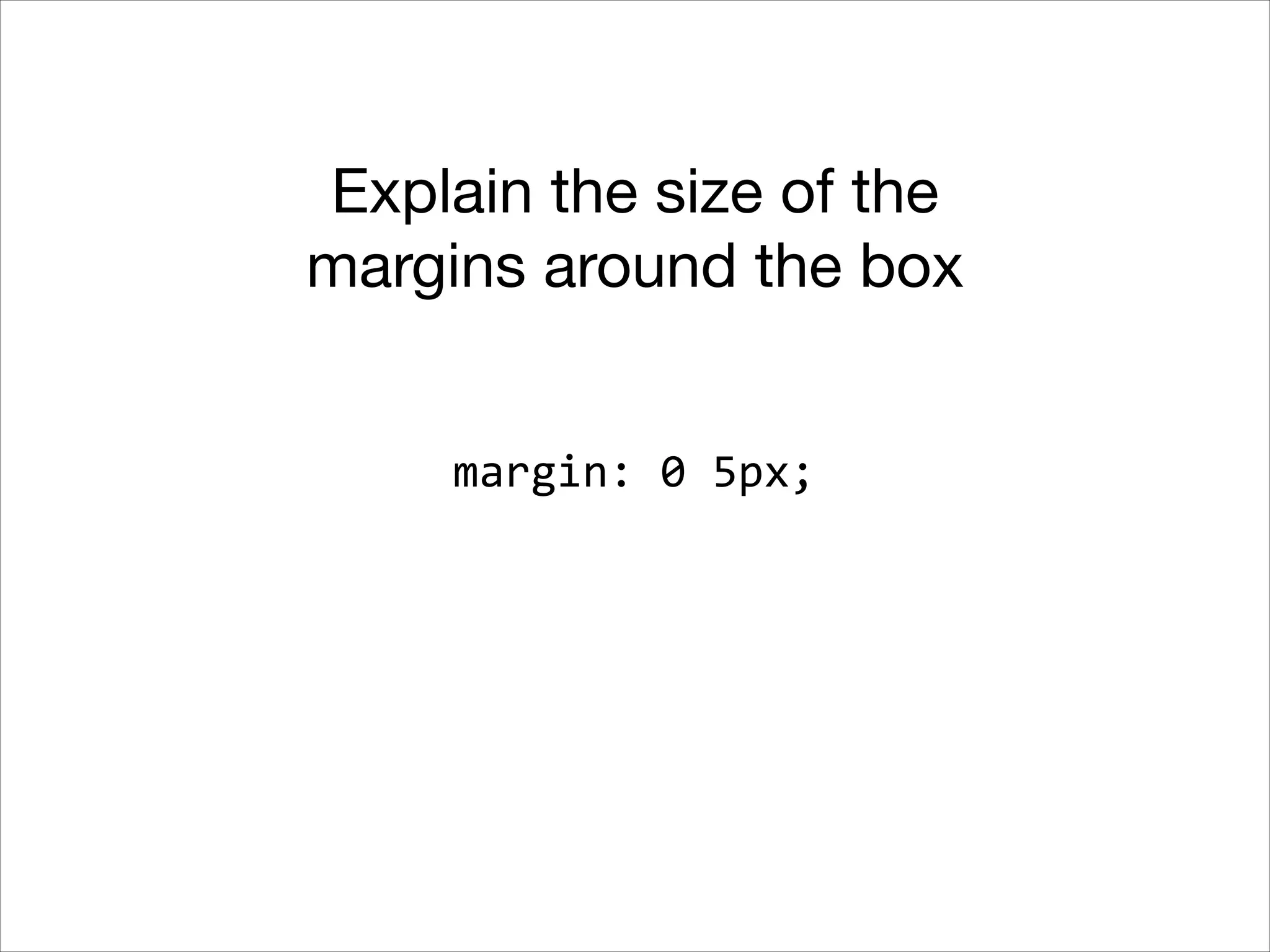
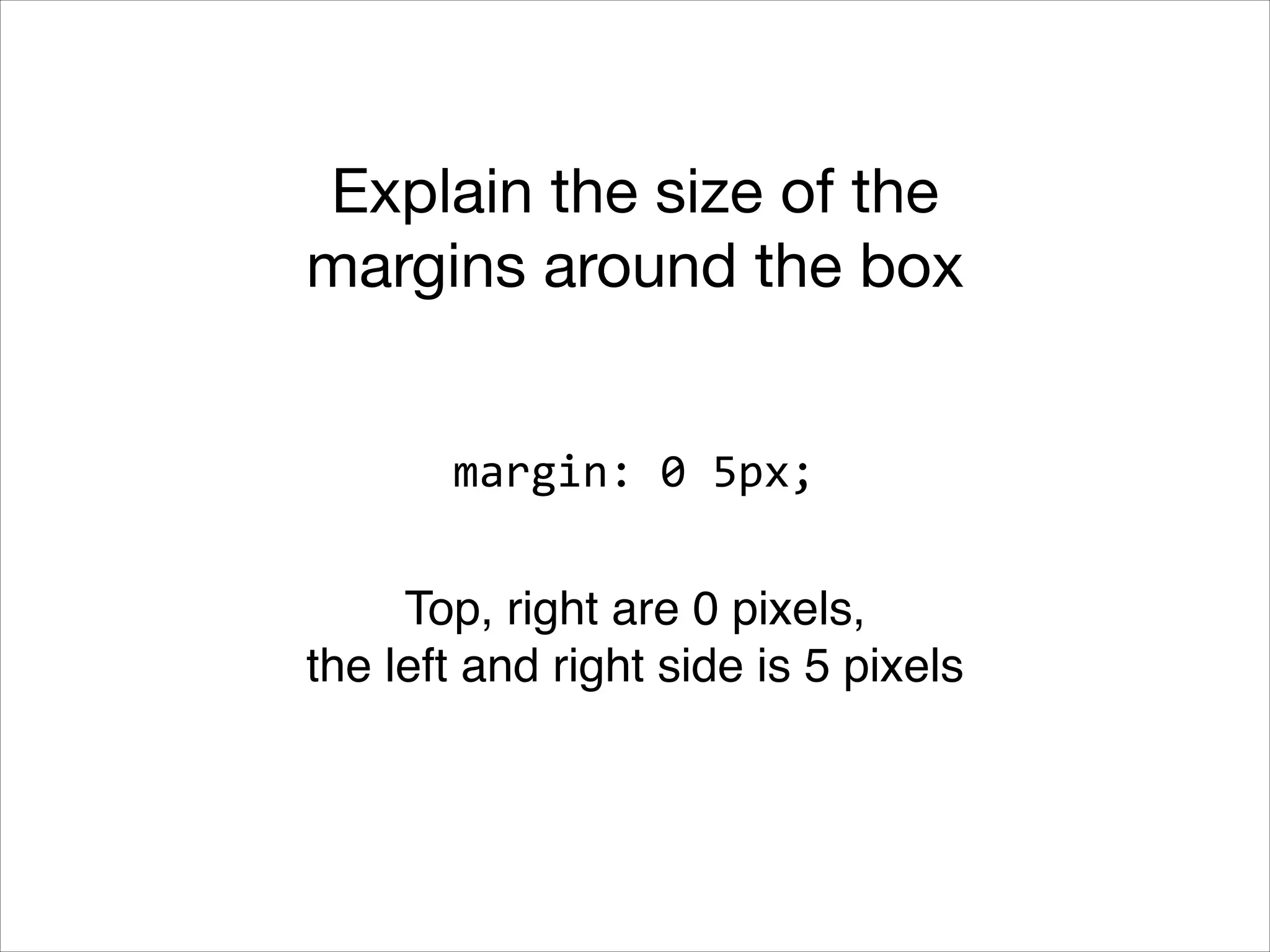
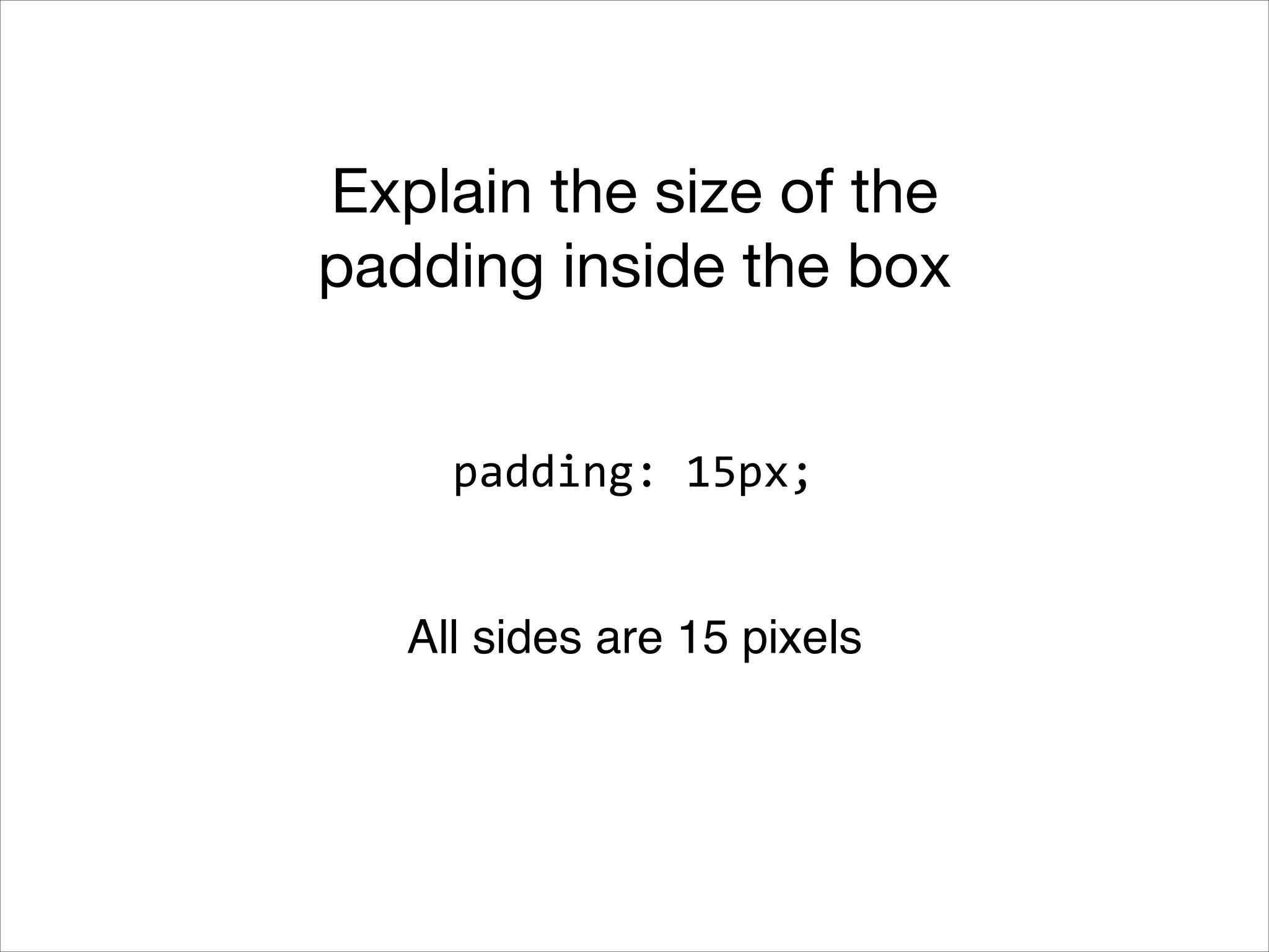
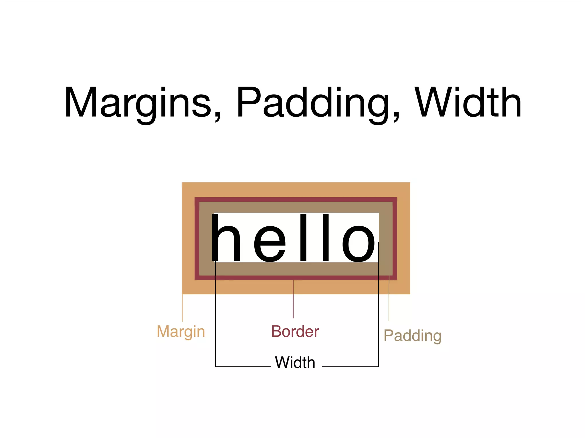
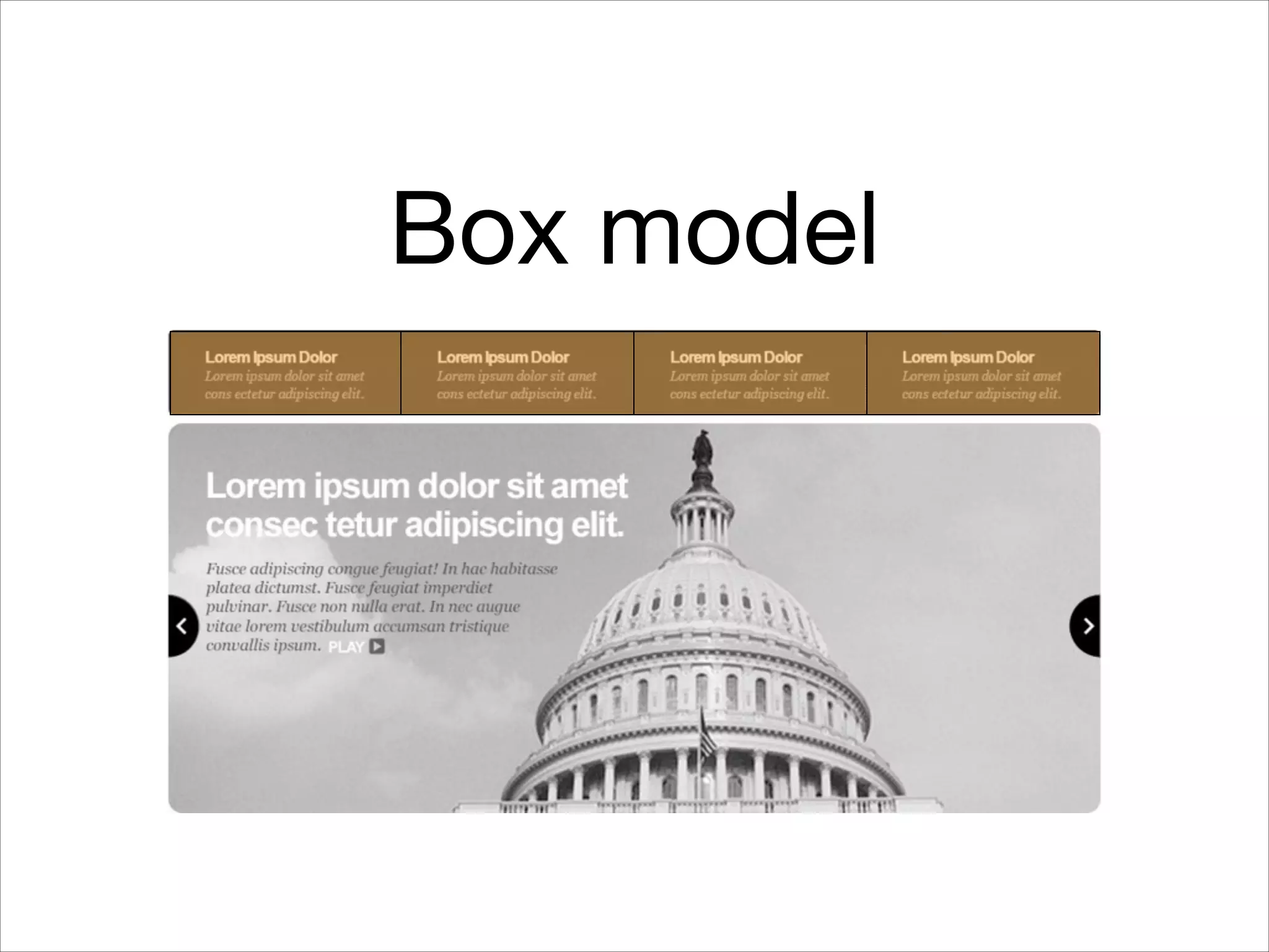
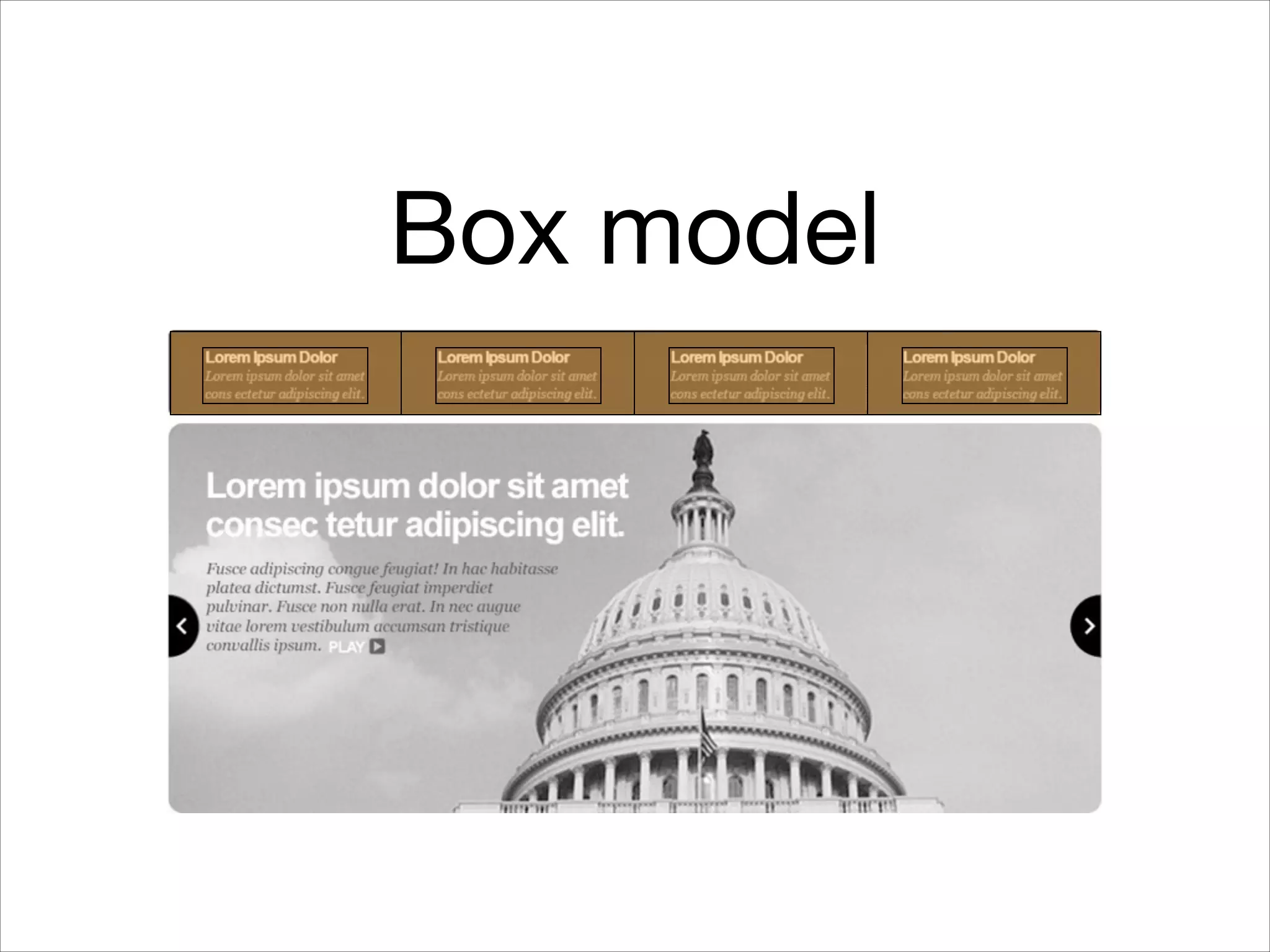
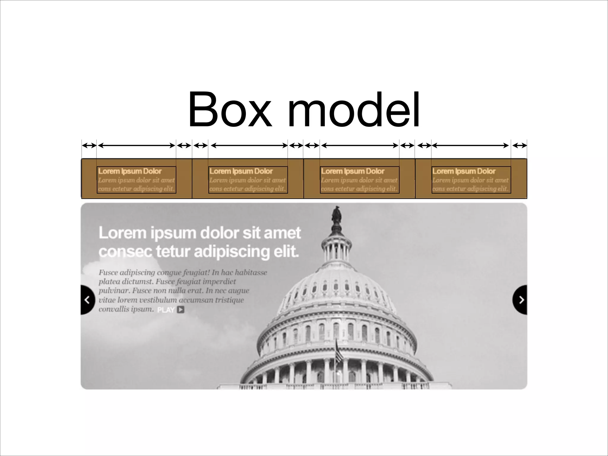
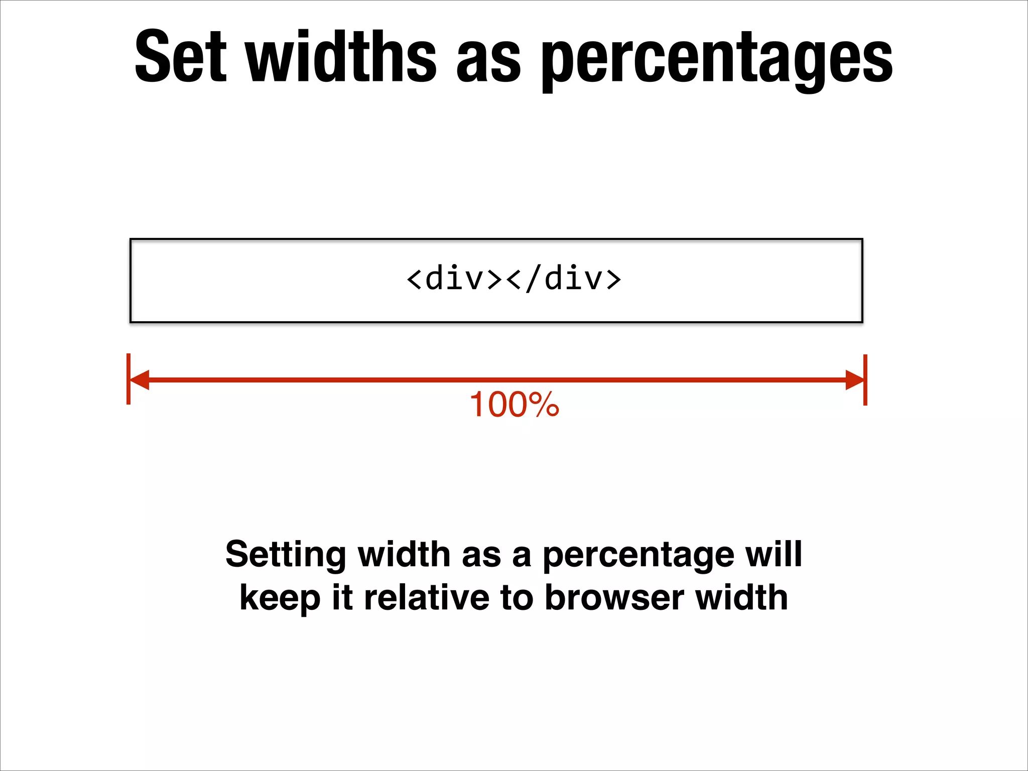
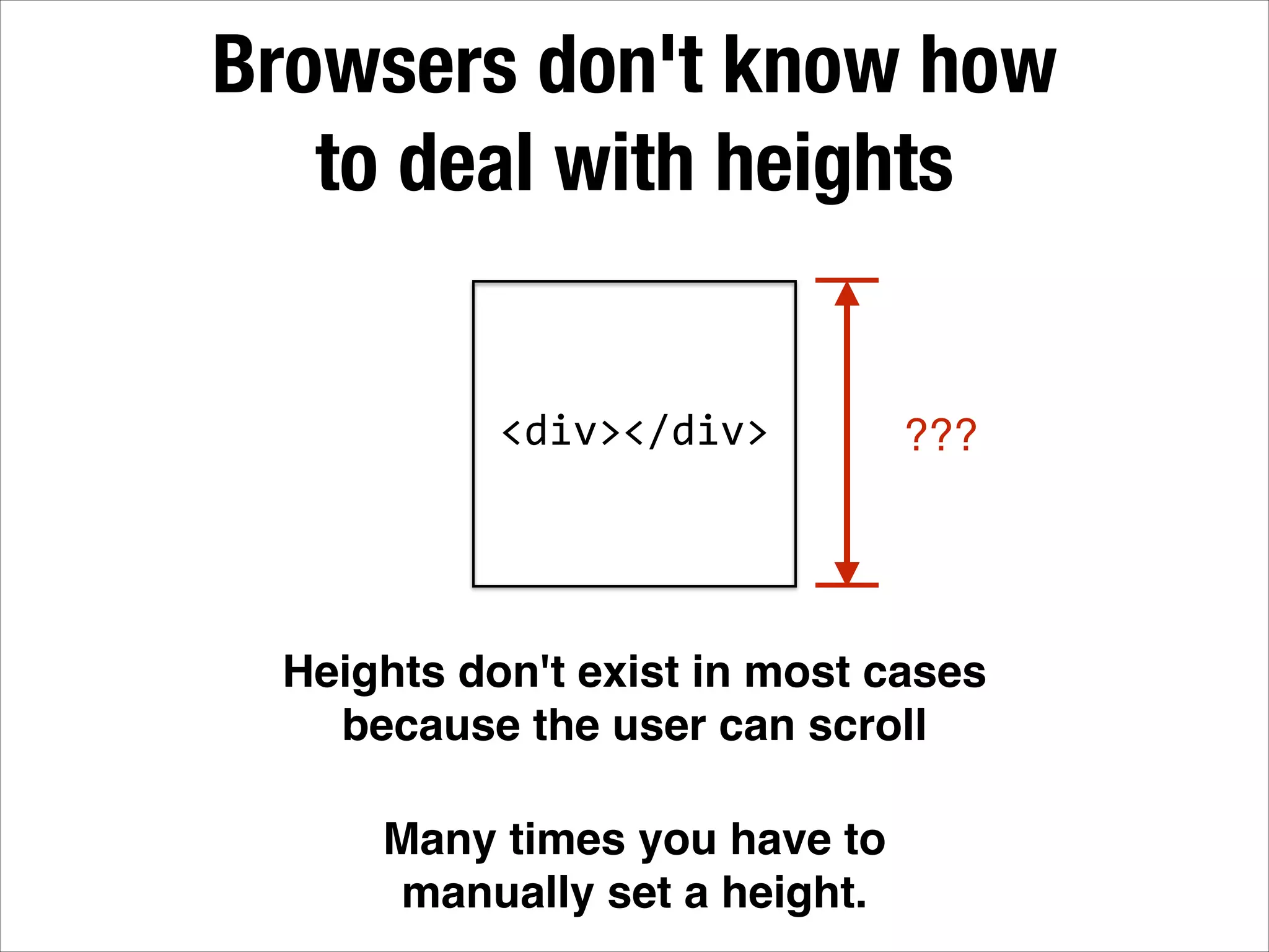
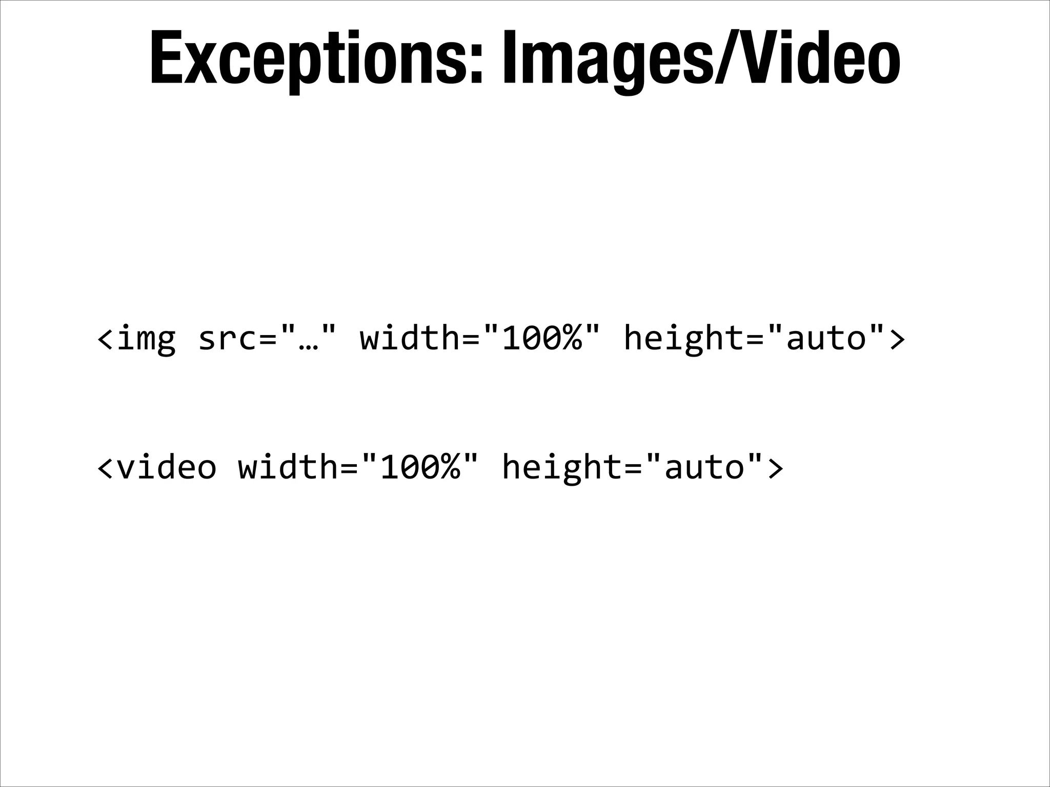
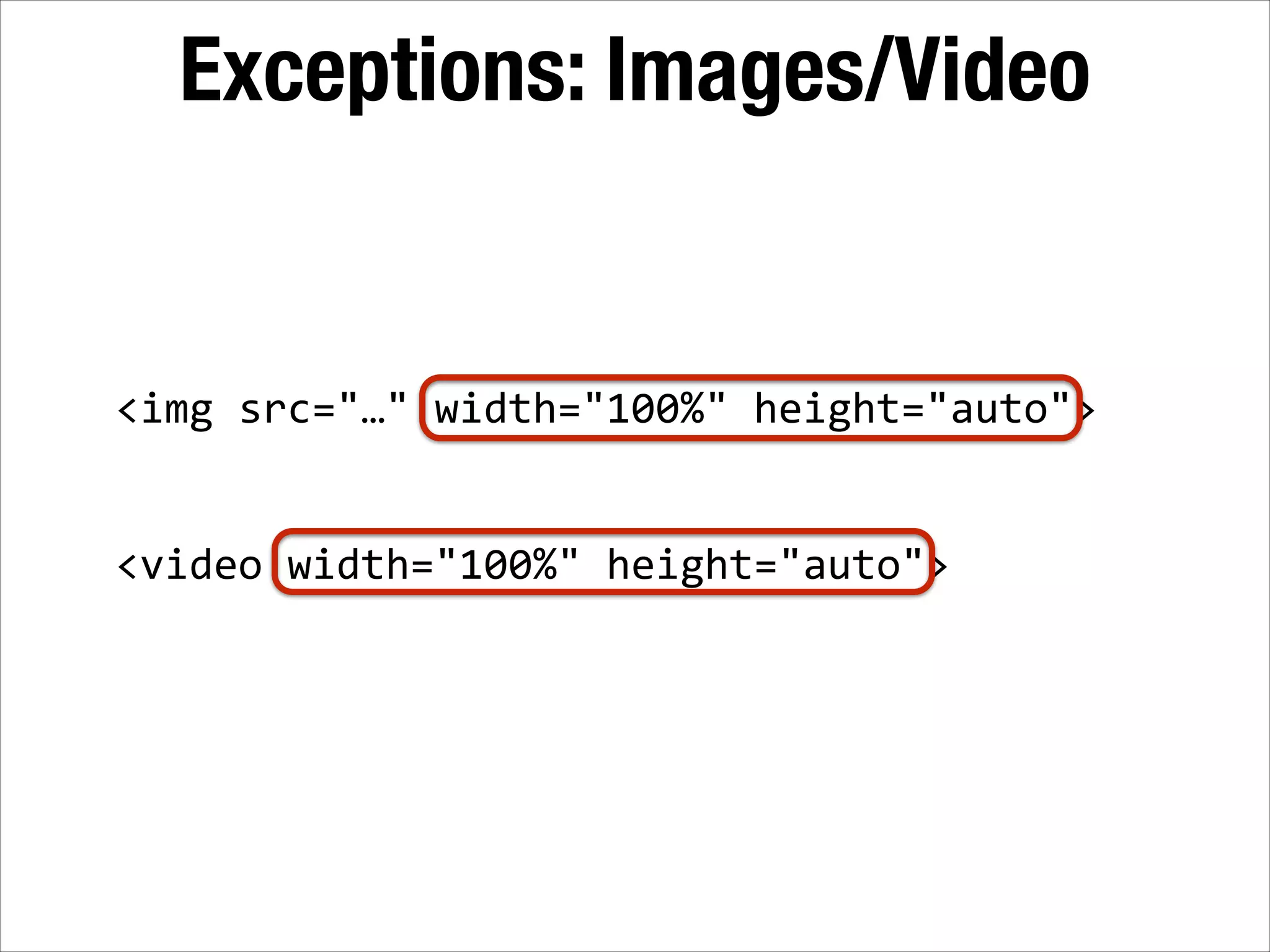
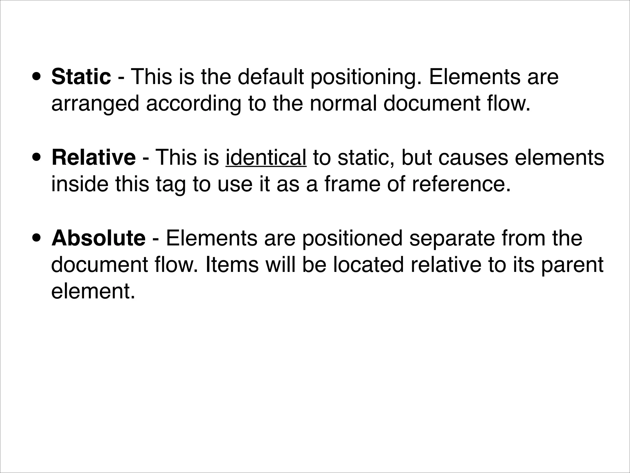
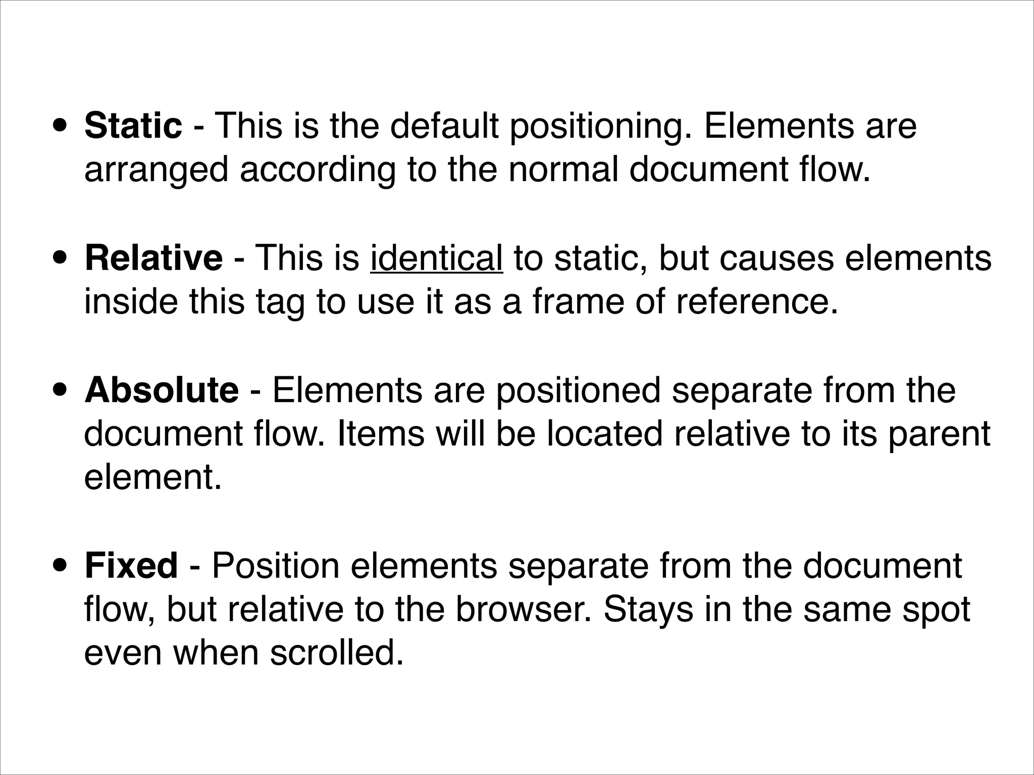
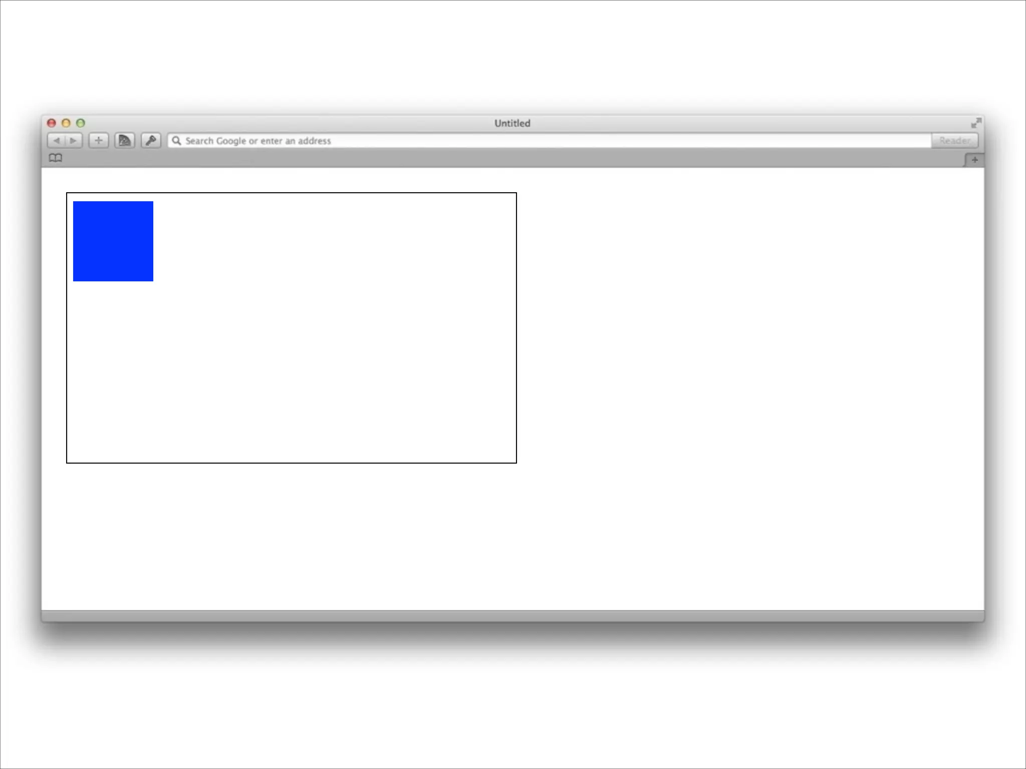
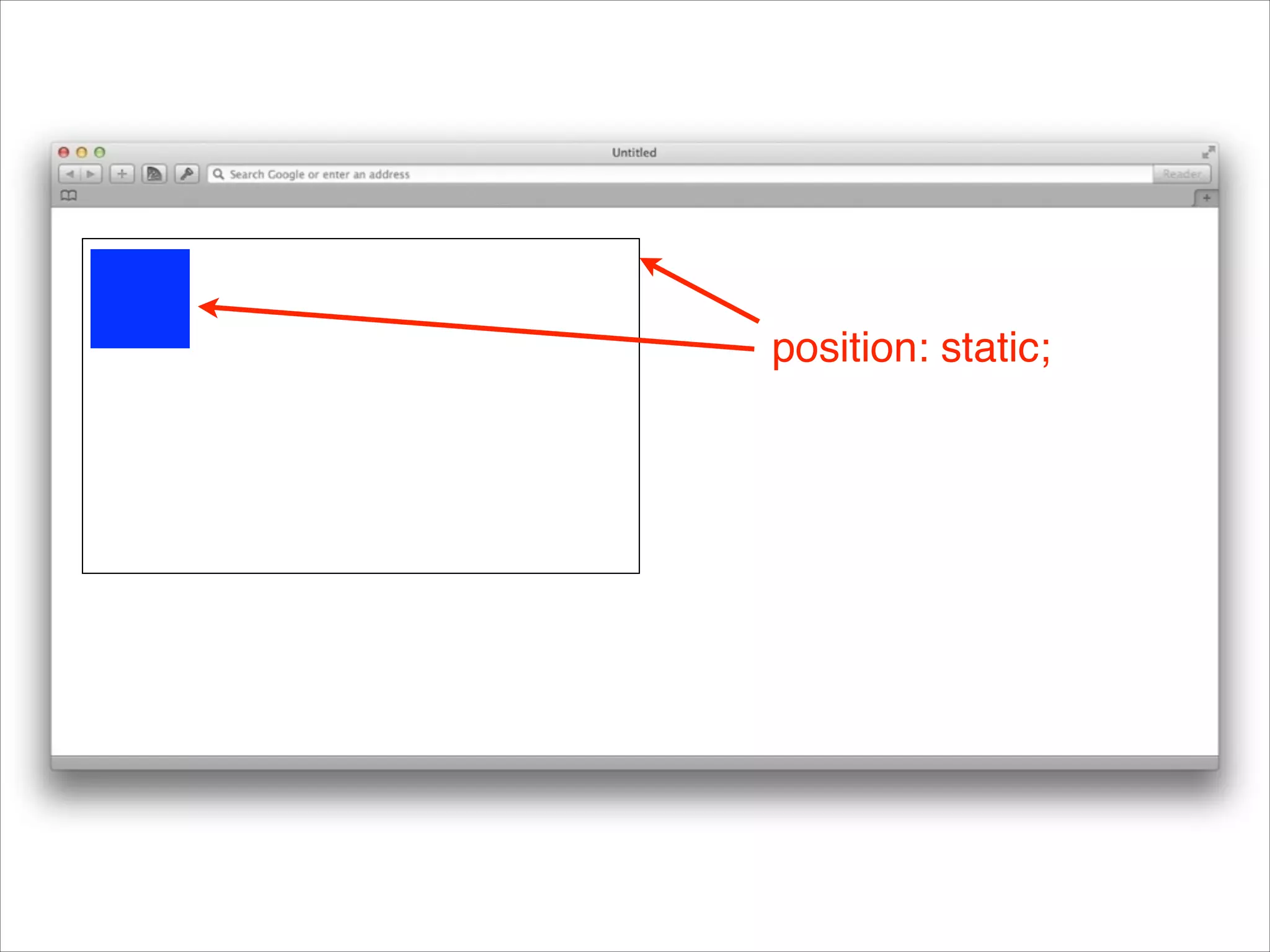
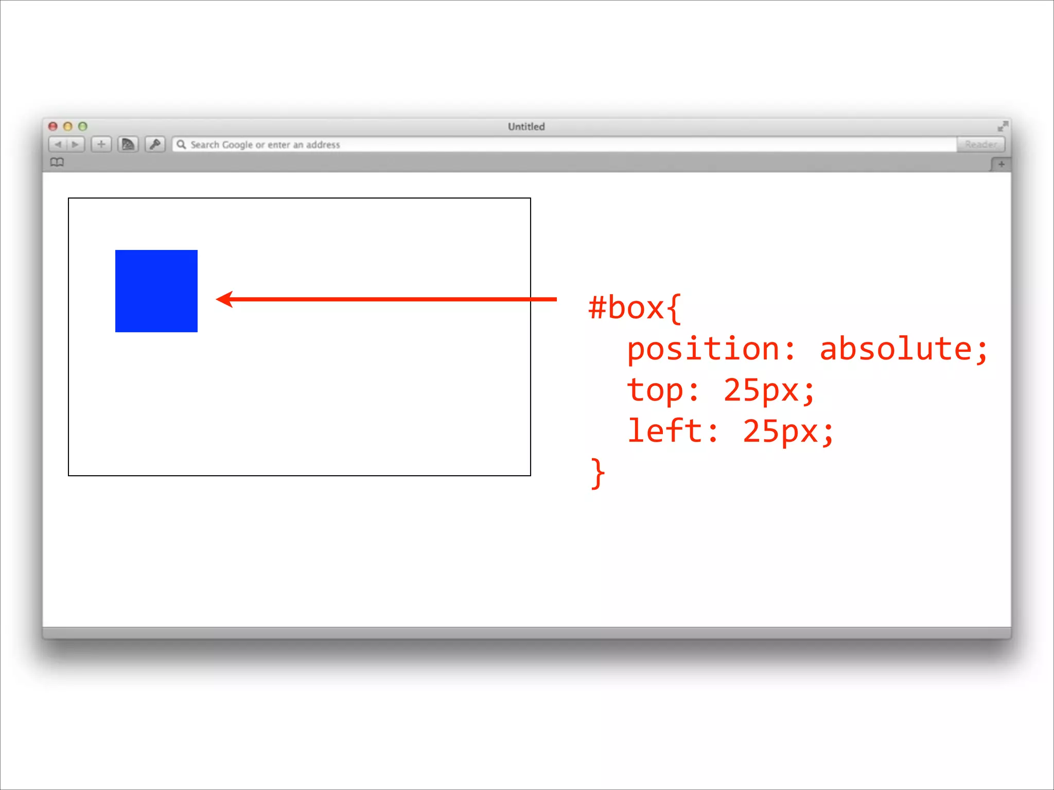
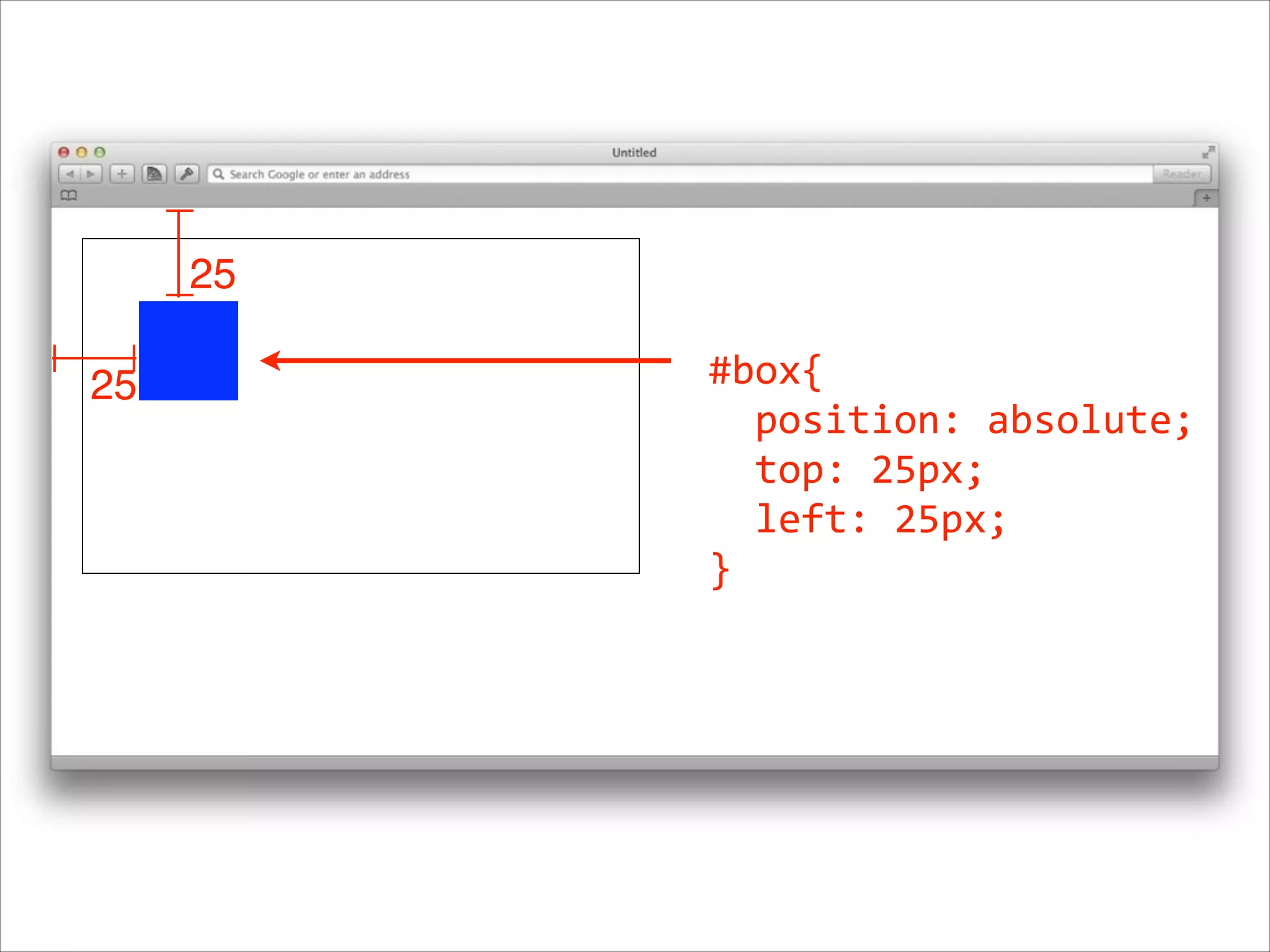
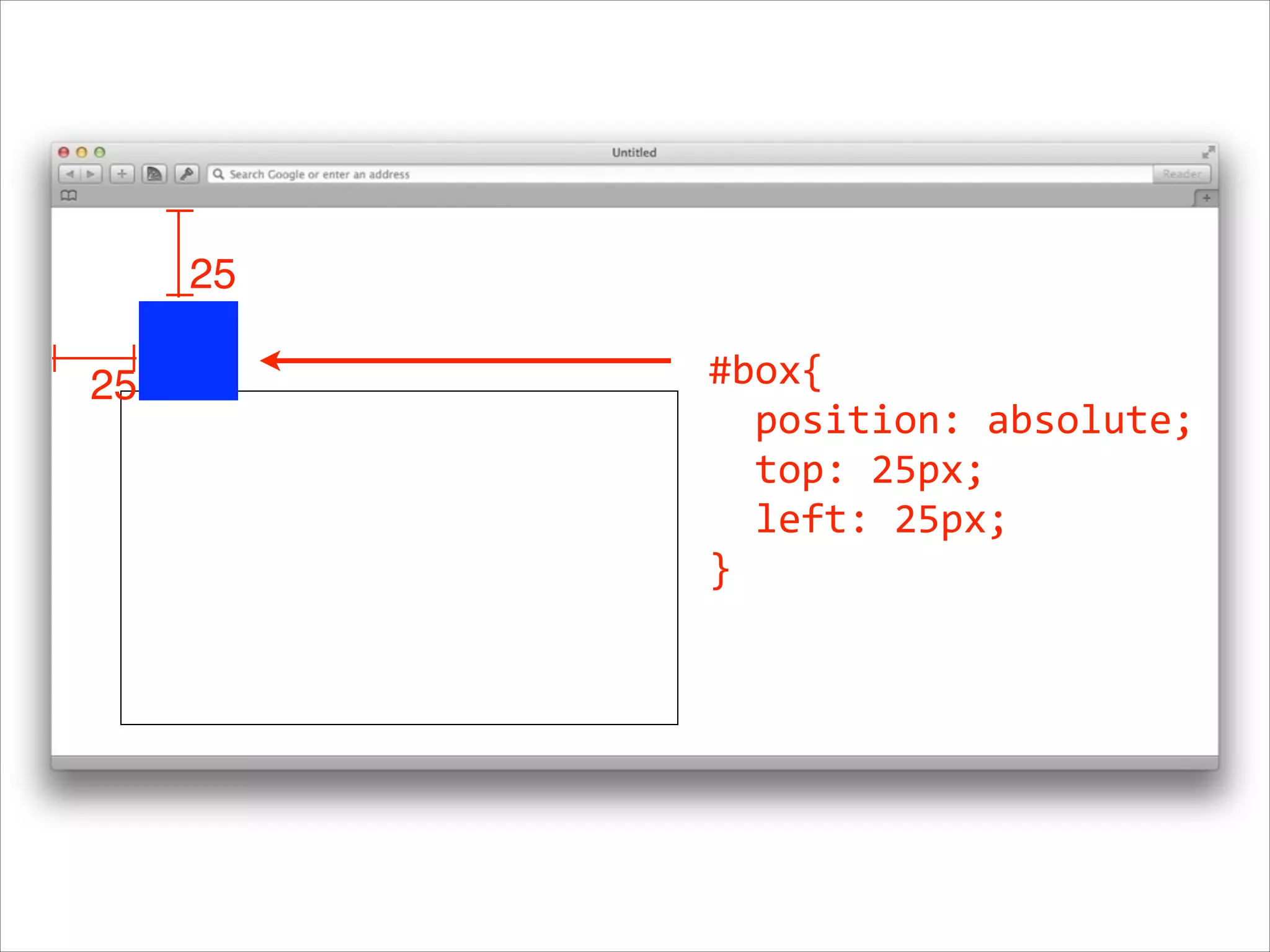
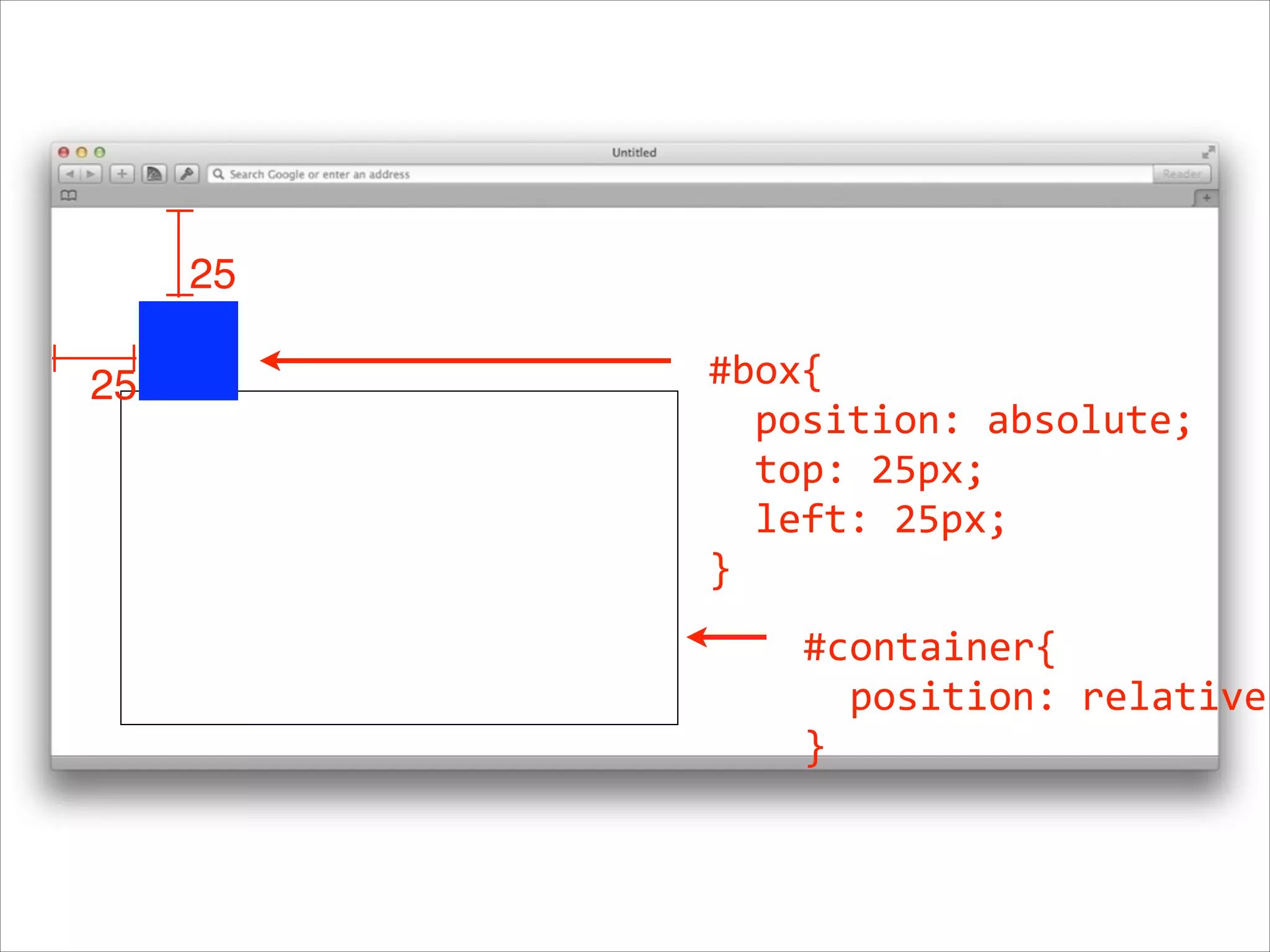
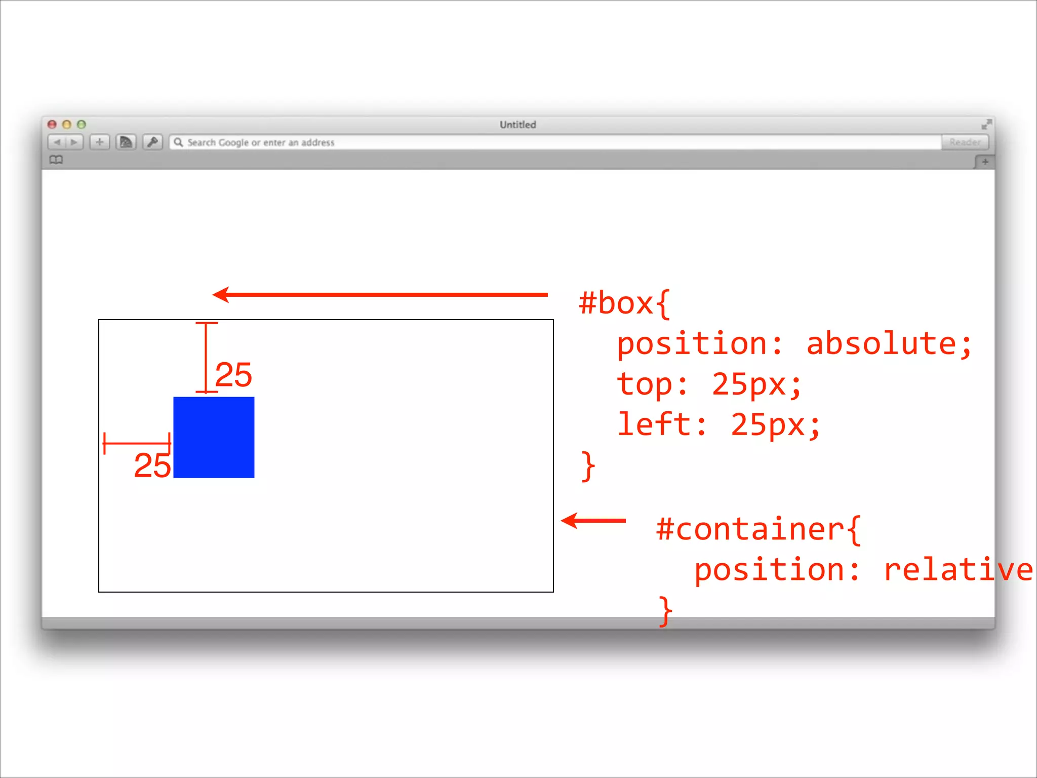
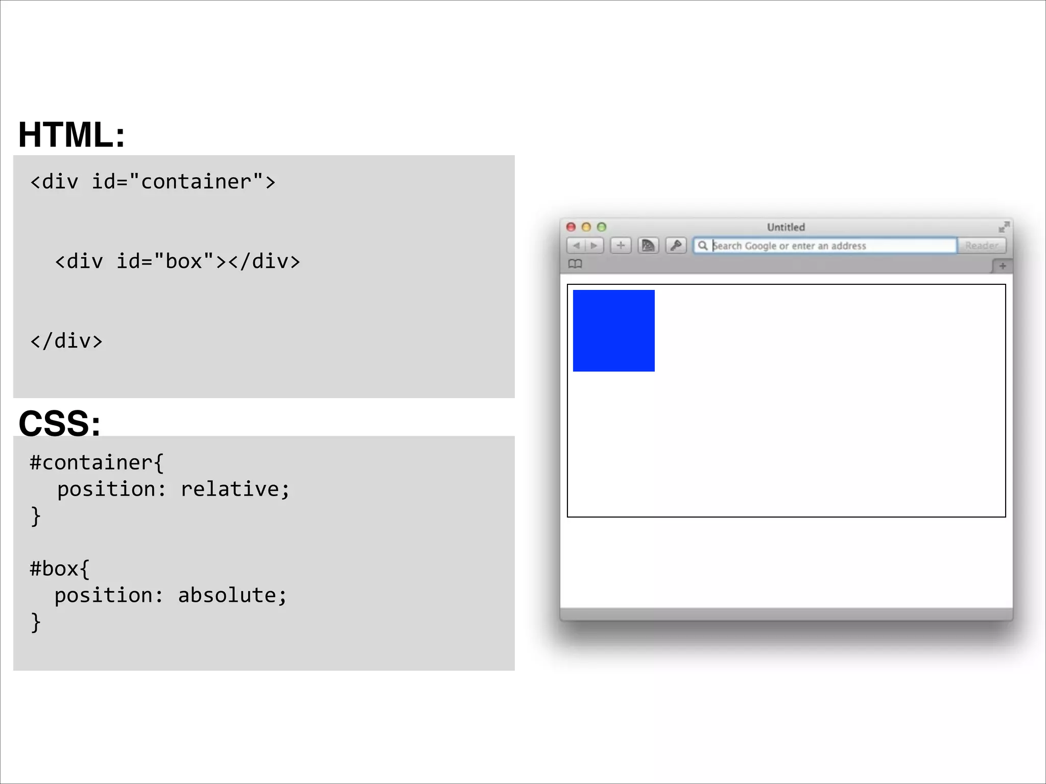
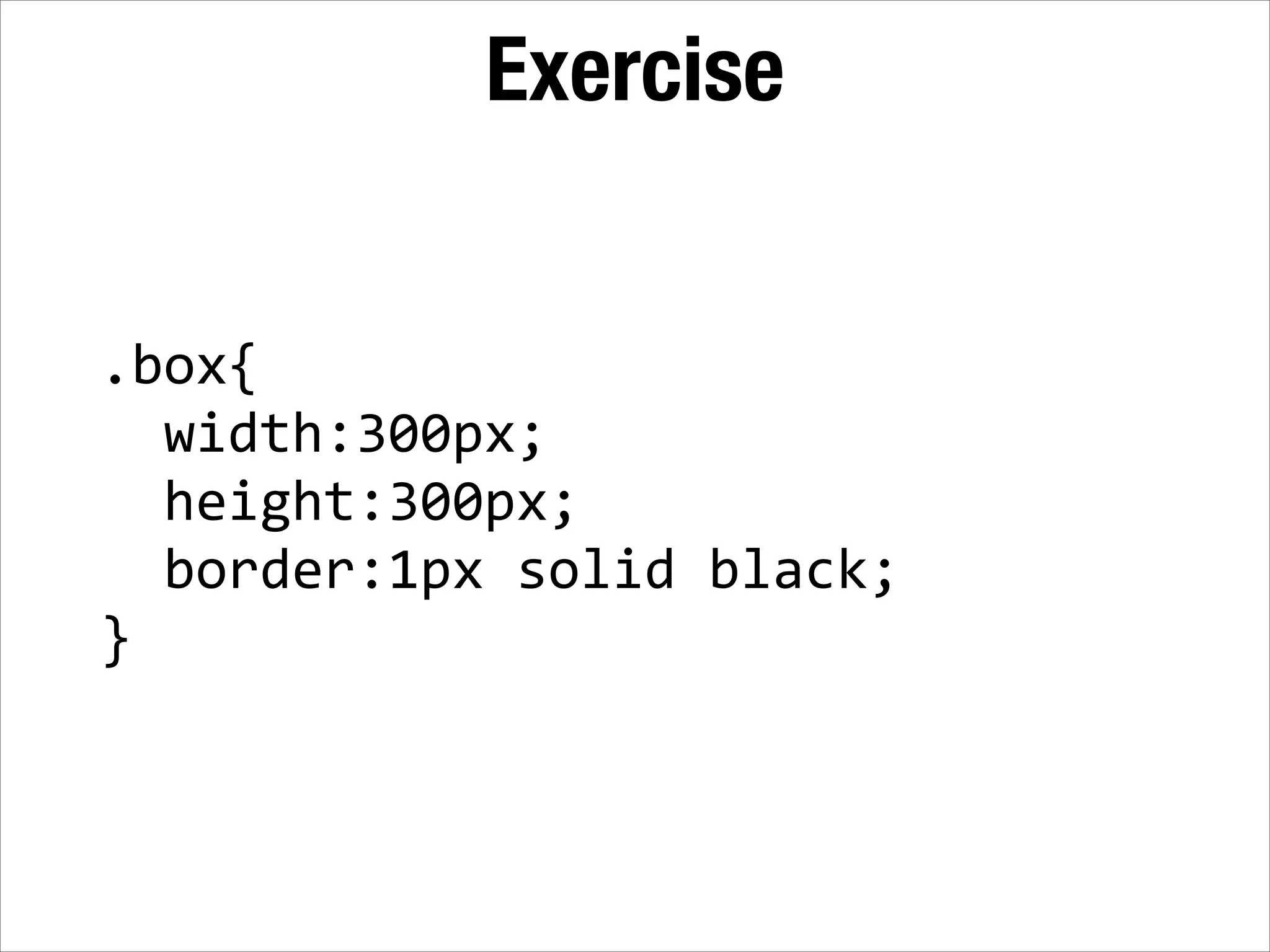
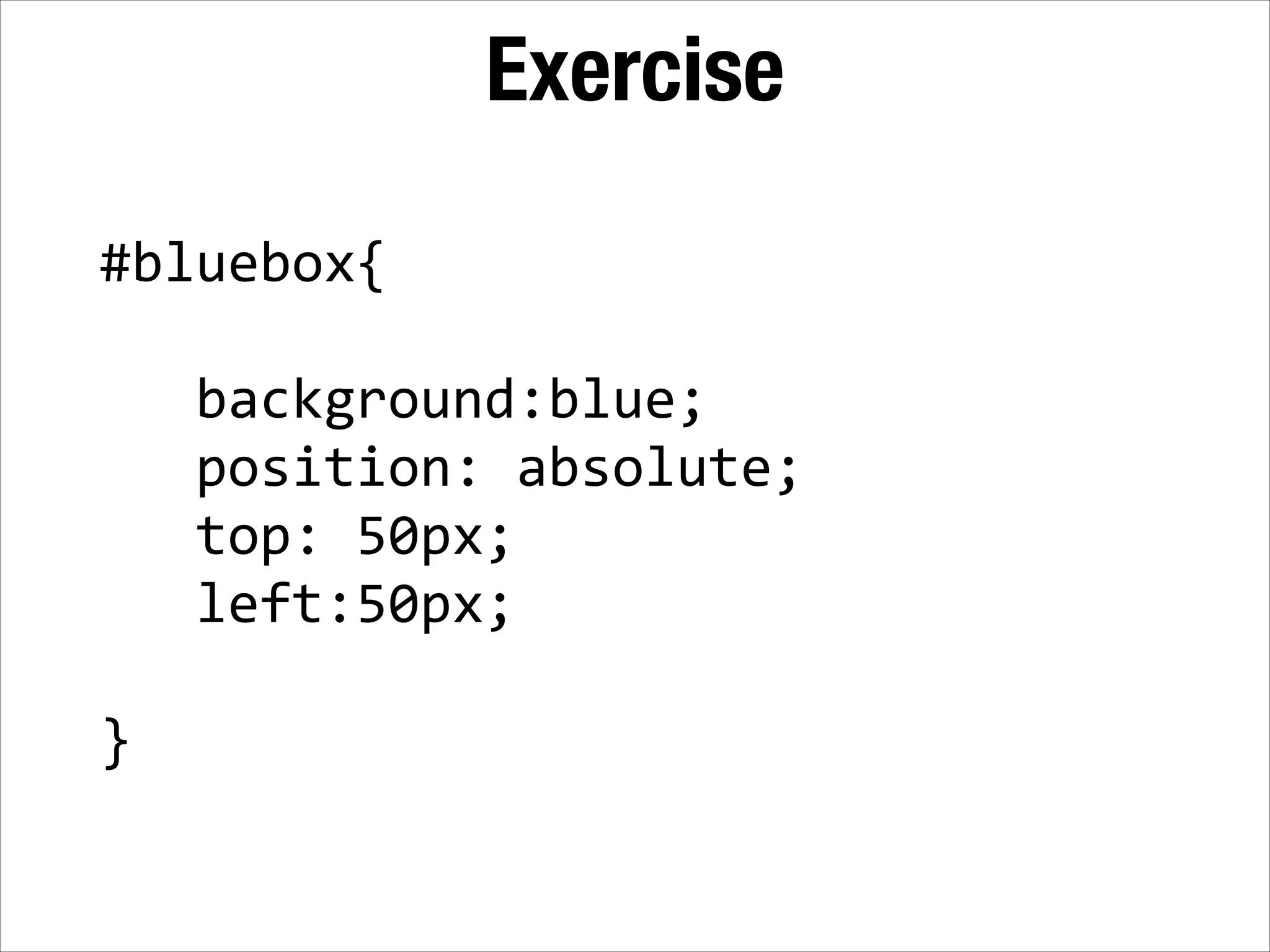
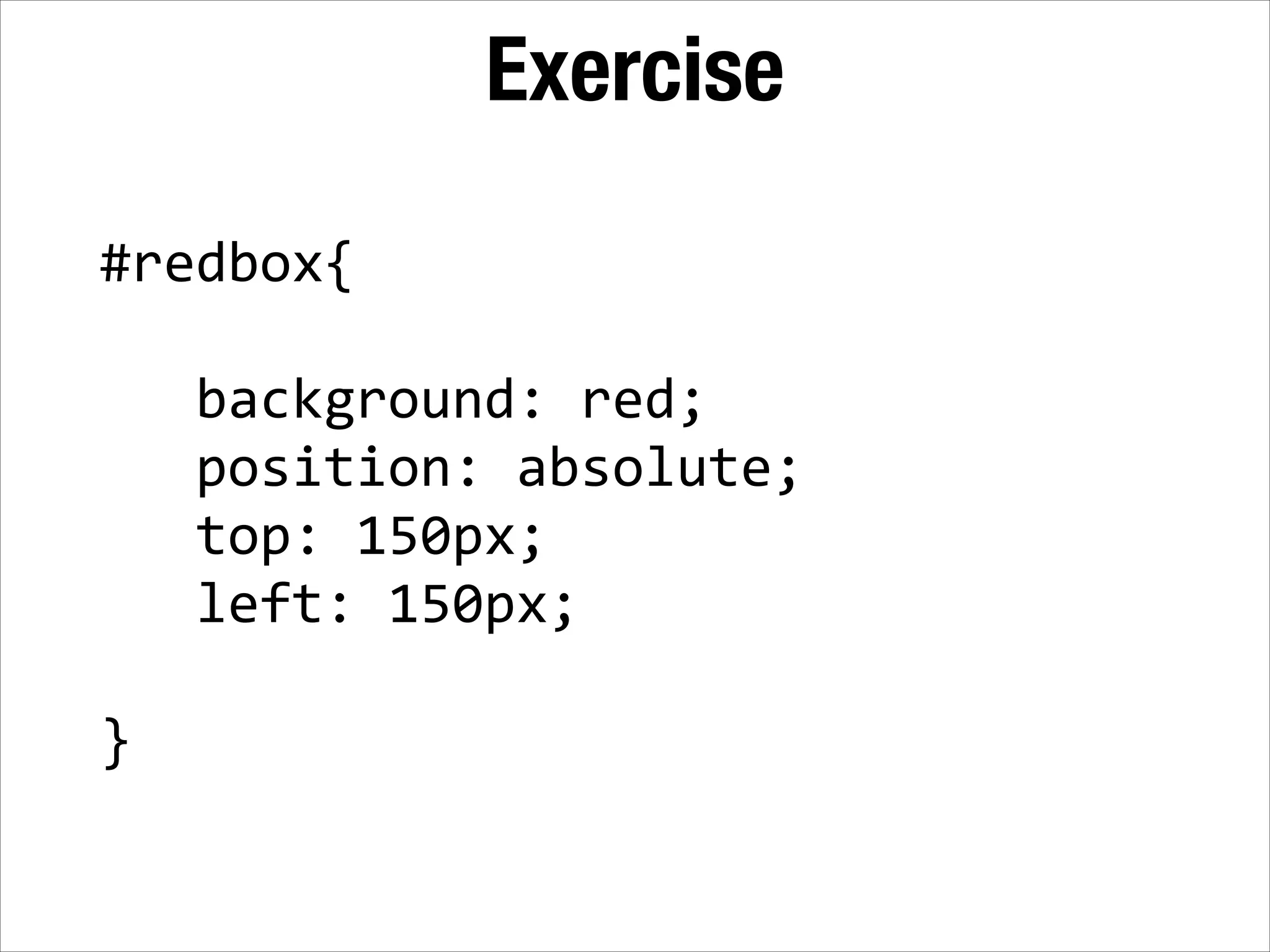
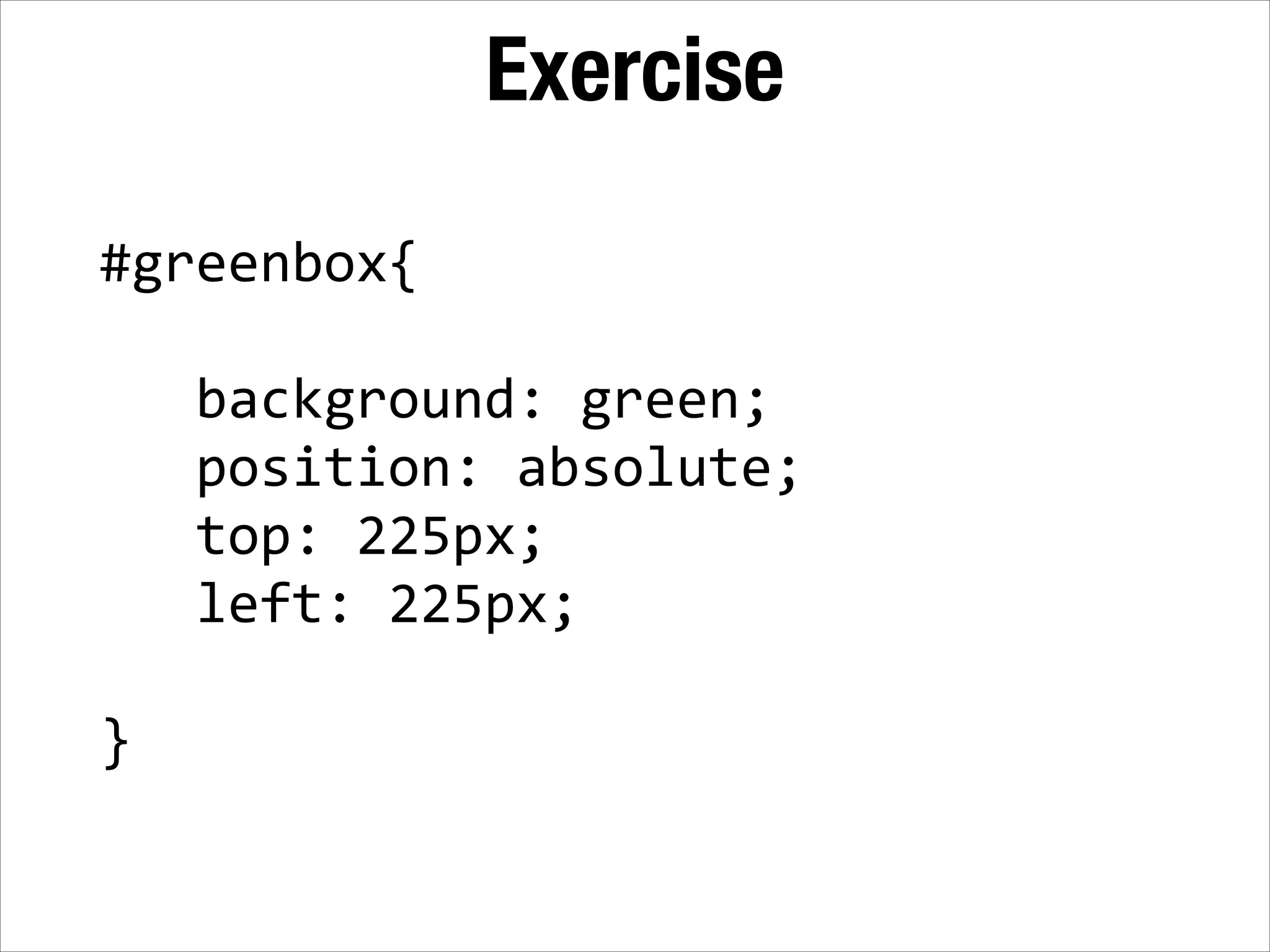
Inline vs Block
Block <div></div>   <div></div>   <div></div>
Inline <span></span>   <span></span>   <span></span>
Examples of each Block Elements <div>   <p>   <h1>   <ul>/<li> Inline Elements <span>   <a>   <strong>   <img> With CSS, you can switch these! (e.g. you can make divs inline or spans block)
Understanding Rules of Block Elements • A <div> tag, (or any block element) will be invisible by default.
Understanding Rules of Block Elements • A <div> tag, (or any block element) will be invisible by default. • A <div> tag (or any block element) will span the length of the browser by 100% by default.
Understanding Rules of Block Elements • A <div> tag, (or any block element) will be invisible by default. • A <div> tag (or any block element) will span the length of the browser by 100% by default. • A <div> tag (or any block element) will conform to its content if no height is set.
Understanding Rules of Block Elements • A <div> tag, (or any block element) will be invisible by default. • A <div> tag (or any block element) will span the length of the browser by 100% by default. • A <div> tag (or any block element) will conform to its content if no height is set. • A <div> tag will stack from top down, regardless of the width.
Exercise Step 1: Create two <div> tags below everything you've done so far, give them class="example1"
Exercise Step 1: Create two <div> tags below everything you've done so far, give them class="example1" <div  class="example1"></div>   <div  class="example1"></div>   ! By default, <div> tags are invisible.
Exercise Step 2: In your <style> tag, add a CSS rule that targets the div, and set's border: 1px  solid  black;
Exercise Step 2: In your <style> tag, add a CSS rule that targets the div, and set's border: 1px  solid  black; .example1{        border:  1px  solid  black;   }   ! By default, block elements span the width of the page.
Exercise Step 3: In the <div> tags, add two sentences about yourself.
Exercise Step 3: In the <div> tags, add two sentences about yourself. <div…>I  feel  fine.</div>   <div…>I  think.</div>   ! By default, block elements conform to their content if no height is set.
Exercise Step 4: In your <style> tag, add another CSS rule to the div selector: height:  100px;
Exercise Step 4: In your <style> tag, add another CSS rule to the div selector: height:  100px; .example1{      height:100px;   }   ! If a height is specified, it takes precedence over the content.
Exercise Step 5: In your <style> tag, add more CSS rules: width:  100px;   background:  red;
Exercise Step 5: In your <style> tag, add more CSS rules: width:  100px;   background:  red; .example1{      height:100px;      width:100px;      background:  red;   }   Stacks from the top down.
Exercise Step 6: In your <style> tag, set the overflow property: overflow:hidden;
Exercise Step 6: In your <style> tag, set the overflow property: overflow:hidden; .example1{      overflow:hidden;   }   This controls what happens to things that protrude from the box.
Understanding rules of inline elements • By default a <span> tag (or any inline element) will not create a new line, but instead will continue stacking from the left, like text.
Understanding rules of inline elements • By default a <span> tag (or any inline element) will not create a new line, but instead will continue stacking from the left, like text. • If there isn't enough browser width to fit inline elements, they automatically shift to the next line.
Understanding rules of inline elements • By default a <span> tag (or any inline element) will not create a new line, but instead will continue stacking from the left, like text. • If there isn't enough browser width to fit inline elements, they automatically shift to the next line. • Height is defined by "line-height", and width is defined by the text flow; you cannot set a height or width.
Understanding rules of inline elements • By default a <span> tag (or any inline element) will not create a new line, but instead will continue stacking from the left, like text. • If there isn't enough browser width to fit inline elements, they automatically shift to the next line. • Height is defined by "line-height", and width is defined by the text flow; you cannot set a height or width. • Generally, inline elements may only contain content, data or other inline elements (not block elements)
Exercise Step 1: Create multiple span tags, each one surrounding two words of the following aphorism: "It's all storytelling, you know. That's what journalism is all about" Tom Brokaw"
Exercise Step 1: Create multiple span tags, each one surrounding two words of the following aphorism: "It's all storytelling, you know. That's what journalism is all about" Tom Brokaw" <span>It's  all  </span>   <span>storytelling  </span>   ! Inline elements stack from the left. If you had used <div> tags, it would stack from top down.
Exercise Step 2: Shrink your browser window to see how the span tags will drop down to the next line.
Exercise Step 2: Shrink your browser window to see how the span tags will drop down to the next line. If there isn't enough room, span tags will drop to the next line.
Exercise Step 3: Add the following CSS rules to the span selector: height:  100px;   width:  100px;
Exercise Step 3: Add the following CSS rules to the span selector: height:  100px;   width:  100px; span{     width  :  100px;     height:  100px;   }   Nothing happens! Height is defined by the line-height property, and width is defined by content.
Exercise Step 4: Add the following CSS rules to the span selector: line-­‐height:100px;
Exercise Step 4: Add the following CSS rules to the span selector: line-­‐height:100px; span{     line-­‐height:100px;   }   ! Line height is the space between lines.
Recap Block elements (layout): • Stacks from the top down, they conform to the content unless you set a width/height. ! Inline elements (content): • Works like text, stacks from the left. Cannot set a width and height on these.
Recap Block elements (layout): • Stacks from the top down, they conform to the content unless you set a width/height. ! Inline elements (content): • Works like text, stacks from the left. Cannot set a width and height on these. Fortunately, we will be working mostly with block elements, which are easier to understand.
The Box Model
Box model applies to BLOCK only hello Margin Border Width Padding
Box Model Any padding, borders or margin are in addition to the width of the box.
HTML: <div  id="container">   !    <div  id="navigation">      </div>   ! </div> CSS: #container{      width:  960px;   }   960px
HTML: <div  id="container">   !    <div  id="navigation">      </div>   ! </div> CSS: #container{      width:  960px;   }   #navigation{      width:  960px;      background:  gray;   } 960px
HTML: <div  id="container">   !    <div  id="navigation">      </div>   ! </div> CSS: #container{      width:  960px;   }   #navigation{      width:  960px;      background:  gray;      border:  5px  solid  red;   } 960px
HTML: <div  id="container">   !    <div  id="navigation">      </div>   ! </div> CSS: #container{      width:  960px;   }   #navigation{      width:  960px;      background:  gray;      border:  5px  solid  red;      padding:  5px;   } 960px
HTML: <div  id="container">   ! 960px    <div  id="navigation">      </div>   ! </div> CSS: #container{      width:  960px;   }   #navigation{      width:  960px;      background:  gray;      border:  5px  solid  red;      padding:  5px;   } 960px
Pop Quiz
What is the width of this box? hello 20px 2px 200px 10px
What is the width of this box? hello 20px 2px 200px 200 pixels 10px
What is the width and padding combined? hello 20px 2px 200px 10px
What is the width and padding combined? hello 20px 2px 200px 220 pixels 10px
What is the width and padding and border combined? hello 20px 2px 200px 10px
What is the width and padding and border combined? hello 20px 2px 200px 224 pixels 10px
What is the total (outer) width? hello 20px 2px 200px 10px
What is the total (outer) width? 200 + 20 + 20 + ! 10 + 10 + 2 + 2 =! hello ! 264 pixels 20px 2px 200px 10px
padding and margins padding:
padding and margins padding:10px;
padding and margins padding:10px  5px  1px  0;
padding and margins padding:10px  5px  1px  0; top
padding and margins padding:10px  5px  1px  0; top right
padding and margins padding:10px  5px  1px  0; top right bottom
padding and margins padding:10px  5px  1px  0; top right left bottom
padding and margins margin: 5px  15px  1px  10px;
padding and margins margin: 5px  15px  1px  10px; top
padding and margins margin: 5px  15px  1px  10px; top right
padding and margins margin: 5px  15px  1px  10px; top right bottom
padding and margins margin: 5px  15px  1px  10px; top right bottom left
padding and margins padding:10px  2px;
padding and margins padding:10px  2px; top! bottom
padding and margins padding:10px  2px; top! right! bottom left
Pop Quiz
Explain the size of the margins around the box margin:  5px  25px;
Explain the size of the margins around the box margin:  5px  25px; Top and bottom are 5 pixels, ! left and right are 25 pixels.!
Explain the size of the padding inside this box padding:  1px  1px  1px  40px;
Explain the size of the padding inside this box padding:  1px  1px  1px  40px; Top, right, bottom are 1 pixel,! the left side is 40 pixels
Explain the size of the margins around the box margin:  0  5px;
Explain the size of the margins around the box margin:  0  5px; Top, right are 0 pixels,! the left and right side is 5 pixels
Explain the size of the padding inside the box padding:  15px;
Explain the size of the padding inside the box padding:  15px; All sides are 15 pixels
Margins, Padding, Width hello Margin Border Width Padding
Box model
Box model
Box model
Box model
More on responsiveness
Set widths as percentages <div></div> 100% Setting width as a percentage will keep it relative to browser width
Browsers don't know how to deal with heights <div></div> ??? Heights don't exist in most cases because the user can scroll Many times you have to manually set a height.
Exceptions: Images/Video <img  src="…"  width="100%"  height="auto">   ! ! <video  width="100%"  height="auto">
Video
The problem with online video <video  width="100%"  height="auto">   ! ! ! ! </video> Each browser is only compatible with certain types of video
The problem with online video <video  width="100%"  height="auto">        <source  src="video.mp4"  type="video/mp4"> ! ! ! ! </video> Chrome/Safari/iOS Each browser is only compatible with certain types of video
The problem with online video <video  width="100%"  height="auto">        <source  src="video.mp4"  type="video/mp4"> ! !    <source  src="video.ogv"  type="video/ogg"> ! ! </video> Chrome/Safari/iOS Firefox Each browser is only compatible with certain types of video
The problem with online video <video  width="100%"  height="auto">        <source  src="video.mp4"  type="video/mp4"> ! !    <source  src="video.ogv"  type="video/ogg"> !      <source  src="video.webm"  type="video/webm"> ! </video> Chrome/Safari/iOS Firefox Internet Explorer Each browser is only compatible with certain types of video
The problem with online video <video  width="100%"  height="auto">        <source  src="video.mp4"  type="video/mp4"> ! !    <source  src="video.ogv"  type="video/ogg"> !      <source  src="video.webm"  type="video/webm"> !      <img  src="fallback.jpg"> </video> Chrome/Safari/iOS Firefox Internet Explorer Each browser is only compatible with certain types of video
Positioning
#sometag{   !  position:  static;   ! }
• Static - This is the default positioning. Elements are arranged according to the normal document flow.
• Static - This is the default positioning. Elements are arranged according to the normal document flow. • Relative - This is identical to static, but causes elements inside this tag to use it as a frame of reference.
• Static - This is the default positioning. Elements are arranged according to the normal document flow. • Relative - This is identical to static, but causes elements inside this tag to use it as a frame of reference. • Absolute - Elements are positioned separate from the document flow. Items will be located relative to its parent element.
• Static - This is the default positioning. Elements are arranged according to the normal document flow. • Relative - This is identical to static, but causes elements inside this tag to use it as a frame of reference. • Absolute - Elements are positioned separate from the document flow. Items will be located relative to its parent element. • Fixed - Position elements separate from the document flow, but relative to the browser. Stays in the same spot even when scrolled.
position: static;
#box{      position:  absolute;      top:  25px;      left:  25px;     }
25 25 #box{      position:  absolute;      top:  25px;      left:  25px;     }
25 25 #box{      position:  absolute;      top:  25px;      left:  25px;     } #container{      position:  relative; }
HTML: <div  id="container">   !        <div  id="box"></div>   ! ! </div> CSS: #container{   position:  relative;   }   ! #box{      position:  absolute;   }
Pop Quiz!
What type of positioning should the outer container be?
What type of positioning should the outer container be? relative!
What type of positioning should content inside the container be, when you want to position it?
What type of positioning should content inside the container be, when you want to position it? absolute!
z-index
• z-index property is an arbitrary number that determines the stacking order.! • A higher z-index number will indicate those elements should be on top. A lower number means they should appear underneath other elements.! • z-index property can only be applied to elements that are positioned with relative, absolute or fixed, but not the default static.
HTML: <div  id="container">      <div  id="redbox"></div>      <div  id="bluebox"></div>      <div  id="greenbox"></div>   </div> CSS: #redbox{      position:absolute;      z-­‐index:  938323;   }   #bluebox{      position:absolute;      z-­‐index:  10;   }   #greenbox{   z-­‐index:  9999999999;   }
Pop Quiz
Which element will display on top of the other? #blue{   position:  relative;   z-­‐index:  55;   } #red{   position:  absolute;   z-­‐index:  45;   }
Which element will display on top of the other? #blue{   position:  relative;   z-­‐index:  55;   } #red{   position:  absolute;   z-­‐index:  45;   } #blue!
Which element will display on top of the other? .bluebox{   position:static;   z-­‐index:  55;   } #bluebox{   position:  relative;   z-­‐index:  45;   }
Which element will display on top of the other? .bluebox{   position:static;   z-­‐index:  55;   } #bluebox{   position:  relative;   z-­‐index:  45;   } #bluebox!
Exercise <div  id="redbox"  class="box"></div>   <div  id="bluebox"  class="box"></div>   <div  id="greenbox"  class="box"></div>
Exercise .box{      width:300px;      height:300px;      border:1px  solid  black;   }
Exercise #bluebox{   !      background:blue;        position:  absolute;        top:  50px;        left:50px;   ! }
Exercise #redbox{   !      background:  red;        position:  absolute;        top:  150px;        left:  150px;   ! }
Exercise #greenbox{   !      background:  green;        position:  absolute;        top:  225px;        left:  225px;   ! }

Inline, Block and Positioning in CSS

  • 1.
  • 2.
  • 3.
  • 4.
    Examples of each BlockElements <div>   <p>   <h1>   <ul>/<li> Inline Elements <span>   <a>   <strong>   <img> With CSS, you can switch these! (e.g. you can make divs inline or spans block)
  • 5.
    Understanding Rules ofBlock Elements • A <div> tag, (or any block element) will be invisible by default.
  • 6.
    Understanding Rules ofBlock Elements • A <div> tag, (or any block element) will be invisible by default. • A <div> tag (or any block element) will span the length of the browser by 100% by default.
  • 7.
    Understanding Rules ofBlock Elements • A <div> tag, (or any block element) will be invisible by default. • A <div> tag (or any block element) will span the length of the browser by 100% by default. • A <div> tag (or any block element) will conform to its content if no height is set.
  • 8.
    Understanding Rules ofBlock Elements • A <div> tag, (or any block element) will be invisible by default. • A <div> tag (or any block element) will span the length of the browser by 100% by default. • A <div> tag (or any block element) will conform to its content if no height is set. • A <div> tag will stack from top down, regardless of the width.
  • 9.
    Exercise Step 1: Create two<div> tags below everything you've done so far, give them class="example1"
  • 10.
    Exercise Step 1: Create two<div> tags below everything you've done so far, give them class="example1" <div  class="example1"></div>   <div  class="example1"></div>   ! By default, <div> tags are invisible.
  • 11.
    Exercise Step 2: In your<style> tag, add a CSS rule that targets the div, and set's border: 1px  solid  black;
  • 12.
    Exercise Step 2: In your<style> tag, add a CSS rule that targets the div, and set's border: 1px  solid  black; .example1{        border:  1px  solid  black;   }   ! By default, block elements span the width of the page.
  • 13.
    Exercise Step 3: In the<div> tags, add two sentences about yourself.
  • 14.
    Exercise Step 3: In the<div> tags, add two sentences about yourself. <div…>I  feel  fine.</div>   <div…>I  think.</div>   ! By default, block elements conform to their content if no height is set.
  • 15.
    Exercise Step 4: In your<style> tag, add another CSS rule to the div selector: height:  100px;
  • 16.
    Exercise Step 4: In your<style> tag, add another CSS rule to the div selector: height:  100px; .example1{      height:100px;   }   ! If a height is specified, it takes precedence over the content.
  • 17.
    Exercise Step 5: In your<style> tag, add more CSS rules: width:  100px;   background:  red;
  • 18.
    Exercise Step 5: In your<style> tag, add more CSS rules: width:  100px;   background:  red; .example1{      height:100px;      width:100px;      background:  red;   }   Stacks from the top down.
  • 19.
    Exercise Step 6: In your<style> tag, set the overflow property: overflow:hidden;
  • 20.
    Exercise Step 6: In your<style> tag, set the overflow property: overflow:hidden; .example1{      overflow:hidden;   }   This controls what happens to things that protrude from the box.
  • 21.
    Understanding rules ofinline elements • By default a <span> tag (or any inline element) will not create a new line, but instead will continue stacking from the left, like text.
  • 22.
    Understanding rules ofinline elements • By default a <span> tag (or any inline element) will not create a new line, but instead will continue stacking from the left, like text. • If there isn't enough browser width to fit inline elements, they automatically shift to the next line.
  • 23.
    Understanding rules ofinline elements • By default a <span> tag (or any inline element) will not create a new line, but instead will continue stacking from the left, like text. • If there isn't enough browser width to fit inline elements, they automatically shift to the next line. • Height is defined by "line-height", and width is defined by the text flow; you cannot set a height or width.
  • 24.
    Understanding rules ofinline elements • By default a <span> tag (or any inline element) will not create a new line, but instead will continue stacking from the left, like text. • If there isn't enough browser width to fit inline elements, they automatically shift to the next line. • Height is defined by "line-height", and width is defined by the text flow; you cannot set a height or width. • Generally, inline elements may only contain content, data or other inline elements (not block elements)
  • 25.
    Exercise Step 1: Create multiplespan tags, each one surrounding two words of the following aphorism: "It's all storytelling, you know. That's what journalism is all about" Tom Brokaw"
  • 26.
    Exercise Step 1: Create multiplespan tags, each one surrounding two words of the following aphorism: "It's all storytelling, you know. That's what journalism is all about" Tom Brokaw" <span>It's  all  </span>   <span>storytelling  </span>   ! Inline elements stack from the left. If you had used <div> tags, it would stack from top down.
  • 27.
    Exercise Step 2: Shrink yourbrowser window to see how the span tags will drop down to the next line.
  • 28.
    Exercise Step 2: Shrink yourbrowser window to see how the span tags will drop down to the next line. If there isn't enough room, span tags will drop to the next line.
  • 29.
    Exercise Step 3: Add thefollowing CSS rules to the span selector: height:  100px;   width:  100px;
  • 30.
    Exercise Step 3: Add thefollowing CSS rules to the span selector: height:  100px;   width:  100px; span{     width  :  100px;     height:  100px;   }   Nothing happens! Height is defined by the line-height property, and width is defined by content.
  • 31.
    Exercise Step 4: Add thefollowing CSS rules to the span selector: line-­‐height:100px;
  • 32.
    Exercise Step 4: Add thefollowing CSS rules to the span selector: line-­‐height:100px; span{     line-­‐height:100px;   }   ! Line height is the space between lines.
  • 33.
    Recap Block elements (layout): •Stacks from the top down, they conform to the content unless you set a width/height. ! Inline elements (content): • Works like text, stacks from the left. Cannot set a width and height on these.
  • 34.
    Recap Block elements (layout): •Stacks from the top down, they conform to the content unless you set a width/height. ! Inline elements (content): • Works like text, stacks from the left. Cannot set a width and height on these. Fortunately, we will be working mostly with block elements, which are easier to understand.
  • 35.
  • 36.
    Box model appliesto BLOCK only hello Margin Border Width Padding
  • 37.
    Box Model Any padding,borders or margin are in addition to the width of the box.
  • 38.
    HTML: <div  id="container">   !    <div  id="navigation">      </div>   ! </div> CSS: #container{      width:  960px;   }   960px
  • 39.
    HTML: <div  id="container">   !    <div  id="navigation">      </div>   ! </div> CSS: #container{      width:  960px;   }   #navigation{      width:  960px;      background:  gray;   } 960px
  • 40.
    HTML: <div  id="container">   !    <div  id="navigation">      </div>   ! </div> CSS: #container{      width:  960px;   }   #navigation{      width:  960px;      background:  gray;      border:  5px  solid  red;   } 960px
  • 41.
    HTML: <div  id="container">   !    <div  id="navigation">      </div>   ! </div> CSS: #container{      width:  960px;   }   #navigation{      width:  960px;      background:  gray;      border:  5px  solid  red;   } 960px
  • 42.
    HTML: <div  id="container">   !    <div  id="navigation">      </div>   ! </div> CSS: #container{      width:  960px;   }   #navigation{      width:  960px;      background:  gray;      border:  5px  solid  red;      padding:  5px;   } 960px
  • 43.
    HTML: <div  id="container">   ! 960px    <div  id="navigation">      </div>   ! </div> CSS: #container{      width:  960px;   }   #navigation{      width:  960px;      background:  gray;      border:  5px  solid  red;      padding:  5px;   } 960px
  • 44.
    HTML: <div  id="container">   ! 960px    <div  id="navigation">      </div>   ! </div> CSS: #container{      width:  960px;   }   #navigation{      width:  960px;      background:  gray;      border:  5px  solid  red;      padding:  5px;   } 960px
  • 45.
  • 46.
    What is thewidth of this box? hello 20px 2px 200px 10px
  • 47.
    What is thewidth of this box? hello 20px 2px 200px 200 pixels 10px
  • 48.
    What is thewidth and padding combined? hello 20px 2px 200px 10px
  • 49.
    What is thewidth and padding combined? hello 20px 2px 200px 220 pixels 10px
  • 50.
    What is thewidth and padding and border combined? hello 20px 2px 200px 10px
  • 51.
    What is thewidth and padding and border combined? hello 20px 2px 200px 224 pixels 10px
  • 52.
    What is thetotal (outer) width? hello 20px 2px 200px 10px
  • 53.
    What is thetotal (outer) width? 200 + 20 + 20 + ! 10 + 10 + 2 + 2 =! hello ! 264 pixels 20px 2px 200px 10px
  • 54.
  • 55.
  • 56.
  • 57.
  • 58.
    padding and margins padding:10px  5px  1px  0; top right
  • 59.
    padding and margins padding:10px  5px  1px  0; top right bottom
  • 60.
    padding and margins padding:10px  5px  1px  0; top right left bottom
  • 61.
    padding and margins padding:10px  5px  1px  0; top right left bottom
  • 62.
    padding and margins margin:5px  15px  1px  10px;
  • 63.
    padding and margins margin:5px  15px  1px  10px; top
  • 64.
    padding and margins margin:5px  15px  1px  10px; top right
  • 65.
    padding and margins margin:5px  15px  1px  10px; top right bottom
  • 66.
    padding and margins margin:5px  15px  1px  10px; top right bottom left
  • 67.
  • 68.
  • 69.
    padding and margins padding:10px  2px; top! right! bottom left
  • 70.
  • 71.
    Explain the sizeof the margins around the box margin:  5px  25px;
  • 72.
    Explain the sizeof the margins around the box margin:  5px  25px; Top and bottom are 5 pixels, ! left and right are 25 pixels.!
  • 73.
    Explain the sizeof the padding inside this box padding:  1px  1px  1px  40px;
  • 74.
    Explain the sizeof the padding inside this box padding:  1px  1px  1px  40px; Top, right, bottom are 1 pixel,! the left side is 40 pixels
  • 75.
    Explain the sizeof the margins around the box margin:  0  5px;
  • 76.
    Explain the sizeof the margins around the box margin:  0  5px; Top, right are 0 pixels,! the left and right side is 5 pixels
  • 77.
    Explain the sizeof the padding inside the box padding:  15px;
  • 78.
    Explain the sizeof the padding inside the box padding:  15px; All sides are 15 pixels
  • 79.
  • 80.
  • 81.
  • 82.
  • 83.
  • 84.
  • 85.
    Set widths aspercentages <div></div> 100% Setting width as a percentage will keep it relative to browser width
  • 86.
    Browsers don't knowhow to deal with heights <div></div> ??? Heights don't exist in most cases because the user can scroll Many times you have to manually set a height.
  • 87.
    Exceptions: Images/Video <img  src="…"  width="100%"  height="auto">   ! ! <video  width="100%"  height="auto">
  • 88.
    Exceptions: Images/Video <img  src="…"  width="100%"  height="auto">   ! ! <video  width="100%"  height="auto">
  • 89.
  • 90.
    The problem withonline video <video  width="100%"  height="auto">   ! ! ! ! </video> Each browser is only compatible with certain types of video
  • 91.
    The problem withonline video <video  width="100%"  height="auto">        <source  src="video.mp4"  type="video/mp4"> ! ! ! ! </video> Chrome/Safari/iOS Each browser is only compatible with certain types of video
  • 92.
    The problem withonline video <video  width="100%"  height="auto">        <source  src="video.mp4"  type="video/mp4"> ! !    <source  src="video.ogv"  type="video/ogg"> ! ! </video> Chrome/Safari/iOS Firefox Each browser is only compatible with certain types of video
  • 93.
    The problem withonline video <video  width="100%"  height="auto">        <source  src="video.mp4"  type="video/mp4"> ! !    <source  src="video.ogv"  type="video/ogg"> !      <source  src="video.webm"  type="video/webm"> ! </video> Chrome/Safari/iOS Firefox Internet Explorer Each browser is only compatible with certain types of video
  • 94.
    The problem withonline video <video  width="100%"  height="auto">        <source  src="video.mp4"  type="video/mp4"> ! !    <source  src="video.ogv"  type="video/ogg"> !      <source  src="video.webm"  type="video/webm"> !      <img  src="fallback.jpg"> </video> Chrome/Safari/iOS Firefox Internet Explorer Each browser is only compatible with certain types of video
  • 95.
  • 96.
  • 97.
  • 98.
    • Static -This is the default positioning. Elements are arranged according to the normal document flow.
  • 99.
    • Static -This is the default positioning. Elements are arranged according to the normal document flow. • Relative - This is identical to static, but causes elements inside this tag to use it as a frame of reference.
  • 100.
    • Static -This is the default positioning. Elements are arranged according to the normal document flow. • Relative - This is identical to static, but causes elements inside this tag to use it as a frame of reference. • Absolute - Elements are positioned separate from the document flow. Items will be located relative to its parent element.
  • 101.
    • Static -This is the default positioning. Elements are arranged according to the normal document flow. • Relative - This is identical to static, but causes elements inside this tag to use it as a frame of reference. • Absolute - Elements are positioned separate from the document flow. Items will be located relative to its parent element. • Fixed - Position elements separate from the document flow, but relative to the browser. Stays in the same spot even when scrolled.
  • 104.
  • 106.
    #box{      position:  absolute;      top:  25px;      left:  25px;     }
  • 107.
    25 25 #box{      position:  absolute;      top:  25px;      left:  25px;     }
  • 108.
    25 25 #box{      position:  absolute;      top:  25px;      left:  25px;     }
  • 109.
    25 25 #box{      position:  absolute;      top:  25px;      left:  25px;     } #container{      position:  relative; }
  • 110.
    25 25 #box{      position:  absolute;      top:  25px;      left:  25px;     } #container{      position:  relative; }
  • 111.
    HTML: <div  id="container">   !        <div  id="box"></div>   ! ! </div> CSS: #container{   position:  relative;   }   ! #box{      position:  absolute;   }
  • 112.
  • 113.
    What type ofpositioning should the outer container be?
  • 114.
    What type ofpositioning should the outer container be? relative!
  • 115.
    What type ofpositioning should content inside the container be, when you want to position it?
  • 116.
    What type ofpositioning should content inside the container be, when you want to position it? absolute!
  • 117.
  • 119.
    • z-index property isan arbitrary number that determines the stacking order.! • A higher z-index number will indicate those elements should be on top. A lower number means they should appear underneath other elements.! • z-index property can only be applied to elements that are positioned with relative, absolute or fixed, but not the default static.
  • 120.
    HTML: <div  id="container">      <div  id="redbox"></div>      <div  id="bluebox"></div>      <div  id="greenbox"></div>   </div> CSS: #redbox{      position:absolute;      z-­‐index:  938323;   }   #bluebox{      position:absolute;      z-­‐index:  10;   }   #greenbox{   z-­‐index:  9999999999;   }
  • 121.
    HTML: <div  id="container">      <div  id="redbox"></div>      <div  id="bluebox"></div>      <div  id="greenbox"></div>   </div> CSS: #redbox{      position:absolute;      z-­‐index:  938323;   }   #bluebox{      position:absolute;      z-­‐index:  10;   }   #greenbox{   z-­‐index:  9999999999;   }
  • 122.
  • 123.
    Which element willdisplay on top of the other? #blue{   position:  relative;   z-­‐index:  55;   } #red{   position:  absolute;   z-­‐index:  45;   }
  • 124.
    Which element willdisplay on top of the other? #blue{   position:  relative;   z-­‐index:  55;   } #red{   position:  absolute;   z-­‐index:  45;   } #blue!
  • 125.
    Which element willdisplay on top of the other? .bluebox{   position:static;   z-­‐index:  55;   } #bluebox{   position:  relative;   z-­‐index:  45;   }
  • 126.
    Which element willdisplay on top of the other? .bluebox{   position:static;   z-­‐index:  55;   } #bluebox{   position:  relative;   z-­‐index:  45;   } #bluebox!
  • 127.
    Exercise <div  id="redbox"  class="box"></div>   <div  id="bluebox"  class="box"></div>   <div  id="greenbox"  class="box"></div>
  • 128.
    Exercise .box{      width:300px;      height:300px;      border:1px  solid  black;   }
  • 129.
    Exercise #bluebox{   !      background:blue;        position:  absolute;        top:  50px;        left:50px;   ! }
  • 130.
    Exercise #redbox{   !      background:  red;        position:  absolute;        top:  150px;        left:  150px;   ! }
  • 131.
    Exercise #greenbox{   !      background:  green;        position:  absolute;        top:  225px;        left:  225px;   ! }