Downloaded 116 times
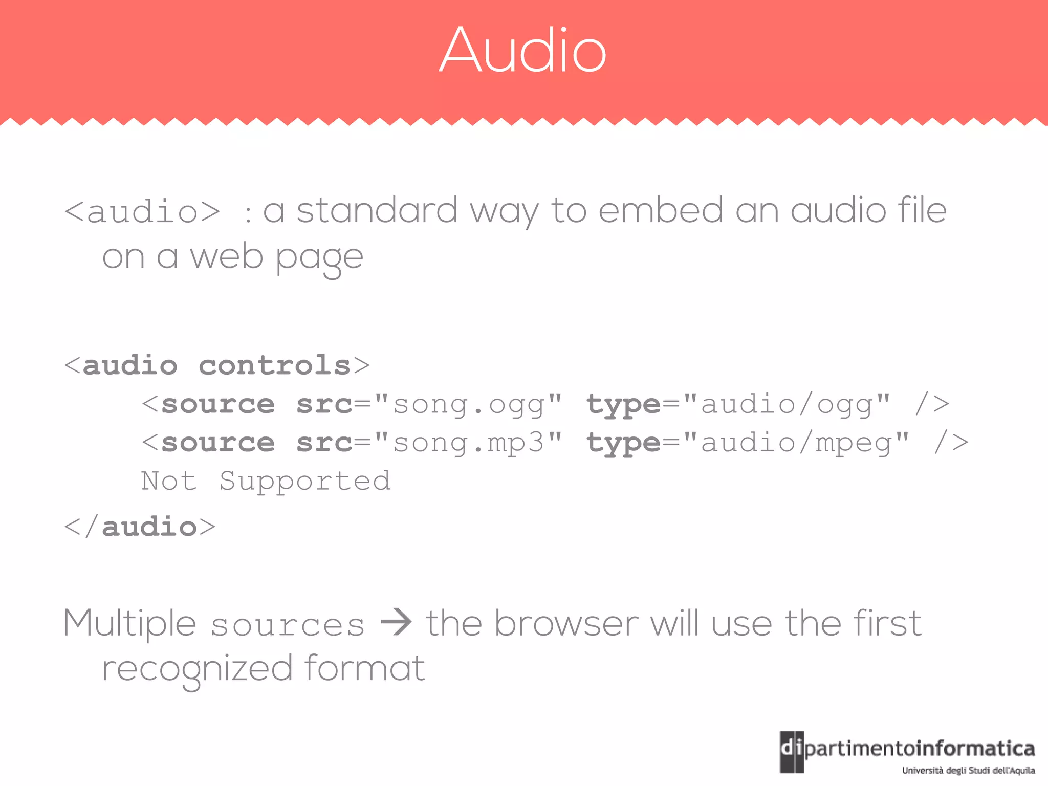
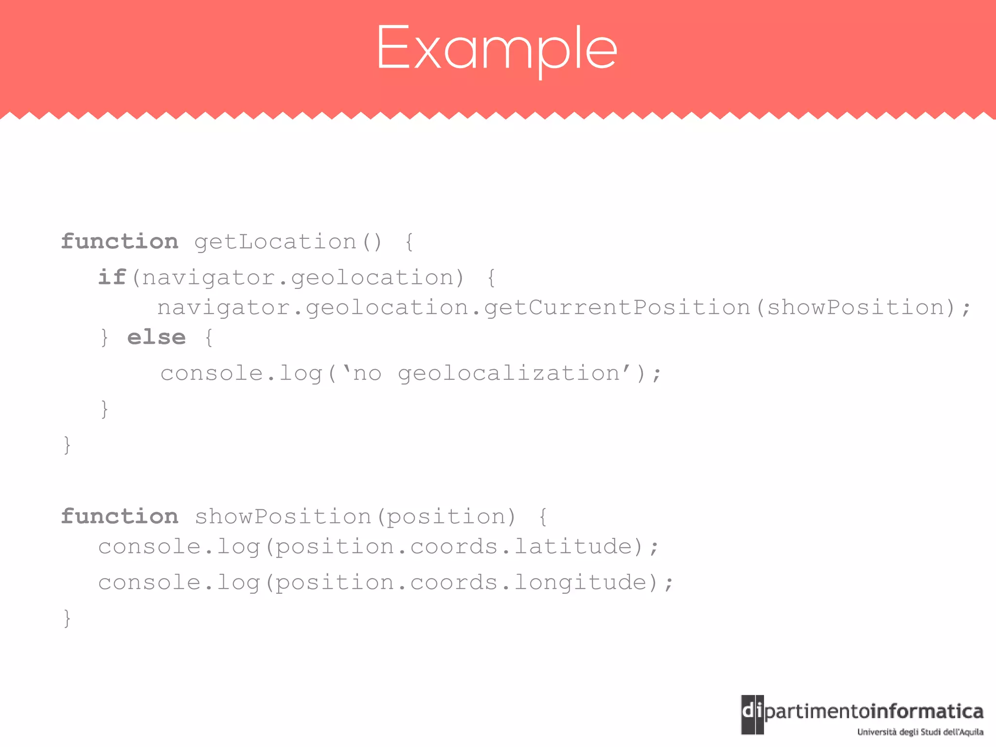
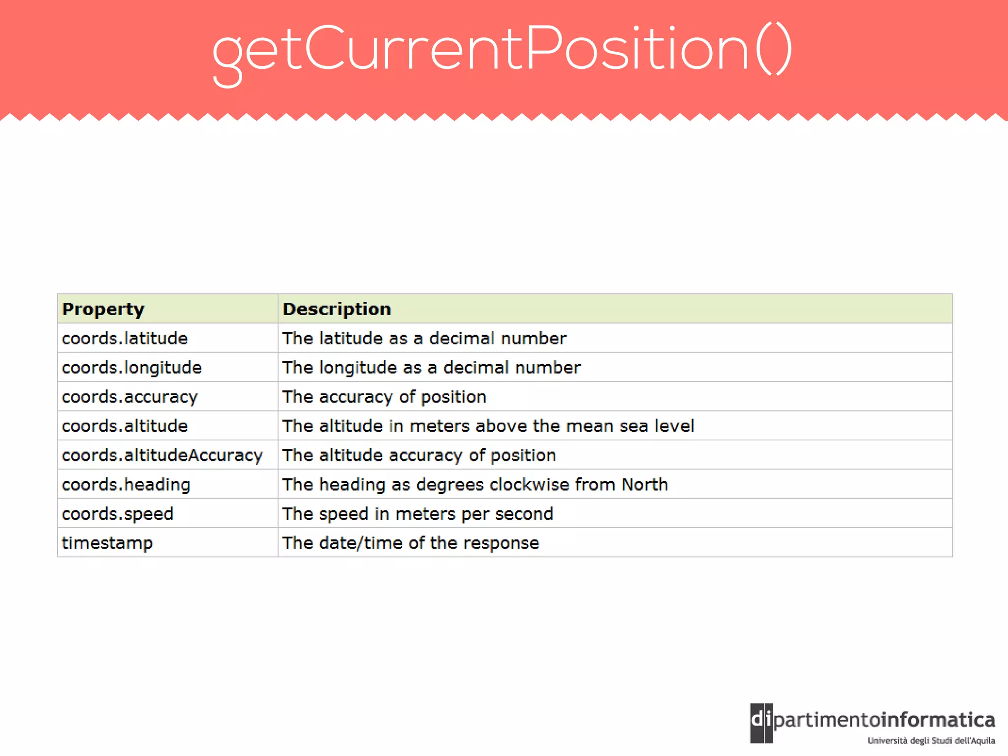


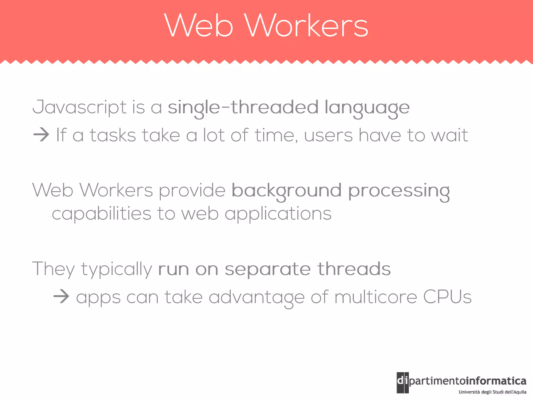
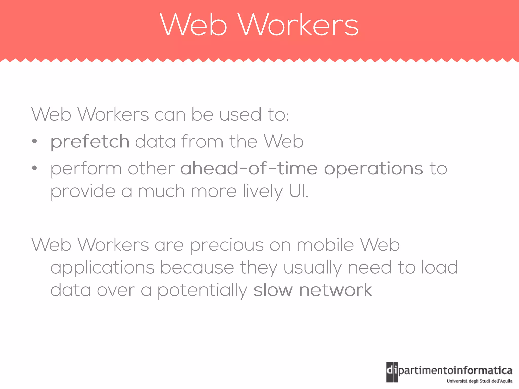
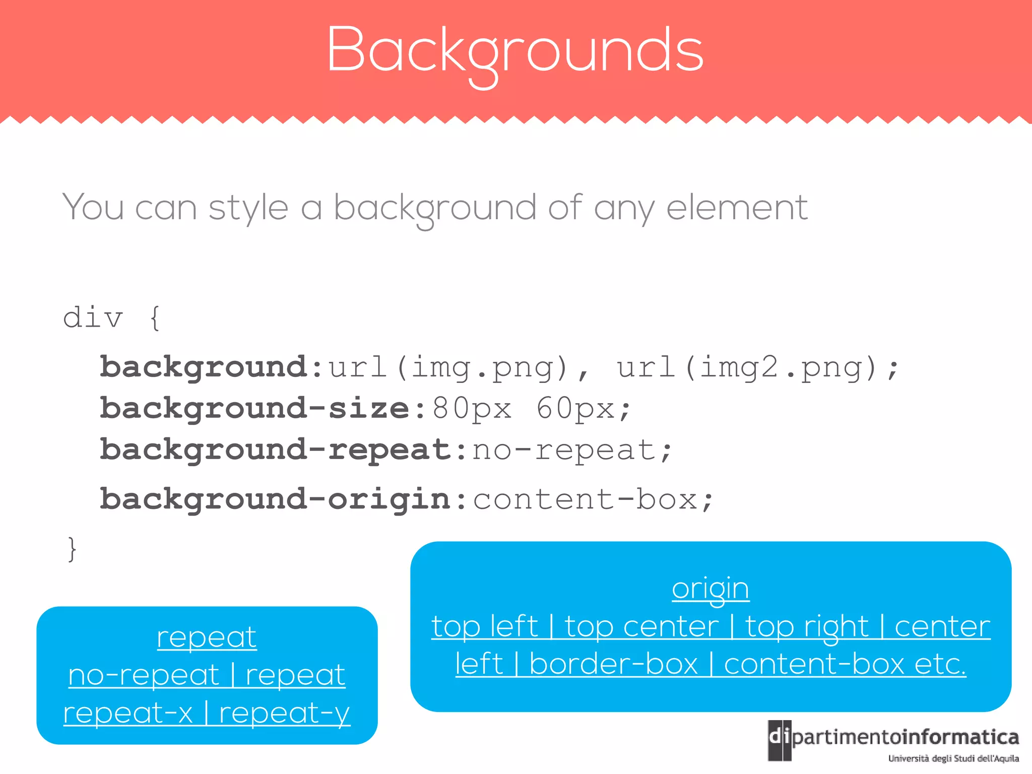
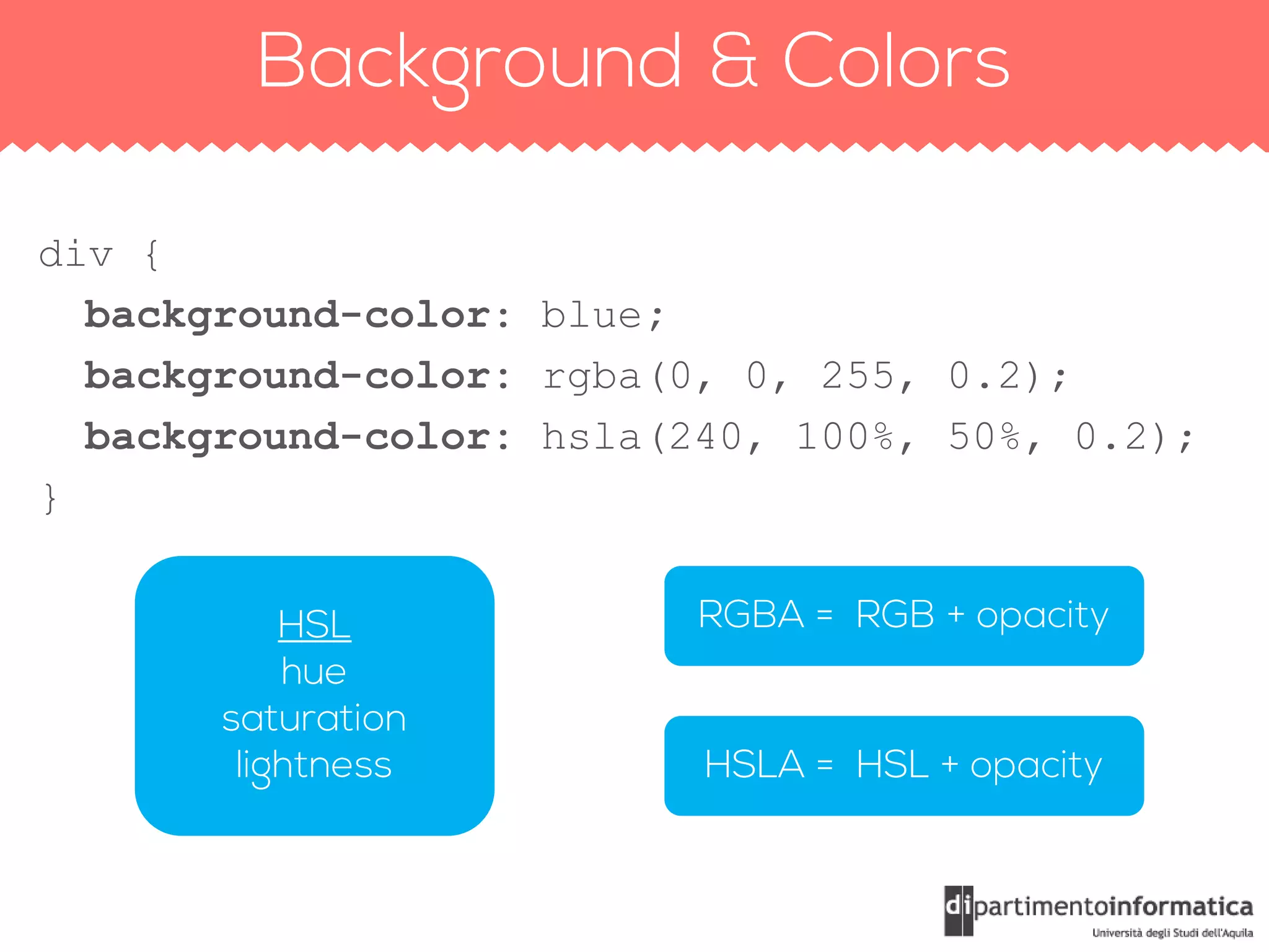
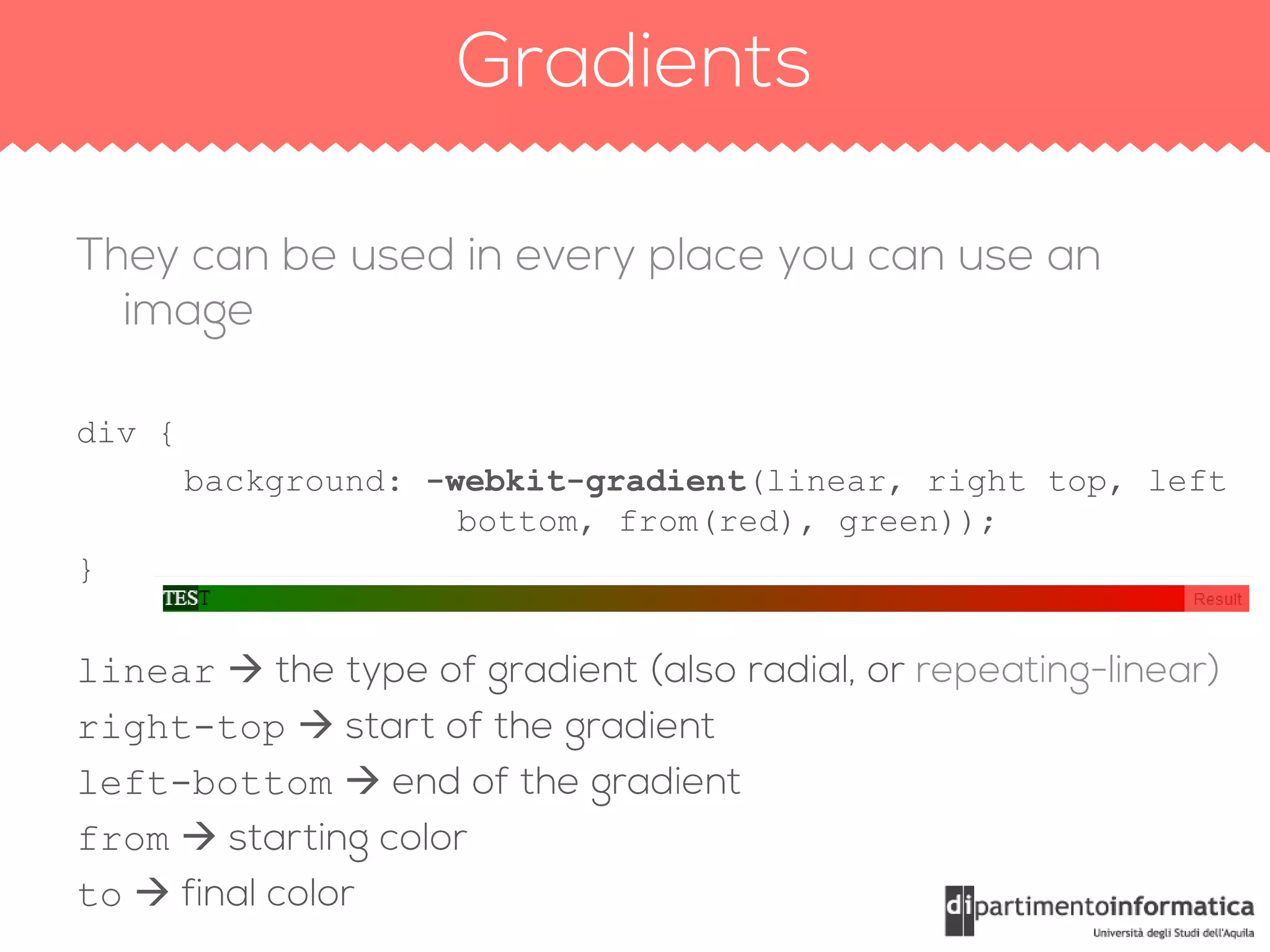
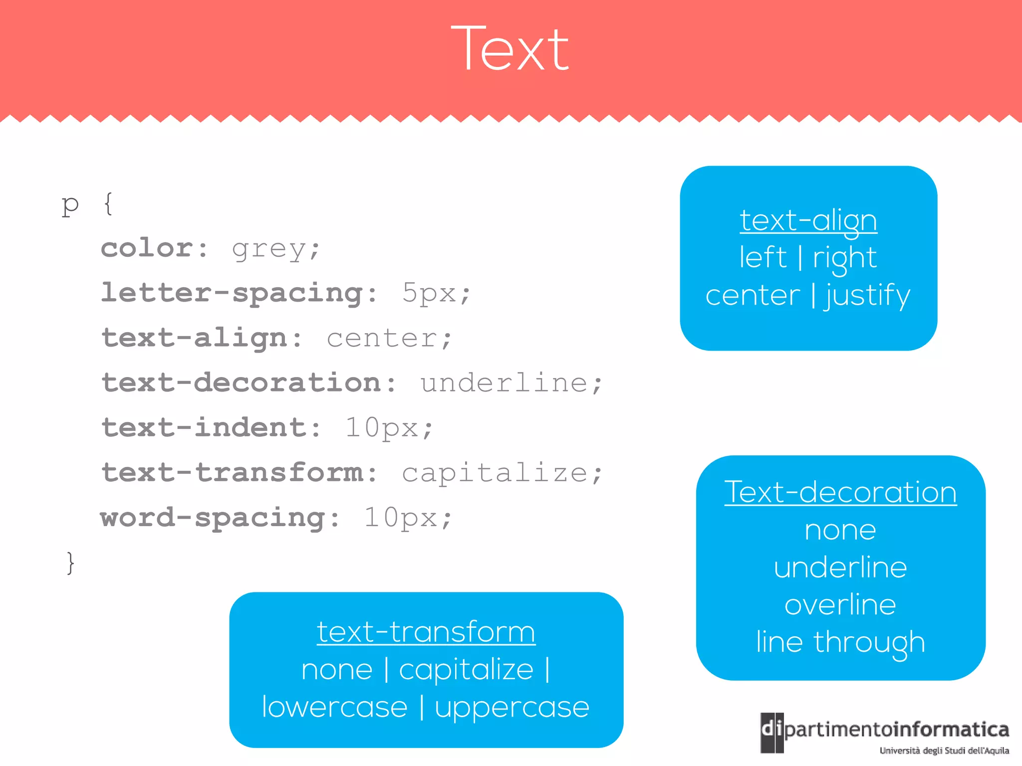

The document contains a large amount of HTML code, including elements such as headers, footers, navigation, articles, and multimedia sources like audio and video. It also includes JavaScript functions for geolocation and web worker processes, as well as CSS styling for various elements. Additionally, media queries are present for responsive design across different devices.