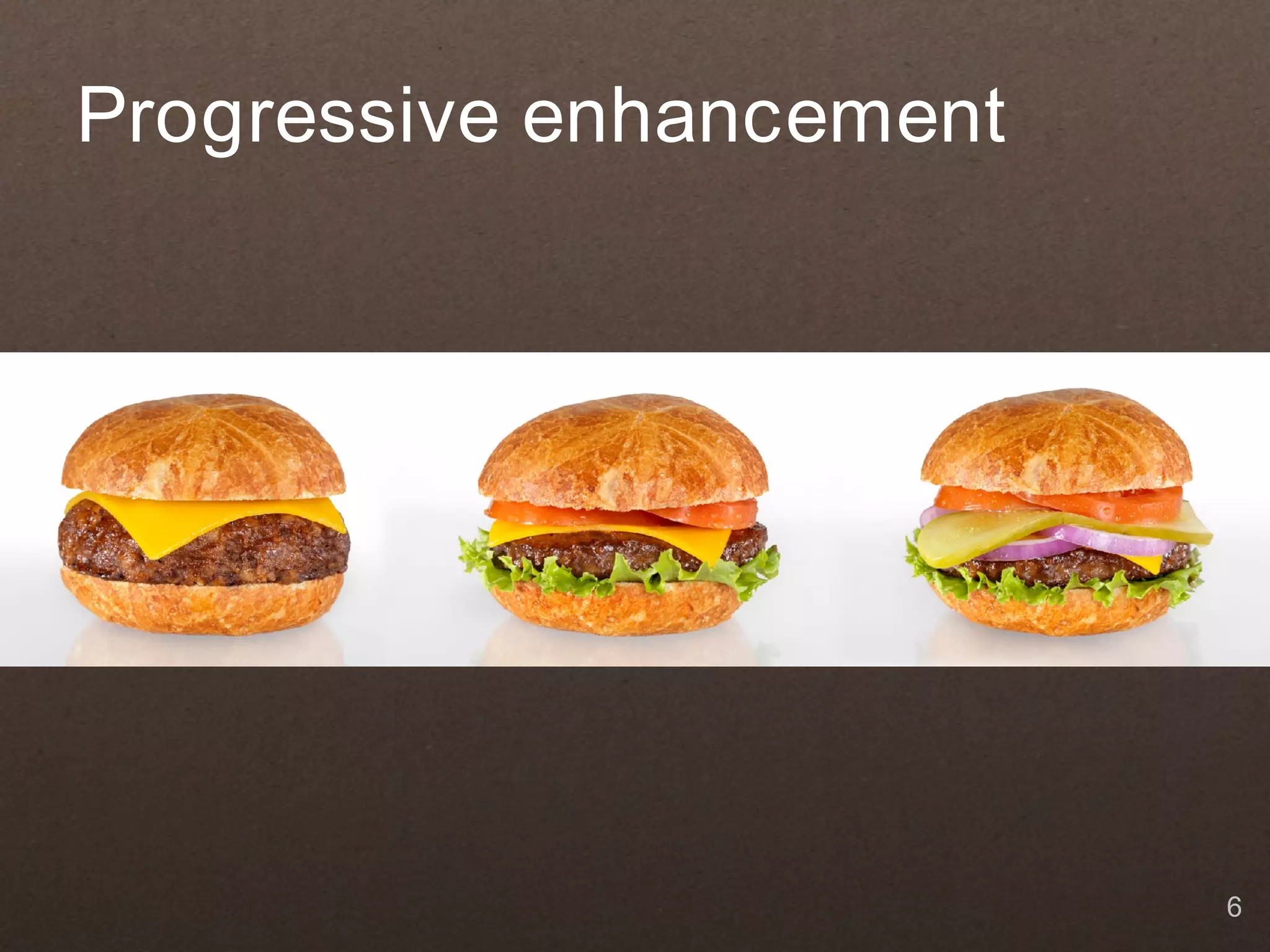
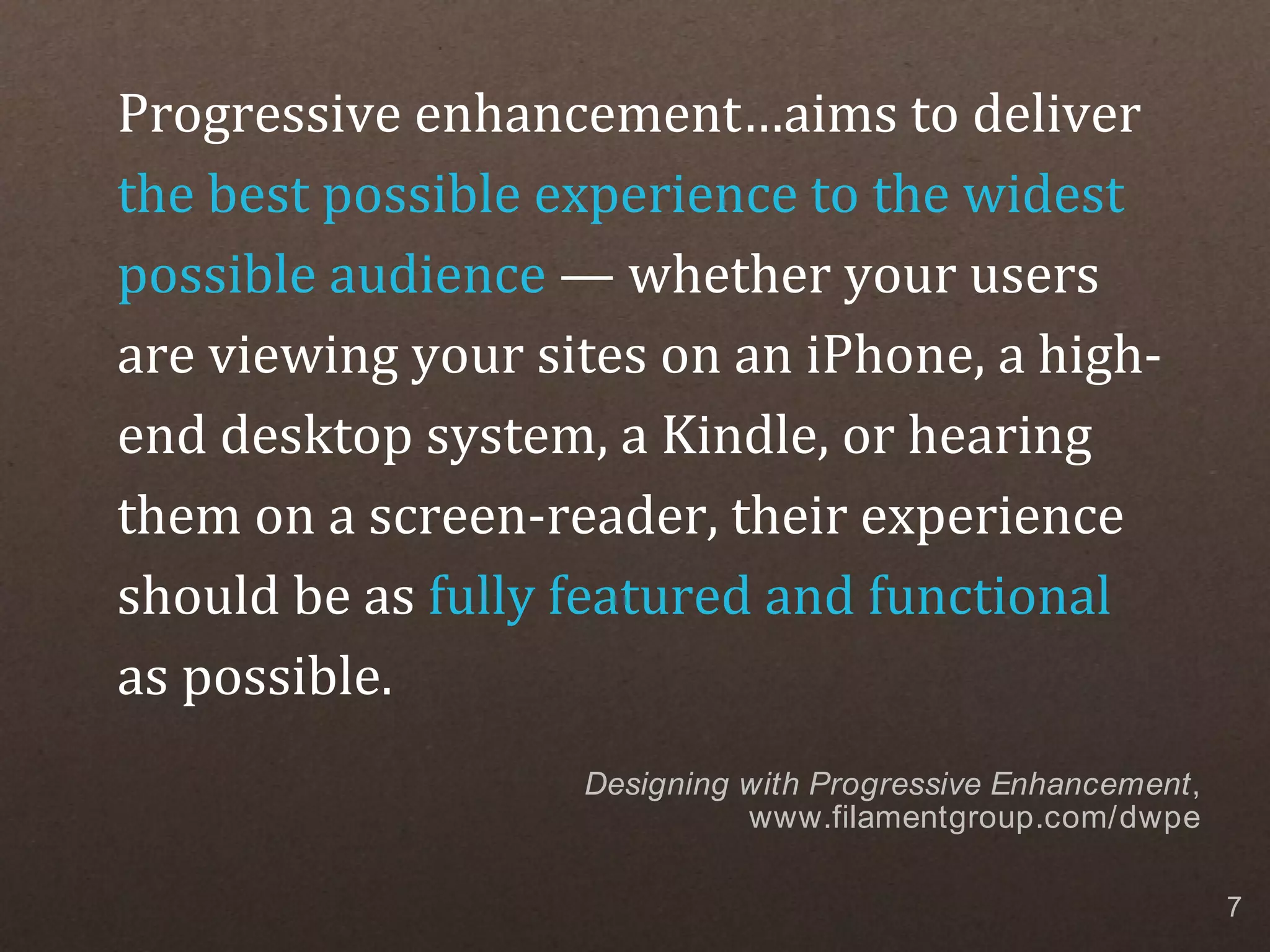
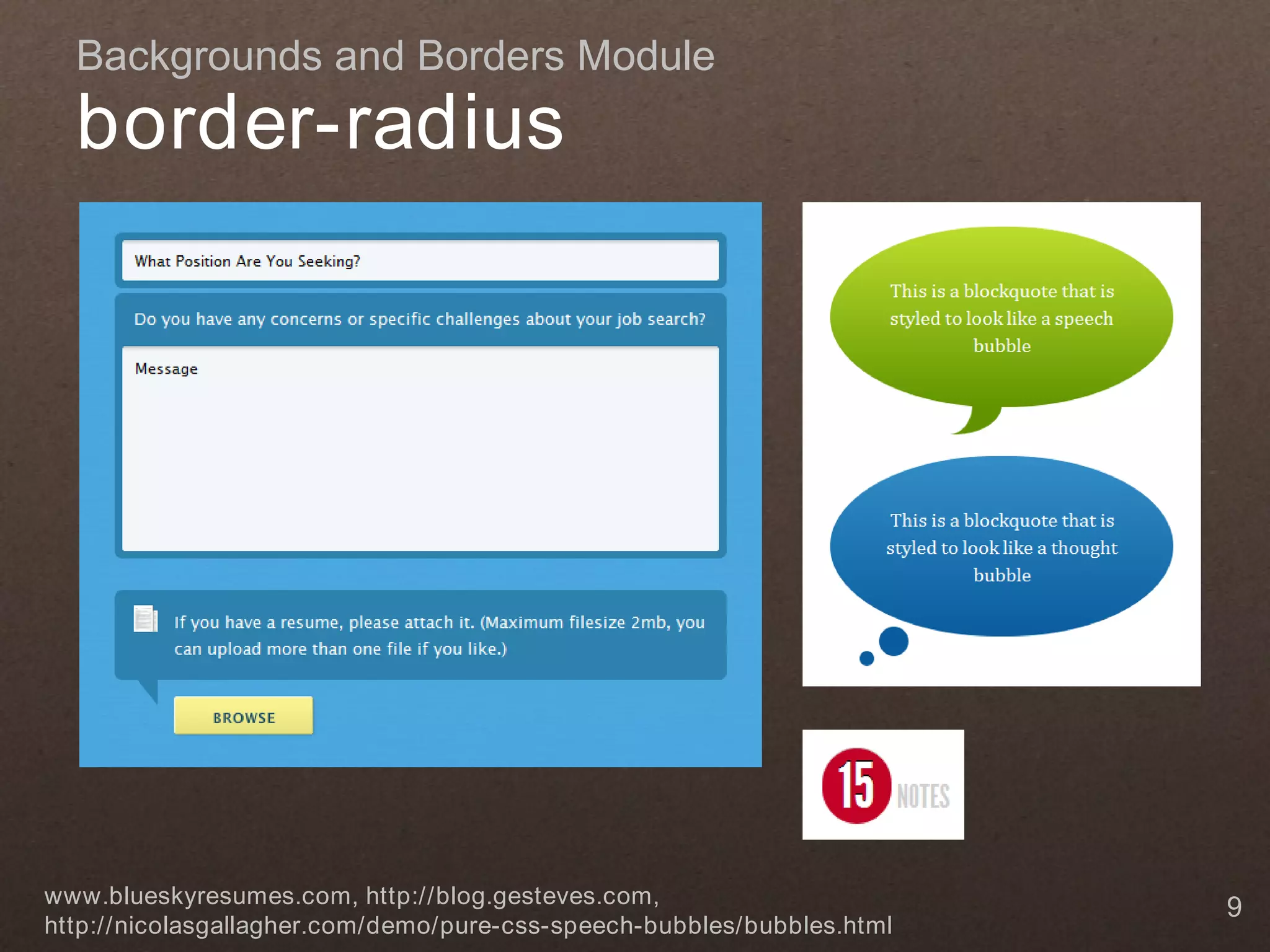
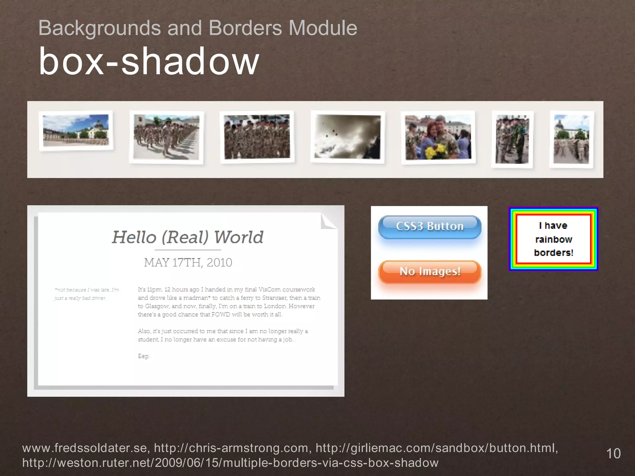
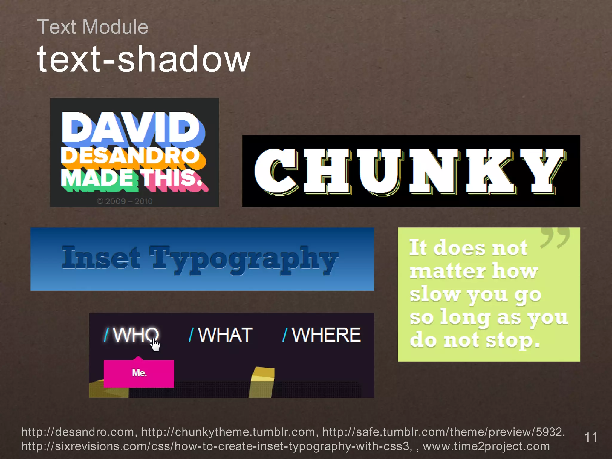
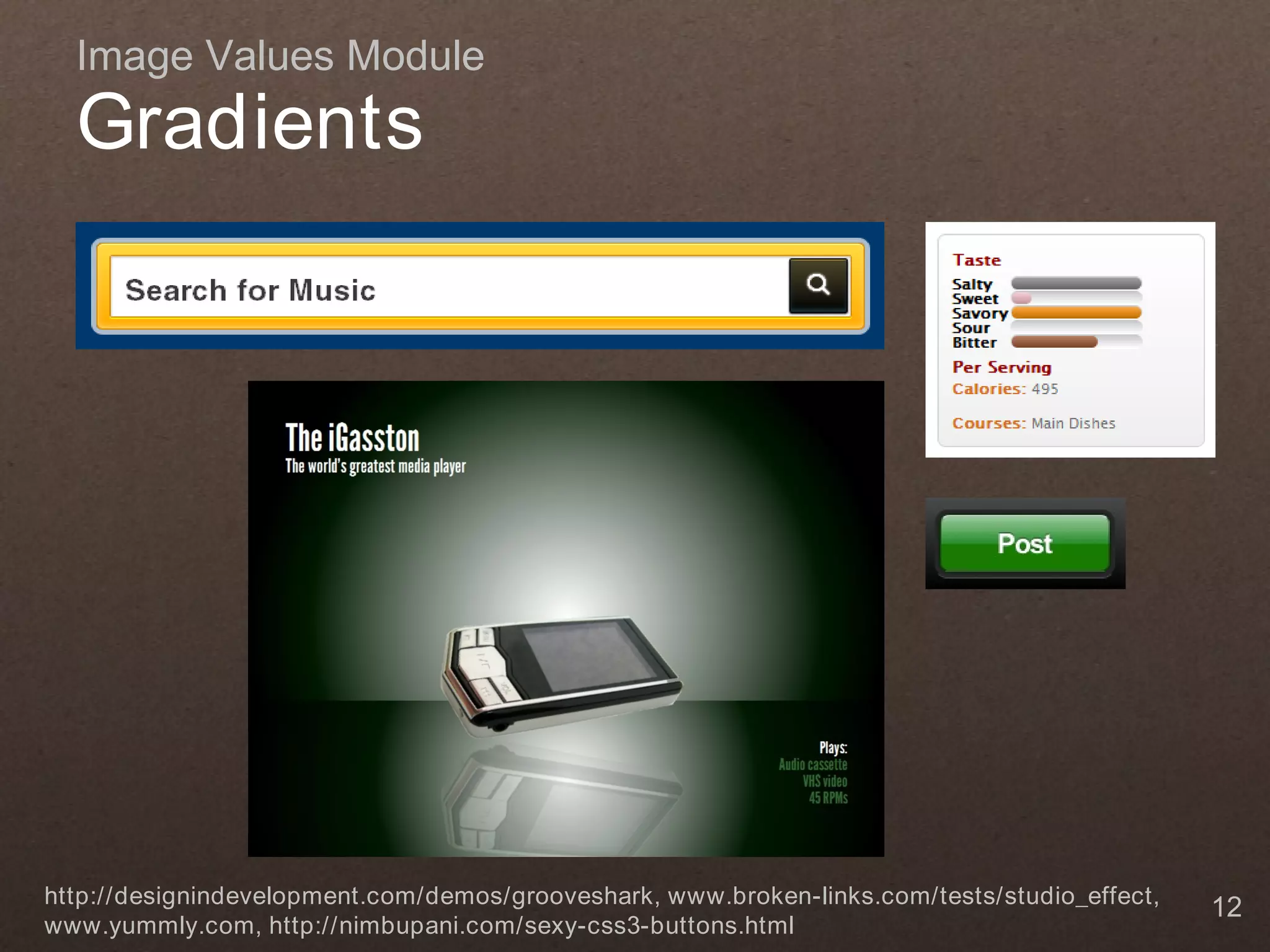
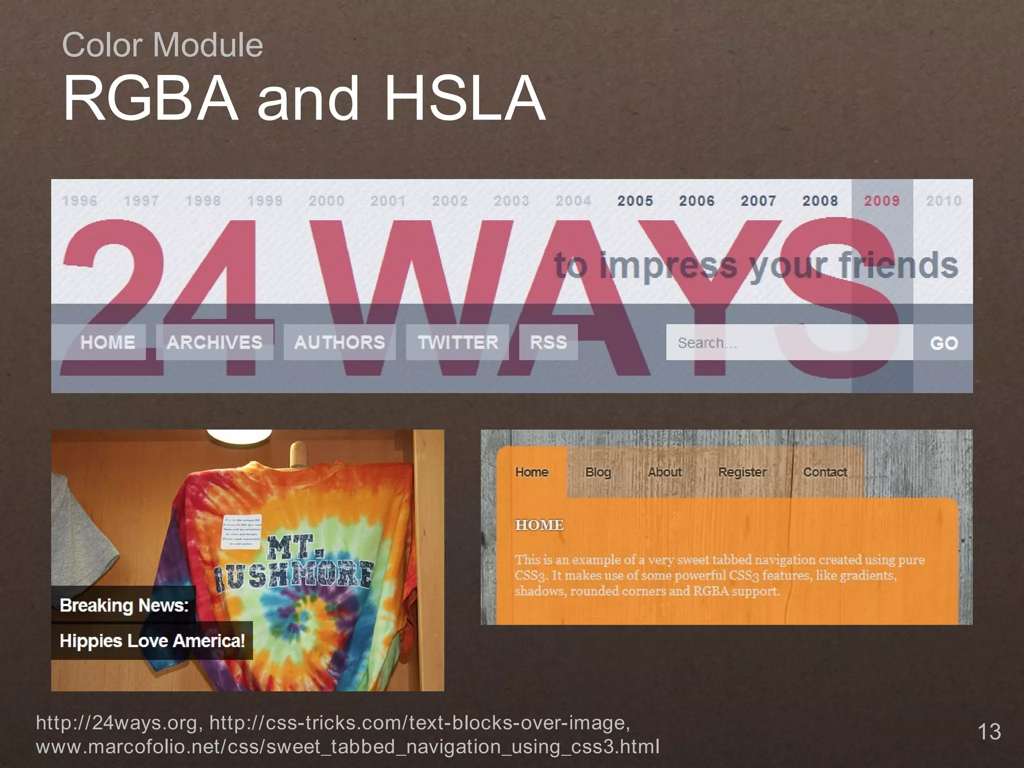
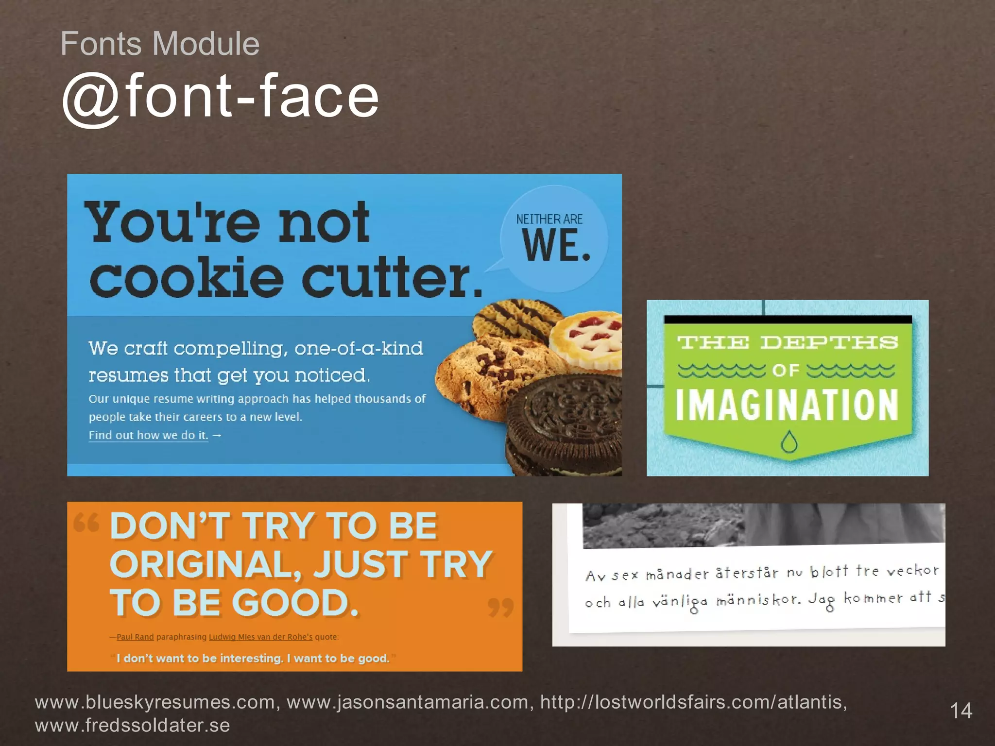
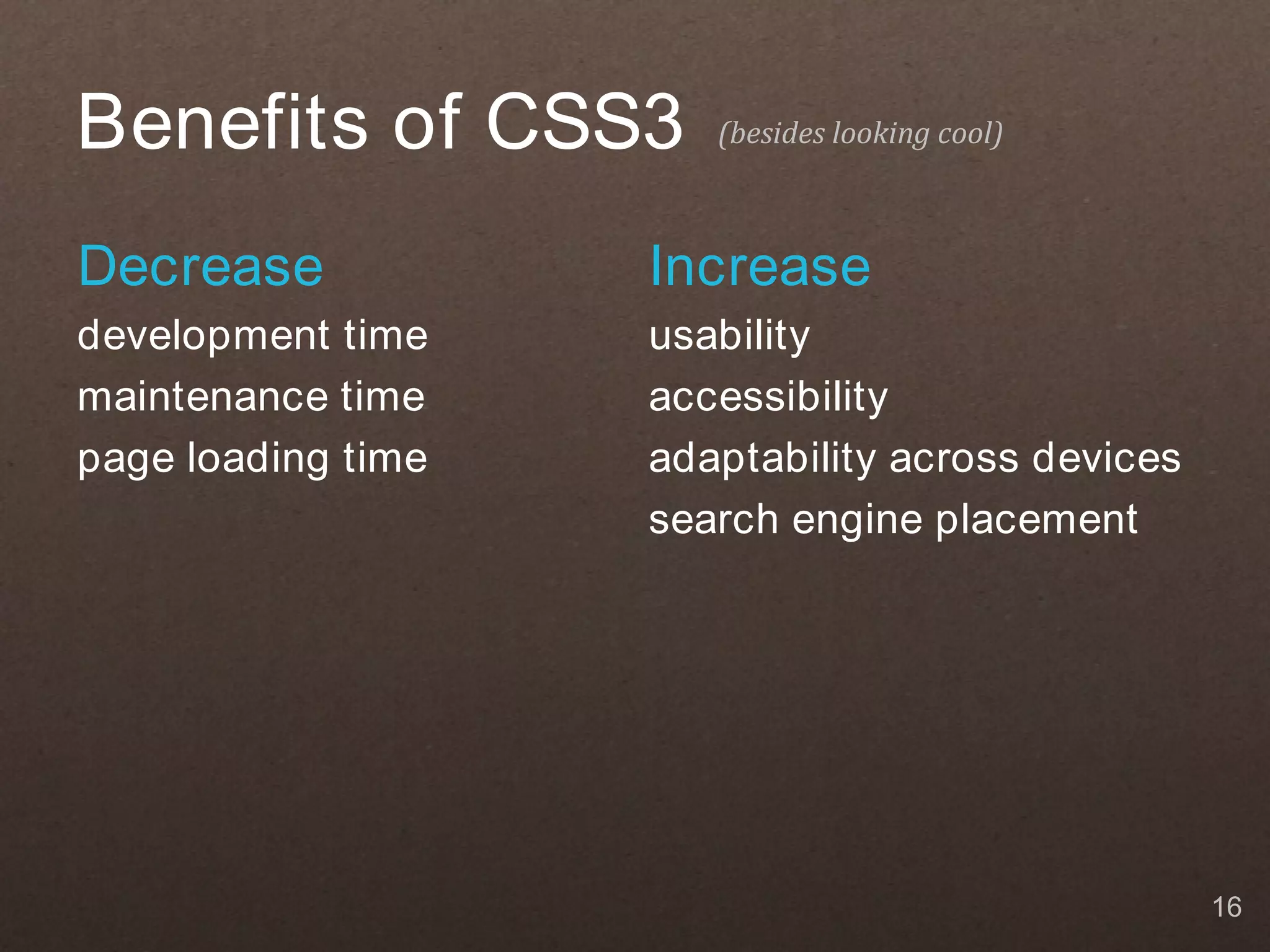
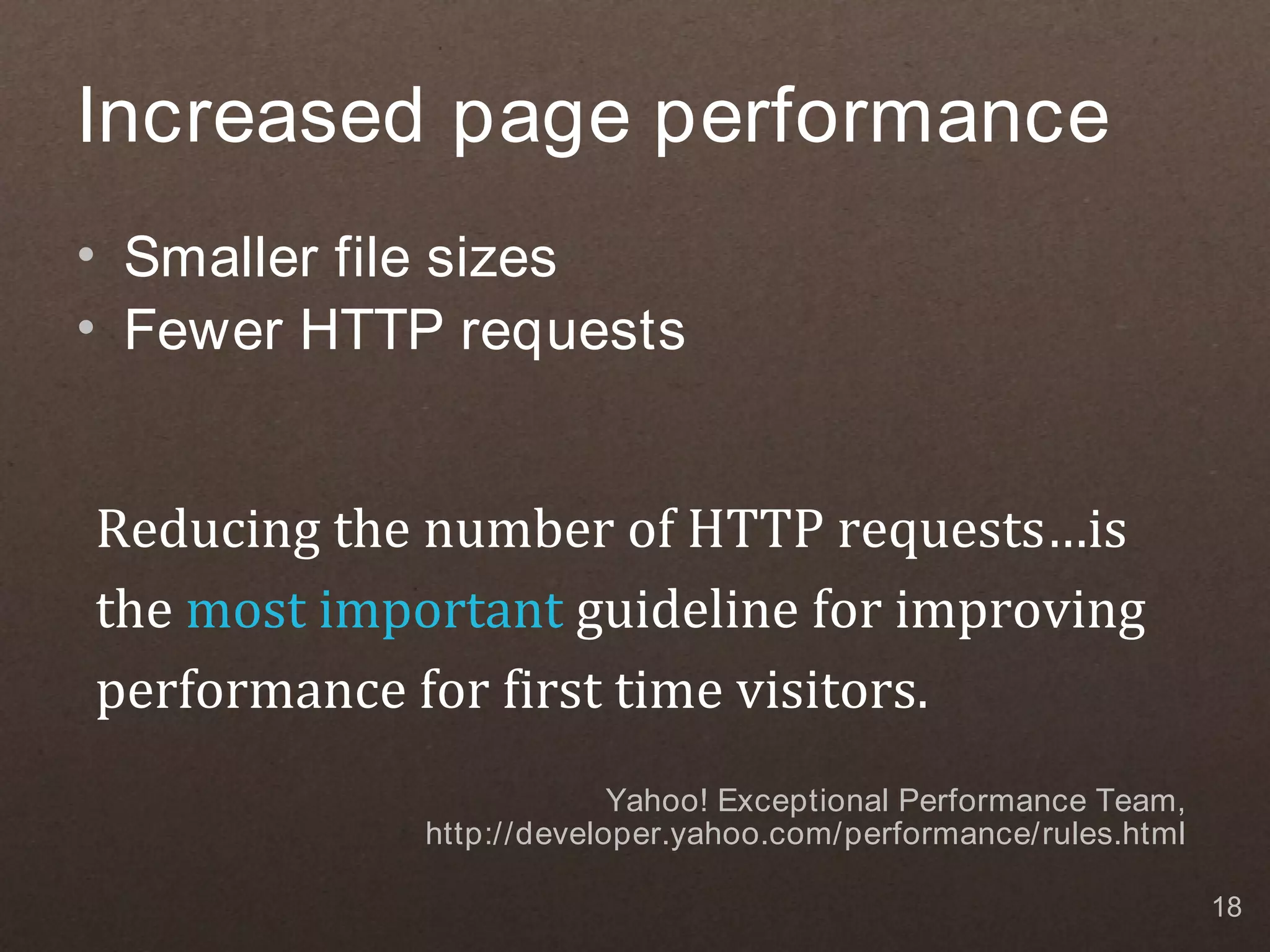
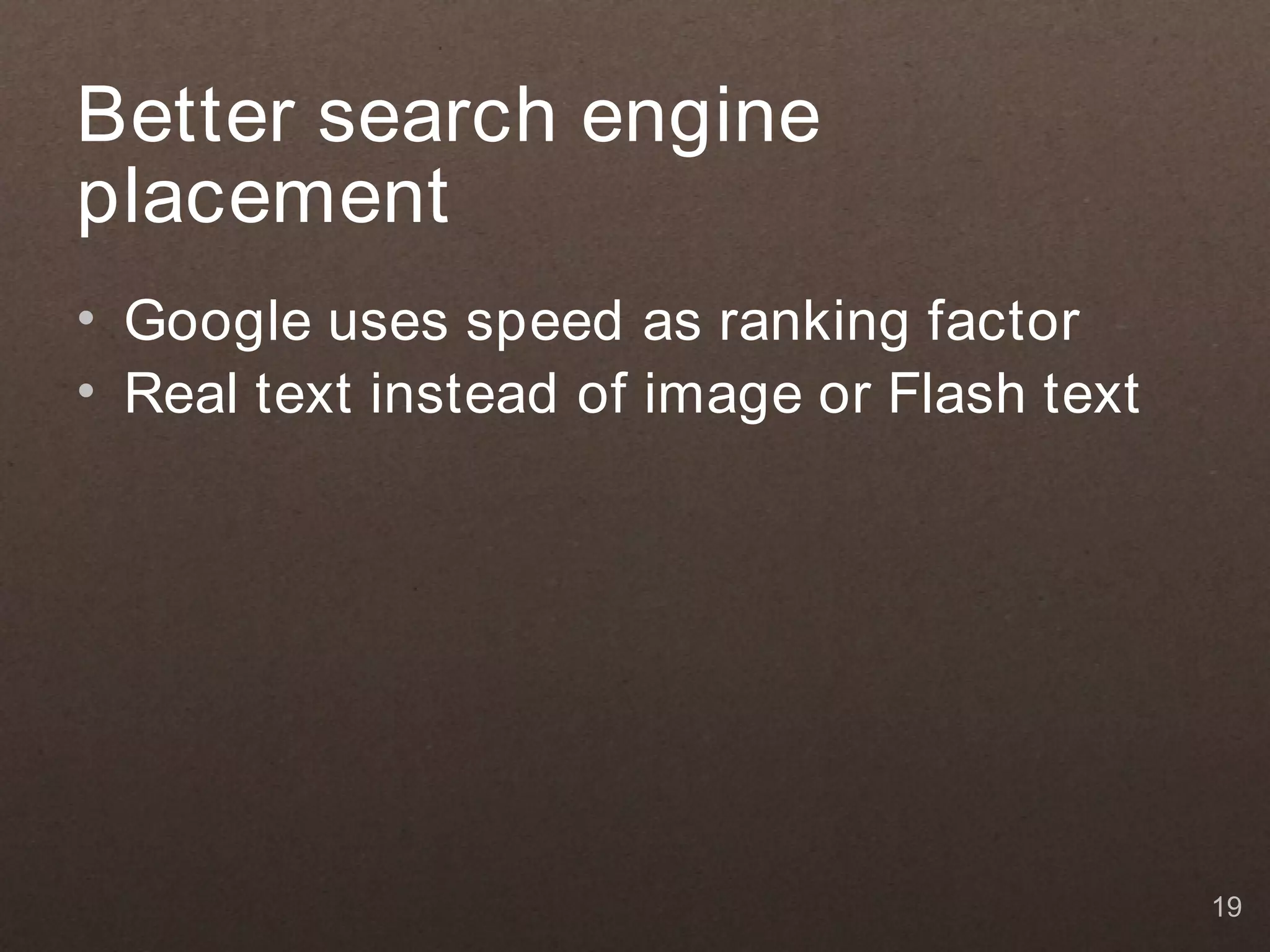
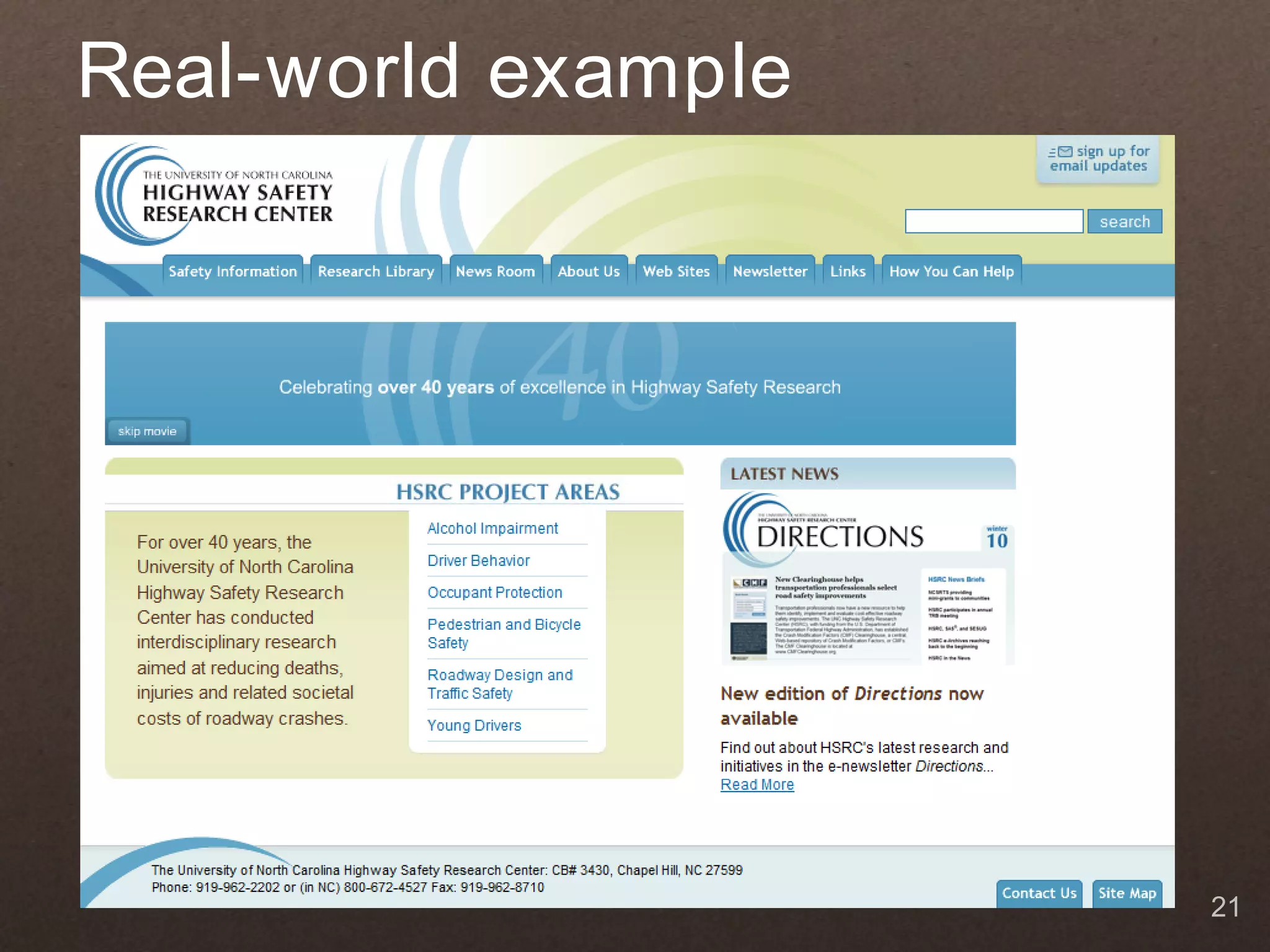
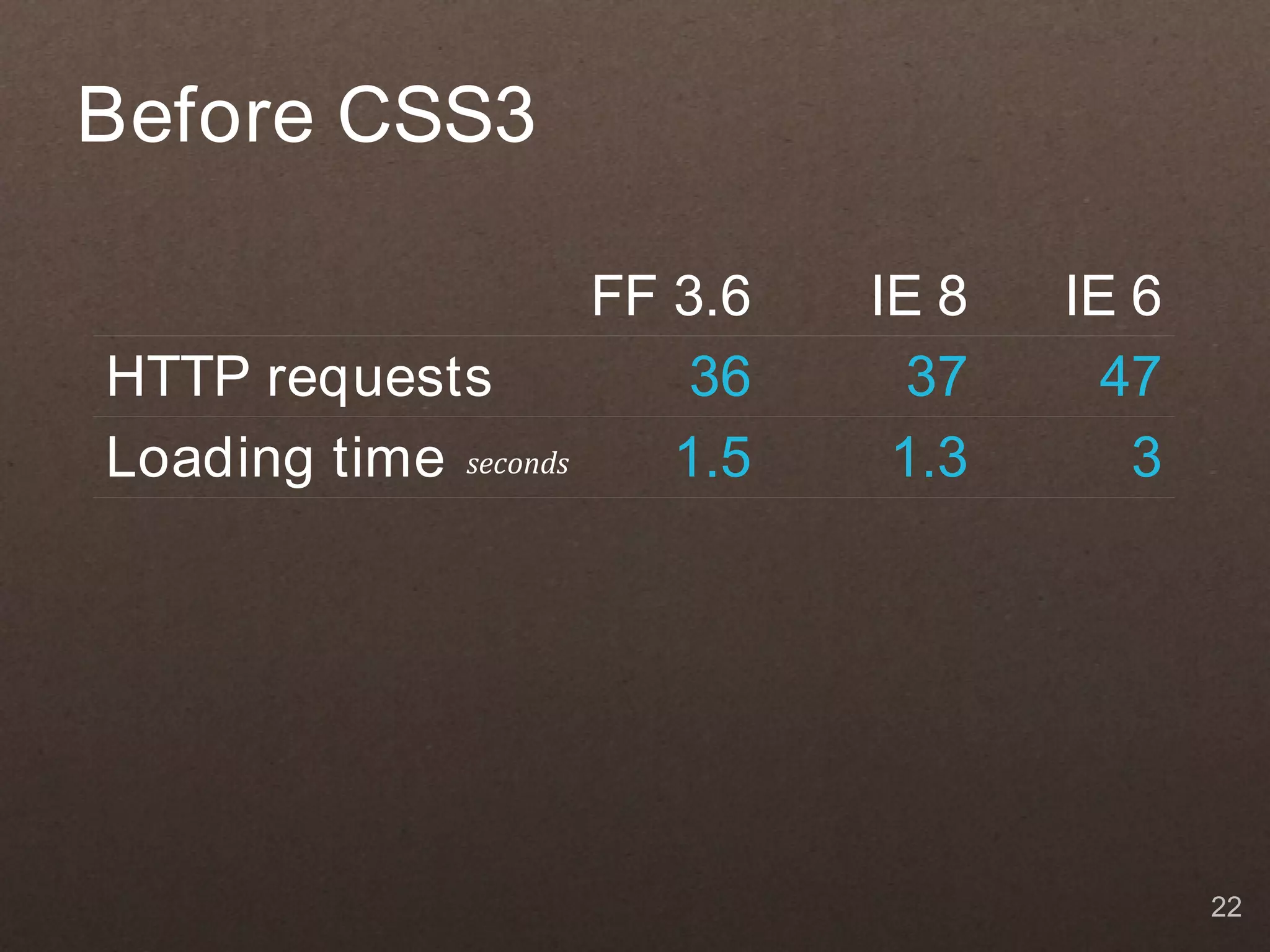
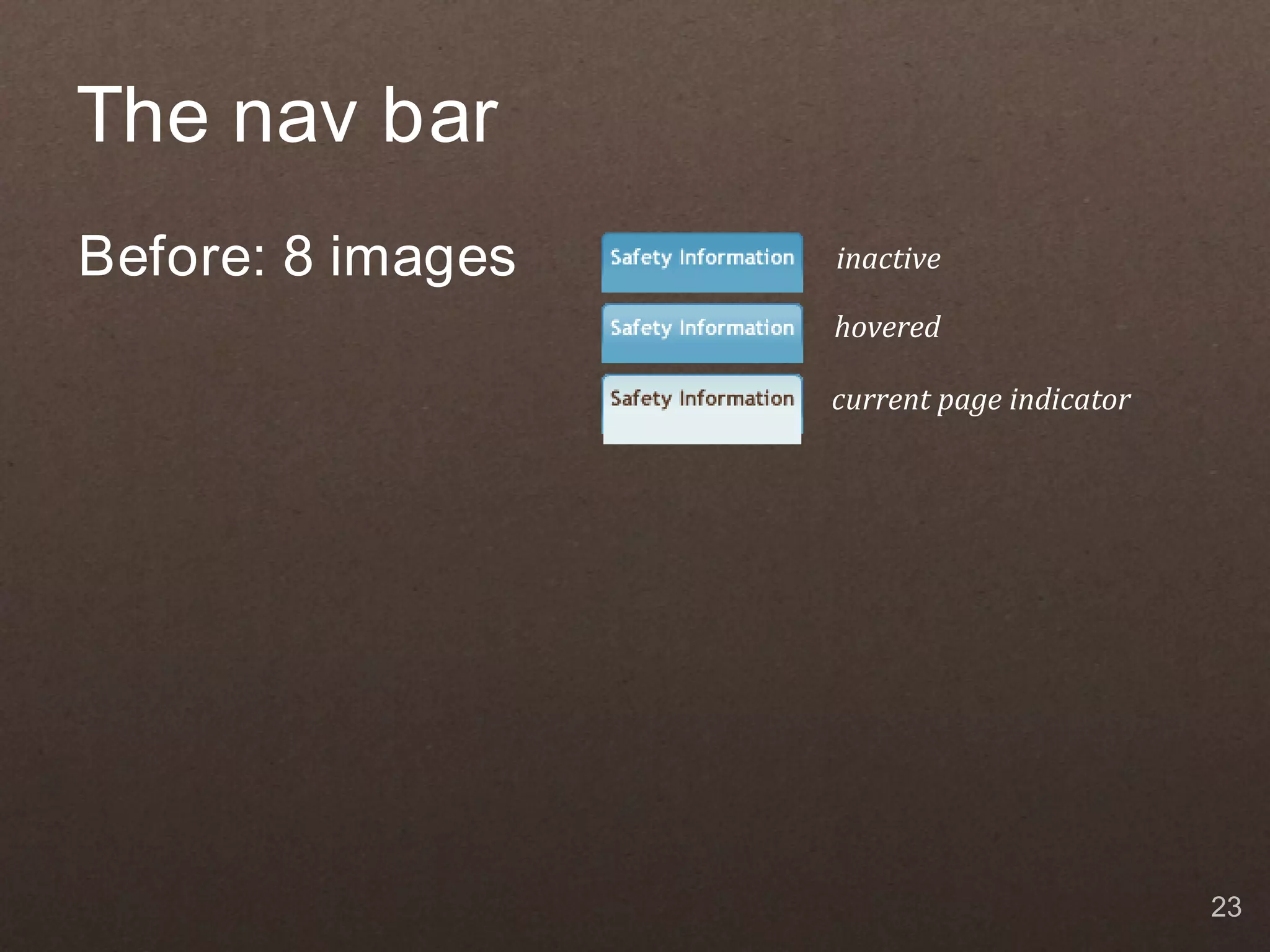
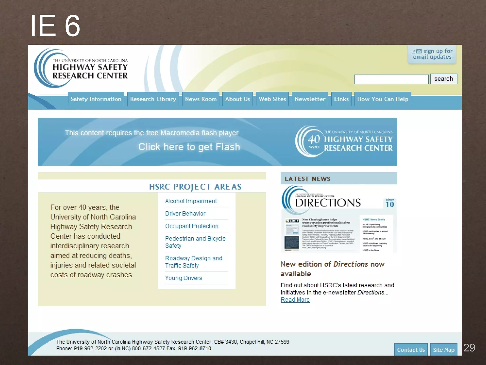
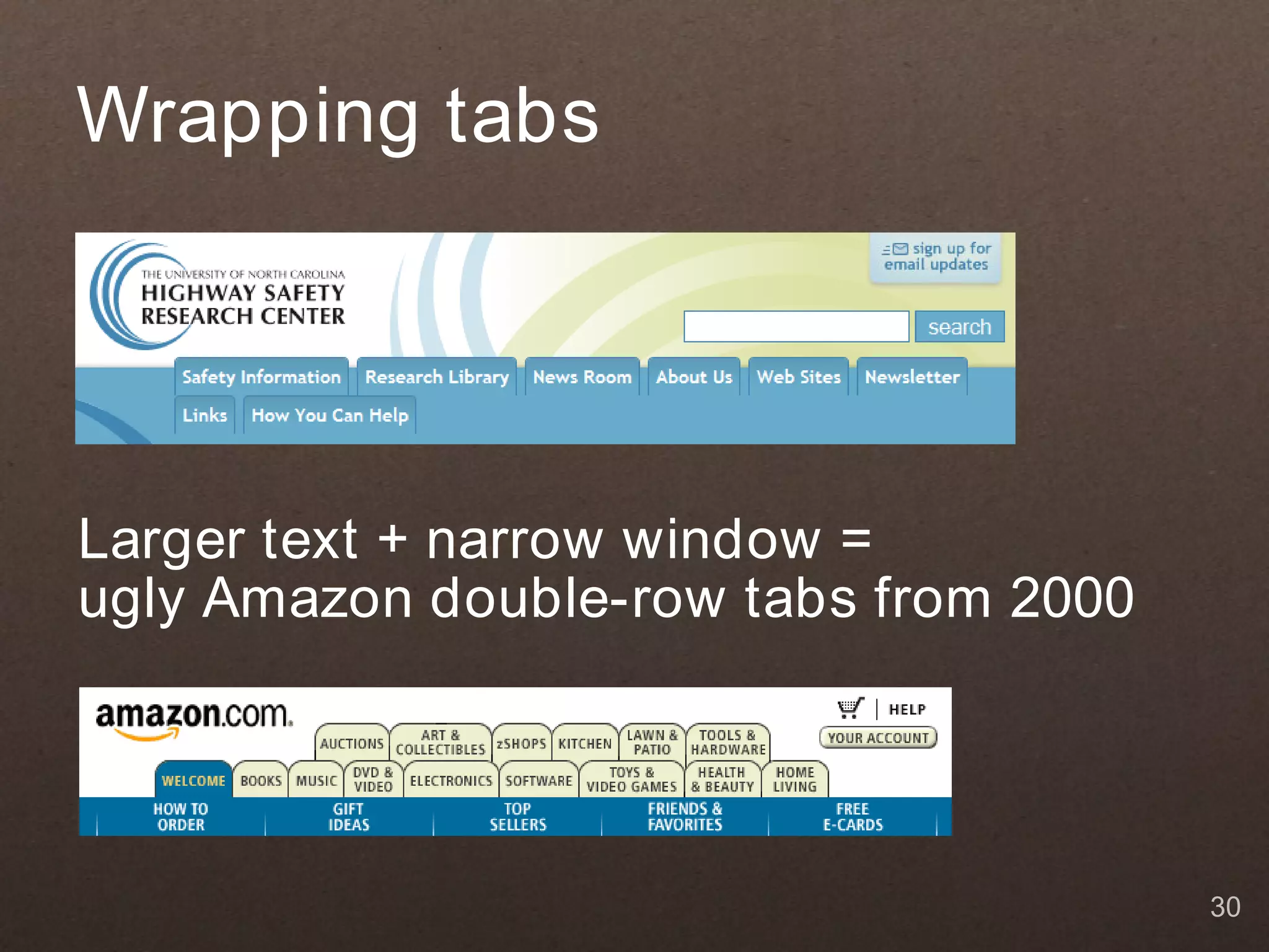
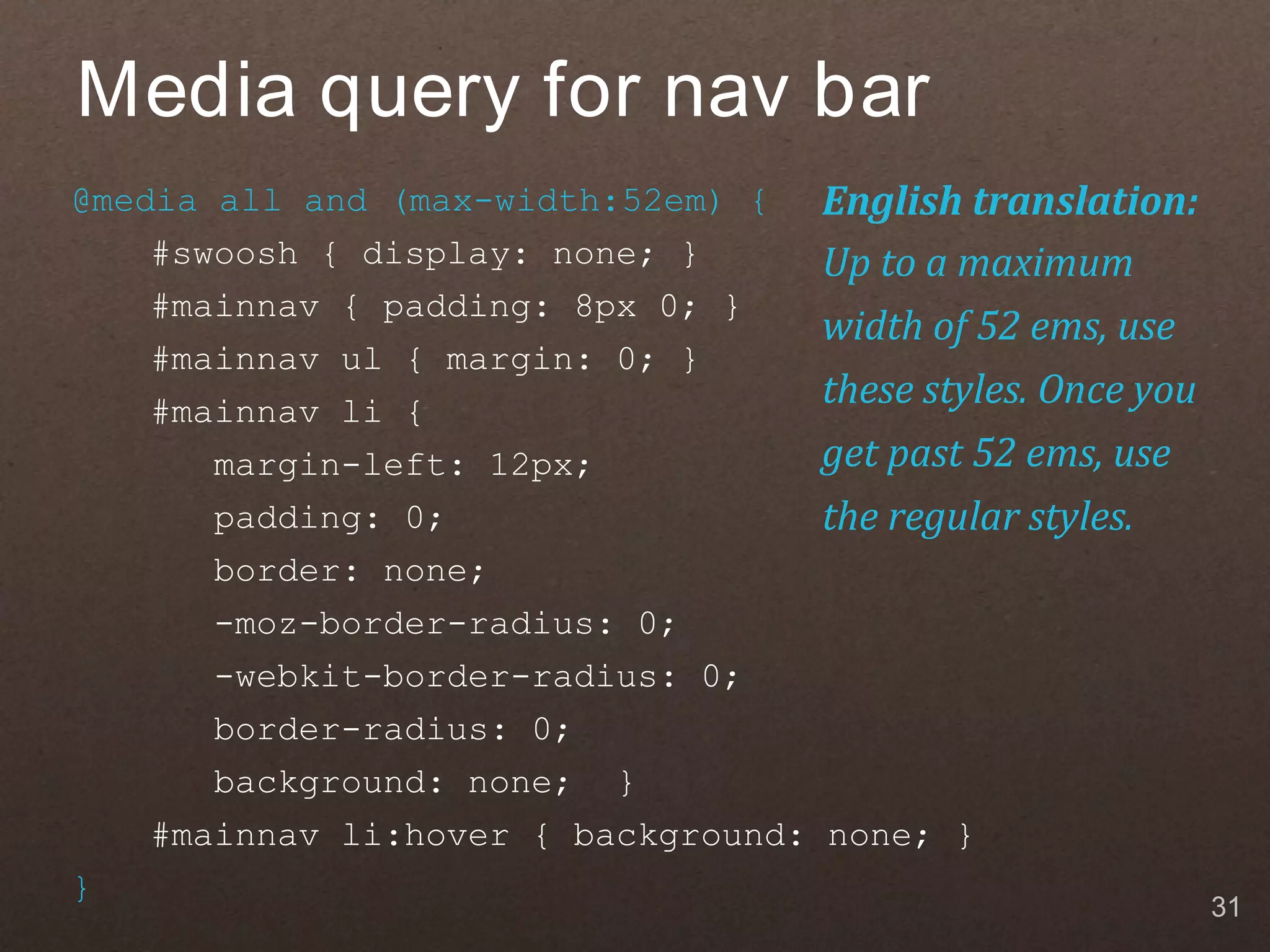
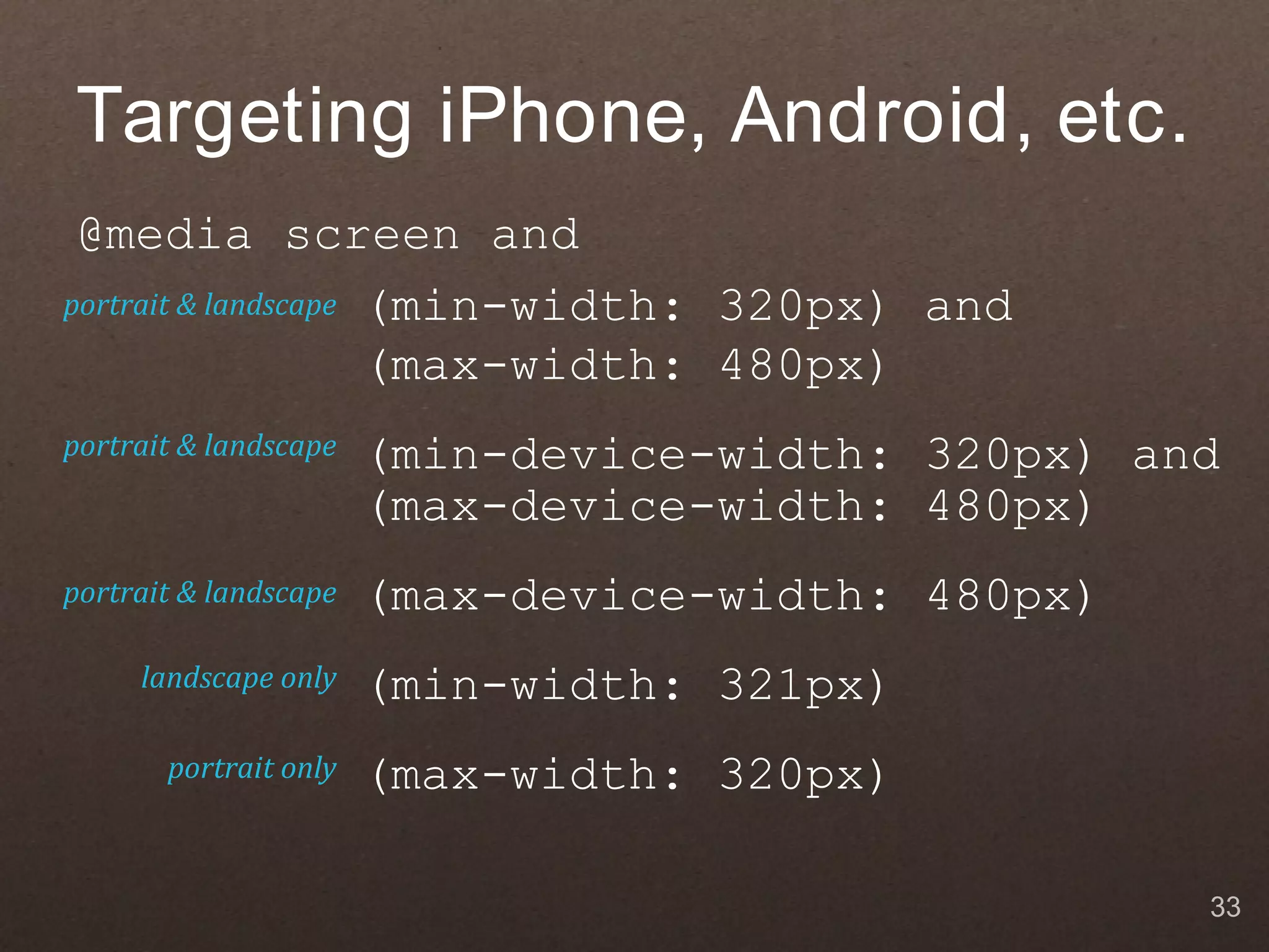
Effective & Efficient Design with CSS3 September 23, 2010 Web Directions USA Zoe Mickley Gillenwater @ zomigi 1
What I do Books Web now Flexible Web Design: Freelance graphic Creating Liquid and Elastic designer and web Layouts with CSS developer www.flexiblewebbook.com CSS consultant Member of Adobe soon Stunning CSS3: Task Force for WaSP A Project-based Guide to the Latest in CSS www.stunningcss3.com 2
What is CSS3? See modules at www.w3.org/Style/ CSS/current-work 3
Current status 4
Use the parts of CSS3 that: ✔ have generally stable syntax. ✔ have good support. ✔ don't harm non-supporting browsers by their lack. 5
Progressive enhancement 6
Progressive enhancement…aims to deliver the best possible experience to the widest possible audience — whether your users are viewing your sites on an iPhone, a high- end desktop system, a Kindle, or hearing them on a screen-reader, their experience should be as fully featured and functional as possible. Designing with Progressive Enhancement, www.filamentgroup.com/dwpe 7
A few of the things you can use... Photo by Kristin Roach, www.flickr.com/photos/kristinroach/3995676135 8
Backgrounds and Borders Module border-radius www.blueskyresumes.com, http://blog.gesteves.com, 9 http://nicolasgallagher.com/demo/pure-css-speech-bubbles/bubbles.html
Backgrounds and Borders Module box-shadow www.fredssoldater.se, http://chris-armstrong.com, http://girliemac.com/sandbox/button.html, 10 http://weston.ruter.net/2009/06/15/multiple-borders-via-css-box-shadow
Text Module text-shadow http://desandro.com, http://chunkytheme.tumblr.com, http://safe.tumblr.com/theme/preview/5932, 11 http://sixrevisions.com/css/how-to-create-inset-typography-with-css3, , www.time2project.com
Image Values Module Gradients http://designindevelopment.com/demos/grooveshark, www.broken-links.com/tests/studio_effect, 12 www.yummly.com, http://nimbupani.com/sexy-css3-buttons.html
Color Module RGBA and HSLA http://24ways.org, http://css-tricks.com/text-blocks-over-image, 13 www.marcofolio.net/css/sweet_tabbed_navigation_using_css3.html
Fonts Module @ font-face www.blueskyresumes.com, www.jasonsantamaria.com, http://lostworldsfairs.com/atlantis, 14 www.fredssoldater.se
2D Transforms Module Transforms http://butterlabel.com, http://forabeautifulweb.com, http://girliemac.com/sandbox/dock.html, 15 http://lab.simurai.com/css/tilt-shift
Benefits of CSS3 (besides looking cool) Decrease Increase development time usability maintenance time accessibility page loading time adaptability across devices search engine placement 16
Reduced development and maintenance time • Less images, Flash, JavaScript • Streamlined markup 17
Increased page performance • Smaller file sizes • Fewer HTTP requests Reducing the number of HTTP requests…is the most important guideline for improving performance for first time visitors. Yahoo! Exceptional Performance Team, http://developer.yahoo.com/performance/rules.html 18
Better search engine placement • Google uses speed as ranking factor • Real text instead of image or Flash text 19
Increased usability • Real text • Optimized styles based on device capabilities 20
Real-world example 21
Before CSS3 FF 3.6 IE 8 IE 6 HTTP requests 36 37 47 Loading time seconds 1.5 1.3 3 22
The nav bar Before: 8 images inactive hovered current page indicator 23
The nav bar Before: 8 images inactive hovered current page indicator After: 1 image 24
Before CSS3, optimized FF 3.6 IE 8 IE 6 HTTP requests 29 30 33 Loading time seconds 1.3 1.15 2 decrease 13% 11% 33% 25
After CSS3 FF 3.6 IE 8 IE 6 HTTP requests 22 23 24 Loading time seconds 1.1 1 1.5 decrease 15% 13% 25% 26
IE 9 beta 27
IE 8 28
IE 6 29
Wrapping tabs Larger text + narrow window = ugly Amazon double-row tabs from 2000 30
Media query for nav bar @media all and (max-width:52em) { English translation: #swoosh { display: none; } Up to a maximum #mainnav { padding: 8px 0; } width of 52 ems, use #mainnav ul { margin: 0; } #mainnav li { these styles. Once you margin-left: 12px; get past 52 ems, use padding: 0; the regular styles. border: none; -moz-border-radius: 0; -webkit-border-radius: 0; border-radius: 0; background: none; } #mainnav li:hover { background: none; } } 31
Media queries for mobile min-width max-width device-width min-device-width max-device-width orientation -webkit-min-device-pixel-ratio 32
Targeting iPhone, Android, etc. @media screen and portrait & landscape (min-width: 320px) and (max-width: 480px) portrait & landscape (min-device-width: 320px) and (max-device-width: 480px) portrait & landscape (max-device-width: 480px) landscape only (min-width: 321px) portrait only (max-width: 320px) 33
Targeting iPad @media screen and portrait & landscape (min-device-width: 768px) and (max-device-width: 1024px) landscape only (min-width: 769px) landscape only (min-device-width: 481px) and (max-device-width: 1024px) and (orientation: landscape) portrait only (min-device-width: 481px) and (max-device-width: 1024px) and (orientation: portrait) 34
Viewport meta tag Forces mobile devices to scale viewport to actual device width <meta name="viewport" content="width=device-width, minimum-scale=1.0, maximum-scale=1.0"> 35
Learn more Download slides, get links: www.zomigi.com/blog/web-directions-usa/ Book: www.stunningcss3.com Zoe Mickley Gillenwater @ zomigi design@ zomigi.com www.zomigi.com 36
Questions? Zoe Mickley Gillenwater @ zomigi design@ zomigi.com www.zomigi.com 37

Effective and Efficient Design with CSS3

  • 1.
    Effective & Efficient Designwith CSS3 September 23, 2010 Web Directions USA Zoe Mickley Gillenwater @ zomigi 1
  • 2.
    What I do Books Web now Flexible Web Design: Freelance graphic Creating Liquid and Elastic designer and web Layouts with CSS developer www.flexiblewebbook.com CSS consultant Member of Adobe soon Stunning CSS3: Task Force for WaSP A Project-based Guide to the Latest in CSS www.stunningcss3.com 2
  • 3.
    What is CSS3? Seemodules at www.w3.org/Style/ CSS/current-work 3
  • 4.
  • 5.
    Use the partsof CSS3 that: ✔ have generally stable syntax. ✔ have good support. ✔ don't harm non-supporting browsers by their lack. 5
  • 6.
  • 7.
    Progressive enhancement…aims todeliver the best possible experience to the widest possible audience — whether your users are viewing your sites on an iPhone, a high- end desktop system, a Kindle, or hearing them on a screen-reader, their experience should be as fully featured and functional as possible. Designing with Progressive Enhancement, www.filamentgroup.com/dwpe 7
  • 8.
    A few ofthe things you can use... Photo by Kristin Roach, www.flickr.com/photos/kristinroach/3995676135 8
  • 9.
    Backgrounds and BordersModule border-radius www.blueskyresumes.com, http://blog.gesteves.com, 9 http://nicolasgallagher.com/demo/pure-css-speech-bubbles/bubbles.html
  • 10.
    Backgrounds and BordersModule box-shadow www.fredssoldater.se, http://chris-armstrong.com, http://girliemac.com/sandbox/button.html, 10 http://weston.ruter.net/2009/06/15/multiple-borders-via-css-box-shadow
  • 11.
    Text Module text-shadow http://desandro.com, http://chunkytheme.tumblr.com, http://safe.tumblr.com/theme/preview/5932, 11 http://sixrevisions.com/css/how-to-create-inset-typography-with-css3, , www.time2project.com
  • 12.
    Image Values Module Gradients http://designindevelopment.com/demos/grooveshark, www.broken-links.com/tests/studio_effect, 12 www.yummly.com, http://nimbupani.com/sexy-css3-buttons.html
  • 13.
    Color Module RGBA and HSLA http://24ways.org, http://css-tricks.com/text-blocks-over-image, 13 www.marcofolio.net/css/sweet_tabbed_navigation_using_css3.html
  • 14.
    Fonts Module @ font-face www.blueskyresumes.com, www.jasonsantamaria.com, http://lostworldsfairs.com/atlantis, 14 www.fredssoldater.se
  • 15.
    2D Transforms Module Transforms http://butterlabel.com, http://forabeautifulweb.com, http://girliemac.com/sandbox/dock.html, 15 http://lab.simurai.com/css/tilt-shift
  • 16.
    Benefits of CSS3 (besides looking cool) Decrease Increase development time usability maintenance time accessibility page loading time adaptability across devices search engine placement 16
  • 17.
    Reduced development and maintenancetime • Less images, Flash, JavaScript • Streamlined markup 17
  • 18.
    Increased page performance •Smaller file sizes • Fewer HTTP requests Reducing the number of HTTP requests…is the most important guideline for improving performance for first time visitors. Yahoo! Exceptional Performance Team, http://developer.yahoo.com/performance/rules.html 18
  • 19.
    Better search engine placement •Google uses speed as ranking factor • Real text instead of image or Flash text 19
  • 20.
    Increased usability • Realtext • Optimized styles based on device capabilities 20
  • 21.
  • 22.
    Before CSS3 FF 3.6 IE 8 IE 6 HTTP requests 36 37 47 Loading time seconds 1.5 1.3 3 22
  • 23.
    The nav bar Before:8 images inactive hovered current page indicator 23
  • 24.
    The nav bar Before:8 images inactive hovered current page indicator After: 1 image 24
  • 25.
    Before CSS3, optimized FF 3.6 IE 8 IE 6 HTTP requests 29 30 33 Loading time seconds 1.3 1.15 2 decrease 13% 11% 33% 25
  • 26.
    After CSS3 FF 3.6 IE 8 IE 6 HTTP requests 22 23 24 Loading time seconds 1.1 1 1.5 decrease 15% 13% 25% 26
  • 27.
  • 28.
  • 29.
  • 30.
    Wrapping tabs Larger text+ narrow window = ugly Amazon double-row tabs from 2000 30
  • 31.
    Media query fornav bar @media all and (max-width:52em) { English translation: #swoosh { display: none; } Up to a maximum #mainnav { padding: 8px 0; } width of 52 ems, use #mainnav ul { margin: 0; } #mainnav li { these styles. Once you margin-left: 12px; get past 52 ems, use padding: 0; the regular styles. border: none; -moz-border-radius: 0; -webkit-border-radius: 0; border-radius: 0; background: none; } #mainnav li:hover { background: none; } } 31
  • 32.
    Media queries formobile min-width max-width device-width min-device-width max-device-width orientation -webkit-min-device-pixel-ratio 32
  • 33.
    Targeting iPhone, Android,etc. @media screen and portrait & landscape (min-width: 320px) and (max-width: 480px) portrait & landscape (min-device-width: 320px) and (max-device-width: 480px) portrait & landscape (max-device-width: 480px) landscape only (min-width: 321px) portrait only (max-width: 320px) 33
  • 34.
    Targeting iPad @mediascreen and portrait & landscape (min-device-width: 768px) and (max-device-width: 1024px) landscape only (min-width: 769px) landscape only (min-device-width: 481px) and (max-device-width: 1024px) and (orientation: landscape) portrait only (min-device-width: 481px) and (max-device-width: 1024px) and (orientation: portrait) 34
  • 35.
    Viewport meta tag Forcesmobile devices to scale viewport to actual device width <meta name="viewport" content="width=device-width, minimum-scale=1.0, maximum-scale=1.0"> 35
  • 36.
    Learn more Download slides,get links: www.zomigi.com/blog/web-directions-usa/ Book: www.stunningcss3.com Zoe Mickley Gillenwater @ zomigi design@ zomigi.com www.zomigi.com 36
  • 37.
    Questions? Zoe Mickley Gillenwater @zomigi design@ zomigi.com www.zomigi.com 37