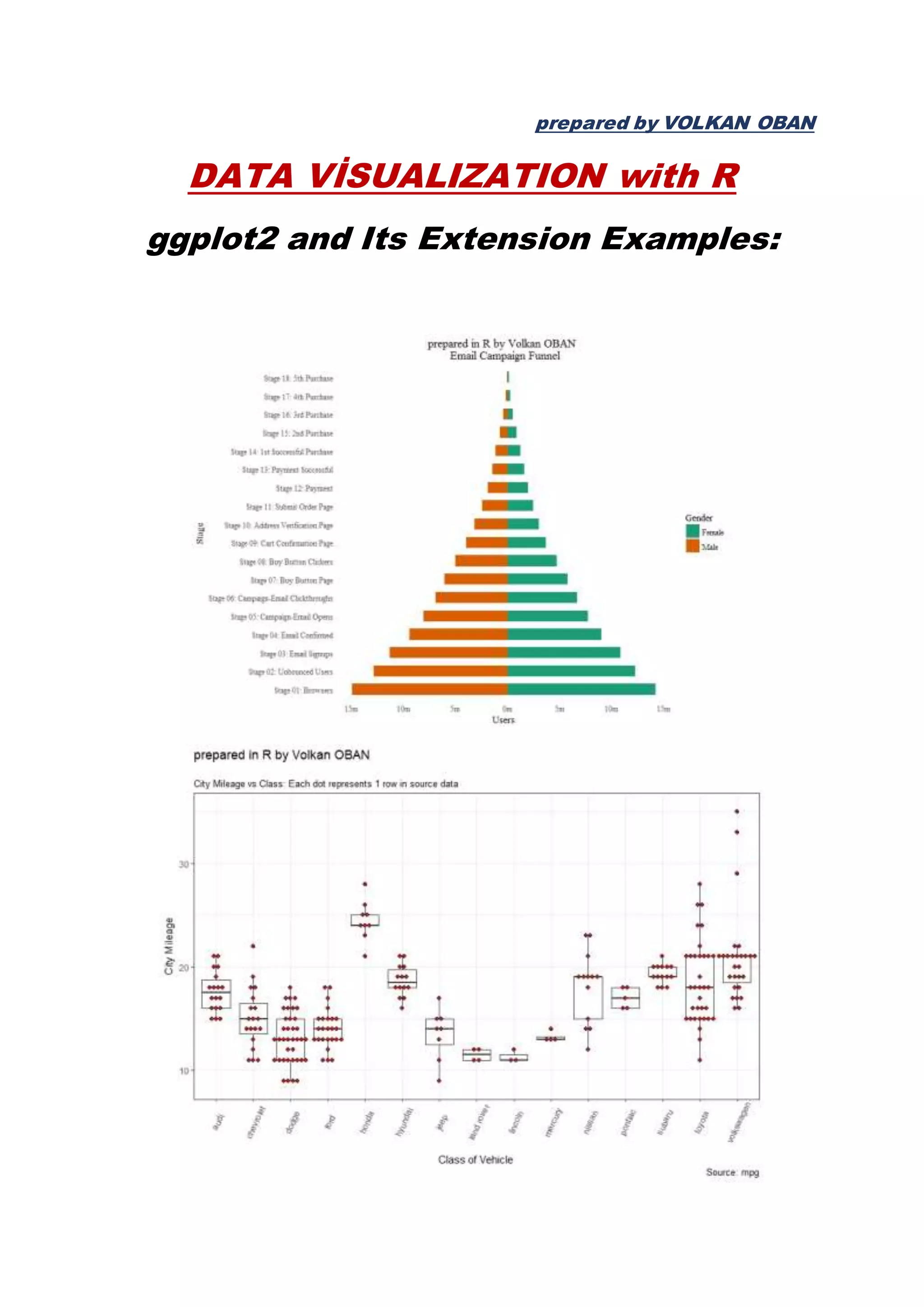
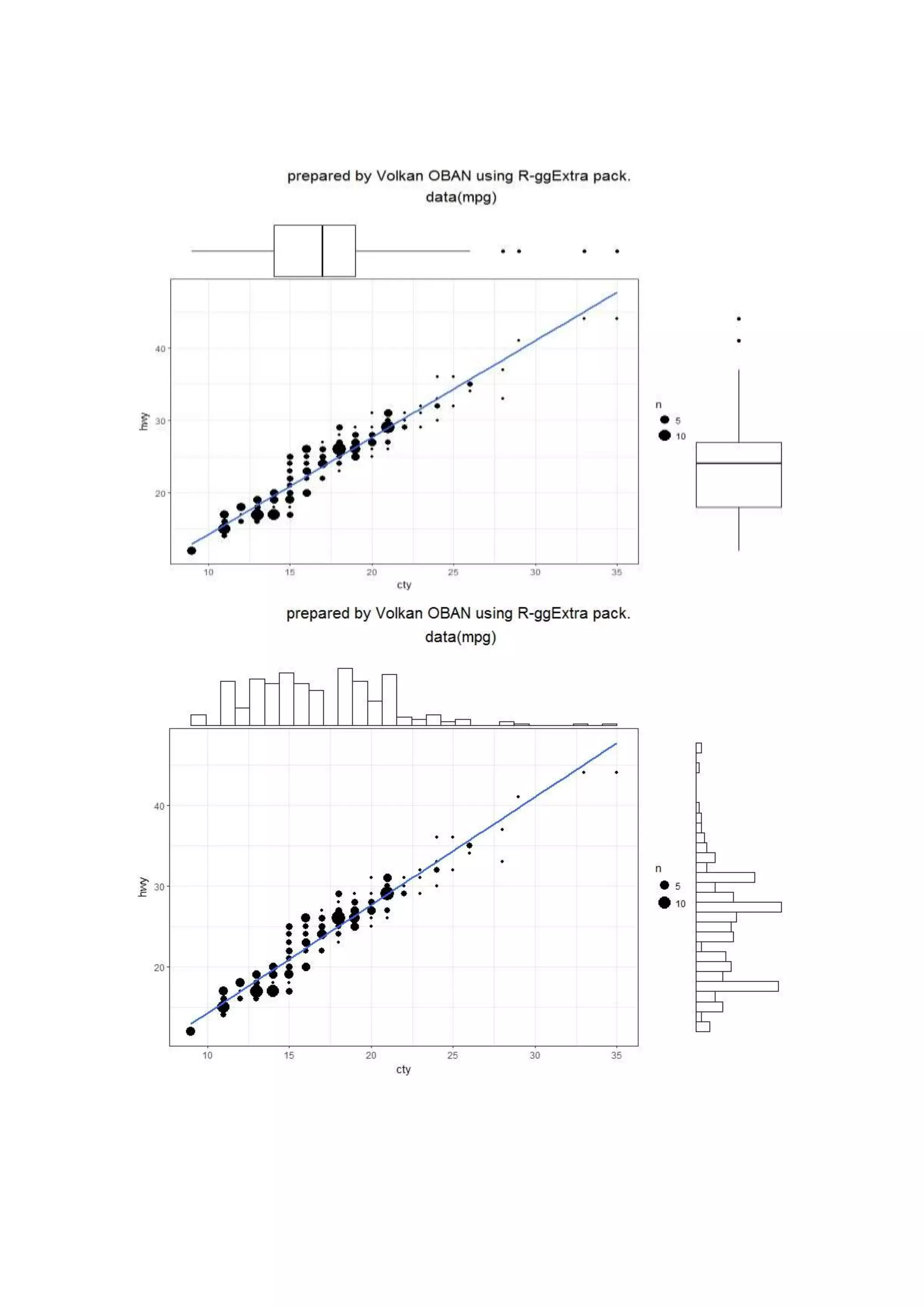
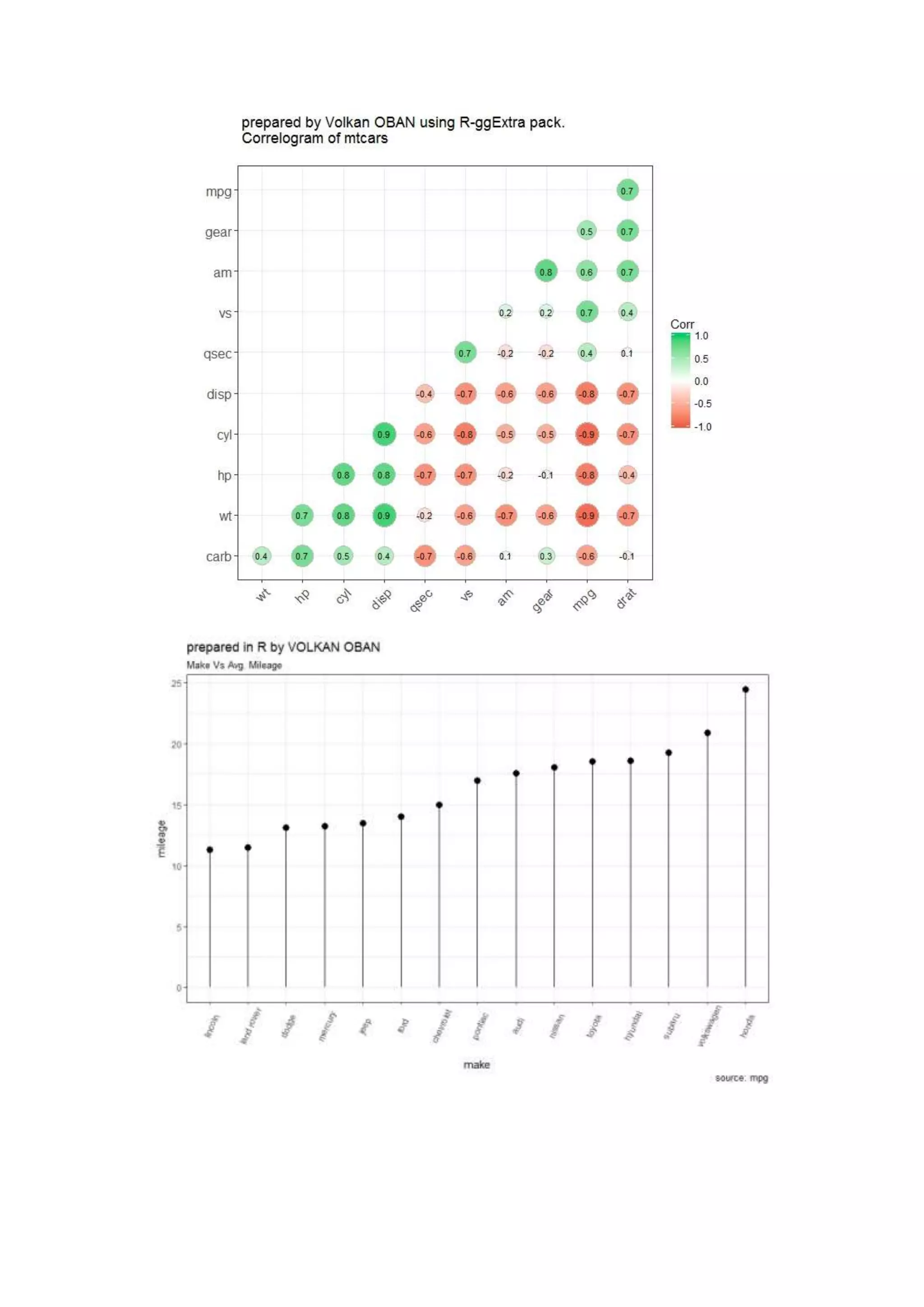
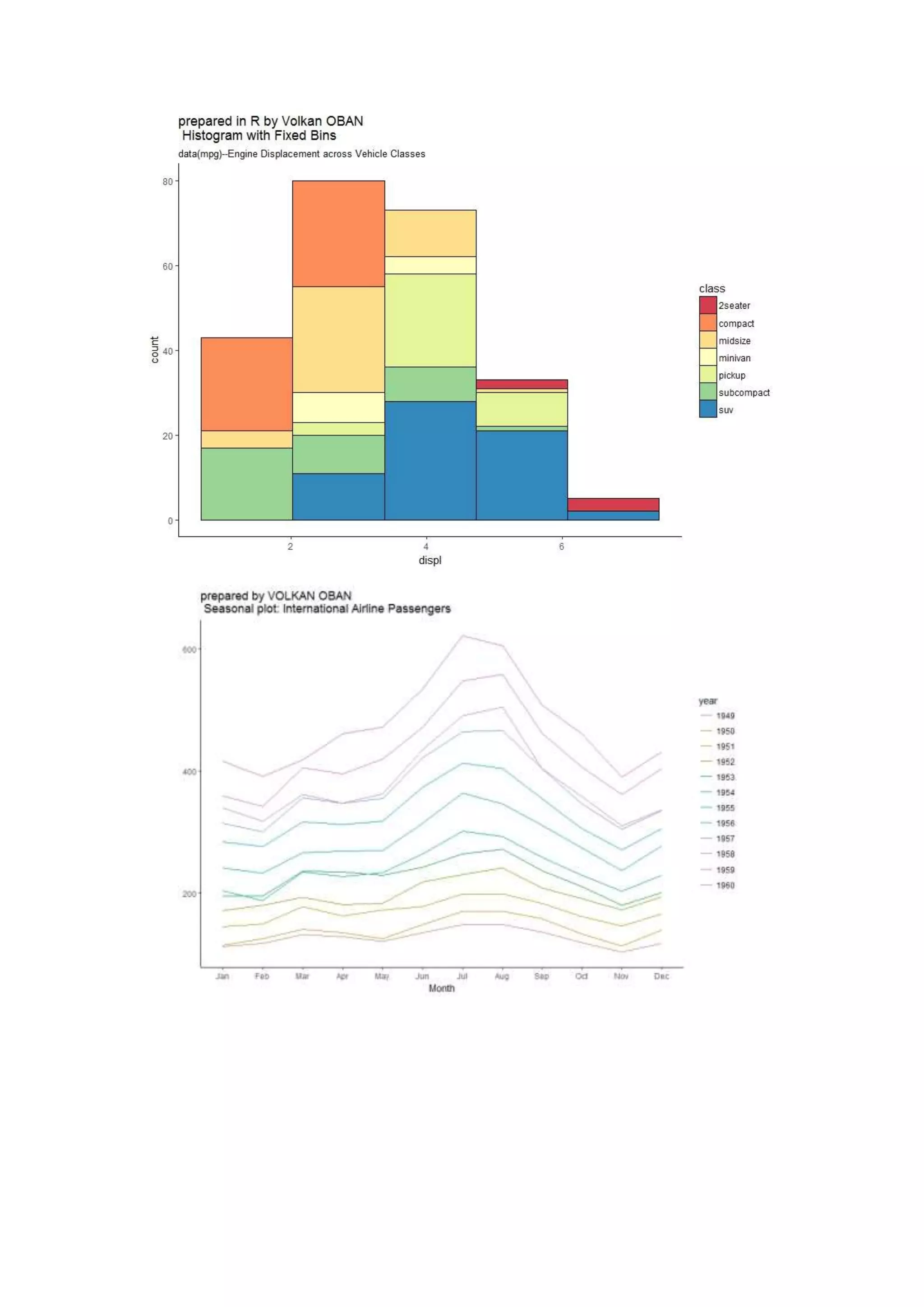
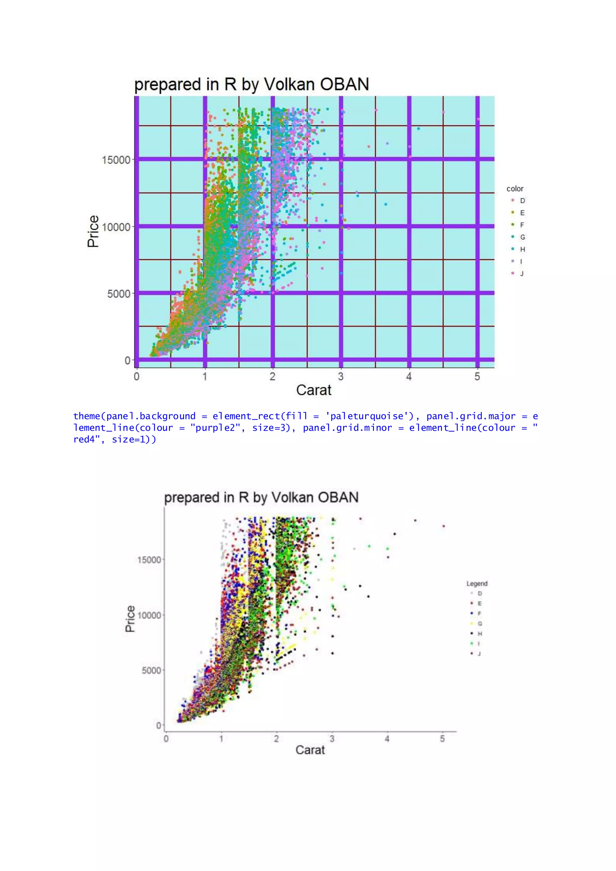
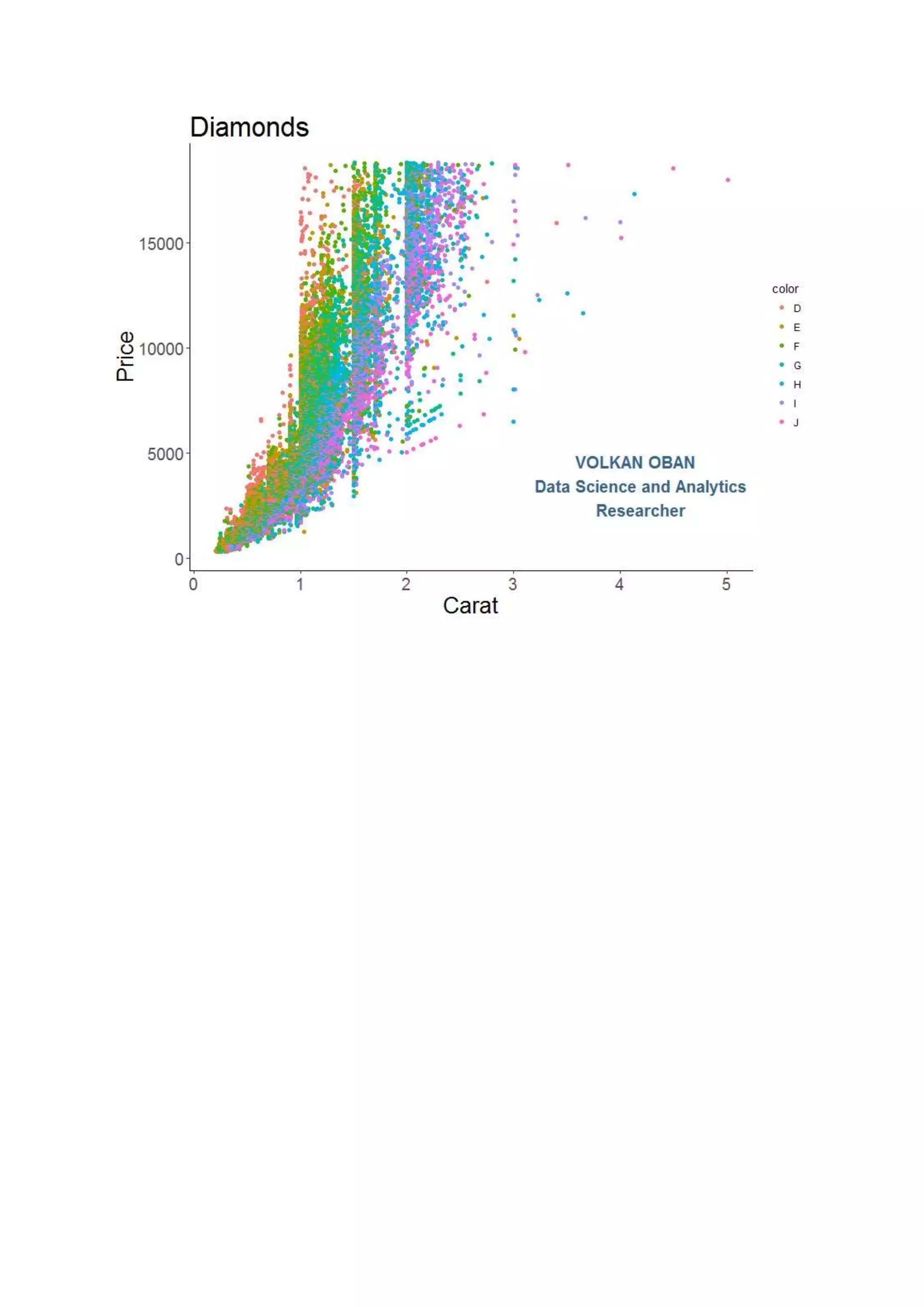
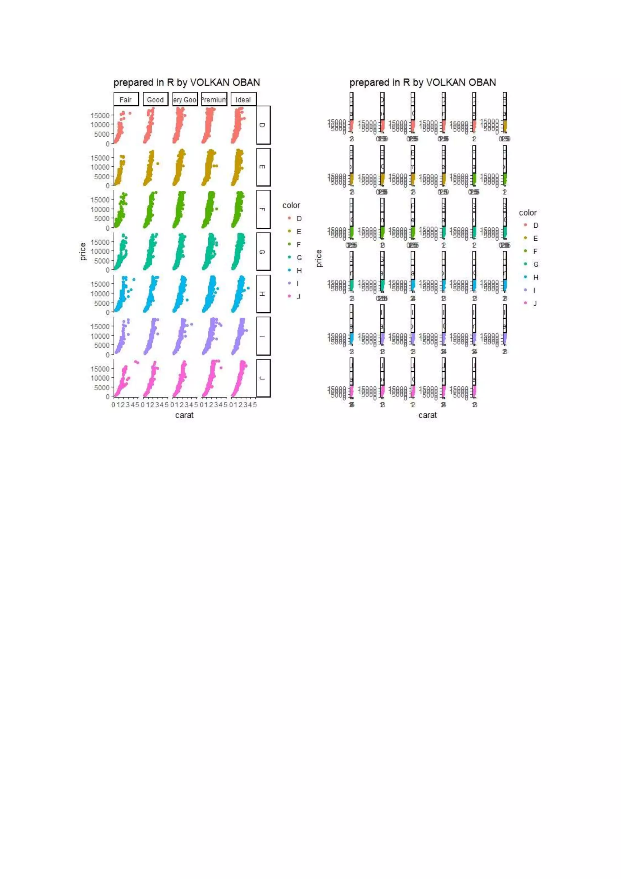
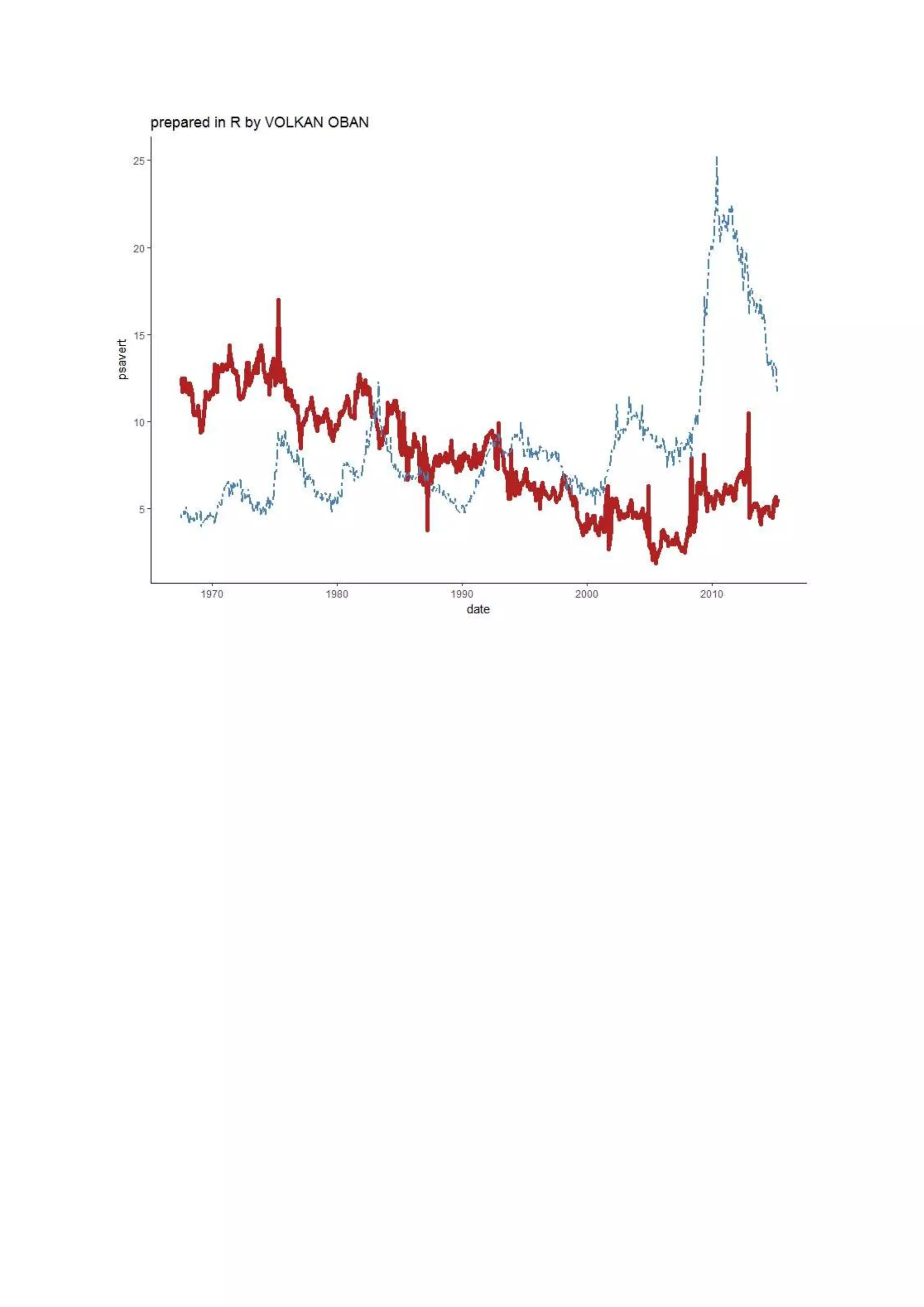
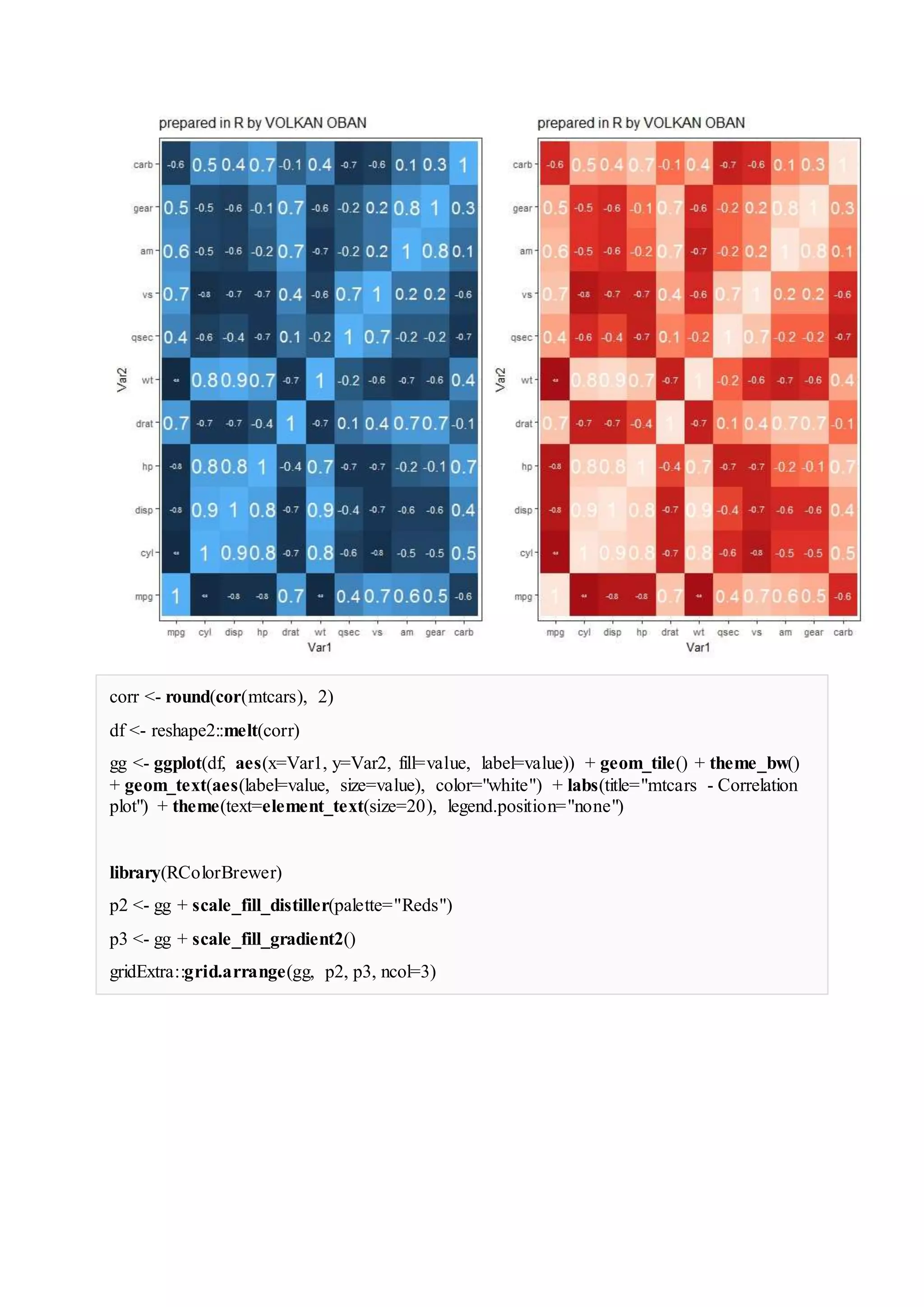
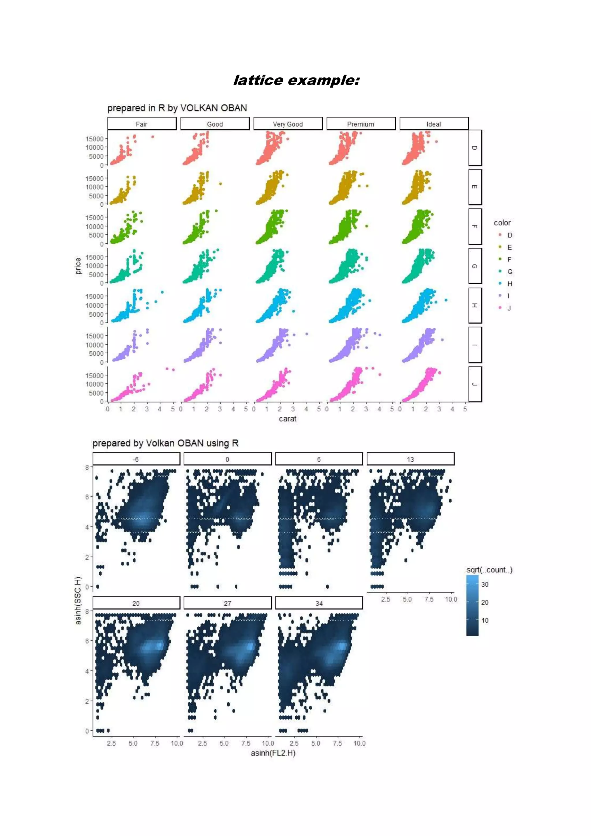
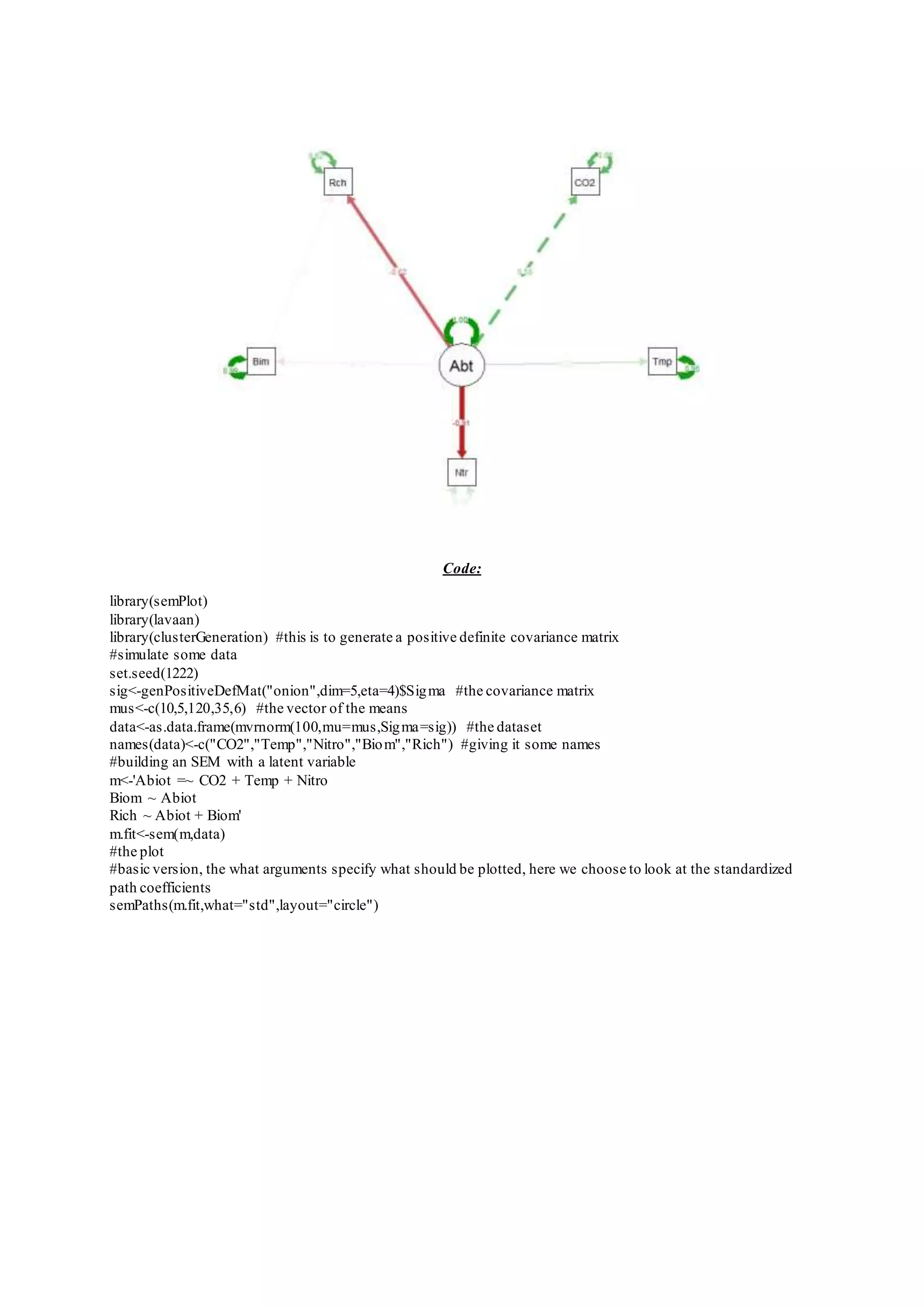
prepared by VOLKAN OBAN DATA VİSUALIZATION with R ggplot2 and Its Extension Examples:
theme(panel.background = element_rect(fill = 'paleturquoise'), panel.grid.major = e lement_line(colour = "purple2", size=3), panel.grid.minor = element_line(colour = " red4", size=1))
corr <- round(cor(mtcars), 2) df <- reshape2::melt(corr) gg <- ggplot(df, aes(x=Var1, y=Var2, fill=value, label=value)) + geom_tile() + theme_bw() + geom_text(aes(label=value, size=value), color="white") + labs(title="mtcars - Correlation plot") + theme(text=element_text(size=20), legend.position="none") library(RColorBrewer) p2 <- gg + scale_fill_distiller(palette="Reds") p3 <- gg + scale_fill_gradient2() gridExtra::grid.arrange(gg, p2, p3, ncol=3)
lattice example:
Code: library(semPlot) library(lavaan) library(clusterGeneration) #this is to generate a positive definite covariance matrix #simulate some data set.seed(1222) sig<-genPositiveDefMat("onion",dim=5,eta=4)$Sigma #the covariance matrix mus<-c(10,5,120,35,6) #the vector of the means data<-as.data.frame(mvrnorm(100,mu=mus,Sigma=sig)) #the dataset names(data)<-c("CO2","Temp","Nitro","Biom","Rich") #giving it some names #building an SEM with a latent variable m<-'Abiot =~ CO2 + Temp + Nitro Biom ~ Abiot Rich ~ Abiot + Biom' m.fit<-sem(m,data) #the plot #basic version, the what arguments specify what should be plotted, here we choose to look at the standardized path coefficients semPaths(m.fit,what="std",layout="circle")
Reference: http://r-statistics.co/ http://r-statistics.co/ggplot2-cheatsheet.html#Annotation http://www.stat.columbia.edu/~tzheng/files/Rcolor.pdf

Data Visualization with R.ggplot2 and its extensions examples.

  • 1.
    prepared by VOLKANOBAN DATA VİSUALIZATION with R ggplot2 and Its Extension Examples:
  • 8.
    theme(panel.background = element_rect(fill= 'paleturquoise'), panel.grid.major = e lement_line(colour = "purple2", size=3), panel.grid.minor = element_line(colour = " red4", size=1))
  • 12.
    corr <- round(cor(mtcars),2) df <- reshape2::melt(corr) gg <- ggplot(df, aes(x=Var1, y=Var2, fill=value, label=value)) + geom_tile() + theme_bw() + geom_text(aes(label=value, size=value), color="white") + labs(title="mtcars - Correlation plot") + theme(text=element_text(size=20), legend.position="none") library(RColorBrewer) p2 <- gg + scale_fill_distiller(palette="Reds") p3 <- gg + scale_fill_gradient2() gridExtra::grid.arrange(gg, p2, p3, ncol=3)
  • 13.
  • 14.
    Code: library(semPlot) library(lavaan) library(clusterGeneration) #this isto generate a positive definite covariance matrix #simulate some data set.seed(1222) sig<-genPositiveDefMat("onion",dim=5,eta=4)$Sigma #the covariance matrix mus<-c(10,5,120,35,6) #the vector of the means data<-as.data.frame(mvrnorm(100,mu=mus,Sigma=sig)) #the dataset names(data)<-c("CO2","Temp","Nitro","Biom","Rich") #giving it some names #building an SEM with a latent variable m<-'Abiot =~ CO2 + Temp + Nitro Biom ~ Abiot Rich ~ Abiot + Biom' m.fit<-sem(m,data) #the plot #basic version, the what arguments specify what should be plotted, here we choose to look at the standardized path coefficients semPaths(m.fit,what="std",layout="circle")
  • 15.