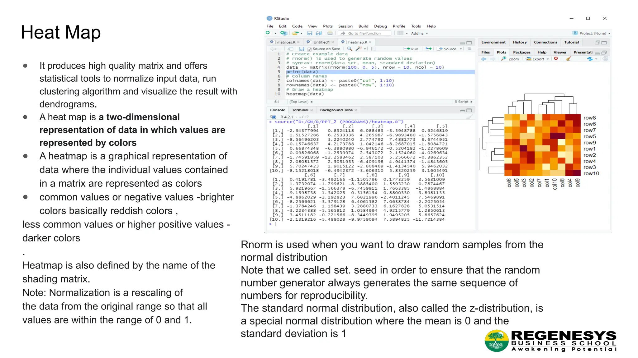
Heat Map ● Itproduces high quality matrix and offers statistical tools to normalize input data, run clustering algorithm and visualize the result with dendrograms. ● A heat map is a two-dimensional representation of data in which values are represented by colors ● A heatmap is a graphical representation of data where the individual values contained in a matrix are represented as colors ● common values or negative values -brighter colors basically reddish colors , less common values or higher positive values - darker colors . Heatmap is also defined by the name of the shading matrix. Note: Normalization is a rescaling of the data from the original range so that all values are within the range of 0 and 1. Rnorm is used when you want to draw random samples from the normal distribution Note that we called set. seed in order to ensure that the random number generator always generates the same sequence of numbers for reproducibility. The standard normal distribution, also called the z-distribution, is a special normal distribution where the mean is 0 and the standard deviation is 1
4.
Mosaic Map ● Amosaic plot (also referred as a Marimekko diagram) is a graphical way for visually representing data from two or more qualitative variables. ● It is a graphical representation of two way contingency table which pictographically represents the relationship among two or more categorical variables. ● In statistics, a contingency table (also known as a cross tabulation or crosstab) is a type of table in a matrix format that displays the (multivariate) frequency distribution of the variables. They are heavily used in survey research, business intelligence, engineering, and scientific research. ● Mosaic plots are used to show relationships between Multivariate Categorical Data and to provide a visual comparison of groups. ● Mosaic plots are a great way to visualize hierarchical data. ● A collection of rectangles represents all the elements to be visualized with the rectangles of different sizes and colors makes a table, but what makes these mosaic charts unique is the arrangement of the elements where there is a hierarchy ,those elements are collected and labeled together, perhaps even with subcategories. Note: We often have lots of measurements for grouping (categorical) variables, e.g. (1) yes & no, (2) woman & man, (3) the good, the bad & the ugly etc., which we need to summarize in a more digestible condense way, e.g. count, sum, average etc. Frequency tables show counts or proportions within groups of categorical variables. Contingency tables analyze the relationship between several categorical variables by (1) placing some variables into rows and other variables into columns and (2) calculating some meaningful statistics: counts, sum, average etc. Contingency tables provide the basic picture of interrelation between two or more variables and also can help to find the interaction between them
5.
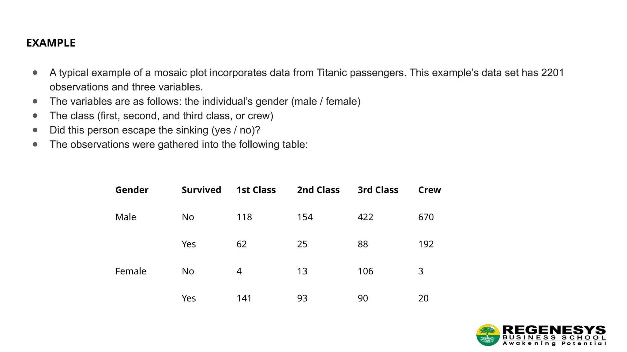
EXAMPLE ● A typicalexample of a mosaic plot incorporates data from Titanic passengers. This example’s data set has 2201 observations and three variables. ● The variables are as follows: the individual’s gender (male / female) ● The class (first, second, and third class, or crew) ● Did this person escape the sinking (yes / no)? ● The observations were gathered into the following table: Gender Survived 1st Class 2nd Class 3rd Class Crew Male No 118 154 422 670 Yes 62 25 88 192 Female No 4 13 106 3 Yes 141 93 90 20
6.
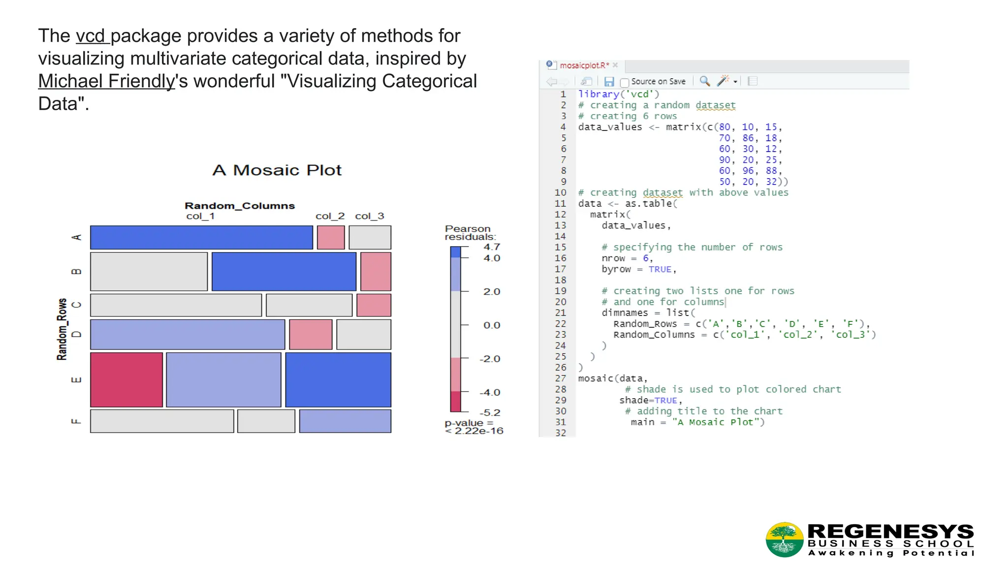
The vcd packageprovides a variety of methods for visualizing multivariate categorical data, inspired by Michael Friendly's wonderful "Visualizing Categorical Data".
7.
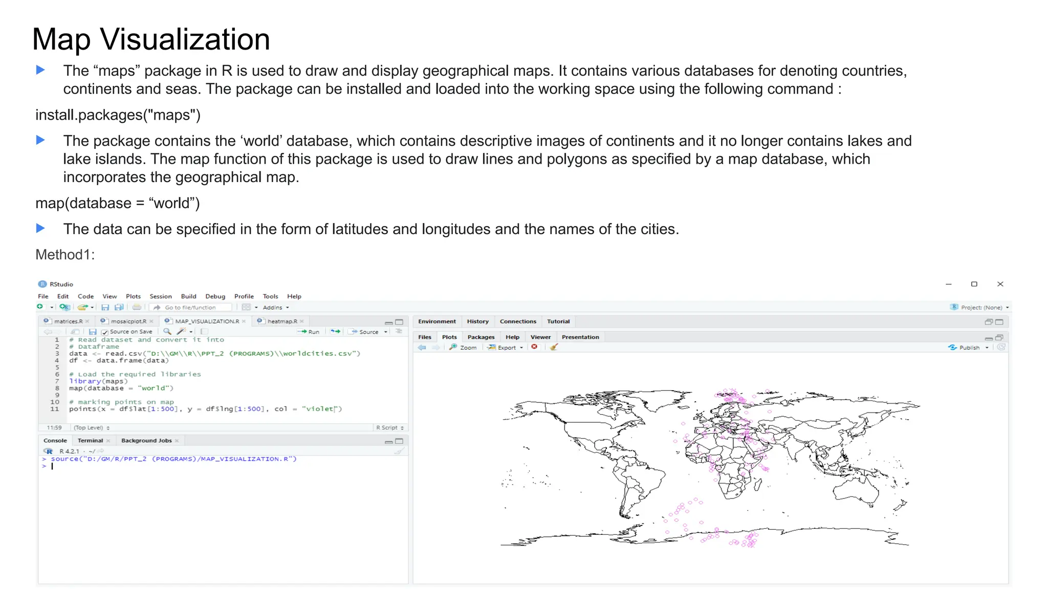
Map Visualization The“maps” package in R is used to draw and display geographical maps. It contains various databases for denoting countries, continents and seas. The package can be installed and loaded into the working space using the following command : install.packages("maps") The package contains the ‘world’ database, which contains descriptive images of continents and it no longer contains lakes and lake islands. The map function of this package is used to draw lines and polygons as specified by a map database, which incorporates the geographical map. map(database = “world”) The data can be specified in the form of latitudes and longitudes and the names of the cities. Method1:
8.
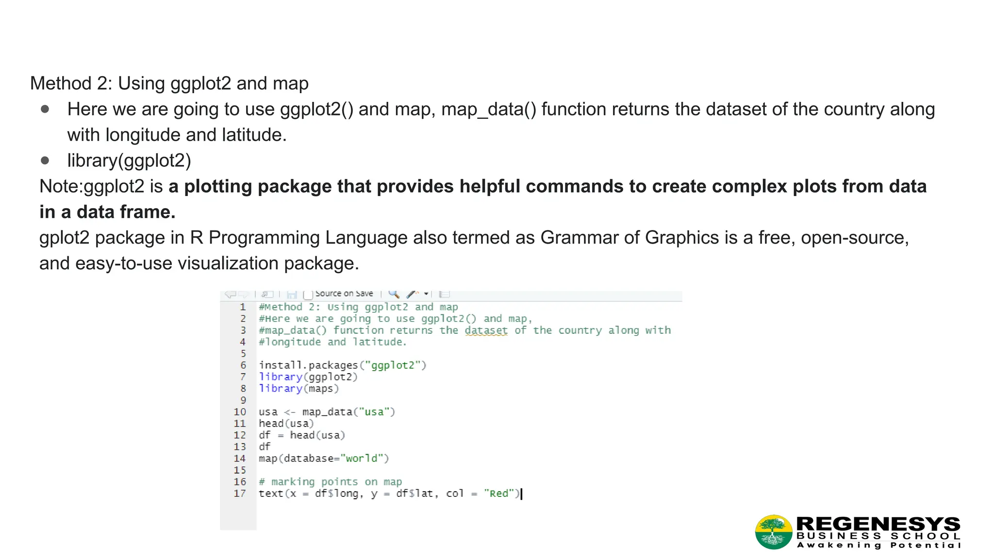
Method 2: Usingggplot2 and map ● Here we are going to use ggplot2() and map, map_data() function returns the dataset of the country along with longitude and latitude. ● library(ggplot2) Note:ggplot2 is a plotting package that provides helpful commands to create complex plots from data in a data frame. gplot2 package in R Programming Language also termed as Grammar of Graphics is a free, open-source, and easy-to-use visualization package.
9.
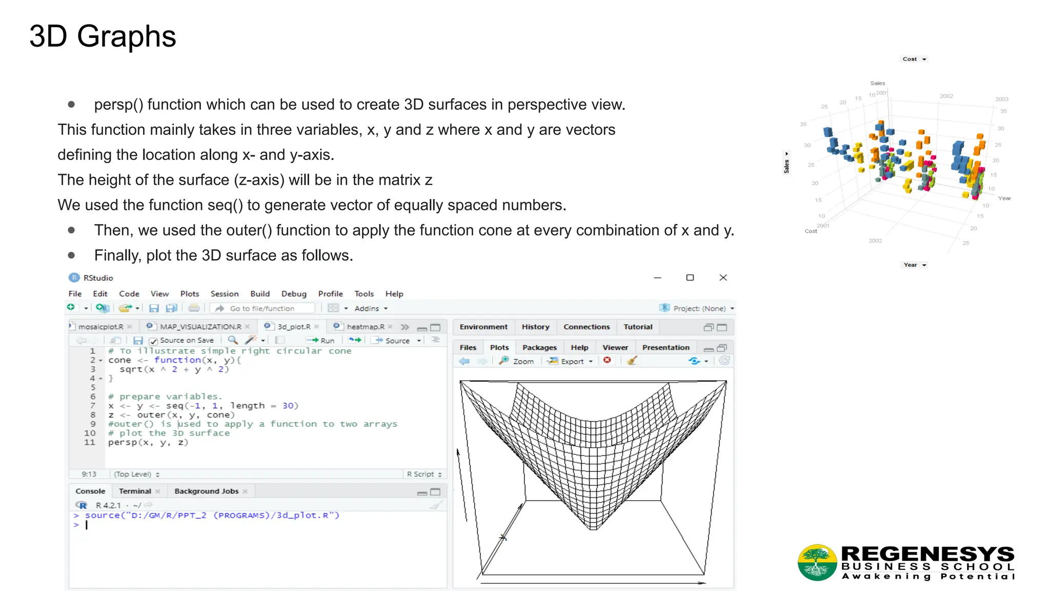
3D Graphs ● persp()function which can be used to create 3D surfaces in perspective view. This function mainly takes in three variables, x, y and z where x and y are vectors defining the location along x- and y-axis. The height of the surface (z-axis) will be in the matrix z We used the function seq() to generate vector of equally spaced numbers. ● Then, we used the outer() function to apply the function cone at every combination of x and y. ● Finally, plot the 3D surface as follows.
10.
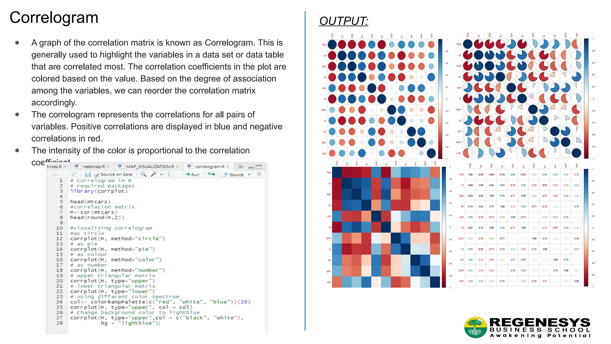
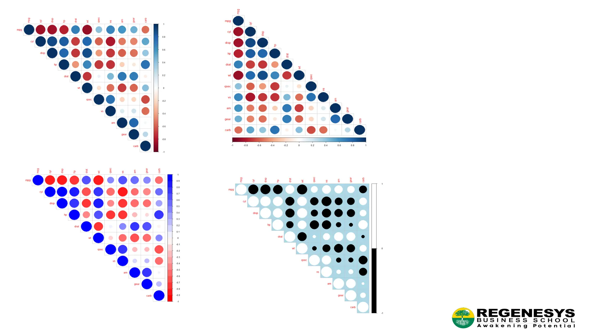
Correlogram ● A graphof the correlation matrix is known as Correlogram. This is generally used to highlight the variables in a data set or data table that are correlated most. The correlation coefficients in the plot are colored based on the value. Based on the degree of association among the variables, we can reorder the correlation matrix accordingly. ● The correlogram represents the correlations for all pairs of variables. Positive correlations are displayed in blue and negative correlations in red. ● The intensity of the color is proportional to the correlation coefficient. OUTPUT:
12.
STRING MANIPULATION • Concatenationof strings • Calculating Length of strings • Case Conversion of strings • Character replacement • Splitting the string • Working with substring • Process of handling and analyzing strings
13.
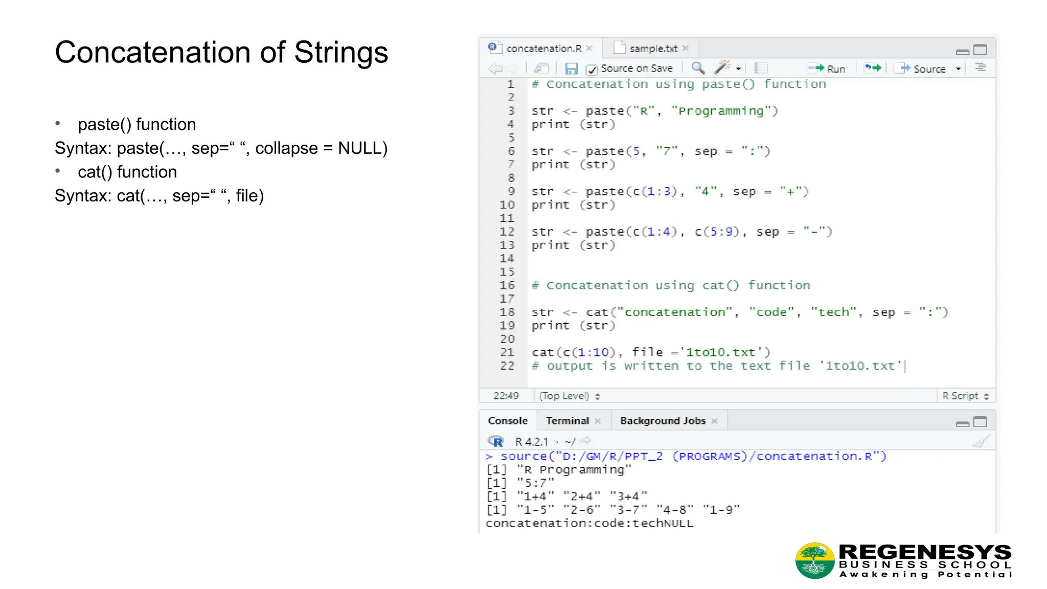
Concatenation of Strings •paste() function Syntax: paste(…, sep=“ “, collapse = NULL) • cat() function Syntax: cat(…, sep=“ “, file)
14.
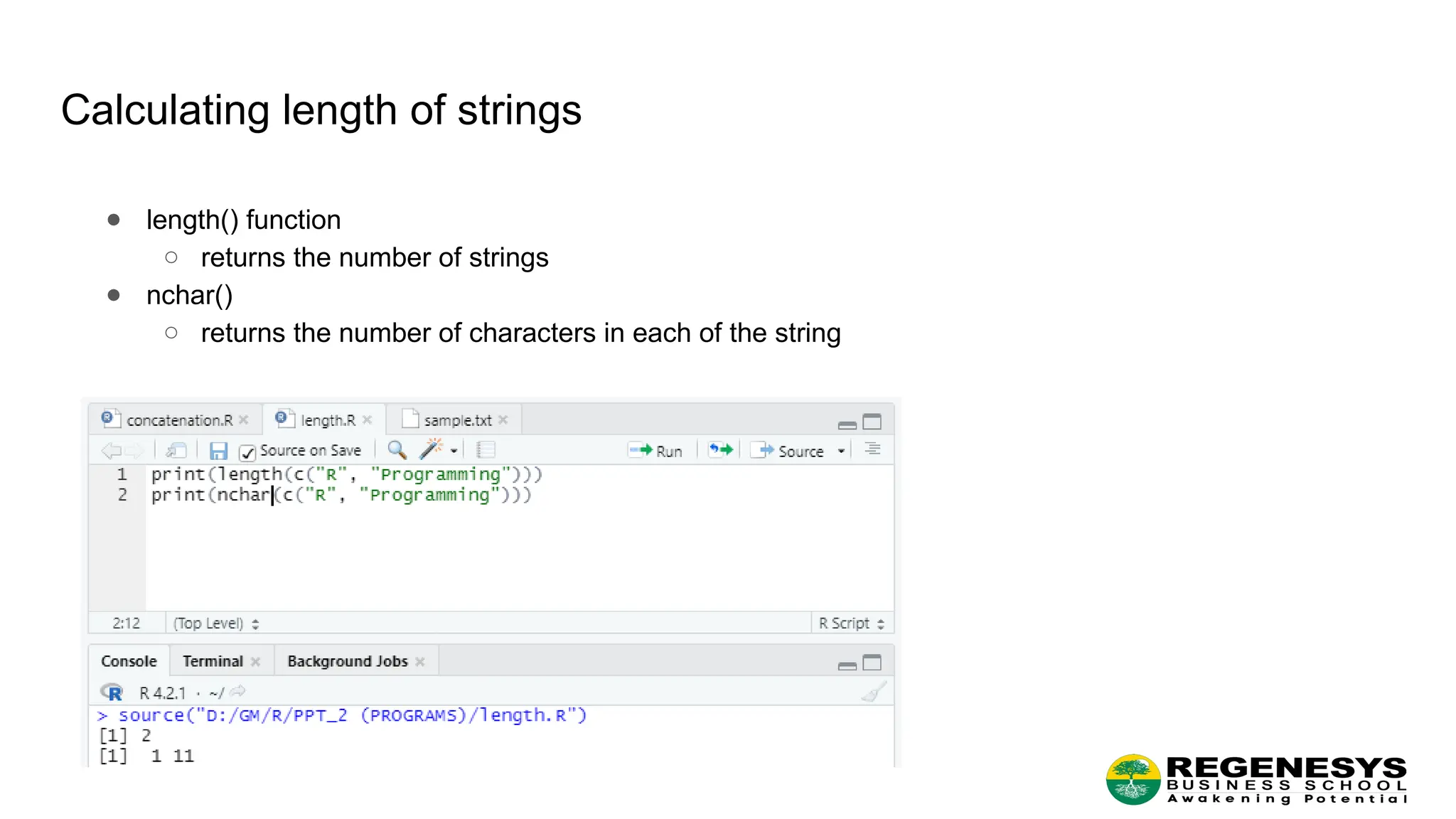
Calculating length ofstrings ● length() function ○ returns the number of strings ● nchar() ○ returns the number of characters in each of the string
15.
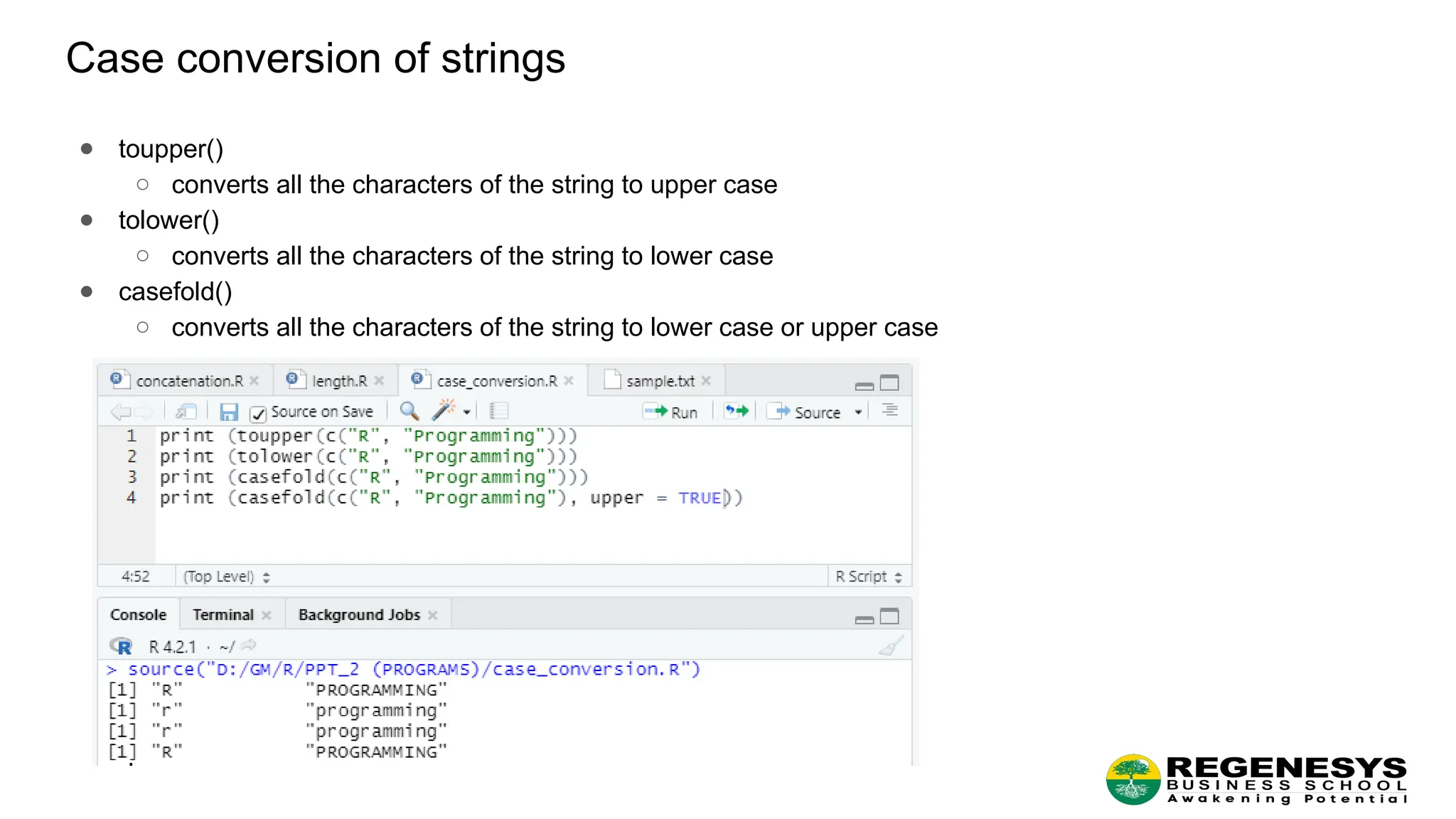
Case conversion ofstrings ● toupper() ○ converts all the characters of the string to upper case ● tolower() ○ converts all the characters of the string to lower case ● casefold() ○ converts all the characters of the string to lower case or upper case
16.
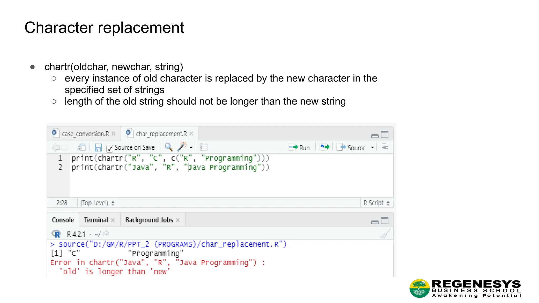
Character replacement ● chartr(oldchar,newchar, string) ○ every instance of old character is replaced by the new character in the specified set of strings ○ length of the old string should not be longer than the new string
17.
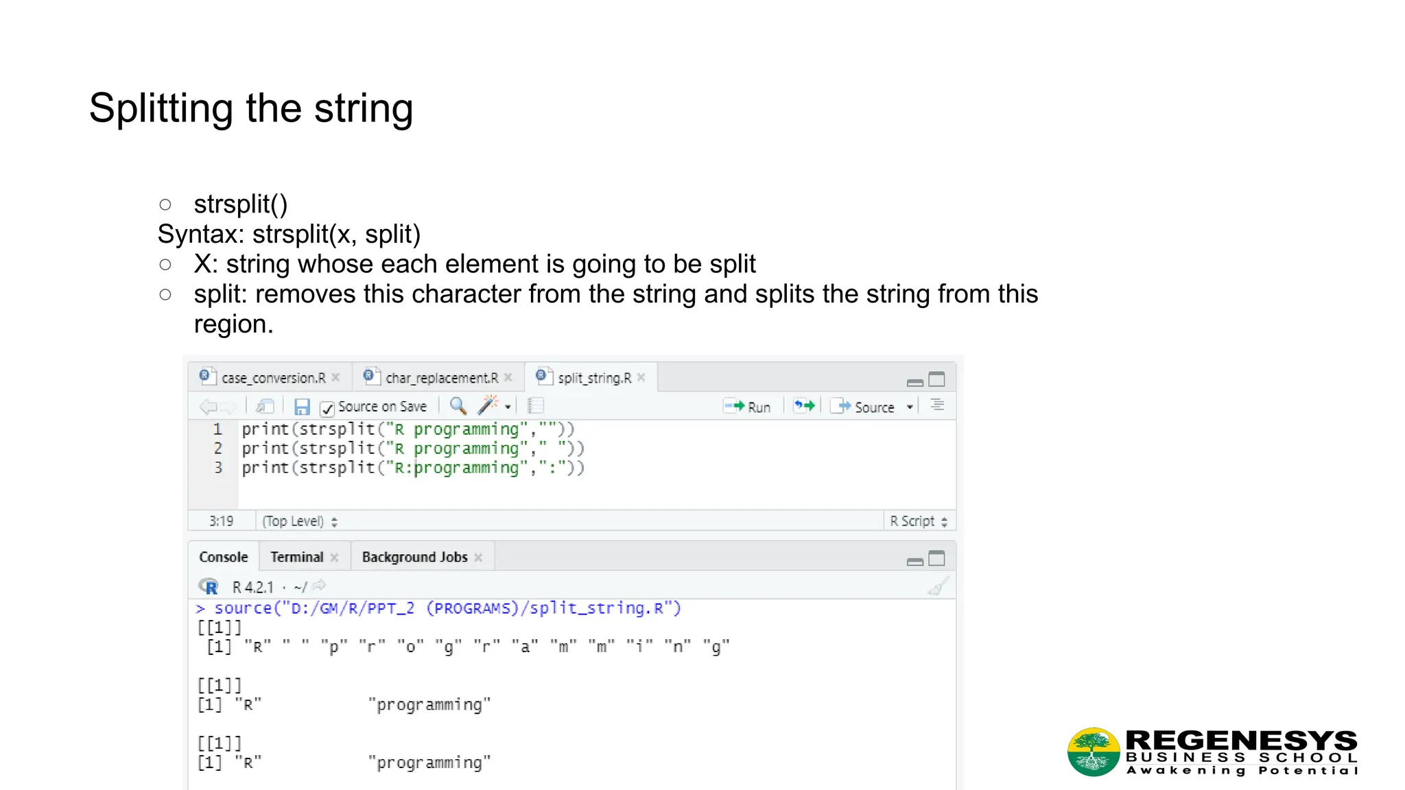
Splitting the string ○strsplit() Syntax: strsplit(x, split) ○ X: string whose each element is going to be split ○ split: removes this character from the string and splits the string from this region.
18.
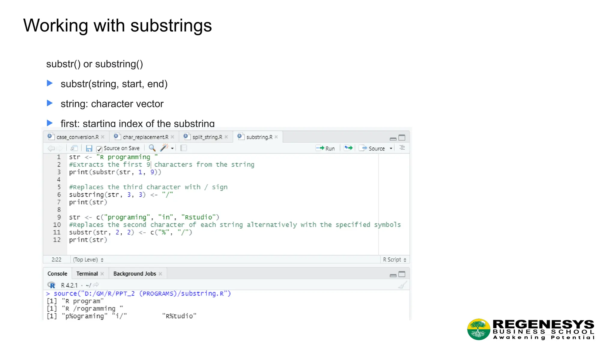
Working with substrings substr()or substring() substr(string, start, end) string: character vector first: starting index of the substring last: Ending index of the substring