CSS Cascading Style Sheets By: Asif Shahzad
Introduction to CSS • CSS stands of Cascading Style Sheets, used to describe presentation or styles of web pages e.g.: – Layout, color, font, borders, paddings, etc. – Responsiveness – Mobile friendly user interfaces • World Wide Web Consortium W3C develop and publish CSS Specifications. The specification is used by web browsers, publishers and developers etc. • CSS can be embedded in HTML page or attached as an external CSS file. • How much CSS one should know: depends on objective e.g. front end developer, backend developer, full stack developer. 2
Selectors • Rules/syntax to select page element/s to apply CSS properties. • Code structure to declare style or CSS properties: – selector {property1: value1; property2:value2;…} • There are three basic types of selectors: Tag Name, Tag ID, Tag Class • Examples: 1. p {color: red;} 2. #name {font-size:20px;} 3. .alpha {font-family: arial;} • Some other selectors: nested/child, immediate child, universal, attribute, etc. 3
How to add CSS in HTML page • CSS can be added to HTML page using following ways: – Inline Using style attribute of the element – Internal Using <style> element, usually in <head> section – External Using external CSS file. Link tag to used to attach external file. 4
Properties for Color, Size, Font Color • Background-color • Color Size • Height • Width Font • Font-family • Font-size • Font-weight • Font-style https://www.chromestatus.com/metrics/css/popularity 5
Properties for Text text-align text-indent line-height (normal, number, unit length, %, initial, inherit) word-spacing letter-spacing 6
CSS Box Model • Elements are renders as rectangular box. Box size is calculated using following sizes: 1. Content 2. Padding 3. Border 4. Margin* • By default, specified width and height belong to content area. We can set to border-to-border (inclusive) using: box-sizing: border-box; 7
Padding, Border and Margin Padding:20px Padding-left Padding-top Padding-right Padding-bottom Margin Margin-left Margin-top Margin-right Margin-bottom Border Border-width:20px; Border-style Border-color OR Border-left-width Border-left-style Border-left-color . . 8
Background Image Properties 1. background-image 2. background-repeat 3. background-position 4. background-attachment 9
Styling Hyperlinks • Link States Link Visited Hover Active • Link state properties A:Link A:Visited A:Hover A:Active 10
Positioning • Static – Its default. Elements aren’t positioned • Relative • Elements are placed relative to its default position i.e. from where it would normally occur. It still occupies the original space in document, so incorrect use may cause subsequent elements be hidden. • Absolute • Remove the element from document flow and places as per positions specified w.r.t. page. It do not occupy the original space. • If you want to position an element w.r.t. container, the container itself must be relatively positioned (used to place contents over components). • Fixed - Fixed with reference to page 11
Website Layout • Template or structure of a website. All pages generally follow common layout for quality user experience. • Table and div tags can be used to implement layouts • Tables objective is not layout creation – Tables are mostly used for tabular data – Creates code smell for complex templates (refactor) – Consumes more bytes of markup • We prefer div over table for layout • Float and position are important properties to make div based layouts 12
Styling Lists • How to style ordered and unordered lists? • list-style-* type (none, disc, circle, square, etc.) image (url(‘image-name.ext’)) position (outside, inside, initial, inherit) List-style-* properties using single line: list-style: circle url("texture.jpg") inside; 13
Creating Navigation Bar using List • We can create navigation bars and drop down menus using list tag (i.e. ul, ol), by applying CSS properties • Remember following points from inline and block elements topic: – We can’t apply top and bottom margins, width and height properties to inline elements – Default ‘display’ of li tag is list-item. We must override to bring list items in single row. – Use inline-block to apply sizing properties on inline elements 14
Floats – 1 of 4 • Block elements take 100% width of container (when width is not specified). They do not allow elements on right or left [1]. • Float property changes the way a block element is laid out by the browser. These are taken out of the normal flow and then placed back following some rules. • Float property can be applied to block elements e.g. div, p, etc. Float applies with respect to container. Usage: float:right; float:left [2_0 to 2_1] 15
Floats – 2 of 4 • Floated block elements shift to above row, when space is available. If there is not enough space, elements are shifted down automatically [2_2]. One element properties, may effect the others in layout. • Container fails to calculate height when it contains floated elements only. We apply some CSS to force container draw itself correctly. [2_3 and 2_4] 16
Floats – 3 of 4 • Block elements before a floated element do not effect [3_0]. But when upper element is applied float property, bottom non-floated elements would wrap around [3_1] i.e. float my effect, non-floated elements. • If bottom elements are also floated, they would shift below when content is large [3_2]. Use width with floated elements [3_3] for predictable behavior. • If you want to stop non-floated elements to wrap around the floated elements, you need to clear the float. [3_4] 17
Floats – 4 of 4 • ‘Clear’ forces the element to shift down, even when it can adjust. clear:left allows no element be placed on left. clear:right allows no element be placed at right. To make both sides clear, use clear:both [3_4, 3_5]. Remember box model, see [3_5] again • While content will wrap - border, background image and background color will extend underneath [4_1]. 18
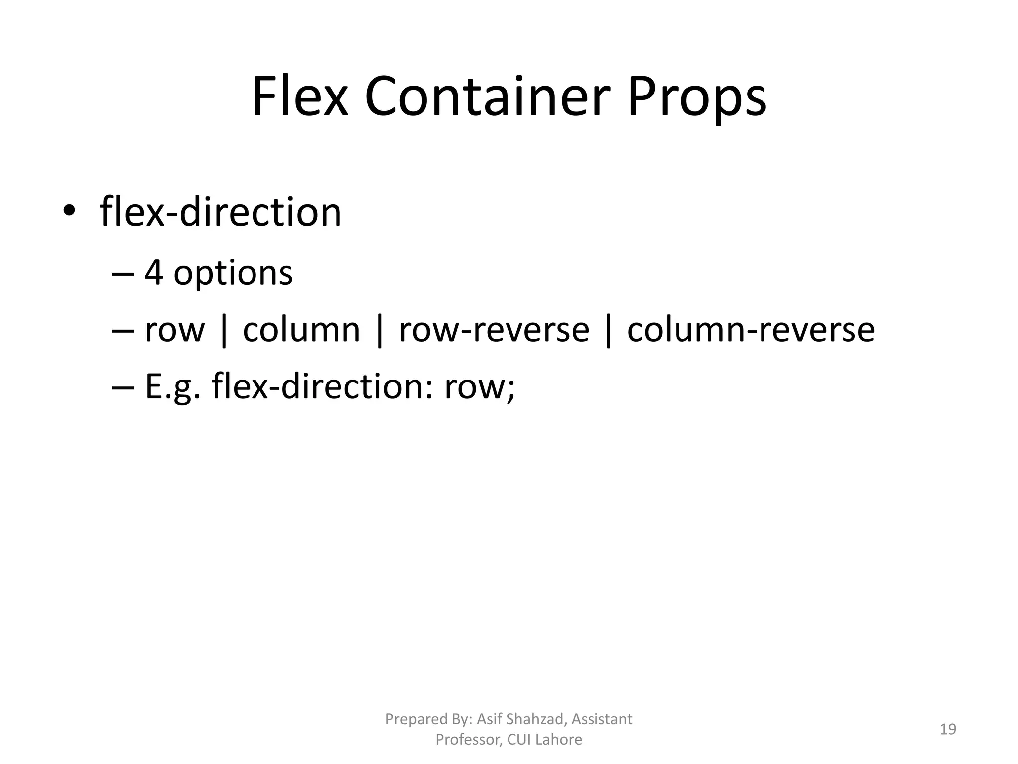
Flex Container Props • flex-direction – 4 options – row | column | row-reverse | column-reverse – E.g. flex-direction: row; Prepared By: Asif Shahzad, Assistant Professor, CUI Lahore 19
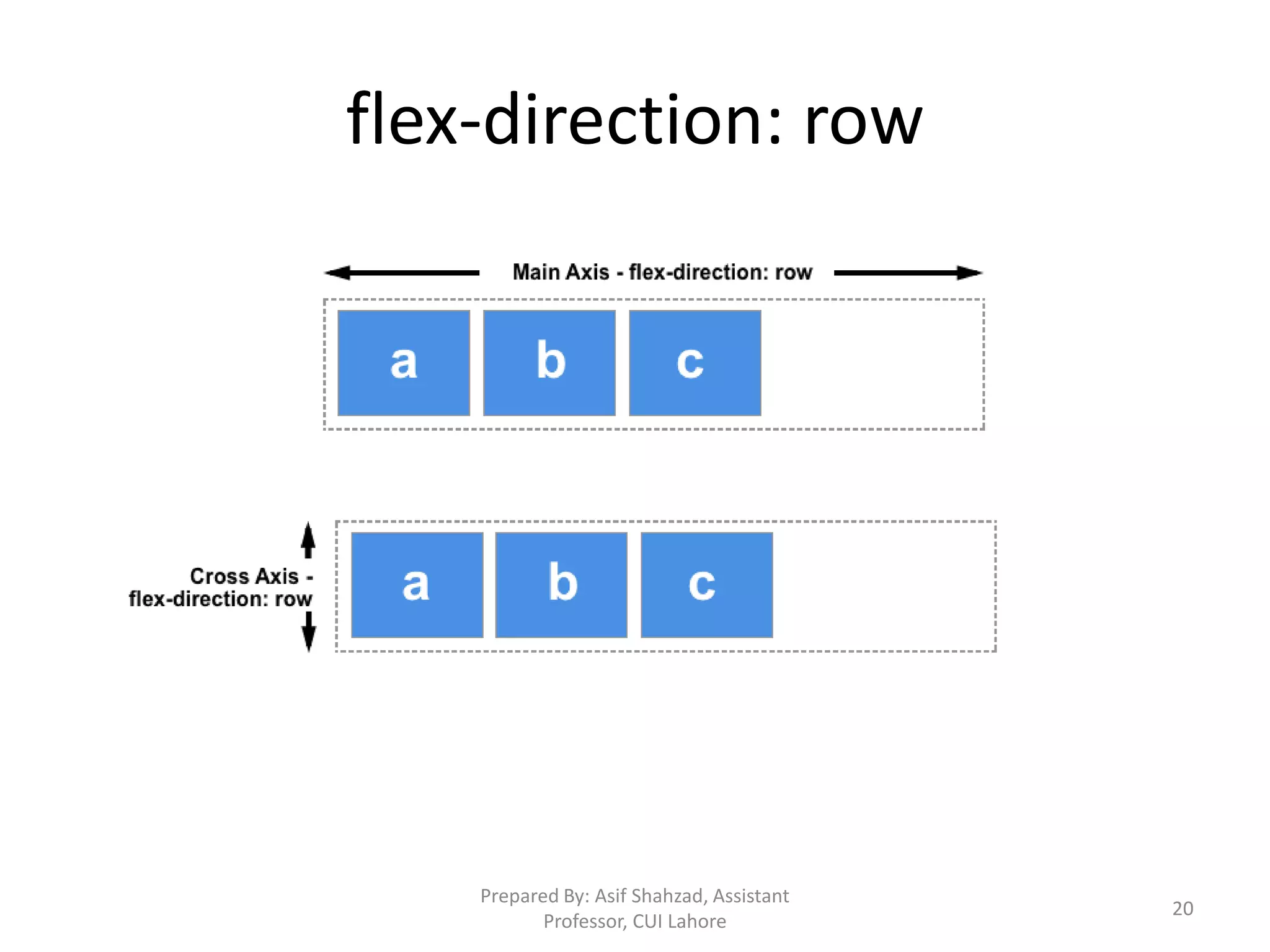
flex-direction: row Prepared By: Asif Shahzad, Assistant Professor, CUI Lahore 20
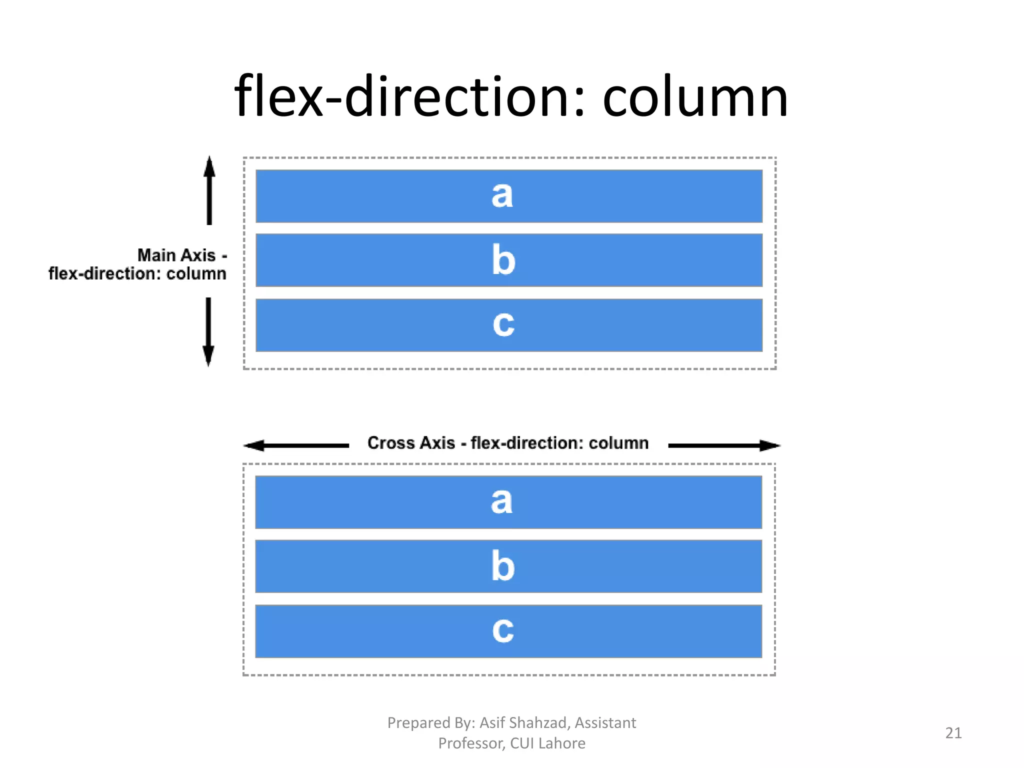
flex-direction: column Prepared By: Asif Shahzad, Assistant Professor, CUI Lahore 21
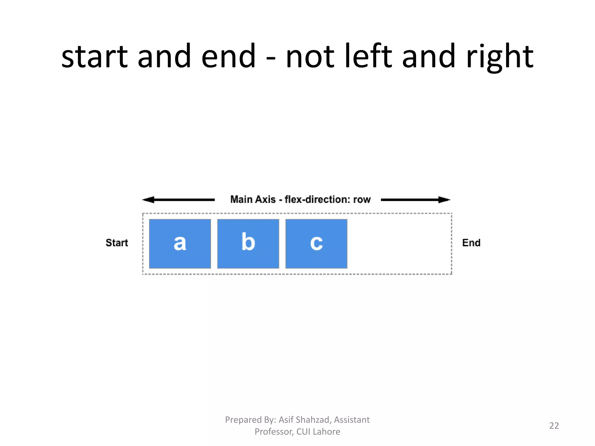
start and end - not left and right Prepared By: Asif Shahzad, Assistant Professor, CUI Lahore 22
Flex Container • Direct children of flex container are called, flex items. If we do not specify flex-direction, items display in a row, as its default value. 1x.html • The items start from the start edge of the main axis. See 1x.html • The items do not stretch on the main dimension, but can shrink. See 1x.html • The items will stretch to fill the size of the cross axis. 1x2.html Prepared By: Asif Shahzad, Assistant Professor, CUI Lahore 23
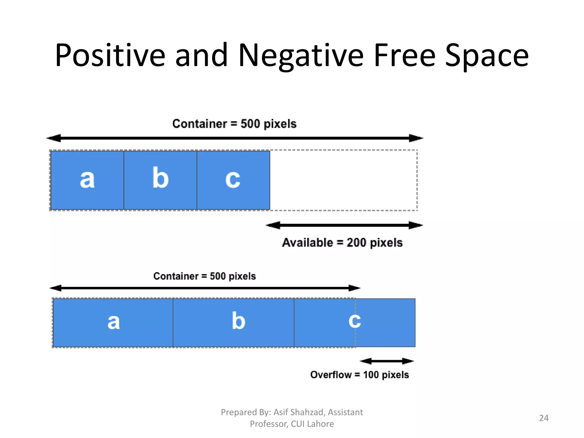
Positive and Negative Free Space Prepared By: Asif Shahzad, Assistant Professor, CUI Lahore 24
Flex Container Basis Props • justify-content – Its for main-axis – Divide available space b/w items. See 2x.html – How to divide positive free space inside the item, we would shortly see. Prepared By: Asif Shahzad, Assistant Professor, CUI Lahore 25
Flex Container Basis Props • align-items – align-items property work in cross axis. – Think of it, justify-content version for the cross- axis. – There must be some free pace in cross axis. In other words, there must be height or width specified for container. See 3x.html – If there is space in cross axis, and you do not specify the align-items, the items would stretch. Prepared By: Asif Shahzad, Assistant Professor, CUI Lahore 26
Flex Container Basis Props • flex-wrap – By default, items do not wrap in cross axis with container is resized, or screen size is small. Default value is nowrap. See 4x.html – Container cross-axis size auto change, depending on space required by items. Prepared By: Asif Shahzad, Assistant Professor, CUI Lahore 27
flex-grow • It defines, how the free positive space should be distributed among items. • See 9x.html Prepared By: Asif Shahzad, Assistant Professor, CUI Lahore 28
flex-shrink • It defines, how the free negative space should be extracted from items to fit them in container. • See 10x.html Prepared By: Asif Shahzad, Assistant Professor, CUI Lahore 29
Flex-basis impact on item-size • Is flex-basis set to auto, and does the item have a width set? If so, the size will be based on that width. • Is flex-basis set to auto or content? If so, the size is based on the item size. • Is flex-basis a length unit, but not zero? If so this is the size of the item. • Is flex-basis set to 0? if so then the item size is not taken into consideration for the space-sharing calculation. Prepared By: Asif Shahzad, Assistant Professor, CUI Lahore 30
Media Queries • Media Queries help in making responsive design. • We can apply conditional CSS on elements e.g. apply certain CSS properties if screen width is greater than certain pixels. 31

Cascading Style Sheets CSS

  • 1.
  • 2.
    Introduction to CSS •CSS stands of Cascading Style Sheets, used to describe presentation or styles of web pages e.g.: – Layout, color, font, borders, paddings, etc. – Responsiveness – Mobile friendly user interfaces • World Wide Web Consortium W3C develop and publish CSS Specifications. The specification is used by web browsers, publishers and developers etc. • CSS can be embedded in HTML page or attached as an external CSS file. • How much CSS one should know: depends on objective e.g. front end developer, backend developer, full stack developer. 2
  • 3.
    Selectors • Rules/syntax toselect page element/s to apply CSS properties. • Code structure to declare style or CSS properties: – selector {property1: value1; property2:value2;…} • There are three basic types of selectors: Tag Name, Tag ID, Tag Class • Examples: 1. p {color: red;} 2. #name {font-size:20px;} 3. .alpha {font-family: arial;} • Some other selectors: nested/child, immediate child, universal, attribute, etc. 3
  • 4.
    How to addCSS in HTML page • CSS can be added to HTML page using following ways: – Inline Using style attribute of the element – Internal Using <style> element, usually in <head> section – External Using external CSS file. Link tag to used to attach external file. 4
  • 5.
    Properties for Color,Size, Font Color • Background-color • Color Size • Height • Width Font • Font-family • Font-size • Font-weight • Font-style https://www.chromestatus.com/metrics/css/popularity 5
  • 6.
    Properties for Text text-align text-indent line-height (normal,number, unit length, %, initial, inherit) word-spacing letter-spacing 6
  • 7.
    CSS Box Model •Elements are renders as rectangular box. Box size is calculated using following sizes: 1. Content 2. Padding 3. Border 4. Margin* • By default, specified width and height belong to content area. We can set to border-to-border (inclusive) using: box-sizing: border-box; 7
  • 8.
    Padding, Border andMargin Padding:20px Padding-left Padding-top Padding-right Padding-bottom Margin Margin-left Margin-top Margin-right Margin-bottom Border Border-width:20px; Border-style Border-color OR Border-left-width Border-left-style Border-left-color . . 8
  • 9.
    Background Image Properties 1.background-image 2. background-repeat 3. background-position 4. background-attachment 9
  • 10.
    Styling Hyperlinks • LinkStates Link Visited Hover Active • Link state properties A:Link A:Visited A:Hover A:Active 10
  • 11.
    Positioning • Static –Its default. Elements aren’t positioned • Relative • Elements are placed relative to its default position i.e. from where it would normally occur. It still occupies the original space in document, so incorrect use may cause subsequent elements be hidden. • Absolute • Remove the element from document flow and places as per positions specified w.r.t. page. It do not occupy the original space. • If you want to position an element w.r.t. container, the container itself must be relatively positioned (used to place contents over components). • Fixed - Fixed with reference to page 11
  • 12.
    Website Layout • Templateor structure of a website. All pages generally follow common layout for quality user experience. • Table and div tags can be used to implement layouts • Tables objective is not layout creation – Tables are mostly used for tabular data – Creates code smell for complex templates (refactor) – Consumes more bytes of markup • We prefer div over table for layout • Float and position are important properties to make div based layouts 12
  • 13.
    Styling Lists • Howto style ordered and unordered lists? • list-style-* type (none, disc, circle, square, etc.) image (url(‘image-name.ext’)) position (outside, inside, initial, inherit) List-style-* properties using single line: list-style: circle url("texture.jpg") inside; 13
  • 14.
    Creating Navigation Barusing List • We can create navigation bars and drop down menus using list tag (i.e. ul, ol), by applying CSS properties • Remember following points from inline and block elements topic: – We can’t apply top and bottom margins, width and height properties to inline elements – Default ‘display’ of li tag is list-item. We must override to bring list items in single row. – Use inline-block to apply sizing properties on inline elements 14
  • 15.
    Floats – 1of 4 • Block elements take 100% width of container (when width is not specified). They do not allow elements on right or left [1]. • Float property changes the way a block element is laid out by the browser. These are taken out of the normal flow and then placed back following some rules. • Float property can be applied to block elements e.g. div, p, etc. Float applies with respect to container. Usage: float:right; float:left [2_0 to 2_1] 15
  • 16.
    Floats – 2of 4 • Floated block elements shift to above row, when space is available. If there is not enough space, elements are shifted down automatically [2_2]. One element properties, may effect the others in layout. • Container fails to calculate height when it contains floated elements only. We apply some CSS to force container draw itself correctly. [2_3 and 2_4] 16
  • 17.
    Floats – 3of 4 • Block elements before a floated element do not effect [3_0]. But when upper element is applied float property, bottom non-floated elements would wrap around [3_1] i.e. float my effect, non-floated elements. • If bottom elements are also floated, they would shift below when content is large [3_2]. Use width with floated elements [3_3] for predictable behavior. • If you want to stop non-floated elements to wrap around the floated elements, you need to clear the float. [3_4] 17
  • 18.
    Floats – 4of 4 • ‘Clear’ forces the element to shift down, even when it can adjust. clear:left allows no element be placed on left. clear:right allows no element be placed at right. To make both sides clear, use clear:both [3_4, 3_5]. Remember box model, see [3_5] again • While content will wrap - border, background image and background color will extend underneath [4_1]. 18
  • 19.
    Flex Container Props •flex-direction – 4 options – row | column | row-reverse | column-reverse – E.g. flex-direction: row; Prepared By: Asif Shahzad, Assistant Professor, CUI Lahore 19
  • 20.
    flex-direction: row Prepared By:Asif Shahzad, Assistant Professor, CUI Lahore 20
  • 21.
    flex-direction: column Prepared By:Asif Shahzad, Assistant Professor, CUI Lahore 21
  • 22.
    start and end- not left and right Prepared By: Asif Shahzad, Assistant Professor, CUI Lahore 22
  • 23.
    Flex Container • Directchildren of flex container are called, flex items. If we do not specify flex-direction, items display in a row, as its default value. 1x.html • The items start from the start edge of the main axis. See 1x.html • The items do not stretch on the main dimension, but can shrink. See 1x.html • The items will stretch to fill the size of the cross axis. 1x2.html Prepared By: Asif Shahzad, Assistant Professor, CUI Lahore 23
  • 24.
    Positive and NegativeFree Space Prepared By: Asif Shahzad, Assistant Professor, CUI Lahore 24
  • 25.
    Flex Container BasisProps • justify-content – Its for main-axis – Divide available space b/w items. See 2x.html – How to divide positive free space inside the item, we would shortly see. Prepared By: Asif Shahzad, Assistant Professor, CUI Lahore 25
  • 26.
    Flex Container BasisProps • align-items – align-items property work in cross axis. – Think of it, justify-content version for the cross- axis. – There must be some free pace in cross axis. In other words, there must be height or width specified for container. See 3x.html – If there is space in cross axis, and you do not specify the align-items, the items would stretch. Prepared By: Asif Shahzad, Assistant Professor, CUI Lahore 26
  • 27.
    Flex Container BasisProps • flex-wrap – By default, items do not wrap in cross axis with container is resized, or screen size is small. Default value is nowrap. See 4x.html – Container cross-axis size auto change, depending on space required by items. Prepared By: Asif Shahzad, Assistant Professor, CUI Lahore 27
  • 28.
    flex-grow • It defines,how the free positive space should be distributed among items. • See 9x.html Prepared By: Asif Shahzad, Assistant Professor, CUI Lahore 28
  • 29.
    flex-shrink • It defines,how the free negative space should be extracted from items to fit them in container. • See 10x.html Prepared By: Asif Shahzad, Assistant Professor, CUI Lahore 29
  • 30.
    Flex-basis impact onitem-size • Is flex-basis set to auto, and does the item have a width set? If so, the size will be based on that width. • Is flex-basis set to auto or content? If so, the size is based on the item size. • Is flex-basis a length unit, but not zero? If so this is the size of the item. • Is flex-basis set to 0? if so then the item size is not taken into consideration for the space-sharing calculation. Prepared By: Asif Shahzad, Assistant Professor, CUI Lahore 30
  • 31.
    Media Queries • MediaQueries help in making responsive design. • We can apply conditional CSS on elements e.g. apply certain CSS properties if screen width is greater than certain pixels. 31

Editor's Notes

  • #3 Block and inline elements
  • #6 TODO: adding external font and units details
  • #8 To-do: add slide to show it graphically
  • #10 https://projects.verou.me/css3patterns/#
  • #12 To-do: add slide to show where positioning is useful, graphically. Absolute and fixed positioned elements loses the dimension. We need to give width, height.
  • #14 Other style types: http://www.w3schools.com/cssref/pr_list-style-type.asp
  • #15 Other style types: http://www.w3schools.com/cssref/pr_list-style-type.asp