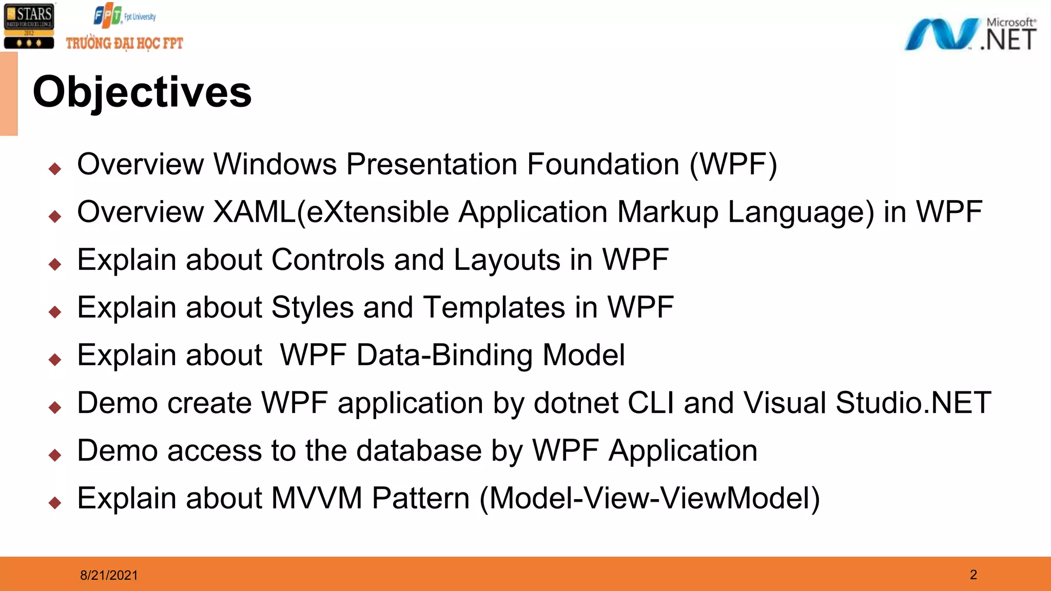
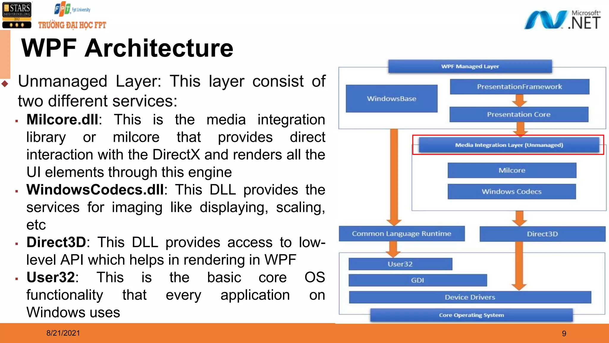
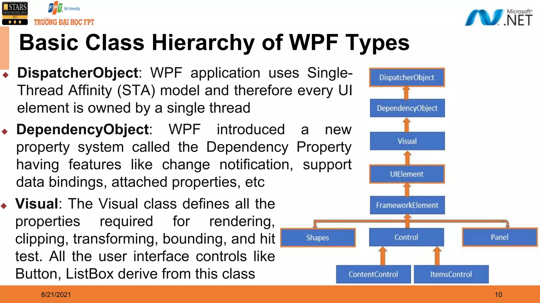
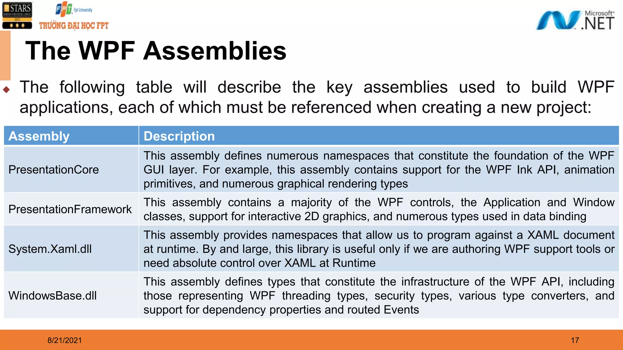
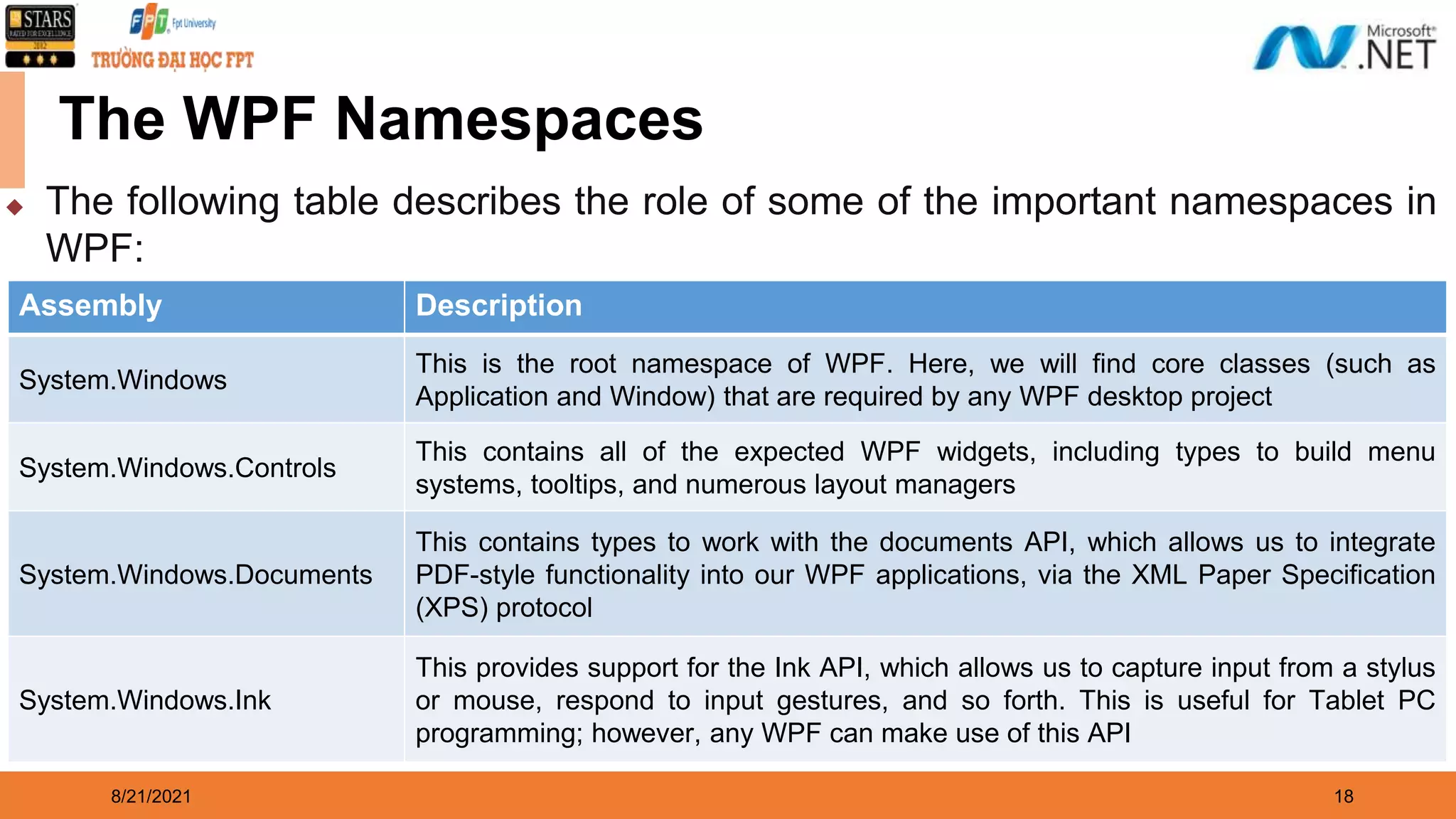
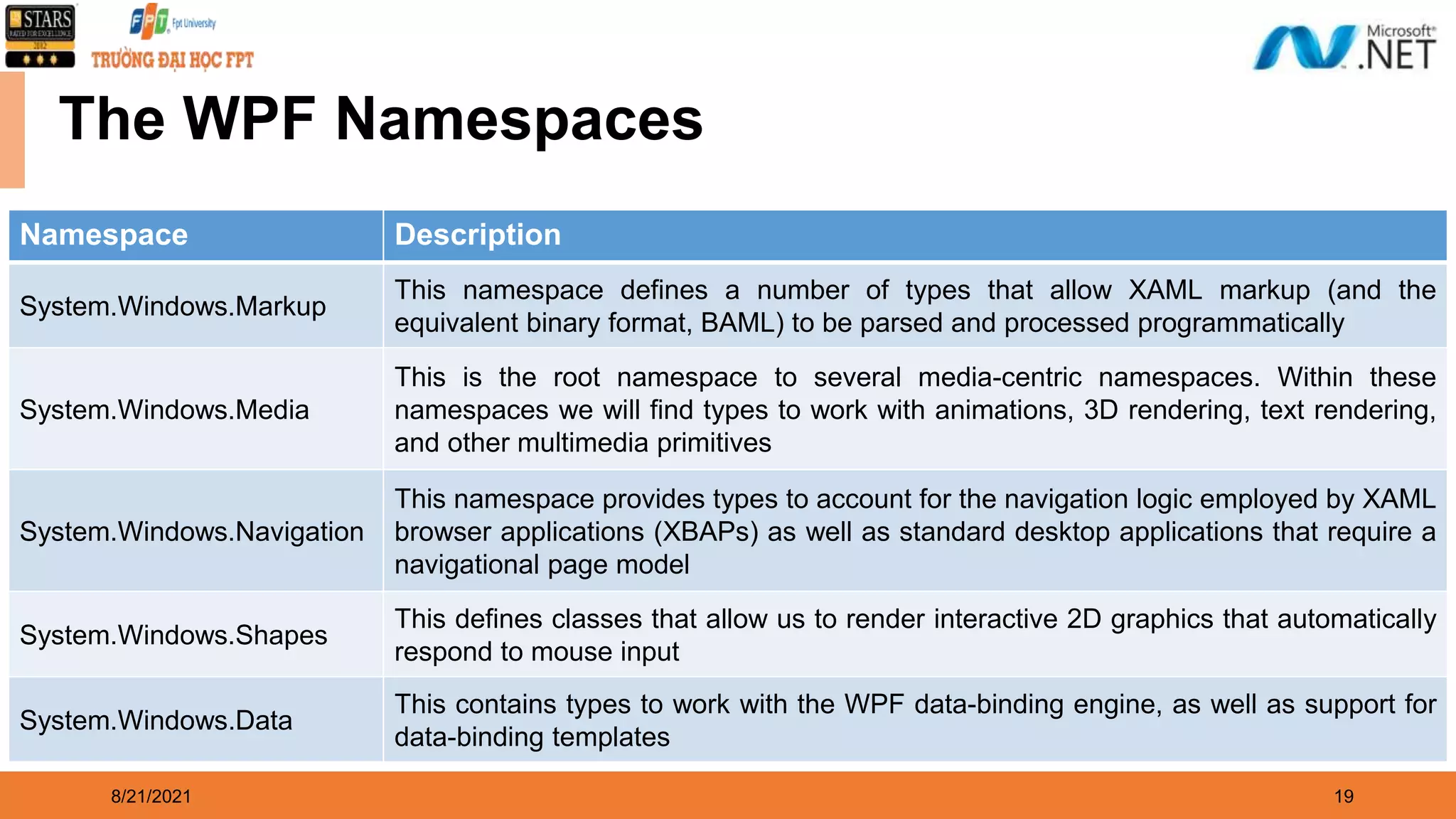
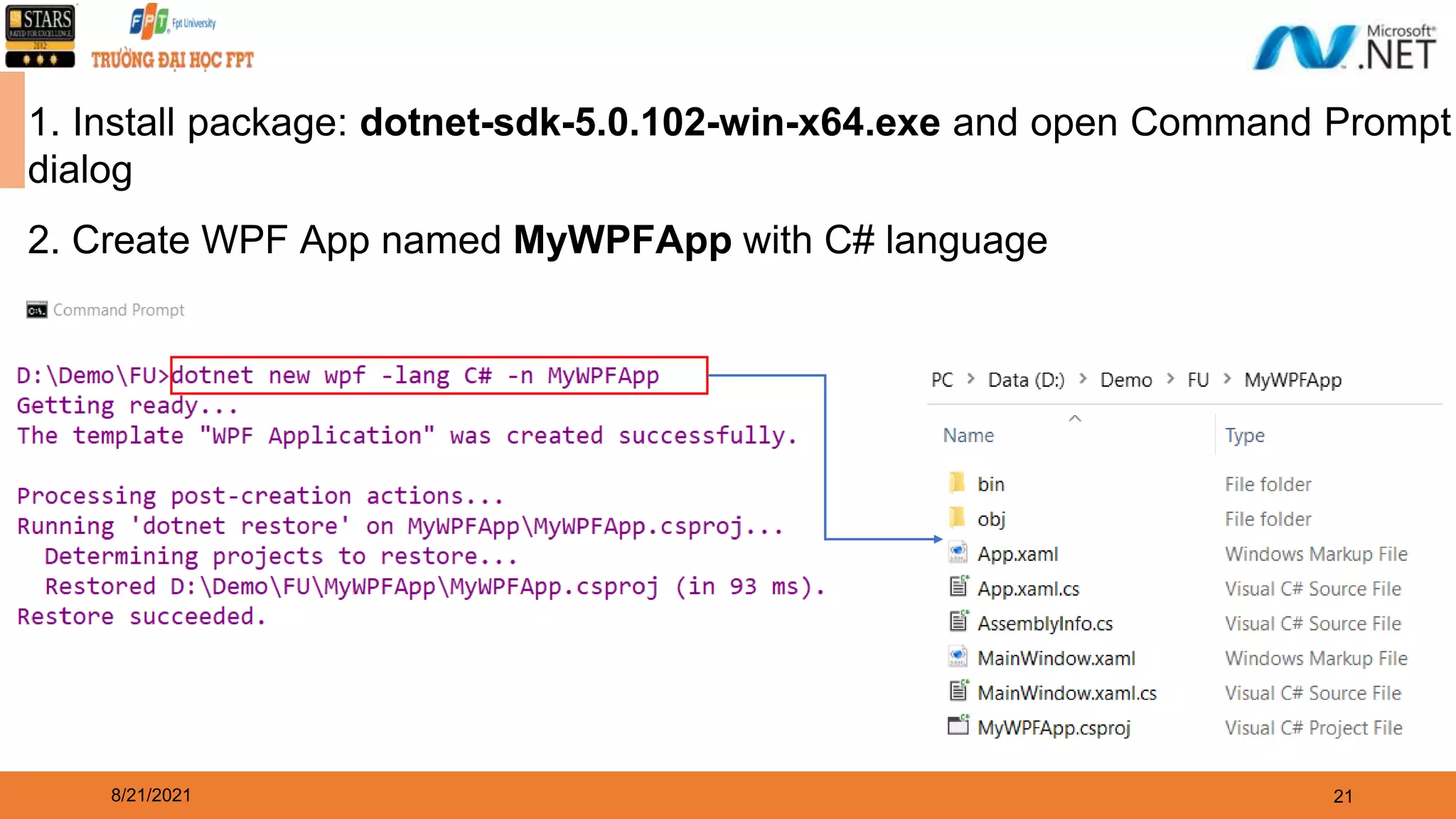
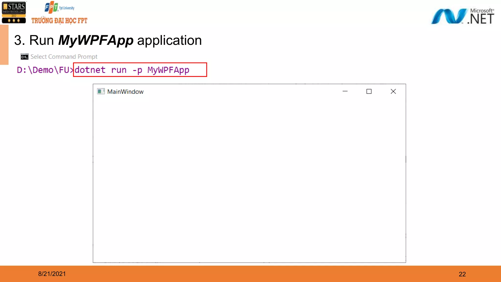
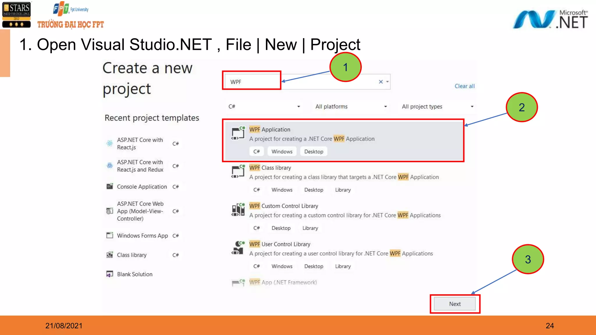
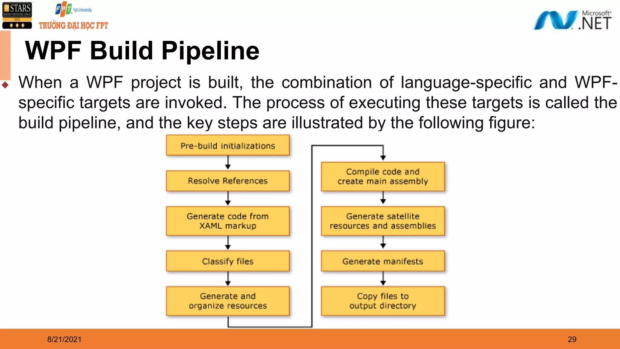
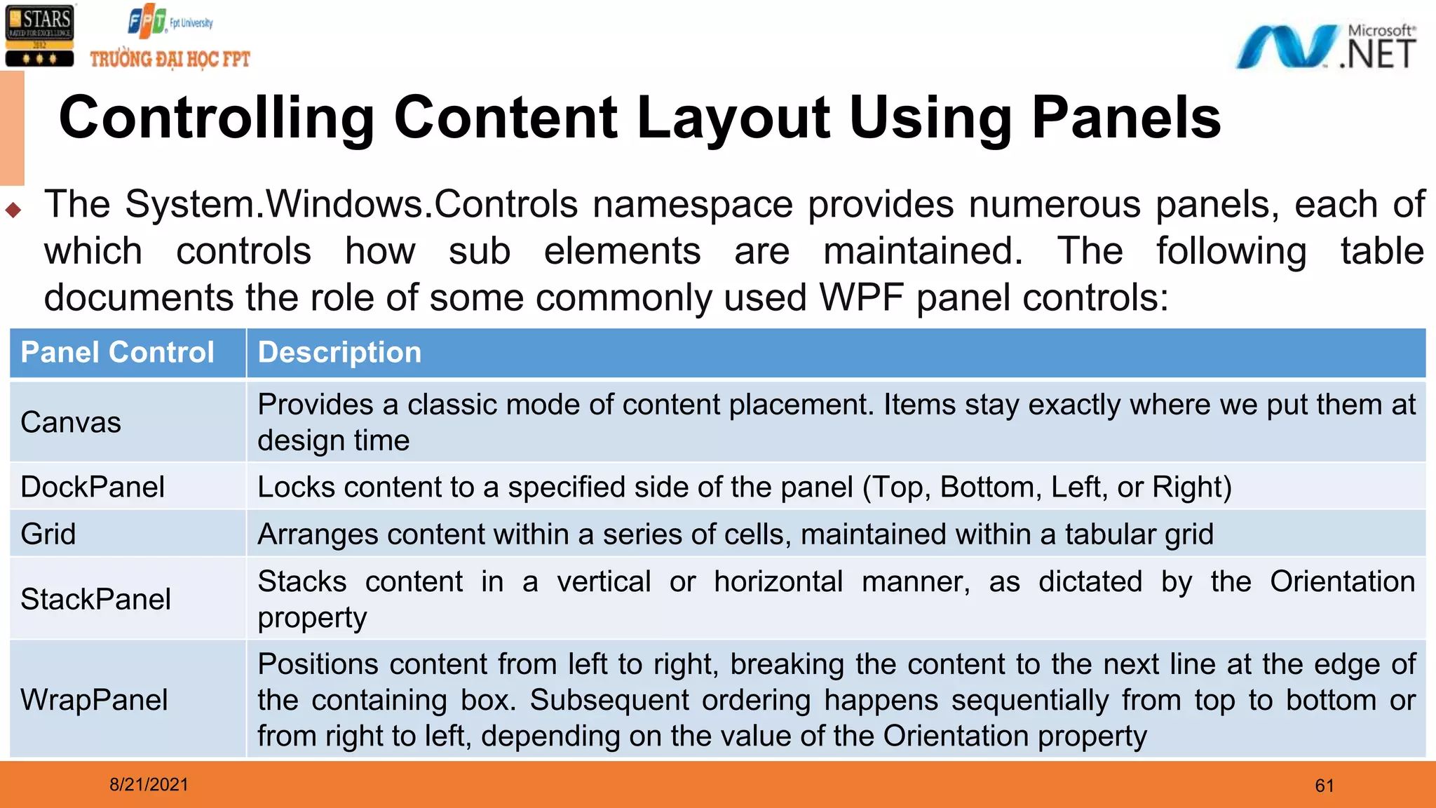
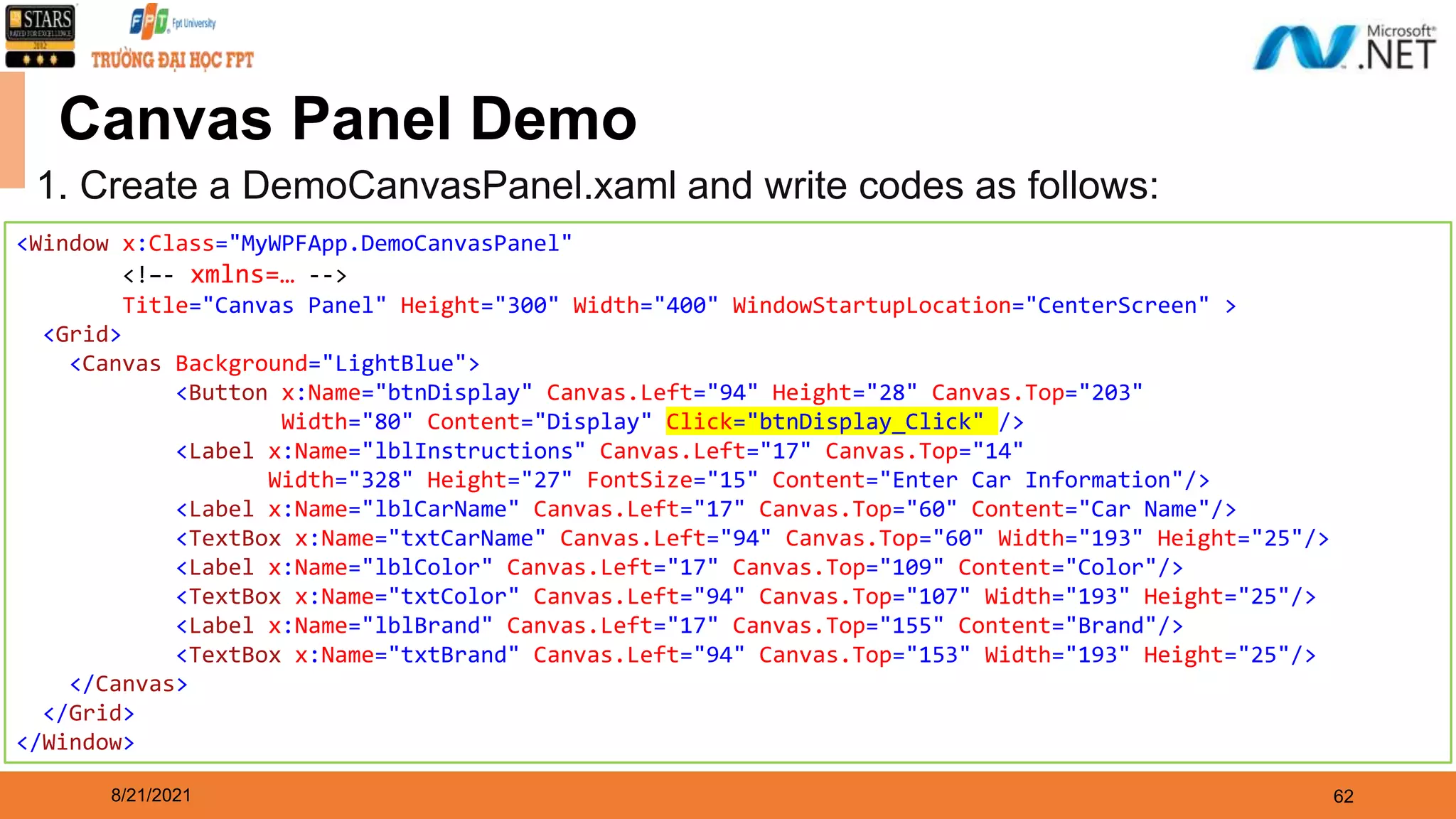
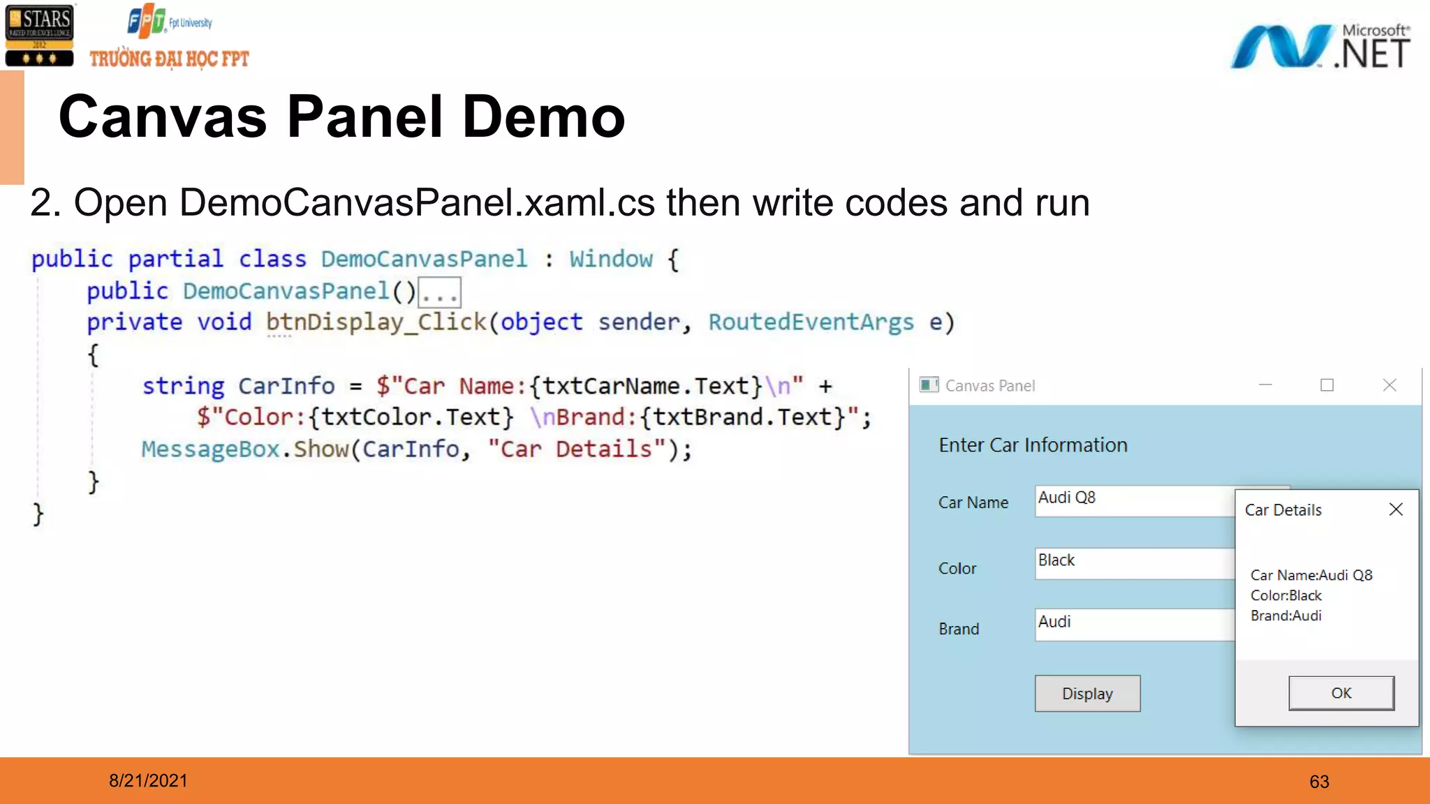
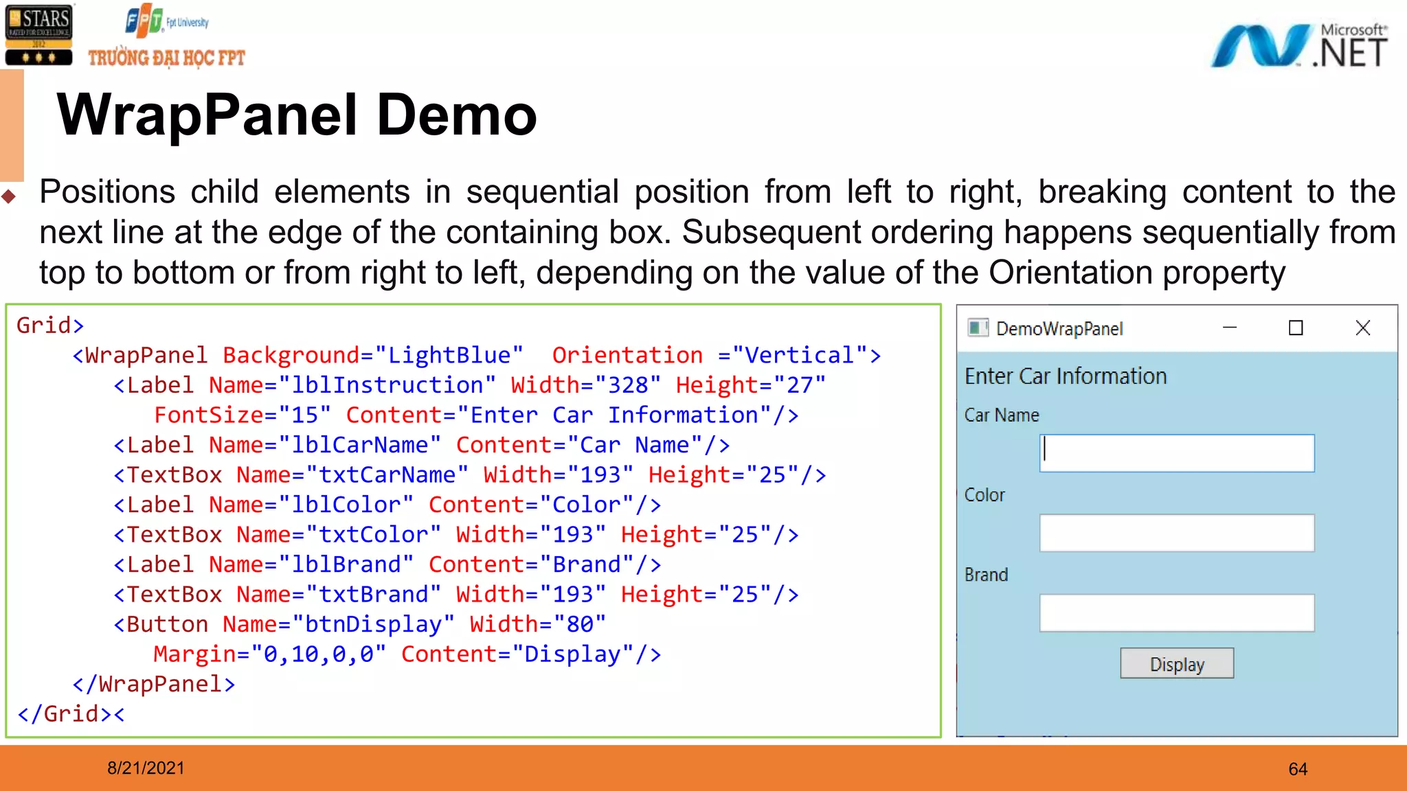
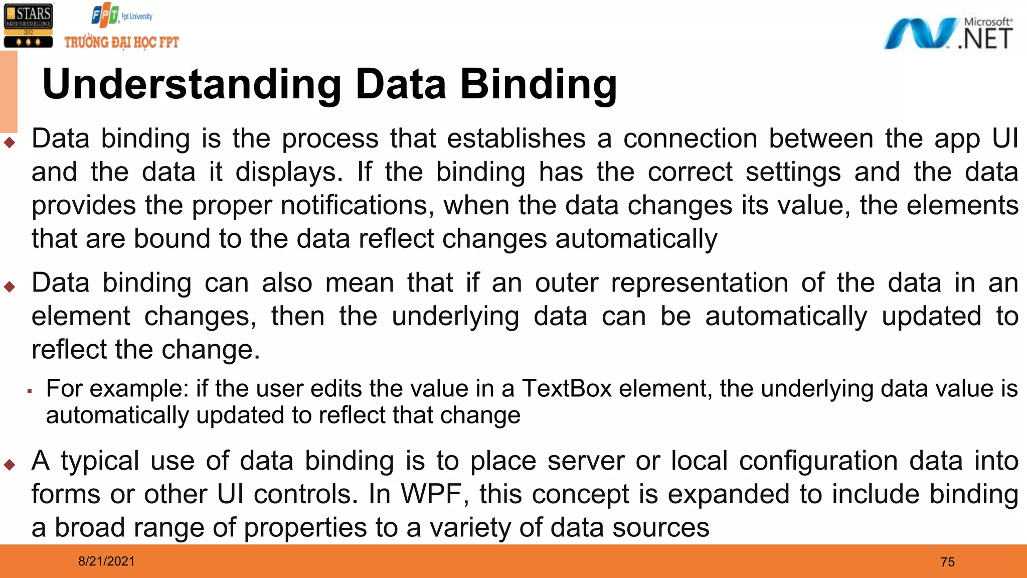
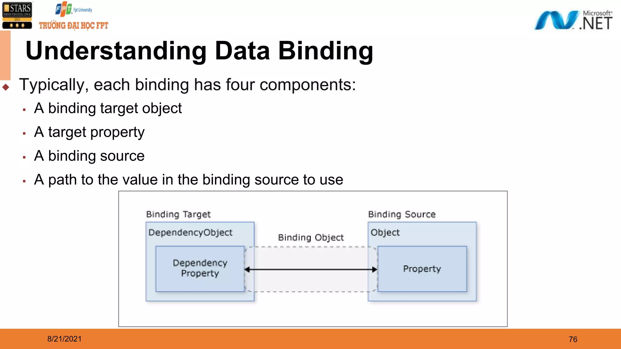
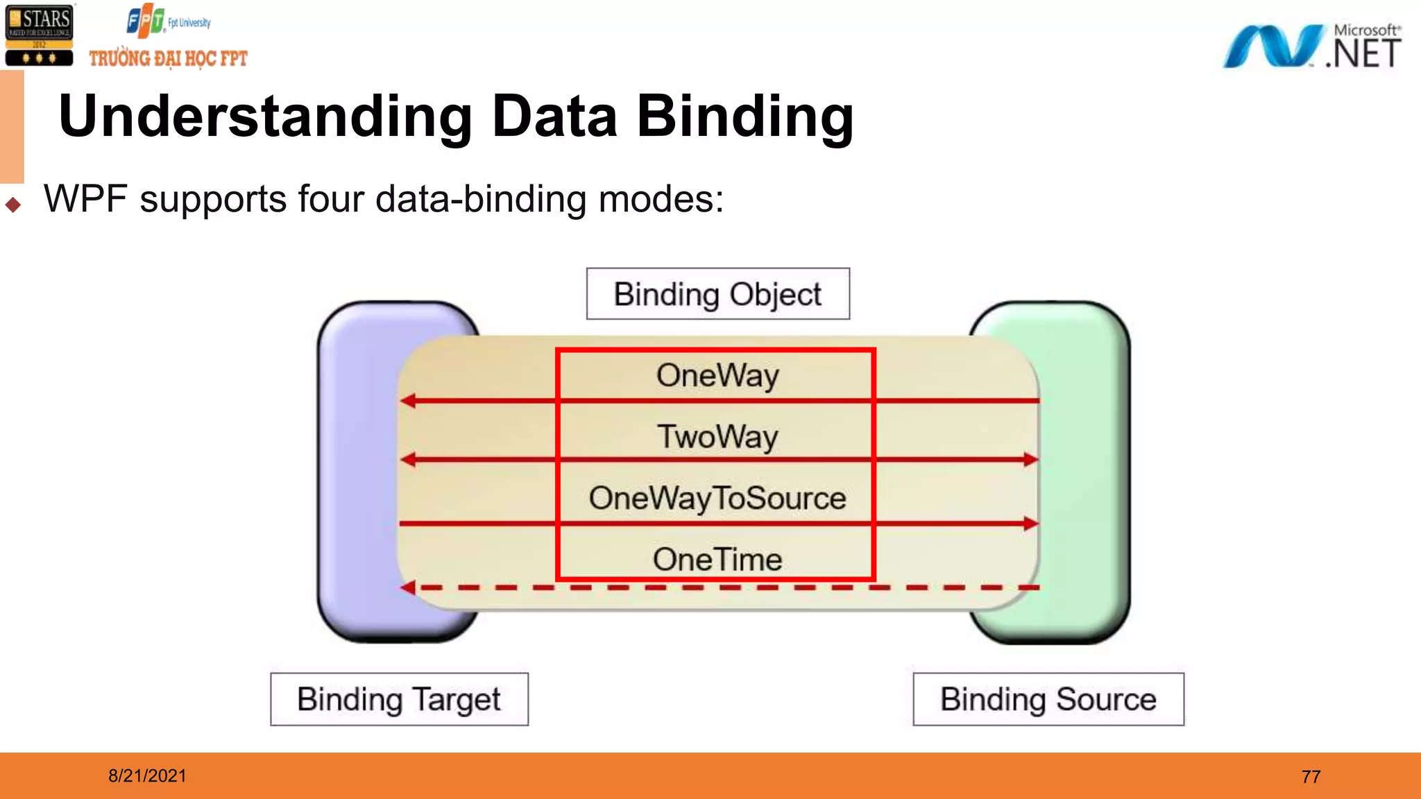
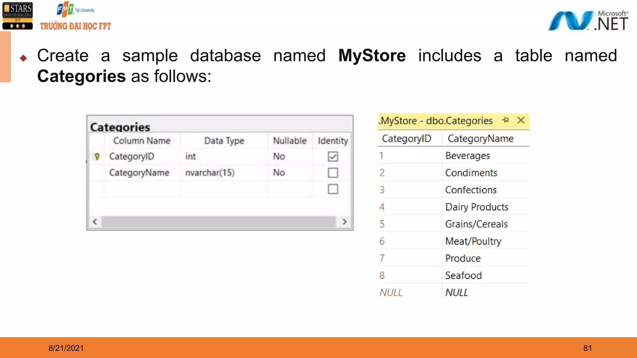
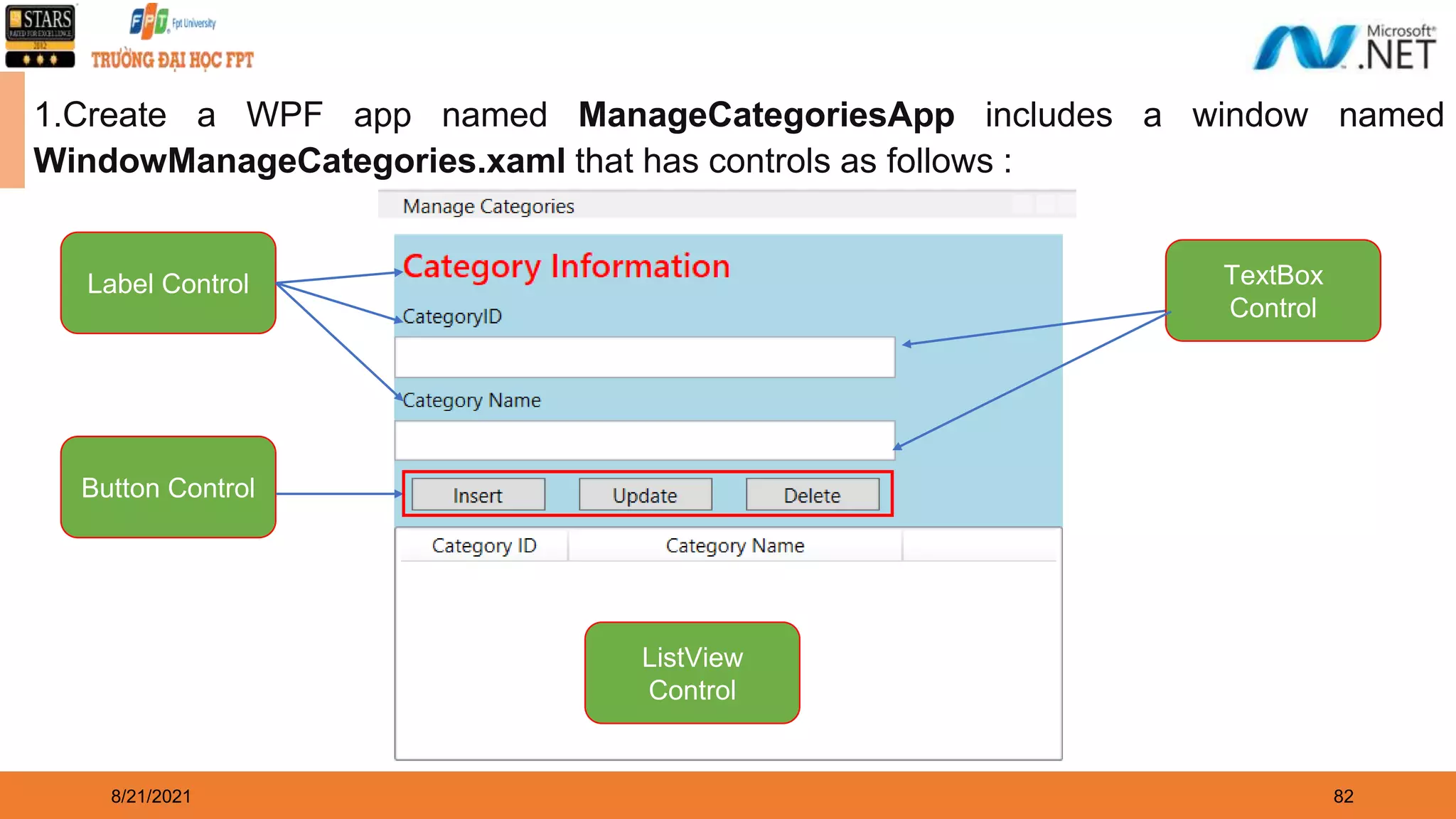
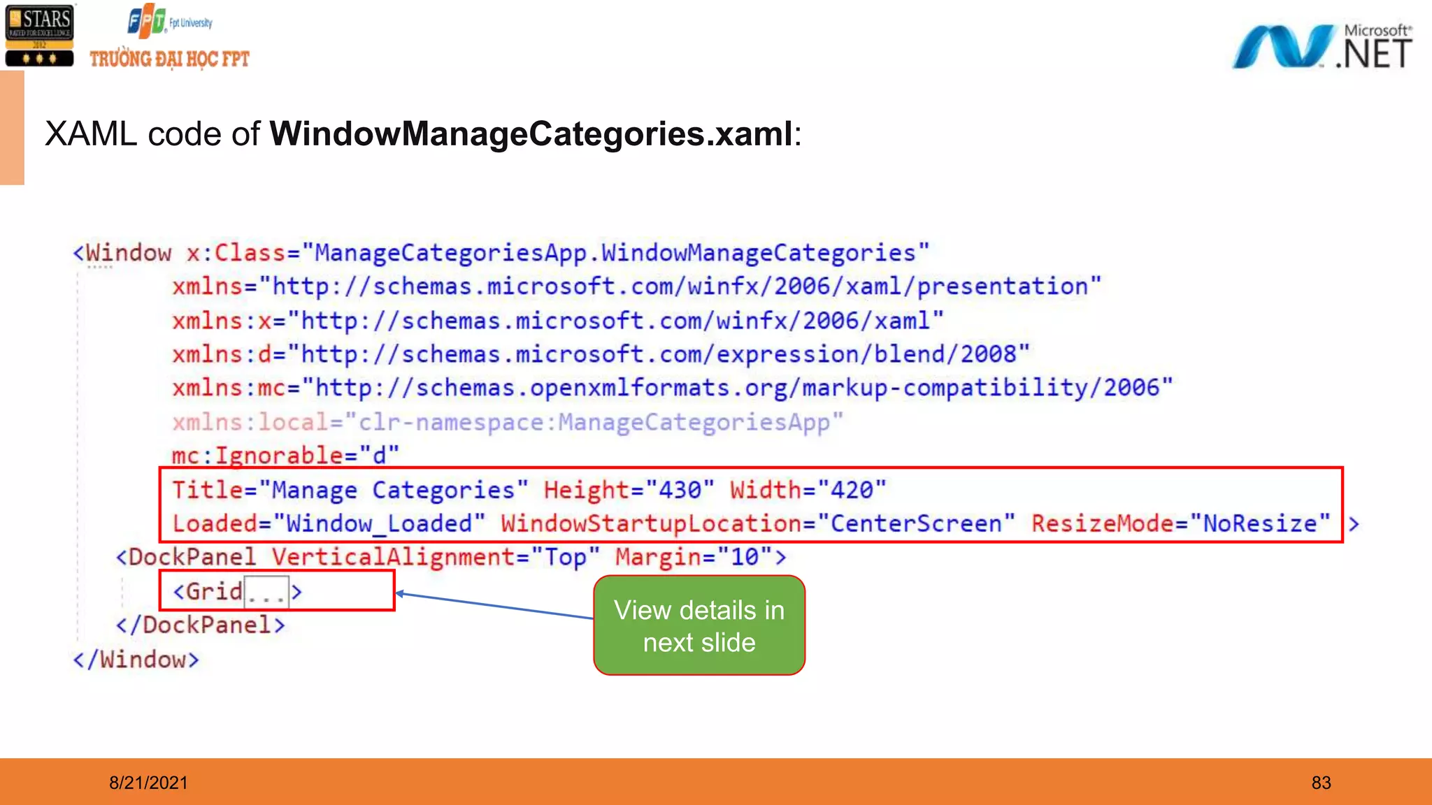
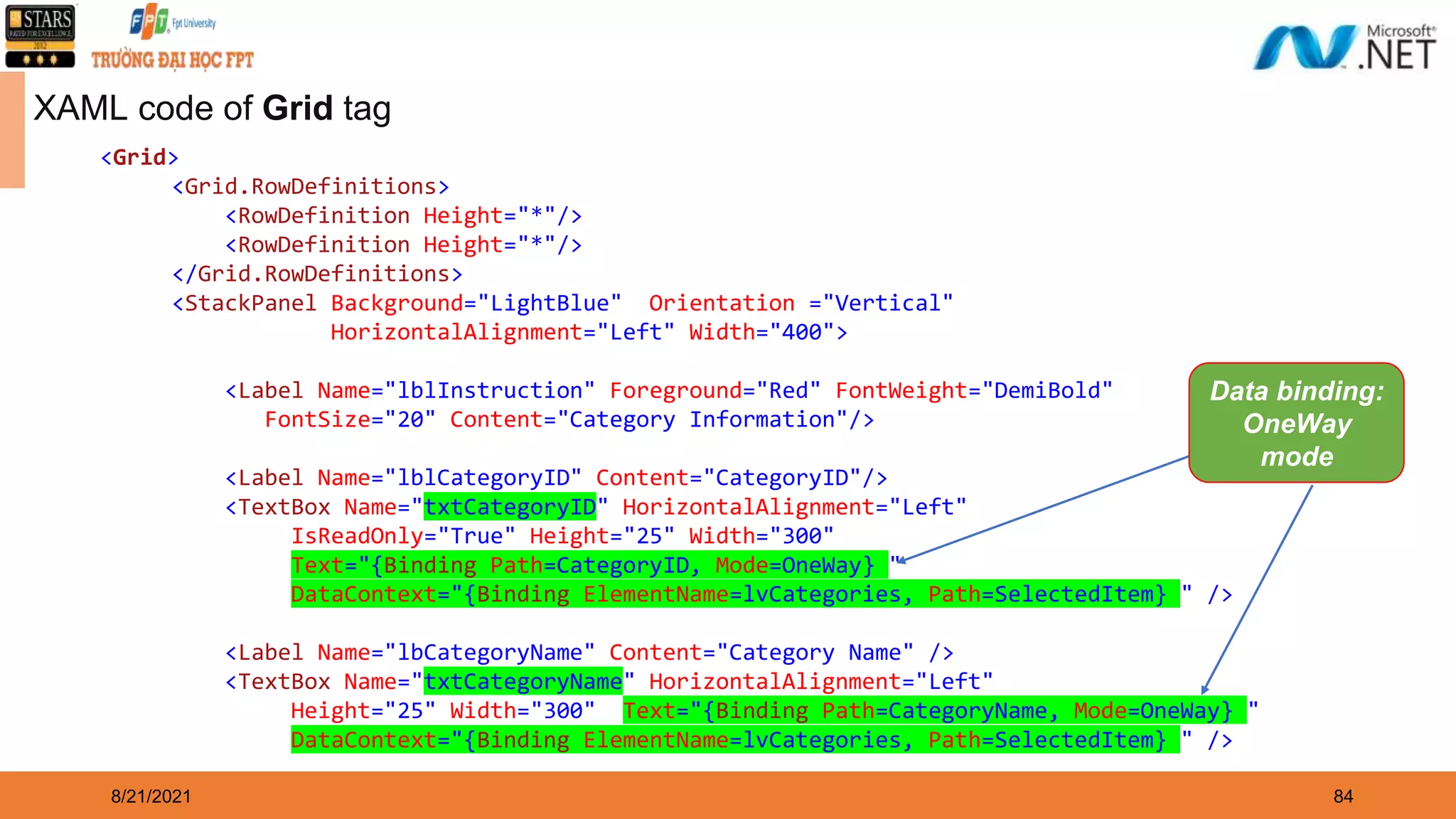
Building Windows Presentation Foundation (WPF) Application
2 ◆ Overview Windows Presentation Foundation (WPF) ◆ Overview XAML(eXtensible Application Markup Language) in WPF ◆ Explain about Controls and Layouts in WPF ◆ Explain about Styles and Templates in WPF ◆ Explain about WPF Data-Binding Model ◆ Demo create WPF application by dotnet CLI and Visual Studio.NET ◆ Demo access to the database by WPF Application ◆ Explain about MVVM Pattern (Model-View-ViewModel) 8/21/2021 Objectives
Overview Windows Presentation Foundation (WPF)
8/21/2021 4 WPF History ◆ WPF version 3.0 was first released as a part of .NET Framework 3.0 in the year 2006 and received its major updates and enhancements in version 3.5 which was released with .NET Framework 3.5. ◆ An overall timeline about the feature and updates that were added in subsequent major releases and current is WPF version of .NET Framework 4.8 and .NET 5 (.NET Core)
8/21/2021 5 What is Windows Presentation Foundation? ◆ Windows Presentation Foundation (WPF) is a UI framework that creates desktop client applications ◆ The WPF development platform supports a broad set of application development features, including an application model, resources, controls, graphics, layout, data binding, documents, and security ◆ The framework is part of .NET, so if we have previously built applications with .NET using ASP.NET or Windows Forms, the programming experience should be familiar
8/21/2021 6 What is Windows Presentation Foundation? ◆ WPF uses the Extensible Application Markup Language (XAML) to provide a declarative model for application programming ◆ WPF applications are based on a vector graphics architecture. This enables applications to look great on high DPI (Dots per inch) monitors, as they can be infinitely scaled ◆ WPF also includes a flexible hosting model, which makes it straightforward to host a video in a button, for example ◆ The visual designer provided in Visual Studio makes it easy to build WPF application, with drag-in-drop and/or direct editing of XAML markup
8/21/2021 7 WPF Architecture ◆ Managed Layer: The layer is composed of three different services: ▪ PresentationFramework.dll: This DLL provides the basic types to build a WPF application, such as windows, controls, shapes, media, documents, animation, data bindings, style and many more ▪ PresentationCore.dll: This DLL provides basic types like UIElement and Visual. The UIElement defines the actions and element layout properties and provides classes to override them if required
8/21/2021 8 WPF Architecture ▪ WindowBase.dll: This DLL holds the WPF basic types like DependencyProperty, DependencyObject, DispatcherObject, and other types. The important one is given below: • DependencyProperty: provides a new property system that can enable or disable function like data binding, define attach properties, etc • DependencyObject: is the base of every WPF types and provides the function to enable property notification • DispatcherObject: This class provides a way for thread safety and threads other than Dispatcher created cannot directly access it
8/21/2021 9 WPF Architecture ◆ Unmanaged Layer: This layer consist of two different services: ▪ Milcore.dll: This is the media integration library or milcore that provides direct interaction with the DirectX and renders all the UI elements through this engine ▪ WindowsCodecs.dll: This DLL provides the services for imaging like displaying, scaling, etc ▪ Direct3D: This DLL provides access to low- level API which helps in rendering in WPF ▪ User32: This is the basic core OS functionality that every application on Windows uses
8/21/2021 10 Basic Class Hierarchy of WPF Types ◆ DispatcherObject: WPF application uses Single- Thread Affinity (STA) model and therefore every UI element is owned by a single thread ◆ Visual: The Visual class defines all the properties required for rendering, clipping, transforming, bounding, and hit test. All the user interface controls like Button, ListBox derive from this class ◆ DependencyObject: WPF introduced a new property system called the Dependency Property having features like change notification, support data bindings, attached properties, etc
8/21/2021 11 Basic Class Hierarchy of WPF Types ◆ UIElement: This class adds the basic functionality of layout, input, focus, and events to UI elements and sets the basic foundation of the layout process ◆ FrameworkElement: This class extends the functionality provided by the UIElement, and override the layout for framework level implementations ◆ Shapes: This class is the base class for shape elements like Line, Ellipse, Polygon, Path, etc ◆ Controls: This namespace contains all the elements that help in interacting with the user. Few of the control like Textbox, Button, Listbox, Menu, etc are present in this namespace. Font, Background color, and control appearances support via templates support are added from this namespace
8/21/2021 12 Basic Class Hierarchy of WPF Types ◆ ContentControl: This is the base class for all the control that supports only single content. Control from Label, Button, Windows, etc. The appearance of the control can be enhanced using a data template ◆ ItemsControl: This is the base class for all the control that displays a list of items and includes controls like, ListBox, TreeView, Menus, Toolbar, etc. ControlTemplate can be used to change the appearance of the control and ItemsTemplate can be applied to define how the objects will be displayed on the control ◆ Panel: This class is the base class of all the layout container elements. The class can host child objects and provides service to position and arrange child objects in the user interface. Control like Grid, Canvas, DockPanel, StackPanel, WrapPanel, etc derives from this class
8/21/2021 13 WPF Capabilities and Features ◆ Providing a Separation of Concerns via XAML ▪ One of the most compelling benefits is that WPF provides a way to cleanly separate the look and feel of a GUI application from the programming logic ▪ Using XAML, it is possible to define the UI of an application via XML markup. This markup (ideally generated using tools such as Microsoft Visual Studio or Blend for Visual Studio) can then be connected to a related C# code file to provide the guts of the program’s functionality ▪ XAML allows us to define not only simple UI elements (buttons, grids, list boxes, etc.) in markup but also interactive 2D and 3D graphics, animations, data-binding logic, and multimedia functionality (such as video playback)
8/21/2021 14 <Window ... > ... <Label>Label</Label> <TextBox>TextBox</TextBox> <RichTextBox ... /> <RadioButton>RadioButton</RadioButton> <CheckBox>CheckBox</CheckBox> <Button>Button</Button> </Window> XAML sample
8/21/2021 15 WPF Capabilities and Features ◆ Providing an Optimized Rendering Model ▪ The WPF programming model is quite different, in that GDI is not used when rendering graphical data. All rendering operations (e.g., 2D graphics, 3D graphics, animations, control rendering, etc.) now make use of the DirectX API ▪ The first obvious benefit is that our WPF applications will automatically take advantage of hardware and software optimizations ▪ As well, WPF applications can tap into very rich graphical services (blur effects,anti- aliasing, transparency, etc.) without the complexity of programming directly against the DirectX AP ⮚ If we want to build a desktop application that requires the fastest possible execution speed (such as a 3D video game), unmanaged C++ and DirectX are still the best approach
8/21/2021 16 WPF Capabilities and Features ◆ Simplifying Complex UI Programming ▪ A number of layout managers (far more than Windows Forms) to provide extremely flexible control over the placement and repositioning of content ▪ Use of an enhanced data-binding engine to bind content to UI elements in a variety of ways and a built-in style engine, which allows us to define “themes” for a WPF application ▪ Use of vector graphics, which allows content to be automatically resized to fit the size and resolution of the screen hosting the application ▪ Support for 2D and 3D graphics, animations, and video and audio playback ▪ A rich typography API, such as support for XML Paper Specification (XPS) documents, fixed documents (WYSIWYG), flow documents, and document annotations (e.g., a Sticky Notes API) ▪ Support for interoperating with legacy GUI models (e.g., Windows Forms, ActiveX, and Win32 HWNDs)
8/21/2021 17 The WPF Assemblies ◆ The following table will describe the key assemblies used to build WPF applications, each of which must be referenced when creating a new project: Assembly Description PresentationCore This assembly defines numerous namespaces that constitute the foundation of the WPF GUI layer. For example, this assembly contains support for the WPF Ink API, animation primitives, and numerous graphical rendering types PresentationFramework This assembly contains a majority of the WPF controls, the Application and Window classes, support for interactive 2D graphics, and numerous types used in data binding System.Xaml.dll This assembly provides namespaces that allow us to program against a XAML document at runtime. By and large, this library is useful only if we are authoring WPF support tools or need absolute control over XAML at Runtime WindowsBase.dll This assembly defines types that constitute the infrastructure of the WPF API, including those representing WPF threading types, security types, various type converters, and support for dependency properties and routed Events
8/21/2021 18 The WPF Namespaces ◆ The following table describes the role of some of the important namespaces in WPF: Assembly Description System.Windows This is the root namespace of WPF. Here, we will find core classes (such as Application and Window) that are required by any WPF desktop project System.Windows.Controls This contains all of the expected WPF widgets, including types to build menu systems, tooltips, and numerous layout managers System.Windows.Documents This contains types to work with the documents API, which allows us to integrate PDF-style functionality into our WPF applications, via the XML Paper Specification (XPS) protocol System.Windows.Ink This provides support for the Ink API, which allows us to capture input from a stylus or mouse, respond to input gestures, and so forth. This is useful for Tablet PC programming; however, any WPF can make use of this API
8/21/2021 19 The WPF Namespaces Namespace Description System.Windows.Markup This namespace defines a number of types that allow XAML markup (and the equivalent binary format, BAML) to be parsed and processed programmatically System.Windows.Media This is the root namespace to several media-centric namespaces. Within these namespaces we will find types to work with animations, 3D rendering, text rendering, and other multimedia primitives System.Windows.Navigation This namespace provides types to account for the navigation logic employed by XAML browser applications (XBAPs) as well as standard desktop applications that require a navigational page model System.Windows.Shapes This defines classes that allow us to render interactive 2D graphics that automatically respond to mouse input System.Windows.Data This contains types to work with the WPF data-binding engine, as well as support for data-binding templates
Demo 01: Create a WPF Application using dotnet CLI
8/21/2021 21 2. Create WPF App named MyWPFApp with C# language 1. Install package: dotnet-sdk-5.0.102-win-x64.exe and open Command Prompt dialog
8/21/2021 22 3. Run MyWPFApp application
Demo 02: Create a WPF Application using Visual Studio.NET
24 21/08/2021 1. Open Visual Studio.NET , File | New | Project 1 2 3
25 21/08/2021 2. Fill out Project name: MyWPFApp and Location then click Next 4 5 6
26 21/08/2021 3. Choose Target Framework: .NET 5.0 (Current) then click Create 8 7
8/21/2021 27 4. Update codes of the MainWindow.xaml
8/21/2021 28 5. Press Ctrl+F5 to run application
8/21/2021 29 WPF Build Pipeline ◆ When a WPF project is built, the combination of language-specific and WPF- specific targets are invoked. The process of executing these targets is called the build pipeline, and the key steps are illustrated by the following figure:
eXtensible Application Markup Language (XAML)
8/21/2021 31 Understanding XAML ◆ XAML is a declarative markup language. As applied to the .NET Core programming model, XAML simplifies creating a UI for a .NET Core app ◆ We can create visible UI elements in the declarative XAML markup, and then separate the UI definition from the run-time logic by using code-behind files that are joined to the markup through partial class definitions ◆ XAML directly represents the instantiation of objects in a specific set of backing types defined in assemblies ◆ XAML enables a workflow where separate parties can work on the UI and the logic of an app, using potentially different tools ◆ When represented as text, XAML files are XML files that generally have the .xaml extension. The files can be encoded by any XML encoding, but encoding as UTF-8 is typical
8/21/2021 32 ◆ UI and Business Logic Separation: This is one of the greatest benefits of XAML. It separates design and development from each other. This provides more collaboration and efficiency between developers and designers of an application ◆ High User Experience: XAML files are basically simple XML format files, so transferring user interfaces between platforms is easy. To design user interfaces using XAML is easier and also needs lesser code ◆ Easier Extension: In XAML, .NET classes are placed in a hierarchical manner, where each element is the equivalent of a Core Common Language Runtime (Core CLR) class. So, extension of the .NET classes will be easier ◆ Easier to implement Styles for UI: XAML makes the development of any user interface much faster and easier. It provides features such as creating layout, applying styles, and templates for the UI application The Features of XAML
8/21/2021 33 Basic Structure of XAML ◆ A WPF application contains windows or pages. A Window is a top-level window with the tag, whereas the Page is a browser-hosted page with the <Page> tag in a XAML file ◆ Apart from Window and Page, XAML has ResourceDictionary and Application root elements for specifying the external dictionary and application definition
8/21/2021 34 Basic Structure of XAML <Window x:Class="MyWPFApp.MyWin" xmlns=“…" xmlns:x=“…" Title="My Window" > <Grid> <!--.......--> </Grid> </Window> ◆ Window: One of commonly used root element which contains other elements ◆ xmlns: Namespace declared specifically for WPF ◆ xmlns:x: Namespace with keywords and markup extensions in XAML. It includes mapping with the x: prefix ◆ Some commonly used prefixes are as follows: ▪ x:Type : To specify the type ▪ x:Null: To assign a null value ▪ x:Class: Specifies the related code-behind file. Here, MyWPFApp is the name of an application and MyWin is the name of the class that binds the XAML file with the related codebehind file ▪ Title: The title of the window ▪ Grid: Displays tabular data in a row and column format
8/21/2021 35 Attributes in XAML ◆ The attribute element assigns the names for an event or value to the property ◆ The attribute is mentioned using attribute name, an assignment operator, and the value of the attribute in quotation marks (“”) ◆ The attributes are of two types ▪ Property Attribute which defines properties for the element ▪ Event Attribute which specifies handler for the element Syntax <...attribute_name="value"...> <Button Background="Blue" Foreground="Red" Content="This is a button"/>
8/21/2021 36 Elements in XAML ◆ An XAML element instantiates a Core Common Language Runtime (Core CLR) class. The syntax of declaring elements is the same as element syntax of markup languages such as HTML, included two types: ▪ Property element: enables to assign other element as a value of a property ▪ Event element: handles an event of the control Syntax – Property Element <typeName.propertyName>...</typeName.propertyName > Syntax – Event Element <typeName event="event handler">...</ typeName> <Button> <Button.Foreground> <SolidColorBrush Color="Red"/> </Button.Foreground> <Button.Content> This is a button </Button.Content> </Button> <Page xmlns=“…" xmlns:x=“…” x:Class="ExampleNamespace.ExamplePage"> <Button Click="Button_Click" >Click Me!</Button> </Page>
8/21/2021 37 Defining the Window and Page
38 21/08/2021 1.Create a WPF project named DemoWindowPage 2.Right-click on project, select Add | Page (WPF)… and named Page_01.xaml 3.Right-click on project, select Add | Page (WPF)… and named Page_02.xaml Demo Create Window and Page
39 21/08/2021 4.Open the Page_01.xaml and write codes as the follows: <Page x:Class="DemoWindowPage.Page_01" xmlns="http://schemas.microsoft.com/winfx/2006/xaml/presentation" xmlns:x="http://schemas.microsoft.com/winfx/2006/xaml" xmlns:mc="http://schemas.openxmlformats.org/markup-compatibility/2006" xmlns:d="http://schemas.microsoft.com/expression/blend/2008" xmlns:local="clr-namespace:Demo01_Window_Page" mc:Ignorable="d" Width="500" Height="323" Title="Page 01: Welcome to WPF" > <Grid Background="LightGreen"> <TextBlock TextAlignment="Center" Width="362" FontSize="24" FontWeight="Bold" Foreground="Red" Text="Welcome to WPF" Margin="69,130,69,151"/> </Grid> </Page>
40 21/08/2021 5.Open the Page_02.xaml and write codes as the follows: <Page x:Class="DemoWindowPage.Page_02" xmlns="http://schemas.microsoft.com/winfx/2006/xaml/presentation" xmlns:x="http://schemas.microsoft.com/winfx/2006/xaml" xmlns:mc="http://schemas.openxmlformats.org/markup-compatibility/2006" xmlns:d="http://schemas.microsoft.com/expression/blend/2008" xmlns:local="clr-namespace:Demo01_Window_Page" mc:Ignorable="d" Height="323" Width="500" Title="Page 02: .NET Programming"> <Grid Background="PaleTurquoise"> <TextBlock TextAlignment="Center" Width="362" FontSize="24" FontWeight="Bold" Text=".NET Programming" Foreground="ForestGreen" Margin="69,130,69,151"/> </Grid> </Page>
41 21/08/2021 6.Open the MainWindow.xaml and write codes as the follows: <Window x:Class="DemoWindowPage.MainWindow" xmlns="http://schemas.microsoft.com/winfx/2006/xaml/presentation" xmlns:x="http://schemas.microsoft.com/winfx/2006/xaml" xmlns:d="http://schemas.microsoft.com/expression/blend/2008" xmlns:mc="http://schemas.openxmlformats.org/markup-compatibility/2006" xmlns:local="clr-namespace:Demo01_Window_Page" mc:Ignorable="d" Title="Main Window" Height="456" Width="800"> <Grid> <Frame x:Name="frMain" VerticalAlignment="Stretch" NavigationUIVisibility="Visible"/> <Button Content="To page 1" Name="btnToPage01" Click="btnToPage01_Click" HorizontalAlignment="Left" Margin="316,383,0,0" Height="28" Width="79"/> <Button Content="To page 2" Name="btnToPage02" Click="btnToPage02_Click" HorizontalAlignment="Left" Margin="400,383,0,0" Height="28" Width="79"/> </Grid> </Window> Event Handler: Click
42 21/08/2021 7.Open the MainWindow.xaml.cs and write codes as the follows:
43 21/08/2021 8.Press Ctrl+F5 to run project then click To page 1 or To page 2 button to view result
8/21/2021 44 The Window Class ◆ The System.Windows.Window class (located in the PresentationFramework.dll assembly) represents a single window owned by the Application-derived class, including any dialog boxes displayed by the main window ◆ It serves as the root of a window and provides us with the standard border, title bar and maximize, minimize and close buttons ◆ A WPF window is a combination of a XAML (.xaml) file, where the <Window> element is the root, and a CodeBehind (.cs) file
8/21/2021 45 The Window Class <Window xmlns="http://schemas.microsoft.com/winfx /2006/xaml/presentation" Title="Main Window in Markup Only" Height="300" Width="300" /> using System; using System.Windows; namespace CSharp { public partial class CodeOnlyWindow : Window { public CodeOnlyWindow() { this.Title = "Main Window in Code Only"; this.Width = 300; this.Height = 300; } } }
8/21/2021 46 The Window Class Property Description DataContext Gets or sets the data context for an element when it participates in data binding DialogResult Gets or sets the dialog result value, which is the value that is returned from the ShowDialog() method SizeToContent Decide if the Window should resize itself to automatically fit its content. The default is Manual, which means that the window doesn't automatically resize Topmost The default is false, but if set to true, our Window will stay on top of other windows unless minimized. Only useful for special situations Opacity Gets or sets the opacity factor applied to the entire UIElement when it is rendered in the user interface (UI). This is a dependency property WindowStartupLocation Gets or sets the position of the window when first shown WindowState Gets or sets a value that indicates whether a window is restored, minimized, or maximized WindowStyle Gets or sets a window's border style ◆ The following table describes some of the key properties:
8/21/2021 47 The Window Class Method Description Activate() Attempts to bring the window to the foreground and activates it AddText(String) Adds a specified text string to a ContentControl Close() Manually closes a Window Hide() Makes a window invisible Show() Opens a window and returns without waiting for the newly opened window to close ShowDialog() Opens a window and returns only when the newly opened window is closed Show() Opens a window and returns without waiting for the newly opened window to close UpdateLayout() Ensures that all visual child elements of this element are properly updated for layout TransformToDescendant(Visual) Returns a transform that can be used to transform coordinates from the Visual to the specified visual object descendant BeginStoryboard(Storyboard) Begins the sequence of actions that are contained in the provided storyboard ◆ The following table describes some of the key methods:
8/21/2021 48 Defining the Application ◆ Visual Studio generates a XAML application file that specifies: ▪ The code-behind class for the application ▪ The startup window or page ▪ Application-wide resources
8/21/2021 49 The Application Class ◆ The System.Windows.Application class represents a global instance of a running WPF application ◆ This class supplies a series of events that we are able to handle in order to interact with the application’s lifetime (such as OnStartup and OnExit)
8/21/2021 50 Property Description Current This static property allows us to gain access to the running Application object from anywhere in our code. This can be helpful when a window or dialog box needs to gain access to the Application object that created it, typically to access application-wide variables and functionality MainWindow This property allows us to programmatically get or set the main window of the application Properties This property allows us to establish and obtain data that is accessible throughout all aspects of a WPF application (windows, dialog boxes, etc.) StartupUri This property gets or sets a URI that specifies a window or page to open automatically when the application starts Windows This property returns a WindowCollection type, which provides access to each window created from the thread that created the Application object. This can be helpful when we want to iterate over each open window of an application and alter its state (such as minimizing all windows) The Application Class ◆ The following table describes some of the key properties:
Controls and Layouts in WPF
8/21/2021 52 System.Windows.Controls.Control ◆ Represents the base class for user interface (UI) elements that use a ControlTemplate to define their appearance ◆ The Template property, which is a ControlTemplate, specifies the appearance of the Control. If we want to change the appearance of a control but retain its functionality, we should consider creating a new ControlTemplate instead of creating a new class ◆ The Control class is the base class for many of the controls we add to an application such as TextBlock, Button, ListBox, etc
8/21/2021 53 System.Windows.Controls.Control Members Description Background, Foreground, BorderBrush, BorderThickness, Padding, HorizontalContentAlignment, VerticalContentAlignment These properties allow us to set basic settings regarding how the control will be rendered and positioned FontFamily, FontSize, FontStretch, FontWeight These properties control various font-centric settings IsTabStop, TabIndex These properties are used to establish tab order among controls on a window MouseDoubleClick, PreviewMouseDoubleClick These events handle the act of double-clicking a widget Template This property allows us to get and set the control’s template, which can be used to change the rendering output of the widget ◆ The following table describes some of the key members of the Control type:
8/21/2021 54 Styles and Templates ◆ WPF styling and templating refer to a suite of features that let developers and designers create visually compelling effects and a consistent appearance for their product ◆ When customizing the appearance of an app, we want a strong styling and templating model that enables maintenance and sharing of appearance within and among apps. WPF provides that model ◆ Another feature of the WPF styling model is the separation of presentation and logic. Designers can work on the appearance of an app by using only XAML at the same time that developers work on the programming logic by using C# or Visual Basic
8/21/2021 55 Styles ◆ A Style as a convenient way to apply a set of property values to multiple elements ◆ We can use a style on any element that derives from FrameworkElement or FrameworkContentElement such as a Window or a Button ◆ The most common way to declare a style is as a resource in the Resources section in a XAML file ◆ If we declare the style in the root element of app definition XAML file, the style can be used anywhere in app
8/21/2021 56 Styles <Window x:Class="DemoWPFControls.DemoStyle" <!--xmlns:--> Title="DemoStyle" Height="200" Width="300"> <Window.Resources> <Style TargetType="TextBlock"> <Setter Property="Foreground" Value="Green" /> <Setter Property="FontSize" Value="24" /> </Style> </Window.Resources> <StackPanel Margin="10"> <TextBlock>WPF</TextBlock> <TextBlock>.NET</TextBlock> <TextBlock Foreground="Blue">C#</TextBlock> </StackPanel> </Window>
8/21/2021 57 Templates ◆ A template describes the overall look and visual appearance of a control. For each control, there is a default template associated with it which gives the control its appearance ◆ In WPF applications, we can easily create templates when we want to customize the visual behavior and visual appearance of a control ◆ Connectivity between the logic and the template can be achieved by data binding. The main difference between styles and templates are listed below ▪ Styles can only change the appearance of control with default properties of that control ▪ With templates, we can access more parts of a control than in styles. we can also specify both existing and new behavior of a control
8/21/2021 58 Templates ◆ There are two types of templates which are most commonly used: Control Template and Data Template ◆ Control Template defines the visual appearance of a control. All of the UI elements have some kind of appearance as well as behavior, e.g. Templates can be applied globally to application, windows and pages, or directly to controls. Most scenarios that require we to create a new control can be covered by instead creating a new template for an existing control ◆ Data Template defines and specifies the appearance and structure of a collection of data. It provides the flexibility to format and define the presentation of the data on any UI element. It is mostly used on data related Item controls such as ComboBox, ListBox, etc
8/21/2021 59 Control Template with Button Demo
8/21/2021 60 Controlling Content Layout Using Panels ◆ A WPF application invariably contains a good number of UI elements (e.g., user input controls, graphical content, menu systems, and status bars) that need to be well organized within various windows. ◆ After place the UI elements, we need to make sure they behave as intended when the end user resizes the window or possibly a portion of the window (as in the case of a splitter window) ◆ To ensure our WPF controls retain their position within the hosting window, we can take advantage of a good number of panel types (also known as layout managers) ◆ By default, a new WPF Window created with Visual Studio will use a layout manager of type Grid
8/21/2021 61 ◆ The System.Windows.Controls namespace provides numerous panels, each of which controls how sub elements are maintained. The following table documents the role of some commonly used WPF panel controls: Controlling Content Layout Using Panels Panel Control Description Canvas Provides a classic mode of content placement. Items stay exactly where we put them at design time DockPanel Locks content to a specified side of the panel (Top, Bottom, Left, or Right) Grid Arranges content within a series of cells, maintained within a tabular grid StackPanel Stacks content in a vertical or horizontal manner, as dictated by the Orientation property WrapPanel Positions content from left to right, breaking the content to the next line at the edge of the containing box. Subsequent ordering happens sequentially from top to bottom or from right to left, depending on the value of the Orientation property
8/21/2021 62 Canvas Panel Demo 1. Create a DemoCanvasPanel.xaml and write codes as follows: <Window x:Class="MyWPFApp.DemoCanvasPanel" <!–- xmlns=… --> Title="Canvas Panel" Height="300" Width="400" WindowStartupLocation="CenterScreen" > <Grid> <Canvas Background="LightBlue"> <Button x:Name="btnDisplay" Canvas.Left="94" Height="28" Canvas.Top="203" Width="80" Content="Display" Click="btnDisplay_Click" /> <Label x:Name="lblInstructions" Canvas.Left="17" Canvas.Top="14" Width="328" Height="27" FontSize="15" Content="Enter Car Information"/> <Label x:Name="lblCarName" Canvas.Left="17" Canvas.Top="60" Content="Car Name"/> <TextBox x:Name="txtCarName" Canvas.Left="94" Canvas.Top="60" Width="193" Height="25"/> <Label x:Name="lblColor" Canvas.Left="17" Canvas.Top="109" Content="Color"/> <TextBox x:Name="txtColor" Canvas.Left="94" Canvas.Top="107" Width="193" Height="25"/> <Label x:Name="lblBrand" Canvas.Left="17" Canvas.Top="155" Content="Brand"/> <TextBox x:Name="txtBrand" Canvas.Left="94" Canvas.Top="153" Width="193" Height="25"/> </Canvas> </Grid> </Window>
8/21/2021 63 Canvas Panel Demo 2. Open DemoCanvasPanel.xaml.cs then write codes and run
8/21/2021 64 WrapPanel Demo Grid> <WrapPanel Background="LightBlue" Orientation ="Vertical"> <Label Name="lblInstruction" Width="328" Height="27" FontSize="15" Content="Enter Car Information"/> <Label Name="lblCarName" Content="Car Name"/> <TextBox Name="txtCarName" Width="193" Height="25"/> <Label Name="lblColor" Content="Color"/> <TextBox Name="txtColor" Width="193" Height="25"/> <Label Name="lblBrand" Content="Brand"/> <TextBox Name="txtBrand" Width="193" Height="25"/> <Button Name="btnDisplay" Width="80" Margin="0,10,0,0" Content="Display"/> </WrapPanel> </Grid>< ◆ Positions child elements in sequential position from left to right, breaking content to the next line at the edge of the containing box. Subsequent ordering happens sequentially from top to bottom or from right to left, depending on the value of the Orientation property
8/21/2021 65 StackPanel Demo <Grid> <StackPanel Background="LightBlue“ Orientation ="Vertical"> <Label Name="lblInstruction" FontSize="15" Content="Enter Car Information"/> <Label Name="lblCarName" Content="Car Name"/> <TextBox Name="txtCarName" Height="25"/> <Label Name="lblColor" Content="Color"/> <TextBox Name="txtColor" Height="25"/> <Label Name="lblBrand" Content="Brand"/> <TextBox Name="txtBrand" Height="25"/> <Button Name="btnDisplay" Width="80" Margin="0,10,0,0" Content="Display"/> </StackPanel> </Grid> ◆ Arranges child elements into a single line that can be oriented horizontally or vertically
8/21/2021 66 Grid Panel Demo ◆ Defines a flexible grid area that consists of columns and rows
8/21/2021 67 DockPanel Demo ◆ Defines an area where we can arrange child elements either horizontally or vertically, relative to each other
8/21/2021 68 Controls in WPF ◆ WPF has a rich set of UI controls. These controls are grouped into various categories depending on their functionality, as shown in the following table: Category Controls Layout Border, Canvas, DockPanel, Grid, GridView, GridSplitter, GroupBox, Panel, StackPanel, Viewbox, WrapPanel Core user input controls Button, Calendar, DatePicker, Expander, DataGrid, ToggleButton, ScrollBar, Slider,TextBlock, TextBox, RepeatButton, RichTextBox, Label, PasswordBox Menus ContextMenu, Menu, ToolBar Selection CheckBox, ComboBox, ListBox, ListView, TreeView, RadioButton Navigation Frame, Hyperlink, Page, NavigationWindow, TabControl User Information AccessText, Label, Popup, ProgressBar, StatusBar, TextBlock, ToolTip Media Image, MediaElement, SoundPlayerAction
8/21/2021 69 TextBlock ◆ Provides a lightweight control for displaying small amounts of flow content <Grid> <StackPanel> <TextBlock Name="textBlock1" TextWrapping="Wrap"> <Bold>TextBlock</Bold> is designed to be <Italic>lightweight</Italic>, and is geared specifically at integrating <Italic>small</Italic> portions of flow content into a UI. </TextBlock> <Button Width="100" Margin="10">Click Me</Button> <TextBlock Name="textBlock2" TextWrapping="Wrap" Background="AntiqueWhite" TextAlignment="Center"> By default, a TextBlock provides no UI beyond simply displaying its contents. </TextBlock> <Button Width="100" Margin="10">Click Me</Button> </StackPanel> </Grid>
8/21/2021 70 Button ◆ Represents a Windows button control, which reacts to the Click event <Window x:Class="DemoWPFControls.MainWindow" //xmlns:… Title="MainWindow" Height="250" Width="350"> <Grid> <Button Margin="10"> <Grid> <Polygon Points="100,25 125,0 200,25 125,50" Fill="LightSteelBlue" /> <Polygon Points="100,25 75,0 0,25 75,50" Fill="White"/> </Grid> </Button> </Grid> </Window>
8/21/2021 71 RadioButton ◆ Represents a button that can be selected, but not cleared, by a user
8/21/2021 72 ListBox ◆ Contains a list of selectable items
8/21/2021 73 ComboBox ◆ Represents a selection control with a drop-down list that can be shown or hidden by clicking the arrow on the control
8/21/2021 74 DataGrid ◆ Represents a control that displays data in a customizable grid
8/21/2021 75 Understanding Data Binding ◆ Data binding is the process that establishes a connection between the app UI and the data it displays. If the binding has the correct settings and the data provides the proper notifications, when the data changes its value, the elements that are bound to the data reflect changes automatically ◆ Data binding can also mean that if an outer representation of the data in an element changes, then the underlying data can be automatically updated to reflect the change. ▪ For example: if the user edits the value in a TextBox element, the underlying data value is automatically updated to reflect that change ◆ A typical use of data binding is to place server or local configuration data into forms or other UI controls. In WPF, this concept is expanded to include binding a broad range of properties to a variety of data sources
8/21/2021 76 Understanding Data Binding ◆ Typically, each binding has four components: ▪ A binding target object ▪ A target property ▪ A binding source ▪ A path to the value in the binding source to use
8/21/2021 77 Understanding Data Binding ◆ WPF supports four data-binding modes:
8/21/2021 78 Understanding Data Binding ◆ OneWay binding causes changes to the source property to automatically update the target property, but changes to the target property are not propagated back to the source property. This type of binding is appropriate if the control being bound is implicitly read-only ◆ TwoWay binding causes changes to either the source property or the target property to automatically update the other. This type of binding is appropriate for editable forms or other fully interactive UI scenarios. Most properties default to OneWay binding, but some dependency properties (typically properties of user-editable controls such as the TextBox.Text and CheckBox.IsChecked) default to TwoWay binding
8/21/2021 79 Understanding Data Binding ◆ OneWayToSource is the reverse of OneWay binding; it updates the source property when the target property changes. One example scenario is if we only need to reevaluate the source value from the UI ◆ OneTime is essentially a simpler form of OneWay binding that provides better performance in cases where the source value does not change. Updates the binding target when the application starts or when the data context changes. This type of binding is appropriate if we are using data where either a snapshot of the current state is appropriate to use or the data is truly static
Access to Database Demonstration
8/21/2021 81 ◆ Create a sample database named MyStore includes a table named Categories as follows:
8/21/2021 82 1.Create a WPF app named ManageCategoriesApp includes a window named WindowManageCategories.xaml that has controls as follows : ListView Control TextBox Control Label Control Button Control
8/21/2021 83 XAML code of WindowManageCategories.xaml: View details in next slide
8/21/2021 84 XAML code of Grid tag <Grid> <Grid.RowDefinitions> <RowDefinition Height="*"/> <RowDefinition Height="*"/> </Grid.RowDefinitions> <StackPanel Background="LightBlue" Orientation ="Vertical" HorizontalAlignment="Left" Width="400"> <Label Name="lblInstruction" Foreground="Red" FontWeight="DemiBold" FontSize="20" Content="Category Information"/> <Label Name="lblCategoryID" Content="CategoryID"/> <TextBox Name="txtCategoryID" HorizontalAlignment="Left" IsReadOnly="True" Height="25" Width="300" Text="{Binding Path=CategoryID, Mode=OneWay} " DataContext="{Binding ElementName=lvCategories, Path=SelectedItem} " /> <Label Name="lbCategoryName" Content="Category Name" /> <TextBox Name="txtCategoryName" HorizontalAlignment="Left" Height="25" Width="300" Text="{Binding Path=CategoryName, Mode=OneWay} " DataContext="{Binding ElementName=lvCategories, Path=SelectedItem} " /> Data binding: OneWay mode
8/21/2021 85 XAML code of Grid tag (cont.) <StackPanel Orientation="Horizontal" HorizontalAlignment="Left"> <Button x:Name="btnInsert" Margin="10" Width="80" Content="Insert" Click="btnInsert_Click" /> <Button x:Name="btnUpdate" Margin="10" Width="80" Content="Update" Click="btnUpdate_Click" /> <Button x:Name="btnDelete" Margin="10" Width="80" Content="Delete" Click="btnDelete_Click" /> </StackPanel> </StackPanel> <ListView Grid.Row="1" Name="lvCategories" Width="400" > <ListView.View> <GridView> <GridViewColumn Header="Category ID" Width="100" DisplayMemberBinding="{Binding Path=CategoryID } "/> <GridViewColumn Header="Category Name" Width="200" DisplayMemberBinding="{Binding Path=CategoryName} "/> </GridView> </ListView.View> </ListView> </Grid> Event Handler: Click Data binding
8/21/2021 86 2.Right-click on the project | Add | Class, named ManageCategories.cs then write codes as follows ( Note: Install Microsoft.Data.SqlClient package from Nuget)
8/21/2021 87
8/21/2021 88
8/21/2021 89 3.Write codes in WindowManageCategories.xaml.cs as follows:
8/21/2021 90
8/21/2021 91
8/21/2021 92 4. Press Ctrl+F5 to run project and view the output
Introduction to MVVM Pattern (Model-View-ViewModel)
8/21/2021 94 MVVM Pattern (Model-View-ViewModel) ◆ MVVM was introduced by John Gossman in 2005 specifically for use with WPF as a concrete application of Martin Fowler's broader Presentation Model pattern ◆ The implementation of an application, based on the MVVM patterns, uses various platform capabilities that are available in some form for WPF, Silverlight Desktop/web, and on Windows. Many commercial applications, including Microsoft Expression products, were built following MVVM ◆ The Model, View, ViewModel (MVVM pattern) is all about guiding us in how to organize and structure our code to write maintainable, testable and extensible applications
8/21/2021 95 MVVM Pattern (Model-View-ViewModel)
8/21/2021 96 ◆ Model: The model is the object representation of data. In MVVM, models are conceptually the same as the models from data access layer (DAL) ◆ ViewModel is a non-visual class. The MVVM Design Pattern does not derive from any WPF based class. The ViewModel is unaware of the view directly. Communication between the View and ViewModel is through some property and binding. Models are connected directly to the ViewModel and invoke a method by the model class, it knows what the model has, like properties, methods etcetera and also is aware of what the view needs ◆ View: The View is the graphical interface incharge of displaying data to users and interacting with them. In a WPF application, the View might be a UserControl, a Window, or a Page MVVM Pattern (Model-View-ViewModel)
8/21/2021 97 MVVM Advantages ◆ Maintainability ▪ A clean separation of different kinds of code should make it easier to go into one or several of those more granular and focused parts and make changes without worrying. That means we can remain agile and keep moving out to new releases quickly ◆ Testability ▪ With MVVM each piece of code is more granular and if it is implemented right our external and internal dependences are in separate pieces of code from the parts with the core logic that we would like to test. That makes it a lot easier to write unit tests against a core logic ◆ Extensibility ▪ It sometimes overlaps with maintainability, because of the clean separation boundaries and more granular pieces of code. We have a better chance of making any of those parts more reusable
Summary ◆ Concepts were introduced: ▪ Overview Windows Presentation Foundation (WPF) ▪ Overview XAML(eXtensible Application Markup Language) in WPF ▪ Explain about Controls and Layouts in WPF ▪ Explain about Styles and Templates in WPF ▪ Explain about WPF Data-Binding Model ▪ Demo create WPF application by dotnet CLI and Visual Studio.NET ▪ Demo access to the database by WPF Application ▪ Explain about MVVM Pattern (Model-View-ViewModel) 98
8/21/2021 99 1. Do Hands-on Lab: Lab_01_AutomobileManagement_Using_EntityFramework and WPF 2. Do Assigment: Assignment_01_SalesManagement.pdf Lab and Assigment

Building Windows Presentation Foundation (WPF) Application

  • 1.
  • 2.
    2 ◆ Overview WindowsPresentation Foundation (WPF) ◆ Overview XAML(eXtensible Application Markup Language) in WPF ◆ Explain about Controls and Layouts in WPF ◆ Explain about Styles and Templates in WPF ◆ Explain about WPF Data-Binding Model ◆ Demo create WPF application by dotnet CLI and Visual Studio.NET ◆ Demo access to the database by WPF Application ◆ Explain about MVVM Pattern (Model-View-ViewModel) 8/21/2021 Objectives
  • 3.
  • 4.
    8/21/2021 4 WPF History ◆WPF version 3.0 was first released as a part of .NET Framework 3.0 in the year 2006 and received its major updates and enhancements in version 3.5 which was released with .NET Framework 3.5. ◆ An overall timeline about the feature and updates that were added in subsequent major releases and current is WPF version of .NET Framework 4.8 and .NET 5 (.NET Core)
  • 5.
    8/21/2021 5 What isWindows Presentation Foundation? ◆ Windows Presentation Foundation (WPF) is a UI framework that creates desktop client applications ◆ The WPF development platform supports a broad set of application development features, including an application model, resources, controls, graphics, layout, data binding, documents, and security ◆ The framework is part of .NET, so if we have previously built applications with .NET using ASP.NET or Windows Forms, the programming experience should be familiar
  • 6.
    8/21/2021 6 What isWindows Presentation Foundation? ◆ WPF uses the Extensible Application Markup Language (XAML) to provide a declarative model for application programming ◆ WPF applications are based on a vector graphics architecture. This enables applications to look great on high DPI (Dots per inch) monitors, as they can be infinitely scaled ◆ WPF also includes a flexible hosting model, which makes it straightforward to host a video in a button, for example ◆ The visual designer provided in Visual Studio makes it easy to build WPF application, with drag-in-drop and/or direct editing of XAML markup
  • 7.
    8/21/2021 7 WPF Architecture ◆Managed Layer: The layer is composed of three different services: ▪ PresentationFramework.dll: This DLL provides the basic types to build a WPF application, such as windows, controls, shapes, media, documents, animation, data bindings, style and many more ▪ PresentationCore.dll: This DLL provides basic types like UIElement and Visual. The UIElement defines the actions and element layout properties and provides classes to override them if required
  • 8.
    8/21/2021 8 WPF Architecture ▪WindowBase.dll: This DLL holds the WPF basic types like DependencyProperty, DependencyObject, DispatcherObject, and other types. The important one is given below: • DependencyProperty: provides a new property system that can enable or disable function like data binding, define attach properties, etc • DependencyObject: is the base of every WPF types and provides the function to enable property notification • DispatcherObject: This class provides a way for thread safety and threads other than Dispatcher created cannot directly access it
  • 9.
    8/21/2021 9 WPF Architecture ◆Unmanaged Layer: This layer consist of two different services: ▪ Milcore.dll: This is the media integration library or milcore that provides direct interaction with the DirectX and renders all the UI elements through this engine ▪ WindowsCodecs.dll: This DLL provides the services for imaging like displaying, scaling, etc ▪ Direct3D: This DLL provides access to low- level API which helps in rendering in WPF ▪ User32: This is the basic core OS functionality that every application on Windows uses
  • 10.
    8/21/2021 10 Basic ClassHierarchy of WPF Types ◆ DispatcherObject: WPF application uses Single- Thread Affinity (STA) model and therefore every UI element is owned by a single thread ◆ Visual: The Visual class defines all the properties required for rendering, clipping, transforming, bounding, and hit test. All the user interface controls like Button, ListBox derive from this class ◆ DependencyObject: WPF introduced a new property system called the Dependency Property having features like change notification, support data bindings, attached properties, etc
  • 11.
    8/21/2021 11 Basic ClassHierarchy of WPF Types ◆ UIElement: This class adds the basic functionality of layout, input, focus, and events to UI elements and sets the basic foundation of the layout process ◆ FrameworkElement: This class extends the functionality provided by the UIElement, and override the layout for framework level implementations ◆ Shapes: This class is the base class for shape elements like Line, Ellipse, Polygon, Path, etc ◆ Controls: This namespace contains all the elements that help in interacting with the user. Few of the control like Textbox, Button, Listbox, Menu, etc are present in this namespace. Font, Background color, and control appearances support via templates support are added from this namespace
  • 12.
    8/21/2021 12 Basic ClassHierarchy of WPF Types ◆ ContentControl: This is the base class for all the control that supports only single content. Control from Label, Button, Windows, etc. The appearance of the control can be enhanced using a data template ◆ ItemsControl: This is the base class for all the control that displays a list of items and includes controls like, ListBox, TreeView, Menus, Toolbar, etc. ControlTemplate can be used to change the appearance of the control and ItemsTemplate can be applied to define how the objects will be displayed on the control ◆ Panel: This class is the base class of all the layout container elements. The class can host child objects and provides service to position and arrange child objects in the user interface. Control like Grid, Canvas, DockPanel, StackPanel, WrapPanel, etc derives from this class
  • 13.
    8/21/2021 13 WPF Capabilitiesand Features ◆ Providing a Separation of Concerns via XAML ▪ One of the most compelling benefits is that WPF provides a way to cleanly separate the look and feel of a GUI application from the programming logic ▪ Using XAML, it is possible to define the UI of an application via XML markup. This markup (ideally generated using tools such as Microsoft Visual Studio or Blend for Visual Studio) can then be connected to a related C# code file to provide the guts of the program’s functionality ▪ XAML allows us to define not only simple UI elements (buttons, grids, list boxes, etc.) in markup but also interactive 2D and 3D graphics, animations, data-binding logic, and multimedia functionality (such as video playback)
  • 14.
    8/21/2021 14 <Window ...> ... <Label>Label</Label> <TextBox>TextBox</TextBox> <RichTextBox ... /> <RadioButton>RadioButton</RadioButton> <CheckBox>CheckBox</CheckBox> <Button>Button</Button> </Window> XAML sample
  • 15.
    8/21/2021 15 WPF Capabilitiesand Features ◆ Providing an Optimized Rendering Model ▪ The WPF programming model is quite different, in that GDI is not used when rendering graphical data. All rendering operations (e.g., 2D graphics, 3D graphics, animations, control rendering, etc.) now make use of the DirectX API ▪ The first obvious benefit is that our WPF applications will automatically take advantage of hardware and software optimizations ▪ As well, WPF applications can tap into very rich graphical services (blur effects,anti- aliasing, transparency, etc.) without the complexity of programming directly against the DirectX AP ⮚ If we want to build a desktop application that requires the fastest possible execution speed (such as a 3D video game), unmanaged C++ and DirectX are still the best approach
  • 16.
    8/21/2021 16 WPF Capabilitiesand Features ◆ Simplifying Complex UI Programming ▪ A number of layout managers (far more than Windows Forms) to provide extremely flexible control over the placement and repositioning of content ▪ Use of an enhanced data-binding engine to bind content to UI elements in a variety of ways and a built-in style engine, which allows us to define “themes” for a WPF application ▪ Use of vector graphics, which allows content to be automatically resized to fit the size and resolution of the screen hosting the application ▪ Support for 2D and 3D graphics, animations, and video and audio playback ▪ A rich typography API, such as support for XML Paper Specification (XPS) documents, fixed documents (WYSIWYG), flow documents, and document annotations (e.g., a Sticky Notes API) ▪ Support for interoperating with legacy GUI models (e.g., Windows Forms, ActiveX, and Win32 HWNDs)
  • 17.
    8/21/2021 17 The WPFAssemblies ◆ The following table will describe the key assemblies used to build WPF applications, each of which must be referenced when creating a new project: Assembly Description PresentationCore This assembly defines numerous namespaces that constitute the foundation of the WPF GUI layer. For example, this assembly contains support for the WPF Ink API, animation primitives, and numerous graphical rendering types PresentationFramework This assembly contains a majority of the WPF controls, the Application and Window classes, support for interactive 2D graphics, and numerous types used in data binding System.Xaml.dll This assembly provides namespaces that allow us to program against a XAML document at runtime. By and large, this library is useful only if we are authoring WPF support tools or need absolute control over XAML at Runtime WindowsBase.dll This assembly defines types that constitute the infrastructure of the WPF API, including those representing WPF threading types, security types, various type converters, and support for dependency properties and routed Events
  • 18.
    8/21/2021 18 The WPFNamespaces ◆ The following table describes the role of some of the important namespaces in WPF: Assembly Description System.Windows This is the root namespace of WPF. Here, we will find core classes (such as Application and Window) that are required by any WPF desktop project System.Windows.Controls This contains all of the expected WPF widgets, including types to build menu systems, tooltips, and numerous layout managers System.Windows.Documents This contains types to work with the documents API, which allows us to integrate PDF-style functionality into our WPF applications, via the XML Paper Specification (XPS) protocol System.Windows.Ink This provides support for the Ink API, which allows us to capture input from a stylus or mouse, respond to input gestures, and so forth. This is useful for Tablet PC programming; however, any WPF can make use of this API
  • 19.
    8/21/2021 19 The WPFNamespaces Namespace Description System.Windows.Markup This namespace defines a number of types that allow XAML markup (and the equivalent binary format, BAML) to be parsed and processed programmatically System.Windows.Media This is the root namespace to several media-centric namespaces. Within these namespaces we will find types to work with animations, 3D rendering, text rendering, and other multimedia primitives System.Windows.Navigation This namespace provides types to account for the navigation logic employed by XAML browser applications (XBAPs) as well as standard desktop applications that require a navigational page model System.Windows.Shapes This defines classes that allow us to render interactive 2D graphics that automatically respond to mouse input System.Windows.Data This contains types to work with the WPF data-binding engine, as well as support for data-binding templates
  • 20.
    Demo 01: Createa WPF Application using dotnet CLI
  • 21.
    8/21/2021 21 2. CreateWPF App named MyWPFApp with C# language 1. Install package: dotnet-sdk-5.0.102-win-x64.exe and open Command Prompt dialog
  • 22.
    8/21/2021 22 3. RunMyWPFApp application
  • 23.
    Demo 02: Createa WPF Application using Visual Studio.NET
  • 24.
    24 21/08/2021 1. Open VisualStudio.NET , File | New | Project 1 2 3
  • 25.
    25 21/08/2021 2. Fill outProject name: MyWPFApp and Location then click Next 4 5 6
  • 26.
    26 21/08/2021 3. Choose TargetFramework: .NET 5.0 (Current) then click Create 8 7
  • 27.
    8/21/2021 27 4. Updatecodes of the MainWindow.xaml
  • 28.
    8/21/2021 28 5. PressCtrl+F5 to run application
  • 29.
    8/21/2021 29 WPF BuildPipeline ◆ When a WPF project is built, the combination of language-specific and WPF- specific targets are invoked. The process of executing these targets is called the build pipeline, and the key steps are illustrated by the following figure:
  • 30.
  • 31.
    8/21/2021 31 Understanding XAML ◆XAML is a declarative markup language. As applied to the .NET Core programming model, XAML simplifies creating a UI for a .NET Core app ◆ We can create visible UI elements in the declarative XAML markup, and then separate the UI definition from the run-time logic by using code-behind files that are joined to the markup through partial class definitions ◆ XAML directly represents the instantiation of objects in a specific set of backing types defined in assemblies ◆ XAML enables a workflow where separate parties can work on the UI and the logic of an app, using potentially different tools ◆ When represented as text, XAML files are XML files that generally have the .xaml extension. The files can be encoded by any XML encoding, but encoding as UTF-8 is typical
  • 32.
    8/21/2021 32 ◆ UIand Business Logic Separation: This is one of the greatest benefits of XAML. It separates design and development from each other. This provides more collaboration and efficiency between developers and designers of an application ◆ High User Experience: XAML files are basically simple XML format files, so transferring user interfaces between platforms is easy. To design user interfaces using XAML is easier and also needs lesser code ◆ Easier Extension: In XAML, .NET classes are placed in a hierarchical manner, where each element is the equivalent of a Core Common Language Runtime (Core CLR) class. So, extension of the .NET classes will be easier ◆ Easier to implement Styles for UI: XAML makes the development of any user interface much faster and easier. It provides features such as creating layout, applying styles, and templates for the UI application The Features of XAML
  • 33.
    8/21/2021 33 Basic Structureof XAML ◆ A WPF application contains windows or pages. A Window is a top-level window with the tag, whereas the Page is a browser-hosted page with the <Page> tag in a XAML file ◆ Apart from Window and Page, XAML has ResourceDictionary and Application root elements for specifying the external dictionary and application definition
  • 34.
    8/21/2021 34 Basic Structureof XAML <Window x:Class="MyWPFApp.MyWin" xmlns=“…" xmlns:x=“…" Title="My Window" > <Grid> <!--.......--> </Grid> </Window> ◆ Window: One of commonly used root element which contains other elements ◆ xmlns: Namespace declared specifically for WPF ◆ xmlns:x: Namespace with keywords and markup extensions in XAML. It includes mapping with the x: prefix ◆ Some commonly used prefixes are as follows: ▪ x:Type : To specify the type ▪ x:Null: To assign a null value ▪ x:Class: Specifies the related code-behind file. Here, MyWPFApp is the name of an application and MyWin is the name of the class that binds the XAML file with the related codebehind file ▪ Title: The title of the window ▪ Grid: Displays tabular data in a row and column format
  • 35.
    8/21/2021 35 Attributes inXAML ◆ The attribute element assigns the names for an event or value to the property ◆ The attribute is mentioned using attribute name, an assignment operator, and the value of the attribute in quotation marks (“”) ◆ The attributes are of two types ▪ Property Attribute which defines properties for the element ▪ Event Attribute which specifies handler for the element Syntax <...attribute_name="value"...> <Button Background="Blue" Foreground="Red" Content="This is a button"/>
  • 36.
    8/21/2021 36 Elements inXAML ◆ An XAML element instantiates a Core Common Language Runtime (Core CLR) class. The syntax of declaring elements is the same as element syntax of markup languages such as HTML, included two types: ▪ Property element: enables to assign other element as a value of a property ▪ Event element: handles an event of the control Syntax – Property Element <typeName.propertyName>...</typeName.propertyName > Syntax – Event Element <typeName event="event handler">...</ typeName> <Button> <Button.Foreground> <SolidColorBrush Color="Red"/> </Button.Foreground> <Button.Content> This is a button </Button.Content> </Button> <Page xmlns=“…" xmlns:x=“…” x:Class="ExampleNamespace.ExamplePage"> <Button Click="Button_Click" >Click Me!</Button> </Page>
  • 37.
  • 38.
    38 21/08/2021 1.Create a WPFproject named DemoWindowPage 2.Right-click on project, select Add | Page (WPF)… and named Page_01.xaml 3.Right-click on project, select Add | Page (WPF)… and named Page_02.xaml Demo Create Window and Page
  • 39.
    39 21/08/2021 4.Open the Page_01.xamland write codes as the follows: <Page x:Class="DemoWindowPage.Page_01" xmlns="http://schemas.microsoft.com/winfx/2006/xaml/presentation" xmlns:x="http://schemas.microsoft.com/winfx/2006/xaml" xmlns:mc="http://schemas.openxmlformats.org/markup-compatibility/2006" xmlns:d="http://schemas.microsoft.com/expression/blend/2008" xmlns:local="clr-namespace:Demo01_Window_Page" mc:Ignorable="d" Width="500" Height="323" Title="Page 01: Welcome to WPF" > <Grid Background="LightGreen"> <TextBlock TextAlignment="Center" Width="362" FontSize="24" FontWeight="Bold" Foreground="Red" Text="Welcome to WPF" Margin="69,130,69,151"/> </Grid> </Page>
  • 40.
    40 21/08/2021 5.Open the Page_02.xamland write codes as the follows: <Page x:Class="DemoWindowPage.Page_02" xmlns="http://schemas.microsoft.com/winfx/2006/xaml/presentation" xmlns:x="http://schemas.microsoft.com/winfx/2006/xaml" xmlns:mc="http://schemas.openxmlformats.org/markup-compatibility/2006" xmlns:d="http://schemas.microsoft.com/expression/blend/2008" xmlns:local="clr-namespace:Demo01_Window_Page" mc:Ignorable="d" Height="323" Width="500" Title="Page 02: .NET Programming"> <Grid Background="PaleTurquoise"> <TextBlock TextAlignment="Center" Width="362" FontSize="24" FontWeight="Bold" Text=".NET Programming" Foreground="ForestGreen" Margin="69,130,69,151"/> </Grid> </Page>
  • 41.
    41 21/08/2021 6.Open the MainWindow.xamland write codes as the follows: <Window x:Class="DemoWindowPage.MainWindow" xmlns="http://schemas.microsoft.com/winfx/2006/xaml/presentation" xmlns:x="http://schemas.microsoft.com/winfx/2006/xaml" xmlns:d="http://schemas.microsoft.com/expression/blend/2008" xmlns:mc="http://schemas.openxmlformats.org/markup-compatibility/2006" xmlns:local="clr-namespace:Demo01_Window_Page" mc:Ignorable="d" Title="Main Window" Height="456" Width="800"> <Grid> <Frame x:Name="frMain" VerticalAlignment="Stretch" NavigationUIVisibility="Visible"/> <Button Content="To page 1" Name="btnToPage01" Click="btnToPage01_Click" HorizontalAlignment="Left" Margin="316,383,0,0" Height="28" Width="79"/> <Button Content="To page 2" Name="btnToPage02" Click="btnToPage02_Click" HorizontalAlignment="Left" Margin="400,383,0,0" Height="28" Width="79"/> </Grid> </Window> Event Handler: Click
  • 42.
    42 21/08/2021 7.Open the MainWindow.xaml.csand write codes as the follows:
  • 43.
    43 21/08/2021 8.Press Ctrl+F5 torun project then click To page 1 or To page 2 button to view result
  • 44.
    8/21/2021 44 The WindowClass ◆ The System.Windows.Window class (located in the PresentationFramework.dll assembly) represents a single window owned by the Application-derived class, including any dialog boxes displayed by the main window ◆ It serves as the root of a window and provides us with the standard border, title bar and maximize, minimize and close buttons ◆ A WPF window is a combination of a XAML (.xaml) file, where the <Window> element is the root, and a CodeBehind (.cs) file
  • 45.
    8/21/2021 45 The WindowClass <Window xmlns="http://schemas.microsoft.com/winfx /2006/xaml/presentation" Title="Main Window in Markup Only" Height="300" Width="300" /> using System; using System.Windows; namespace CSharp { public partial class CodeOnlyWindow : Window { public CodeOnlyWindow() { this.Title = "Main Window in Code Only"; this.Width = 300; this.Height = 300; } } }
  • 46.
    8/21/2021 46 The WindowClass Property Description DataContext Gets or sets the data context for an element when it participates in data binding DialogResult Gets or sets the dialog result value, which is the value that is returned from the ShowDialog() method SizeToContent Decide if the Window should resize itself to automatically fit its content. The default is Manual, which means that the window doesn't automatically resize Topmost The default is false, but if set to true, our Window will stay on top of other windows unless minimized. Only useful for special situations Opacity Gets or sets the opacity factor applied to the entire UIElement when it is rendered in the user interface (UI). This is a dependency property WindowStartupLocation Gets or sets the position of the window when first shown WindowState Gets or sets a value that indicates whether a window is restored, minimized, or maximized WindowStyle Gets or sets a window's border style ◆ The following table describes some of the key properties:
  • 47.
    8/21/2021 47 The WindowClass Method Description Activate() Attempts to bring the window to the foreground and activates it AddText(String) Adds a specified text string to a ContentControl Close() Manually closes a Window Hide() Makes a window invisible Show() Opens a window and returns without waiting for the newly opened window to close ShowDialog() Opens a window and returns only when the newly opened window is closed Show() Opens a window and returns without waiting for the newly opened window to close UpdateLayout() Ensures that all visual child elements of this element are properly updated for layout TransformToDescendant(Visual) Returns a transform that can be used to transform coordinates from the Visual to the specified visual object descendant BeginStoryboard(Storyboard) Begins the sequence of actions that are contained in the provided storyboard ◆ The following table describes some of the key methods:
  • 48.
    8/21/2021 48 Defining theApplication ◆ Visual Studio generates a XAML application file that specifies: ▪ The code-behind class for the application ▪ The startup window or page ▪ Application-wide resources
  • 49.
    8/21/2021 49 The ApplicationClass ◆ The System.Windows.Application class represents a global instance of a running WPF application ◆ This class supplies a series of events that we are able to handle in order to interact with the application’s lifetime (such as OnStartup and OnExit)
  • 50.
    8/21/2021 50 Property Description Current Thisstatic property allows us to gain access to the running Application object from anywhere in our code. This can be helpful when a window or dialog box needs to gain access to the Application object that created it, typically to access application-wide variables and functionality MainWindow This property allows us to programmatically get or set the main window of the application Properties This property allows us to establish and obtain data that is accessible throughout all aspects of a WPF application (windows, dialog boxes, etc.) StartupUri This property gets or sets a URI that specifies a window or page to open automatically when the application starts Windows This property returns a WindowCollection type, which provides access to each window created from the thread that created the Application object. This can be helpful when we want to iterate over each open window of an application and alter its state (such as minimizing all windows) The Application Class ◆ The following table describes some of the key properties:
  • 51.
  • 52.
    8/21/2021 52 System.Windows.Controls.Control ◆ Representsthe base class for user interface (UI) elements that use a ControlTemplate to define their appearance ◆ The Template property, which is a ControlTemplate, specifies the appearance of the Control. If we want to change the appearance of a control but retain its functionality, we should consider creating a new ControlTemplate instead of creating a new class ◆ The Control class is the base class for many of the controls we add to an application such as TextBlock, Button, ListBox, etc
  • 53.
    8/21/2021 53 System.Windows.Controls.Control Members Description Background,Foreground, BorderBrush, BorderThickness, Padding, HorizontalContentAlignment, VerticalContentAlignment These properties allow us to set basic settings regarding how the control will be rendered and positioned FontFamily, FontSize, FontStretch, FontWeight These properties control various font-centric settings IsTabStop, TabIndex These properties are used to establish tab order among controls on a window MouseDoubleClick, PreviewMouseDoubleClick These events handle the act of double-clicking a widget Template This property allows us to get and set the control’s template, which can be used to change the rendering output of the widget ◆ The following table describes some of the key members of the Control type:
  • 54.
    8/21/2021 54 Styles andTemplates ◆ WPF styling and templating refer to a suite of features that let developers and designers create visually compelling effects and a consistent appearance for their product ◆ When customizing the appearance of an app, we want a strong styling and templating model that enables maintenance and sharing of appearance within and among apps. WPF provides that model ◆ Another feature of the WPF styling model is the separation of presentation and logic. Designers can work on the appearance of an app by using only XAML at the same time that developers work on the programming logic by using C# or Visual Basic
  • 55.
    8/21/2021 55 Styles ◆ AStyle as a convenient way to apply a set of property values to multiple elements ◆ We can use a style on any element that derives from FrameworkElement or FrameworkContentElement such as a Window or a Button ◆ The most common way to declare a style is as a resource in the Resources section in a XAML file ◆ If we declare the style in the root element of app definition XAML file, the style can be used anywhere in app
  • 56.
    8/21/2021 56 Styles <Window x:Class="DemoWPFControls.DemoStyle" <!--xmlns:--> Title="DemoStyle"Height="200" Width="300"> <Window.Resources> <Style TargetType="TextBlock"> <Setter Property="Foreground" Value="Green" /> <Setter Property="FontSize" Value="24" /> </Style> </Window.Resources> <StackPanel Margin="10"> <TextBlock>WPF</TextBlock> <TextBlock>.NET</TextBlock> <TextBlock Foreground="Blue">C#</TextBlock> </StackPanel> </Window>
  • 57.
    8/21/2021 57 Templates ◆ Atemplate describes the overall look and visual appearance of a control. For each control, there is a default template associated with it which gives the control its appearance ◆ In WPF applications, we can easily create templates when we want to customize the visual behavior and visual appearance of a control ◆ Connectivity between the logic and the template can be achieved by data binding. The main difference between styles and templates are listed below ▪ Styles can only change the appearance of control with default properties of that control ▪ With templates, we can access more parts of a control than in styles. we can also specify both existing and new behavior of a control
  • 58.
    8/21/2021 58 Templates ◆ Thereare two types of templates which are most commonly used: Control Template and Data Template ◆ Control Template defines the visual appearance of a control. All of the UI elements have some kind of appearance as well as behavior, e.g. Templates can be applied globally to application, windows and pages, or directly to controls. Most scenarios that require we to create a new control can be covered by instead creating a new template for an existing control ◆ Data Template defines and specifies the appearance and structure of a collection of data. It provides the flexibility to format and define the presentation of the data on any UI element. It is mostly used on data related Item controls such as ComboBox, ListBox, etc
  • 59.
  • 60.
    8/21/2021 60 Controlling ContentLayout Using Panels ◆ A WPF application invariably contains a good number of UI elements (e.g., user input controls, graphical content, menu systems, and status bars) that need to be well organized within various windows. ◆ After place the UI elements, we need to make sure they behave as intended when the end user resizes the window or possibly a portion of the window (as in the case of a splitter window) ◆ To ensure our WPF controls retain their position within the hosting window, we can take advantage of a good number of panel types (also known as layout managers) ◆ By default, a new WPF Window created with Visual Studio will use a layout manager of type Grid
  • 61.
    8/21/2021 61 ◆ TheSystem.Windows.Controls namespace provides numerous panels, each of which controls how sub elements are maintained. The following table documents the role of some commonly used WPF panel controls: Controlling Content Layout Using Panels Panel Control Description Canvas Provides a classic mode of content placement. Items stay exactly where we put them at design time DockPanel Locks content to a specified side of the panel (Top, Bottom, Left, or Right) Grid Arranges content within a series of cells, maintained within a tabular grid StackPanel Stacks content in a vertical or horizontal manner, as dictated by the Orientation property WrapPanel Positions content from left to right, breaking the content to the next line at the edge of the containing box. Subsequent ordering happens sequentially from top to bottom or from right to left, depending on the value of the Orientation property
  • 62.
    8/21/2021 62 Canvas PanelDemo 1. Create a DemoCanvasPanel.xaml and write codes as follows: <Window x:Class="MyWPFApp.DemoCanvasPanel" <!–- xmlns=… --> Title="Canvas Panel" Height="300" Width="400" WindowStartupLocation="CenterScreen" > <Grid> <Canvas Background="LightBlue"> <Button x:Name="btnDisplay" Canvas.Left="94" Height="28" Canvas.Top="203" Width="80" Content="Display" Click="btnDisplay_Click" /> <Label x:Name="lblInstructions" Canvas.Left="17" Canvas.Top="14" Width="328" Height="27" FontSize="15" Content="Enter Car Information"/> <Label x:Name="lblCarName" Canvas.Left="17" Canvas.Top="60" Content="Car Name"/> <TextBox x:Name="txtCarName" Canvas.Left="94" Canvas.Top="60" Width="193" Height="25"/> <Label x:Name="lblColor" Canvas.Left="17" Canvas.Top="109" Content="Color"/> <TextBox x:Name="txtColor" Canvas.Left="94" Canvas.Top="107" Width="193" Height="25"/> <Label x:Name="lblBrand" Canvas.Left="17" Canvas.Top="155" Content="Brand"/> <TextBox x:Name="txtBrand" Canvas.Left="94" Canvas.Top="153" Width="193" Height="25"/> </Canvas> </Grid> </Window>
  • 63.
    8/21/2021 63 Canvas PanelDemo 2. Open DemoCanvasPanel.xaml.cs then write codes and run
  • 64.
    8/21/2021 64 WrapPanel Demo Grid> <WrapPanelBackground="LightBlue" Orientation ="Vertical"> <Label Name="lblInstruction" Width="328" Height="27" FontSize="15" Content="Enter Car Information"/> <Label Name="lblCarName" Content="Car Name"/> <TextBox Name="txtCarName" Width="193" Height="25"/> <Label Name="lblColor" Content="Color"/> <TextBox Name="txtColor" Width="193" Height="25"/> <Label Name="lblBrand" Content="Brand"/> <TextBox Name="txtBrand" Width="193" Height="25"/> <Button Name="btnDisplay" Width="80" Margin="0,10,0,0" Content="Display"/> </WrapPanel> </Grid>< ◆ Positions child elements in sequential position from left to right, breaking content to the next line at the edge of the containing box. Subsequent ordering happens sequentially from top to bottom or from right to left, depending on the value of the Orientation property
  • 65.
    8/21/2021 65 StackPanel Demo <Grid> <StackPanelBackground="LightBlue“ Orientation ="Vertical"> <Label Name="lblInstruction" FontSize="15" Content="Enter Car Information"/> <Label Name="lblCarName" Content="Car Name"/> <TextBox Name="txtCarName" Height="25"/> <Label Name="lblColor" Content="Color"/> <TextBox Name="txtColor" Height="25"/> <Label Name="lblBrand" Content="Brand"/> <TextBox Name="txtBrand" Height="25"/> <Button Name="btnDisplay" Width="80" Margin="0,10,0,0" Content="Display"/> </StackPanel> </Grid> ◆ Arranges child elements into a single line that can be oriented horizontally or vertically
  • 66.
    8/21/2021 66 Grid PanelDemo ◆ Defines a flexible grid area that consists of columns and rows
  • 67.
    8/21/2021 67 DockPanel Demo ◆Defines an area where we can arrange child elements either horizontally or vertically, relative to each other
  • 68.
    8/21/2021 68 Controls inWPF ◆ WPF has a rich set of UI controls. These controls are grouped into various categories depending on their functionality, as shown in the following table: Category Controls Layout Border, Canvas, DockPanel, Grid, GridView, GridSplitter, GroupBox, Panel, StackPanel, Viewbox, WrapPanel Core user input controls Button, Calendar, DatePicker, Expander, DataGrid, ToggleButton, ScrollBar, Slider,TextBlock, TextBox, RepeatButton, RichTextBox, Label, PasswordBox Menus ContextMenu, Menu, ToolBar Selection CheckBox, ComboBox, ListBox, ListView, TreeView, RadioButton Navigation Frame, Hyperlink, Page, NavigationWindow, TabControl User Information AccessText, Label, Popup, ProgressBar, StatusBar, TextBlock, ToolTip Media Image, MediaElement, SoundPlayerAction
  • 69.
    8/21/2021 69 TextBlock ◆ Providesa lightweight control for displaying small amounts of flow content <Grid> <StackPanel> <TextBlock Name="textBlock1" TextWrapping="Wrap"> <Bold>TextBlock</Bold> is designed to be <Italic>lightweight</Italic>, and is geared specifically at integrating <Italic>small</Italic> portions of flow content into a UI. </TextBlock> <Button Width="100" Margin="10">Click Me</Button> <TextBlock Name="textBlock2" TextWrapping="Wrap" Background="AntiqueWhite" TextAlignment="Center"> By default, a TextBlock provides no UI beyond simply displaying its contents. </TextBlock> <Button Width="100" Margin="10">Click Me</Button> </StackPanel> </Grid>
  • 70.
    8/21/2021 70 Button ◆ Representsa Windows button control, which reacts to the Click event <Window x:Class="DemoWPFControls.MainWindow" //xmlns:… Title="MainWindow" Height="250" Width="350"> <Grid> <Button Margin="10"> <Grid> <Polygon Points="100,25 125,0 200,25 125,50" Fill="LightSteelBlue" /> <Polygon Points="100,25 75,0 0,25 75,50" Fill="White"/> </Grid> </Button> </Grid> </Window>
  • 71.
    8/21/2021 71 RadioButton ◆ Representsa button that can be selected, but not cleared, by a user
  • 72.
    8/21/2021 72 ListBox ◆ Containsa list of selectable items
  • 73.
    8/21/2021 73 ComboBox ◆ Representsa selection control with a drop-down list that can be shown or hidden by clicking the arrow on the control
  • 74.
    8/21/2021 74 DataGrid ◆ Representsa control that displays data in a customizable grid
  • 75.
    8/21/2021 75 Understanding DataBinding ◆ Data binding is the process that establishes a connection between the app UI and the data it displays. If the binding has the correct settings and the data provides the proper notifications, when the data changes its value, the elements that are bound to the data reflect changes automatically ◆ Data binding can also mean that if an outer representation of the data in an element changes, then the underlying data can be automatically updated to reflect the change. ▪ For example: if the user edits the value in a TextBox element, the underlying data value is automatically updated to reflect that change ◆ A typical use of data binding is to place server or local configuration data into forms or other UI controls. In WPF, this concept is expanded to include binding a broad range of properties to a variety of data sources
  • 76.
    8/21/2021 76 Understanding DataBinding ◆ Typically, each binding has four components: ▪ A binding target object ▪ A target property ▪ A binding source ▪ A path to the value in the binding source to use
  • 77.
    8/21/2021 77 Understanding DataBinding ◆ WPF supports four data-binding modes:
  • 78.
    8/21/2021 78 Understanding DataBinding ◆ OneWay binding causes changes to the source property to automatically update the target property, but changes to the target property are not propagated back to the source property. This type of binding is appropriate if the control being bound is implicitly read-only ◆ TwoWay binding causes changes to either the source property or the target property to automatically update the other. This type of binding is appropriate for editable forms or other fully interactive UI scenarios. Most properties default to OneWay binding, but some dependency properties (typically properties of user-editable controls such as the TextBox.Text and CheckBox.IsChecked) default to TwoWay binding
  • 79.
    8/21/2021 79 Understanding DataBinding ◆ OneWayToSource is the reverse of OneWay binding; it updates the source property when the target property changes. One example scenario is if we only need to reevaluate the source value from the UI ◆ OneTime is essentially a simpler form of OneWay binding that provides better performance in cases where the source value does not change. Updates the binding target when the application starts or when the data context changes. This type of binding is appropriate if we are using data where either a snapshot of the current state is appropriate to use or the data is truly static
  • 80.
    Access to DatabaseDemonstration
  • 81.
    8/21/2021 81 ◆ Createa sample database named MyStore includes a table named Categories as follows:
  • 82.
    8/21/2021 82 1.Create aWPF app named ManageCategoriesApp includes a window named WindowManageCategories.xaml that has controls as follows : ListView Control TextBox Control Label Control Button Control
  • 83.
    8/21/2021 83 XAML codeof WindowManageCategories.xaml: View details in next slide
  • 84.
    8/21/2021 84 XAML codeof Grid tag <Grid> <Grid.RowDefinitions> <RowDefinition Height="*"/> <RowDefinition Height="*"/> </Grid.RowDefinitions> <StackPanel Background="LightBlue" Orientation ="Vertical" HorizontalAlignment="Left" Width="400"> <Label Name="lblInstruction" Foreground="Red" FontWeight="DemiBold" FontSize="20" Content="Category Information"/> <Label Name="lblCategoryID" Content="CategoryID"/> <TextBox Name="txtCategoryID" HorizontalAlignment="Left" IsReadOnly="True" Height="25" Width="300" Text="{Binding Path=CategoryID, Mode=OneWay} " DataContext="{Binding ElementName=lvCategories, Path=SelectedItem} " /> <Label Name="lbCategoryName" Content="Category Name" /> <TextBox Name="txtCategoryName" HorizontalAlignment="Left" Height="25" Width="300" Text="{Binding Path=CategoryName, Mode=OneWay} " DataContext="{Binding ElementName=lvCategories, Path=SelectedItem} " /> Data binding: OneWay mode
  • 85.
    8/21/2021 85 XAML codeof Grid tag (cont.) <StackPanel Orientation="Horizontal" HorizontalAlignment="Left"> <Button x:Name="btnInsert" Margin="10" Width="80" Content="Insert" Click="btnInsert_Click" /> <Button x:Name="btnUpdate" Margin="10" Width="80" Content="Update" Click="btnUpdate_Click" /> <Button x:Name="btnDelete" Margin="10" Width="80" Content="Delete" Click="btnDelete_Click" /> </StackPanel> </StackPanel> <ListView Grid.Row="1" Name="lvCategories" Width="400" > <ListView.View> <GridView> <GridViewColumn Header="Category ID" Width="100" DisplayMemberBinding="{Binding Path=CategoryID } "/> <GridViewColumn Header="Category Name" Width="200" DisplayMemberBinding="{Binding Path=CategoryName} "/> </GridView> </ListView.View> </ListView> </Grid> Event Handler: Click Data binding
  • 86.
    8/21/2021 86 2.Right-click onthe project | Add | Class, named ManageCategories.cs then write codes as follows ( Note: Install Microsoft.Data.SqlClient package from Nuget)
  • 87.
  • 88.
  • 89.
    8/21/2021 89 3.Write codesin WindowManageCategories.xaml.cs as follows:
  • 90.
  • 91.
  • 92.
    8/21/2021 92 4. PressCtrl+F5 to run project and view the output
  • 93.
    Introduction to MVVMPattern (Model-View-ViewModel)
  • 94.
    8/21/2021 94 MVVM Pattern(Model-View-ViewModel) ◆ MVVM was introduced by John Gossman in 2005 specifically for use with WPF as a concrete application of Martin Fowler's broader Presentation Model pattern ◆ The implementation of an application, based on the MVVM patterns, uses various platform capabilities that are available in some form for WPF, Silverlight Desktop/web, and on Windows. Many commercial applications, including Microsoft Expression products, were built following MVVM ◆ The Model, View, ViewModel (MVVM pattern) is all about guiding us in how to organize and structure our code to write maintainable, testable and extensible applications
  • 95.
    8/21/2021 95 MVVM Pattern(Model-View-ViewModel)
  • 96.
    8/21/2021 96 ◆ Model:The model is the object representation of data. In MVVM, models are conceptually the same as the models from data access layer (DAL) ◆ ViewModel is a non-visual class. The MVVM Design Pattern does not derive from any WPF based class. The ViewModel is unaware of the view directly. Communication between the View and ViewModel is through some property and binding. Models are connected directly to the ViewModel and invoke a method by the model class, it knows what the model has, like properties, methods etcetera and also is aware of what the view needs ◆ View: The View is the graphical interface incharge of displaying data to users and interacting with them. In a WPF application, the View might be a UserControl, a Window, or a Page MVVM Pattern (Model-View-ViewModel)
  • 97.
    8/21/2021 97 MVVM Advantages ◆Maintainability ▪ A clean separation of different kinds of code should make it easier to go into one or several of those more granular and focused parts and make changes without worrying. That means we can remain agile and keep moving out to new releases quickly ◆ Testability ▪ With MVVM each piece of code is more granular and if it is implemented right our external and internal dependences are in separate pieces of code from the parts with the core logic that we would like to test. That makes it a lot easier to write unit tests against a core logic ◆ Extensibility ▪ It sometimes overlaps with maintainability, because of the clean separation boundaries and more granular pieces of code. We have a better chance of making any of those parts more reusable
  • 98.
    Summary ◆ Concepts wereintroduced: ▪ Overview Windows Presentation Foundation (WPF) ▪ Overview XAML(eXtensible Application Markup Language) in WPF ▪ Explain about Controls and Layouts in WPF ▪ Explain about Styles and Templates in WPF ▪ Explain about WPF Data-Binding Model ▪ Demo create WPF application by dotnet CLI and Visual Studio.NET ▪ Demo access to the database by WPF Application ▪ Explain about MVVM Pattern (Model-View-ViewModel) 98
  • 99.
    8/21/2021 99 1. DoHands-on Lab: Lab_01_AutomobileManagement_Using_EntityFramework and WPF 2. Do Assigment: Assignment_01_SalesManagement.pdf Lab and Assigment