Create a document form progress component
Summarise form progression by decorating the entire editing form for a document with a component loaded at the root level.
This developer guide was contributed by Simeon Griggs (Principal Educator).
Summarise form progression by decorating the entire editing form for a document with a component loaded at the root level.
What you need to know:
This guide assumes that you know how to set up and configure a Sanity Studio and have basic knowledge about defining a schema with document and field types. Basic knowledge of React and TypeScript is also useful, although you should be able to copy-paste the example code to get a runnable result.
Custom form components by example
One of Sanity Studio’s most powerful features is custom drop-in replacements for form fields. This guide is one in a series of code examples.
You can get more familiar with the Form Components API in the documentation.
- Create a “coupon generator” string field input
- Create a visual string selector field input
- Create a survey rating number field input
- Create a time duration object field
- Create an array input field with selectable templates
- Create interactive array items for featured elements
- Create richer array item previews
- Create a document form progress component
What you’ll learn
In this guide, you will learn how to:
- Customize the document form and interact with its values
- Make a form customization that’s composable using render methods
- Use Sanity UI in combination with a third-party library to make a custom form progress bar UI
Schema preparation
The imaginary scenario is that your Studio contains preflight documents which contain a checklist to complete before getting approval to proceed. Users of this Studio could benefit from clearly showing how close to completion the current form is.
To complete this guide you’ll need to add a new document type first. Create the following file in your Studio and make sure to import it into the schema in sanity.config.ts:
// ./schema/preflight/preflightType.ts import {defineType, defineField} from 'sanity' export const preflightType = defineType({ name: 'preflight', title: 'Preflight', type: 'document', fields: [ defineField({ name: 'title', type: 'string', }), defineField({name: 'copyApproved', type: 'boolean'}), defineField({name: 'lighthouse', type: 'boolean'}), defineField({name: 'accessibility', type: 'boolean'}), defineField({name: 'seo', title: 'SEO', type: 'boolean'}), defineField({name: 'bestPractices', type: 'boolean'}), ], })Now create a new document. It’s a functional column of boolean fields.
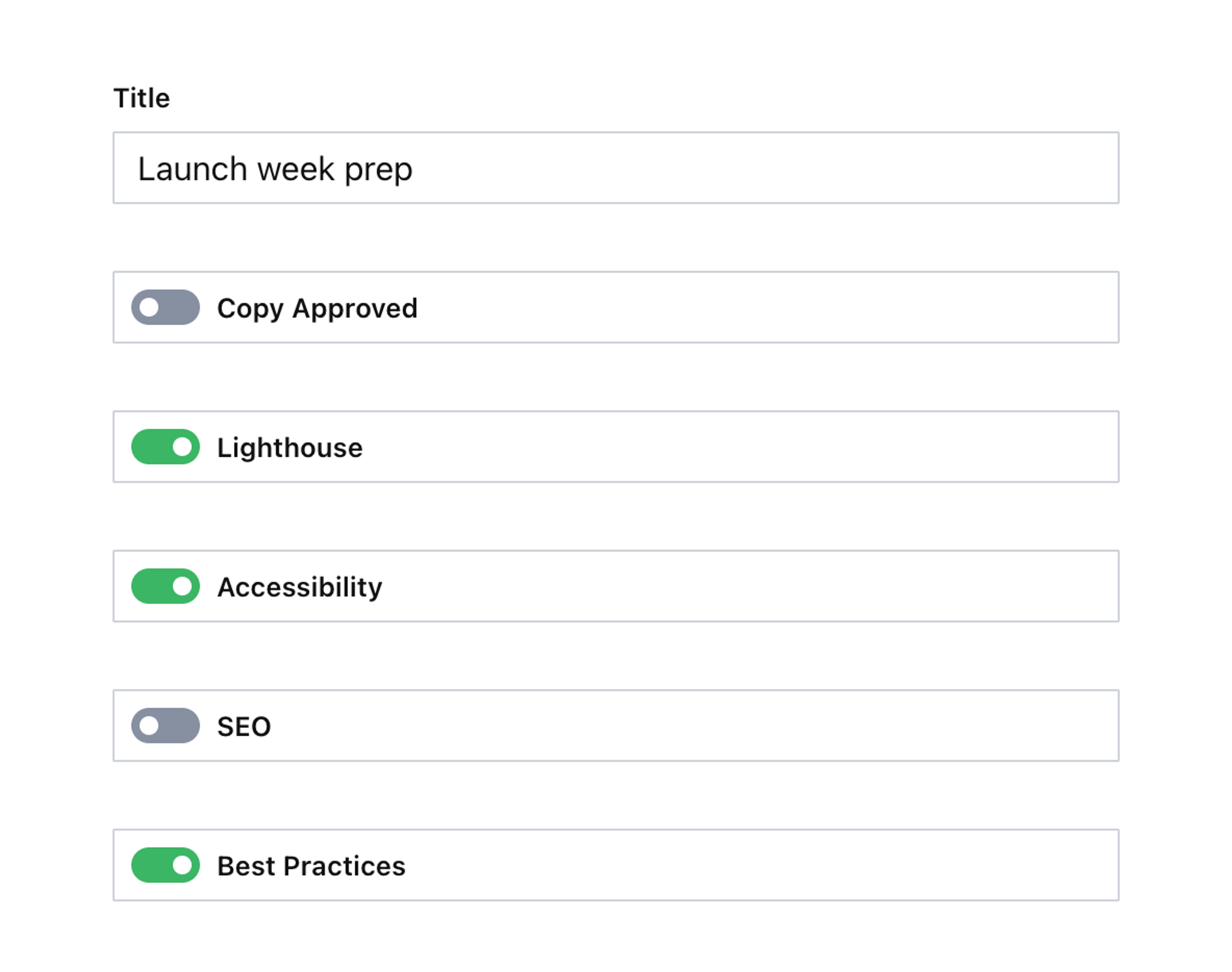
All these fields should have detailed description values, but for brevity in this guide, they’ve been omitted. Now you can make this a truly excellent editing experience.
Customizing the document form
Create a custom form component to display the form’s current progress:
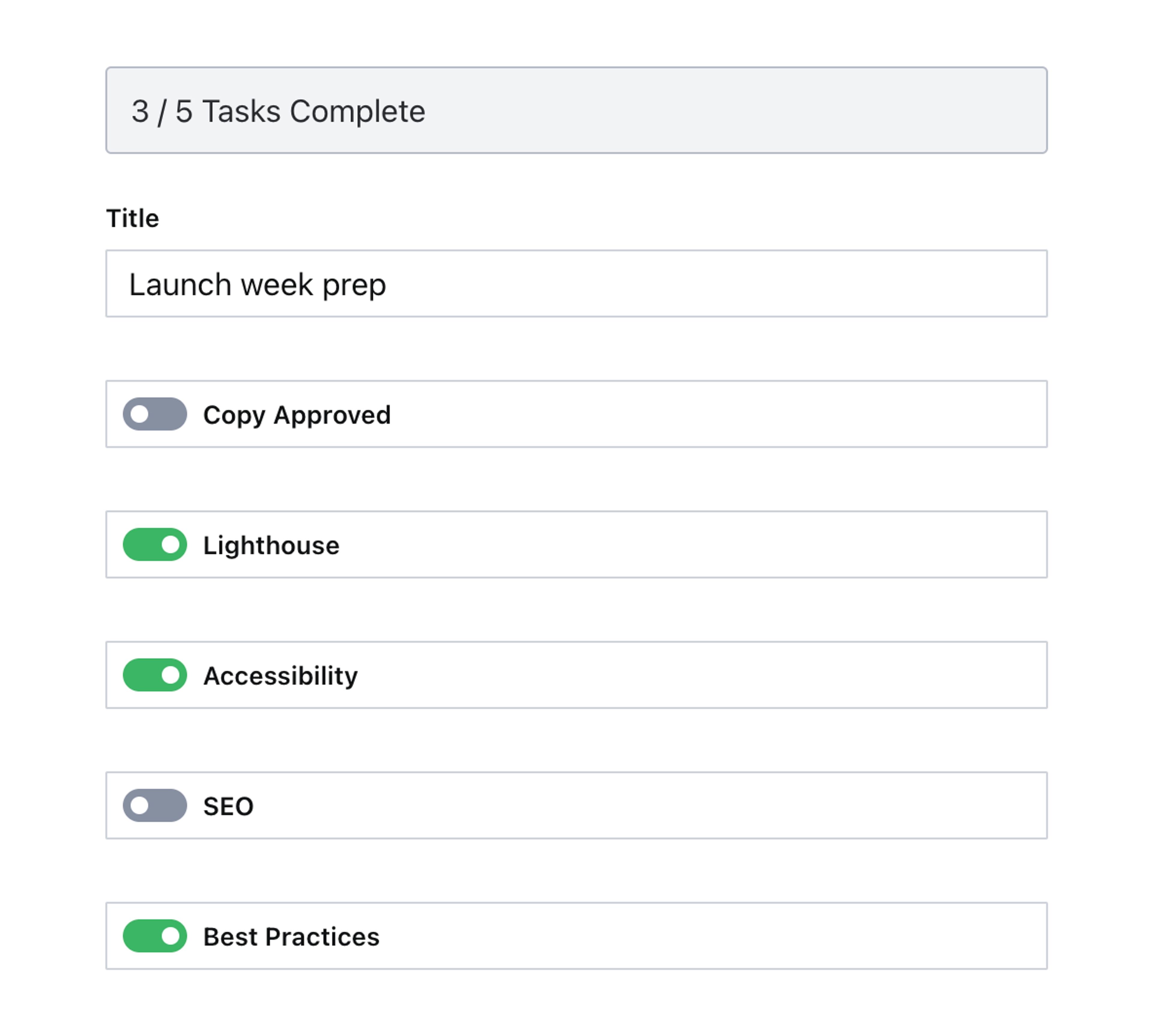
// ./schema/preflight/Progress.tsx import {ObjectInputProps, ObjectMember} from 'sanity' import {Flex, Card, Box, Stack} from '@sanity/ui' interface ProgressProps extends ObjectInputProps { members: ObjectMember[] } type FieldProgress = { name: string value: boolean } export function Progress(props: ProgressProps) { const {members = []} = props const booleanFieldProgress = members.reduce<FieldProgress[]>((acc, member) => { const isFieldMember = member.kind === 'field' && member.field.schemaType.name === 'boolean' if (!isFieldMember) { return acc } return [...acc, {name: member.name, value: Boolean(member.field.value)}] }, []) const totalCount = booleanFieldProgress.length const completeCount = booleanFieldProgress.filter((field) => field.value).length const isComplete = completeCount === totalCount return ( <Stack space={4}> <Card tone={isComplete ? `positive` : `transparent`} border padding={3} radius={2}> <Flex align="center" gap={3}> <Box> {completeCount} / {totalCount} Tasks Complete </Box> </Flex> </Card> {/* Render the default form */} {props.renderDefault(props)} </Stack> ) }Unlike other guides in this series where the component is decorating or replacing a built-in part of the Studio – this component will receive props and be rendered on its own.
The props it receives will be the field members that make up the form. In the component you’ll check for every boolean type field, and create array of just their names and whether they’re currently to true or falsy.
The component will also be loaded from a different location, as demonstrated below:
// ./sanity.config.tsx import {defineConfig, isObjectInputProps} from 'sanity' import {Stack} from '@sanity/ui' import {Progress} from './schema/preflight/Progress' export default defineConfig({ // ...all other settings form: { components: { input: (props) => { if ( props.id === 'root' && props.schemaType.type?.name === 'document' && props.schemaType.name === 'preflight' ) { return Progress(props as ObjectInputProps) } return props.renderDefault(props) }, }, }, })Notice how you’ll only load the Progress component if the root of the form is being rendered, and only on the preflight schema type and it’s the document component. Yes, in this case the Studio treats the whole document form as an “input component”.
Open a preflight document now and try changing a few boolean fields. A summary of your progress is now displayed at the top of the form. It goes green once all fields are completed. Best of all, the counts will be correct even if boolean fields are added or removed from the document schema.
This is good, but we can do even better.
Install React Circular Progressbar to your Studio:
npm install react-circular-progressbarNow update your component to use the component.
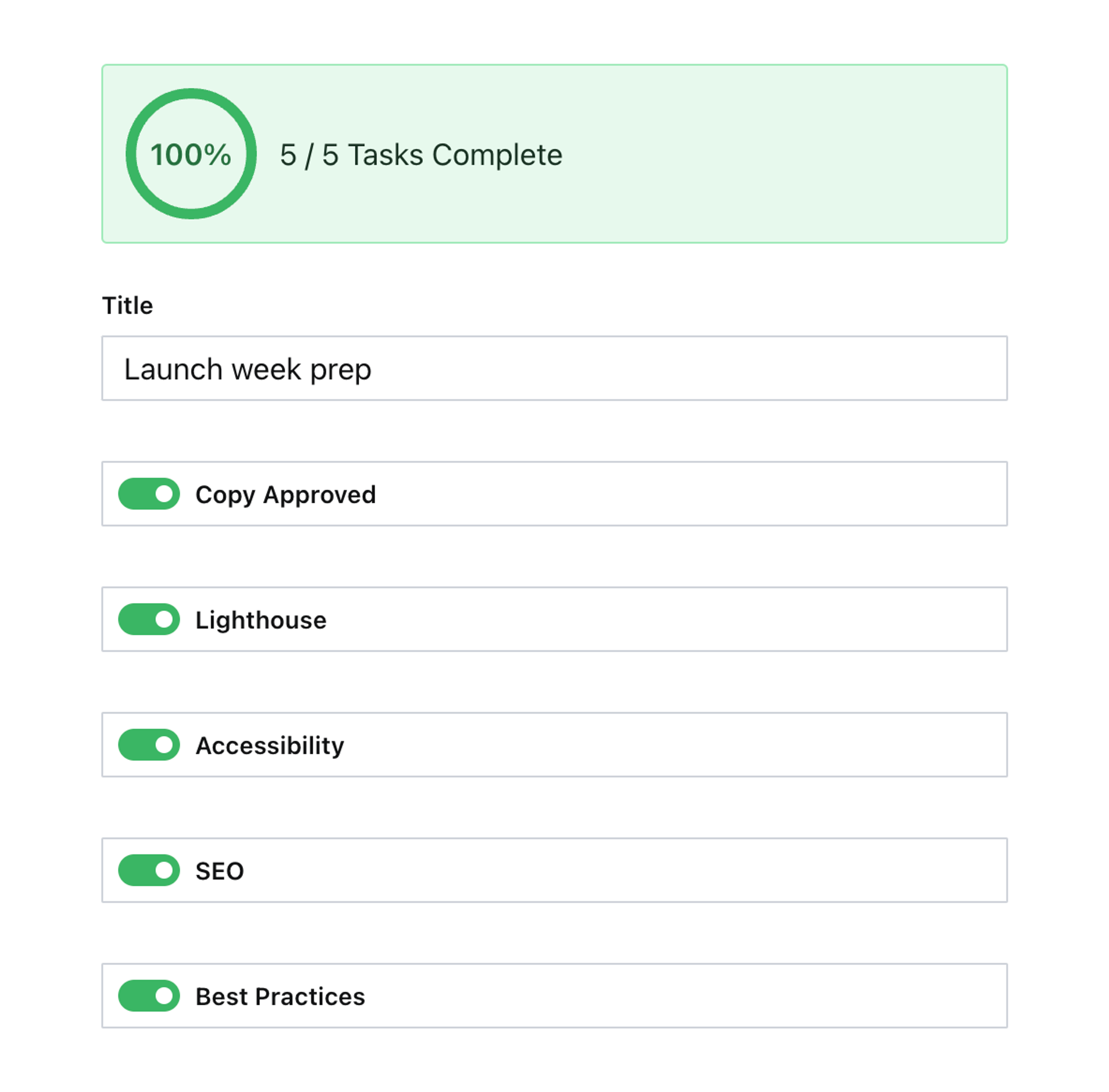
// ./schema/preflight/Progress.tsx import {ObjectInputProps, ObjectMember, TextWithTone} from 'sanity' import {Flex, Card, Box, Stack} from '@sanity/ui' import {hues} from '@sanity/color' import {CircularProgressbarWithChildren} from 'react-circular-progressbar' import 'react-circular-progressbar/dist/styles.css' interface ProgressProps extends ObjectInputProps { members: ObjectMember[] } type FieldProgress = { name: string value: boolean } export function Progress(props: ProgressProps) { const {members} = props const booleanFieldProgress = members.reduce<FieldProgress[]>((acc, member) => { const isFieldMember = member.kind === 'field' && member.field.schemaType.name === 'boolean' if (!isFieldMember) { return acc } return [...acc, {name: member.name, value: Boolean(member.field.value)}] }, []) const totalCount = booleanFieldProgress.length const completeCount = booleanFieldProgress.filter((field) => field.value).length const isComplete = completeCount === totalCount const percentage = Math.round((completeCount / totalCount) * 100) return ( <Stack space={4}> <Card tone={isComplete ? `positive` : `transparent`} border padding={3} radius={2}> <Flex align="center" gap={3}> <Box style={{maxWidth: 70}}> <CircularProgressbarWithChildren value={percentage} styles={{ path: {stroke: hues.green[500].hex}, trail: {stroke: hues.gray[100].hex}, text: {fill: hues.green[500].hex}, }} > <TextWithTone tone={isComplete ? `positive` : `default`} size={2} weight="semibold"> {percentage}% </TextWithTone> </CircularProgressbarWithChildren> </Box> <Box> {completeCount} / {totalCount} Tasks Complete </Box> </Flex> </Card> {/* Render the default form */} {props.renderDefault(props)} </Stack> ) }Notice the imports include hues from @sanity/color so that this 3rd party component can still be styled to look like a consistently designed part of the Studio UI.
Job done!
Next steps
- Add a React confetti package to shower your author with celebratory praise when a document reaches completion.
- Imagine how this might be used to call a 3rd party API to retrieve and display additional information based on values in the form.
- Other ideas include using an image generation package like Satori to generate an image based on values in the document.
Was this page helpful?