saturate()
Summary
Applies a saturation effect to an element’s color, making it appear more or less vivid, for use by the filter property. A decimal value of 1 or percentage of 100% keeps the image as is, while increasing the amount produces more dramatically stratified hues.
This CSS property value is reflected in the following image:
filter: saturate(1000%); filter: saturate(10); /* same */ 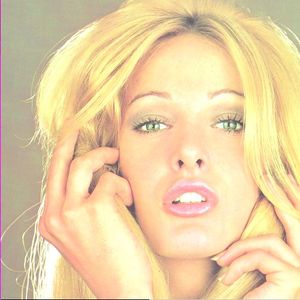

Examples
The following example shows the difference between two images, where one has a saturation of 1000%:

<!DOCTYPE html> <html> <head> <title>Filter example</title> <style> .foo { float: left; } .bar { -webkit-filter: saturate(1000%); } </style> </head> <body> <img src="/logo/wplogo_transparent_xlg.png" class="foo" /> <img src="/logo/wplogo_transparent_xlg.png" class="foo bar" /> </body> </html> Notes
The CSS filter corresponds to this SVG filter definition, based on a variable amount passed to the function:
<filter id="saturate"> <feColorMatrix type="saturate" values="(1 - [amount])"/> </filter> Related specifications
- Filter Effects 1.0
- Editor’s Draft
- Filter Effects 1.0
- Working Draft
See also
Related articles
Filters
saturate()