blur()
Summary
Blurs an element, for use by the filter property. Accepts a distance measurement within which pixels are randomly scattered. A value of 0 leaves the image as is.
This CSS property value is reflected in the following image:
filter: blur(10px); 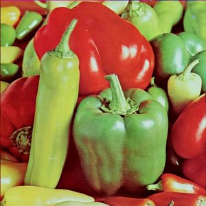
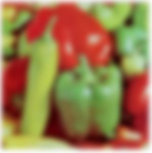
Note that pixels blur around the contours of image transparencies, possibly affecting the ability of background content to show through:
Examples
The following example shows the difference between two images, where one has a blur of 10px: 
<!DOCTYPE html> <html> <head> <title>Blur example</title> <style> .foo { float: left; } .bar { -webkit-filter: blur(10px); } </style> </head> <body> <img src="/logo/wplogo_transparent_xlg.png" class="foo" /> <img src="/logo/wplogo_transparent_xlg.png" class="foo bar" /> </body> </html> Notes
The CSS filter corresponds to this SVG filter definition, based on a variable radius passed to the function:
<filter id="blur"> <feGaussianBlur stdDeviation="[radius radius]"> </filter> Related specifications
- Filter Effects 1.0
- Editor’s Draft
- Filter Effects 1.0
- Working Draft
See also
Related articles
Filters
blur()