Text
Lets users enter or edit text within a single-line input. Use to collect short, free-form information from users.
Anchor to propertiesProperties
- Anchor to autocompleteautocompleteAutocompleteField | `${AutocompleteSection} ${AutocompleteField}` | `${AutocompleteGroup} ${AutocompleteField}` | `${AutocompleteSection} ${AutocompleteGroup} ${AutocompleteField}` | "on" | "off"Default: 'on' for everything else
A hint as to the intended content of the field.
When set to
on(the default), this property indicates that the field should support autofill, but you do not have any more semantic information on the intended contents.When set to
off, you are indicating that this field contains sensitive information, or contents that are never saved, like one-time codes.Alternatively, you can provide value which describes the specific data you would like to be entered into this field during autofill.
- Anchor to defaultValuedefaultValuestring
The default value for the field.
- Anchor to disableddisabledbooleanDefault: false
Disables the field, disallowing any interaction.
- Anchor to errorerrorstring
Indicate an error to the user. The field will be given a specific stylistic treatment to communicate problems that have to be resolved immediately.
- Anchor to iconicon'' | 'cart' | 'note' | 'settings' | 'reset' | 'map' | 'menu' | 'search' | 'circle' | 'filter' | 'image' | 'alert-circle' | 'alert-triangle-filled' | 'alert-triangle' | 'arrow-down' | 'arrow-left' | 'arrow-right' | 'arrow-up-right' | 'arrow-up' | 'bag' | 'bullet' | 'calendar' | 'camera' | 'caret-down' | 'cash-dollar'Default: ''
The type of icon to be displayed in the field.
- string
A unique identifier for the element.
- Anchor to labellabelstring
Content to use as the field label.
- Anchor to labelAccessibilityVisibilitylabelAccessibilityVisibility'visible' | 'exclusive'Default: 'visible'
Changes the visibility of the component's label.
visible: the label is visible to all users.exclusive: the label is visually hidden but remains in the accessibility tree.
- Anchor to maxLengthmaxLengthnumberDefault: Infinity
Specifies the maximum number of characters allowed.
- Anchor to minLengthminLengthnumberDefault: 0
Specifies the min number of characters allowed.
- Anchor to namenamestring
An identifier for the field that is unique within the nearest containing form.
- Anchor to prefixprefixstringDefault: ''
A value to be displayed immediately before the editable portion of the field.
This is useful for displaying an implied part of the value, such as "https://" or "+353".
This cannot be edited by the user, and it isn't included in the value of the field.
It may not be displayed until the user has interacted with the input. For example, an inline label may take the place of the prefix until the user focuses the input.
- Anchor to readOnlyreadOnlybooleanDefault: false
The field cannot be edited by the user. It is focusable will be announced by screen readers.
- Anchor to requiredrequiredbooleanDefault: false
Whether the field needs a value. This requirement adds semantic value to the field, but it will not cause an error to appear automatically. If you want to present an error when this field is empty, you can do so with the
errorproperty.- Anchor to suffixsuffixstringDefault: ''
A value to be displayed immediately after the editable portion of the field.
This is useful for displaying an implied part of the value, such as "@shopify.com", or "%".
This cannot be edited by the user, and it isn't included in the value of the field.
It may not be displayed until the user has interacted with the input. For example, an inline label may take the place of the suffix until the user focuses the input.
- Anchor to valuevaluestring
The current value for the field. If omitted, the field will be empty.
AutocompleteSection
The “section” scopes the autocomplete data that should be inserted to a specific area of the page. Commonly used when there are multiple fields with the same autocomplete needs in the same page. For example: 2 shipping address forms in the same page.
`section-${string}`AutocompleteGroup
The contact information group the autocomplete data should be sourced from.
"shipping" | "billing"Anchor to eventsEvents
- Anchor to blurblur((event: CallbackEventListener<typeof tagName>) => void) | null
Callback when the element loses focus.
- Anchor to changechange((event: CallbackEventListener<typeof tagName>) => void) | null
Callback when the user has finished editing a field, e.g. once they have blurred the field.
- Anchor to focusfocus((event: CallbackEventListener<typeof tagName>) => void) | null
Callback when the element receives focus.
- Anchor to inputinput((event: CallbackEventListener<typeof tagName>) => void) | null
Callback when the user makes any changes in the field.
CallbackEventListener
(EventListener & { (event: CallbackEvent<TTagName, TEvent>): void; }) | nullCallbackEvent
TEvent & { currentTarget: HTMLElementTagNameMap[TTagName]; }Anchor to slotsSlots
- Anchor to accessoryaccessoryHTMLElement
Additional content to be displayed in the field. Commonly used to display an icon that activates a tooltip providing more information.
Code
Examples
Code
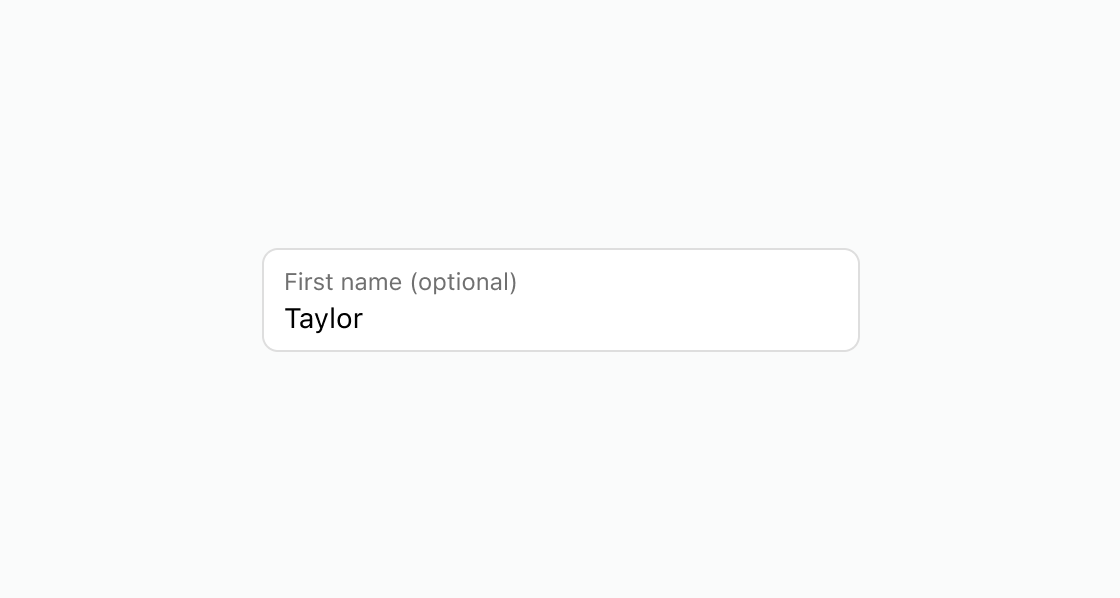
Default
<s-text-field label="First name (optional)" defaultValue="Taylor" ></s-text-field>
Preview
Anchor to best-practicesBest Practices
- Clearly label text fields so that it’s obvious what customers should enter.
- Label text fields as optional when input isn’t required. For example, use the label First name (optional).
- Don’t have optional fields pass true to the required property.