Text
Collect longer text content from users with a multi-line input that expands automatically.
Anchor to propertiesProperties
- Anchor to autocompleteautocompleteAutocompleteField | `${AutocompleteSection} ${AutocompleteField}` | `${AutocompleteGroup} ${AutocompleteField}` | `${AutocompleteSection} ${AutocompleteGroup} ${AutocompleteField}` | "on" | "off"Default: 'on' for everything else
A hint as to the intended content of the field.
When set to
on(the default), this property indicates that the field should support autofill, but you do not have any more semantic information on the intended contents.When set to
off, you are indicating that this field contains sensitive information, or contents that are never saved, like one-time codes.Alternatively, you can provide value which describes the specific data you would like to be entered into this field during autofill.
- Anchor to defaultValuedefaultValuestring
The default value for the field.
- Anchor to disableddisabledbooleanDefault: false
Disables the field, disallowing any interaction.
- Anchor to errorerrorstring
Indicate an error to the user. The field will be given a specific stylistic treatment to communicate problems that have to be resolved immediately.
- string
A unique identifier for the element.
- Anchor to labellabelstring
Content to use as the field label.
- Anchor to labelAccessibilityVisibilitylabelAccessibilityVisibility'visible' | 'exclusive'Default: 'visible'
Changes the visibility of the component's label.
visible: the label is visible to all users.exclusive: the label is visually hidden but remains in the accessibility tree.
- Anchor to maxLengthmaxLengthnumberDefault: Infinity
Specifies the maximum number of characters allowed.
- Anchor to minLengthminLengthnumberDefault: 0
Specifies the min number of characters allowed.
- Anchor to namenamestring
An identifier for the field that is unique within the nearest containing form.
- Anchor to readOnlyreadOnlybooleanDefault: false
The field cannot be edited by the user. It is focusable will be announced by screen readers.
- Anchor to requiredrequiredbooleanDefault: false
Whether the field needs a value. This requirement adds semantic value to the field, but it will not cause an error to appear automatically. If you want to present an error when this field is empty, you can do so with the
errorproperty.- Anchor to rowsrowsnumberDefault: 2
A number of visible text lines.
- Anchor to valuevaluestring
The current value for the field. If omitted, the field will be empty.
AutocompleteSection
The “section” scopes the autocomplete data that should be inserted to a specific area of the page. Commonly used when there are multiple fields with the same autocomplete needs in the same page. For example: 2 shipping address forms in the same page.
`section-${string}`AutocompleteGroup
The contact information group the autocomplete data should be sourced from.
"shipping" | "billing"Anchor to eventsEvents
- Anchor to blurblur((event: CallbackEventListener<typeof tagName>) => void) | null
Callback when the element loses focus.
- Anchor to changechange((event: CallbackEventListener<typeof tagName>) => void) | null
Callback when the user has finished editing a field, e.g. once they have blurred the field.
- Anchor to focusfocus((event: CallbackEventListener<typeof tagName>) => void) | null
Callback when the element receives focus.
- Anchor to inputinput((event: CallbackEventListener<typeof tagName>) => void) | null
Callback when the user makes any changes in the field.
CallbackEventListener
(EventListener & { (event: CallbackEvent<TTagName, TEvent>): void; }) | nullCallbackEvent
TEvent & { currentTarget: HTMLElementTagNameMap[TTagName]; }Code
Examples
Code
Default
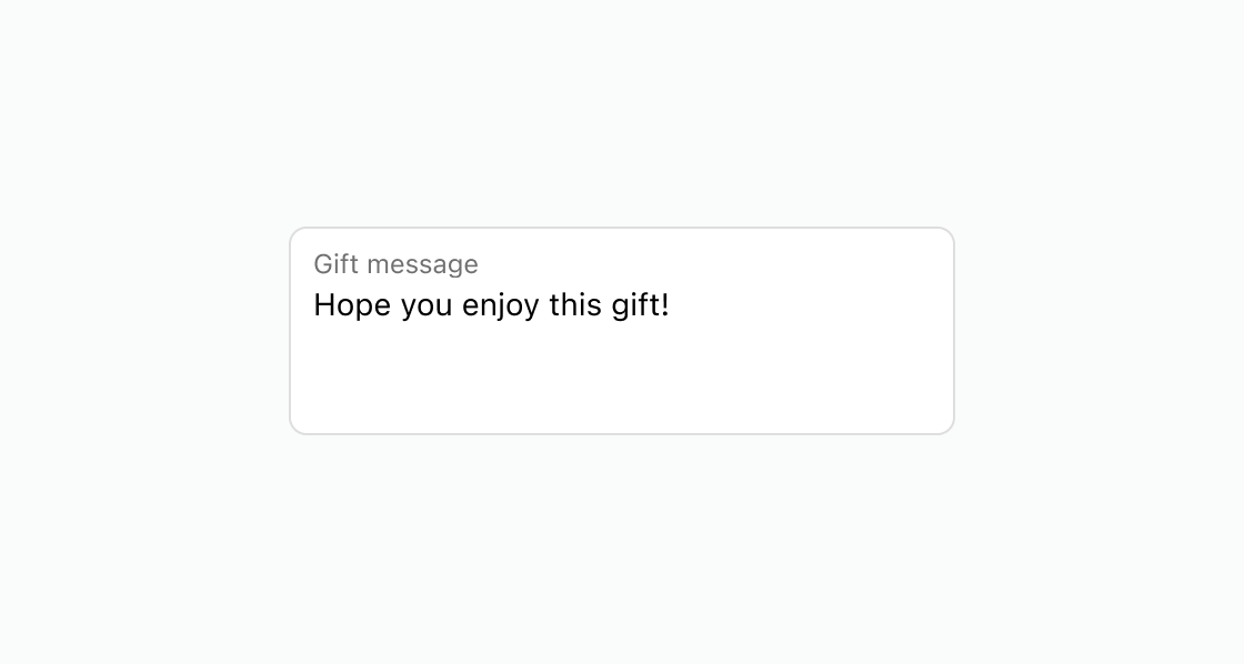
<s-text-area label="Gift message" value="Hope you enjoy this gift!" rows={3} ></s-text-area>
Preview