Date
Allow users to select a specific date or date range.
Anchor to propertiesProperties
- Anchor to allowallowstringDefault: ""
Dates that can be selected.
A comma-separated list of dates, date ranges. Whitespace is allowed after commas.
The default
''allows all dates.- Dates in
format allow a single date. - Dates in
format allow a whole month. - Dates in
format allow a whole year. - Ranges are expressed as
start--end. - Ranges are inclusive.- If either
startorendis omitted, the range is unbounded in that direction. - If parts of the date are omitted for
start, they are assumed to be the minimum possible value. So2024--is equivalent to2024-01-01--. - If parts of the date are omitted for
end, they are assumed to be the maximum possible value. So--2024is equivalent to--2024-12-31. - Whitespace is allowed either side of
--.
- If either
- Dates in
- Anchor to allowDaysallowDaysstringDefault: ""
Days of the week that can be selected. These intersect with the result of
allowanddisallow.A comma-separated list of days. Whitespace is allowed after commas.
The default
''has no effect on the result ofallowanddisallow.Days are
sunday,monday,tuesday,wednesday,thursday,friday,saturday.- Anchor to defaultValuedefaultValuestringDefault: ""
Default selected value.
The default means no date is selected.
If the provided value is invalid, no date is selected.
- If
type="single", this is a date informat. - If
type="multiple", this is a comma-separated list of dates informat. - If
type="range", this is a range informat. The range is inclusive.
- If
- Anchor to defaultViewdefaultViewstring
Default month to display in
format.This value is used until
viewis set, either directly or as a result of user interaction.Defaults to the current month in the user's locale.
- Anchor to disableddisabledbooleanDefault: false
Disables the field, disallowing any interaction.
- Anchor to disallowdisallowstringDefault: ""
Dates that cannot be selected. These subtract from
allow.A comma-separated list of dates, date ranges. Whitespace is allowed after commas.
The default
''has no effect onallow.- Dates in
format disallow a single date. - Dates in
format disallow a whole month. - Dates in
format disallow a whole year. - Ranges are expressed as
start--end. - Ranges are inclusive.- If either
startorendis omitted, the range is unbounded in that direction. - If parts of the date are omitted for
start, they are assumed to be the minimum possible value. So2024--is equivalent to2024-01-01--. - If parts of the date are omitted for
end, they are assumed to be the maximum possible value. So--2024is equivalent to--2024-12-31. - Whitespace is allowed either side of
--.
- If either
- Dates in
- Anchor to disallowDaysdisallowDaysstringDefault: ""
Days of the week that cannot be selected. This subtracts from
, and intersects with the result ofallowanddisallow.A comma-separated list of days. Whitespace is allowed after commas.
The default
''has no effect on.Days are
sunday,monday,tuesday,wednesday,thursday,friday,saturday.- string
A unique identifier for the element.
- Anchor to namenamestring
An identifier for the field that is unique within the nearest containing form.
- Anchor to typetype'single' | 'multiple' | 'range'Default: "single"
The type of selection the date picker allows.
singleallows selecting a single date.multipleallows selecting multiple non-contiguous dates.rangeallows selecting a single range of dates.
- Anchor to valuevaluestringDefault: ""
Current selected value.
The default means no date is selected.
If the provided value is invalid, no date is selected.
Otherwise:
- If
type="single", this is a date informat. - If
type="multiple", this is a comma-separated list of dates informat. - If
type="range", this is a range informat. The range is inclusive.
- If
- Anchor to viewviewstring
Displayed month in
format.is called when this value changes.Defaults to
.
Anchor to eventsEvents
- Anchor to blurblur((event: CallbackEventListener<typeof tagName>) => void) | null
Callback when the element loses focus.
- Anchor to changechange((event: CallbackEventListener<typeof tagName>) => void) | null
Callback when the user has finished editing a field, e.g. once they have blurred the field.
- Anchor to focusfocus((event: CallbackEventListener<typeof tagName>) => void) | null
Callback when the element receives focus.
- Anchor to inputinput((event: CallbackEventListener<typeof tagName>) => void) | null
Callback when the user makes any changes in the field.
- Anchor to viewChangeviewChange((event: CallbackEventListener<typeof tagName>) => void) | null
Callback when the view changes.
CallbackEventListener
(EventListener & { (event: CallbackEvent<TTagName, TEvent>): void; }) | nullCallbackEvent
TEvent & { currentTarget: HTMLElementTagNameMap[TTagName]; }Code
Examples
Code
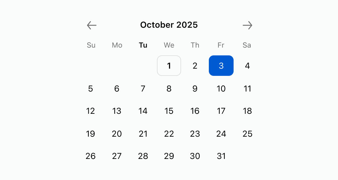
Default
<s-date-picker defaultView="2025-10" defaultValue="2025-10-03"></s-date-picker>
Preview